INK REVIEW: Private Reserve Arabian Rose

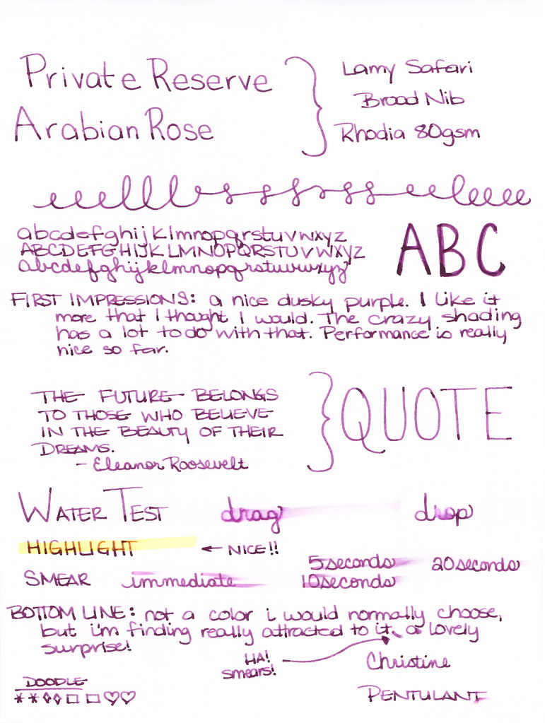
I have a zillion ink samples and sometimes I know exactly which I want to try next. A couple of weeks ago, though, I was in a funk. I knew I wanted to try a new (to me) ink, but I was feeling ambivalent about exactly which ink to try.  Reaching my hand into my samples, I pulled out Private Reserve Arabian Rose.

The color is nice. It reminds me a bit of Yama-budo, though not as bright.

Lots of good shading.

Flow from the pen is great. No feathering, bleeding, or ghosting on the various decent-quality papers I’ve used over the last couple of weeks.

Water resistance isn’t a big factor in choosing an ink for me – if it is for you, you may want to look elsewhere.

My bottom line?  I like it quite a bit.  Preferring Yama-budo, this ink isn’t one that I would normally choose for myself, but I will almost certainly use the entire sample without complaint.

All of this makes me wonder – do you prefer the super-bright, in-your-face colors, or something a bit more dusky like this purply color?  

PEN REVIEW: Kaweco AL Sport Grey

Kaweco AL Sport Grey Fountain Pen Review

I’m usually not into the weights and measures of my fountain pens, but I can’t help it this time. Capped, this great-looking pen measures right around four inches – the perfect size for pockets or smaller bags. When posted, the Kaweco gains over an inch to just about 5.25 inches.  Perfect.

The AL Sport weighs in at a solid 22g. For comparison, the Kaweco Ice Sport weighs just 10g.

I love the look of this pen – classic Kaweco design, sleek, simple, smart.

The color of is simply called grey. It’s a very warm grey – leaning well into red. Lot of depth of color for what is basically a flat finish. I can’t help but think that if you wanted to match this pen to an ink, you should try Pilot Iroshizuku’s Kiri-same.

Unfortunately, this pen only accepts short international cartridges. Fortunately, some short international converters may work with the pen. Unfortunately, I don’t know which those are – I am hoping someone will post with suggestions.

A great solid pen.

But how does it write?

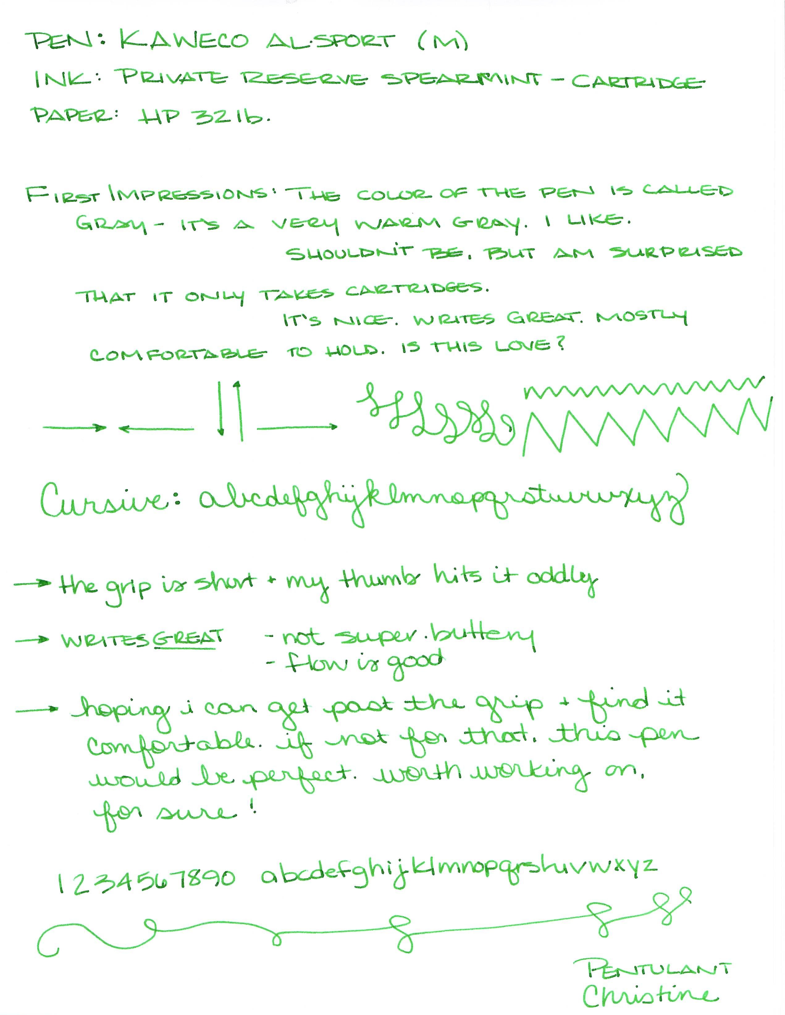
I loaded up my medium-nibbed AL Sport with a Private Reserve Spearmint cartridge and got to writing . . . .

My early (and only) concern was that the section (grip area) is quite short and my thumb was hitting  (and rubbing against) it oddly. Honestly, I wasn’t sure it was going to work out.

After writing with it for awhile, putting it down for a day or two, and then going back to it, there were no issues with the section/grip. Whew.  Perfectly comfortable, but something to be aware of because that section does seem short.

My bottom line . . . At around $80 (I got mine from Goulet Pens with my own saved pennies), it’s a bit more expensive than some of the other Kaweco fountain pens, but the quality is there. Definitely recommended. In fact, I’m already looking for the Stonewashed version of this same pen – stay tuned!

xoxox

INK REVIEW: FOUR FABULOUS BLUE INKS (Part 2)

Last week, I took a really close look at four fabulous blue inks.

Some of these inks are not easy to find. Let’s take a look and see if we can figure this thing out…
Sailor Bung Box Sapphire


After a little searching, I’ve found some sources for Bung Box inks . . . 
Rumor has it Cool-Japan had them over on eBay at one time. As of this writing, there are no Bung Box inks listed, I’ve bought ink from Cool Japan in the past and had a great experience.

The bottles and packaging look amazing and I’ve definitely enjoyed using the sample Gerald sent me. 

Here’s the trouble: money.  The Bung Box inks are not cheap – add in some shipping (from Japan!) charges, and you’re at right around $45-50 per bottle. Yikes.
Parker Penman Sapphire would also be a good substitute for Bung Box Sapphire. Because the Penman ink is no longer available, I’ve listed some good replacements in that section.  Zoom down to see.
Bottom Line:  If $ isn’t a concern, go for it. It’s a great-looking and well-performing ink – you wouldn’t be disappointed. If $ is a concern, DC Supershow Blue is a fine alternative.

Noodler’s Liberty’s Elysium


Noodler’s Liberty’s Elysium is only available from Goulet Pens. The good news is that Goulet Pens has a fantastic reputation in the fountain pen community for excellent customer service. They will also ship overseas.

I shop at Goulet Pens regularly and mention them frequently. I’m not related to the Goulet’s, I receive no discounts, free product, special treatment, or anything else from them. Unfortunately, in our relationship – the money only flows in the one direction 😉

PW Akkerman #5 Shocking Blue


I got mine direct from the Netherlands. Shipping was fast, seemed reasonable (though I was buying multiple bottles), and everything arrived in good condition.

Vanness Pen Shop also carries Akkerman inks. You’ll have to call or email them for specifics.

It’s expensive. The Akkerman bottles are super-fancy and they’ve come a long distance. If you don’t want to put out the money, my strong recommendation is Diamine Majestic Blue (see image below).

Parker Penman Sapphire


No longer available, there are some inky recipes out there for replacing Penman Sapphire. A quick search turned up these two links for you . . . 

Another Parker Penman Sapphire Replacement

The difficulty here is that while I think it is possible to get the color right (or at least close enough), I’m feeling pretty certain that it’s quite impossible to get the feel of Parker Penman right on target. That is to say this: the color is only part of what makes an ink so special. The feel of the sample I had is wonderfully different from all of the other blues here and I seriously doubt that mixing 6.5 drops of ink #1 with 3.75 drops of ink #2 is going to result in that same feel* – and without that, well, there are plenty of off the shelf colors that come close enough.  Have a look . . .


Some of the above ink swabs are showing the sheen – and maybe you’re thinking Penman Sapphire doesn’t have much sheen here or in my review from last week, but look at this review over on FPN – crazy sheen.

Sailor Bung Box Sapphire also looks like a good sub for Parker Penman Sapphire, but there are difficulties in obtaining that ink, too. (See the above section for those details.)

Bottom Line – DC Supershow Blue is the color I would choose if I was trying to match the color of Parker Penman Sapphire.

Of course, you could search eBay for it, but there are rumors that it was discontinued because it may contain metallic bits (hello, sheen) in it and it causes pens to clog. I’ve not had trouble with it in my Pilot Metorpolitan, however.

* Did you know that mixing inks can be an invitation for Major Trouble? Some inks don’t play well with others and you could end up with a blobby globby mess – in your pen. Some mixtures will take some time to form the blobby globby mess and by the time it does, you may have already loaded it into your pen. Be careful.

Annnnnd…that’s that!  Four Fabulous Blue Inks. This has been a fun fun project and I really have to thank Gerald again for sending me samples of some of these inks. If you’re not following me and Gerald on Instagram, you simply must.

You tell me . . . Are you going shopping for one of these? Or maybe you have another favorite blue ink?

INK REVIEW: Private Reserve Black Magic Blue

Private Reserve Black Magic Blue Fountain Pen Ink

First ink review of the new year and I am so glad to say that we have a winner!  Maybe this is an indicator that all inks this year will be winners? Ha!

Other than my usual pet peeve (see below), Black Magic Blue is pretty special.

Black Magic Not Blue

This “blue” ink is definitely purple. Purple in the swab, purple in the bottle, purple in the writing – blue in the name.  I once read a post (probably on FPN) where the writer was complaining that the colors on ink packages didn’t match the color in the bottle – I totally get that it would be very difficult to color-match bottled ink to a printed package – but the name? I totally don’t get it. Why not be be as descriptive in the names as possible?

So . . . I wanted to hate Black Magic Blue on principle, but this ink definitely worked it magic on me.

Check it out . . .

Woo!

The color of an ink is everything to me.  Other things are negotiable, but if the color and saturation aren’t there, all of those other features don’t matter a bit.  And..if the color is there, I’ll put up with some pretty terrible “features” to get that color.

Fortunately, Black Magic Blue is easy to love. (Yes, it’s making my love list!)

It writes wonderfully – great flow in the Lamy Safari (Broad Nib) I used for this test. Perhaps a little wet – but, again, I was using a broad nib so some smearing is expected and it doesn’t seem terrible even when I was smearing on purpose.

The color is deep.  If you’re looking for bright, check out Private Reserve Purple Mojo – there’s some bright!

The color is clear. If you’re looking for something a little dusky, check out Alexander Hamilton from De Atramentis.

As for me – I used Black Magic Blue for a full week and definitely fell in love.

Have you fallen in love in 2014? With inks, pens, or anything (anyone?) else?

INK REVIEW: Private Reserve Vampire Red

Happy Almost Halloween!

This isn’t my red – but it is someone’s.

Every so often (in fact, regularly) over on FPN, the topic of blood red ink comes up. People really really crave ink that is blood red. Often, I think they are looking for something that is a bit darker than this, but really . . .

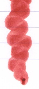
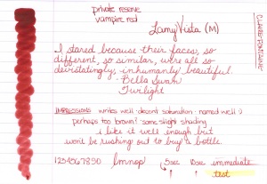
Private Reserve Vampire Red

Blood red, right?

I like it well enough that I left it in my pen and used it for a week or so . . .

. . . but it’s not love.

It’s certainly named well – and that always gets bonus points in my book, but I’m more of a bright red kinda girl. I like (most of) my colors bright and bold.

I first tried Vampire Red on Clairefontaine paper and it really is a good ink. No complaints here at all.

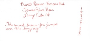
And then gave it a go on Tomoe River Paper . . .

I don’t see too much difference between the two. Sometimes, Tomoe River Paper will make colors really pop.

What do you think? Bloody enough for your Halloween? Trick or Treat!

INK REVIEW: Private Reserve DC Supershow Green

Private Reserve DC Supershow Green Ink Swab

First, forgive the swab – not sure why it’s a bit blurry.

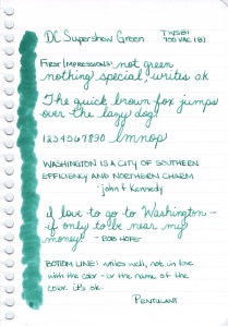
Second, this ink isn’t green. It’s teal. More toward the green side of teal, but still – it’s teal.

Private Reserve DC Supershow Green Writing Sample

That aside, I don’t know what I was thinking when I wrote the following…..

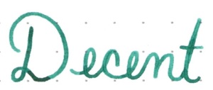
Was I perhaps blinded by my pet peeve? I think maybe so.  Because looking at it now, DC Supershow Teal Green definitely has something special.  Look at all of that shading.  Now that the bitterness of the name not matching the color of the ink has subsided, even I can admit that there are some really great qualities about this ink.

What is my new bottom line?  The one I’m writing while keeping names out of it?  It’s a good ink. It writes well.  The color isn’t for me.

OK…this is a trend. Three Mondays in a row, I’ve not loved the ink. What is going on here?  I’m going to need to find something really terrific for next week!

INK REVIEW: Private Reserve Purple Mojo

Private Reserve Purple Mojo Ink Swab

Hello, Purple Mojo!

Words that come to mind….vibrant, in-yo-face color, PURPLE, bright. This is one screamin’ purple ink!

Private Reserve Purple Mojo Writing Sample

It writes quite well. No issues with bleeding, show through, or feathering on my Rhodia paper. There’s even a bit of shading – always nice, yes?

Dry time isn’t really an issue and the highlight test was also fine.

I keep returning to my one lingering question, though. Is Purple Mojo…

special enough?

After falling in love with Mr. President, I just don’t know.  Check it out in the Compare Squares.

Bottom Line:   I like Purple Mojo well enough. I don’t love it.  To me, it’s not special enough in terms of color. But..that is the only thing holding me back and if you love the color, you should go for it because it really is a well-behaved ink.

INK REVIEW: Private Reserve Buttercup

Hello, Buttercup!

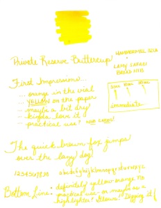
Yellow inks are tough. This one is so pretty in person – Private Reserve Buttercup.

The problem with yellow inks, of course, is – how do you use them? They aren’t very practical other than for highlighting (and, frankly, I just use a highlighter for that).

I used this color for about a week in my work notebooks, but it was just too hard on my eyes when I went back to look at the notes later. Too bad, really.

So..I don’t know…but, still, I am rather fond of this ink.  Look at the shading . . .

It’s nice, right?

Buttercup writes well enough – perhaps a little slow-flowing even in my Lamy Safari with a broad nib. It almost GLOWS with color.

What is your bottom line on yellow inks? Love them, hate them, would never even bother with them? If you’re using yellow inks for something other than highlighting – let me know – I’d love to discover a new use for this pretty Buttercup.

QUICK LOOK WEDNESDAY – Six Pretty Colors

Sometimes, I want to play with my pens, inks, and papers, but can think of nothing to write.

The first step is to write the name of the ink and the name of the pen (see above). I just noticed that each ink is from a different manufacturer – nice.

Apparently, the last resort is to write things that I overhear from the television (see below).

It was actually quite a bit of fun – watching and scribbling, changing pens and writing a bit more. I love the way the entire sheet of paper looks – each color is pretty amazing on its own, yes?

Let’s take a closer look . . .

Above – DeAtramentis Alexander Hamilton. I love this purple. It’s so rich and deep in color – nice saturation. I don’t see this ink discussed much on the various forums, but I think this is a purple that could be used anywhere.  (more on that another day)

Below – Private Reserve Spearmint. One of my favorite green inks. It looks a bit dark here to my eye, but it is usually quite cheery.

Do you have a guess as to which show I was watching at the time?

Below – Montblanc Hitchcock. A gorgeous blood red ink if I ever did see one. Some really pretty shading in there, too. I have to confess, I have a quite a lot of this in my cabinet. Shall I keep it forever? Use it as if I’ll never run out? Or maybe even sell some?

Below – Noodler’s Habanero. A favorite. That shading. The brightness of the color. Need I say more? Mm..wait, I already did right here.
 

By the way, the above quote is the one that seems like the one that would tell the secret of what I was watching. Have you guessed it yet?

Above – Pilot Iroshizuku Fuyu-syogun. I wonder if I only could have one ink, if this would be it. Check out my big review here. It is crazy CrAzY to think that I, lover of bright and beautiful colors, would be so taken with a gray ink, but there you go.

Above – Diamine Majestic Blue.  Easy to see why it’s one of my favorites, yes?  So pretty.

And, so, there we have it – six pretty colors. All so different from one another and yet all so wonderful.

Which show was I watching?  Downton Abbey, of course!  Have you seen it? Highly recommended.

QUICK LOOK WEDNESDAY: Four Fab Blues

Time for this week’s Quick Look Wednesday!

I like all of these inks for different reasons.

De Atramentis Indigo Blue – a straight-forward blue that could be used in any setting

Diamine Eau de Nil – (does this mean River Water?) a bit of green, but not quite enough to call it turquoise

Private Reserve Ebony Blue – maybe my least favorite because it looks more like a green-black in my swabs. Have any of you tried writing with this one?

Noodler’s Ottman Azure – boom! Pure blue saturation with this one.

So, yeah, each of these are so different from the others and I like them all.  Which is your pick?