QUICK LOOK WEDNESDAY: You call that red?

Time for another Quick Look Wednesday!

What do all of these inks have in common?  They are all samples from my bag of red inks.

Red?

 Private Reserve – Vampire Red
 Diamine – Maroon
 Pelikan Edelstein – Ruby
 Sailor Jentle – Grenade
So, yes, I sort my ink samples by color. I have so many that there has to be a system – I’ll take pictures and show you sometime soon. 
I first look at the name of the ink and sometimes it’s obvious where the ink belongs.  Delta Brown?  Not a big decision. Frankly, Pelikan Edelstein Ruby didn’t seem like a big decision either. Ruby – Red, right? Not so much. Yikes.
When the name doesn’t make it obvious, I open the sample, have a peek, and make a best guess. Sailor Jentle Grenade belongs with the purples. Oops.
I’m really liking Private Reserve Vampire Red. Perfect name for this color, yes? Can’t wait to write with it!
Maroon from Diamine is ok – nothing special to me. It’s one of those colors that isn’t really a color. Haha.
What do you think?  Do the names of inks get you all bothered, too? Ruby – ha!

QUICK LOOK WEDNESDAY: Four Green Inks

It’s Quick Look Wednesday!  Today, we have four very different shades of green.

 De Atramentis Bamboo Green
 Private Reserve Sherwood Green

 De Atramentis Black Edition Green
 De Atramentis Patina Green
Do you have a favorite?  I’m digging Sherwood Green. Nice clear color.
My least favorite is De Atramentis Black Edition Green. It just looks too muddied to me. But check out the review here.  It looks much better, yes?  The difference may be explained by the fact that my quick looks are just swabs and this is a handwritten review.
As for green inks? I love them. More than I thought I would. They are fun without being too loud (like some kind of crazy pink inks!)

Some Things Were Just Meant to Be

Waterman 52 / Private Reserve Spearmint / Clairefontaine

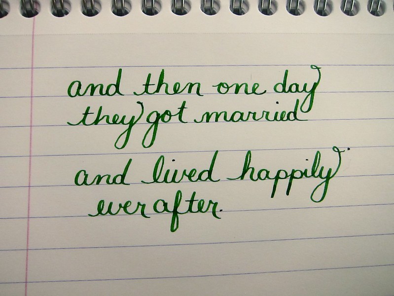
My posts have been a bit sporadic over the last few weeks.  I was just a little busy.  Getting married!

It’s true! Mr. P. and I finally tied the knot last week and we couldn’t be more happy.

I wrote the above several weeks ago and the following just one day before the wedding.

A small peek at our invitation below. We sent around twenty invitations. Each was individually calligraphed by someone we found on Etsy. I love the way they turned out. Perfectly us.
The day before the ceremony, we went to Max’s Opera House Cafe.  Following is a quick picture of their menu. Green + Typography + Darling = Perfection.  (Did you know my new last name is Darling?)
When we checked into our hotel the night before, we had no idea we would have a view of San Francisco City Hall where we would be married. I took this picture in the morning when the fog was still laying low.
I have to admit – looking at all of this makes me a bit teary all over again. Such a happy day. So perfectly us.

PEN REVIEW: Waterman 52

On Friday, I shared some recent purchases including this little gem I acquired from VintagePen.

Going to (mostly) let the pictures do the talking here . . .
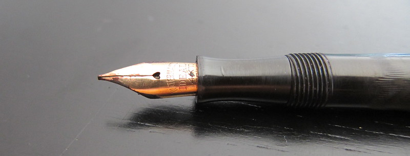
That’s a little nib creep – not rust or anything icky like that
love the gentle chevron – so subtle

And now . . .

Sammy is one of our three (!!) dogs.

My handwriting needs a bit of work, but man-oh-man, I am digging this pen. So much so that some of my other favorite pens have been sitting around unused in the short time I’ve had the Waterman 52.

It’s a little skinny, a little short – neither of those things are a bother to me. It writes wonderfully – perfectly smooth, easy to flex. It’s not even a little scratchy and it doesn’t skate uncontrollably across the paper.

The lever-fill is easy to manage – perhaps a pain to clean and ink capacity seems a bit low, but I can live with those things.

I love everything about the pen except there’s no clip on the cap – making the pen very likely to roll around. I hope so much that I never inadvertently set it down and have it roll onto the floor. Yikes.

This is a pen that will stay in the house because I really would be heartbroken if something happened to it.

It’s love! True love.
INK REVIEW: J Herbin Violette Pensee

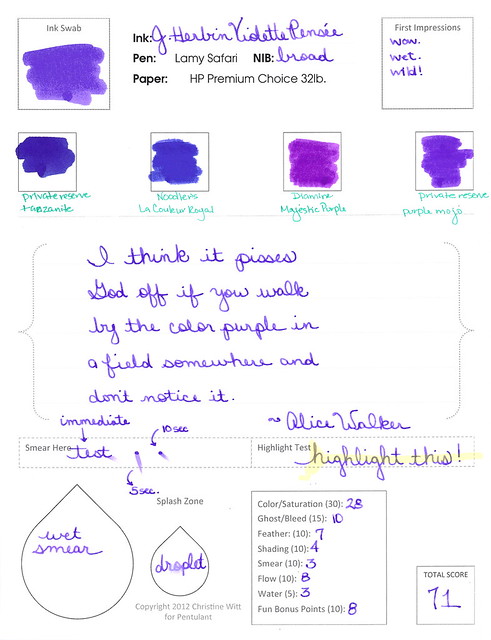
Boom! Take that, boring winter colors! Pow! In yo face!

See it huge.

I really like this color. It’s maybe a little milky looking, but in this case, I really really like it. Boom!

Totally saturated, fun color that doesn’t hold up well to water. (So what?)
LOVE that the drop spatter is visible in this image.
It’s the little things.

My bottom line? Same as my top line!

Perfect getting ready for spring color. Agree? Disagree? Discuss in the comments!
(Oh yeah..and Private Reserve Tanzanite? I’m coming for you, Ms. Thang.)

INK REVIEW: Private Reserve Chocolat

Well.
You know what I love? An ink that has a great name. Chocolat from Private Reserve. Yum. I can practically taste the cocoa.
And even with the swab above, it’s easy to see that this is one glossy shiny ink. I love that, too. Love.
Maybe just a tiny bit too red.  And not water resistant, though I’m not surprised by that.
A little smeary. 
Bottom Line:  I dig it! If I wanted a brown, I’d probably buy a full bottle.

INK REVIEW: Private Reserve – DC Supershow Blue

Woo Woo!
I love you!
DC Supershow
Blue!
Look at that color! Super-saturated. In yo face, blue!  Private Reserve did a great job with DC Supershow Blue.
But..it’s not perfect, is it?  Look at the water test. Check out, especially, where “from” should be written. That is where a droplet of water was placed and allowed to sit. Fail. And the smear? It definitely smeared, oh yeah. But this is a blue, not a black – we can’t expect perfection, right?

This is a blue I could fall in love with. I get all blue from this color – I don’t see purple like I did with Noodler’s Baystate Blue.

This is a blue I could fall in love with. I want to fall in love. I want to. I neeeed to fall in love with this blue. Except – it’s feathery. And it’s wet. And it smears like cheap peanut butter (what does that even mean!).

I want to love it, but I cant. Not yet, anyway. I’m going to give this another go. In a different pen. Maybe something with a super fine nib to slow it down just a bit. Maybe on a different paper.
What Others Say…
Goulet Pens where it’s available for $8.75
Stay Tuned….Later today, I’m going to be talking about the Edison Nouveau LE Encore!

INK REVIEW: Private Reserve – Orange Crush

Let me start by saying that this is a perfectly fine ink. It’s well-behaved with the glass dip pen and on the paper. And I probably would have loved it. Had it not been for Diamine Pumpkin getting in the way!

The color is a bit muddy for me. When I think of Orange Crush, I think of big bright screamin’ orange -and this wasn’t exactly that.

But…no smearing…no ghosting or bleeding..it’s fine. But just fine. It’s not BIG LOVE. Honestly, I wonder if any other orange ink will ever pass Diamine Pumpkin for me. Probably not in 2012, at least. Hahaaha
As a side note – we’re so close to Christmas! Peeking through the pile of gifts, I do think some of them look pen-box-shaped!  Wheeee!    What is Santa bringing you this year?

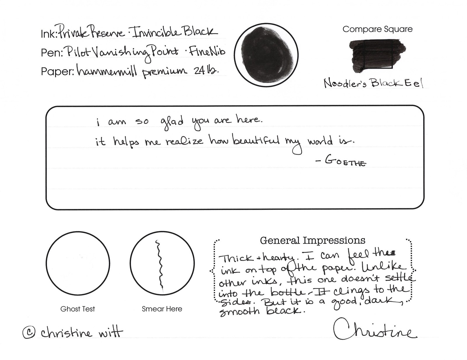
INK REVIEW: Private Reserve – Invincible Black

click to see bigger images
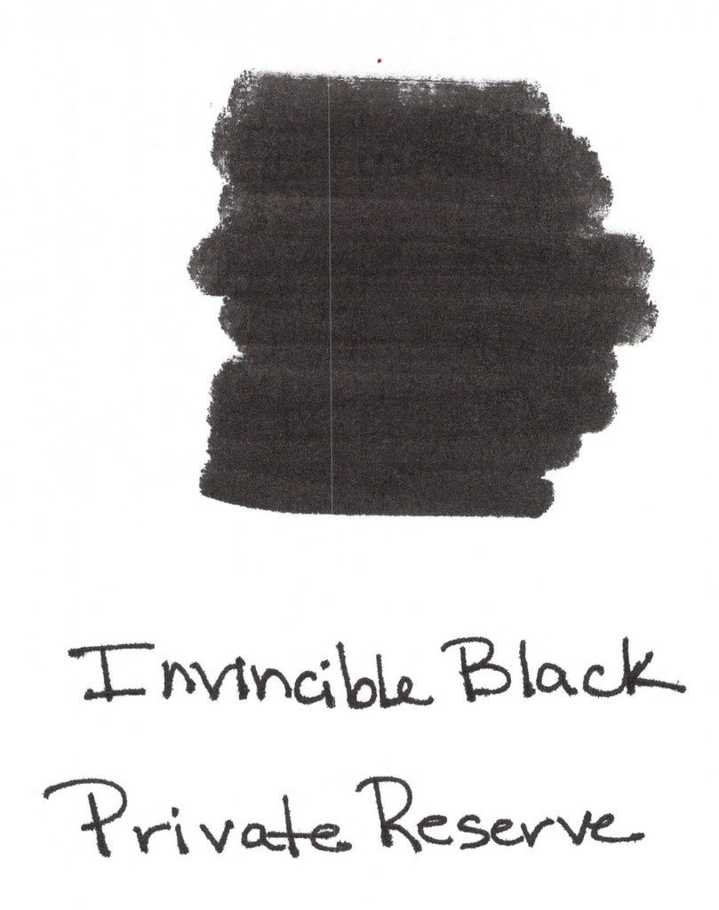
Invincible Black from Private Reserve is an interesting ink!  The difference between it and other ink samples in my collection was noticeable right from the start. Rather than the ink settling in the bottom of the vial, it clung to the sides.  (Think…the difference between a bottle of Coke and a bottle of ketchup – not that the ink is thick like ketchup!..it’s not, but it hung like that to the sides of the vial.)
Anyway, I knew right away that I had something interesting on my hands.  And just look at the swab – that is some crazy black. Opaque.  (That streak down the left side of the scan was something from my scanner, not from the ink.) Anyway – opaque – I almost want to say chalky, but that’s not exactly right. Keep reading . . . 
passes the water test!

I inked this up in my white Pilot Vanishing Point (fine nib) and when I sloshed ink all over the place (don’t ask), I was definitely nervous that it was going to be a nightmare to clean, but it wasn’t. (Big Sigh of Relief!)
Does the swab in my review form below look chalky to you? I think it’s because the ink was definitely thicker than others I’ve experienced. Not in a bad way – just different. And!!!…I could actually feel the ink on the surface of the paper. St-range! But in a cool way.
thick & hearty?

It feathers. Quite a bit.  Look at these from the Hammermill paper (same paper I’ve used in my other reviews of other inks):

And so I decided to test it on other paper – Rhodia . . .

…and it definitely feathered less. Somewhat less, anyway.
Is it strange that I seem to write above the line rather than right on it?

So. I was worried about Invincible Black – just the name alone had me a little worried. It’s cling-factor freaked my freak. Should have seen my face when I flung some of the ink across the table. Yikes.
But..I think I like it.  Probably not enough to buy a bottle? Maybe. I’ll try it again with a different pen and other paper (thinking Lamy and Clairfontaine). We’ll see.
After I wrote this review, I researched it a bit. Here’s a link to a thread on Fountain Pen Network – where there are some differing opinions. And here’s a link to it on Goulet Pens – again, opinions vary.
Have you tried Invincible Black? What is your “go to” black?