QUICK LOOK WEDNESDAY – Six Pretty Colors

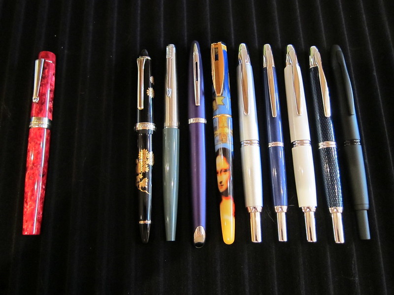
Sometimes, I want to play with my pens, inks, and papers, but can think of nothing to write.

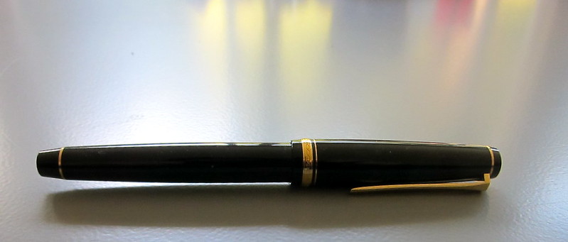
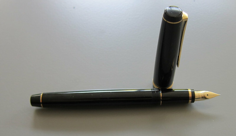
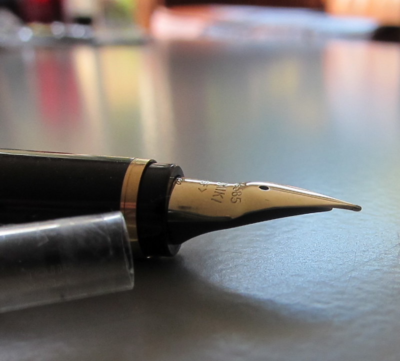
The first step is to write the name of the ink and the name of the pen (see above). I just noticed that each ink is from a different manufacturer – nice.

Apparently, the last resort is to write things that I overhear from the television (see below).

It was actually quite a bit of fun – watching and scribbling, changing pens and writing a bit more. I love the way the entire sheet of paper looks – each color is pretty amazing on its own, yes?

Let’s take a closer look . . .

Above – DeAtramentis Alexander Hamilton. I love this purple. It’s so rich and deep in color – nice saturation. I don’t see this ink discussed much on the various forums, but I think this is a purple that could be used anywhere.  (more on that another day)

Below – Private Reserve Spearmint. One of my favorite green inks. It looks a bit dark here to my eye, but it is usually quite cheery.

Do you have a guess as to which show I was watching at the time?

Below – Montblanc Hitchcock. A gorgeous blood red ink if I ever did see one. Some really pretty shading in there, too. I have to confess, I have a quite a lot of this in my cabinet. Shall I keep it forever? Use it as if I’ll never run out? Or maybe even sell some?

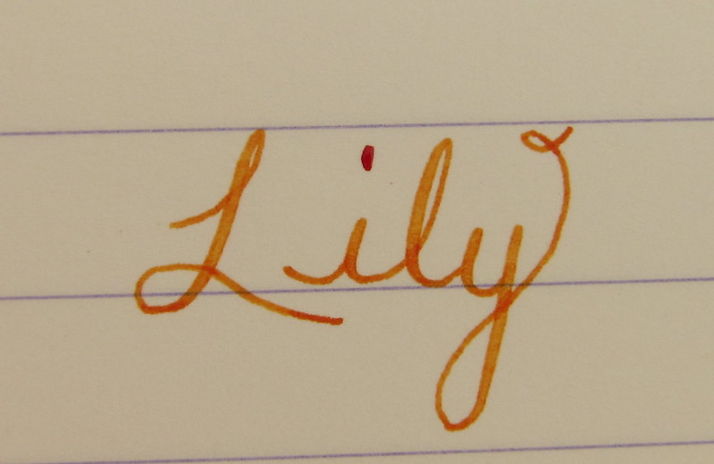
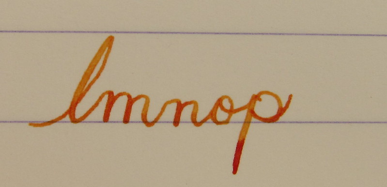
Below – Noodler’s Habanero. A favorite. That shading. The brightness of the color. Need I say more? Mm..wait, I already did right here.
 

By the way, the above quote is the one that seems like the one that would tell the secret of what I was watching. Have you guessed it yet?

Above – Pilot Iroshizuku Fuyu-syogun. I wonder if I only could have one ink, if this would be it. Check out my big review here. It is crazy CrAzY to think that I, lover of bright and beautiful colors, would be so taken with a gray ink, but there you go.

Above – Diamine Majestic Blue.  Easy to see why it’s one of my favorites, yes?  So pretty.

And, so, there we have it – six pretty colors. All so different from one another and yet all so wonderful.

Which show was I watching?  Downton Abbey, of course!  Have you seen it? Highly recommended.

PEN REVIEW: Namiki Falcon

This Namiki Falcon with a soft fine nib was actually my first nib with any kind of serious flex to it. My gateway to flex, if you will.

Super-easy to clean. A real joy with which to write. Springy nib with just a bit of flex. I have to say that I was a bit disappointed with the amount of flex. If you’re looking for a wet noodle, this is not the pent for you.

Know what I love? The CON-50 converter that comes with the pen. I know the thingy in there is supposed to help keep your ink mixed (and how nice is that?), but I also use it to tell how much ink is left in the pen – when that thing starts rattling around like crazy, it’s time to refill!

Got mine from Goulet Pens. It’s $144, but as of this writing – out of stock. Wahwah. (The pen, not the converter.)

And that nib?  Falcon.

But..how did it write? I wrote the review below shortly after inking it the first time . . .

click to see larger
And these pictures were taken just a few days ago. I’ve had lots of time to practice and I really like the pen. Not as much as I like my (new to me) vintage Waterman 52, though.
The ink is Noodler’s Habanero (a favorite). You’ll just have to forgive the color inaccuracy.
Lily is one of our three (!!) dogs. We lovingly refer to her as The Crazy One

INK DROP: April 2013

I received my Goulet Pens Ink Drop delivery a couple of days ago.

What a great group of colors, yes?

If I had to choose one that didn’t fit with the others, it would be the De Atramentis Indigo Blue – it’s a little dusky compared with the other clear clean colors, but I’d definitely write with it.

Between the two turquoise colors, I would choose the Lamy. Though the colors are very similar, the Lamy is definitely more saturated and I like that.

The Namiki blue has a bit of red in it – defnitely still blue, but leans more toward the purple end of things to my eye.

I’ve heard some great things about Diamine Soft Mint (which ended up a little funky in the scanned image above) and hope to have time to take a closer look at it in the very near future.  Here’s a picture from my iPhone – the color is a bit better here….

Kudos to the person at Goulet Pens who chose this assortment! Well done.

Oh..and here’s the image I posted over on Instagram. I’m @christinewitt there.

Missing Converters

A couple of weeks ago, I gathered up all of my pens that were missing this or that. And then sorted through my this or that pile to replace what I could.

The above pens were all missing converters.

And today, only the Delta on the far left is missing its converter. From my understanding, the regular Delta converters won’t work in this style. I may go with cartridges if I can’t find a suitable converter soon.

From left to right we have . . .

Delta
Sailor
Parker
Waterman
Waterman
Namiki Vanishing Point x 5!!

How did all of these pens end up with missing converters? I used to be a cartridge-only girl. So much so that I’d toss the converters right over my shoulder and into the trash.

It’s a good thing converters aren’t very expensive to replace!