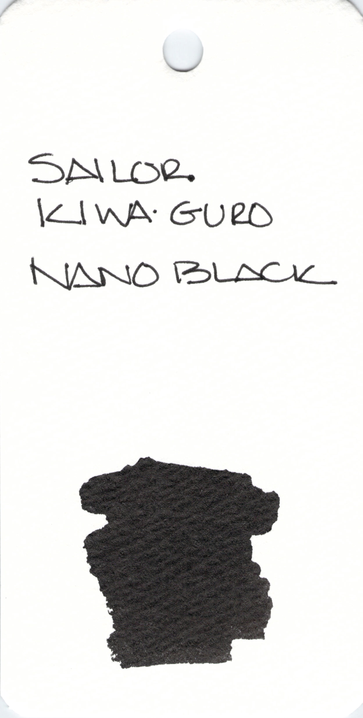
INK SWAB 222: Sailor Kiwa-Guro Nano Black
1,270


Those of you who follow me on Instagram know how much I love Lamy Safari fountain pens. Desk of Lori recently posted about her experience with a fake Safari that she bought on Amazon from the third party seller. Buyer beware. Please.

In swabs, this ink looks like a pretty pink-to-lavender color, but in reality Sailor Jentle Peche was so light as to be unusable. If I’m remembering correctly, it was also super-dry and just didn’t flow from the pen at all. A truly frustrating experience.
This ink (and all others in the Sailor Jentle line) has been discontinued.
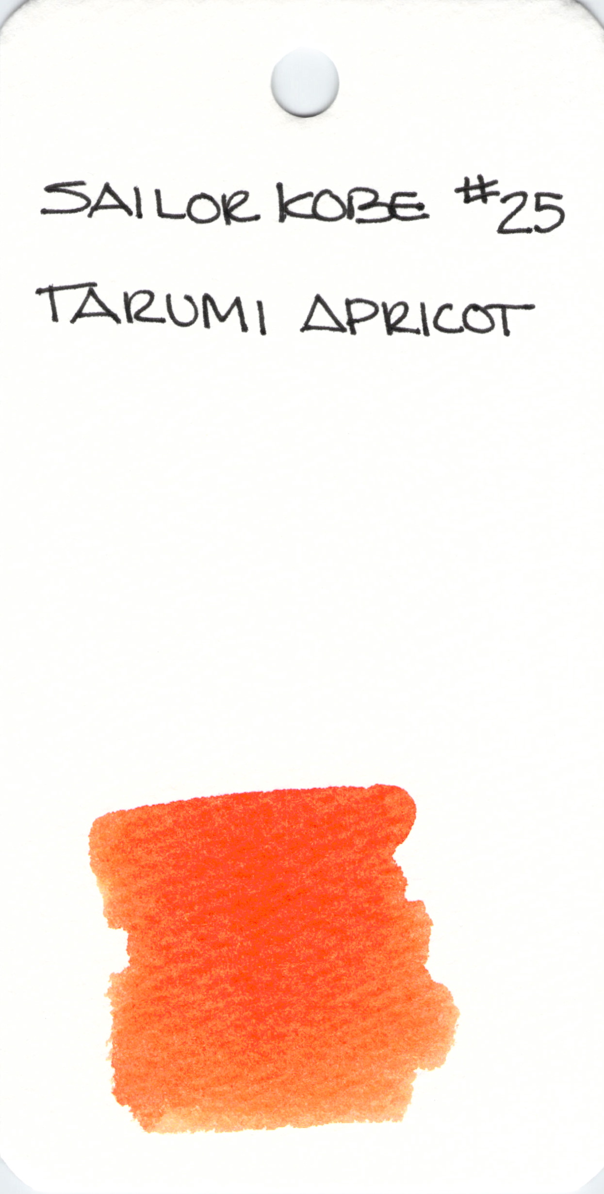
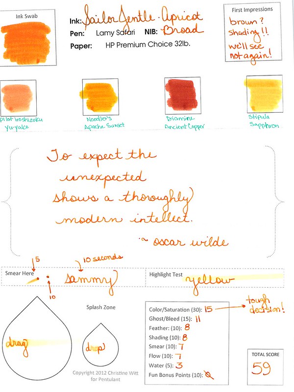
Sailor Kobe #25 Tarumi Apricot is a pleasant orange and the ink writes really well.
I’m trying to decide if this is exactly the same ink as this one. What do you think?
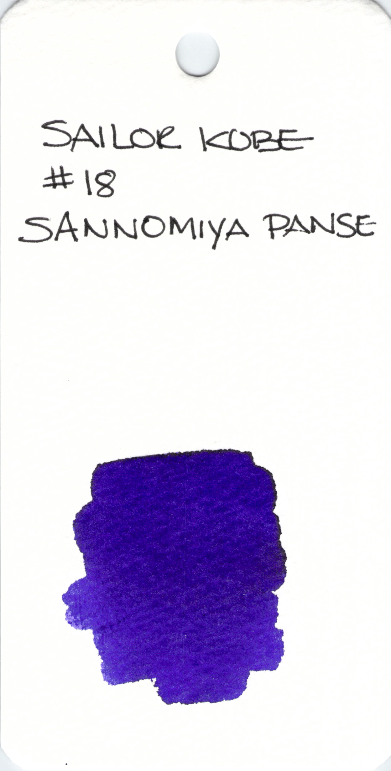
I love this ink. The Sailor Kobe line has lots of great colors and (so far) the ones I’ve tried perform well. I got mine on eBay.
If you know of other places to get the Kobe line, please leave a comment below.
I found Candyology over the holidays. I don’t know if that’s a good or bad thing. Mmm…chocolate.
xo

Can you see the differences between these two inks? One color is always on top. The other is always on the bottom.
Let’s take a closer look . . .


Alrighty, which do you like? Both? Neither? They are pretty close, yes? I would choose the top color – but not by much. It’s the shading that made the difference for me. I think I could be happy with either (even though teal isn’t my most favorite color).
Scroll down for the spoiler . . .
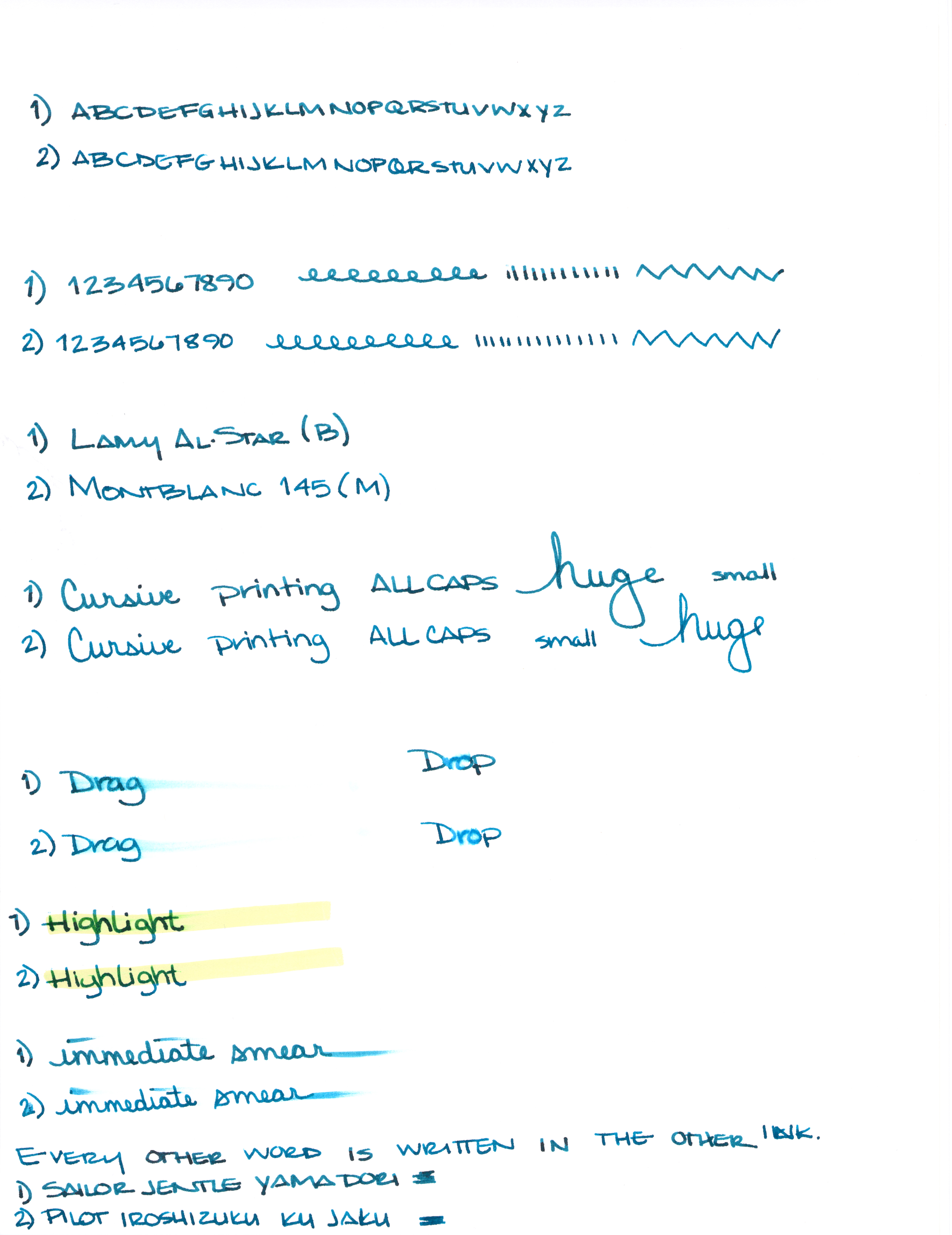
What is so interesting to me about this is that Yama-dori is legendary. Ku-jaku gets favorable reviews, but it’s not a Big Deal. The differences are subtle and if they weren’t side-by-side, I wonder if you or I could tell them apart.
Like I said yesterday, Yama-dori is my E.T. ink. You can read all about that right here.
What do you think? Am I crazy and there’s a huge difference that I’m not appreciating here?

I generally try to avoid reading much about inks before I have the opportunity to try them for myself. I want my opinion to definitely be my own and not influenced by others as much as possible.
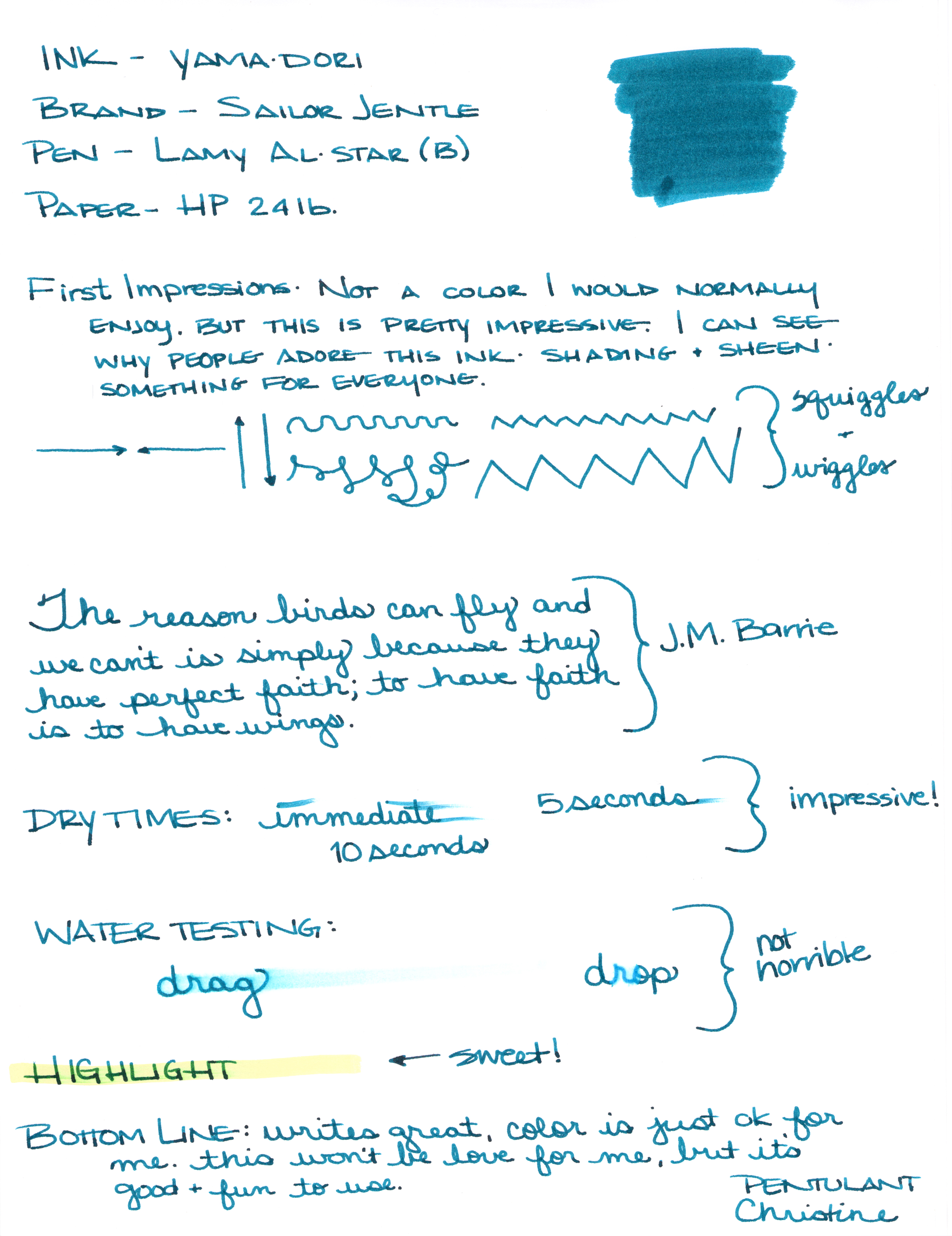
That was impossible with Yama-dori. This ink has superstar status over on Fountain Pen Network. Even before the ink was re-released, there was chatter about how amazing it is – it sheens, it shades, it’s perfect! Gotta get me some of that!

I got mine from JetPens with pennies from my own piggy bank. It’s listed at $20 there. Looks like it can be had for a buck or two less at some other online stores.

There are things I really like about Yama-dori. It sheens, it shades, it flows really well. It passed the smear and highlight tests with flying colors.

Yama-dori is my E.T. of inks. Let me explain . . .
Waaaay back when the movie E.T. (you know, the Extra-Terristrial) came out in theaters, it was the Must See movie. OMG, gotta see it. What, you haven’t seen it? You don’t know what you’re missing! Best. Movie. Ever.
The build-up was just so much that there was practically no way the E.T. was going to meet my expectations. And it didn’t. I mean, it was ok.
And that’s kind of where I am with Yama-dori. It’s good. It’s nice. I like it. But am I coco-crazy-go-nutters for it? Nah.

I’ll be back tomorrow (a rare Tuesday post!) with more show and tell on Yama-dori. (How is that for a tease?)
In the meantime, check out the full review (click here for the full-size image – it’s huge), and tell me what you think. Do you love Yama-dori? Do you have an E.T. ink?

Last week, I took a really close look at four fabulous blue inks.

The bottles and packaging look amazing and I’ve definitely enjoyed using the sample Gerald sent me.
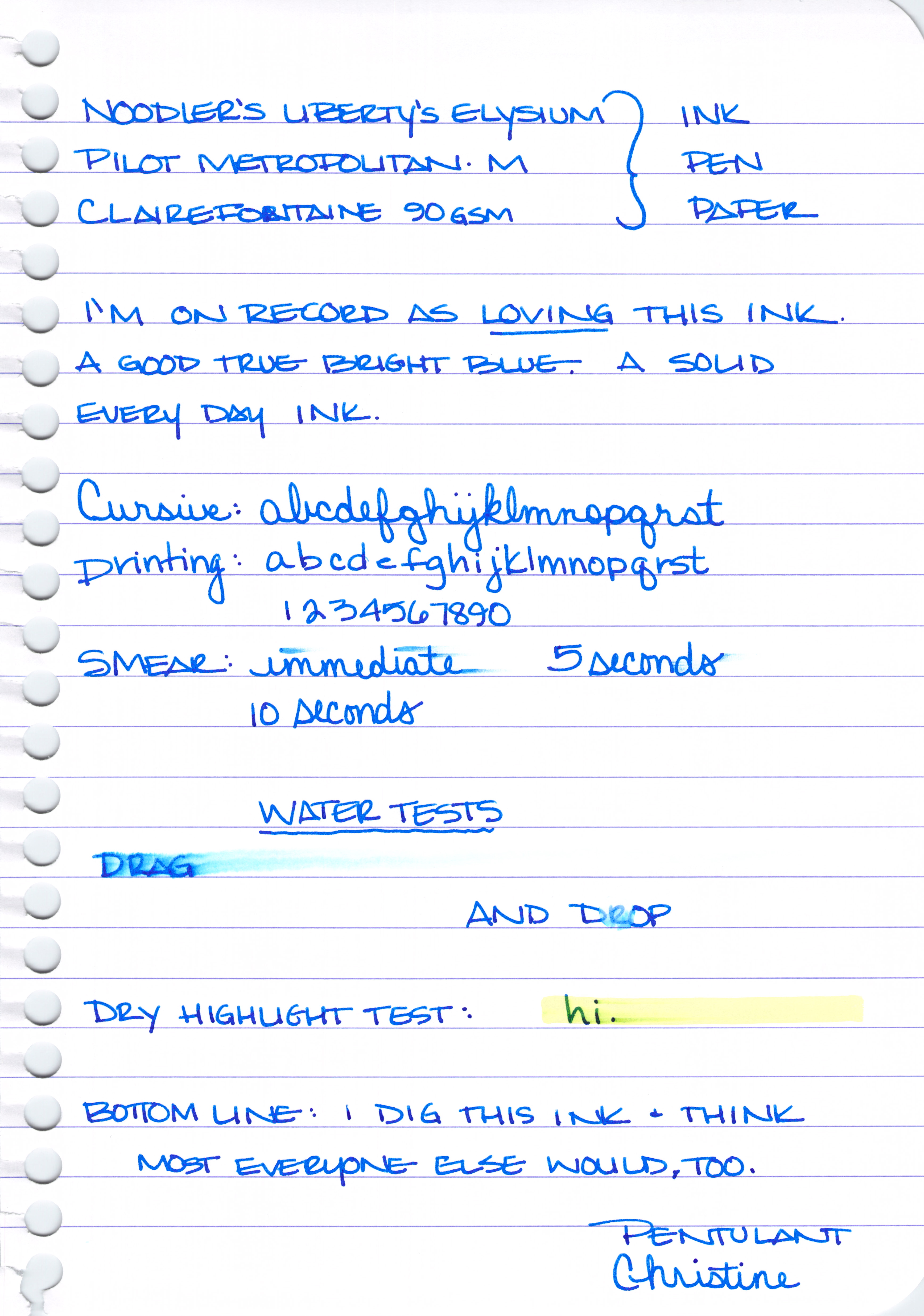
Noodler’s Liberty’s Elysium

Noodler’s Liberty’s Elysium is only available from Goulet Pens. The good news is that Goulet Pens has a fantastic reputation in the fountain pen community for excellent customer service. They will also ship overseas.
I shop at Goulet Pens regularly and mention them frequently. I’m not related to the Goulet’s, I receive no discounts, free product, special treatment, or anything else from them. Unfortunately, in our relationship – the money only flows in the one direction 😉
PW Akkerman #5 Shocking Blue

I got mine direct from the Netherlands. Shipping was fast, seemed reasonable (though I was buying multiple bottles), and everything arrived in good condition.
Vanness Pen Shop also carries Akkerman inks. You’ll have to call or email them for specifics.
It’s expensive. The Akkerman bottles are super-fancy and they’ve come a long distance. If you don’t want to put out the money, my strong recommendation is Diamine Majestic Blue (see image below).

Another Parker Penman Sapphire Replacement
The difficulty here is that while I think it is possible to get the color right (or at least close enough), I’m feeling pretty certain that it’s quite impossible to get the feel of Parker Penman right on target. That is to say this: the color is only part of what makes an ink so special. The feel of the sample I had is wonderfully different from all of the other blues here and I seriously doubt that mixing 6.5 drops of ink #1 with 3.75 drops of ink #2 is going to result in that same feel* – and without that, well, there are plenty of off the shelf colors that come close enough. Have a look . . .


Some of the above ink swabs are showing the sheen – and maybe you’re thinking Penman Sapphire doesn’t have much sheen here or in my review from last week, but look at this review over on FPN – crazy sheen.
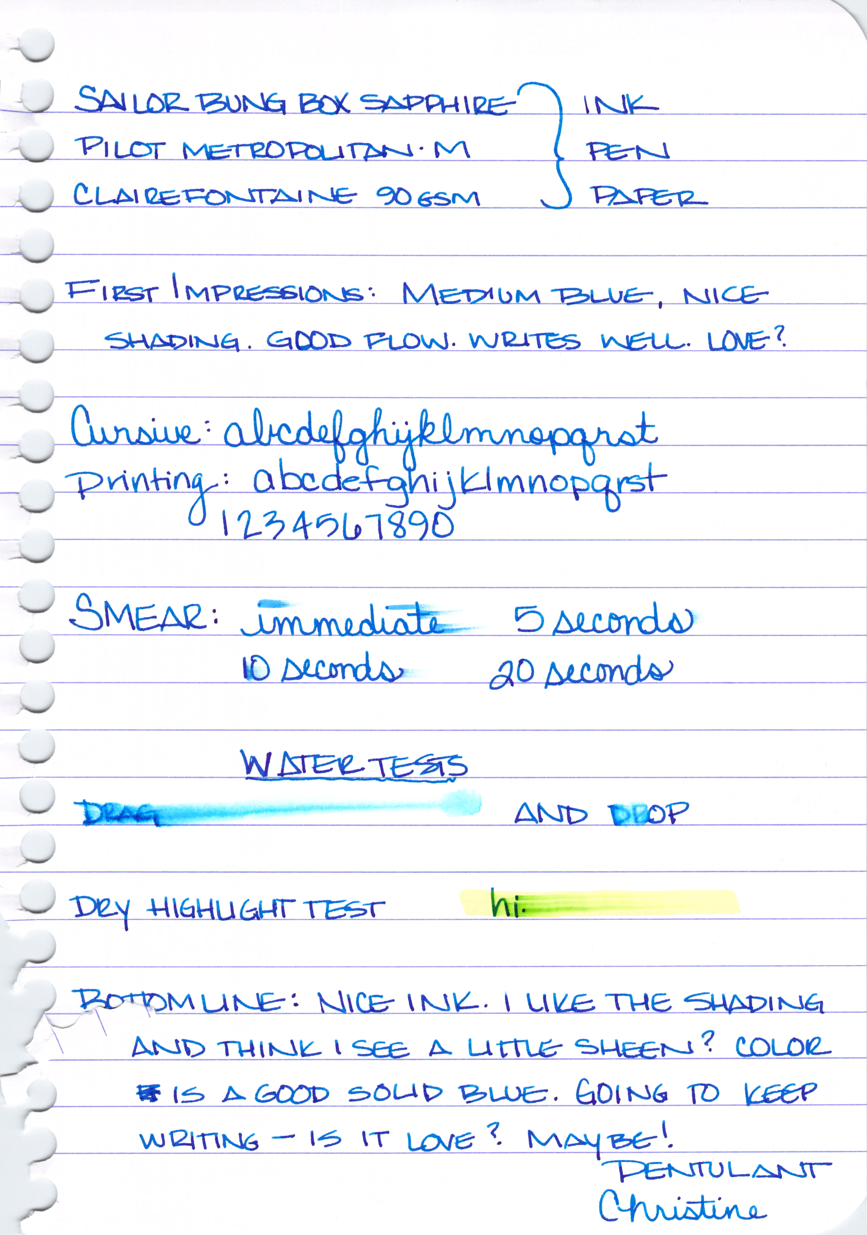
Sailor Bung Box Sapphire also looks like a good sub for Parker Penman Sapphire, but there are difficulties in obtaining that ink, too. (See the above section for those details.)
Bottom Line – DC Supershow Blue is the color I would choose if I was trying to match the color of Parker Penman Sapphire.
Of course, you could search eBay for it, but there are rumors that it was discontinued because it may contain metallic bits (hello, sheen) in it and it causes pens to clog. I’ve not had trouble with it in my Pilot Metorpolitan, however.
* Did you know that mixing inks can be an invitation for Major Trouble? Some inks don’t play well with others and you could end up with a blobby globby mess – in your pen. Some mixtures will take some time to form the blobby globby mess and by the time it does, you may have already loaded it into your pen. Be careful.
Annnnnd…that’s that! Four Fabulous Blue Inks. This has been a fun fun project and I really have to thank Gerald again for sending me samples of some of these inks. If you’re not following me and Gerald on Instagram, you simply must.
You tell me . . . Are you going shopping for one of these? Or maybe you have another favorite blue ink?

I’m so excited to bring you this super-charged review of four fabulous blue inks:
First, a huge and happy shout-out to my Instagram buddy, @mycoffeepot. Gerald provided me with generous samples of Sailor Bung Box Sapphire and Penman Sapphire. He’s a fountain pen nerd (in the best way possible) and if you’re not following him on Instagram, you should be.
Second, let me tell you how I worked this thing: I loaded up four Pilot Metropolitan (medium nib) fountain pens and got to writing on Clairefontaine 90gsm paper. Lots of writing. So much writing. Then, I set everything aside and didn’t think about these inks for a couple of days. Finally, I wrote just a little more with each of the inks to see if my initial thoughts changed with a little time and separation.
Third, let me spoil things just a little here. You could, seriously, choose any of these four inks and be pretty happy. They each write wonderfully, flow is great in the Metropolitan, and the color and saturation are right up there with some of the best inks I’ve tried. These are truly four fabulous blue inks.
Let’s dive in!

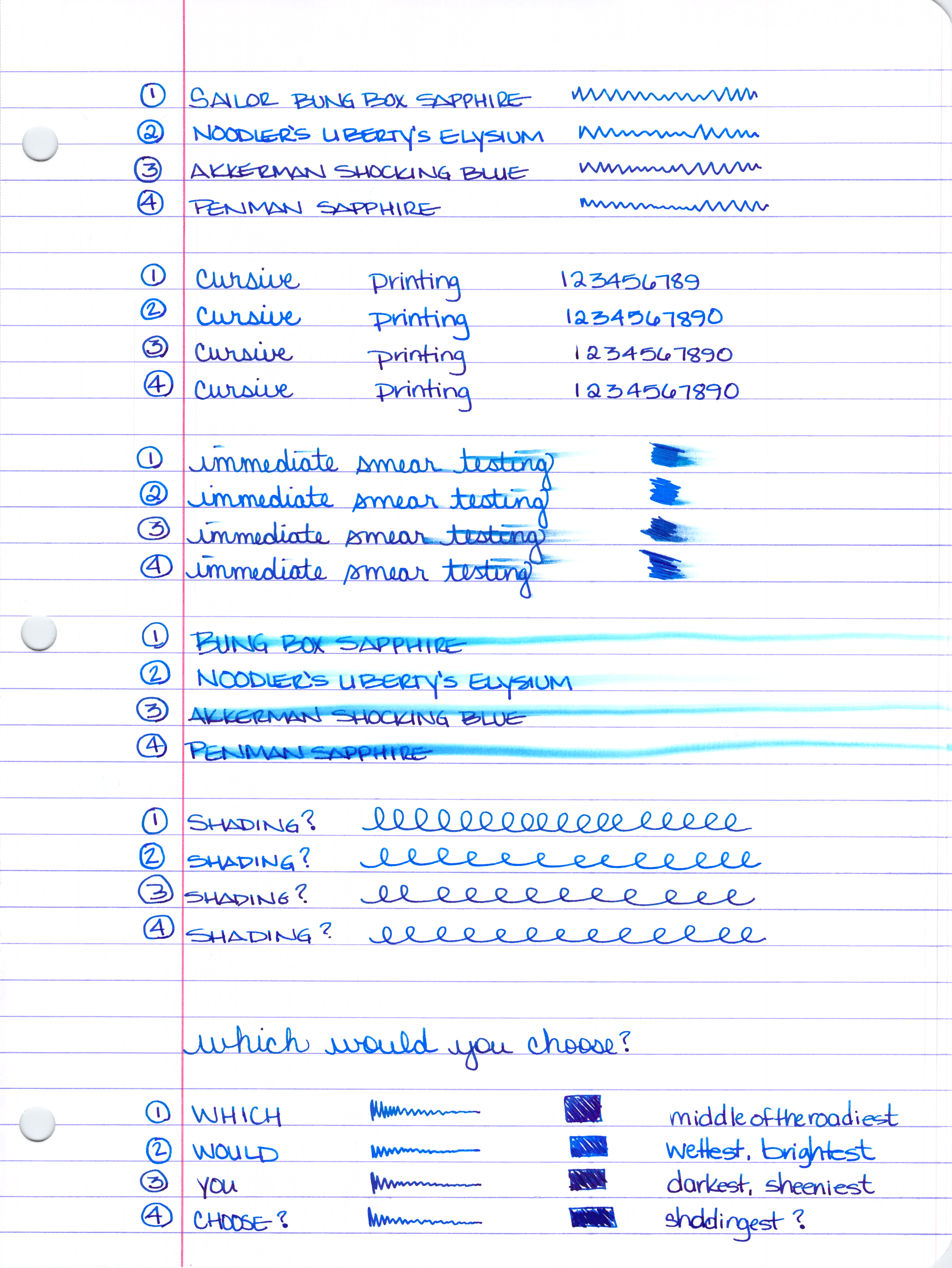
Number 1 above will always be Number 1 (Sailor Bung Box Sapphire) below – same for Number 2, 3, and 4. I think I could have organized things a little better for you, but you’ll figure it out – I’m confident 😉
Smear Testing . . .
I wrote a little and then smeared across the writing. Noodler’s Liberty’s Elysium (number 2) and Penman Sapphire look like the winners here. Then, I scribbled back and forth over the same area three times and smeared that – same winners.

Water Smear Testing . . .
I wrote, let it dry, and then went over my writing with a dampened cotton swab. The clear winner is Noodler’s Liberty’s Elysium. I’d say that the other three inks are about even in their resistance to water.

So, which would you choose?

Still too hard to decide? Let’s take a closer look. (Warning: this is where things get really long.)
Sailor Bung Box Sapphire Review . . .
A solid medium blue, maybe not as saturated as the others. Not especially bright, no muddiness to the color. Just straight up blue.

Some nice shading. Would love to give this a go with a super broad nib because I’m seeing some pretty nice red/purple sheen in there, too.

Decent dry times.

Definitely not water resistant.

And it’s pretty smeary when tested with a highlighter.

My thoughts on Sailor Bung Box Sapphire:
Noodler’s Liberty’s Elysium Review . . .

Not a lot of shading and definitely no sheen.


It’s interesting, I wrote in my initial review that this ink is supposed to be water-resistant. I’m positive this writing and the one above had been sitting for at least ten minutes when I dropped the water onto it. Maybe it needs to sit even longer? It’s also supposed to be semi-bullet-proof. I’m not sure exactly what that means, but there you go.


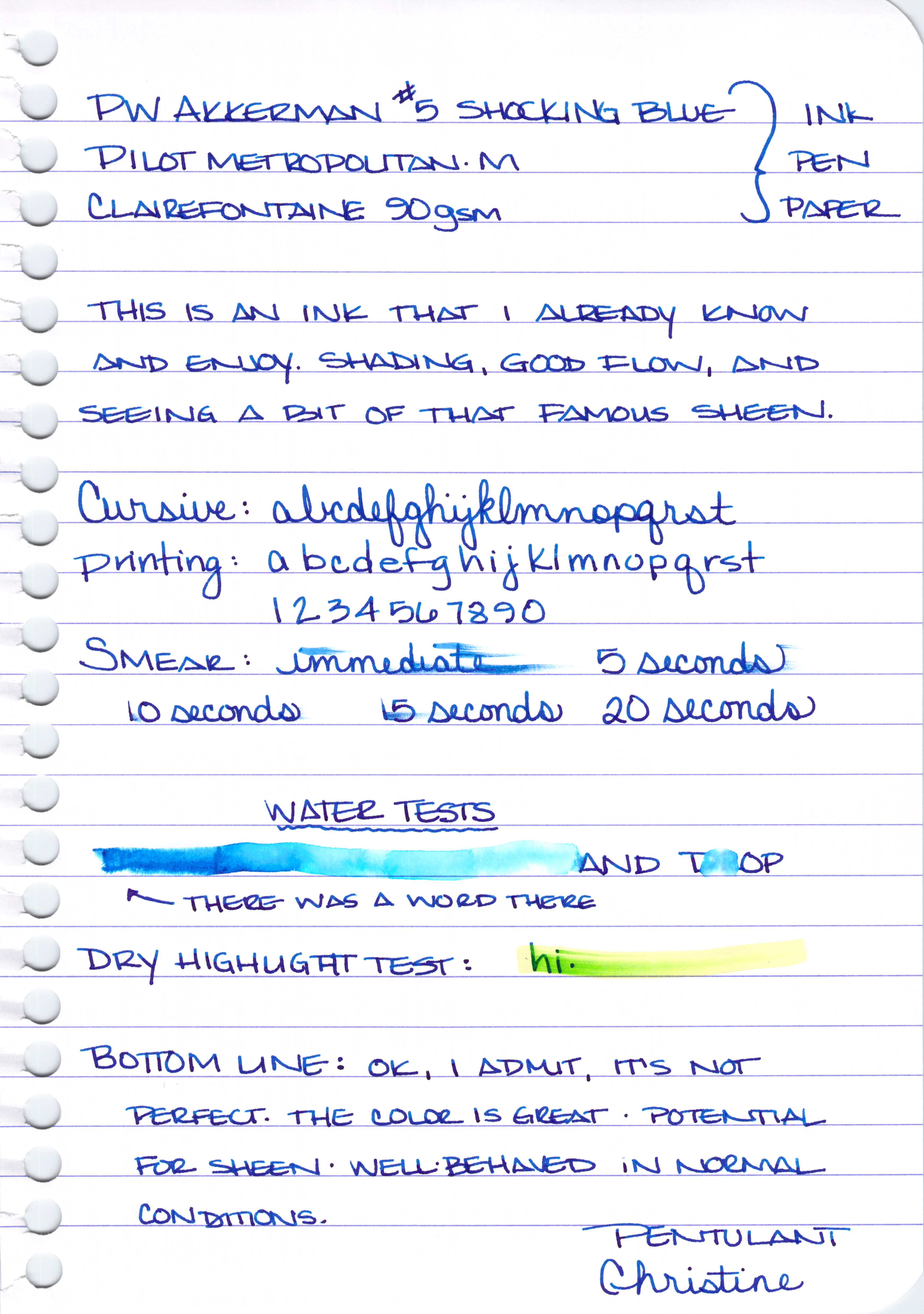
PW Akkerman #5 Shocking Blue Review . . .
A rich, dark, blue with a reputation for some fantastic red sheen.

Good shading . . .

Nice sheen . . .

It does just ok on the smearing tests . . .

Yikes. I wrote the word “DRAG” and then dragged a wet cotton swab over the writing after the ink had dried. Crazy, right?

And given the above, the below highlight test probably isn’t too much of a surprise.

My thoughts on PW Akkerman #5 Shocking Blue . . .
Parker Penman Sapphire Review . . .

Lots of shading and color variation . . .

Great dry time . . .

Not so great water-resistance . . .


I ended up using this ink for a week or so after the review and reading the review now, I don’t think I’ve done it justice here.
In fact, I ended up enjoying it so much that I bought a bottle of it back in March. It’s not perfect – those water tests are not going improve with time, are they?
I’m going to come back to this one. Create some writing samples in a variety of pens and come back to talk about it.
Have you ever had a mediocre first reaction to an ink that you later ended up loving?