Sharing a Couple of Pictures

Hey everyone…I’m still honeymooning, but wanted to pop in to share a few pictures.

Above are a few of the pen-related things I have with me.  In the background, is a DIY leather journal kit that Mr. P had as a surprise for me. I’ve already put it together – way fun (and I’ll share pics another time).

That big thing is a Penvelope from Franklin-Christoph – it holds a whopping 13 pens and I bought it in anticipation of this trip and it does not disappoint. (Again, I’ll have more pictures for you another time.)

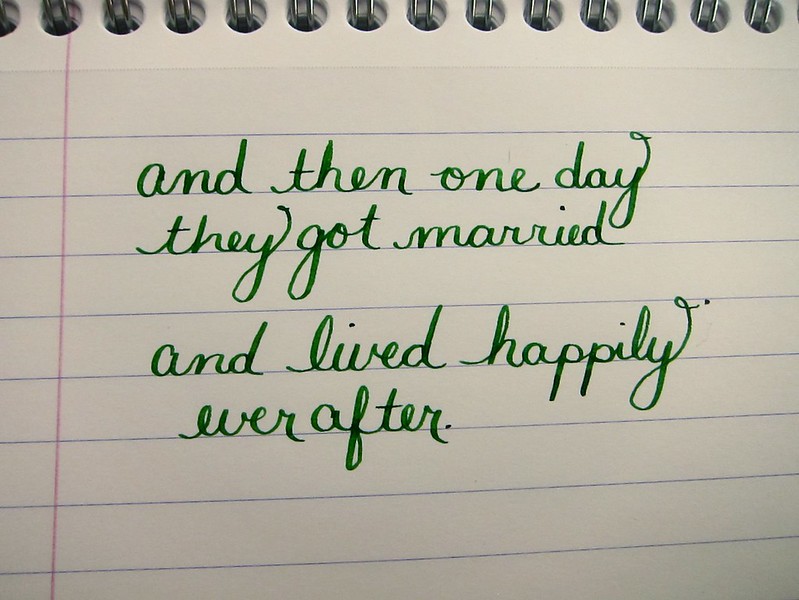
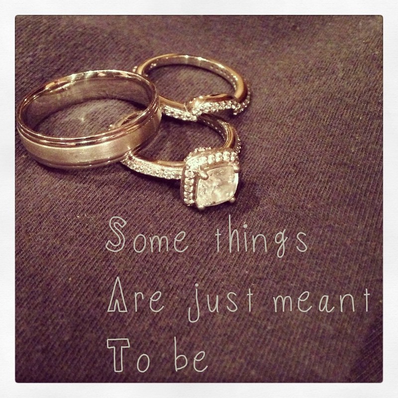
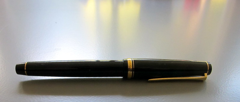
The smaller pen case holds the pen that Jeff’s uncle Robert gave me. Robert died late last year (we miss him so very much). Jeff carried his pen in his suit pocket when we got married last week. Love.

There’s a small Midori Notebook, a Clairfontaine Notebook, and (of course) the charger for my camera in the picture too.  Lots of goodies.

For this first part of our trip, a friend graciously let us borrow his home. How lucky are we?  Of course, this friend knows me (perhaps a bit too well!).

Flowers are such a nice thought…
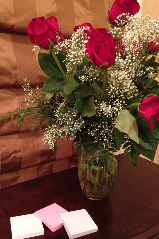
But…Post-It Notes?!

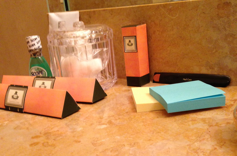
Even in the bathroom!  (Haha..with hotel-style toiletries!)

Isn’t it wonderful to have friends who know you so well?

I’ll check back soon – doing a lot of honeymooning here!

Some Things Were Just Meant to Be

Waterman 52 / Private Reserve Spearmint / Clairefontaine

My posts have been a bit sporadic over the last few weeks.  I was just a little busy.  Getting married!

It’s true! Mr. P. and I finally tied the knot last week and we couldn’t be more happy.

I wrote the above several weeks ago and the following just one day before the wedding.

A small peek at our invitation below. We sent around twenty invitations. Each was individually calligraphed by someone we found on Etsy. I love the way they turned out. Perfectly us.
The day before the ceremony, we went to Max’s Opera House Cafe.  Following is a quick picture of their menu. Green + Typography + Darling = Perfection.  (Did you know my new last name is Darling?)
When we checked into our hotel the night before, we had no idea we would have a view of San Francisco City Hall where we would be married. I took this picture in the morning when the fog was still laying low.
I have to admit – looking at all of this makes me a bit teary all over again. Such a happy day. So perfectly us.

INK REVIEW: De Atramentis Cement Gray

I like gray inks. Always looking for that perfect shade. It’s been a long time since I’ve added an ink to my Fifty Shades of Grey line-up or talked about the spelling of gray -vs- grey. Too long if you ask me!

Unfortunately, I’m not wild about Cement Gray from De Atramentis. (Thank goodness it doesn’t stink like cement, though!)

The problem seems to be that there’s a lot of green in the ink.

Admittedly, it’s difficult to see the green with my scans, but it’s there. It’s there so much that I pointed out to Mr. Pentulant that he might want to consider this ink as his dark-nearly-black-but-still-green choice. He tried it for a short while, but didn’t love it.

The green is most apparent when looked at along side other inks…

As usual, I wrote with this ink for about a week after the review. It wrote fine – a little hard-starting at times even in a medium nib Lamy Safari.

The problem (for me) was the color.  What do you think? See the green? Like it? Hate it?

INK REVIEW: Caran d’Ache Sunset

Caran d’Ache Sunset is such a pretty color. Before you fall in love with it, though, you should know something. 
It’s been discontinued.
In fact, the entire line is being refreshed. Here’s a post about it from back in February on Ink Nouveau. The new ink names amuse me. The new price does not. At 40 bucks a bottle, it better be some impressssive ink, right?
But that’s not what we’re talking about today.  This is…

It’s a good ink. I liked it a lot. After writing with it for a week, I no longer thought it was  true red – too many pink-ish tones for that, but it is a beautiful color.

Have you ever had a favorite ink end up discontinued? I have not – yet.

REVIEW: Sharpie Refillable

click here for full size image

Click for super-size image

I’ve had this in my desk drawer forever. Not really sure why it was never opened. I love me a Sharpie. I paid around $10 for this one.

This item should not be confused with the Sherpa. This is a refillable item – meaning that one would need to purchase a specific refill. Oh, I tried to stuff a regular Sharpie (and several other pens) into the unit . . . no dice.

Would love to know how they decide that the regular (kinda fat) Sharpie is a fine point. I guess if you’re using one of the big fatty fat ones, this would be rather fine, but if you’re used to using any sort of fountain pen or even a broad gel pen, these are going to seem impossibly thick.

I love that the refill part number is so prominent on the packaging – and it shows that the refill screws in. I’m thinking this is to make it abundantly clear that this is a refillable unit.

Refills are available for a couple of bucks on Amazon. Looks like they only come in black – bummer.

click for ginormous image

My bottom line….

REVIEW: Sharpie Glitter Paint Set

Sometimes. A girl needs a needs a little glitter.

A little … scintillant.

A Sharpie. (Who doesn’t love Sharpies? Use them a lot. Mostly for work. But some because of fun.)

These were fun, too. Not sure I have a real use for them.

Each came individually wrapped inside the package. Pretty sure this is for one or two reasons…
1. leak prevention
2. protection from drying up

The big surprise? I thought they’d look WOW on black paper. Turns out, they are best on white. Probably a good thing considering I might be the only person around with a stash of black paper!

Have you tried these? The package says they’re available in six colors – I only saw the three-pack and white. What else is out there?

Are you like me and you sometimes buy cheapie things like this to try out? Even if you don’t have a real purpose for them?

INK REVIEW: Sailor Jentle Apricot

I think I need to admit that I’m into orange inks.
First there was Diamine Pumpkin with its WHOA color. And then there was Noodler’s Habanero with its incredible capacity to shade.
And now – Sailor Jentle Apricot.
At first, I thought we were heading toward another Stipula Sapphron situation. But no – this is different. Sailor Jentle Apricot is a special ink.  Nice color – beautiful shading.

I ended up using this ink for a week or so after the review and reading the review now, I don’t think I’ve done it justice here.

In fact, I ended up enjoying it so much that I bought a bottle of it back in March. It’s not perfect – those water tests are not going improve with time, are they?

I’m going to come back to this one. Create some writing samples in a variety of pens and come back to talk about it.

Have you ever had a mediocre first reaction to an ink that you later ended up loving?

REVIEW: Sharpie Metallic Trio

As we know, I loves me a Sharpie!  Add a bit of metallic and BOOM! We got ourselves a par-tay!

Total bummer that the caps don’t have a clip. Not that I put them in my shirt pocket. It’s just a bit weird without the clip.

I used these to sign some of the Christmas cards I sent out last year. A fun look.

Fun on white paper.

Wait for it….

Amazing on black paper!  Dude. Love the color.

I should do product photography, hm?

PEN REVIEW: Namiki Falcon

This Namiki Falcon with a soft fine nib was actually my first nib with any kind of serious flex to it. My gateway to flex, if you will.

Super-easy to clean. A real joy with which to write. Springy nib with just a bit of flex. I have to say that I was a bit disappointed with the amount of flex. If you’re looking for a wet noodle, this is not the pent for you.

Know what I love? The CON-50 converter that comes with the pen. I know the thingy in there is supposed to help keep your ink mixed (and how nice is that?), but I also use it to tell how much ink is left in the pen – when that thing starts rattling around like crazy, it’s time to refill!

Got mine from Goulet Pens. It’s $144, but as of this writing – out of stock. Wahwah. (The pen, not the converter.)

And that nib?  Falcon.

But..how did it write? I wrote the review below shortly after inking it the first time . . .

click to see larger
And these pictures were taken just a few days ago. I’ve had lots of time to practice and I really like the pen. Not as much as I like my (new to me) vintage Waterman 52, though.
The ink is Noodler’s Habanero (a favorite). You’ll just have to forgive the color inaccuracy.
Lily is one of our three (!!) dogs. We lovingly refer to her as The Crazy One

INK DROP: April 2013

I received my Goulet Pens Ink Drop delivery a couple of days ago.

What a great group of colors, yes?

If I had to choose one that didn’t fit with the others, it would be the De Atramentis Indigo Blue – it’s a little dusky compared with the other clear clean colors, but I’d definitely write with it.

Between the two turquoise colors, I would choose the Lamy. Though the colors are very similar, the Lamy is definitely more saturated and I like that.

The Namiki blue has a bit of red in it – defnitely still blue, but leans more toward the purple end of things to my eye.

I’ve heard some great things about Diamine Soft Mint (which ended up a little funky in the scanned image above) and hope to have time to take a closer look at it in the very near future.  Here’s a picture from my iPhone – the color is a bit better here….

Kudos to the person at Goulet Pens who chose this assortment! Well done.

Oh..and here’s the image I posted over on Instagram. I’m @christinewitt there.