INK REVIEW: De Atramentis Hyacinth

I’ll just blurt it out:  I don’t love this ink.  I don’t even like it.

The color is nice enough, I suppose.

It’s a smeary hot mess, though.  (Can’t believe I missed dotting an i – that’s not like me!)

One of the worst things, though, about De Atramentis Hyacinth?  It stinks. I don’t mind a lightly perfumed ink, but this is just too much for me. It’s a sickening sweet smell that tends to linger.

QUICK LOOK WEDNESDAY: Four Blues from Diamine

A quick look at four blue inks from Diamine.

 Diamine Midnight  (strange that this image is bigger than the others, right?)
  Diamine Presidential Blue
  Diamine Registrar’s Blue Black
  Diamine Denim

Which do you love?

I’m not sure that I have a favorite, but I definitely have a least favorite – Diamine Registrar’s Blue Black. It’s not very well saturated – looks more like a gray/grey – and I just don’t like it. Not one little bit.

Ink Review: Noodler’s Red

Woooo..this is some red!  Great color. Terrific saturation.

love this quote

It writes well, too. No bleeding or feathering.  It’s a bit on the wet side, but I was using a broad nib.

It’s definitely not water-resistant (not many reds are).

Noodler’s Red is a true red. Not too much blue or orange in the mix – just right. Look at the Compare Squares below and you can see what I mean. It’s perfectly red.

I don’t see a lot out on the Interwebs talking about Noodler’s Red. I think it’s because so many people are looking for a blood red rather than a true and bright red.  Which do you prefer?

INK DROP: May 2013

Seriously? I’m probably the last person to comment on the May Ink Drop color from Goulet Pen Shop.

I’ve been just a little busy. There was the wedding. And then the baby! (Not ours – bummer.)

But here they are…

Noodler’s 54th Massachusetts
De Atramentis Ocher Yellow
Roher & Klingner Alt-Goldrun
Roher & Klingner Alt-Bordeaux
De Atramentis Mint Turquoise

They look so different on different papers, yes? Four passes on the Clairfontaine Triomphe paper to get close to the same look on the Brush Dance paper.  (Disclaimer: I’m the president of Brush Dance and maybe just a little slanted in that direction, but really? We have great paper.)

As for the inks? I’m not IN LOVE with any of them.  Each of them falls squarely into that “not a color” area for me. Alt-Goldrun is so popular – I want to write with it very soon.

What do you think? Love ’em? Hate ’em?

Ink Review: Pilot Iroshizuku Tsutsuji

A quickie look at Pilot Iorshizuku Tsutsuji this morning.

First thing’s first – Tsutsuji means Azalea.  Does anyone know how to pronounce Tsutsuji? Help.

I LOVE this color. Look at the saturation.  Yow.  That is some screamin’ bright IN YOUR FACE color!

It reminds me a bit of Momiji, but more purple and more saturated. And while you may not be able to tell from my scans, it’s not at all like Diamine Flamingo Pink. Flamingo has a bit of orange in it.

Tsutsuji is a great ink – the color and saturation are just part of that.  It writes beautifully and is well-behaved on a variety of papers.  There is zero (zero!!) smearing.  It doesn’t resist water very well, but this is one of those colors that typically don’t do well with water.  (I forgot to do the highlight thing – oops.)

Looking for a pink ink that leans to purple – Tsutsuji is just that. How would you use this color?  I definitely have no practical use for it – but that doesn’t matter!

REVIEW: Penvelope 13 from Franklin-Christoph

I shared a tiny preview of my Penvelope 13 from Franklin-Christoph earlier this month and am back now for a more detailed look.

I had originally ordered two of the Penvelopes that would hold six pens each. Unfortunately, they only had one to send me right away – so I was offered the option of waiting another week or upgrading to the “Lucky 13” at no charge.  I took the upgrade offer and received it in the Black Crocodile style (pictured here). The P-6 (which I don’t have pictures of yet) is Boot Brown.

As advertised, it holds 13 pens.

Mr. P snuck one pen out of the holder because he’d ordered a super-secret surprise pen for me (more on that another day).

Without any kind of stretching or straining, it holds some of my biggest pens. I tested with a Montblanc 149 – no problem. The two pens on the left are Waterman Edsons – again, no problems at all. No touching, no rubbing.

Magnetic Snap Closure
High quality interior fabric
Impeccable Stitching

I’m in love.  Fashion and function. High quality. Excellent customer service (they even called to check in after the items were received). Highly recommended.

Paradise Pens (Part 2)

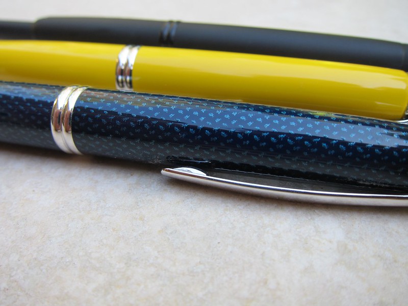
This is Part Two (of three) of our honeymoon visit to Paradise Pen in Las Vegas.

In case you missed the news, the shop is closing at the end of the month. When we were there, it looked like they had lots of Montegrappa fountain pens left, some Montblanc, and a few Cross and assorted other brands. For inks, there was primarily Private Reserve and Pilot Iroshizuku. Other than paper in porfolios and Filofax, the only notebooks I saw were from Rhodia.

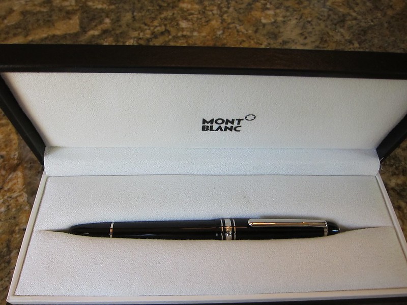
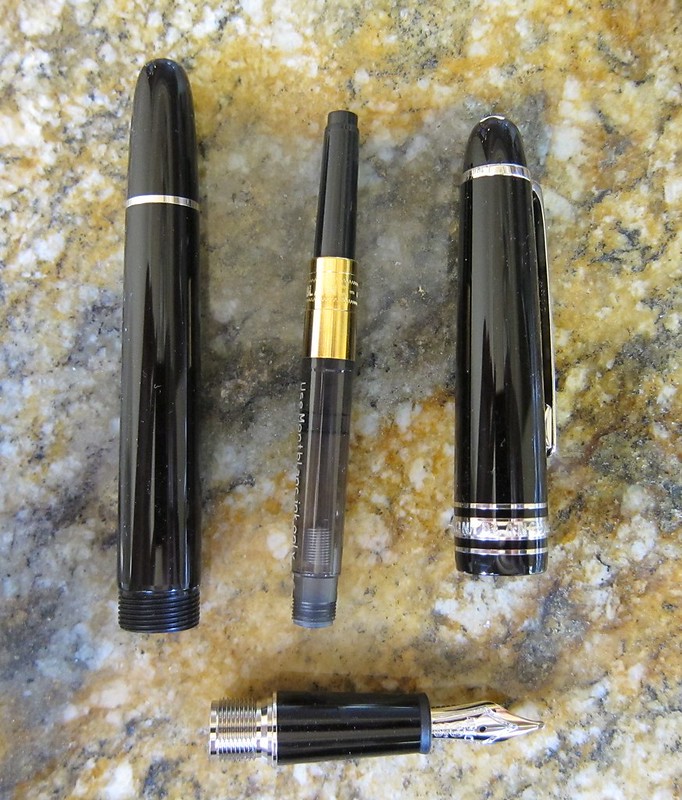
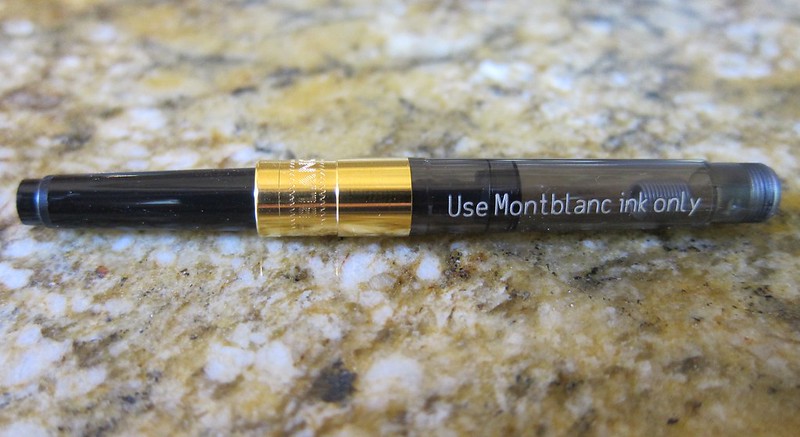
I came away with a stunning Montblanc 145 (its cousin is the piston-fill 146). For a graduation gift a few years ago, I gave Mr. P the Faber-Castell pencil set (because he’s a total math nerd)…

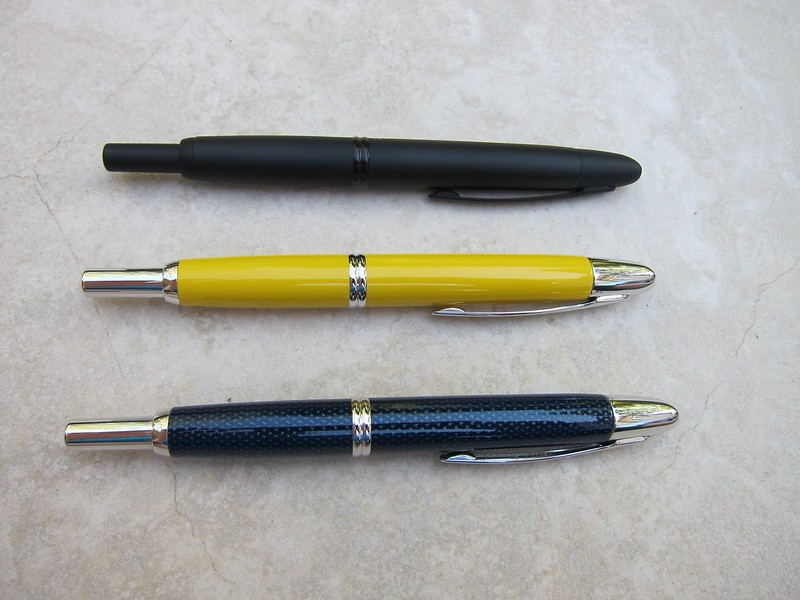
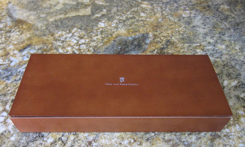
Since then, he’s had his eye on this…

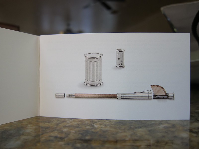
Graf von Faber-Castell

I have to say, Mr. P does have good taste.

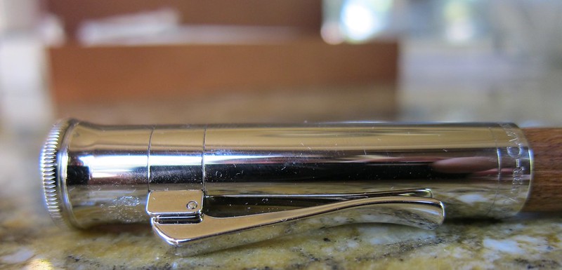
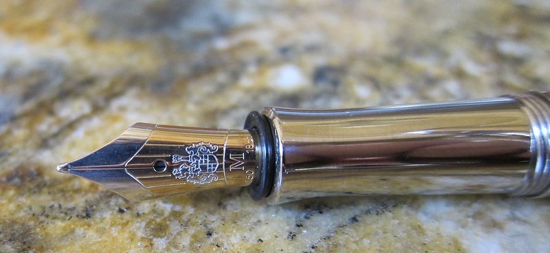
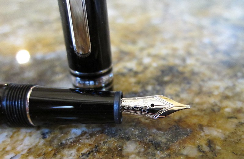
I love all of the details on this pen.  The two-toned nib. The styling of the cap. Mr. P likes the thick threading of the cap (a detail that would have gone missed by me).

We were both a bit concerned about caring for the wood barrel of the pen, but after reading a bunch (after the purchase…haha), it turns out that it requires no special care and will develop a darker color with extended use.

The pen hasn’t been inked yet (still taking it easy and enjoying time together after the wedding), but I’ll definitely post about it when it is.

Paradise Pens (Part 1)

Mr. P and I hit up Paradise Pen in Las Vegas last week. I was so sad to see that they are closing this location effective June 1.  Other than Montblanc in Caesar’s Palace, Paradise Pen is the only pen shop that I know in Vegas. It’s too bad – but I definitely get that the high cost of rent in big malls doesn’t make it easy.

Everything was on sale – up to 25% off all items. The employee on duty didn’t seem to have any wiggle room with this. I asked, they are not selling any fixtures or displays.

But they were selling this….

Montblanc 145

I’ve actually been pondering on this very pen for quite some time. Uncle Robert’s 149 is a bit too big and heavy for my wee lady hands.  (My hands are not actually wee, but the 149 is definitely on the bulky side for me.)

I’ve not inked it yet, but will post about it when I do.

I probably won’t use only Montblanc inks in it – I’m just pentulant that way.  I love that the converter has a mixy thing in it. You can see it in the picture above near “ink only.”

Mr. P didn’t come away empty-handed either. Stay tuned!