INK REVIEW: Diamine Purple Pazzazz

Every now and then, there’s lots of excitement about a new product line in the pen community. Diamine Shimmering Inks definitely caused a lot of speculation and conversation.

When Pen Chalet asked if I wanted a bottle in exchange for posting a review with my honest opinions, my reply was, “Send me the purple!”

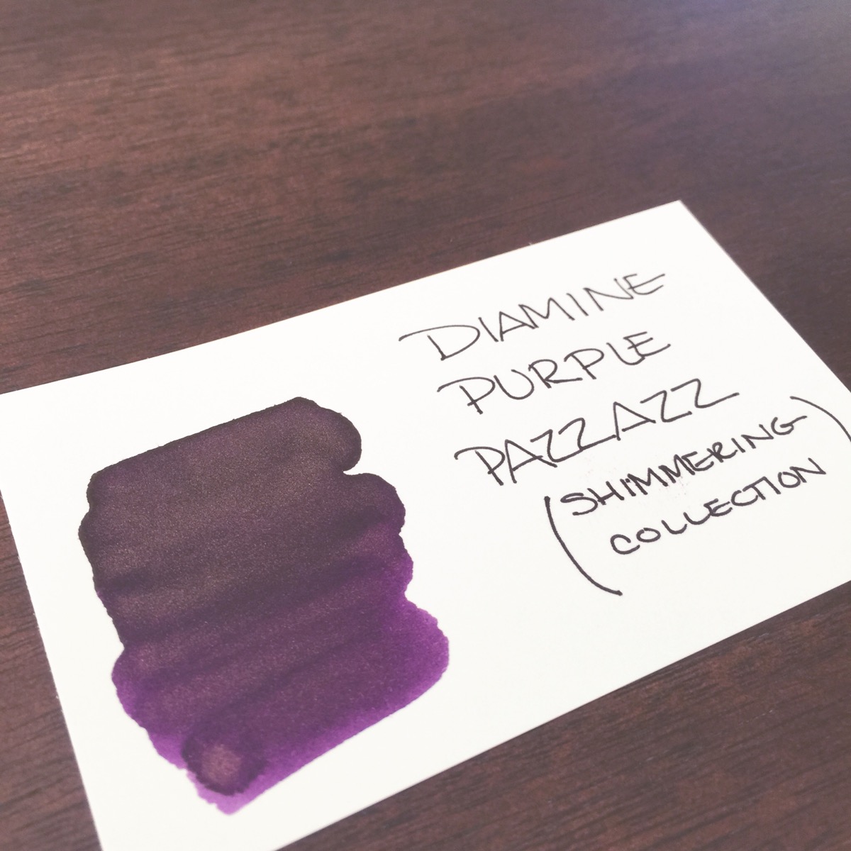
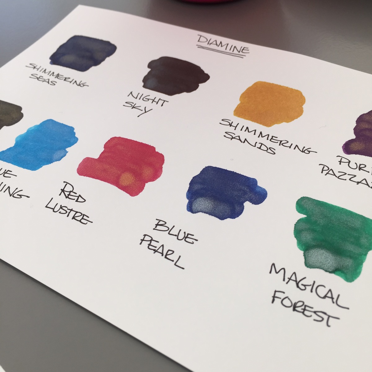
Diamine Purple Pazzazz Ink Swab

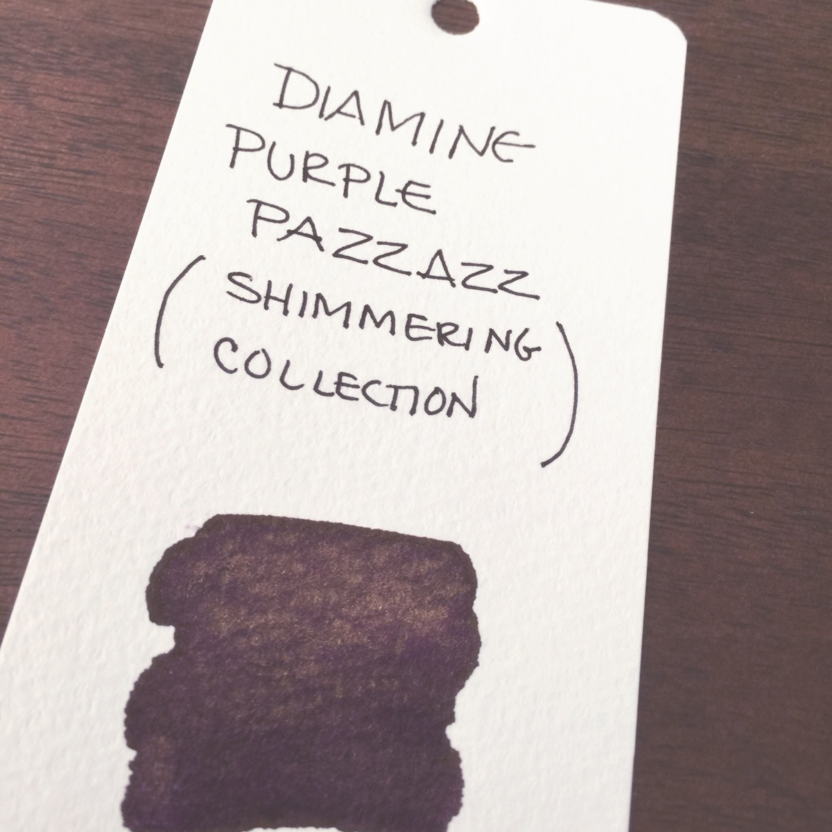
After gently shaking the bottle, I swabbed Purple Pazzazz (the spelling kills me!) on both a smooth card and a textured Mnemosyne Word Card.

(Important Side Note:  Mnemosyne Word Cards are no longer being produced. If you use these for your swabs and are worried about running out, you may want to get them while they’re still semi-available.)

I love the Purple Pazzazz’s color. A nice deep, rich purple and and the gold shimmer is present, but not overwhelming.

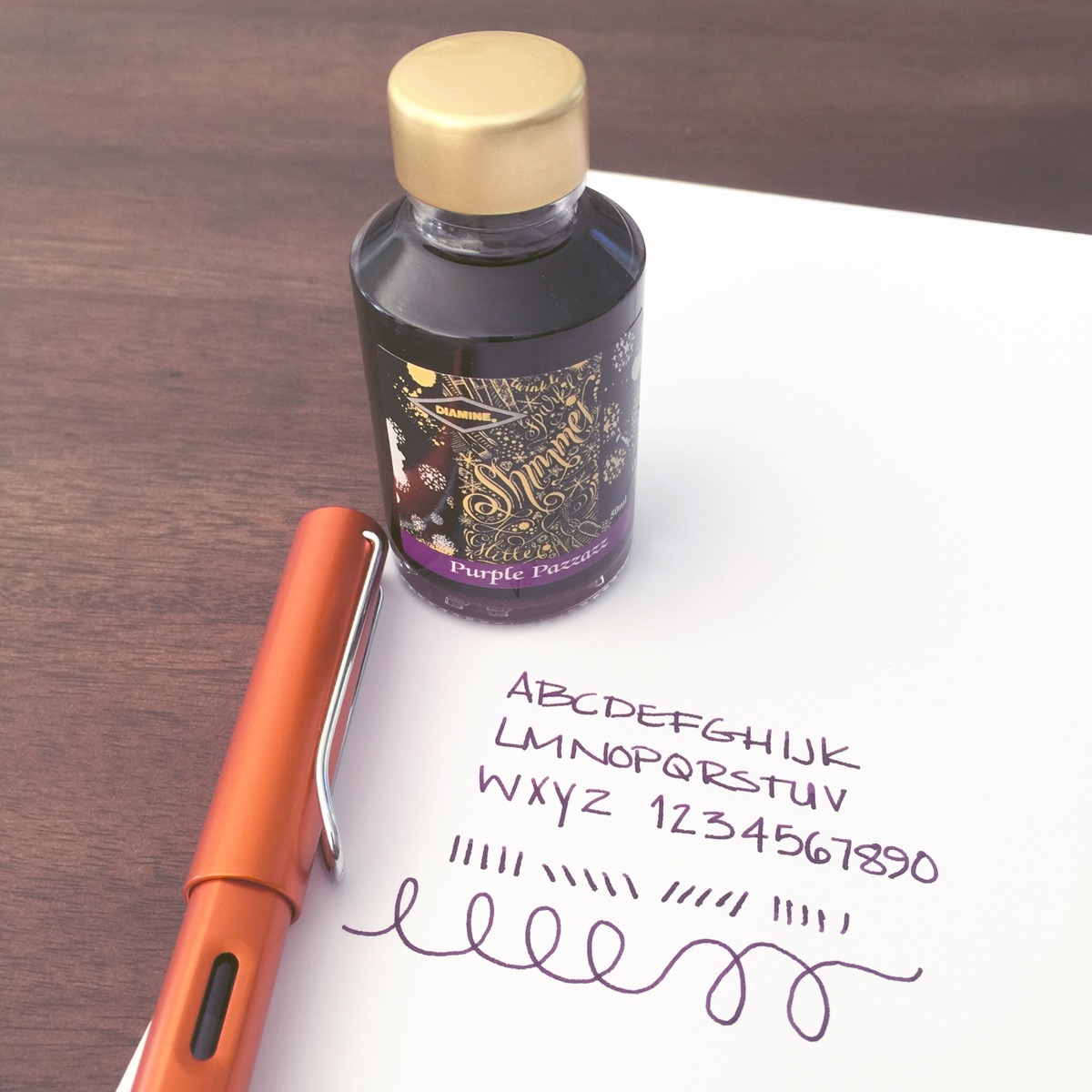
I like using Lamy Safari / Al-Star for new-to-me inks. The Safari pens perform consistently for me and nearly all inks work well in them. I selected a broad nib to encourage lots of shimmery goodness.

I’m bummed that the gold shimmer isn’t noticeable in my writing samples. I definitely gave the bottle a good shake before filling. Maybe it’s the paper (HP 32lb.) I’m using?

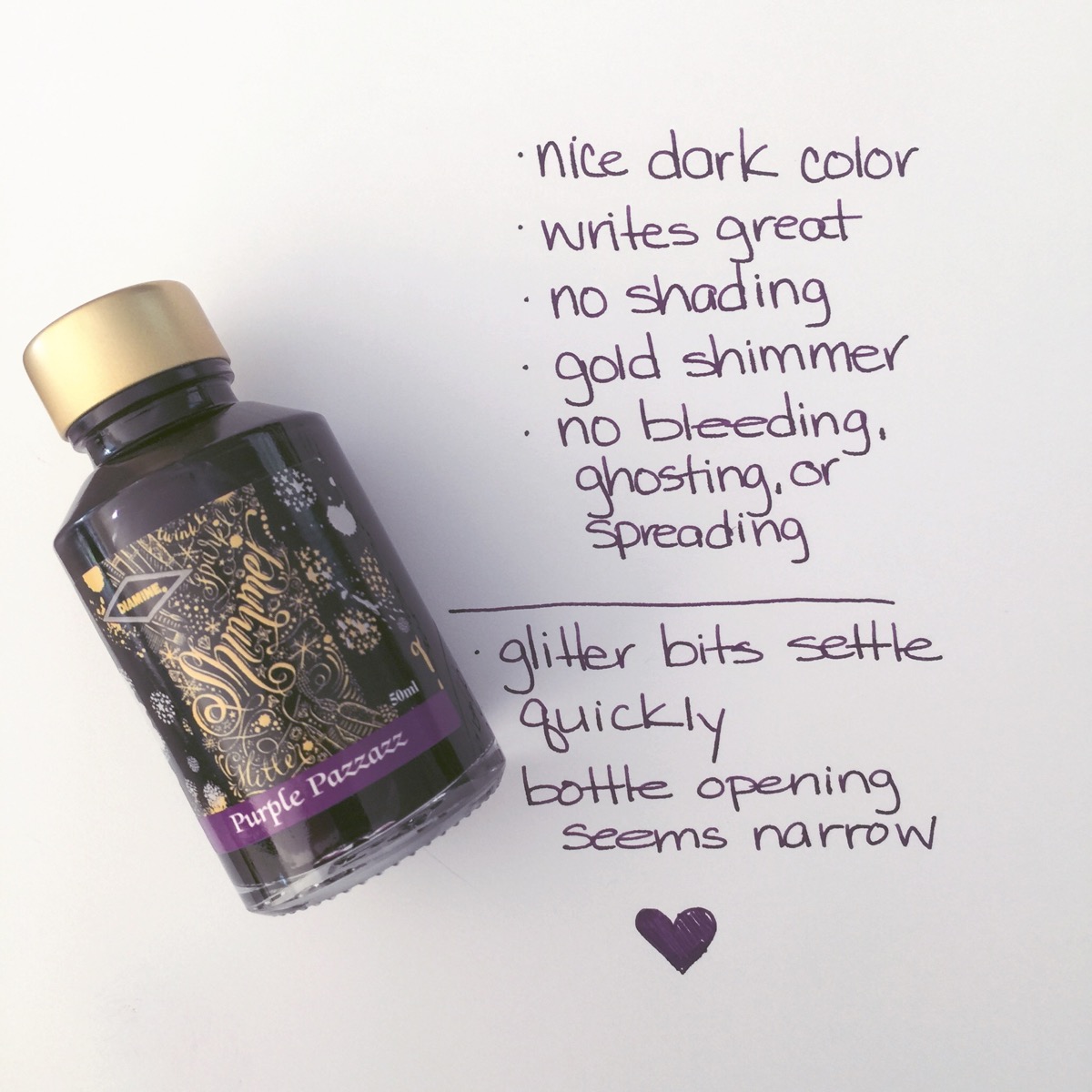
Gold bits aside, Purple Pazzazz (that spelling!) is a wonderful ink.  The color is a dark dark eggplanty purple. It performs well with no issues whatsoever.

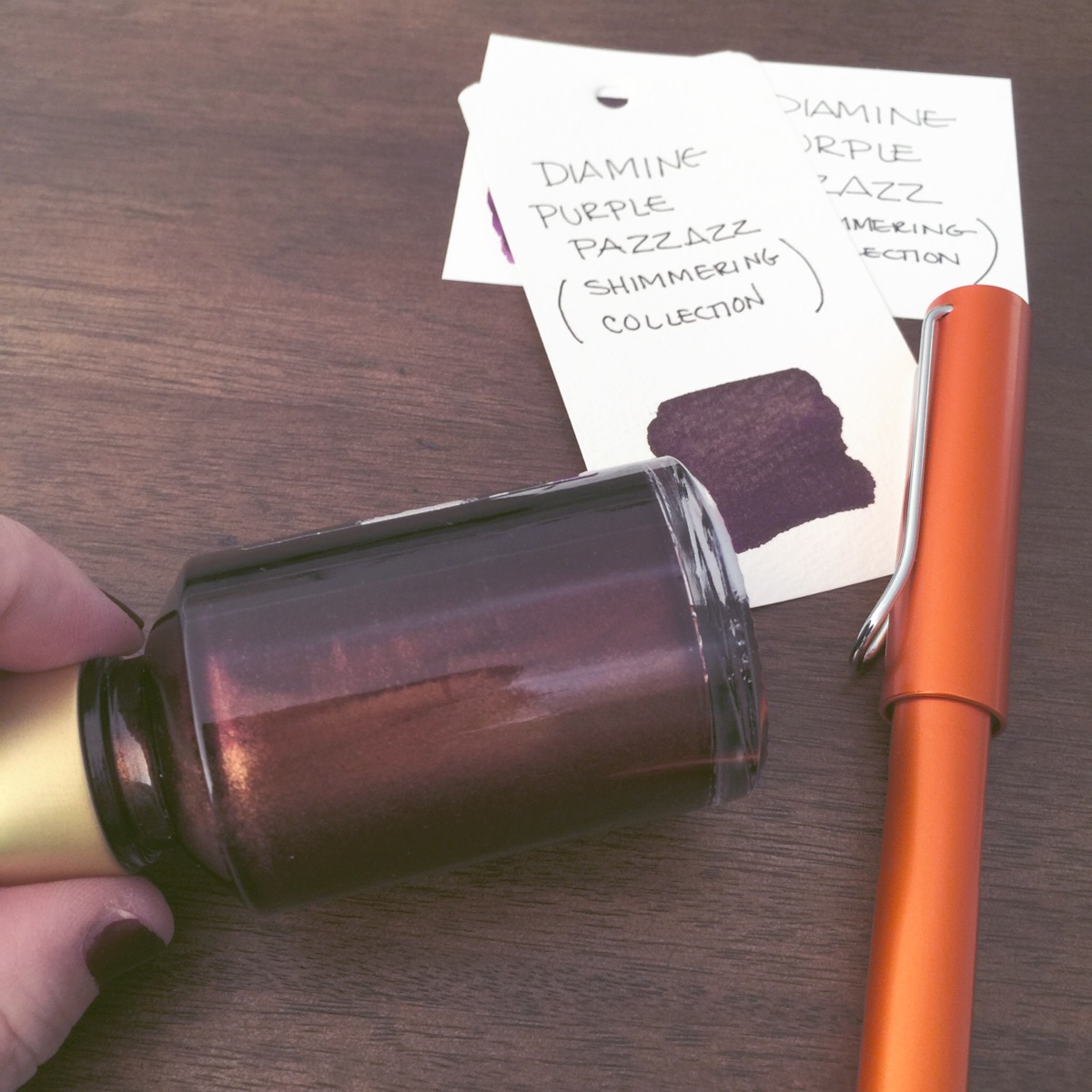
Diamine is so smart. The color of the lid on each of their Shimming Inks is the color of the shimmer – gold or silver. The opening of the bottle seems a little narrow to me, but the Safari was able to be dunked in there with no trouble at all.

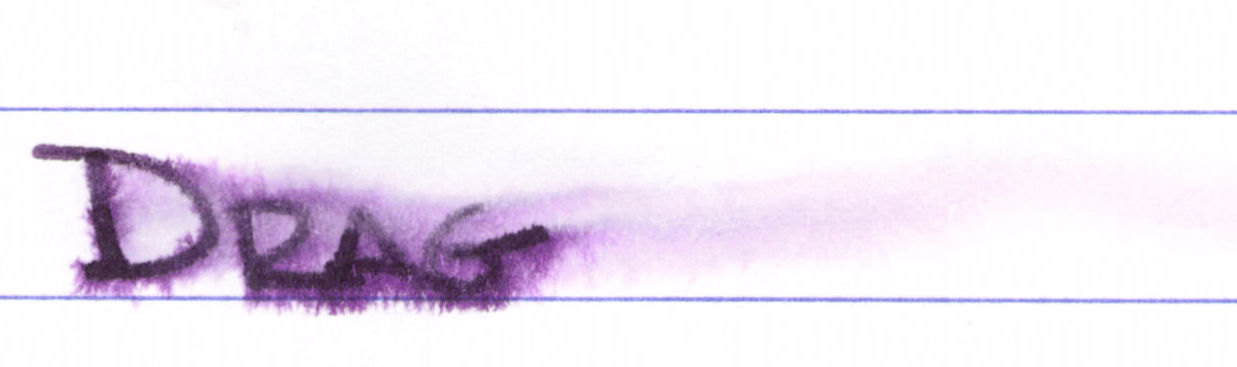
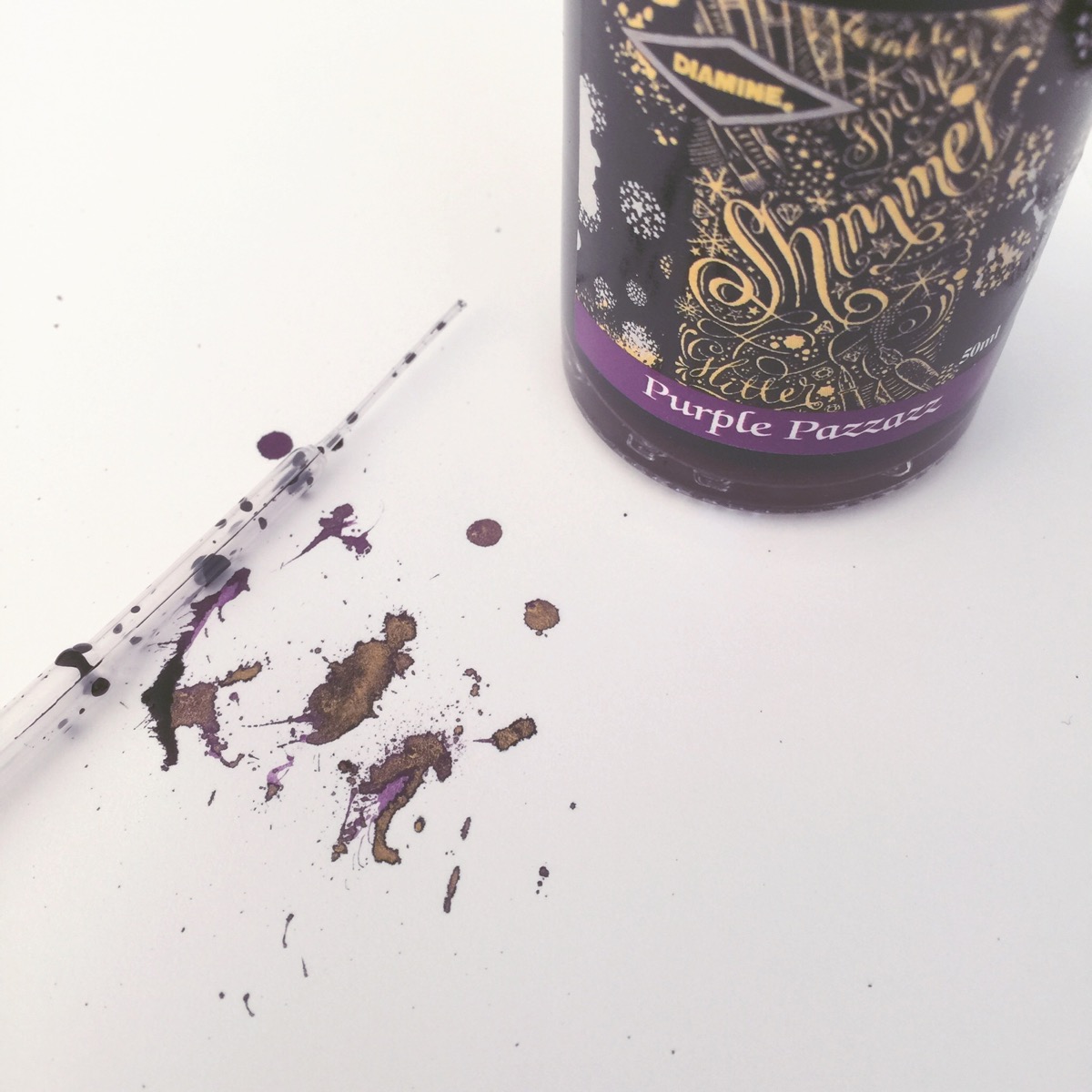
Making spatters is a guilty pleasure.

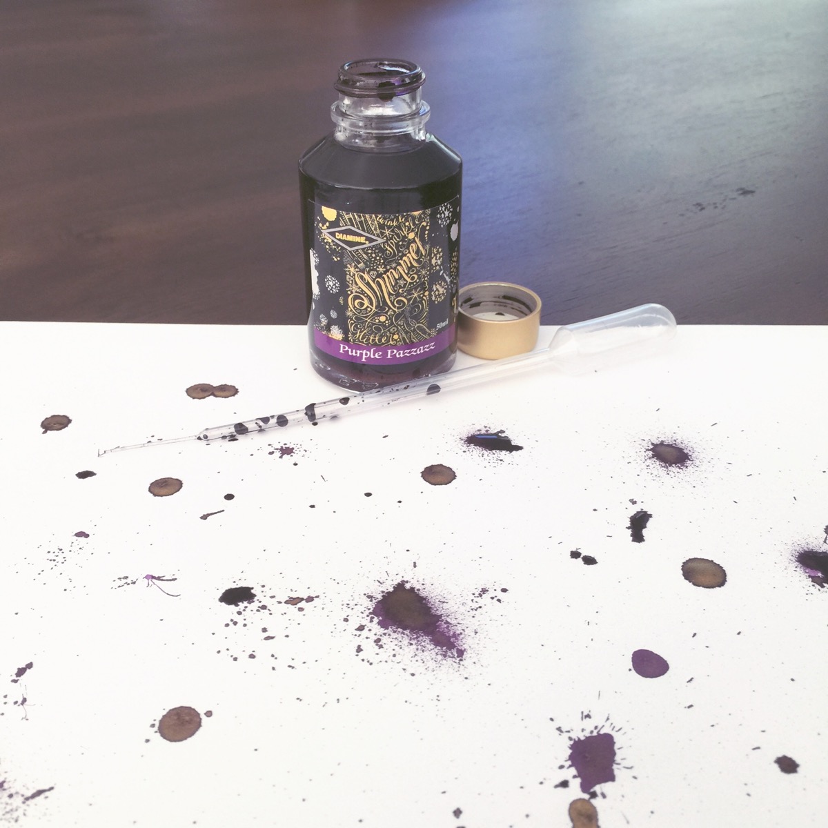
Lovely gold shimmy-shimmy in the spatters.

I’m going to need to give Purple Pazzazz another try. I really want to see that golden sheen in handwriting.

I mentioned above that the Diamine Shimmering Inks comes in ten different colors – below are swabs of the nine I have. I missed Brandy Dazzle, darn it.  Fortunately, Pen Chalet included a coupon in my box for 10% off my next order and I’m about to take advantage of that.

Keep an eye on my Instagram feed and here as I try out more from this line and please let me know your writing experiences with them, too!

FOUNTAIN PEN REVIEW: TWSBI Diamond 580 and INK REVIEW: Pelikan Edelstein Jade

IMG_3710.JPG

TWSBI fountain pens show up on all sorts of Best Fountain Pen Ever lists. To me, TWSBI is to pens what Fields Notes is to paper. That is, TWSBI and Field Notes get it right just enough to keep my coming back for more, but neither would appear on my Best Ever list.

My biggest issues with TWSBI have been nib (and maybe feed) related – hard starts and some skipping. Others have had some serious issues with cracking (though I understand TWSBI has worked through this issue).

That aside, let’s take a closer look at the TWSBI Diamond 580. IMG_3711.JPG

I love the faceted clear barrel of the pen. IMG_3712.JPG Mine has a broad nib. And while I don’t have pictures here, TWSBI pens are designed to be fully disassembled. Cleaning them is a breeze.

IMG_3713.JPG

Pelikan Edelstein inks have a good reputation of working well in most pens and Jade seemed to closely match the color of the pen.IMG_3707.JPG

How does it write? Wonderfully! Perfectly!  Look . . .

IMG_3804.JPG IMG_3805.JPG IMG_3803.JPG Seriously, this was my best TWSBI experience ever. No piddling around, no ink changes, just sit down and write.  Annnnnd! In my Will It Write experiment, you can see that even after this pen sat unused for more than two weeks, it picked up right where it left off.

The 580 is super comfortable to hold. The writing experience was smooth with very little feedback. I only experienced one hard start (probably due to a weird hand position on my part). I’m truly impressed with this pen. I do wish the nib was a bit more broad and it’s not the best pen to post (put the cap on the back end while writing).


What about Pelikan Edelstein Jade?

IMG_3809.JPG


IMG_3808.JPG

It’s a nice enough color – leans a little too blue for me. It writes wonderfully and flow from the pen is good. It’s well-saturated and there is some shading.

BOTTOM LINE – TWSBI Diamond 580: I love this pen. Your mileage may vary due to inconsistencies with TWSBI in general.

BOTTOM LINE – Pelikan Edelstein Jade: You might love this ink! The color isn’t a favorite of mine, but everything else about the ink is wonderful.

So…TWSBI….tell me your experiences? Am I alone in my Field Notes comparison?

INK REVIEW: Diamine Blue Velvet

IMG_3757.JPG


Blue Velvet is part of the Anniversary Collection from Diamine to celebrate the 150th anniversary of the brand.  150 years!  The collection is comprised of eight different inks in these fancy wedge-shaped bottles.

I’m just going to put it right out there – I LOVE Diamine Blue Velvet. Big love.

Letting the pictures do the talking here . . .


IMG_3829.JPG IMG_3826.JPG IMG_3825.JPG IMG_3827.JPG IMG_3824.JPG IMG_3828.JPG


Bottom Line – amazing color, some shading, great saturation, flow is excellent from the Pilot Elite I tested with (more on that pen another day). Big love. Big honkin’ love.

THIS OR THAT: Pilot Iroshizuku Blues Edition

 This or that?

Pilot Iroshizuku Kon-peki or Tsuyu-kusa?


Kon-peki is on top. It’s so popular. I bought it long ago without trying the sample first. But Tsuyu-kusa? I’m not even sure how to pronounce it. I first tried it earlier this month when an Instagram friend asked how it compares to Kon-peki.

IMG_3843.JPG

Both are really pretty and have a little shading. They write wonderfully (as do all of the Iroshizuku inks I’ve tried). Kon-peki leans toward turquoise. Tsuyu-kusa is a warmer, more rich blue color.  Neither is particularly water-resistant (I let things dry for about five minutes before swabbing with a good amount of water).

Here’s a better look at them . . .

IMG_3836.JPG

So. Which will it be for you? I’m choosing . . .

INK REVIEW: Toucan Crimson


Screen Shot 2015-03-18 at 1.40.33 PM

Last year, I participated in a group buy for Toucan inks. The brand is Australian and the inks are formulated so that they may be mixed with one another without concern. I posted about the entire experience here. While it was a good experience and everything went great with the group buy, I’ve not been thrilled with the inks. Here’s a link to my review of Toucan Violet.

My chief complaint is that the inks seem watery. Not just low saturation of color, but thin and . . . watery.

Screen Shot 2015-03-18 at 1.40.48 PM

Along with the above issue, there doesn’t seem to be much lubrication to the ink. I tested using a Lamy Safari (my pen of choice for new inks) and it felt like I had to push, pull, and drag the pen along to get things going.

And then there’s the color – crimson? No.

Screen Shot 2015-03-18 at 1.41.03 PM

Very little water resistance.

Screen Shot 2015-03-18 at 1.41.25 PMWhile poking around for other reviews, I discovered that Anderson Pens is selling Toucan inks by the pouch (how I bought them) and in sample sizes. (Their swabs look totally different than mine.)

I’ve tried a couple other inks from Toucan and will post about those in the next few months – I’m happy to say that the news isn’t all bad.  Stay tuned!

In the meantime, I’d love to hear about your experiences with the Toucan line.


INK REVIEW: De Atramentis Jasmine

Screen Shot 2015-03-18 at 2.31.17 PMDe Atramentis Jasmine is surprising in a number of ways . . .

  • the scent is reminiscent of jasmine
  • the color isn’t very well saturated
  • it writes surprisingly well
  • there is zero water resistance

Screen Shot 2015-03-18 at 2.32.11 PM

I tested this ink in a Lamy Safari with a broad nib and there is some amount of shading going on:

Screen Shot 2015-03-18 at 2.31.37 PM

There are a lot of nice things about this ink. It writes great – no hard starts, no feathering, no bleeding or show through – but I just don’t like it.  The color is nothing special to me and I can’t imagine a situation when I’d want to write in this color.

Having said that, reviews on Goulet Pens are great for Jasmine, though one reviewer said that it bleeds on Filofax paper – good to know.

What do you think?  Love it? Hate it?

Oh, and in case you care about such things – I bought and paid for the sample size of this ink with my own pennies.

INK REVIEW: De Atramentis Giacomo Puccini

PENTULANT 048

Hello, Puccini!

Giacomo Puccini fountain pen ink from De Atramentis is the kind of ink I could really love. The color is a rich, dark purple – eggplant. It writes very well – no issues with flow, no feathering, bleeding, or showing through to the other side of the paper. (The smears you see above are user error – I turned the sheet of Rhodia dot grid paper over and it was still wet.)

Screen Shot 2015-02-10 at 12.59.15 PM

This Puccini might be love!


Screen Shot 2015-02-10 at 12.59.30 PM

Screen Shot 2015-02-10 at 12.59.39 PM

There is zero – zero – water resistance.


Screen Shot 2015-02-10 at 12.59.50 PM


Want to know a little secret? I love the “shreds” that tearing paper out of a notebooks leaves behind. Crazy, right? Crazy, but true. Mr. Pentulant hates them – cracks me up.

Anyway, I bought my sample from Goulet Pens and this ink has since been discontinued. I love it, but I also love Alexander Hamilton. To be honest, I find myself wondering if it’s the same ink. A long time ago, I asked Brian Goulet if there was a way to tell which of the various De Atramentis inks were which of the other De Atramentis inks – there’s not. So disappointing.  In any event, if you love Pucccini like I do, you might take a look at Hamilton and see if you love him, too. I think you will.

PENTULANT 047

INK REVIEW: De Atramentis Cinnamon


Screen Shot 2015-02-12 at 11.11.28 AM


It has been forever since I’ve added to my Fifty Shades of Grey collection!

De Atramentis Cinnamon is from the scented line of De Atramentis inks for fountain pens. The scent is definitely cinnamon with no stinky undertones that I could detect. The ink is dark grey (or is it gray?) with a maybe a hint of green. I don’t see as much green in it as a I saw in De Atramentis Cement, and so I don’t think they are De Atramentis Twins, but they are definitely close, with Cinnamon being just a touch lighter.

Screen Shot 2015-02-12 at 11.16.46 AM


The ink writes wonderfully. No hard starts, no feathering, show-through, or bleeding on either Clairefontaine or Rhodia paper.

Screen Shot 2015-02-12 at 11.17.00 AM


Cinnamon won’t replace Pilot Iroshizuku Fuyu-syogun as my favorite gray ink, but I do like it quite a bit and find myself picking up the pen inked with it regularly.

I scanned the handwritten review before I remembered to complete the water test – oops. Having later completed the test, you will have to trust me when I say that it behaved wonderfully. Not perfectly, but definitely better than what I expected.


PENTULANT 049 PENTULANT 050


My bottom line is that this is an ink that many people will like. The color is good and the writing experience really couldn’t be better. Winner, winner!

Have you tried this one? What is your favorite gray? Or do you spell it grey? Have you seen the movie Fifty Shades of Grey? Or read the book?

INK REVIEW: Noodler’s Hunter Green

Screen Shot 2015-02-08 at 1.13.57 PM

I have two things to say about Noodler’s Hunter Green:

  • the color isn’t for me
  • if the color is for you, you will probably love this ink

Screen Shot 2015-02-08 at 1.14.33 PM

There’s a tiny bit of spread on the Maruman paper I was using for this review. I’m inclined to believe this is an issue with the paper rather than with the ink. This also has me thinking that it’s time for me to be really consistent with my paper choices for ink reviews.

Screen Shot 2015-02-08 at 1.14.48 PM

I am super-duper impressed with the water resistance of this ink. It’s not perfect, but it is among the very best.

Screen Shot 2015-02-08 at 1.15.17 PMThe ink writes well. No issues with bleeding or showing through. It’s wonderfully saturated and seems very consistent as far as flow from the pen goes.

Even though the color isn’t for me (I’m more of a true green girl), Noodler’s Hunter Green is just about as good as it gets in terms of performance. Highly recommended.

I bought my sample from Goulet Pens. It is still available there and has mostly good reviews. Complaints seem to mostly surround dry time (an issue I definitely did not have) and spread (an issue I attribute to the paper).


PENTULANT 046


Do you have a favorite green ink?

INK REVIEW: De Atramentis Magic Fairy

Screen Shot 2015-02-08 at 12.49.22 PM

With its super-bright purple/pink hue, Magic Fairy from De Atramentis is a bold choice for fountain pen users. I’m not sure there are many practical uses for the ink, but I’m not sure that matters either. The heart wants what the heart wants, after all.

Screen Shot 2015-02-08 at 12.49.59 PM

The ink performed well for me at first with no skipping, no bleeding, and no showing through. Initially, I didn’t think there was much potential for shading, but the strokes above and a closer look at some of the other writing makes it seem that with the right nib, one could expect some degree of shading.

Screen Shot 2015-02-08 at 12.50.16 PM

I was prepared to like Magic Fairy and then this started happening as I wrote more with the ink:

Screen Shot 2015-02-08 at 12.50.36 PMSee the spreading? It was really hit or miss. The word “tiny” above is just terrible, but the word “because” looks just fine. Look at “first,” though – the thin downstroke of the r combined with the other issues makes me think that what I’m dealing with here is inconsistent ink flow.

I’ve written with Magic Fairy a couple of times since completing the review and it definitely has a consistency issue for me.  J Herbin’s Rose Cyclamen is a close color match and I’ve not had a bit of trouble with it. For this reason, I’ll not be buying a bottle of Magic Fairy anytime soon.

PENTULANT 045

I bought my sample of this ink from Goulet Pens. It is either out of stock or no longer being offered by them.  It is available for sale on the De Atramentis site, however.

Have you tried this one? Did you find it to be inconsistent? Are there inks that have no practical application that you just can’t stay away from?