INK REVIEW: De Atramentis Giacomo Puccini

PENTULANT 048

Hello, Puccini!

Giacomo Puccini fountain pen ink from De Atramentis is the kind of ink I could really love. The color is a rich, dark purple – eggplant. It writes very well – no issues with flow, no feathering, bleeding, or showing through to the other side of the paper. (The smears you see above are user error – I turned the sheet of Rhodia dot grid paper over and it was still wet.)

Screen Shot 2015-02-10 at 12.59.15 PM

This Puccini might be love!


Screen Shot 2015-02-10 at 12.59.30 PM

Screen Shot 2015-02-10 at 12.59.39 PM

There is zero – zero – water resistance.


Screen Shot 2015-02-10 at 12.59.50 PM


Want to know a little secret? I love the “shreds” that tearing paper out of a notebooks leaves behind. Crazy, right? Crazy, but true. Mr. Pentulant hates them – cracks me up.

Anyway, I bought my sample from Goulet Pens and this ink has since been discontinued. I love it, but I also love Alexander Hamilton. To be honest, I find myself wondering if it’s the same ink. A long time ago, I asked Brian Goulet if there was a way to tell which of the various De Atramentis inks were which of the other De Atramentis inks – there’s not. So disappointing.  In any event, if you love Pucccini like I do, you might take a look at Hamilton and see if you love him, too. I think you will.

PENTULANT 047

INK SWAB: 62/365 – De Atramentis Aubergine

PURPLE DE ATRAMENTIS AUBERGINE


De Atramentis is famous for making a zillion inks. And then they take some of them, add a little scent and name it something else. Some, they add the name of a famous person and then sell both of the inks.

I don’t think De Atramentis Aubergine is the same has Alexander Hamilton. Buuuut…the side of the bottle does say Aubergine. Which really just means purple (or eggplant, apparently).

I generally like De Atramentis inks. It’s a little annoying that they (nor no one else) has a color chart showing which inks are related to which others. If you know of such a chart, please let me know.

xo

INK SWAB: 45/365 – PW Akkerman Simplisties Violet

* PURPLE AKKERMAN SIMPLISTIES VIOLET


Happy Valentine’s Day!

With all of the pink and red out there today, I thought I’d do something a bit different and show off a beautiful purple ink that I love – PW Akkerman’s Simplisties Violet. This is an ink that I’ve reviewed in the past and absolutely loved. The fact that the ink comes in the best bottle ever is just a bonus.

xoox

INK REVIEW: De Atramentis Magic Fairy

Screen Shot 2015-02-08 at 12.49.22 PM

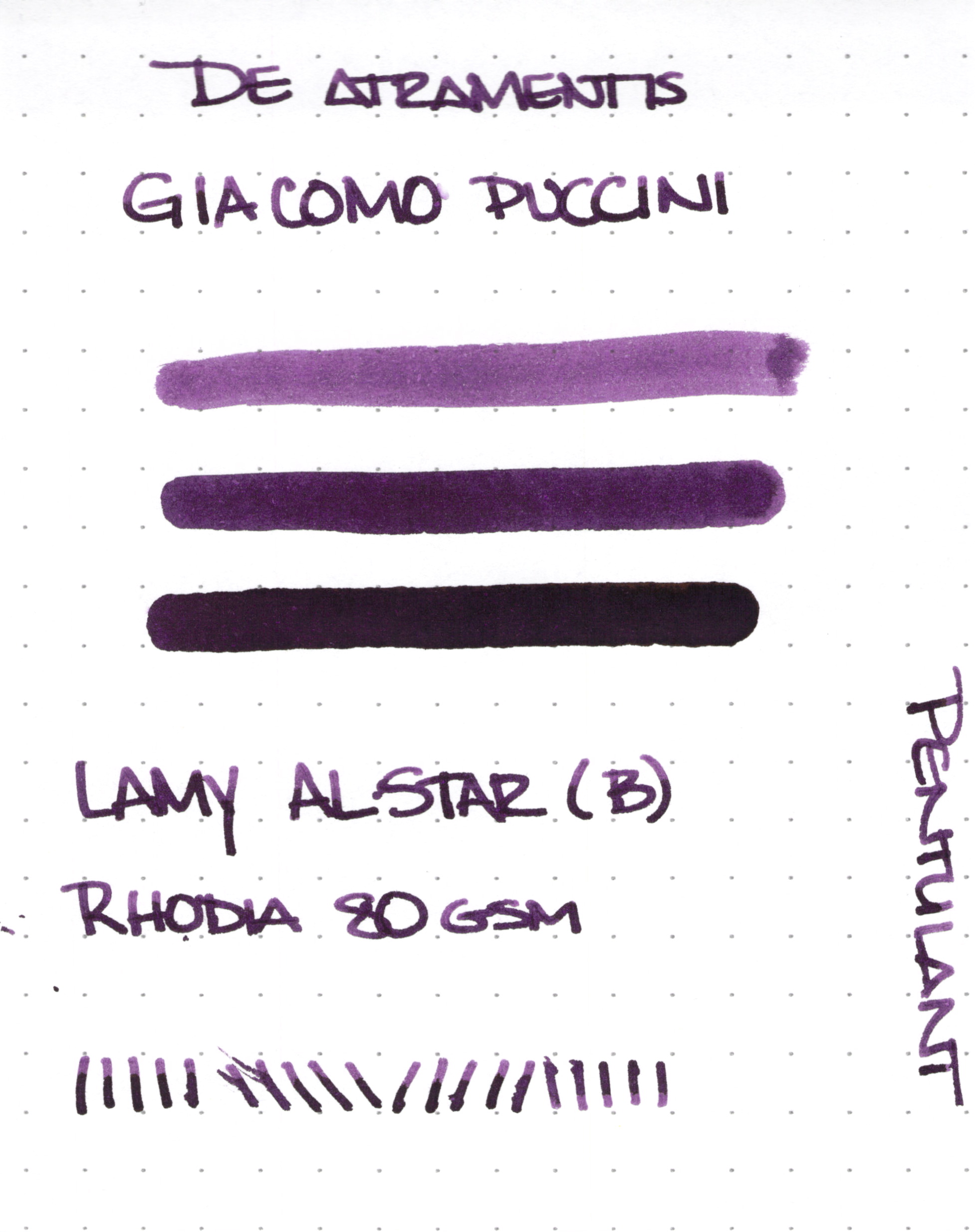
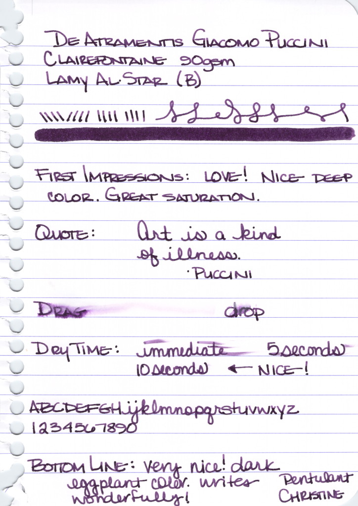
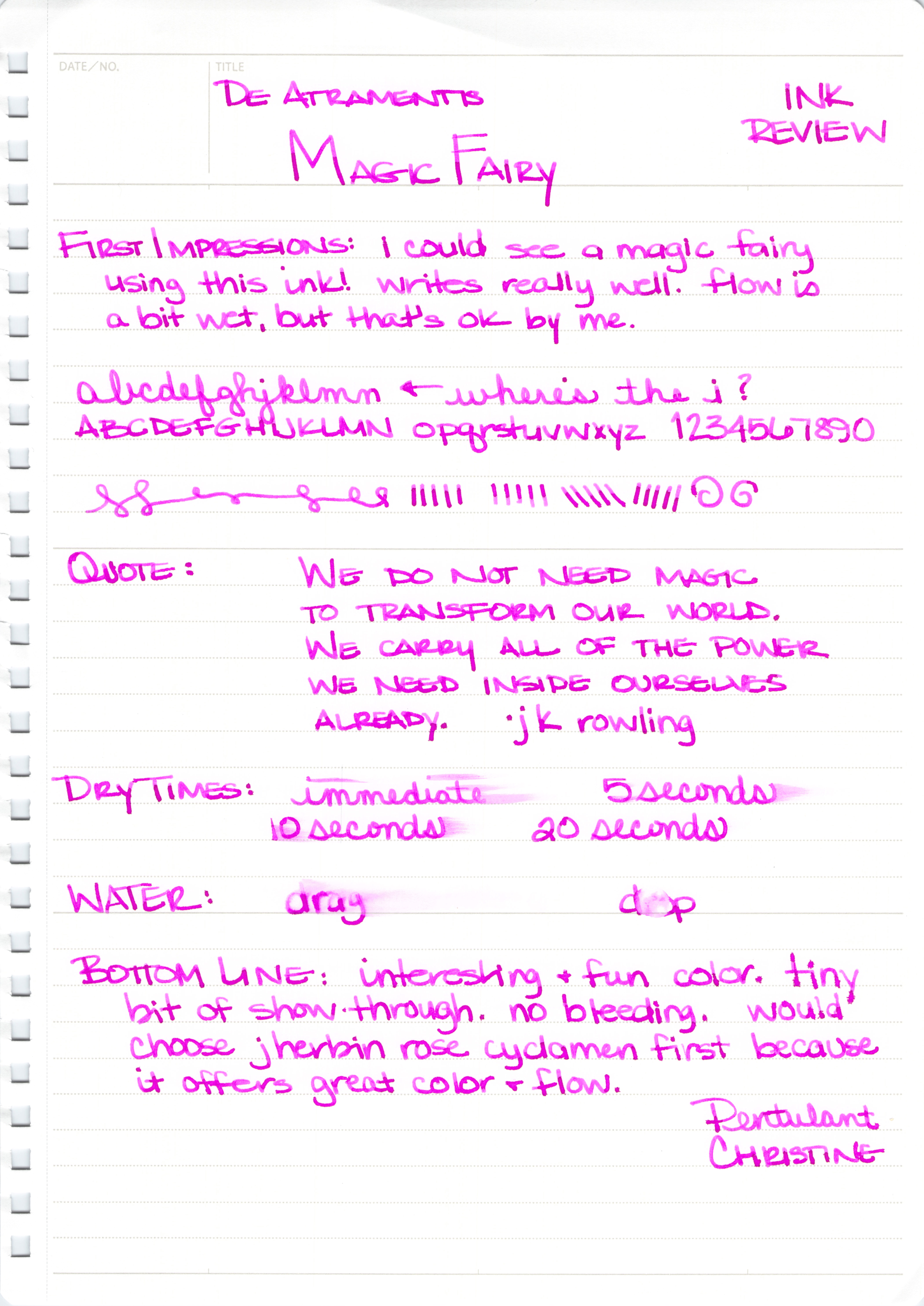
With its super-bright purple/pink hue, Magic Fairy from De Atramentis is a bold choice for fountain pen users. I’m not sure there are many practical uses for the ink, but I’m not sure that matters either. The heart wants what the heart wants, after all.

Screen Shot 2015-02-08 at 12.49.59 PM

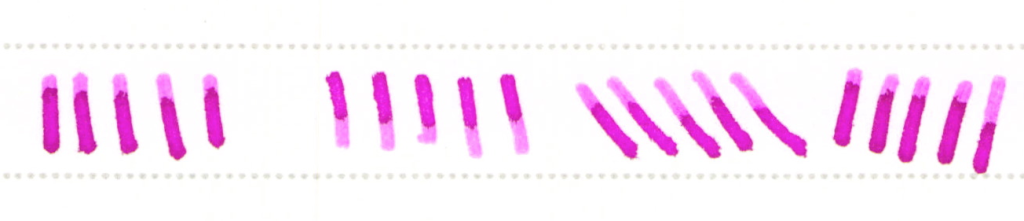
The ink performed well for me at first with no skipping, no bleeding, and no showing through. Initially, I didn’t think there was much potential for shading, but the strokes above and a closer look at some of the other writing makes it seem that with the right nib, one could expect some degree of shading.

Screen Shot 2015-02-08 at 12.50.16 PM

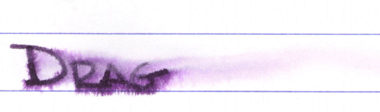
I was prepared to like Magic Fairy and then this started happening as I wrote more with the ink:

Screen Shot 2015-02-08 at 12.50.36 PM
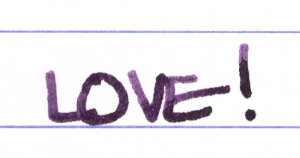
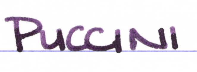
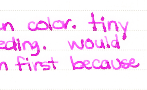
See the spreading? It was really hit or miss. The word “tiny” above is just terrible, but the word “because” looks just fine. Look at “first,” though – the thin downstroke of the r combined with the other issues makes me think that what I’m dealing with here is inconsistent ink flow.

I’ve written with Magic Fairy a couple of times since completing the review and it definitely has a consistency issue for me.  J Herbin’s Rose Cyclamen is a close color match and I’ve not had a bit of trouble with it. For this reason, I’ll not be buying a bottle of Magic Fairy anytime soon.

PENTULANT 045

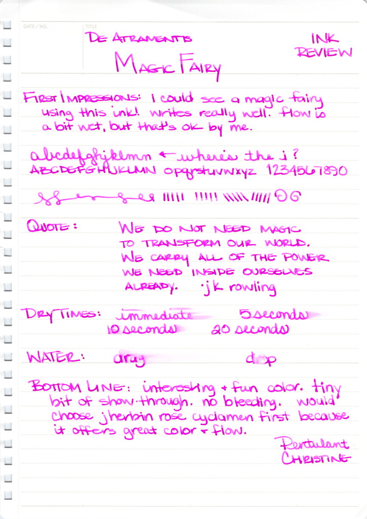
I bought my sample of this ink from Goulet Pens. It is either out of stock or no longer being offered by them.  It is available for sale on the De Atramentis site, however.

Have you tried this one? Did you find it to be inconsistent? Are there inks that have no practical application that you just can’t stay away from?


INK SWAB: 13/365 – Rohrer & Klingner Alt-Bordeaux

* PURPLE ROHRER & KLINGNER ALT BORDEAUX


Rohrer & Klingner is a brand that doesn’t get a whole lot of attention.

I’ve not written with Alt-Bordeaux, but I have enjoyed other R&K inks and this is an interesting purple that leans toward red – aptly named.

While today isn’t Friday, I need to mention how much I enjoy Fashionable Friday from The Well-Appointed Desk. Pretty pretty.

INK DROP: January 2015 (Spoilers)

PENTULANT 044January 2015 Ink Drop from Goulet Pens

I received January’s Ink Drop from Goulet Pens earlier this week.

I usually super-saturate cotton swabs with ink before swiping across the paper, but this time, I barely barely got the cotton wet with ink. I thinking maybe this gives a more accurate idea of what the ink would look like from a pen? If you have thoughts, I’d love to hear them.

I’m about to reveal the inks from top to bottom. If you don’t want to know, this is the time to look away.


  • De Atramentis Black Edition-Brown – I know, it looks kind of purply to me, too (it’s not just the scan)
  • Rohrer & Klingner Verdigris
  • Noodler’s X-Feather – this stuff is great if you’re looking for an ink that doesn’t feather or spread
  • Private Reserve Ebony Purple – another ink I adore
  • Pelikan Edelstein Tanzanite

And the theme?  Safe for Work

I like most of these inks – going to have to look at the De Atramentis a bit more, though.  What are you thinking? Safe for work?