THIS OR THAT: Yama-dori or Ku-jaku

This or that? Top or bottom?  Which do you love?

Can you see the differences between these two inks?  One color is always on top. The other is always on the bottom.

Let’s take a closer look . . .

One of these is Pilot Iroshizuku Ku-jaku.  The other is Sailor Jentle Yama-dori.
Color is quite similar.
I see a definite difference here.
Not much difference here.
Which ink is this?  Hint:  it’s both!

Alrighty, which do you like? Both? Neither?  They are pretty close, yes? I would choose the top color – but not by much. It’s the shading that made the difference for me. I think I could be happy with either (even though teal isn’t my most favorite color).

Scroll down for the spoiler . . .

The top shade is Sailor Jentle Yama-dori. 
The bottom is Pilot Iroshizuku Ku-jaku.  

What is so interesting to me about this is that Yama-dori is legendary. Ku-jaku gets favorable reviews, but it’s not a Big Deal. The differences are subtle and if they weren’t side-by-side, I wonder if you or I could tell them apart.

Like I said yesterday, Yama-dori is my E.T. ink. You can read all about that right here.

What do you think? Am I crazy and there’s a huge difference that I’m not appreciating here?

INK REVIEW: Sailor Jentle Yama-dori

Sailor Jentle Yama-dori Fountain Pen Ink Review


I generally try to avoid reading much about inks before I have the opportunity to try them for myself. I want my opinion to definitely be my own and not influenced by others as much as possible.

That was impossible with Yama-dori. This ink has superstar status over on Fountain Pen Network. Even before the ink was re-released, there was chatter about how amazing it is – it sheens, it shades, it’s perfect! Gotta get me some of that!

I got mine from JetPens with pennies from my own piggy bank. It’s listed at $20 there. Looks like it can be had for a buck or two less at some other online stores.

There are things I really like about Yama-dori. It sheens, it shades, it flows really well. It passed the smear and highlight tests with flying colors.

Yama-dori is my E.T. of inks. Let me explain . . .

Waaaay back when the movie E.T. (you know, the Extra-Terristrial) came out in theaters, it was the Must See movie. OMG, gotta see it. What, you haven’t seen it?  You don’t know what you’re missing!  Best. Movie. Ever.

The build-up was just so much that there was practically no way the E.T. was going to meet my expectations. And it didn’t. I mean, it was ok.

And that’s kind of where I am with Yama-dori. It’s good. It’s nice. I like it. But am I coco-crazy-go-nutters for it?  Nah.

I’ll be back tomorrow (a rare Tuesday post!) with more show and tell on Yama-dori.  (How is that for a tease?)

In the meantime, check out the full review (click here for the full-size image – it’s huge), and tell me what you think.  Do you love Yama-dori?  Do you have an E.T. ink?

INK REVIEW: J Herbin Lie de The

I don’t like brown inks. It’s been documented right here on this blog.  
Delta Brown, what’s the flower you have on? It’s brown.
Chocolat from Private Reserve? I said I liked it, but I don’t. I never bought a bottle like I said I might.
I don’t like brown inks. Really, I don’t!! 
J Herbin Lie de The
Why try again? Well, I have just about every other color group represented in my currently-inked pens and the Kaweco Sport I wanted to use is blue.  I’ve always thought brown and blue look great together. Leather and denim, right? Can’t just be me.
Anyway . . .
Best. Brown. Ever. 

I’m a convert. I have seen the light brown and I like it. I love it.  My gosh, look at that shading.

The color is wonderful. Not too dark, not too light. I’m not seeing any of that red that turned me away from some of the other browns I’ve tried. There’s definitely some yellow in there, though.
It writes fantastically. No flow issues (consider that I was using a BB nib). Dry time was a little long (that nib was laying down some serious ink). 
There was no feathering, bleeding, or ghosting with Clairefontaine paper. There was all of the above when I touched the nib to some cheapie cheap-o paper.  I don’t know if that’s more because of the paper or the ink, but there you go.

I’m adding Lie de The to my inky wish list.
Here’s the full review. Click here to see the full-size image (it’s big).  

OK…speak up….brown ink. Are you in or out? Do you like browns that lean toward the yellow or more toward red?

xoxox

P.S. I rarely look at other reviews before I write my own, but will sometimes check them out after. There are lots of reviews on Fountain Pen Network that talk about how green Lie de The is. I don’t see that. I don’t see that so much that I wonder if the formulation has changed. When I look at the swabs on both Goulet Pens and Zeller Writing, I don’t see green.  Do you?

INK REVIEW: Franklin-Christoph Black Magic

I have, love, and use Franklin-Christoph items. Huge fan here.

Black Magic ink from Franklin-Christoph, though? It has some amazing qualities, but I am not a fan.

Let me explain . . .

The above image sums it up nicely. Black Magic reminds me of writing with a felt-tip marker. The pen (a Lamy Safari with medium ink) would barely touch the paper and just like (black) magic, I’d have a tremendous spot of ink. If I paused even for a nanosecond, another huge spot of ink. 
On to the amazing qualities . . .
Black magic is crazy black. It’s incredibly saturated. Black inks aren’t my favorite, but if I’m using black, it better be black

And then there’s this . . . 

Black Magic don’t smear.  (You can quote me on that.)  It seriously, seriously, seriously doesn’t (Does. Not.) smear. I couldn’t get it to smear even when I tried.

Before writing with it for a few days, I mostly liked the ink.  However, after i few days on regular writing on a variety of paper brands/types, I was worn out from all of the bleeding and washed that ink right out of my pen.
I could see loving this ink. An extra fine nib or a pen with a super-stingy feed to control the flow combined with the right paper and it could be a perfect black.  I’m just way too busy to spend time with such a fussy ink when there are so many inks that work well, you know?

What is your favorite black?  I’m still loving Noodler’s Black.

INK REVIEW: Toucan Violet

Last week, I talked about the Toucan Group Buy over on FPN.  In case you missed it, you can see it right here.
Anticipa-a-a-a-tion.  (Remember those ketchup commercials?)
I was a little concerned when I swabbed this ink. It felt watery. Thin. And you can see that there isn’t much saturation with the color. I’ve used both of the swab cards extensively (over 350 times for the Word Cards on the left) and it is a rare ink that nearly bleeds through. Toucan Violet is one of those rare inks.
Let’s take a closer look . . . 

Smear testing . . .

Water testing . . .

I wrote with Toucan Violet as part of my regular rotation for a week or so. Whenever there’s time (as if I’m on a tight publication schedule – ha), I like to spend at least a few days with a new ink – just to make sure.

Bottom line . . . I’m sure I don’t love it. I’m not sure I like it well enough to take up space in my ink drawer. Yikes.

Have you tried the Toucan inks? I love the concept – I just hope the next one I try goes a bit better than Violet.

Toucan Group Buy

I hadn’t heard of Toucan inks before I saw the news of a group buy over on FPN, but I was definitely intrigued.  Ink in a bag instead of a bottle? Say what?

First, I’ll apologize for the quality of some of these images – not my best work. Maybe my hands were shaking with excitement 😉

I ordered 16 different ink colors, 30 ml each, for a grand total of around $52 + $13 for shipping. The inks came from Australia and the seller was offering to ship the bulk order to a member of FPN who would then split the orders and ship from her home (that was the $13 part). Minimalist packaging for the win!

The whole thing could not have gone more beautifully from my perspective. My inks arrived sealed (from the seller) in a big bag. Each individual ink had tape placed around the screw top and was in it own individual baggy.  I have no drips, spills, or other damages to report.

I have no idea what the kind of seal below is called, but it was a “break-the-seal” deal to open.

I was definitely a little nervous to start pouring into the bottle.  (This is an empty Noodler’s 30ml bottle.)

Someone on Instagram said that milk and wine come packaged like this in Canada.  I’m thinking I need to travel more.

Not a single drop spilled! Yaay!

I’ve been asked a good number of questions about these bags . . .

…The opening is too small to dip a pen – and even if it wasn’t, you’d have to be mighty brave to try it
…I think it would be possible to draw the ink out with a syringe or pipette if you’re super-careful
…The cap can be placed back on the bag – I have no idea how well it seals
…I’d buy like this all.the.time – the savings on shipping and packaging make it an easy decision for me
…the group buy is over, but you can find these inks from JustWrite in Australia

I’ll be back with reviews of some of the inks soon!

INK REVIEW: FOUR FABULOUS BLUE INKS (Part 2)

Last week, I took a really close look at four fabulous blue inks.

Some of these inks are not easy to find. Let’s take a look and see if we can figure this thing out…
Sailor Bung Box Sapphire


After a little searching, I’ve found some sources for Bung Box inks . . . 
Rumor has it Cool-Japan had them over on eBay at one time. As of this writing, there are no Bung Box inks listed, I’ve bought ink from Cool Japan in the past and had a great experience.

The bottles and packaging look amazing and I’ve definitely enjoyed using the sample Gerald sent me. 

Here’s the trouble: money.  The Bung Box inks are not cheap – add in some shipping (from Japan!) charges, and you’re at right around $45-50 per bottle. Yikes.
Parker Penman Sapphire would also be a good substitute for Bung Box Sapphire. Because the Penman ink is no longer available, I’ve listed some good replacements in that section.  Zoom down to see.
Bottom Line:  If $ isn’t a concern, go for it. It’s a great-looking and well-performing ink – you wouldn’t be disappointed. If $ is a concern, DC Supershow Blue is a fine alternative.

Noodler’s Liberty’s Elysium


Noodler’s Liberty’s Elysium is only available from Goulet Pens. The good news is that Goulet Pens has a fantastic reputation in the fountain pen community for excellent customer service. They will also ship overseas.

I shop at Goulet Pens regularly and mention them frequently. I’m not related to the Goulet’s, I receive no discounts, free product, special treatment, or anything else from them. Unfortunately, in our relationship – the money only flows in the one direction 😉

PW Akkerman #5 Shocking Blue


I got mine direct from the Netherlands. Shipping was fast, seemed reasonable (though I was buying multiple bottles), and everything arrived in good condition.

Vanness Pen Shop also carries Akkerman inks. You’ll have to call or email them for specifics.

It’s expensive. The Akkerman bottles are super-fancy and they’ve come a long distance. If you don’t want to put out the money, my strong recommendation is Diamine Majestic Blue (see image below).

Parker Penman Sapphire


No longer available, there are some inky recipes out there for replacing Penman Sapphire. A quick search turned up these two links for you . . . 

Another Parker Penman Sapphire Replacement

The difficulty here is that while I think it is possible to get the color right (or at least close enough), I’m feeling pretty certain that it’s quite impossible to get the feel of Parker Penman right on target. That is to say this: the color is only part of what makes an ink so special. The feel of the sample I had is wonderfully different from all of the other blues here and I seriously doubt that mixing 6.5 drops of ink #1 with 3.75 drops of ink #2 is going to result in that same feel* – and without that, well, there are plenty of off the shelf colors that come close enough.  Have a look . . .


Some of the above ink swabs are showing the sheen – and maybe you’re thinking Penman Sapphire doesn’t have much sheen here or in my review from last week, but look at this review over on FPN – crazy sheen.

Sailor Bung Box Sapphire also looks like a good sub for Parker Penman Sapphire, but there are difficulties in obtaining that ink, too. (See the above section for those details.)

Bottom Line – DC Supershow Blue is the color I would choose if I was trying to match the color of Parker Penman Sapphire.

Of course, you could search eBay for it, but there are rumors that it was discontinued because it may contain metallic bits (hello, sheen) in it and it causes pens to clog. I’ve not had trouble with it in my Pilot Metorpolitan, however.

* Did you know that mixing inks can be an invitation for Major Trouble? Some inks don’t play well with others and you could end up with a blobby globby mess – in your pen. Some mixtures will take some time to form the blobby globby mess and by the time it does, you may have already loaded it into your pen. Be careful.

Annnnnd…that’s that!  Four Fabulous Blue Inks. This has been a fun fun project and I really have to thank Gerald again for sending me samples of some of these inks. If you’re not following me and Gerald on Instagram, you simply must.

You tell me . . . Are you going shopping for one of these? Or maybe you have another favorite blue ink?

IN-DEPTH REVIEW: Four Fabulous Blues

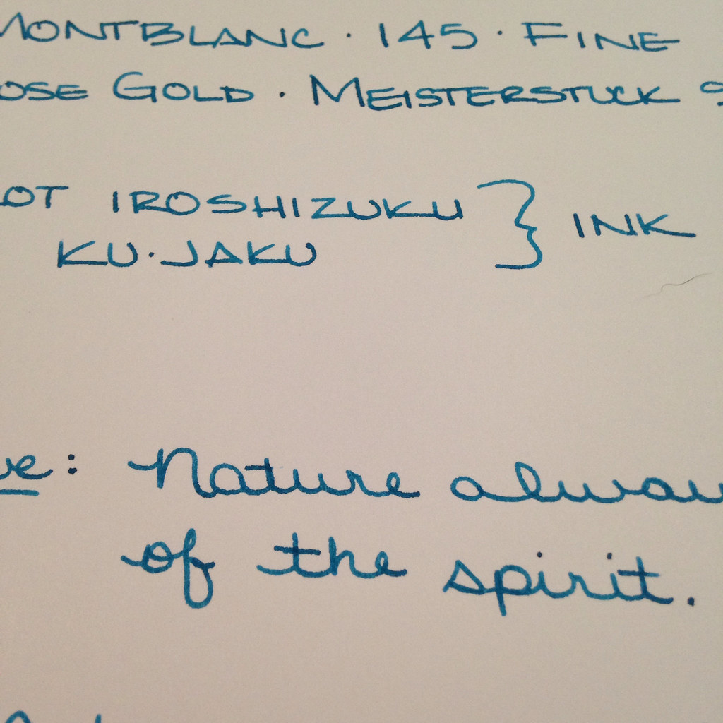
I’m so excited to bring you this super-charged review of four fabulous blue inks:

  • Sailor Bung Box Sapphire
  • Noodler’s Liberty’s Elysium
  • Akkerman Shocking Blue
  • Parker Penman Sapphire

First, a huge and happy shout-out to my Instagram buddy, @mycoffeepot. Gerald provided me with generous samples of Sailor Bung Box Sapphire and Penman Sapphire. He’s a fountain pen nerd (in the best way possible) and if you’re not following him on Instagram, you should be.

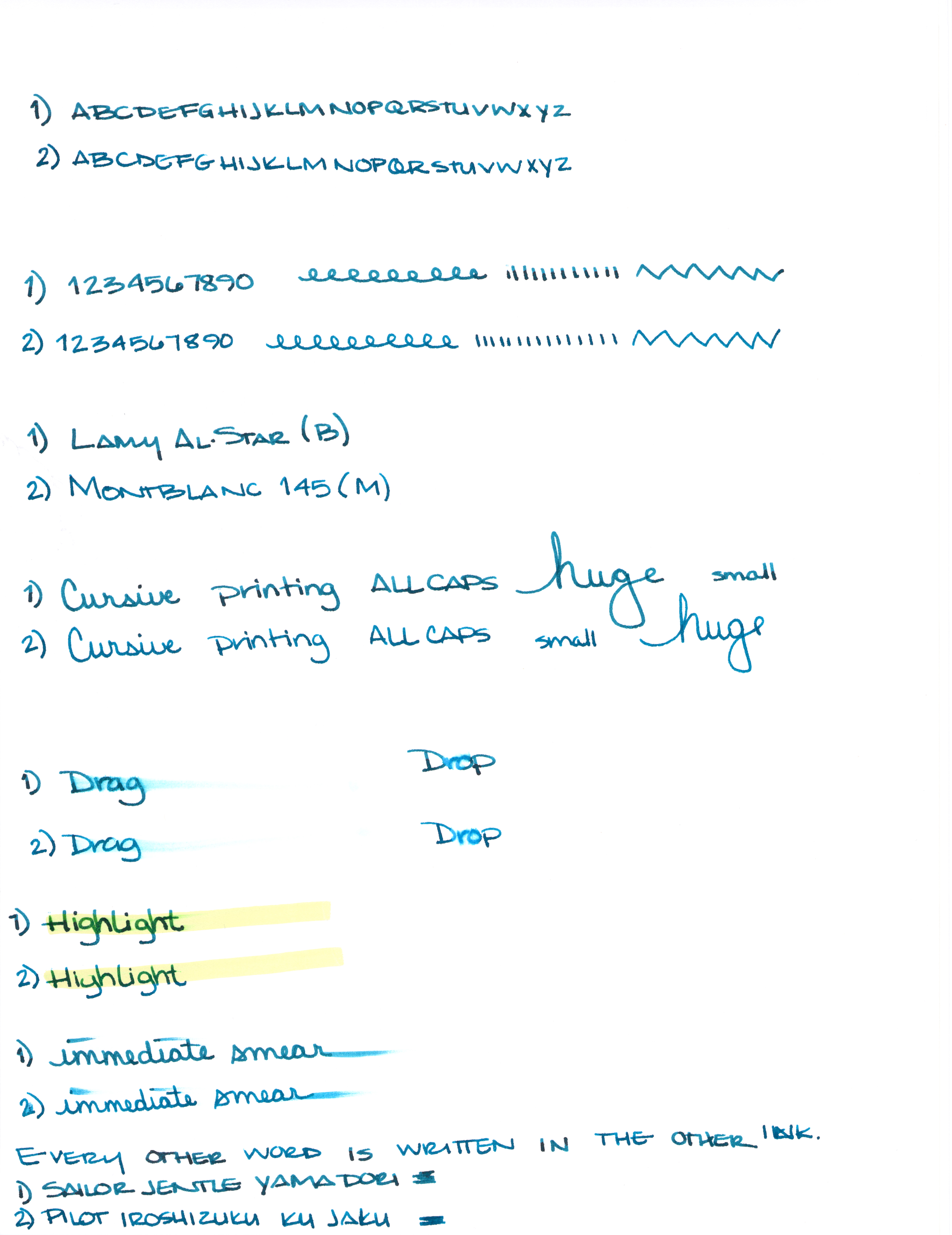
Second, let me tell you how I worked this thing:  I loaded up four Pilot Metropolitan (medium nib) fountain pens and got to writing on Clairefontaine 90gsm paper. Lots of writing. So much writing. Then, I set everything aside and didn’t think about these inks for a couple of days. Finally, I wrote just a little more with each of the inks to see if my initial thoughts changed with a little time and separation.

Third, let me spoil things just a little here. You could, seriously, choose any of these four inks and be pretty happy.  They each write wonderfully, flow is great in the Metropolitan, and the color and saturation are right up there with some of the best inks I’ve tried.  These are truly four fabulous blue inks.

Let’s dive in!

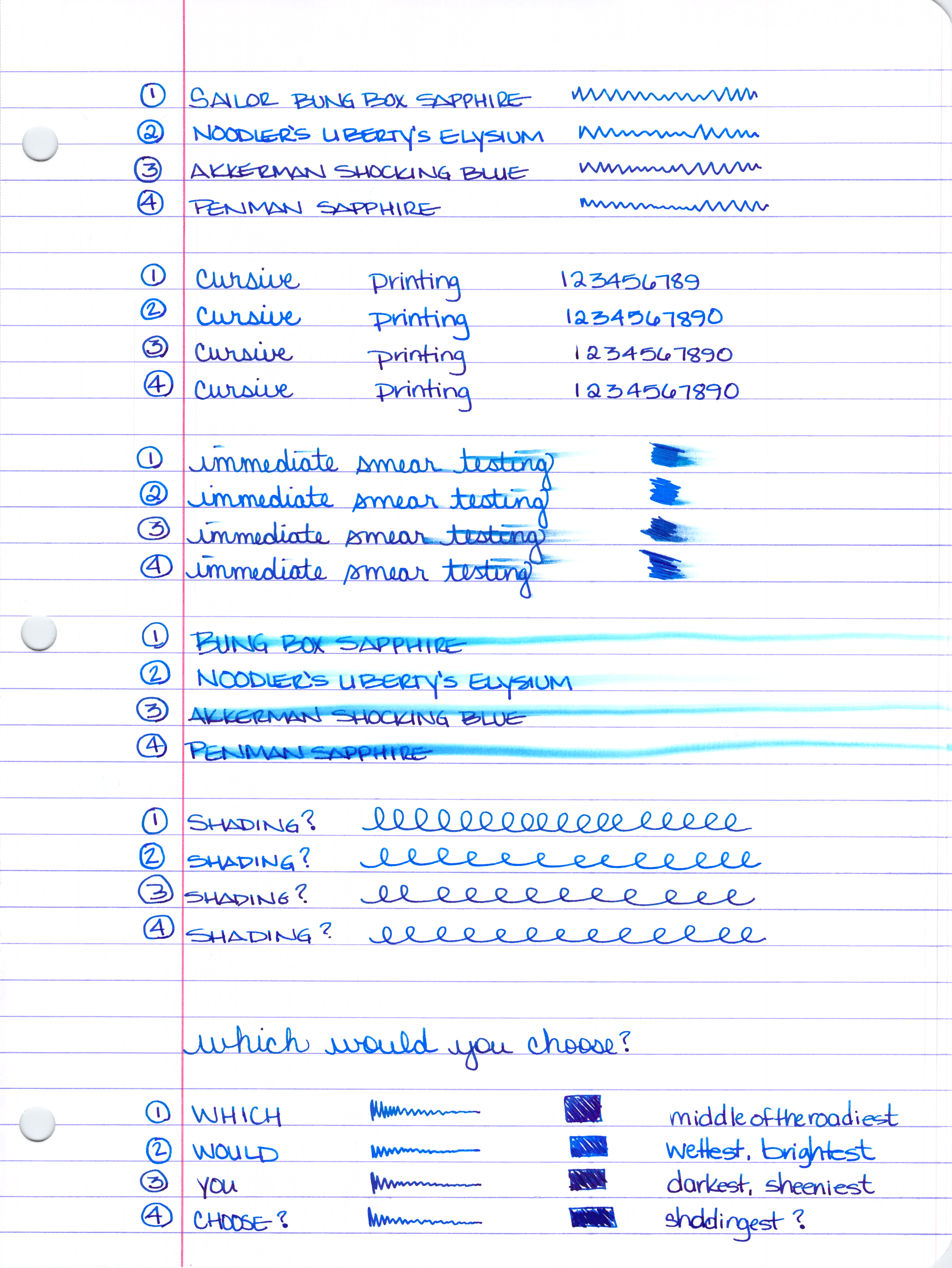
Number 1 above will always be Number 1 (Sailor Bung Box Sapphire) below – same for Number 2, 3, and 4.  I think I could have organized things a little better for you, but you’ll figure it out – I’m confident 😉

Smear Testing . . . 

I wrote a little and then smeared across the writing. Noodler’s Liberty’s Elysium (number 2) and Penman Sapphire look like the winners here. Then, I scribbled back and forth over the same area three times and smeared that – same winners.

Water Smear Testing . . . 

I wrote, let it dry, and then went over my writing with a dampened cotton swab. The clear winner is Noodler’s Liberty’s Elysium. I’d say that the other three inks are about even in their resistance to water.

So, which would you choose?

Still too hard to decide?  Let’s take a closer look.  (Warning: this is where things get really long.)

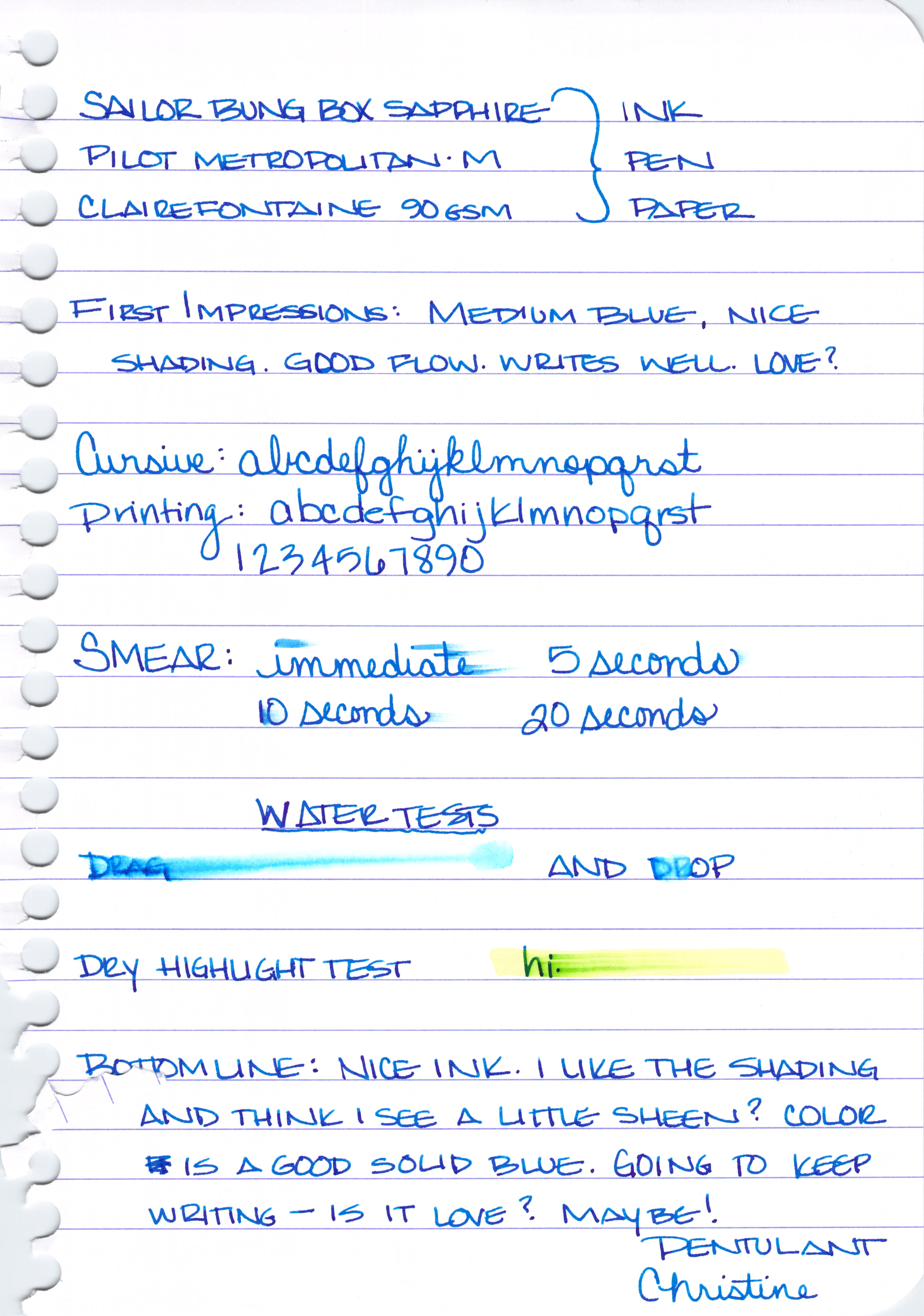
Sailor Bung Box Sapphire Review . . . 

A solid medium blue, maybe not as saturated as the others. Not especially bright, no muddiness to the color. Just straight up blue.

Some nice shading. Would love to give this a go with a super broad nib because I’m seeing some pretty nice red/purple sheen in there, too.

Decent dry times.

 Definitely not water resistant.

And it’s pretty smeary when tested with a highlighter.

My thoughts on Sailor Bung Box Sapphire:

  • i love the color and it’s suitable for any writing occasion
  • nice shading and some serious potential for sheen
  • this ink can be hard to find
  • once you find it, shipping costs may make the whole thing too expensive

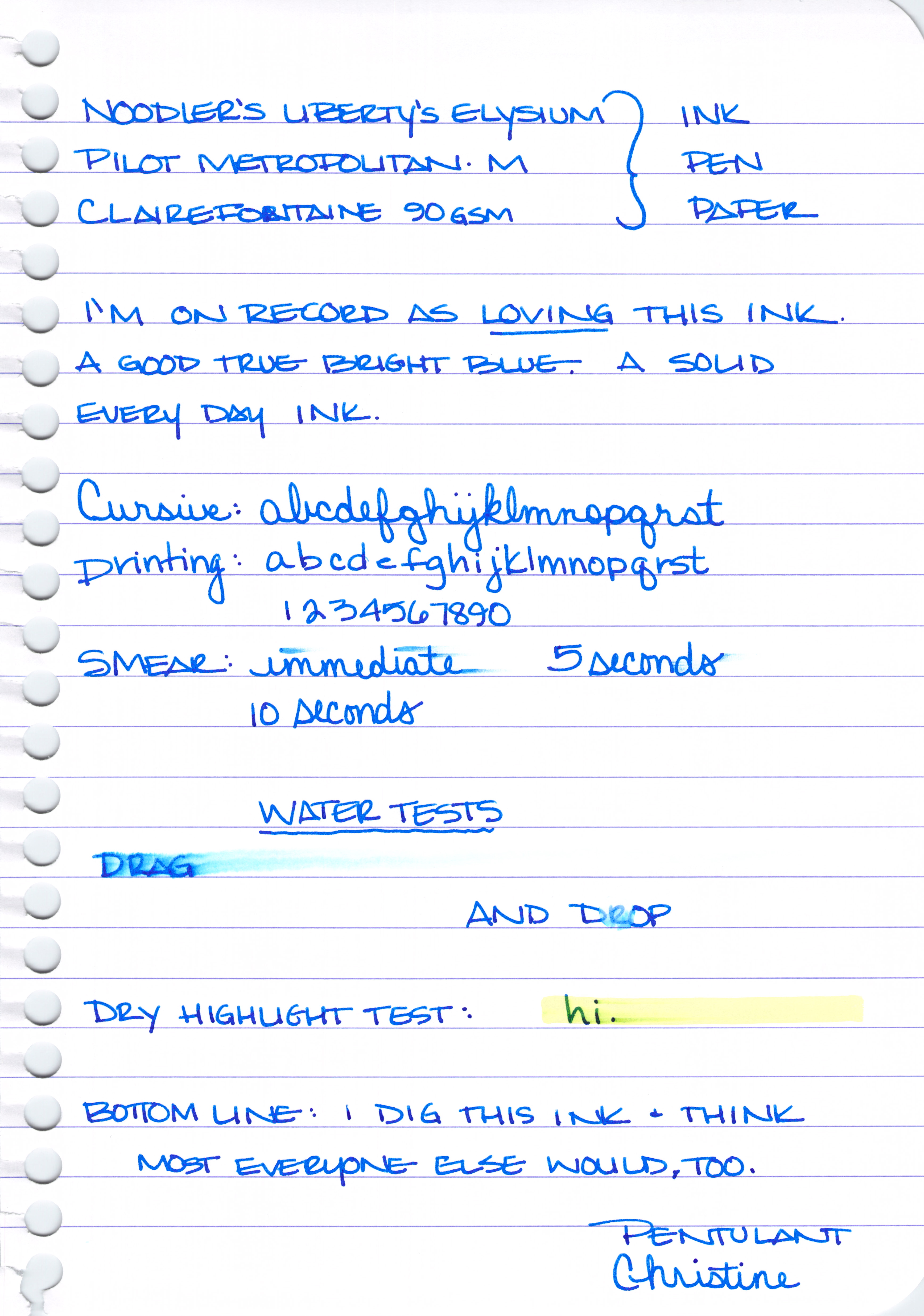
Noodler’s Liberty’s Elysium Review . . .

Pure bright blueness.  

Not a lot of shading and definitely no sheen.

It’s interesting, I wrote in my initial review that this ink is supposed to be water-resistant. I’m positive this writing and the one above had been sitting for at least ten minutes when I dropped the water onto it. Maybe it needs to sit even longer? It’s also supposed to be semi-bullet-proof. I’m not sure exactly what that means, but there you go.

My thoughts on Noodler’s Liberty’s Elysium . . . 
  • this is an ink i own and love
  • the bright color may mean it’s not suitable for some professional settings
  • it’s only available through Goulet Pens – if you’re outside of the US or don’t want to order online, you may be out of luck
  • i’m not finding it particularly water-resistant even though it’s advertised as such

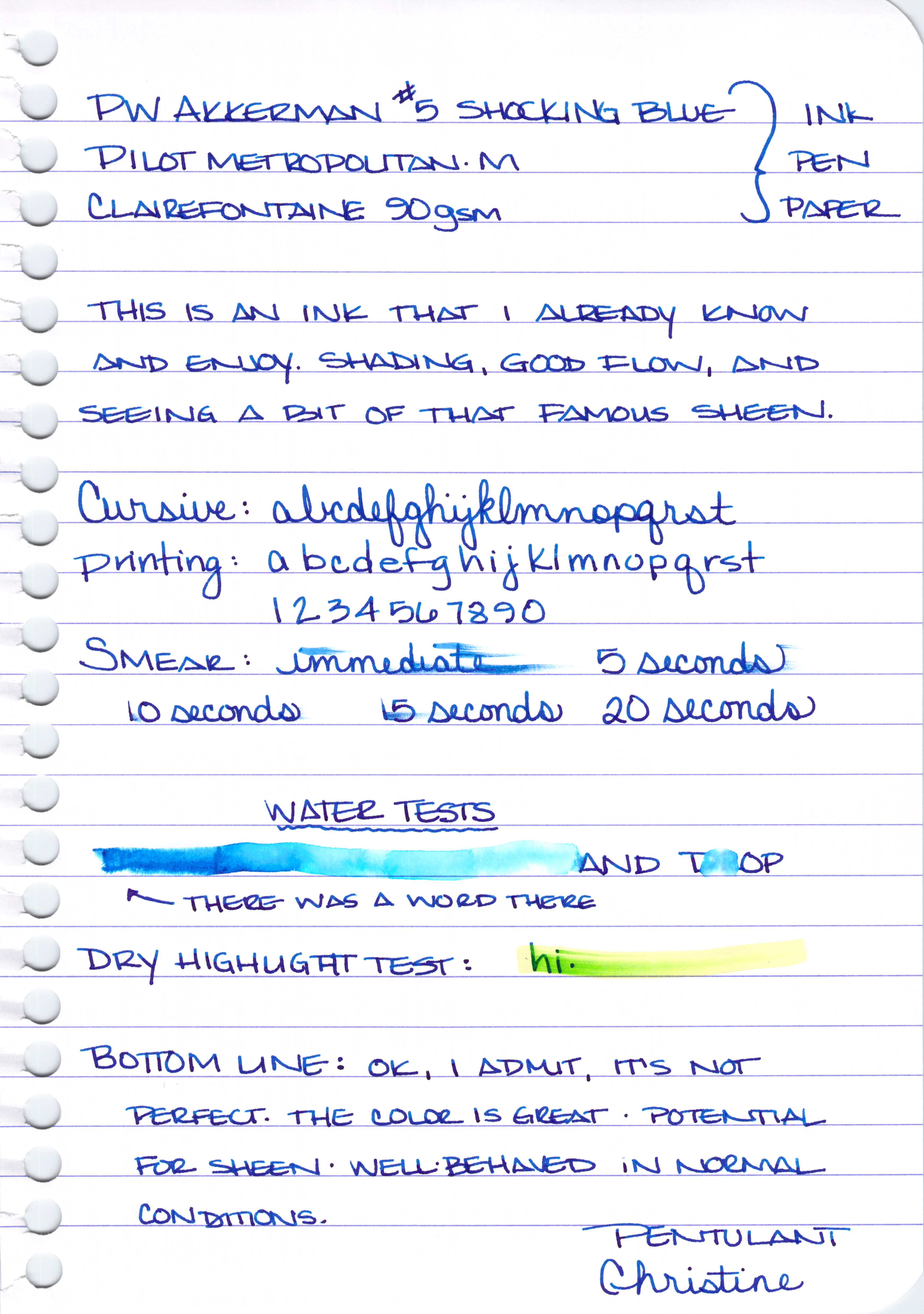
PW Akkerman #5 Shocking Blue Review . . . 


A rich, dark, blue with a reputation for some fantastic red sheen.

Good shading . . .

Nice sheen . . .

It does just ok on the smearing tests . . .

Yikes. I wrote the word “DRAG” and then dragged a wet cotton swab over the writing after the ink had dried. Crazy, right?

And given the above, the below highlight test probably isn’t too much of a surprise.

My thoughts on PW Akkerman #5 Shocking Blue . . .

  • crazy sheening potential from this super-saturated ink
  • fun bottles
  • this ink can be hard to find and international shipping can be expensive. Vanness Pen Shop (in the US) carries the Akkerman line
  • zero water resistance


Parker Penman Sapphire Review . . . 

True blue, dark blue, saturated blue.

Lots of shading and color variation . . .

Great dry time . . .

Not so great water-resistance . . .

Just ok on the highlight testing . . . 
My thoughts on Penman Sapphire . . .
  • i love everything about it – the writing experience is different from all of the others – maybe a little bit more lubrication than the others?
  • impossible to get (i didn’t know this until i started writing the review, but it was the smallest of the samples that Gerald sent and I knew there must be a reason)


That’s it (enough already!) for today.
Just one quick question for you:  which would you choose?
I’ll be back next week with more on these inks. Specifically, I’ll be looking at suitable substitutes for each.  You know, in case you don’t have a time machine so you can pick up a bottle or two of Penman Sapphire 😉
In the meantime, here are links to some full-size images for you (they’re big!) . . . 
Ink Swabs (note, these are a bit out of order)

PEN REVIEW: Montblanc 145 Rose Gold – Meisterstuck 90 Years Anniversary Fountain Pen

It has been busy around here the last couple of weeks!

Mr. Pentulant graduated from his masters program, went on a short vacation, celebrated my birthday while we were away, and Mr. Pentulant started his fancy new job. Busy!

Above is one of my birthday gifts from the mister.  The pen is actually sitting on top of the box in that picture.  Here is the box without the pen . . .

I find it interesting that it’s the 1912 Heritage (or perhaps the original safety pen?) on the sleeve. Also, my understanding from the Montblanc Facebook Page is that the shiny rose gold sleeve is only available for a year.

While I generally am not a huge fan of rose gold, there are so many things to love about this pen – the rose gold is deep and warm, the detailed design of the nib engraving, and (of course) the superb quality and reputation of Montblanc – it was definitely on my wish list.

Mine has a fine nib.  Even the sticker is rose gold . . .

And Mr. Pentulant correctly guessed that I would want a 145 – smaller-sized than the iconic 149 and with a converter rather than piston.

I couldn’t wait to ink it up.

It’s a great pen – the style, the writing. It sounds cliche, but the this pen really is an instant classic.

ACCESSORIES: Here a Swab, There a Swab

I’m obsessed with fountain pen inks (collect them all!) and make swabs of all of the samples I have on these cards. It’s a good solution, but it’s not perfect – the cards are cream-colored and textured rather than white and smooth; I was finding it impossible to sort through them all and figure out which inks I had in full bottles, too.

I found this nifty item at Maido in San Francisco.  (If you only have time to go to one of the Maido stores, head to Japantown. The one in the San Francisco Center Mall is good, but not as many fun Japanese items and the prices seem higher – not sure if they actually are, but that’s the way it seemed.)

Perfect solution! 

Here’s a link to the full-size image of the item with the product information intact. However, this really is just a business card holder – I’m sure any office supply store would be able to help you out with one of those.  Then you’ll just need to find business card size paper (Maido has that, too), and you’ll be all set.

Have fun!