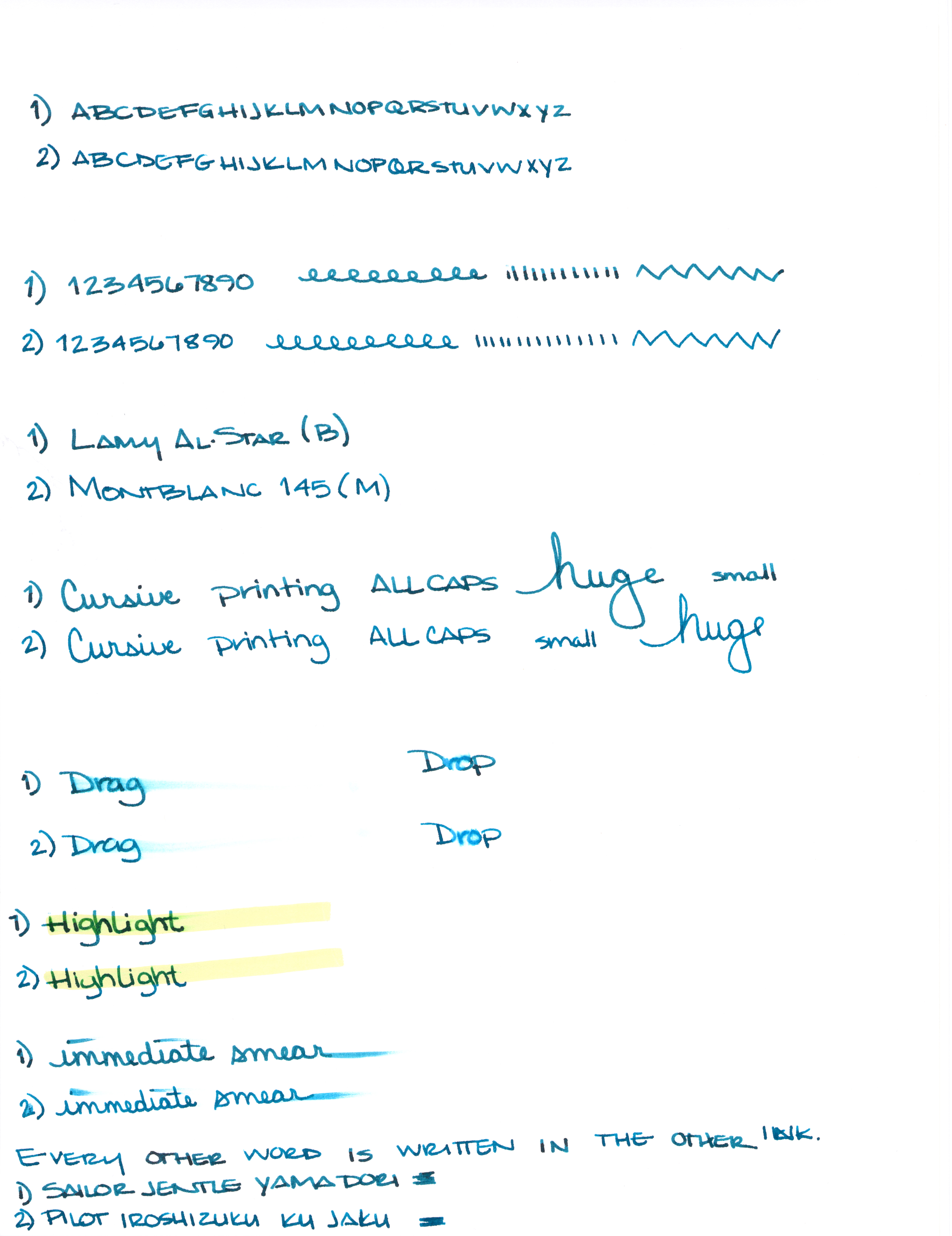
Can you see the differences between these two inks? One color is always on top. The other is always on the bottom.
Let’s take a closer look . . .
Alrighty, which do you like? Both? Neither? They are pretty close, yes? I would choose the top color – but not by much. It’s the shading that made the difference for me. I think I could be happy with either (even though teal isn’t my most favorite color).
Scroll down for the spoiler . . .
What is so interesting to me about this is that Yama-dori is legendary. Ku-jaku gets favorable reviews, but it’s not a Big Deal. The differences are subtle and if they weren’t side-by-side, I wonder if you or I could tell them apart.
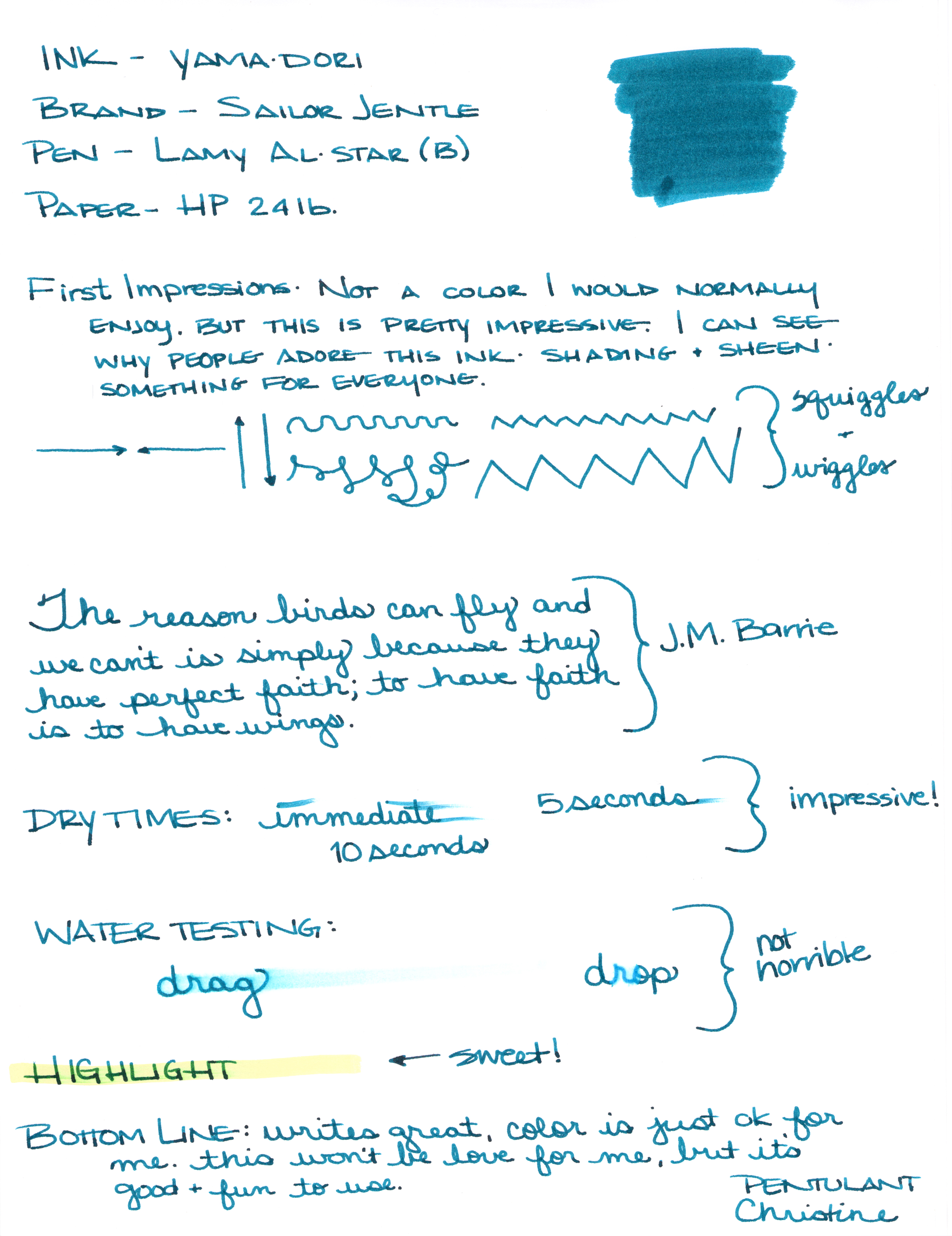
Like I said yesterday, Yama-dori is my E.T. ink. You can read all about that right here.
What do you think? Am I crazy and there’s a huge difference that I’m not appreciating here?


