INK REVIEW: J Herbin Stormy Grey

Handwritten Review: J Herbin – Stormy Grey

There has been so much chatter in the fountain pen community about J Herbin’s Stormy Grey ink. So much anticipation. It’s all about that gold sheen, baby.

When Goulet Pens finally announced that they had it in stock, it was sold out in under an hour – and I missed it. Arrrrgh.

I hurried over to Amazon to see if I could find it there – score! It’s the same price at both places –  $26 for 50 ml.

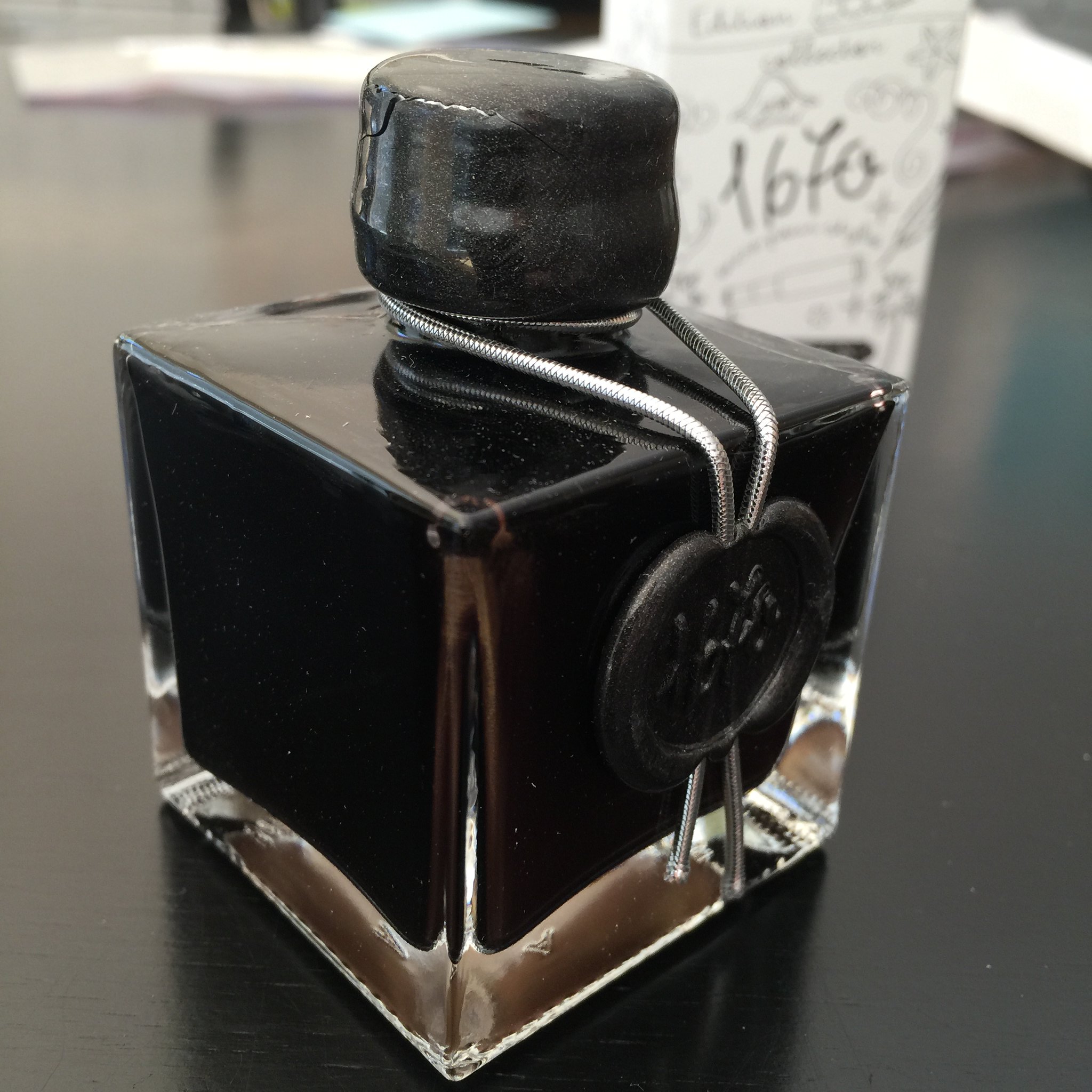
Above: Like the other J Herbin special editions, this bottle is extra special, sealed with wax, and quite lovely. Except that only the smallest pens could fit into the opening of the bottle. And my wax on the screw top is already cracked – whomp whomp.

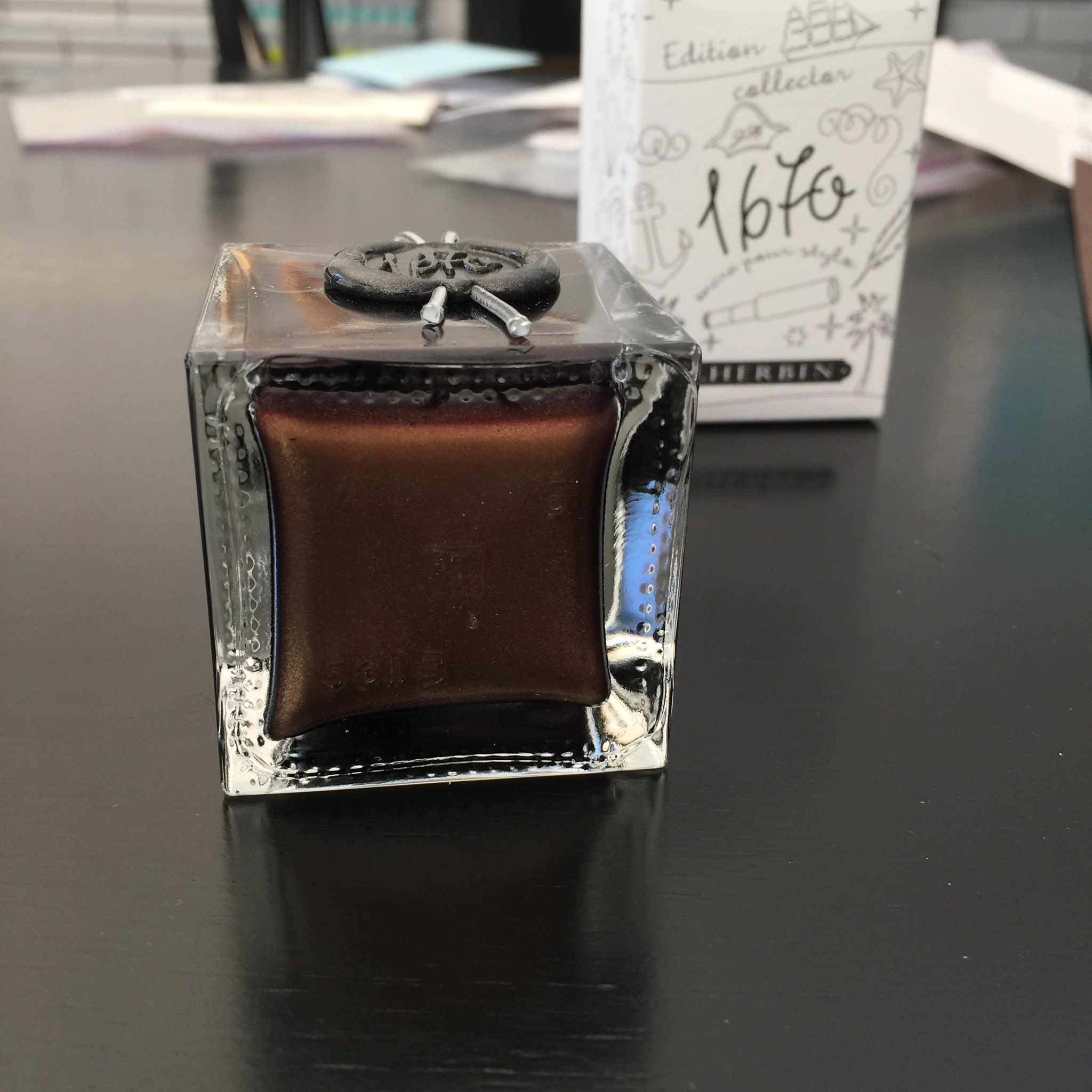
Below: The sheeny bits came to a rest at the bottom of the bottle.  You’ll want to shake well before using this ink.

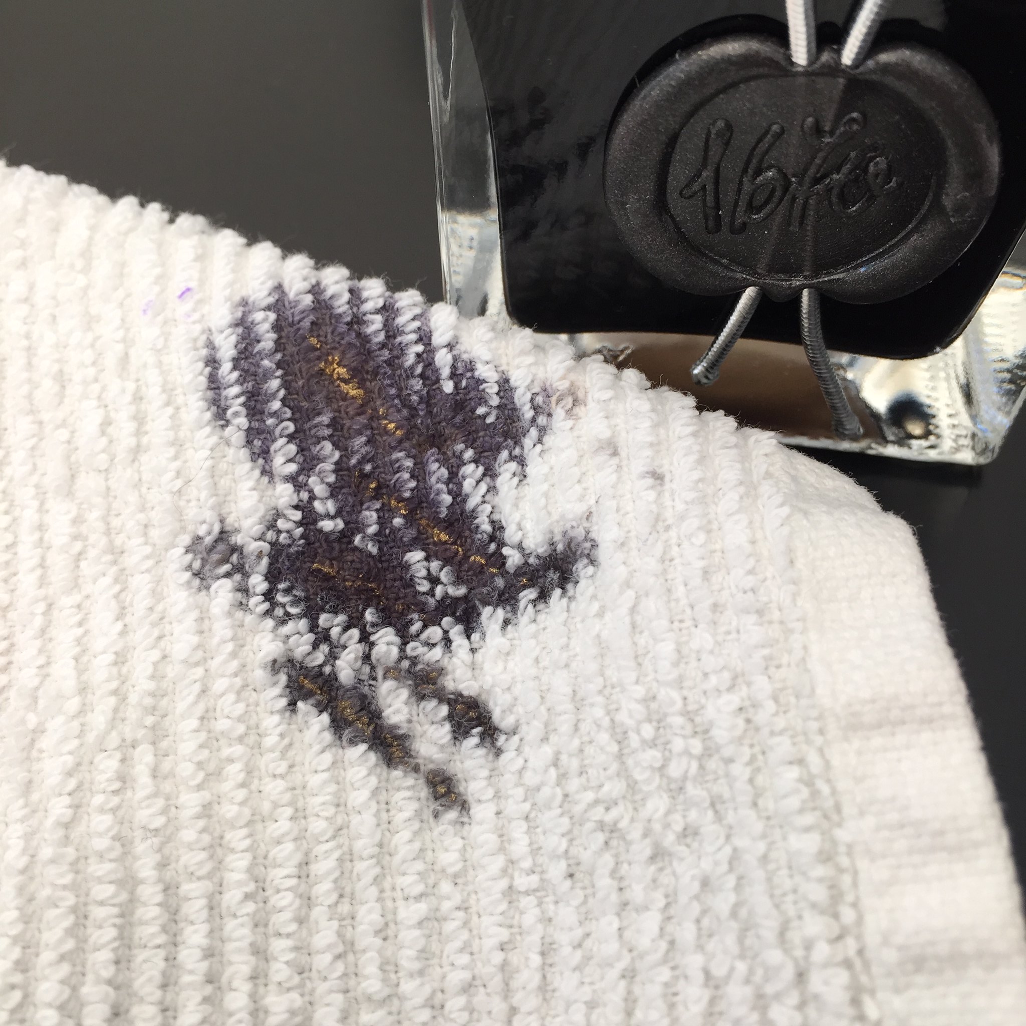
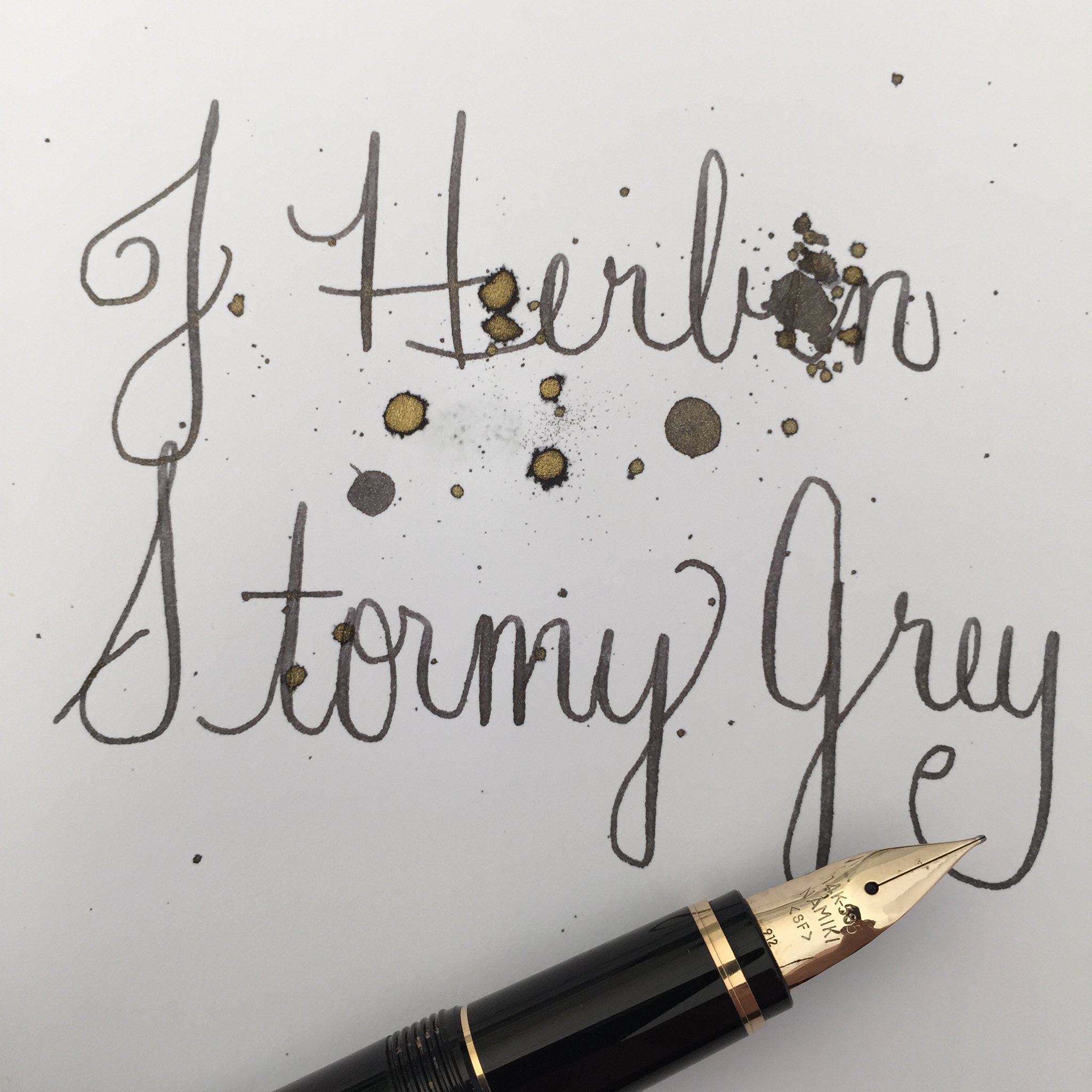
Below: Sheen on the towel that I used to wipe my nib. Crazy, right?

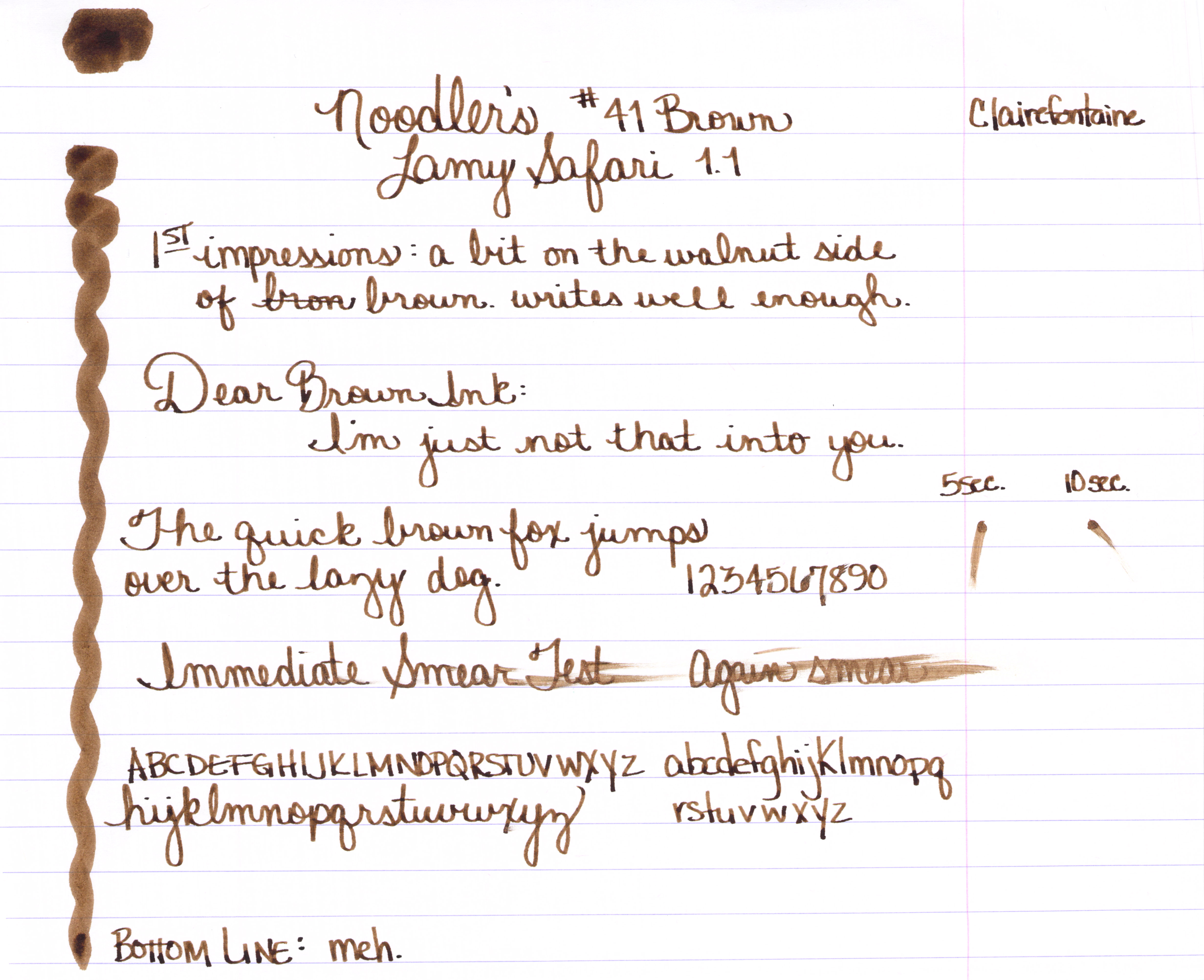
All of that Stormy Grey sheen is just fine, but how does it write?

Quite wonderfully! 
The ink has terrific flow out of the pen (leans toward the wet side, but I like that). There’s some great shading and I really like the darkness of the gray (grey?) color with or without the added fun of the sheen.
Something I noticed that could be a concern – in the bottle, the sheeny bits settled so quickly. I shook the bottle like mad and then quickly pulled the ink into a syringe to fill my pens. If the sheeny bits settle that quickly, what happens in the pen when filled? Will all of the sheeny bits fall to the writing end of the pen and you will get the most sheen from the first few pages – and no sheen at all for the last few? 
The only other downside I can see with this ink is that because of the sheen, it’s not an ink that could be used in every situation. Thankfully, we live in a world that allows us some whimsy now and then.  😉
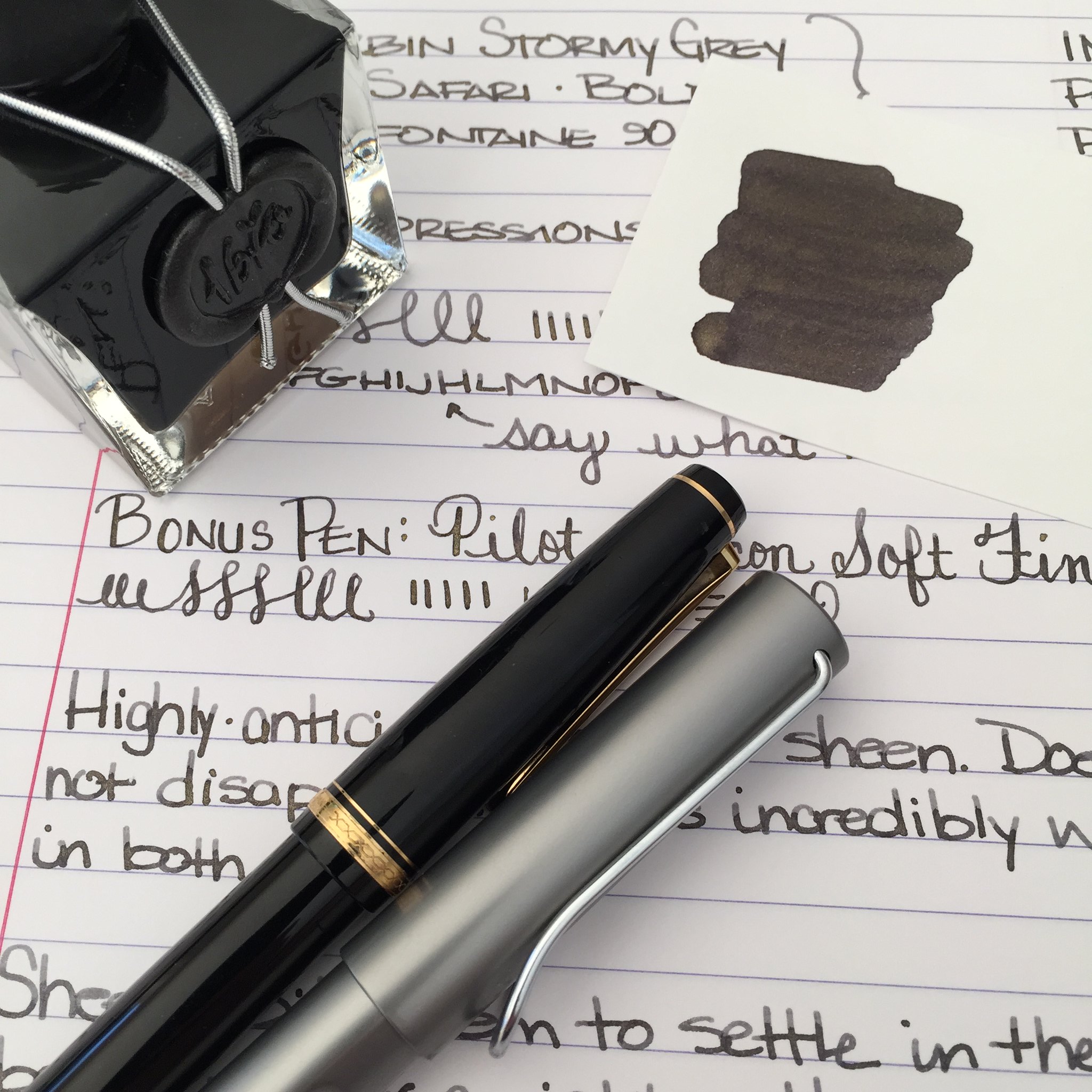
Below: My scanned writing sample doesn’t show much sheen, but it’s definitely there in the right light.

Looking for the sheeniest sheeny picture of them all?  Check out my friend rubengamez’s feed on Instagram. It’s crazy good sheen!

https://instagram.com/p/uEbTlGBafn

INK REVIEW: Noodler’s Luxury Blue

A handwritten review of Noodler’s Luxury Blue fountain pen ink.

Noodler’s Luxury Blue is from the line of Noodler’s Eternal Inks. That is, they are meant to be water, light, and (yes, folks) even bleach-proof. These forever inks are sometimes referred to as bulletproof and fraud-resistant.

While I won’t take the time to list them all here, here’s a link to the bulletproof inks that Goulet Pens carries.

Let’s dive in . . .

A good medium blue with some nice shading.
No flow issue or other complaints from me.

Some reviewers have published pictures and statements that indicate that the ink is more dusky/chalky than I have shown here.  This is a little surprising to me because while the ink is not super-saturated, the color is definitely clear and bright.

Noodler’s Luxury Blue is an expensive ink. As of this writing, it is $13.50 for one ounce at Goulet Pens. Meanwhile, another bulletproof ink (Bad Belted Kingfisher) is $12.50 for three ounces.

Bottom line:  I like it, I don’t love it.

Have you tried this ink? I’d love to hear your thoughts.

INK REVIEW: Montblanc Daniel Defoe – Palm Green

Handwritten Ink Review – Montblanc Palm Green
Montblanc recently released their newest ink: Daniel Defoe – Palm Green.

It’s a darkish yellow-green. 

It’s not super-saturated and it writes great – no problems at all out of the pen.
Amazing shading? Yes!
Daniel Defoe – loving the shading.
At first glance, I was concerned that this ink would be too much like DeAtramentis’s Saraha Grey, but it really is much more dark with more depth of color than that. And then I thought it might be a bit like Sailor Jentle Epinard (now discontinued), but it really is much more pretty than that, with less blue in the ink.

I’m not 100% convinced that the color is for me. I’m generally a fan of clean green colors. For example, Noodler’s Gruene Cactus Eel is appealing to me.

Having said that, though, I will also say that Daniel Defoe and his Palm Green ink is growing on me a quite bit in the week or so that I’ve had it.

I’m going to check in soon with an update after I’ve used it a bit more.  What do you think?  Love it, have to have it?

INK REVIEW & GIVEAWAY: Diamine Sepia

Handwritten Review – Diamine Sepia

Happy Wednesday!

Today, I’m giving away a full-sized bottle of Diamine Sepia Fountain Pen Ink.  I know, I know you were hoping it was the pen. Sorry.   #sorrynotsorry

When I learned that Goulet Pens was sending me the Fall 2014 Edition of  Edison Nouveau Premiere and a bottle of ink, I suggested that they could also send me a sample of the same ink. “I’ll use the sample and giveaway the bottle.”

I had no idea which ink they were sending, but when I saw that it was sepia, I was so glad I was only getting the sample-sized.  Brown inks are a waste on me. Ick.
At least they used to be. And then I fell in love with J Herbin’s Lie de The
And now this:
Diamine Sepia Ink Swap
Let’s dive in . . . 

A beautiful golden brown – with perhaps a bit of red?
No green or gray to muddy things up.
Shading makes me happy.
cRaZy shading makes me crazy happy.
I love this ink. The color is great, saturation is good, there is definitely shading. No bleeding, minimal show through (ghosting).
Water resistance isn’t super-important to me. Good thing, too . . . .
You’ll also note on the full review (click here for full-size version) that the color seems to be less saturated as I get further down on the page.  Totally user error. I was having trouble filling from the sample bottle and ended up with ink clinging to the converter. A small twist of the converter got me going again.
Here’s the review I wrote for the pen review. Click here for the full-size.
Bottom line?  I’ve added this ink to my wish list so that I can keep my word and give you this full-sized unopened bottle.
Leave a comment below to be entered to win. Remember to tell me how to get in touch with you. Open to US mailing addresses only (so sorry, international friends). Entry must be received by Wednesday, September 17. Winner will be announced on Friday, September 19.

Of course, you can always order Diamine Sepia from Goulet Pens.

Good luck!!

xo

EDITED TO ADD: After you’ve entered to win this ink, run on over to Ink Nouveau and enter to win the pen! I’m catching up on my blogs and just saw that you enter to win until the end of today!

PEN REVIEW: Edison Nouveau Premiere Autumn Harvest (Fall 2014 Special Edition Fountain Pen)

Edison Nouveau Premiere
Fall 2014 Special Edition Fountain Pen
Hello Fall!!!

Edison Nouveau Premiere 
Fall 2014
Screw Cap

They are calling it Autumn Harvest.

I was thinking the fall edition might be conservative and concerned that could mean that it wouldn’t have been. . . uh . . . as wonderfully special as those two.  CraZy!

Shades of brown mixed with hues of gold – light mixed with dark – flecks and flakes mixed with discreet swirls.

This is a fountain pen that can go anywhere with anyone and fit in comfortably. It can be dressed up with a business suit or go casual with jeans.

Gold-tone trim (fancy people call this the pen’s “furniture”). Two-toned steel nib (mine is a broad and I think you should go broad, too).

Convenient Converter Fill

It has an almost vintage feel to it, yes? Vintage, but not old. The design is so modern.

This isn’t your grandpa’s fountain pen (not that there’s anything wrong with that!).

OK, so it’s pretty handsome, but how does the Edison Nouveau Premiere Autumn Harvest (Fall 2014 Special Edition) Fountain Pen write?

Swoooooon

Click here to see the full-sized handwritten review.

Things to know . . .

. . . . Goulet Pens graciously sent me this pen in exchange for my honest review. As a special edition, they are predicting that the pen will be available through November 2014. If sales are greater than expected, they could be out of stock sooner. You can get yours for $149 right here.

. . . . I have a giveaway (and more pictures of this beauty) coming up on Wednesday – hoping you’ll come back and check it out.

Your turn . . . love it? hate it? Does it make you look froward to fall?

INK REVIEW: Private Reserve Arabian Rose

I have a zillion ink samples and sometimes I know exactly which I want to try next. A couple of weeks ago, though, I was in a funk. I knew I wanted to try a new (to me) ink, but I was feeling ambivalent about exactly which ink to try.  Reaching my hand into my samples, I pulled out Private Reserve Arabian Rose.

The color is nice. It reminds me a bit of Yama-budo, though not as bright.

Lots of good shading.

Flow from the pen is great. No feathering, bleeding, or ghosting on the various decent-quality papers I’ve used over the last couple of weeks.

Water resistance isn’t a big factor in choosing an ink for me – if it is for you, you may want to look elsewhere.

My bottom line?  I like it quite a bit.  Preferring Yama-budo, this ink isn’t one that I would normally choose for myself, but I will almost certainly use the entire sample without complaint.

All of this makes me wonder – do you prefer the super-bright, in-your-face colors, or something a bit more dusky like this purply color?