Category Archives: INKS
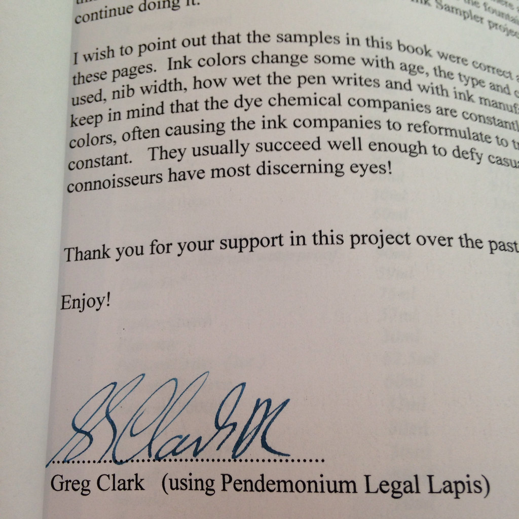
FOUNTAIN PEN INK: A Sampler by Greg Clark
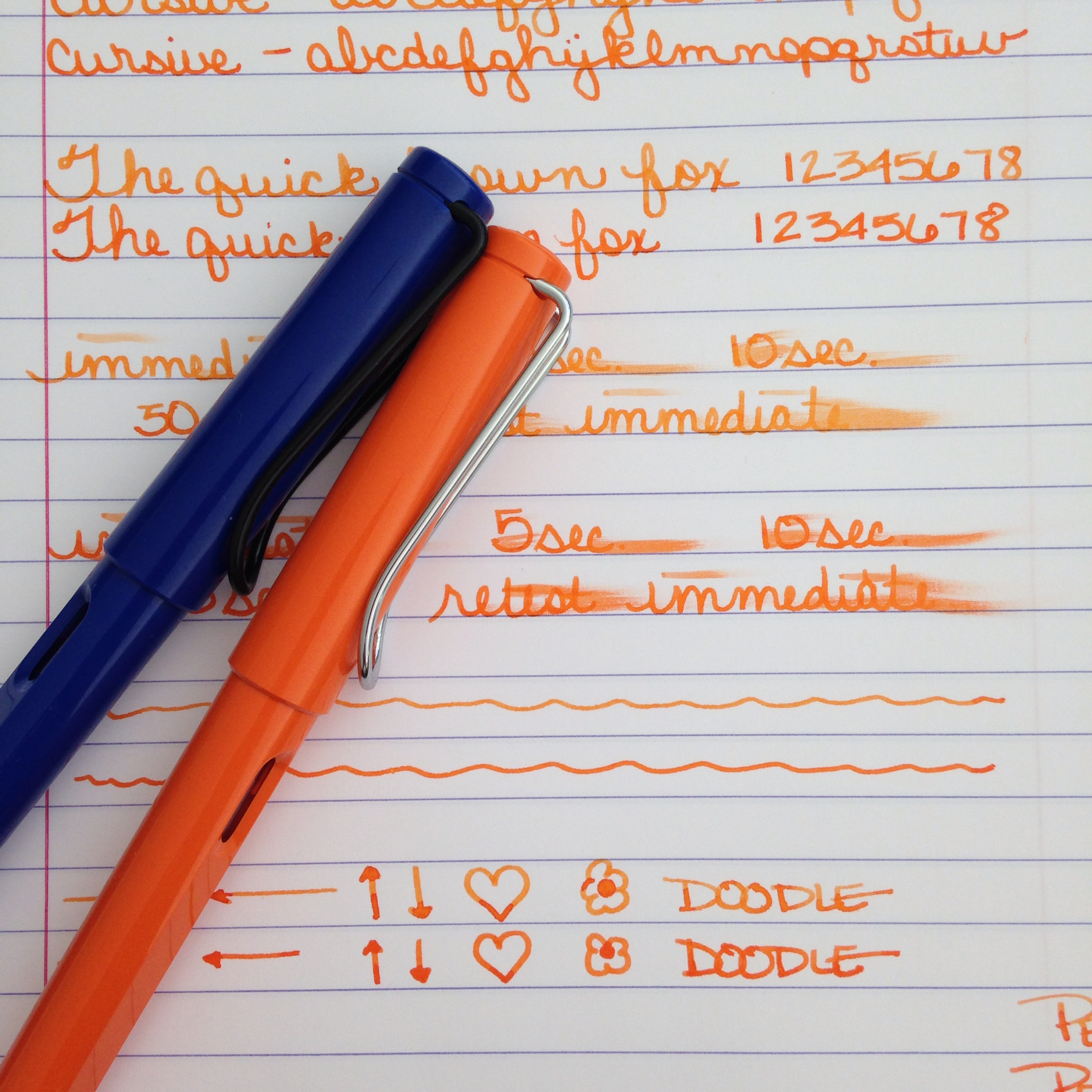
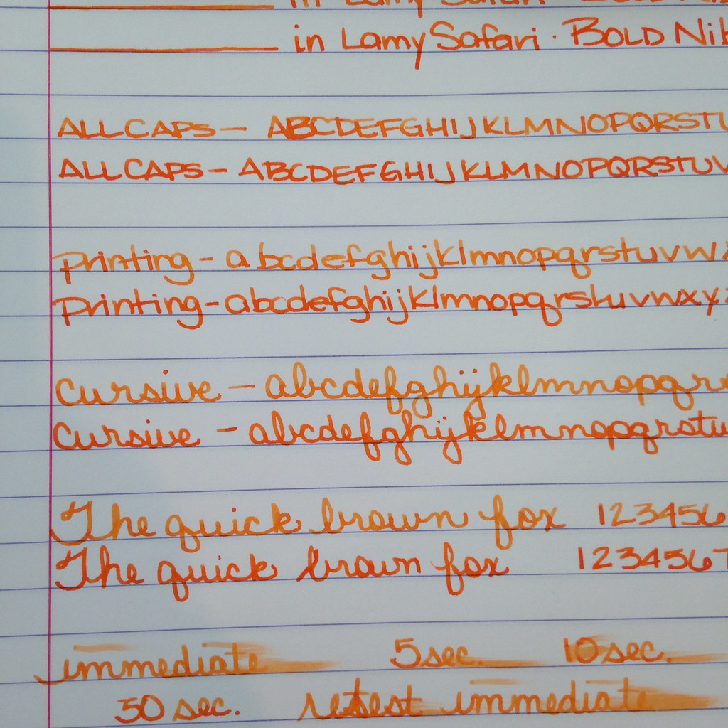
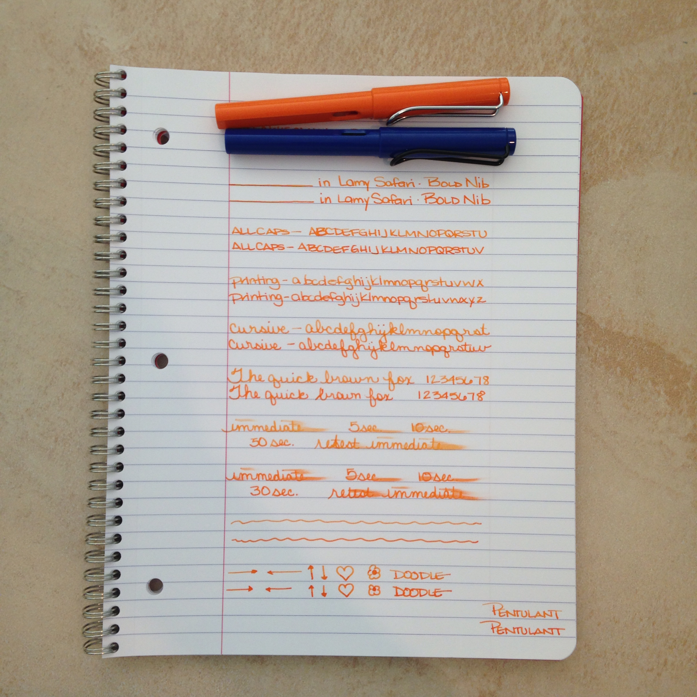
Anyone who follows me anywhere (and anyone who comes to my house – ha!) knows that I’m slightly obsessed with ink. Swabs, samples, bottles, and more – I love ink. I like to say that I’m working on collecting them all. Only kind joking. (The above is Noodler’s Habanero on Tomoe River Paper.)
A few weeks ago, Mr. Pentulant and I had friends over for a delightful afternoon of board games. The topic of my ink addiction came up and one of our friends said, “Hey, I had a friend who wrote a book about fountain pen inks once.”
What!? Say what?!
Something about swabs on all of the pages (and I’m thinking, “No way!”) and next thing you know, our friend is texting the wife of the guy. But, no, that book has been out of print for a number of years.
Well, the end, right?
Wrong!!
Mr. Pentulant regularly trolls the For Sale section of Fountain Pen Network and in an amazing bit of unbeknownst-to-me serendipity, the book showed up for sale there!!!
Saturday was the one year anniversary of our marriage. Among other wonderful things, Mr. Pentulant presented me with the book. True love.
The book is in excellent condition. The previous owner says it was stored in drawer to protect it from light – and, really, the swabs look like they could have been done just a week or two ago and not in 2007 as indicated in the text.
It’s interesting to see some very familiar brands and colors – and it’s also interesting to see which brands and colors have not survived.
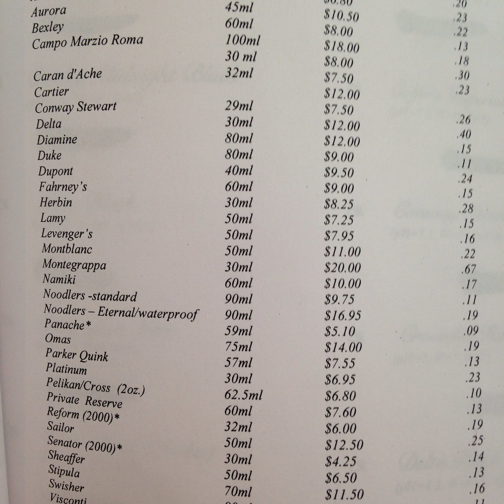
I see this book/project as a snapshot of a moment in time. The pricing guide, the availability of certain inks, and the articles included in the concerning the changes happening with fountain pen inks.
Granted, this isn’t an incredible piece of history (it was published in 2007), but it is a record of someone’s love for something I love – and that’s pretty special.
Tradition says that paper is the gift one gives for first anniversaries – Mr. Pentulant sure got it right with this. (Not to mention our other crazy paper adventures over the weekend – but more on that another time.)
What do you think? Would you be crazy for an item like this, too?
INK REVIEW and COMPARISON: Yama-budo -vs- Black Swan in Australian Roses
Back in January, I did a quickie review of Noodler’s Black Swan in Australian Roses (BSIAR) – I didn’t love it. I didn’t hate it. A week or so ago, I received a larger sample of it along with a sample of Pilot Iroshizuku Yama-budo.
I’d heard so many wonderful things about about Yama-budo that I didn’t wait too long to ink my Pelikan M320 and take it for a spin.
And because I was inking pens, I inked a Lamy Al-Star with BSIAR and decided to compare and contrast it with Yama-budo.
In each of my pairs of writing, Yama-budo will be on top.
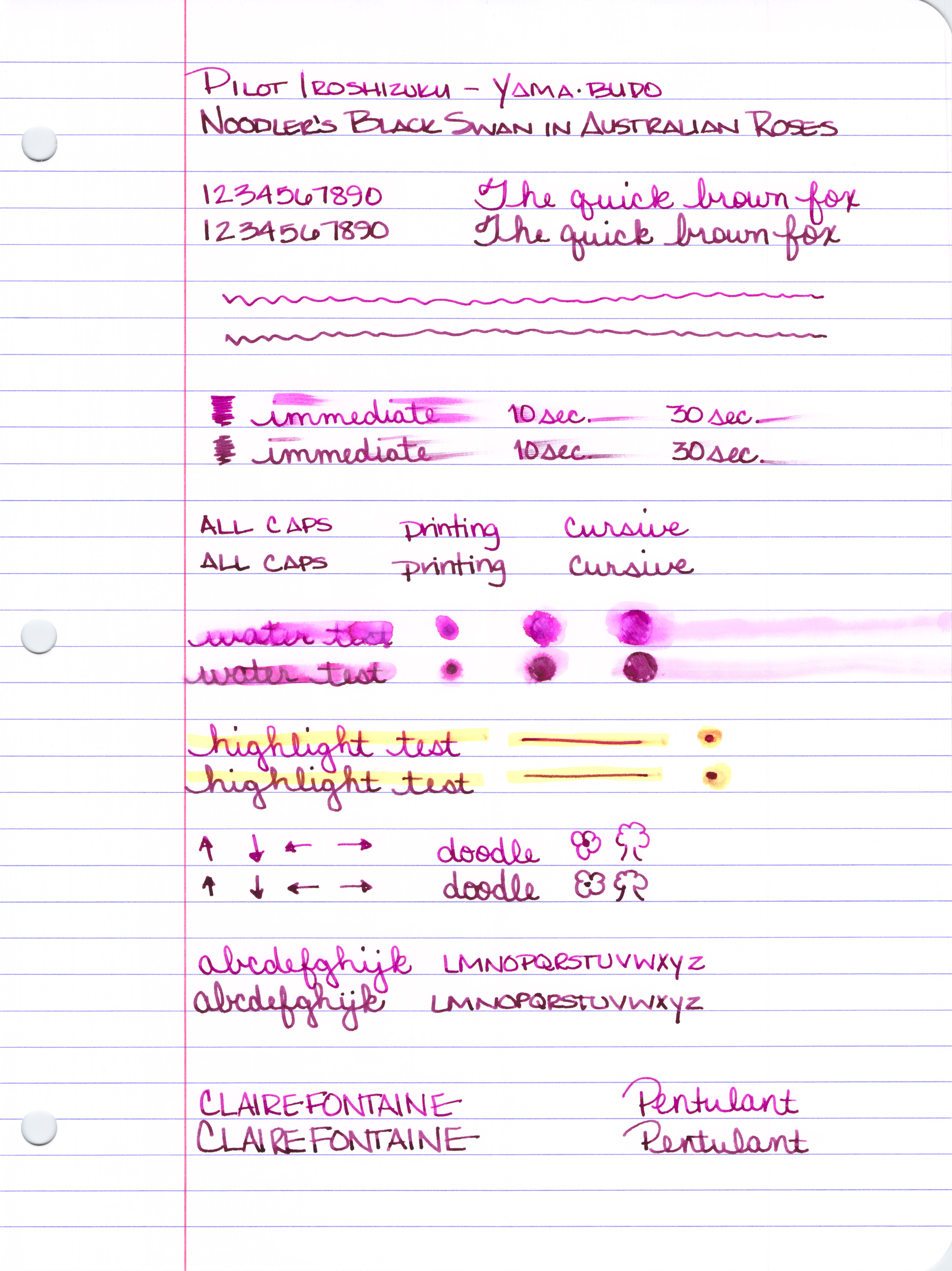
The color of each reminds me of grapes. I’d originally said that BSIAR was bordeaux in color and my first thought about Yama-budo was that it reminded me of melty grape sorbet. In looking at the colors right next to each other, I’m confident with each of those descriptions. Yama-budo looks fresh and BSIAR has a more aged look to it. Yama-budo is a bit brighter while BSIAR has a little muddiness to its darker color.
Shading? They both shade, but there seems to be more variation with Yama-budo. Yama-budo goes from an almost bright pink to a deeper purple color while BSIAR seems to remain various shades of the same color.
Saturation is about equal (and very good) with both inks.
I experienced no trouble writing with either ink. Flow was good, neither was excessively wet nor dry. Each is a good quality ink.
There’s no feathering, or bleed through with either. Yama-budo did have some ghosting on Clairefontaine paper, but just when dotting the letter i in a couple of places – so minor that I almost didn’t mention it.
Yama-budo was more likely to smear right out of the gate, but by the time 30 seconds had passed, things were just about even.
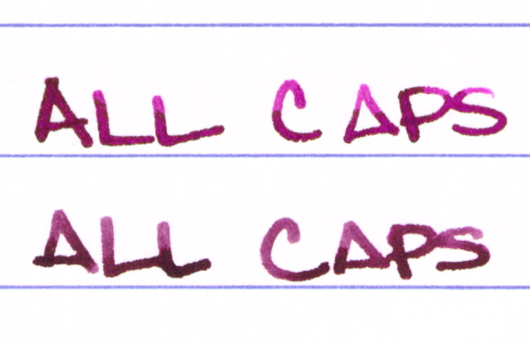
Again, Yama-budo on top and BSIAR under . . .
I regularly write in all caps…
Here’s the entire review sheet . . .
Click Here to see it full size (it’s huge).
So, what’s my bottom line? I’ve ordered a full-sized bottle of Yama-budo. While the color difference isn’t huge, the brightness and amount of shading made all of the difference for me.
There are so many ink choices out there that it is the subtle things that make all of the difference between “just ok,” and “love it!”
Having said that, if you like the color of each of these inks and the brightness doesn’t matter that much to you (or maybe you even prefer the darker color?), save yourself the bucks and go with Black Swan in Australian Roses. Goulet Pens (no association except I spend so much of my paycheck there) sells BSIAR for less than half of what Yama-budo goes for. ($12.50 -vs- $28, respectively)
What do you think? Black Swan in Australian Roses or Yama-budo? Neither? Both?
INK REVIEW: DE ATRAMENTIS ANTIQUE PINK
 |
| De Atramentis Antique Pink |
I’m not the biggest fan of pink inks. I found one that I love (Diamine Flamingo Pink), but otherwise, they are mostly a curiosity for me.
When I think of Antique Pink, the color that comes to mind is perhaps something like a ballet slipper pink. When De Atramentis thinks of Antique Pink, they think of something that is a bit more purple than I’d expect…
 |
| De Atramentis Antique Pink Writing Sample |
With that out of the way, this ink is nice. It’s ok. It writes well in the pen, looks good on the paper. There is no bleeding or feathering. Smear times are decent. (I used a Rhodia Dot Pad for this review.)
If you’re looking for a pink fountain pen ink that leans a bit toward the purple, this color could be the one for you.
There is even some shading – always nice. (I was using the Pilot Falcon for this review – the pen flexes a bit and that could account for some of the shading here, but there is potential.)
So…here’s my bottom line: it’s ok.
Pink inks – love ’em or hate ’em?
What are you writing with this week?
INK REVIEW: AKKERMAN SIMPLISTIES VIOLET
 |
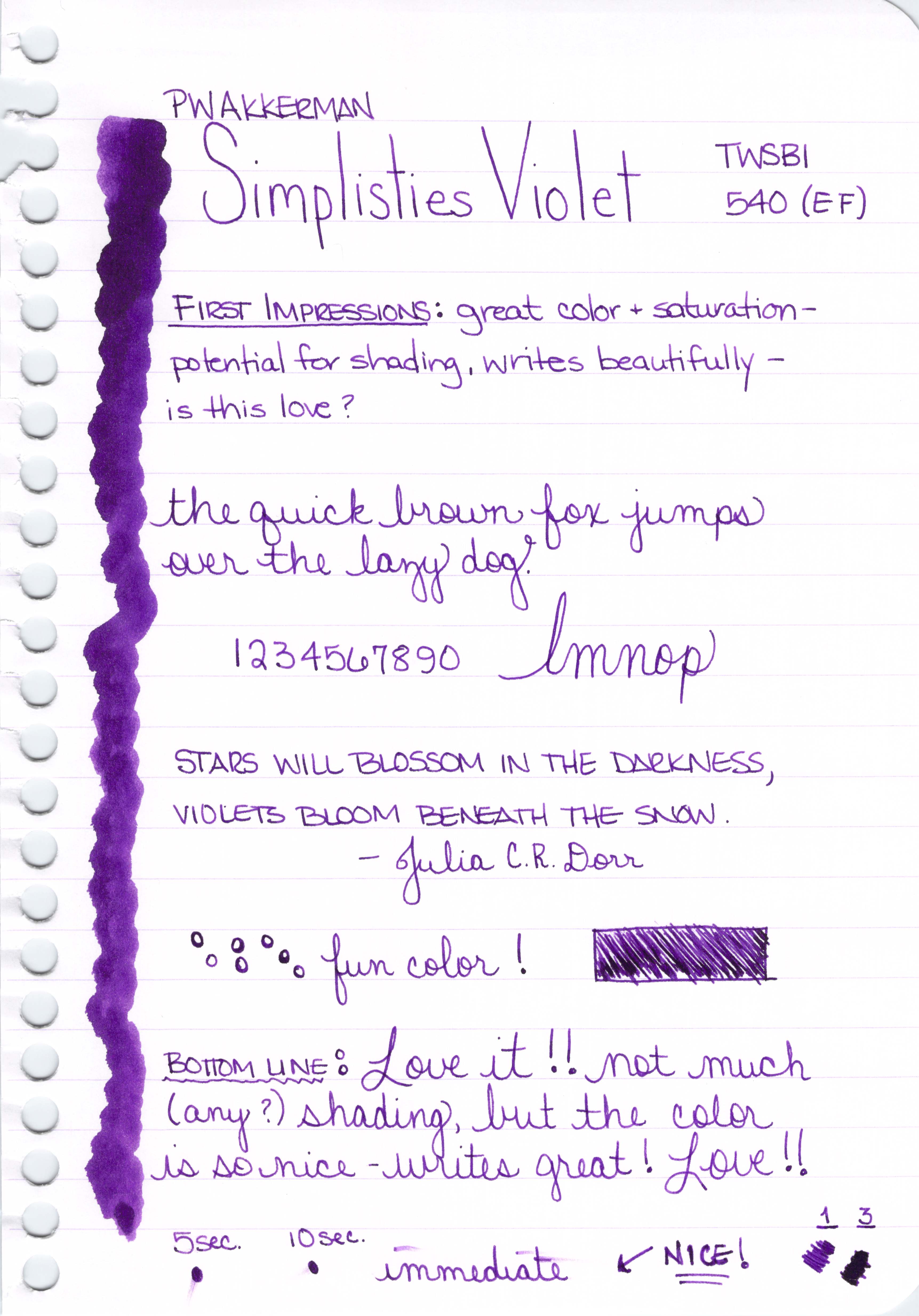
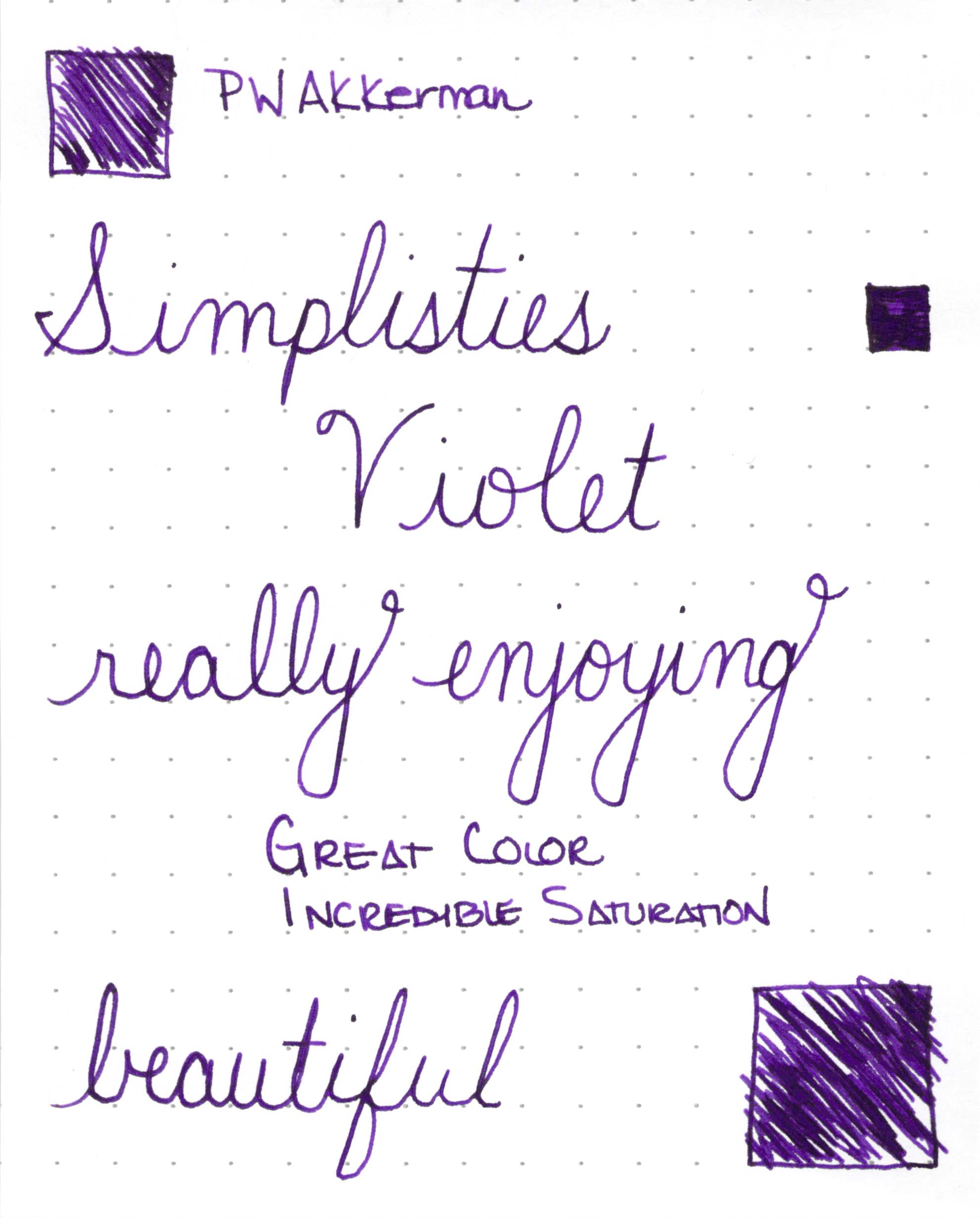
| PW AKKERMAN SIMPLISTIES VIOLET FOUNTAIN PEN INK REVIEW |
Hello purple!
I’ve had this ink for quite awhile, but am just getting around to a good review of it. Akkerman inks have been on my mind because they recently announced a new smaller-sized bottle. The inks come from the Netherlands and shipping isn’t cheap (neither is the ink), but those bottles. Goodness.
 |
| Akkerman Ink Bottle Size Comparison (New on the left.) |
 |
| Closer look at Akkerman Ink Bottle |
 |
| Click for Full-Size Image |
Back to Simplisties Violet – it’s a gorgeous ink. Writes great. Amazing deep, dark color and saturation. I’m not seeing any shading here, but I wonder if I would with a broad nib.
INK REVIEW: Diamine Sunset
 |
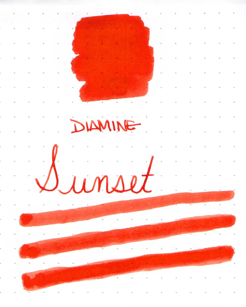
| Diamine Sunset Ink Swab |
 |
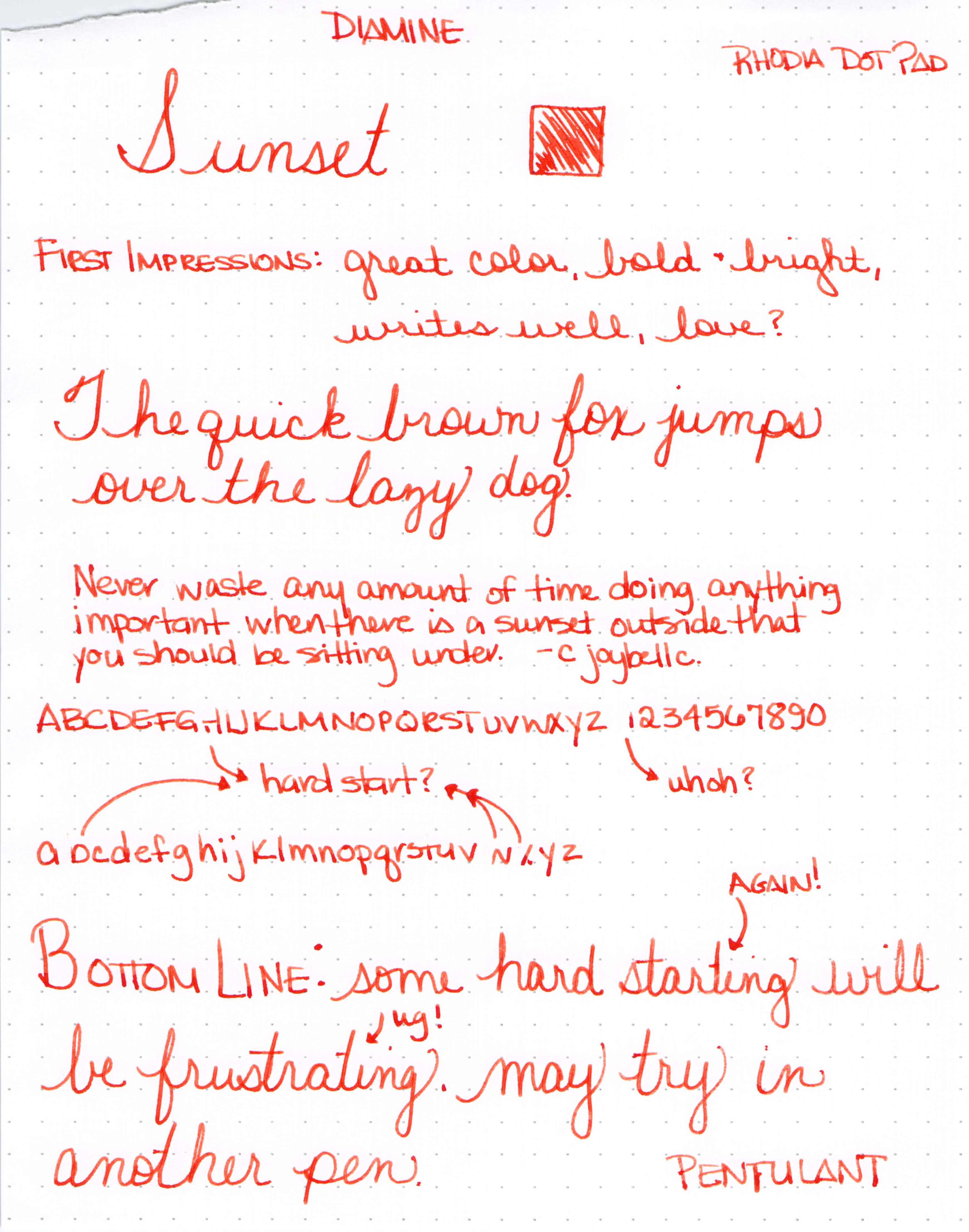
| Diamine Sunset Writing Sample with Lamy Safari (B) |
 |
| Click for Full-Size |
 |
| Click for Full-Size |
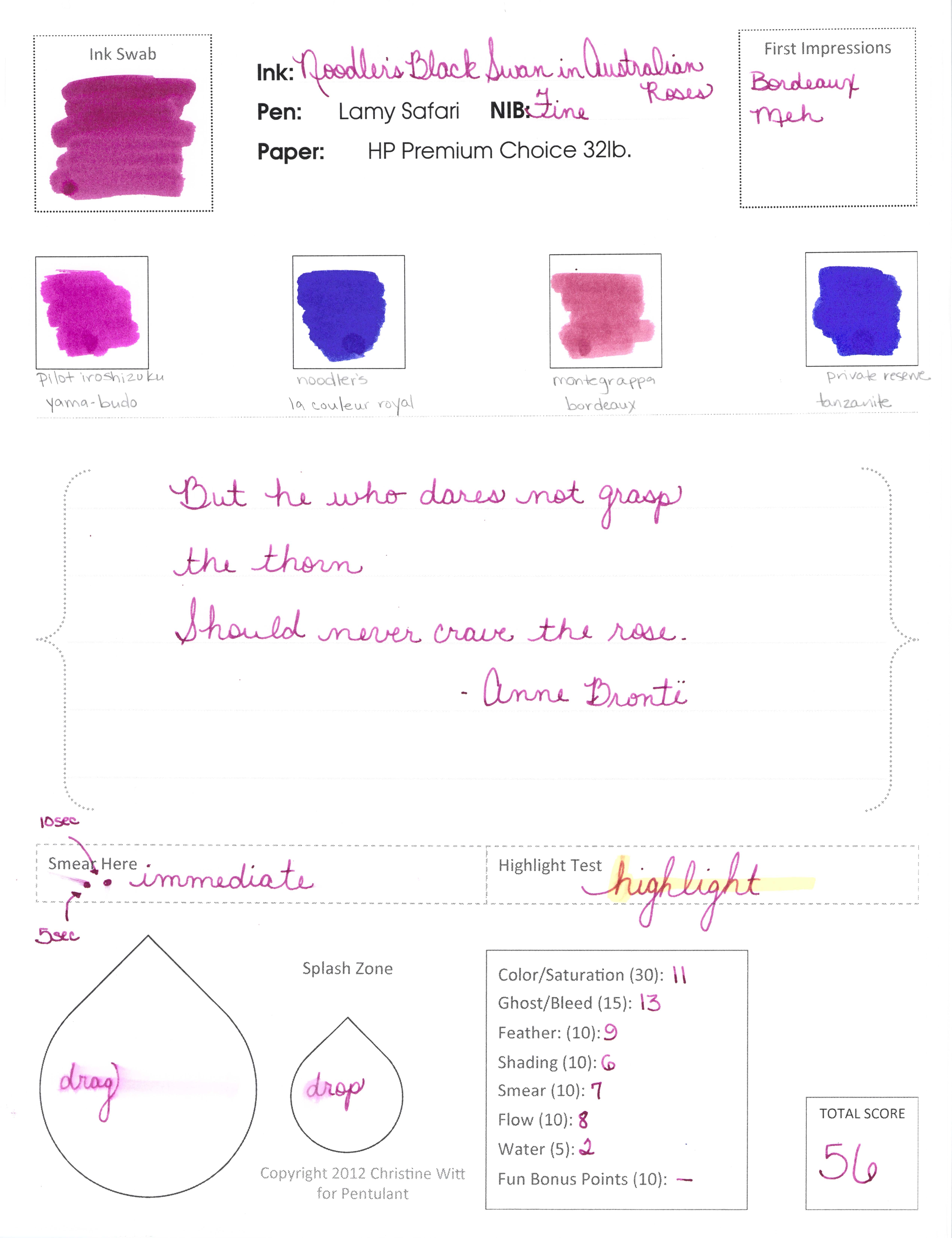
INK REVIEW: Noodler’s Black Swan in Australia Roses
 |
| Noodler’s Black Swan in Australia Roses Ink Swab |
Such a popular color. People really seem to love Black Swan in Australia Roses. I like it well enough, but I wouldn’t call it love. It’s not that it doesn’t write well (it does), it’s just that the color isn’t perfectly me.
 |
| Black Sawn in AUS Roses – writing sample |
Pretty sure it’s the shading that makes everyone love it so much.
 |
| Australian Roses Smear Test Pass! |
The smear test is pretty impressive, yes? Can barely, barely see any smearing (look at the “e” above).
Bottom line: I can see why everyone loves it so much, but it’s still not for me. Is it for you?
Oh, and surprise, I thought it would be fun to pull out one of my old review forms for this test.
 |
| Click to See Full Size Image |
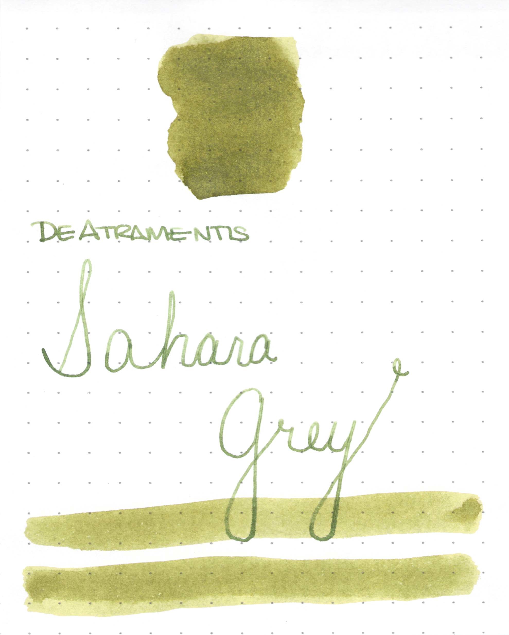
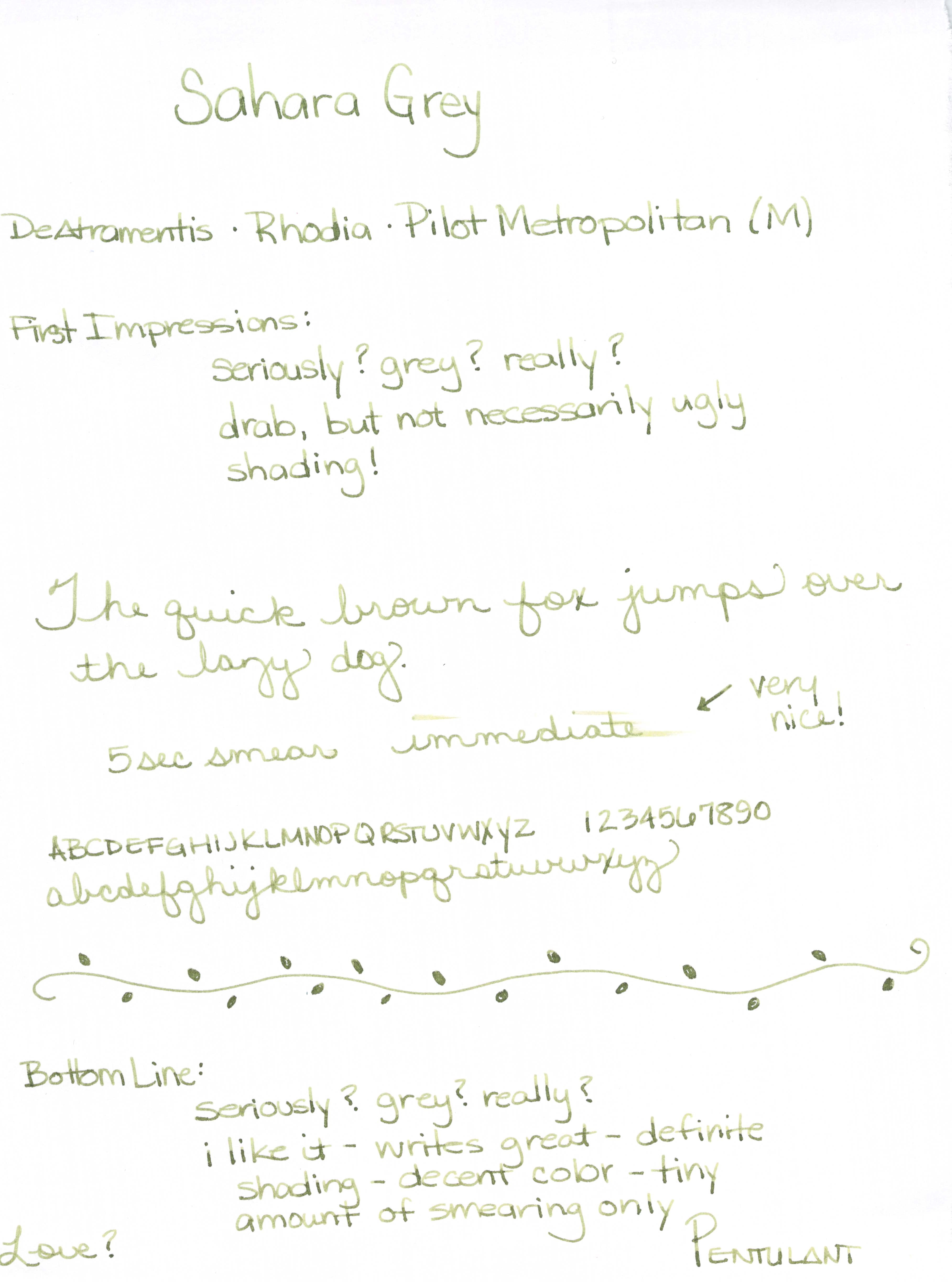
INK REVIEW: De Atramentis Sahara Grey
 |
| DeAtramentis Sahara Grey Ink Swab |
 |
| DeAtramentis Sahara Grey Ink Review |
 |
| DeAtramentis Sahara GreyInk Swab & Review |
 |
| Click For Full-Size Image DeAtramentis Sahara Grey Ink Review |
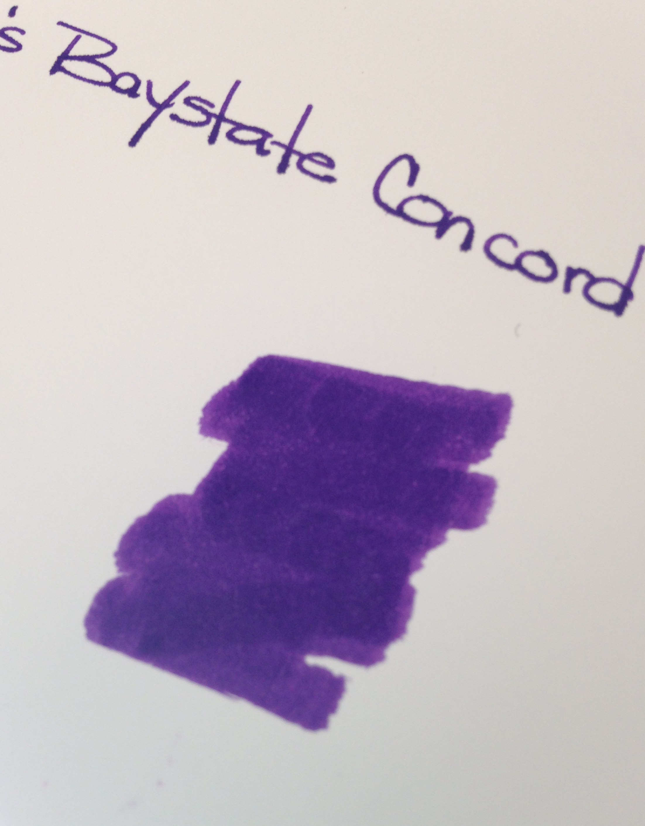
INK REVIEW: Noodler’s Baystate Concord Grape
 |
| Noodler’s Baystate Concord Grape Ink Swab |
Disclaimer: While I usually scan the sheets of paper for my ink reviews, these images are coming right out of my iPhone. That explains the inconsistencies in color and quality.
Second Disclaimer: I realize that this post flies in the face of what I said last week about putting up with some other things as long as the color and saturation are there. What can I say? I’m fickle.
If you’ve been in the fountain pen community for any length of time, you have probably heard of Noodler’s Baystate Blue. Famous for it’s amazing color and it’s amazing ability to stain (or even ruin?) your most loved pens.
But Blue isn’t the only Baystate color from Noodler’s. There is Concord Grape and also Cranberry.
Today, we discuss Concord Grape.
No likeie.
The color is what I expected – very saturated, very purple. No complaints there.
But here’s the problem….
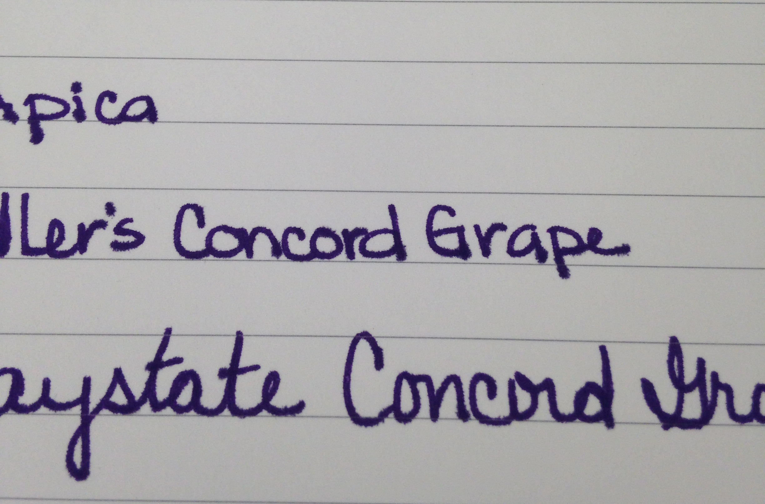 |
| Baystate Concord Grape – Apica Paper Test |
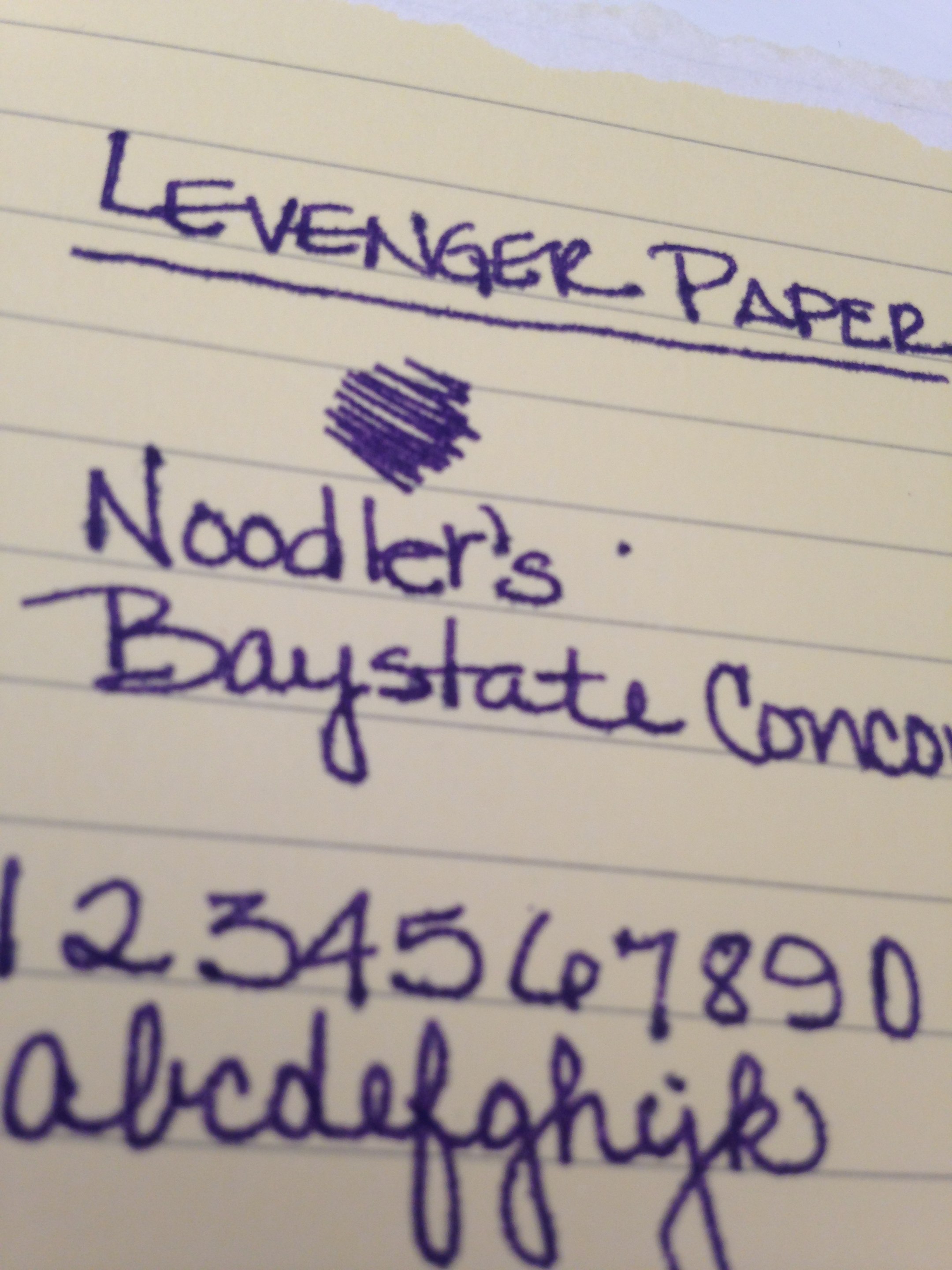 |
| Noodler’s Baystate Concord Grape – Levenger Paper Test |
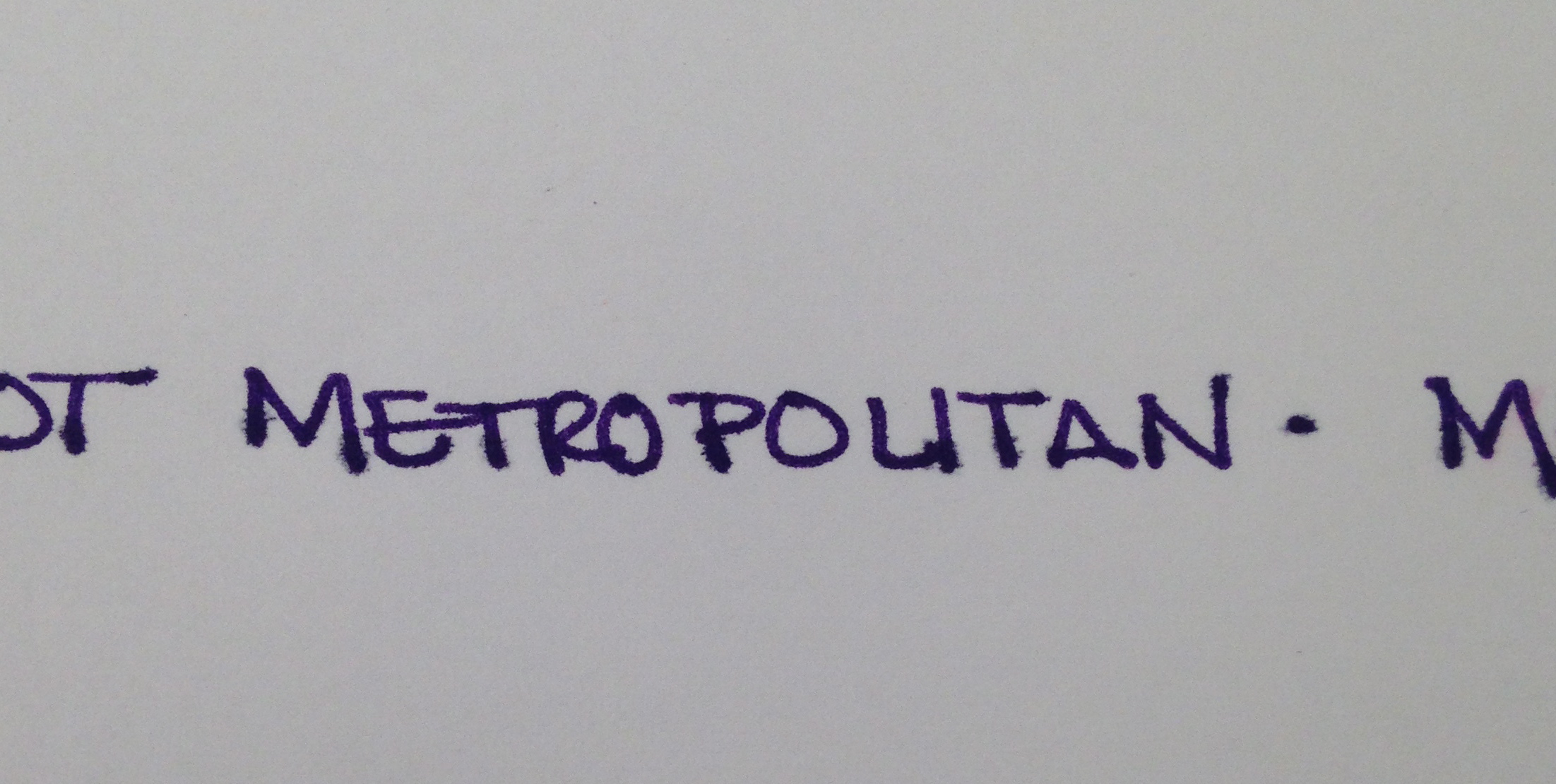 |
| Noodler’s Baystate Concord Grape – HP 32lb Paper Test |
It’s the feathering. Click on the images to see the full-size or have a look at these screenshots from the original images.
If it was just one paper (especially the Levenger, which has been questionable with a number of inks), I could let it go. The color is so great that a problem here or there is ok with me, but this ink was a problem on almost every paper I used.
I was using a Pilot Metropolitan (medium nib). It’s a pen I’m very familiar with and have had no problems with in the past. After the ink sat in this pen for a day or so, the flow was terrible – I eventually had to open the pen and give the squeezie converter thing a little squeeze to get things flowing again.
With most of my ink reviews, I use the ink regularly for an entire week before posting. I was only a few days into the week before I realized that I wasn’t reaching for this ink at all. It was making a mess out of my work notebook (a Rhodia) with all of its ugly feathering.
Now, of course, your mileage may vary and I’m no expert in pens and inks (just love me some pretty colors and shiny things). If you’ve tried Baystate Concord Grape, I would love to hear about your experiences.
INK REVIEW: Private Reserve Black Magic Blue
 |
| Private Reserve Black Magic Blue Fountain Pen Ink |
First ink review of the new year and I am so glad to say that we have a winner! Maybe this is an indicator that all inks this year will be winners? Ha!
Other than my usual pet peeve (see below), Black Magic Blue is pretty special.
 |
| Black Magic Not Blue |
This “blue” ink is definitely purple. Purple in the swab, purple in the bottle, purple in the writing – blue in the name. I once read a post (probably on FPN) where the writer was complaining that the colors on ink packages didn’t match the color in the bottle – I totally get that it would be very difficult to color-match bottled ink to a printed package – but the name? I totally don’t get it. Why not be be as descriptive in the names as possible?
So . . . I wanted to hate Black Magic Blue on principle, but this ink definitely worked it magic on me.
Check it out . . .
 |
| Woo! |
The color of an ink is everything to me. Other things are negotiable, but if the color and saturation aren’t there, all of those other features don’t matter a bit. And..if the color is there, I’ll put up with some pretty terrible “features” to get that color.
Fortunately, Black Magic Blue is easy to love. (Yes, it’s making my love list!)
It writes wonderfully – great flow in the Lamy Safari (Broad Nib) I used for this test. Perhaps a little wet – but, again, I was using a broad nib so some smearing is expected and it doesn’t seem terrible even when I was smearing on purpose.
The color is deep. If you’re looking for bright, check out Private Reserve Purple Mojo – there’s some bright!
The color is clear. If you’re looking for something a little dusky, check out Alexander Hamilton from De Atramentis.
As for me – I used Black Magic Blue for a full week and definitely fell in love.
Have you fallen in love in 2014? With inks, pens, or anything (anyone?) else?

