INK DROP: May 2013

Seriously? I’m probably the last person to comment on the May Ink Drop color from Goulet Pen Shop.

I’ve been just a little busy. There was the wedding. And then the baby! (Not ours – bummer.)

But here they are…

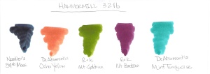
Noodler’s 54th Massachusetts
De Atramentis Ocher Yellow
Roher & Klingner Alt-Goldrun
Roher & Klingner Alt-Bordeaux
De Atramentis Mint Turquoise

They look so different on different papers, yes? Four passes on the Clairfontaine Triomphe paper to get close to the same look on the Brush Dance paper.  (Disclaimer: I’m the president of Brush Dance and maybe just a little slanted in that direction, but really? We have great paper.)

As for the inks? I’m not IN LOVE with any of them.  Each of them falls squarely into that “not a color” area for me. Alt-Goldrun is so popular – I want to write with it very soon.

What do you think? Love ’em? Hate ’em?

Some Things Were Just Meant to Be

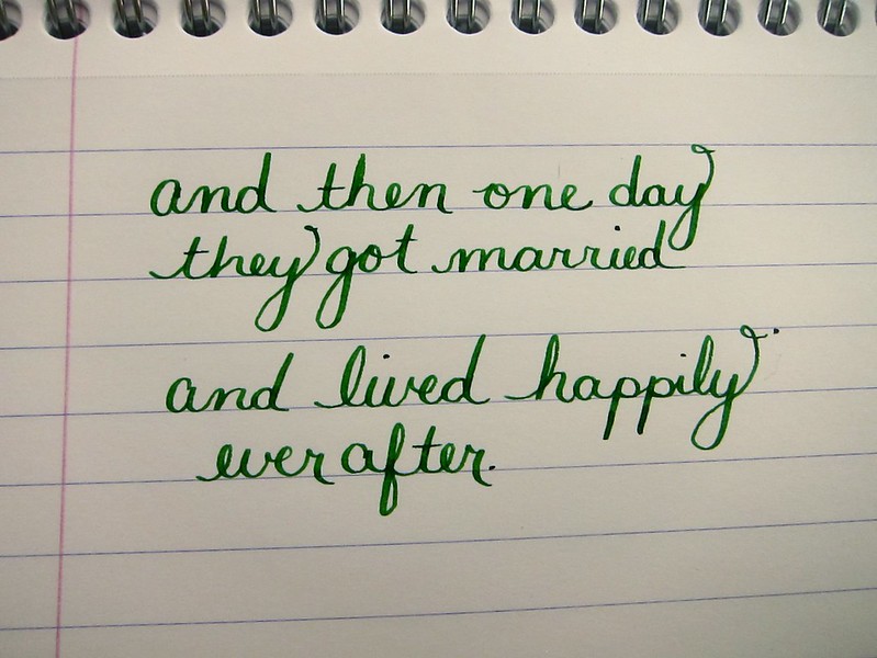
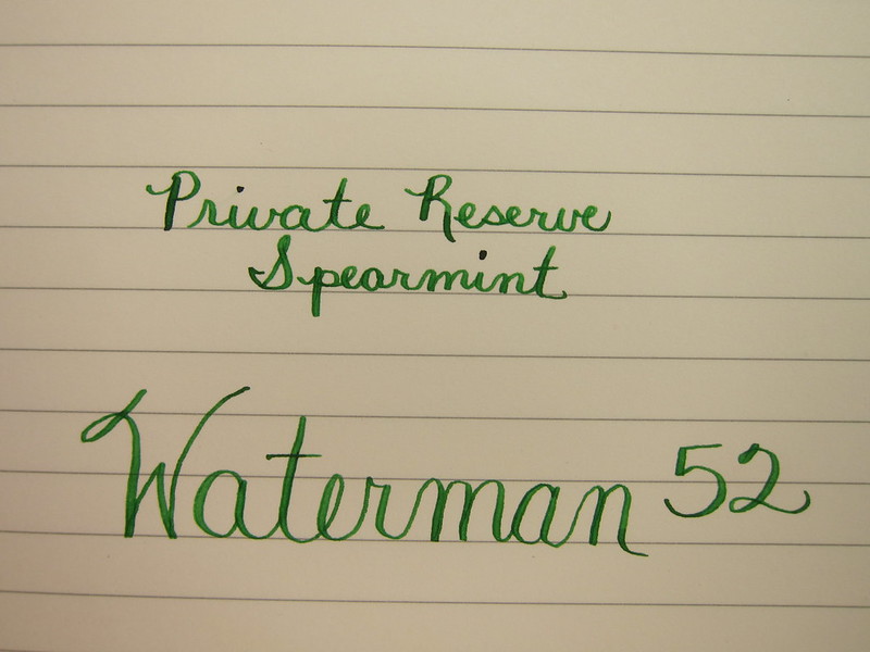
Waterman 52 / Private Reserve Spearmint / Clairefontaine

My posts have been a bit sporadic over the last few weeks.  I was just a little busy.  Getting married!

It’s true! Mr. P. and I finally tied the knot last week and we couldn’t be more happy.

I wrote the above several weeks ago and the following just one day before the wedding.

A small peek at our invitation below. We sent around twenty invitations. Each was individually calligraphed by someone we found on Etsy. I love the way they turned out. Perfectly us.
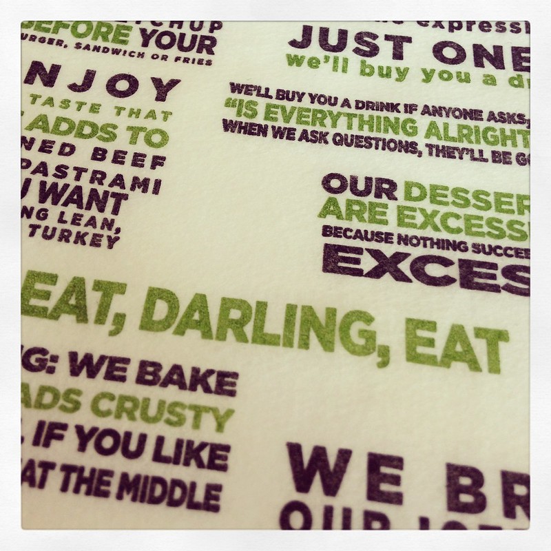
The day before the ceremony, we went to Max’s Opera House Cafe.  Following is a quick picture of their menu. Green + Typography + Darling = Perfection.  (Did you know my new last name is Darling?)
When we checked into our hotel the night before, we had no idea we would have a view of San Francisco City Hall where we would be married. I took this picture in the morning when the fog was still laying low.
I have to admit – looking at all of this makes me a bit teary all over again. Such a happy day. So perfectly us.

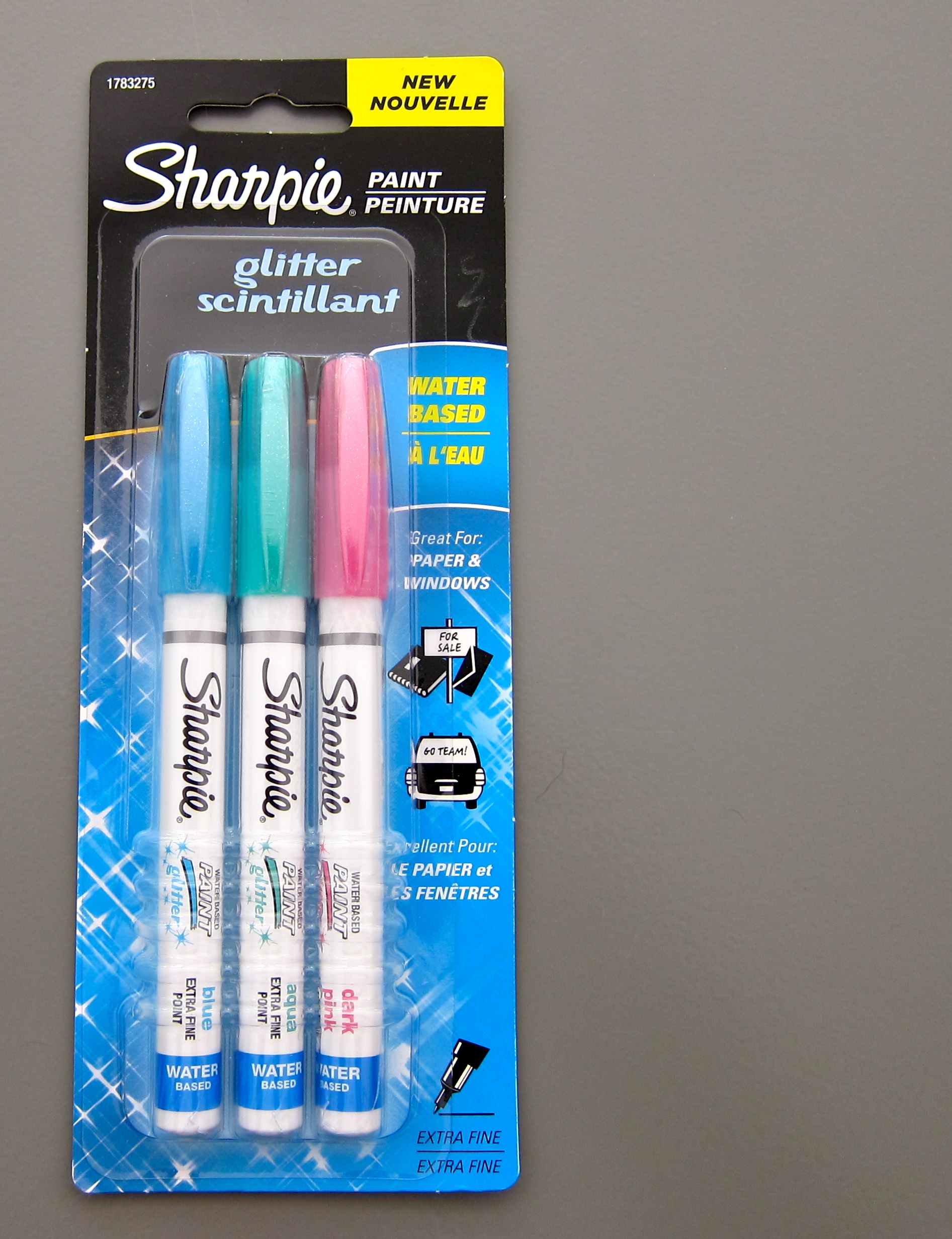
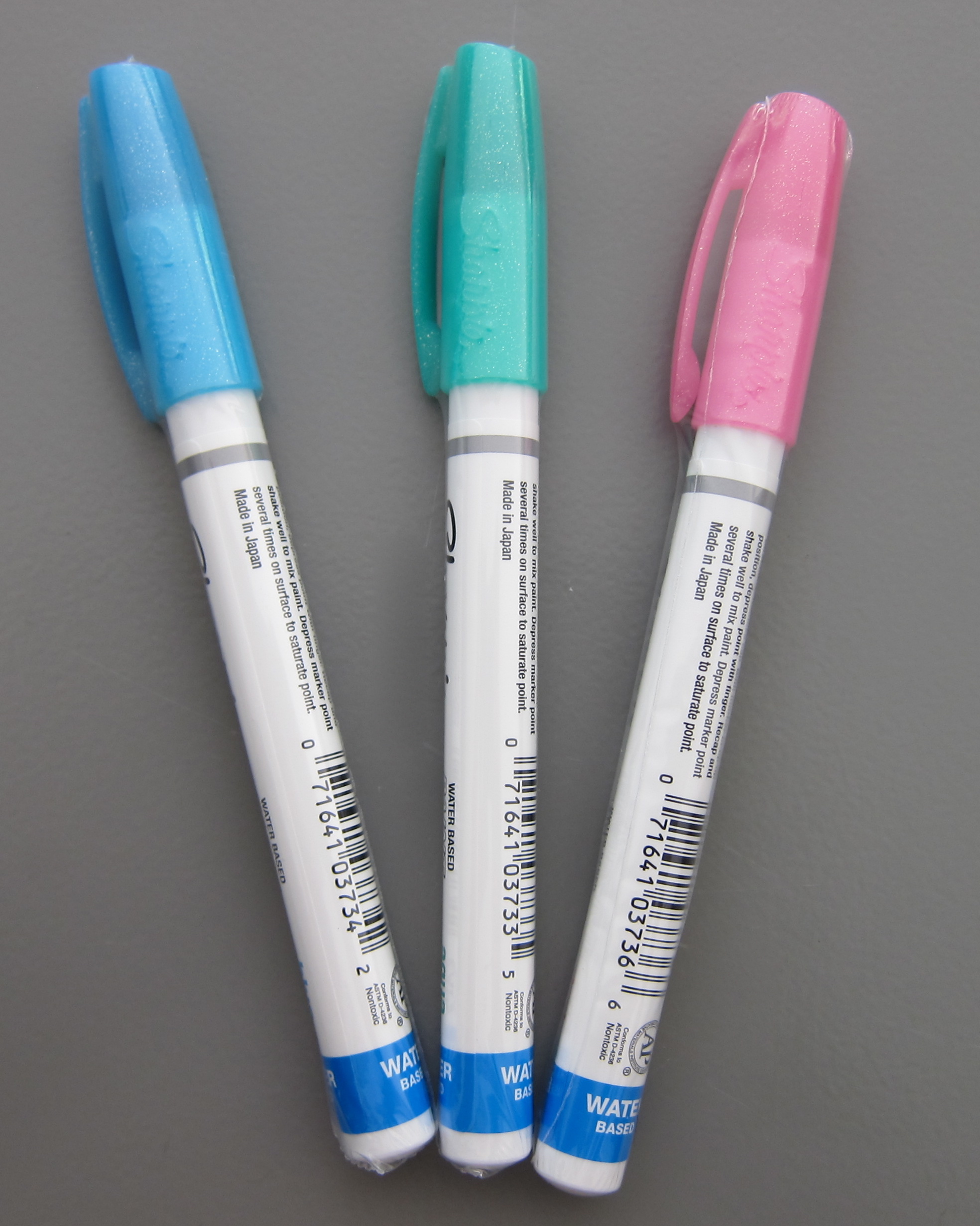
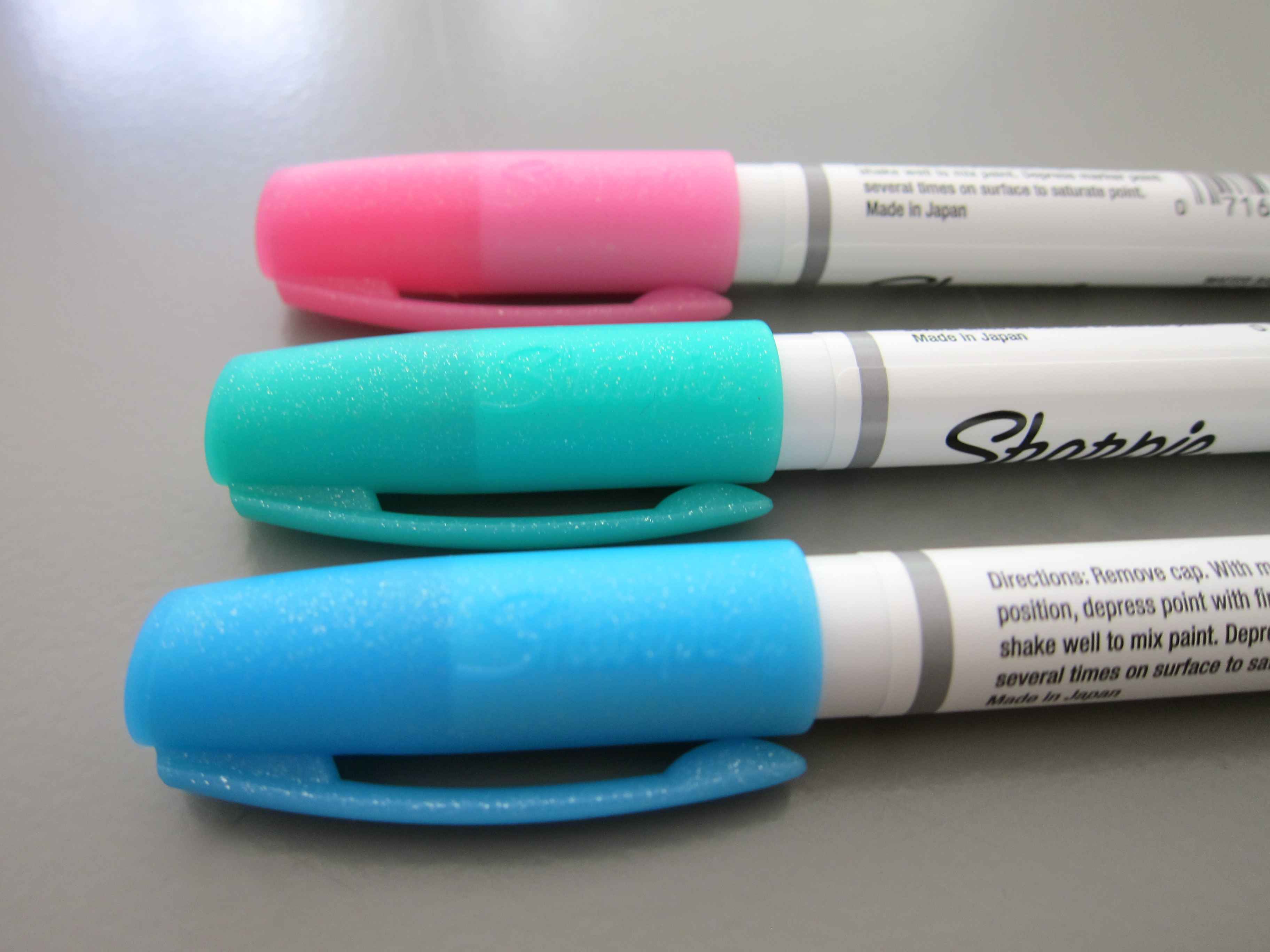
REVIEW: Sharpie Glitter Paint Set

Sometimes. A girl needs a needs a little glitter.

A little … scintillant.

A Sharpie. (Who doesn’t love Sharpies? Use them a lot. Mostly for work. But some because of fun.)

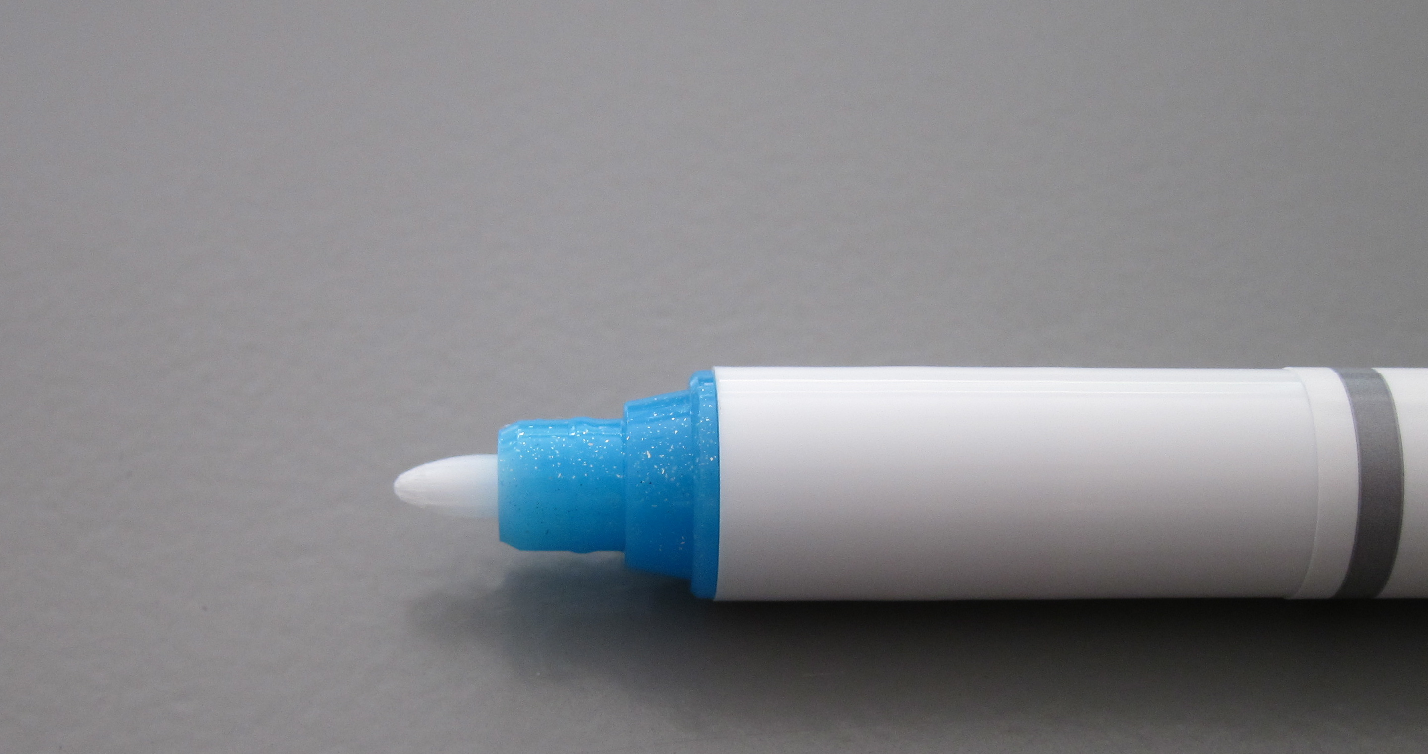
These were fun, too. Not sure I have a real use for them.

Each came individually wrapped inside the package. Pretty sure this is for one or two reasons…
1. leak prevention
2. protection from drying up

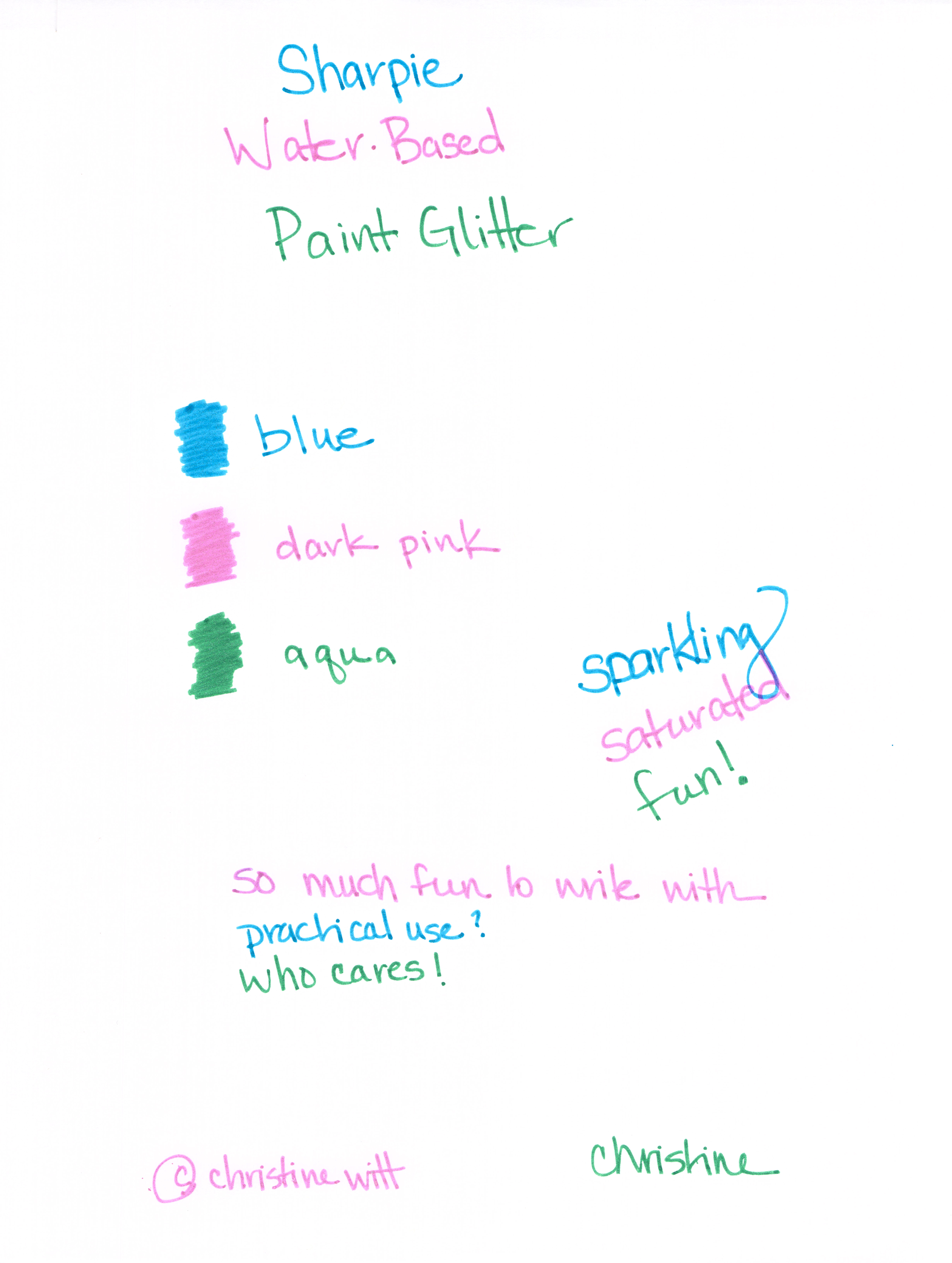
The big surprise? I thought they’d look WOW on black paper. Turns out, they are best on white. Probably a good thing considering I might be the only person around with a stash of black paper!

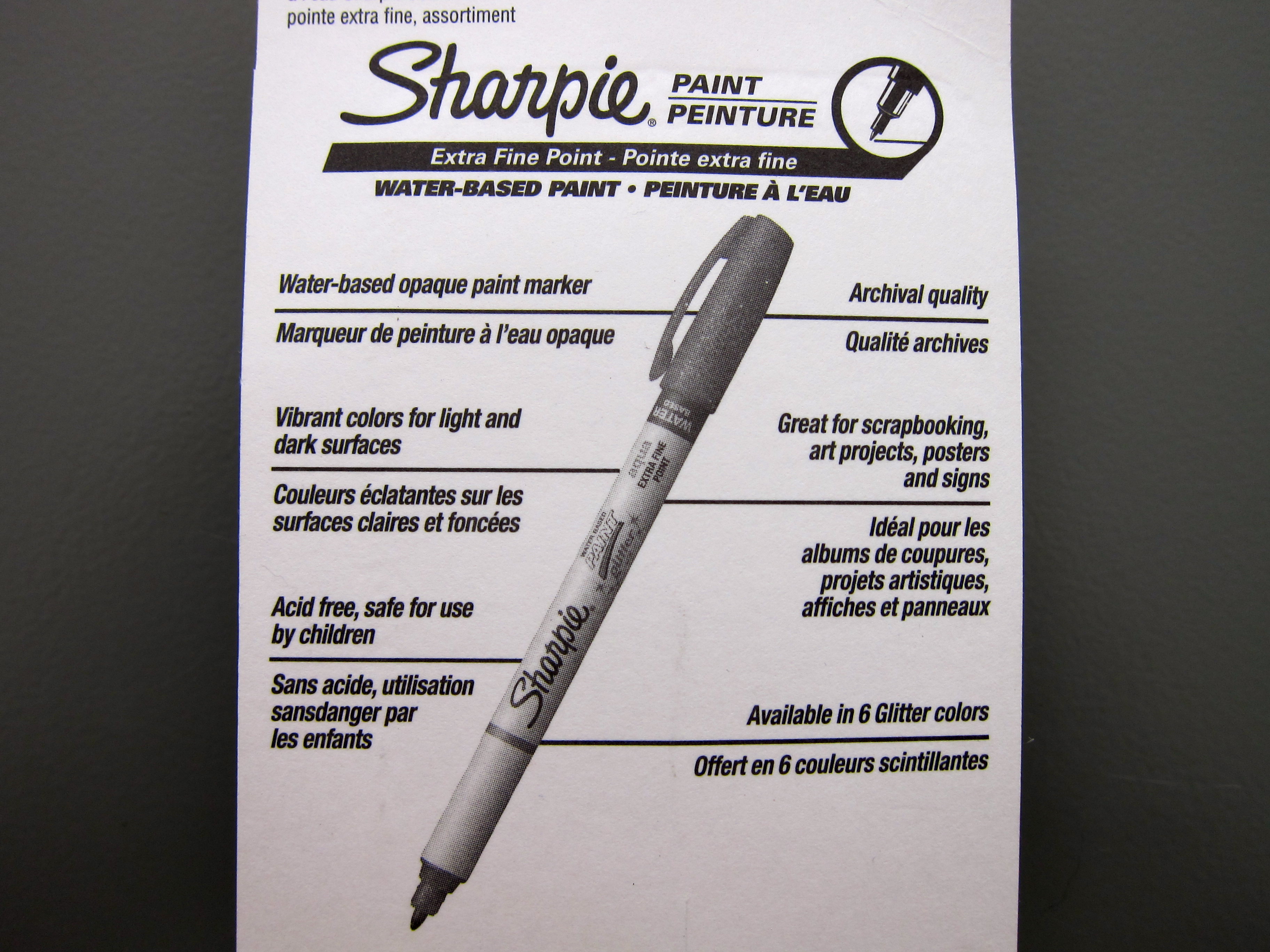
Have you tried these? The package says they’re available in six colors – I only saw the three-pack and white. What else is out there?

Are you like me and you sometimes buy cheapie things like this to try out? Even if you don’t have a real purpose for them?

PEN REVIEW: Waterman 52

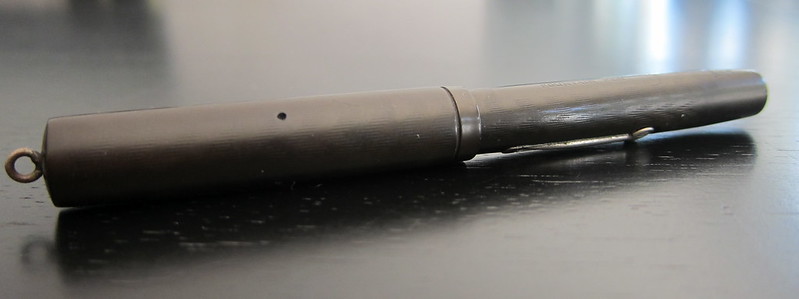
On Friday, I shared some recent purchases including this little gem I acquired from VintagePen.

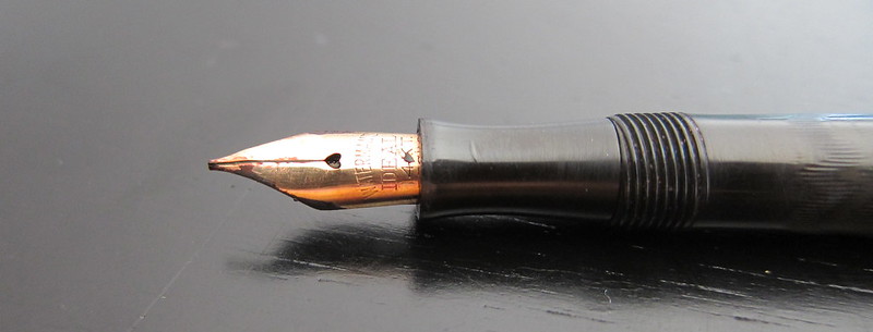
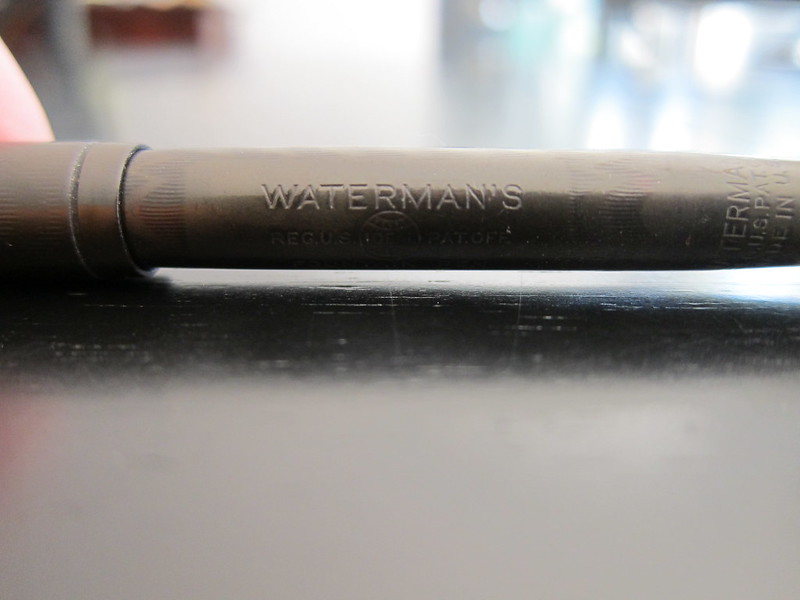
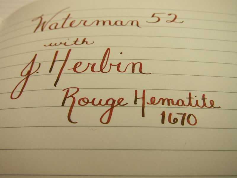
Going to (mostly) let the pictures do the talking here . . .

That’s a little nib creep – not rust or anything icky like that
love the gentle chevron – so subtle

And now . . .

Sammy is one of our three (!!) dogs.

My handwriting needs a bit of work, but man-oh-man, I am digging this pen. So much so that some of my other favorite pens have been sitting around unused in the short time I’ve had the Waterman 52.

It’s a little skinny, a little short – neither of those things are a bother to me. It writes wonderfully – perfectly smooth, easy to flex. It’s not even a little scratchy and it doesn’t skate uncontrollably across the paper.

The lever-fill is easy to manage – perhaps a pain to clean and ink capacity seems a bit low, but I can live with those things.

I love everything about the pen except there’s no clip on the cap – making the pen very likely to roll around. I hope so much that I never inadvertently set it down and have it roll onto the floor. Yikes.

This is a pen that will stay in the house because I really would be heartbroken if something happened to it.

It’s love! True love.

INK REVIEW: De Atramentis Sandalwood

Love this ink. Except….
Let me show and tell you about all of the positives first.

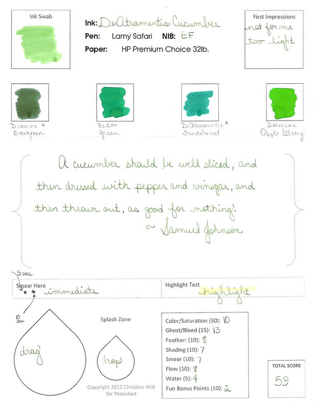
I love the color. Green with a touch of blue.  Definitely pretty.

It writes well. A little shading in there.

It scores well with me. I shouldn’t have given it Fun Bonus Points, but I was caught up in the moment.
So what’s the problem?  It stinks. It’s noticeable, but ok at first. Tolerable. Even kind of fun.
But dude. After a week of using DeAtramentis Sandalwood as my green of choice, I was so over it. Gross. I don’t mind the scent of sandalwood – Mr. Pentulant would even say that I’m a bit of a hippy who embraces the, ahem, earthy scents. But not this. It was just too much. There was a hint of a petroleum smell in the background – totally ruined it for me. Going on the Hated It list. Bummer.
No.
Darn.

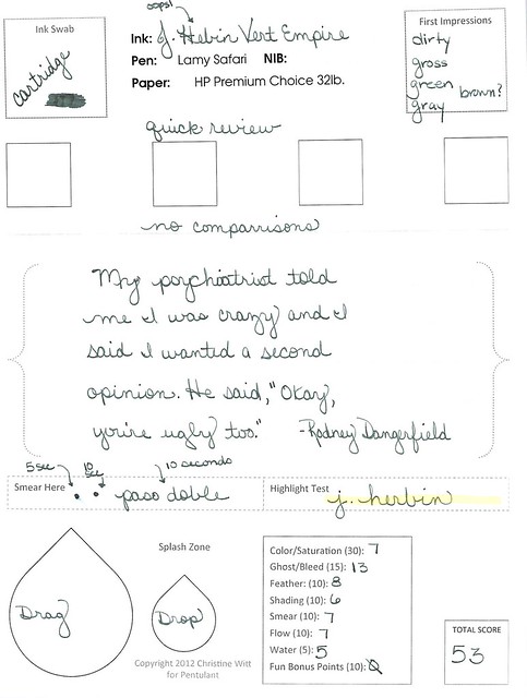
INK REVIEW: J Herbin Vert Empire

We’re going to dive right into this quick review . . .

Click for the full-size image

This was a stop on the way to finding a deep dark green for Mr. Pentulant.

A fast stop. I couldn’t tell if this was green or gray (grey). With a name like Vert, I’d expect something rather obvious.
Bottom Line: This is not the perfect ink for Mr. Pentulant, but mostly because of the color. If you liek the color, it’s actually a very well-behaved ink.  
Tell me, do you like this color? 

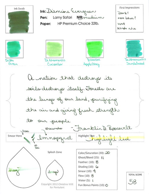
INK REVIEW: Diamine Evergreen

Diamine Evergreen
Nice, right?
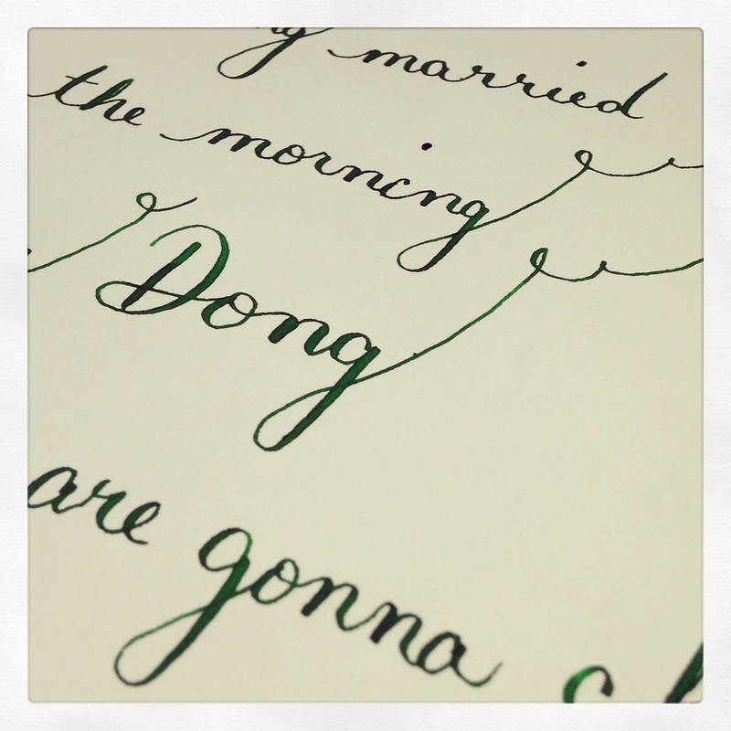
Let’s take a closer look . . .
want a closer look?
Mr. Pentulant has been looking for a dark green ink for everyday use. This translate to . . . I have been looking for a dark green ink for Mr. Pentulant.  Oh yes. poor me, forced to test ink after ink. Whatever will I do? (Probably test every green ink in the world! Muhahahaha!)
Anyway! I think I have a winner in Diamine Evergreen.  
The color is definitely a very dark green.

There’s a tiny bit of shading, little feathering.
It’s a little smearish (dude, it’s a word). If there’s one (or two) big issues, it’s with the water test (both drag and drop) and the highlight test.
So..if Mr. P. can live with the issues, I think the color is a winner, but I’ll probably continue the search – you know, in the name of doing good for other people. Right.
Do you have any dark green recommendations? Have you ever had to search high and low for ink for someone other than yourself? How did you survive?

PEN REVIEW: Pilot Varsity All Colors

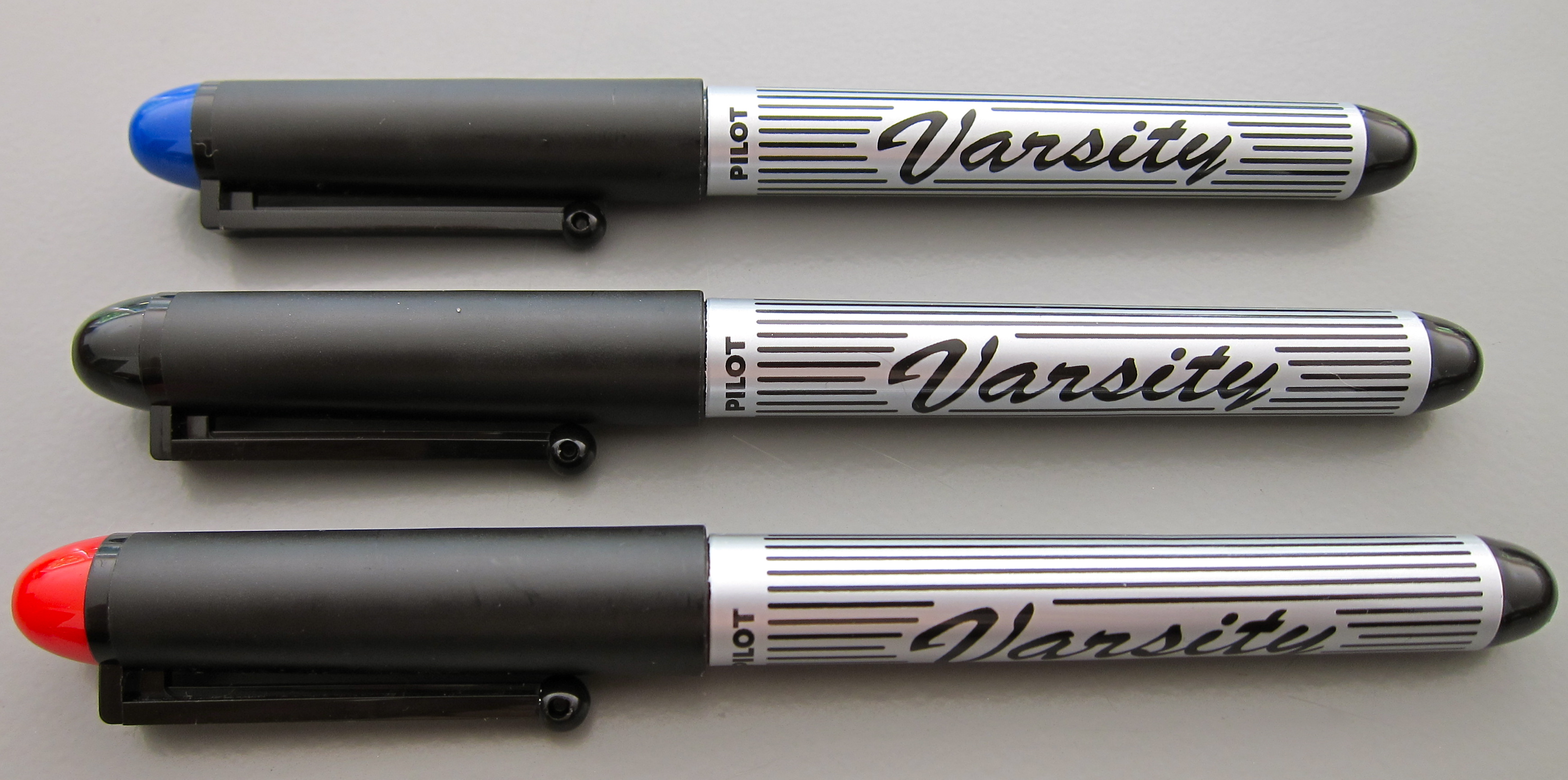
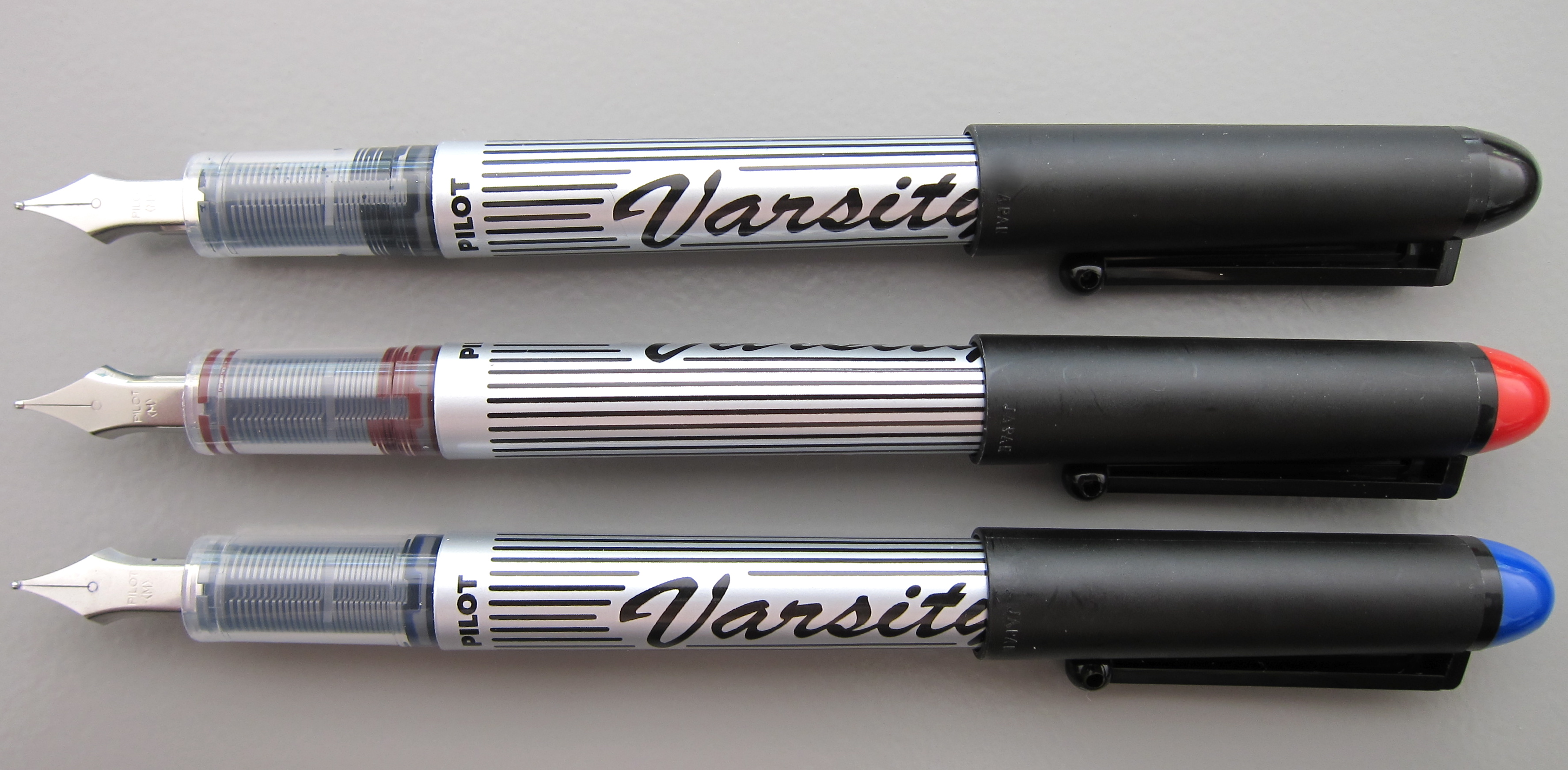
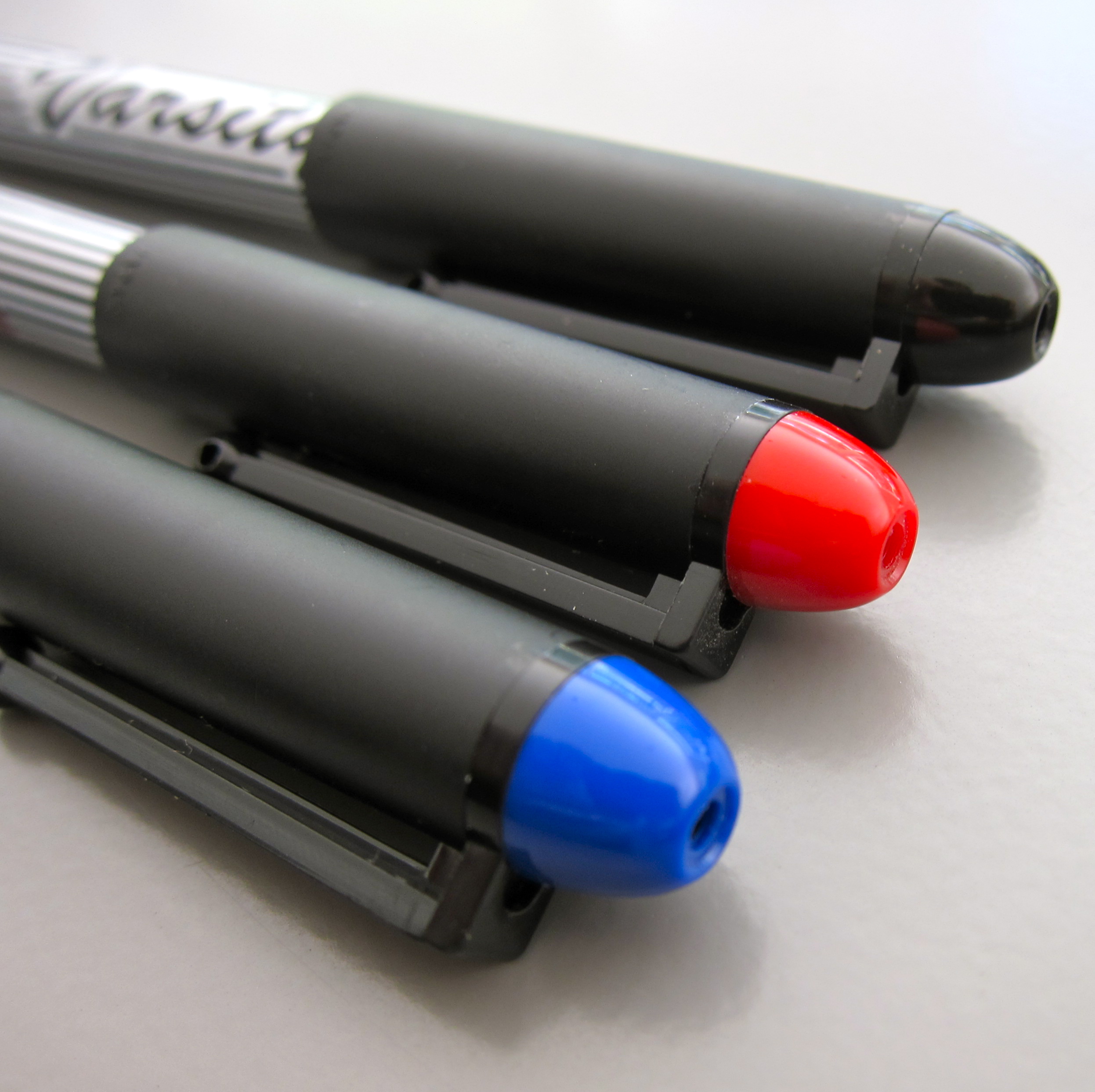
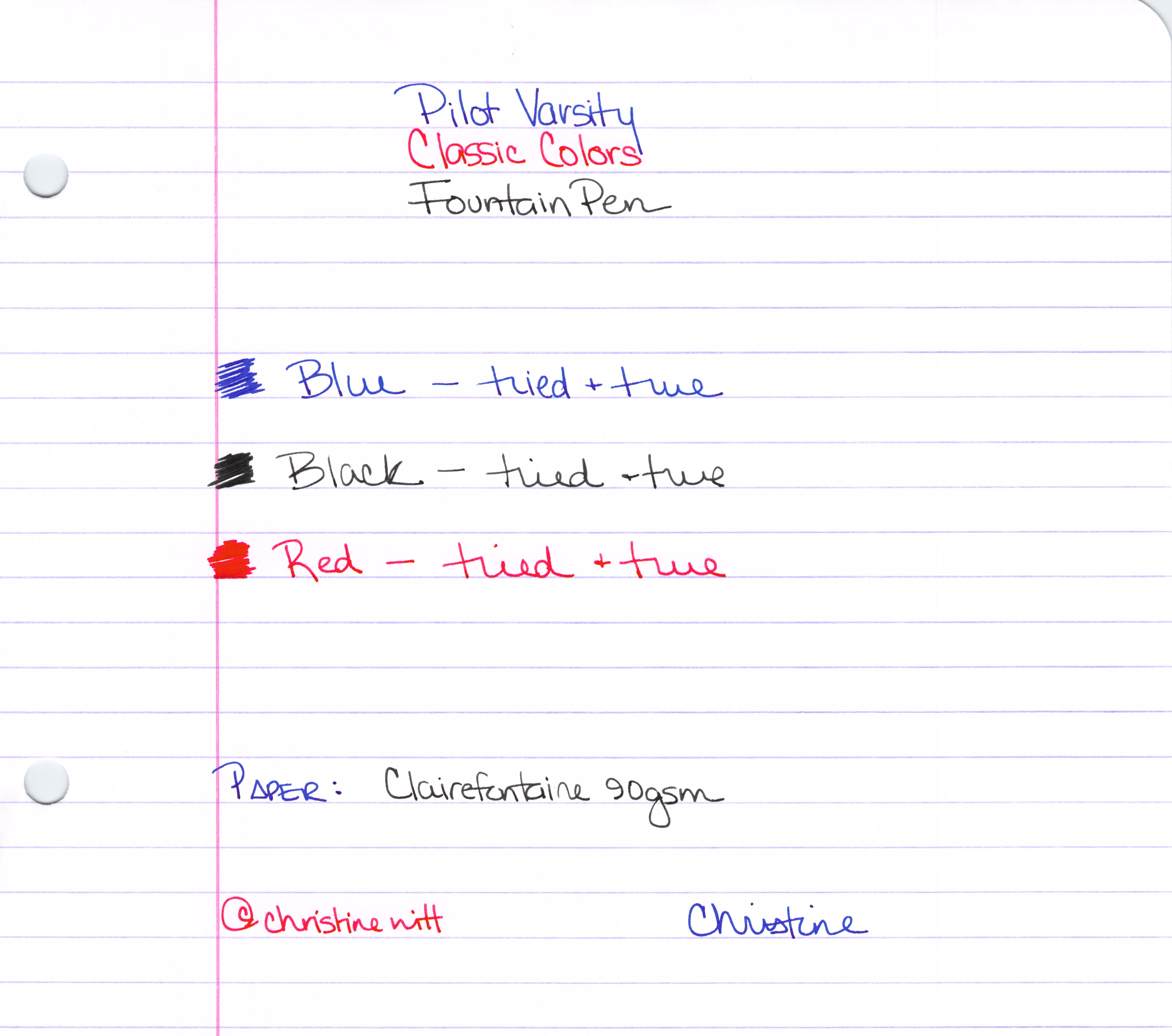
We’ve already looked at the blue – and now here are the remaining colors of the Varsity Pilot fountain pens.

The Classics
Some people worry that something is wrong with the pen when they see the ink down in the section (the part of the pen between the barrel and the nib). This is perfectly normal and is a result of the ink moving through the feed system into the nib. In most pens, this part of the pen is opaque – but if you could see, you would see – this is perfectly normal.

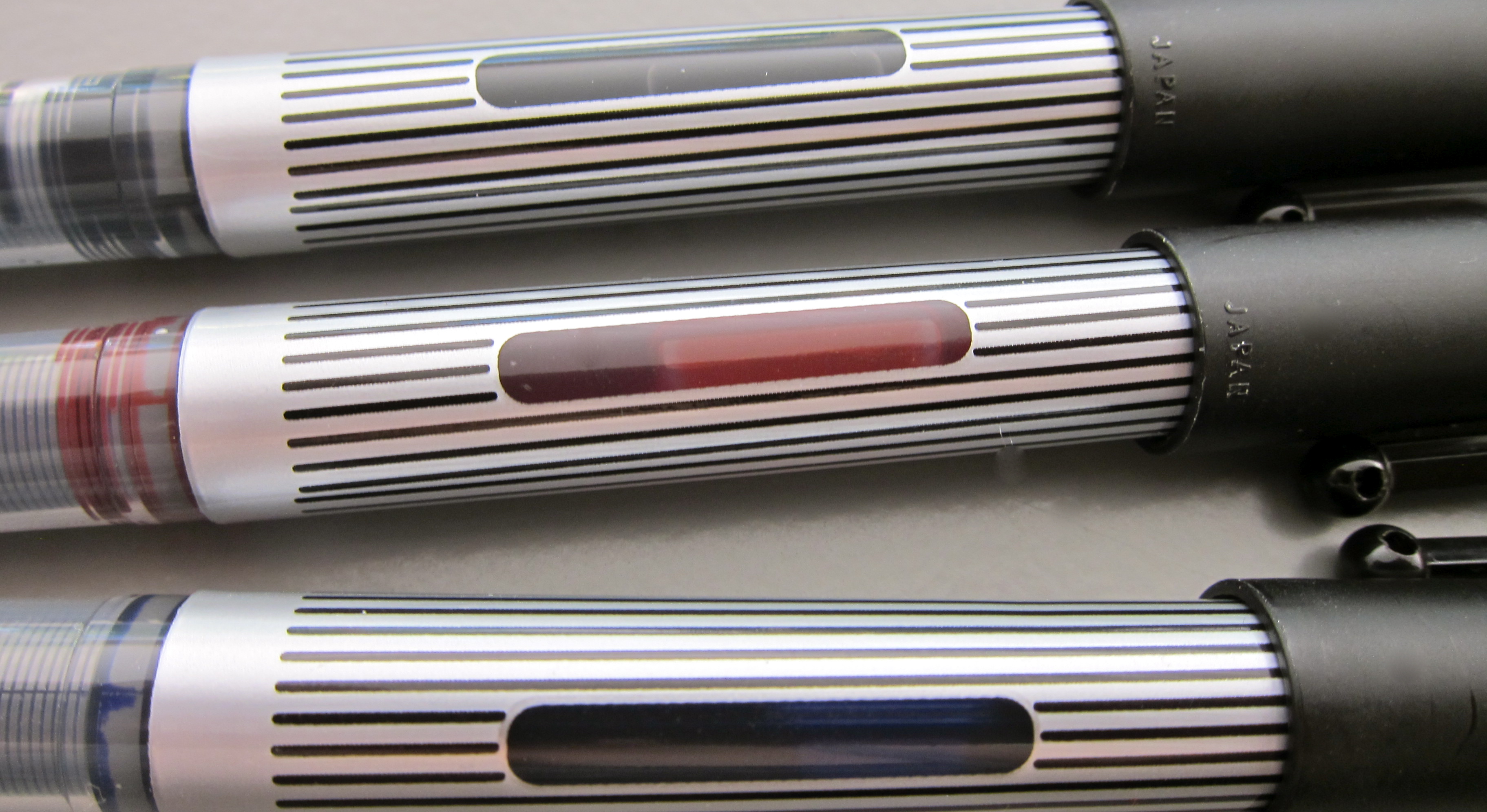
Handy Ink Window

The Whole Enchilada
Bottom Line? In a pinch, these get the job done. The colors are fun.

INK REVIEW: Pilot Iroshizuku – Syo Ro

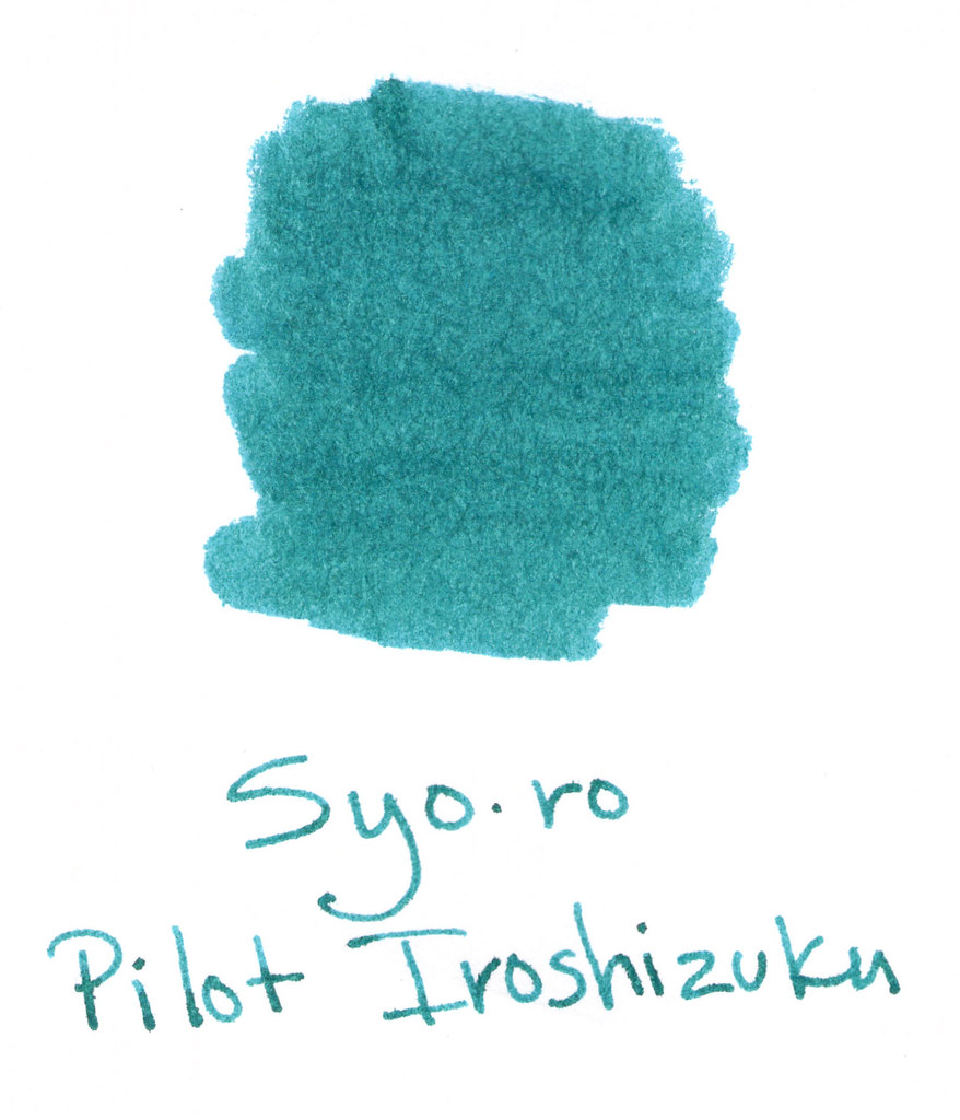
Another very pretty teal color from Pilot Iroshizuku.

Pricing is pretty much the same at $28 all over the place. When pricing is the same in all of my usual places, I generally go for the one that offers the best customer service (heck, I’ll even pay a few dollars more for excellent customer service).

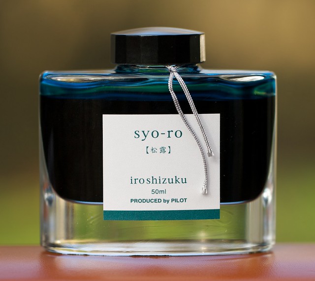
One thing I didn’t mention in my other Pilot Iroshizuku reviews is how lovely the bottle is. Here’s an image I dug up on Flickr from user InkyJournal. Gorgeous, yes? I can almost feel the coolness of the thick thick glass.

Still, I’m not going to invest in a full bottle of this ink. I’m holding out for something different – something with more bOOm bOOm pOw. Hopefully, I’ll find that perfect ink – or have fun on the search.  Hahah..it’s definitely the journey when it comes to inks.

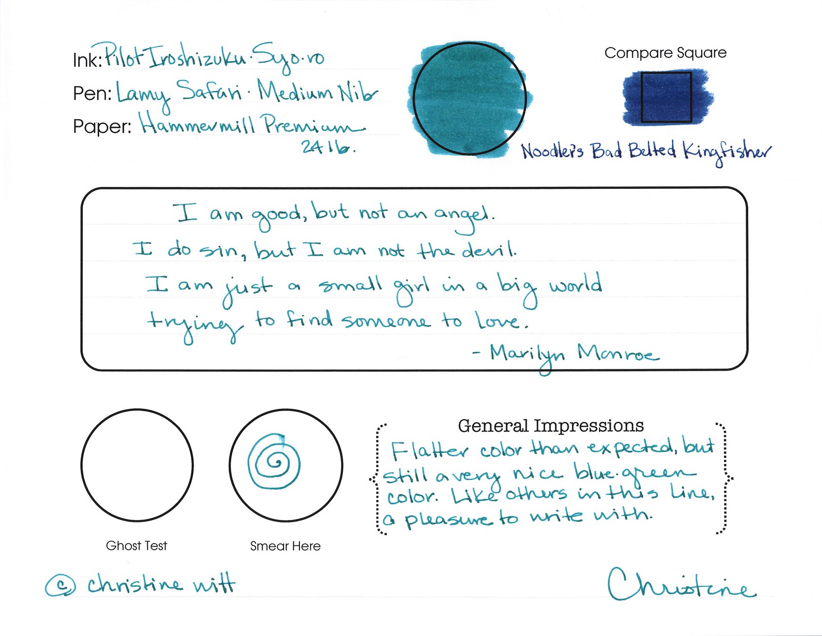
Syo ro writes very well.  No problems with flow. Not much sheen. Decent saturation.  There’s little feathering on my Hammermill Premium paper. And there’s even a tiny bit of shading.

Dry time was perfectly acceptable.

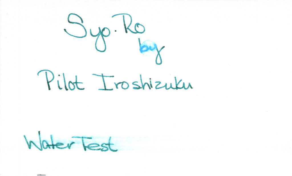
I was surprised at how well it did on the water test. Not perfect, but not too bad for a non-black.

Wrapping things up…I like it, I don’t love it.  I’m looking for love.

But don’t take my word for it. Here’s what others are saying about Syo ro:

Fountain Pen Network Review 1

Fountain Pen Network Review 2