INK REVIEW: Diamine – Syrah

Still recovering from the holidays here and wrapping up a few pre-scheduled reviews before diving into new and exciting things!

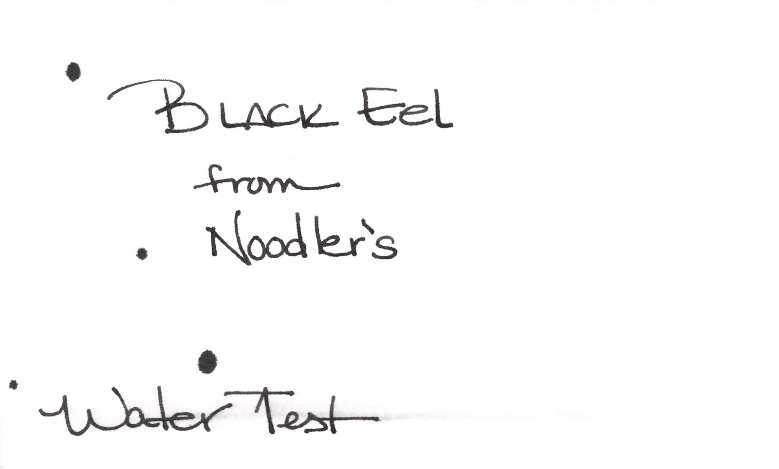
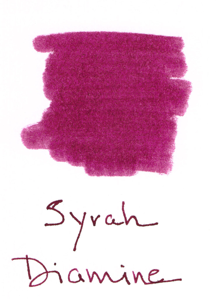
Syrah from Diamine is a berry nice shade. Kinda red-purple. Deep plum. And by now, everyone knows how I feel about “mixed shades” of ink. I’m not a huge fan.

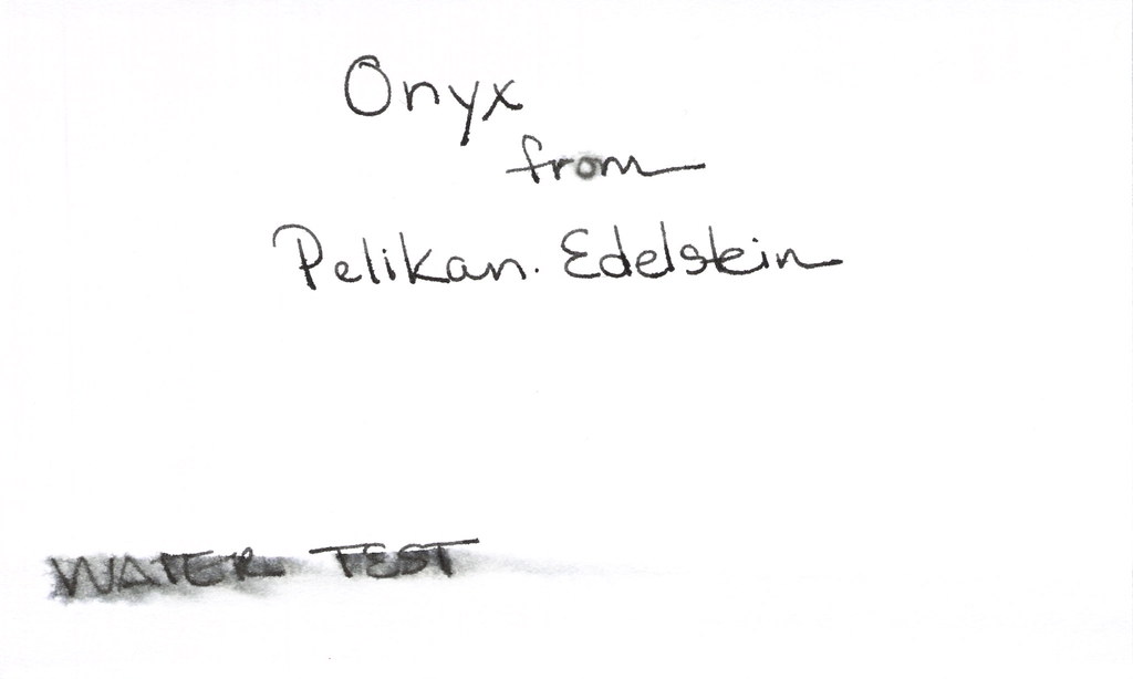
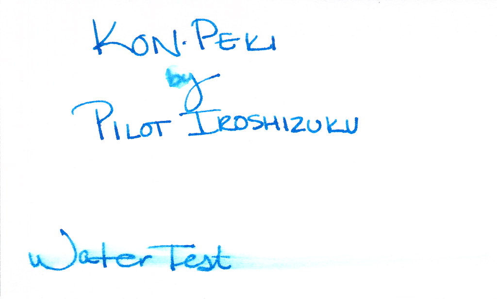
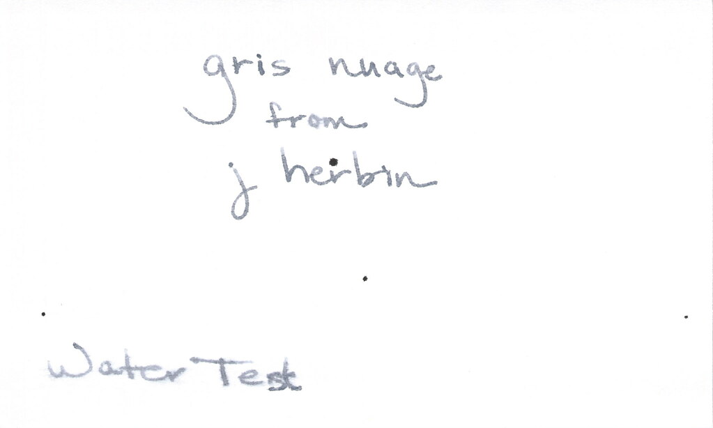
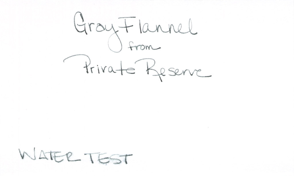
Here’s the ugly. Major fail. (Those of you who watch “How I Met Your Mother” may now salute. Those of you who have no clue about which I speak may also salute. Major Fail – get it?)  Anyway, major fail = water test. Even the tiny droplet test (where the “ro” in “from” should be) faded this color into nothingness.

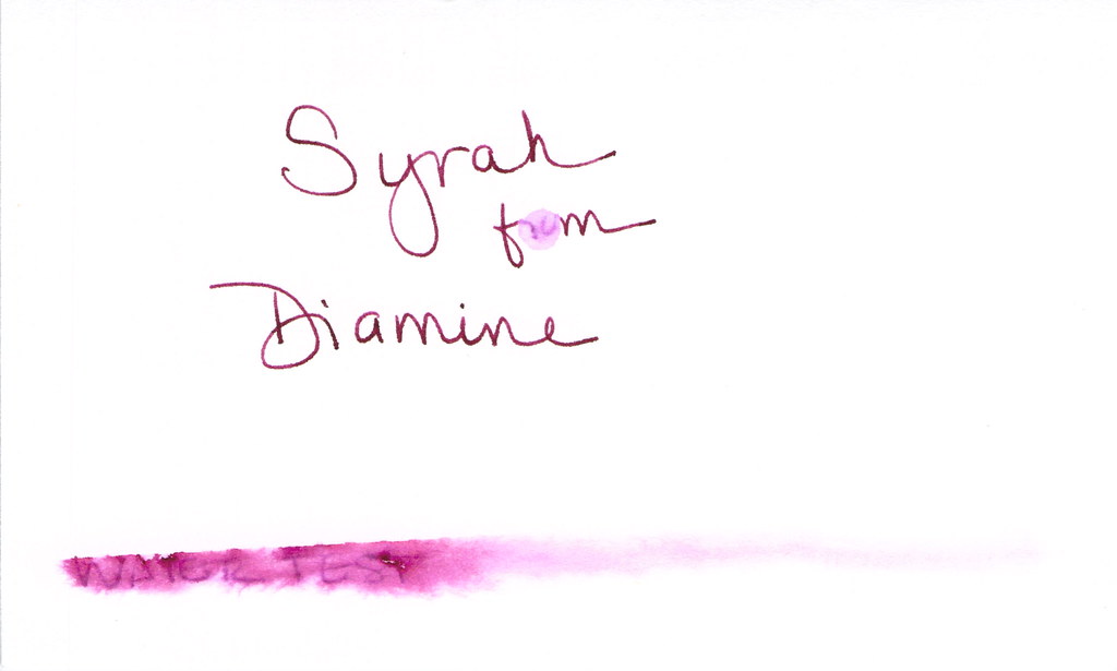
I used a dip pen and Syrah performed well enough. No big complaints, but no big compliments either.

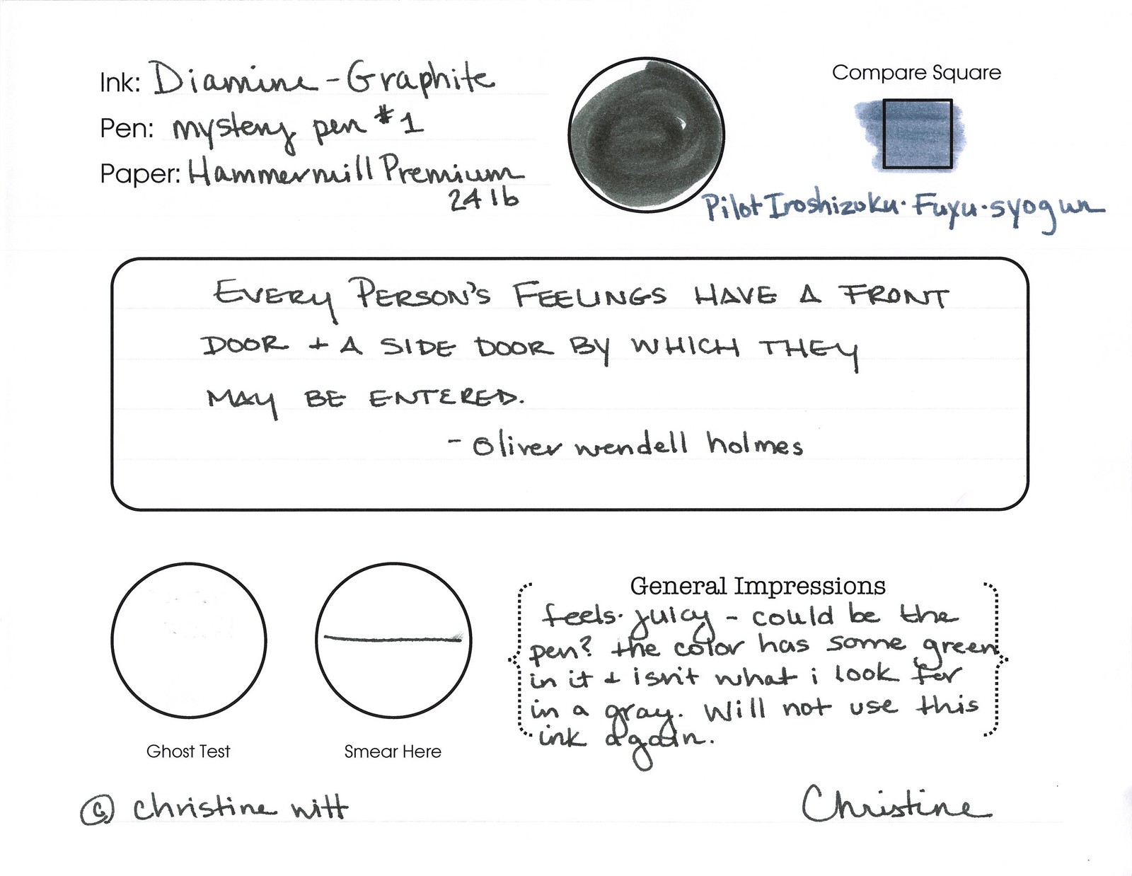
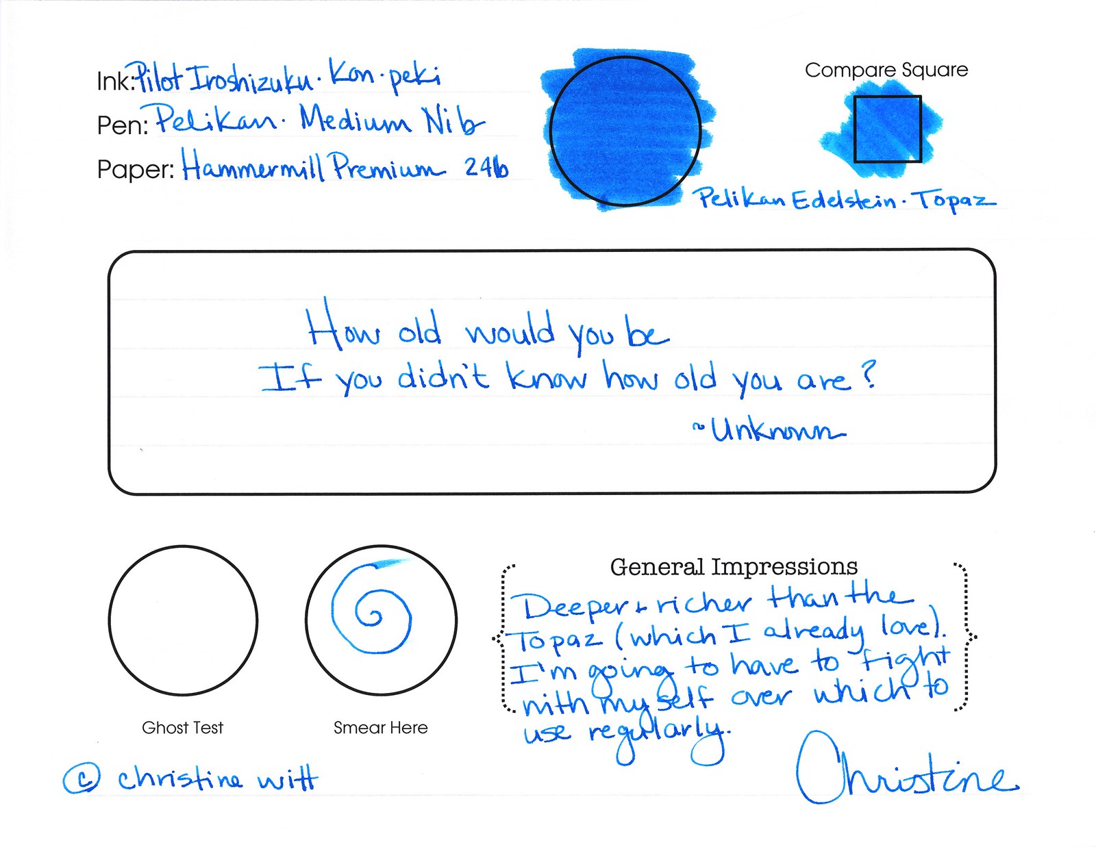
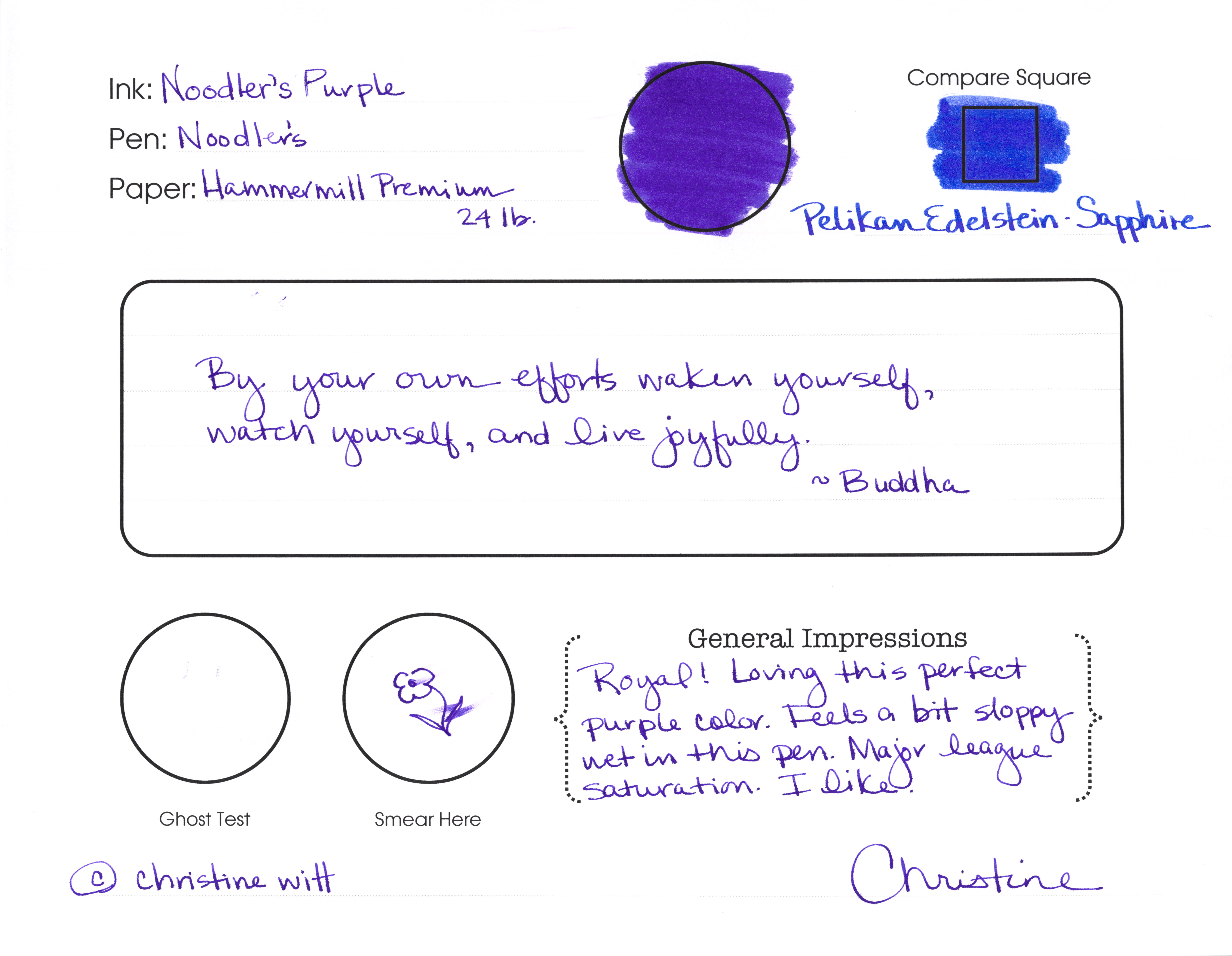
Look at that compare square?  I do think if the writer is looking for something dark, but different, this could work (as long as one never nears the water).

It was a little wet as you can see in the Smear Here – but not intolerable.

Overall, I’d give Syrah from Diamine a good solid C. It would work, but I’m not in love. In looking at other reviews after I wrote this one – this is a popular ink. People love it and its color. Consider me the dissenting reviewer.
Such a contrarian.
What do you think? Love it?

INK REVIEW: Noodler’s Black Eel

I’m off recovering from eggnog, picking ribbon out of my hair, or just taking it easy. In other words, this review was pre-written.  Enjoy!
Noodler’s Black Eel.
How is this different from Noodler’s Black?
Well, I didn’t know. And I wanted to know. So I did some research before this review. 
But first, what the heck is that line down the center of the ink swab? Yeah, I don’t know. It’s not on the swab. I think it’s gunk in the scanner. I hope it’s not too distracting. I hope my mess-up on the “c” in “Black” isn’t too distracting, either. I’m sorry, ok? That’s what I’m trying to say.
Anyway.
Inks in the Noodler’s Eel series are lubricated (stop being gross).  Rumor is that this lubrication helps the action of piston converter pens (the ones you twisty up and down to fill). 
Then I read things that say that the difference isn’t appreciable. Then I read things that say the ink is “sticky,” and takes a long time to dry. And then I read things that contradict all of the above.
My general thought – ymmv, yo. There are so many variables with inks and pens and papers and your writing style. Your mileage may vary, yo.

It’s pretty. The cost is the same as other Noodler’s inks. It’s very well-saturated and I like that. A little smearing, but not horrible. Felt wet to me in my pretty Libelle. I liked it.

Very little feathering. No shading. Solid.

On to the water test. Solid. See those black specks? I don’t want to talk about them, but I can tell you this – those are not Black Eel from Noodler’s. And I hope they are not too distracting.  (They are actually from my horrible Invincible Black fling-a-thon!)

So. That’s Black Eel. Will you give it a go? I may end up getting bottle of this to see if it makes any difference in pens that I’ve had trouble with. 
Here’s what some of the kind people over at Fountain Pen Network had to say about this one.

INK REVIEW: Private Reserve – Orange Crush

Let me start by saying that this is a perfectly fine ink. It’s well-behaved with the glass dip pen and on the paper. And I probably would have loved it. Had it not been for Diamine Pumpkin getting in the way!

The color is a bit muddy for me. When I think of Orange Crush, I think of big bright screamin’ orange -and this wasn’t exactly that.

But…no smearing…no ghosting or bleeding..it’s fine. But just fine. It’s not BIG LOVE. Honestly, I wonder if any other orange ink will ever pass Diamine Pumpkin for me. Probably not in 2012, at least. Hahaaha

As a side note – we’re so close to Christmas! Peeking through the pile of gifts, I do think some of them look pen-box-shaped!  Wheeee!    What is Santa bringing you this year?

INK REVIEW: Pelikan Edelstein – Onyx

Nice!  This ink had great flow from the pen. It was such a pleasure to write with. I wonder how much of that was the pen? (Watch for more on this topic in a future post.)
I little smearing, but I work around that fairly well – even for a lefty.
Nice color. Not as “solid” as some.
But here’s the issue. The major stinkin’ issue …
The way I look at water tests – I don’t expect all of my inks to do well when they meet water. I know they won’t. But . . . I do expect better performance from an average black – probably becuase I know it’s possible to make black with great stability.
I’m so glad I only bought the sample of this ink and not the full-size bottle.  Bummer.
Do you have rules like my black-must-do-well-with-water rule?

INK REVIEW: J Herbin – Gris Nuage

Here’s a quickie review of one of my favorite inks to get us back into the groove this week. (More on Thanksgiving another time.)
The above swab was done with a q-tip and then the name of the ink written with a glass pen. In my experience, there’s a lot of feathering with glass pens and this was no exception. (It also doesn’t help things that it’s written on a cheap-o index card.) (Again, I ask, are there are any nice index cards out there? Starting to think there aren’t.)
Anyway….Gris Nuage (Gray Cloud – how pretty!) is one of my very most favorite gray (grey, if you insist) inks.
It’s light – just like a cloud. It’s prettttttty. Leans more toward blue than red, but is definitely one of those pure colors that I adore.  
And, holy crappoli (it’s a word), it writes like a dream. Check it out….
Pretty, yes?  Some lovely shading going on there, too. And no smearing, no feathering, no ghosting, or bleeding. What more could a girl want in a gray ink?

Oh, yes, it does well with water!  Nice!!!  This is totally one of my gray inks. It makes me swoon!

OK..so see those black specks on the water test?  No, it’s not Gris Nuage gone crazy – that’s collateral damage from my Invincible Black spatter. Haha!

Do you have a favorite gray? Mr. Pentulant was using Montblanc Oyster Grey for awhile in his fancy new Boheme, but he wasn’t loving it.

INK REVIEW: Private Reserve – Invincible Black

click to see bigger images
Invincible Black from Private Reserve is an interesting ink!  The difference between it and other ink samples in my collection was noticeable right from the start. Rather than the ink settling in the bottom of the vial, it clung to the sides.  (Think…the difference between a bottle of Coke and a bottle of ketchup – not that the ink is thick like ketchup!..it’s not, but it hung like that to the sides of the vial.)
Anyway, I knew right away that I had something interesting on my hands.  And just look at the swab – that is some crazy black. Opaque.  (That streak down the left side of the scan was something from my scanner, not from the ink.) Anyway – opaque – I almost want to say chalky, but that’s not exactly right. Keep reading . . . 
passes the water test!

I inked this up in my white Pilot Vanishing Point (fine nib) and when I sloshed ink all over the place (don’t ask), I was definitely nervous that it was going to be a nightmare to clean, but it wasn’t. (Big Sigh of Relief!)
Does the swab in my review form below look chalky to you? I think it’s because the ink was definitely thicker than others I’ve experienced. Not in a bad way – just different. And!!!…I could actually feel the ink on the surface of the paper. St-range! But in a cool way.
thick & hearty?

It feathers. Quite a bit.  Look at these from the Hammermill paper (same paper I’ve used in my other reviews of other inks):

And so I decided to test it on other paper – Rhodia . . .

…and it definitely feathered less. Somewhat less, anyway.
Is it strange that I seem to write above the line rather than right on it?

So. I was worried about Invincible Black – just the name alone had me a little worried. It’s cling-factor freaked my freak. Should have seen my face when I flung some of the ink across the table. Yikes.
But..I think I like it.  Probably not enough to buy a bottle? Maybe. I’ll try it again with a different pen and other paper (thinking Lamy and Clairfontaine). We’ll see.
After I wrote this review, I researched it a bit. Here’s a link to a thread on Fountain Pen Network – where there are some differing opinions. And here’s a link to it on Goulet Pens – again, opinions vary.
Have you tried Invincible Black? What is your “go to” black? 

INK REVIEW: Noodler’s Purple

Woo Woo!
Now, there is some color!
Regal, royal, raving, raging – ok, I’m out of good “R” words. 
I loooove this color. Love this ink.  
It’s a bright purple. Grape, even. It looks like a color that a teenaged girl would love – a teenaged girl AND me!!
Let’s look at it more closely…
Click for bigger image

It’s not a perfect ink. A bit sloppy even for me – and I love me some wet writing. It smears easily. It feathers.
I’m glad I don’t have a Water Test complete – this means I can keep loving this ink – at least for now. My plan is to keep it short today, but to use the sample I have for a week or so, do a water test, and come back to talk about this in more detail another day.
I’m pretty sure that even if it’s too wet. Even if it won’t pass the water test (and it probably won’t). I’ll still love it. Color like that – meant to be loved!
Do you love purple inks? Are there any guys out there using purple? At work?

INK REVIEW: Private Reserve – Gray Flannel

First impression?  It’s a little…green. We all know from other posts that I’m a bit of a purist when it comes to my ink colors. Not meaning that I only like blues and blacks – meaning that I like to look at a color and be able to say, “That’s gray!” (or, “That’s grey!” depending on from where you are in the world.) So..that’s definitely a strike against Gray Flannel from Private Reserve for me. A big strike, but let’s look at it more closely . . .
It passes the water test. I put a droplet of water where I’ve written “from” and that seems to have survived quite well. Where “Water Test” is written, I dragged a water-soaked Q-Tip. So. Yeah – not bad.

How does it write?

It’s fine. It really is, but I cannot get past that color. Look at how it compares to the J Herbin Gris Nuage. Nuage is a bit on the blue side, but the side-by-side comparison really shows who green the Gray Flannel is.

But..I digress…it writes well. Great flow, no smearing. I’ve been loving broad nib pens lately, but this performed really well in my vintage Parker (not sure of the model) with a fine nib.

So…it’s probably easy to see that I’m not all wound up excited about this ink. I’m not. With so many shades of green gray out there, I’m going to keep looking for the ones I swoon over.

I’ve asked before – but what are your thoughts about color? Purist like I am? Or mix-n-match is ok with you?