INK REVIEW: Caran D’Ache – Amazon

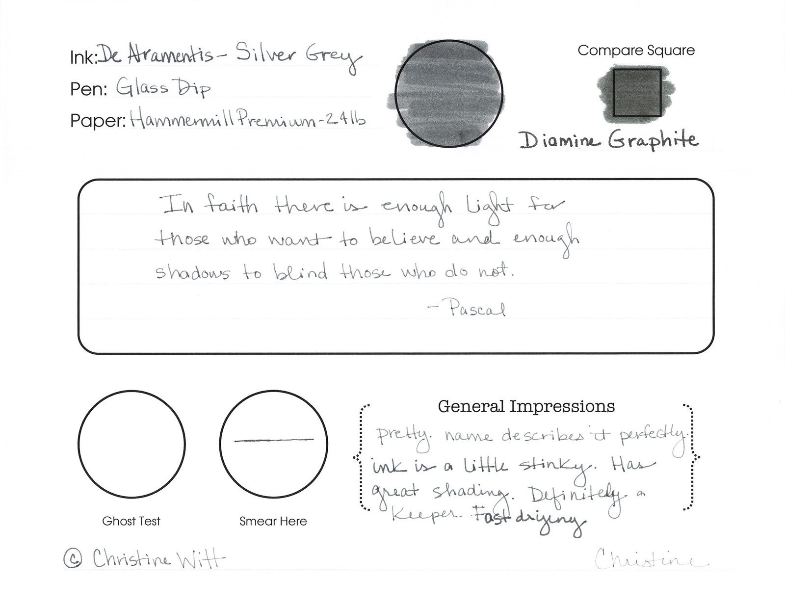
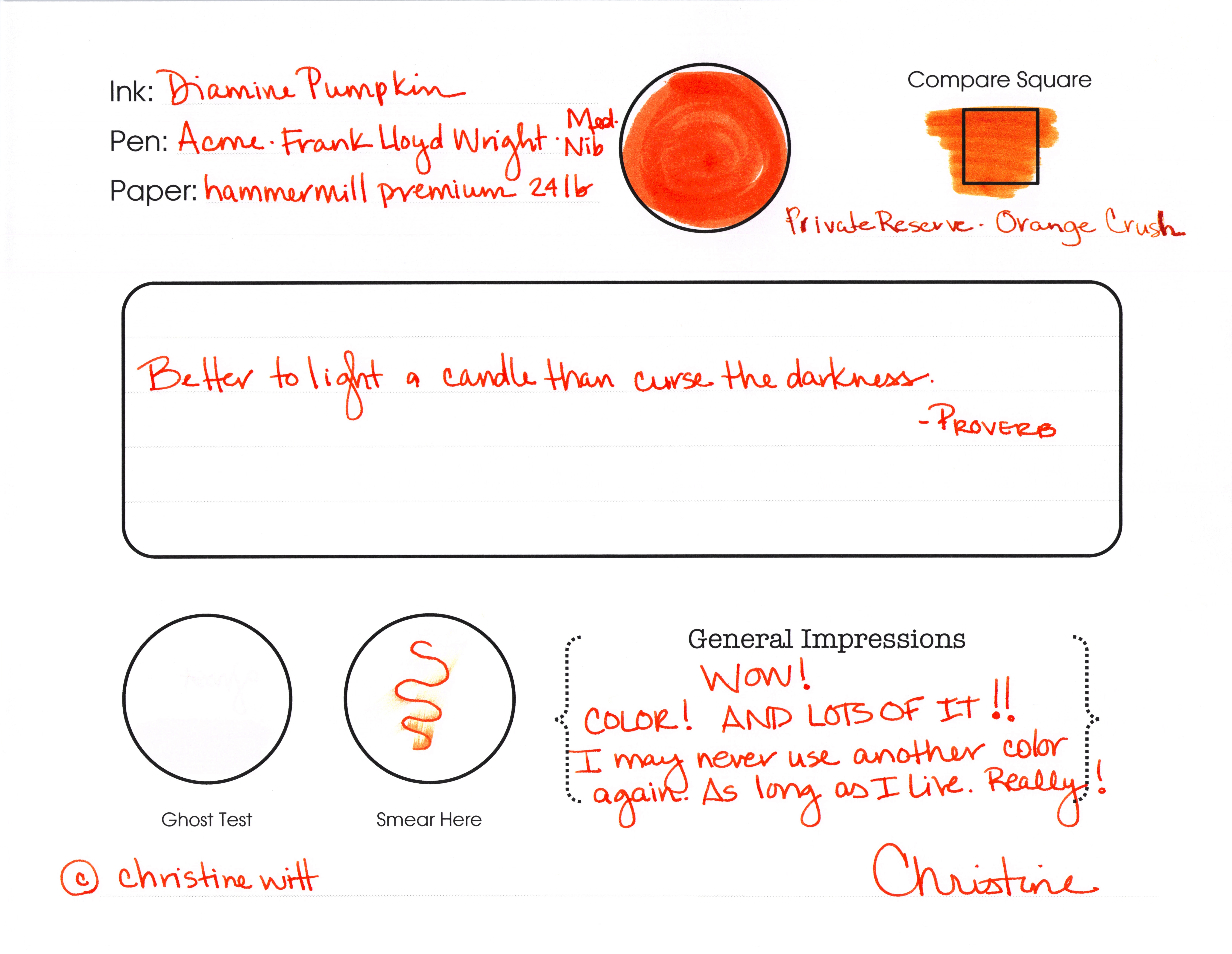
Nice!  I love this Amazon from Caran D’Ache. Remember, Caran D’Ache is not a person!
Anyway – the ink is a true green. It wrote beautifully – though a little wet/smudgy – I’m willing to believe (hope) that had something to do with the pen I was using and allow myself to fall in love with the ink. Not too yellow – not too blue – just green. 
Tiny bit of feathering, but again, that could be linked to the pen. I’m willing to take that bet.
A little shading, too. Not loads, but a nice little bonus.
But the biggest bonus is the big in-your-face color – and we all know how I like that.

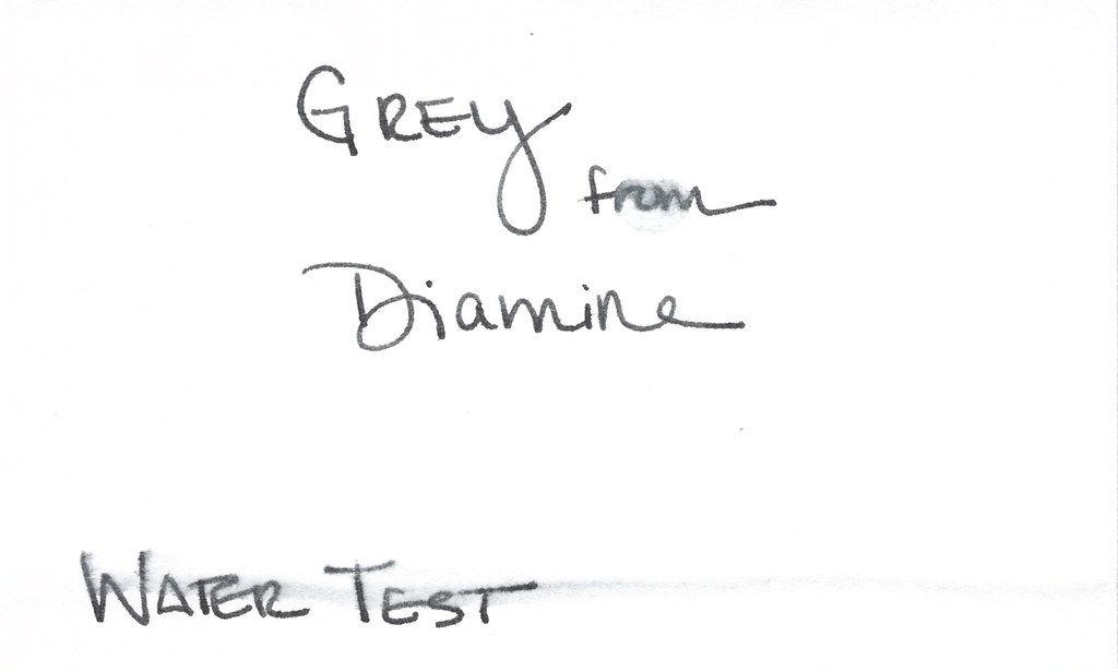
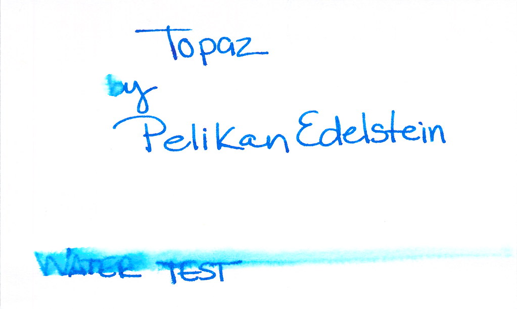
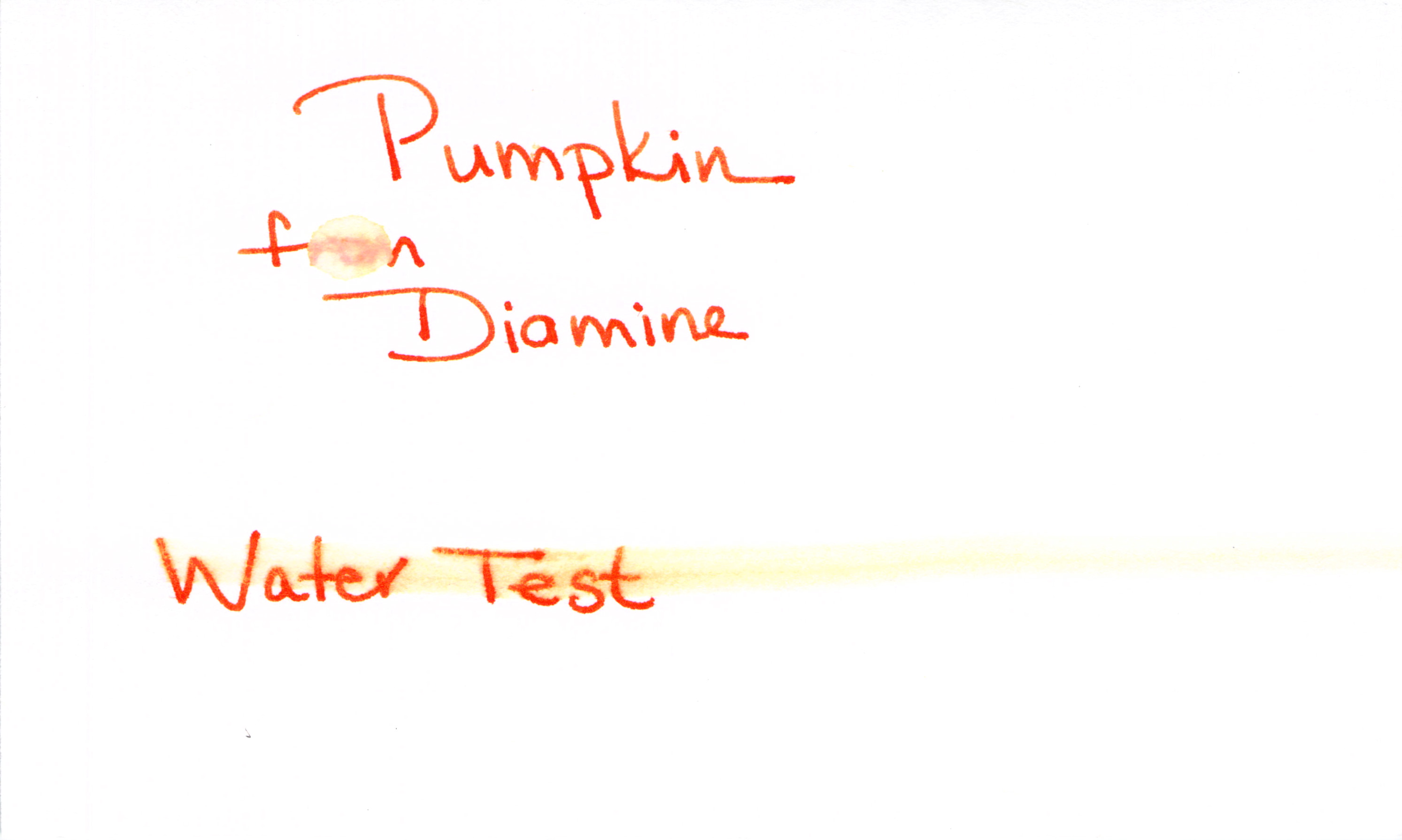
All of this goodness has to come at a price, hm?  Amazon’s water test is a total fail. The droplet of water test (in the word “from” below) completely took over the ink – and, sadly,  the smudge test didn’t fair much better.

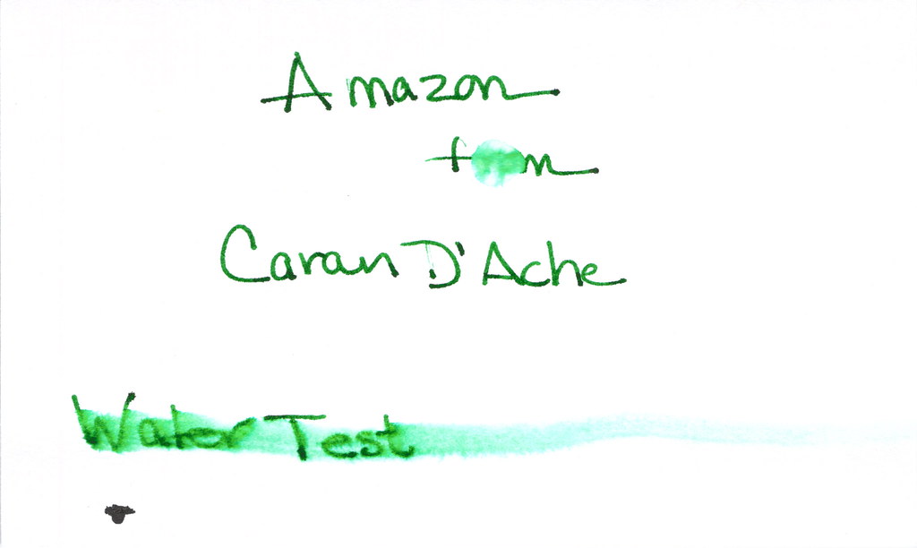
That bloop of ink on the bottom of the water test isn’t Amazon – it’s Invincible Black – but that’s a story for another day!

If there’s another green out there with this sort of color, but more permanency, I wish you’d post a comment and tell me all about it. For now, though, me and Caran – we’re BFFs.

xo

INK REVIEW: Noodler’s Bad Belted Kingfisher

HAPPY HALLOWEEN!!  Now on to the review….Noodler’s Bad Belted Kingfisher.
Crazy name!  Do you know what it means? I have no idea
I like the color quite a bit – a dark steely tealy, yes? Still close enough to blue to be used in a professional setting, but not stodgy at all.
But look at the horrible feathering on the swab above. Granted – this was written on a cheap-o index card, but I do all of my swabs on the same cheap-o cards and none (at least to date) stand out quite like this.  
Even on the Hammermill paper, it’s still feathering. 


I used Noodler’s Flex Nib pen. I believe this was my first (maybe second) time using this pen and, I have to be honest, it was not a good experience. Flow from the pen was good, but it just wasn’t what I expected (more on that another time, though).

Oh no..the water test. Yikes! No bueno, hm?   
Love the color. Do not love the performance.  Given that there are so many inks out there that are pretty, pretty and perform well, I won’t buy a full-sized bottle of this one.
So, tell me – have you tried Noodler’s Bad Belted Kingfisher? Do you love it? What does its name mean!
Oh! And November 2 is Fountain Pen Day!  Can’t wait!!

INK REVIEW: De Atramentis – Silver Grey

Really quick review for today…

Silver-Grey from DeAtramentis is one of my favorites from my Fifty Shades of Grey (Gray) post.

What I love…
..the name of the color matches the color of the ink!
..it’s a true gray – I don’t see any blue or red or green undertones
..no smear, no bleed, no nonsense

What I didn’t love so much…
..it smells a little funky (not like mold funk, but a definitely chemical / petroleum (?) smell. Something.
..maybe a little too fast-drying

I wrote with a glass dip pen for this test and you can see that things are a bit thin. I don’t think this is a necessarily a fair test of the ink for shading and ghosting.  I’ll need to retest at some point.  Maybe I’ll do a single post with all of the inks I’ve promised to retest at some point. It would be a doozy!
Have a great week, everyone!  xo

INK REVIEW: Noodler’s Baystate Blue

The (in)famous Baystate Blue from Noodler’s.
I usually don’t read a lot about inks before I try them out for myself, but for anyone even a little into pens and ink, it’s impossible to avoid reading about Baystate Blue.
First impressions:  It’s pretty, for sure, but it looks a bit purple to me. SATURATED.  
Because of everything I read (staining pens, difficult to clean, beware, BEWARE!!), I decided to wimp-out and use a glass dip pen for my testing.  I don’t think this was the best decision. You can see the feathering above, yes?   I’m definitely going to be brave and retest it in a pen. I want to be fair. 
Of course, I plan to use a pen I like, but don’t love. A pen that is inexpensive enough to replace. 
Here’s what I know…
..no smearing
..ugly feathering on the cheapie index card (above)
..no ghosting or bleeding
..no shading
..COLOR!!
I looooove color. Look at the swabs above and below – that’s some color! Love the saturation.
Oh..and clean-up? Well, it was a bit of a mess (though not the biggest mess I’ve ever made with ink. I wiped the dip pen first to remove any of the wet ink and then rinsed. Unfortunately, I wasn’t mindful about the flow of water and it came rushing out, sending little droplets of water/ink all over the (white) sink. I used a little shampoo and it came right out. Not a huge deal, but I was a bit surprised. I also used shampoo (it was handy) on the glass dip pen – it cleaned right up.
Click to Enlarge Images

I am not even going to ask for your thoughts on this one! I know everyone has an opinion.

INK REVIEW: Diamine Grey

Click Images to Enlarge
A quick look at Diamine Grey..
This color is a true gray (grey, for those of you who insist).  Stately and professional as I said in my Fifty Shades of Grey post last month.
It’s a bit darker than I like. If I’m going to get that close to black, I may as well go black.  
It smeared a bit on my Hammermill Premium paper, but it’s tolerable. Some shading is nice. Tiny bit of feathering – even on the index cards below.
The water test is a fail – not so much from the Q-Tip across “Water Test,” but more from the standing test in the word “from” below.  

But..it is a true gray (ok, grey!) and I do appreciate that.

I’m not going to buy a full bottle of this ink (testing was done from a sample as usual). There’s just nothing that special about it.

Tyler Dahl LOVED this ink. A true sign that YMMV.

Have you tried it? What do you think? Wonderful or just meh?

UPDATE:  For some odd reason, this post received a whole big mess of spammy posts. I’ve closed comments on this post, but please contact me if you have something to add to the conversation! xo

INK REVIEW: Pilot Iroshizuku – Momiji

Yikes!
Is it pink? It is red? It’s – rose. Momiji from Pilot Iroshizuku is pretty, pretty, pretty, and BRIGHT! In yo face! 
It almost glows blue, yes?  
Momiji is also known as Autumn Leaves – not sure why.
But pink ink? I don’t know. I just don’t know! Definitely girly. But what possible use could one have for this? Love letters? You know what I mean? Journaling, perhaps. But I’m not 12 and I don’t dot my letters with hearts. (Usually.)

Momiji is $28 all over the place. And while that’s not a lot of money, it is on the high side for ink. And there are so many inks out there. So many I need to have. I’m going to pass on this one. For now. Unless I find can’t.

But if I’m ever in the market for pink/red/rose – this is going to be my color.

Even if it does schmear all over the place in the water test (even the droplet is a fail). Even if it was a bit of a pain to clean the pen after using. Even if it doesn’t have much shading. It’s that POW of color that has me.

Seriously, though. It wrote great, just like the other Iroshizuku inks. And if this color is your thing, I say go for it. I’m saving my pennies for something else. Probably, anyway. I don’t know!  What do you think? Love it? Hate it?

Here’s what others are saying…

Carpe David
Inky Journal

INK REVIEW: Caran D’Ache – Carbon

Did you know that Caran D’Ache means pencil? (There’s probably more to it, but that’s my understanding.) Here’s how I learned….

A long time ago at pen show far far away, I marched right up to a dealer and exclaimed, “Oh! You have Caran D’Ache! I love her pens!!”

Ug.

Put me right back to high school when someone asked me if I like Def Leppard. Trying to sound like I knew what he was asking while still staying non-committal, I replied, “Yeah. He’s ok. I mean, some of his stuff is alright.”  Oops..Def Leppard is a “them.”

So, anyway. Check out that black. Pretttttttty?  Nice and dark – totally saturated. And it wrote beautifully from the very first stroke of the pen.

No feathering. No shading isn’t a surprise.

Beatiful.

The water test? Well. Not so beautiful. Not a total fail, but definitely a surprise.
Here’s my bottom line – if I had a bottle of it, I’d use it.  I’d rather have Noodler’s Black, though – all of the color, and water-resistance.

Read what others are saying..

Fountain Pen Network (a comparison of blacks..er…an unrealistic comparison)

Goulet Pens is selling for $19.50
and Amazon has it for $20

SF Pen Show is this weekend!! Who’s going?

INK REVIEW: Pelikan Edelstein – Topaz

Aggggh…let’s start with the ugly, shall we?  The water test for Topaz from Pelikan Edelstein did not go well. But, dude, that color. That color!

Moving past the water test – I looooove the bright saturated nature of this ink. Look at how it compares to Pilot Iroshizuku’s Syo ro in the Compare Square. BIF! Bam! Boom! That’s what I need: COLOR!

Topaz almost passes the smear test – just a little wet – when not near water, that is.

You know what else I love about this ink? The name of the ink perfectly matches the color. Topaz!

Oh. So. Pretty.

Whereas so many other inks seem a bit flat, Topaz has a certain glossiness, a beautiful sheen that lasts well after the ink has dried.

As always, click to enlarge images

Check out a close-up of the color . . .

Tiny bit feathering only visible with some magnification (at least to my old eyes). Minimal shading.

This one is a winner in my big book of inks!

What are others saying?
Fountain Pen Network (very in-depth review!)
Art Brown has for $20,
Jet Pens for $21, 
and 
Goulet for $25.   
I’m getting it!

INK REVIEW: Pilot Iroshizuku – Kiri Same

Kiri same from Pilot Iroshizuku is such a pleasing shade of gray.  I like my gray inks to look as much like pencil as possible – so that the reader may even wonder if I’d written in pencil. A simple fine line. Mmm. This one fits the bill, but when compared with other grays – it seems to have some red qualities to it. It’s probably not enough red to notice when the ink is on its own, but the red is definitely there.

The above swab is on a cheap index card (really, are there any quality index cards out there these days?). The feathering on the index card had me concerned, but look below at the water test – no feathering, no smearing.  For the water test, I write, wait a few seconds, and then drag a moistened Q-Tip across the writing. I also place a water droplet on the card – in this case, it’s on the L in “Pilot” – crazy, right?

Pricing is the same as the other Iroshizuku inks – $28 at most places. 
I like the hint of shading, too. Some feathering on my Hammermill Premium paper, but you have to get pretty close to see it. Definitely not something that would keep me from enjoying this ink.
This one is a temptation! I’m going to plan to try another sample. Perhaps on a variety of papers. And then I’ll know. Is this my gray?  Which is your gray (or is it grey)? I answered that question last week.
Here’s what other people are saying . . . 
Fountain Pen Network  (look at that shading!)

Seize the Dave (the essence of storm clouds in a bottle)

Grays are a favorite color for me. Love, hate, or indifferent – how do you feel about gray ink?

INK REVIEW: Diamine Pumpkin

Last year we picked up, packed up, and moved from New York to the San Francisco area. We loooove it here in the Bay area, but I sure miss autumn in New York.  The smells, the weather, the COLOR!
This screamin’ orange ink from Diamine really does it for me. So bright, so right. It’s a perfect shade of orange. Not too brown, too yellow, or too red. I’m in love.
Check it out. 
click the image to see more detail

See what I said? “I may never use another color again. As long as I live. Really!”

Ha! How crazy is that? I might mean it, though.

Look at the Compare Square. I think Orange Crush from Private Reserve looks more like a shade of pumpkin than Pumpkin from Diamine. I really think I should be in charge of naming colors.

There’s some smearing, but it’s not awful. I made that squiggle, waited just a few seconds and then ran my finger along the ink.

I didn’t have any ghosting – and I wish I could come up with a better way of illustrating my ghost tests. I’ll work on that. You work on getting this ink. Today.

Check this out…

Some shading, but it’s mostly super-saturated

There’s some slight feathering on Hammermill paper, but not much.  If we were going to see terrible feathering, it would be on the swab – those are done on 3×5 index cards and the paper is so thin. (Does anyone make high quality index cards?)

Whew. That’s some ORANGE.  I’m in love. Orange Jello! That’s what it reminds me of.

I almost wish I didn’t have to show you this . . .

Water Test – Fail

Poo.

Here’s how I test for water resistance:

1. Write with the ink (always a good first step!)
2. Let it dry for 10+ minutes
3. Place a droplet of water on one word (“from” in this case) and let that dry naturally
4. Smear a moistened Q-Tip across the words “Water Test”

I’m bummed that the water test is a fail. I’m not surprised, though. My limited understanding is that it’s difficult to get water resistance from most mixed shades like purple, orange, green. Wah Wah.

All of this said, I (probably) will not be using this color for everrrrrrything, but I’m totally into it for some fun this fall. I’ve found it all over the place for $12-15.

Are you seasonal about your ink colors? Which are your current favorites?