QUICK LOOK WEDNESDAY: Four Blues from Diamine

A quick look at four blue inks from Diamine.

 Diamine Midnight  (strange that this image is bigger than the others, right?)
  Diamine Presidential Blue
  Diamine Registrar’s Blue Black
  Diamine Denim

Which do you love?

I’m not sure that I have a favorite, but I definitely have a least favorite – Diamine Registrar’s Blue Black. It’s not very well saturated – looks more like a gray/grey – and I just don’t like it. Not one little bit.

Ink Review: Noodler’s Red

Woooo..this is some red!  Great color. Terrific saturation.

love this quote

It writes well, too. No bleeding or feathering.  It’s a bit on the wet side, but I was using a broad nib.

It’s definitely not water-resistant (not many reds are).

Noodler’s Red is a true red. Not too much blue or orange in the mix – just right. Look at the Compare Squares below and you can see what I mean. It’s perfectly red.

I don’t see a lot out on the Interwebs talking about Noodler’s Red. I think it’s because so many people are looking for a blood red rather than a true and bright red.  Which do you prefer?

INK DROP: May 2013

Seriously? I’m probably the last person to comment on the May Ink Drop color from Goulet Pen Shop.

I’ve been just a little busy. There was the wedding. And then the baby! (Not ours – bummer.)

But here they are…

Noodler’s 54th Massachusetts
De Atramentis Ocher Yellow
Roher & Klingner Alt-Goldrun
Roher & Klingner Alt-Bordeaux
De Atramentis Mint Turquoise

They look so different on different papers, yes? Four passes on the Clairfontaine Triomphe paper to get close to the same look on the Brush Dance paper.  (Disclaimer: I’m the president of Brush Dance and maybe just a little slanted in that direction, but really? We have great paper.)

As for the inks? I’m not IN LOVE with any of them.  Each of them falls squarely into that “not a color” area for me. Alt-Goldrun is so popular – I want to write with it very soon.

What do you think? Love ’em? Hate ’em?

Ink Review: Pilot Iroshizuku Tsutsuji

A quickie look at Pilot Iorshizuku Tsutsuji this morning.

First thing’s first – Tsutsuji means Azalea.  Does anyone know how to pronounce Tsutsuji? Help.

I LOVE this color. Look at the saturation.  Yow.  That is some screamin’ bright IN YOUR FACE color!

It reminds me a bit of Momiji, but more purple and more saturated. And while you may not be able to tell from my scans, it’s not at all like Diamine Flamingo Pink. Flamingo has a bit of orange in it.

Tsutsuji is a great ink – the color and saturation are just part of that.  It writes beautifully and is well-behaved on a variety of papers.  There is zero (zero!!) smearing.  It doesn’t resist water very well, but this is one of those colors that typically don’t do well with water.  (I forgot to do the highlight thing – oops.)

Looking for a pink ink that leans to purple – Tsutsuji is just that. How would you use this color?  I definitely have no practical use for it – but that doesn’t matter!

INK REVIEW: De Atramentis Cement Gray

I like gray inks. Always looking for that perfect shade. It’s been a long time since I’ve added an ink to my Fifty Shades of Grey line-up or talked about the spelling of gray -vs- grey. Too long if you ask me!

Unfortunately, I’m not wild about Cement Gray from De Atramentis. (Thank goodness it doesn’t stink like cement, though!)

The problem seems to be that there’s a lot of green in the ink.

Admittedly, it’s difficult to see the green with my scans, but it’s there. It’s there so much that I pointed out to Mr. Pentulant that he might want to consider this ink as his dark-nearly-black-but-still-green choice. He tried it for a short while, but didn’t love it.

The green is most apparent when looked at along side other inks…

As usual, I wrote with this ink for about a week after the review. It wrote fine – a little hard-starting at times even in a medium nib Lamy Safari.

The problem (for me) was the color.  What do you think? See the green? Like it? Hate it?

INK REVIEW: Caran d’Ache Sunset

Caran d’Ache Sunset is such a pretty color. Before you fall in love with it, though, you should know something. 
It’s been discontinued.
In fact, the entire line is being refreshed. Here’s a post about it from back in February on Ink Nouveau. The new ink names amuse me. The new price does not. At 40 bucks a bottle, it better be some impressssive ink, right?
But that’s not what we’re talking about today.  This is…

It’s a good ink. I liked it a lot. After writing with it for a week, I no longer thought it was  true red – too many pink-ish tones for that, but it is a beautiful color.

Have you ever had a favorite ink end up discontinued? I have not – yet.

INK REVIEW: Sailor Jentle Apricot

I think I need to admit that I’m into orange inks.
First there was Diamine Pumpkin with its WHOA color. And then there was Noodler’s Habanero with its incredible capacity to shade.
And now – Sailor Jentle Apricot.
At first, I thought we were heading toward another Stipula Sapphron situation. But no – this is different. Sailor Jentle Apricot is a special ink.  Nice color – beautiful shading.

I ended up using this ink for a week or so after the review and reading the review now, I don’t think I’ve done it justice here.

In fact, I ended up enjoying it so much that I bought a bottle of it back in March. It’s not perfect – those water tests are not going improve with time, are they?

I’m going to come back to this one. Create some writing samples in a variety of pens and come back to talk about it.

Have you ever had a mediocre first reaction to an ink that you later ended up loving?

INK DROP: April 2013

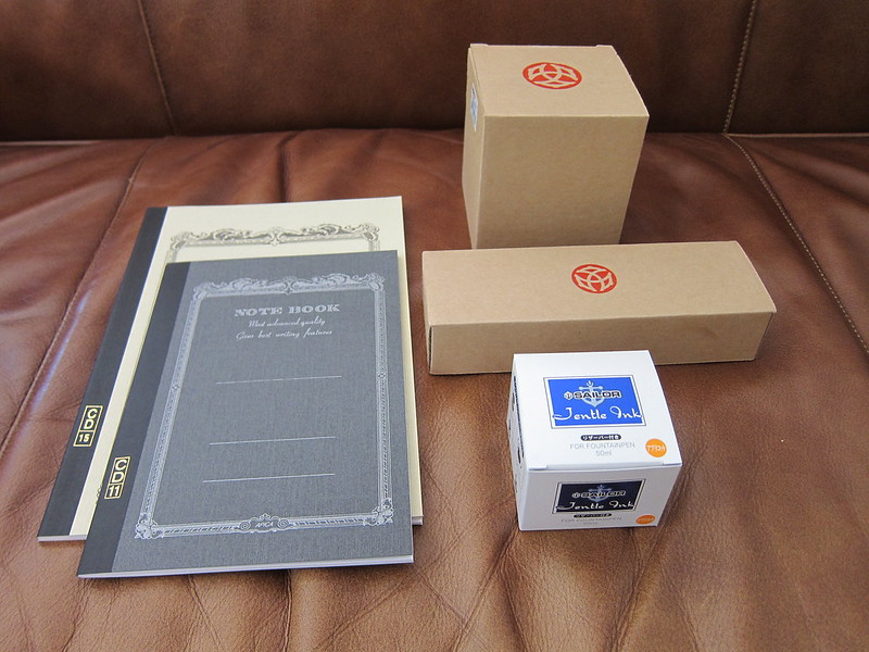
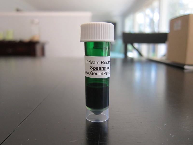
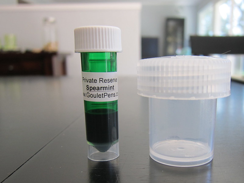
I received my Goulet Pens Ink Drop delivery a couple of days ago.

What a great group of colors, yes?

If I had to choose one that didn’t fit with the others, it would be the De Atramentis Indigo Blue – it’s a little dusky compared with the other clear clean colors, but I’d definitely write with it.

Between the two turquoise colors, I would choose the Lamy. Though the colors are very similar, the Lamy is definitely more saturated and I like that.

The Namiki blue has a bit of red in it – defnitely still blue, but leans more toward the purple end of things to my eye.

I’ve heard some great things about Diamine Soft Mint (which ended up a little funky in the scanned image above) and hope to have time to take a closer look at it in the very near future.  Here’s a picture from my iPhone – the color is a bit better here….

Kudos to the person at Goulet Pens who chose this assortment! Well done.

Oh..and here’s the image I posted over on Instagram. I’m @christinewitt there.

The Fine Point: Recent Purchases

I’ve been shopping!

The picture above are some of the items from my most recently Goulet Pens order. Reviews coming to a blog (this one!) near you soon.

I’ve heard Private Reserve Spearmint is a great shading ink. Going to take it for a spin.

I’ve read a lot of positive things about Nalgene bottles – especially for traveling with inks. I bought a few bottles and am going to give them a try soon. Will report back.

And…omg…finally…

It’s a Waterman 52. I have to tell you – I’m in love. Over the moon. Warm + fuzzy. I am in love with this pen. It’s a wet noodle – ultra-super-flexy – and I am in love. Mini review and handwriting samples coming soon!

Have a great weekend!