Oh. Goodness.
Gracious. Me.
Oh. My.
![]() |
Pilot Iroshizuku Fuyu-syogun Swabs (3, 2, 1) |
Have mercy.
![]() |
Fuyu-syogun Shading |
Oh. Goodness.
Gracious. Me.
Oh. My.
![]() |
Pilot Iroshizuku Fuyu-syogun Swabs (3, 2, 1) |
Have mercy.
![]() |
Fuyu-syogun Shading |
But the more time we spend together, the more I liked you.
You were a bit wet in the Lamy Safari with a broad nib, but who isn’t? You were a little smeary, but I can deal with that.
But here’s the thing. You wrote great. And the water test? Holy smokes.
And you’re pretty. Oh-so-pretty. Just a tiny bit orange to make you softer than other reds. Totally different from Noodler’s Red.
The truth is, Morinda, after visiting with you for a week or so, I might be in love with you. We’ll see – I’m not quite ready to commit to just one red, but maybe…just maybe.
Love,
Pentulant
P.S. I am just about at the end of the reviews that I scanned before the highlight test – thank goodness. And, yes, I am just lazy enough that I didn’t go back and fix the issue. Haha.
Time for this week’s Quick Look Wednesday!
I like all of these inks for different reasons.
De Atramentis Indigo Blue – a straight-forward blue that could be used in any setting
Diamine Eau de Nil – (does this mean River Water?) a bit of green, but not quite enough to call it turquoise
Private Reserve Ebony Blue – maybe my least favorite because it looks more like a green-black in my swabs. Have any of you tried writing with this one?
Noodler’s Ottman Azure – boom! Pure blue saturation with this one.
So, yeah, each of these are so different from the others and I like them all. Which is your pick?
It writes great. No smearing. Maybe a little dry, but not bad. Some nice shading.
You’ll have to believe me when I say that it handles highlighting very well. (What is up with me and all of the failed highlighting tests?)
The water test is pretty amazing. Even on the original, I have to squint to see where I dragged the web cotton swab across my writing.
Overall, this is a gray I dig and I could see using it on a regular basis. That is, if I hadn’t already fallen in love with another gray. Stay tuned . . .
Time for another Quick Look Wednesday!
What do all of these inks have in common? They are all samples from my bag of red inks.
Red?
The above swabs were done as one of my earliest experience with Tomoe River Paper. I did these (as I do all of my swabs) with a cotton swab saturated with the ink and the “scrubbed” onto the paper. Even though the paper is super-duper thin (and wrinkles easily) , there was zero bleed-through. None.
And.
The colors just…pop!…from this paper. This is the way the ink manufacturers must mean for their inks to be experienced.
Here’s a link to the full-size image. It’s big. It’s worth the load time.
Check this out…
![]() |
Diamine Majestic Blue |
And this…
![]() |
Pilot Iroshizuku Fuyu Syogun |
So. If you’re in love with paper and inks and pens and such – Tomoe River Paper is a must try. It’s definitely not an everyday paper for me (wrinkles easily, you know), but wow. Wow.
Have you tried Tomoe River Paper? What other papers do you love?
Super-duper quick look today.
I love Diamine Chocolate Brown – the deep, rich saturation – yum. It seems to have less red in it than Private Reserve Chocolat and I like that.
I usually love Pilot Iroshizuku inks, but neither of these are doing it for me.
Which is your favorite from above?
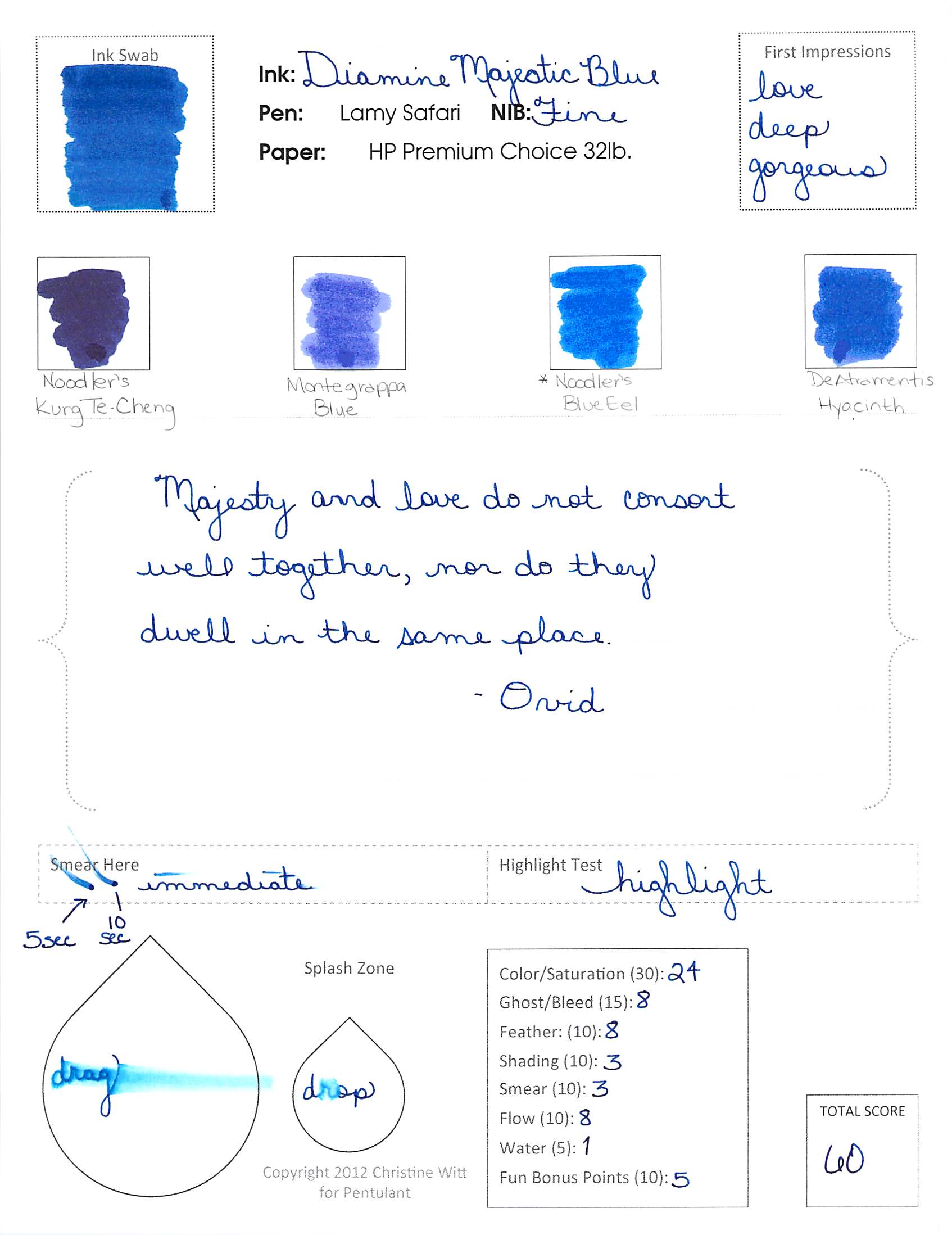
Diamine’s Majestic Blue is not a perfect ink. If you’re looking for an ink that is fast-drying and water-resistant, you should move along because this is not the ink for you.
However. If you’re looking for a blue ink with absolutely fabulous color and saturation – this may be the ink for you. It is for me.
I love Majestic Blue.
The ink is rich with color. Not so bright that it cannot be used in an office environment. Not so dark that you question if the ink is blue or black. This is blue.
I actually wrote this review awhile back (using my old and kinda misleading form) and loved it so much that I ordered a full bottle. I’ve used it nearly every day since then and am still in love with it.
I’ll just blurt it out: I don’t love this ink. I don’t even like it.
It’s a smeary hot mess, though. (Can’t believe I missed dotting an i – that’s not like me!)
One of the worst things, though, about De Atramentis Hyacinth? It stinks. I don’t mind a lightly perfumed ink, but this is just too much for me. It’s a sickening sweet smell that tends to linger.