The Fine Point

Lamy Safari Fountain Pens + Dudek Modern Goods

It’s been a busy week. Over at Brush Dance, we are looking at so much art for 2016 calendars (yes, already), selling so many 2015 calendars (yes, already), and talking about lots of new projects.

And here’s what’s going on with in fountain pens . . .

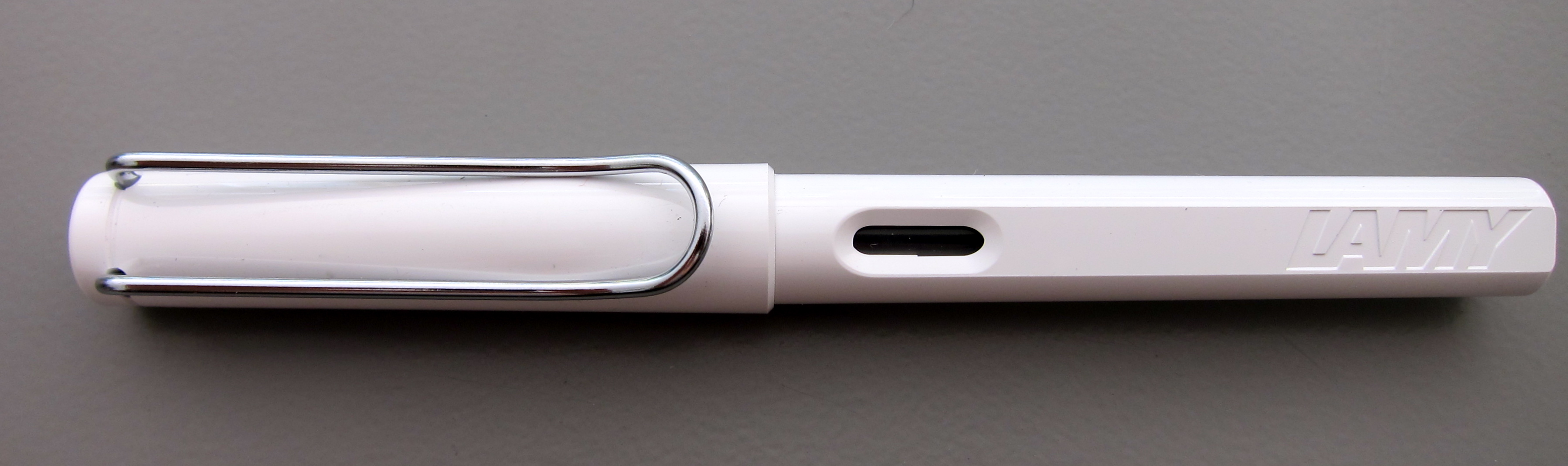
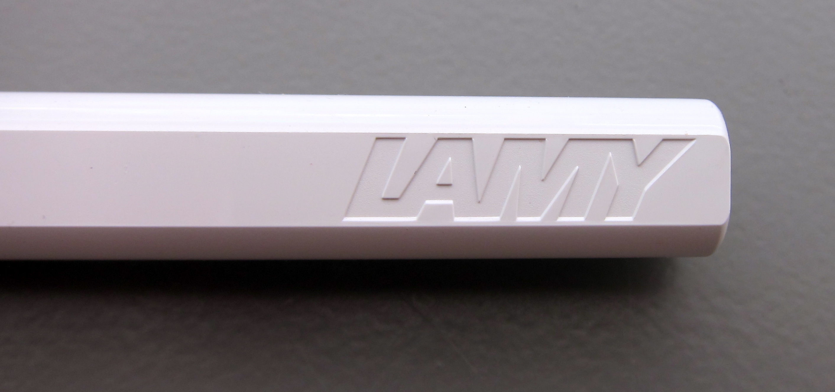
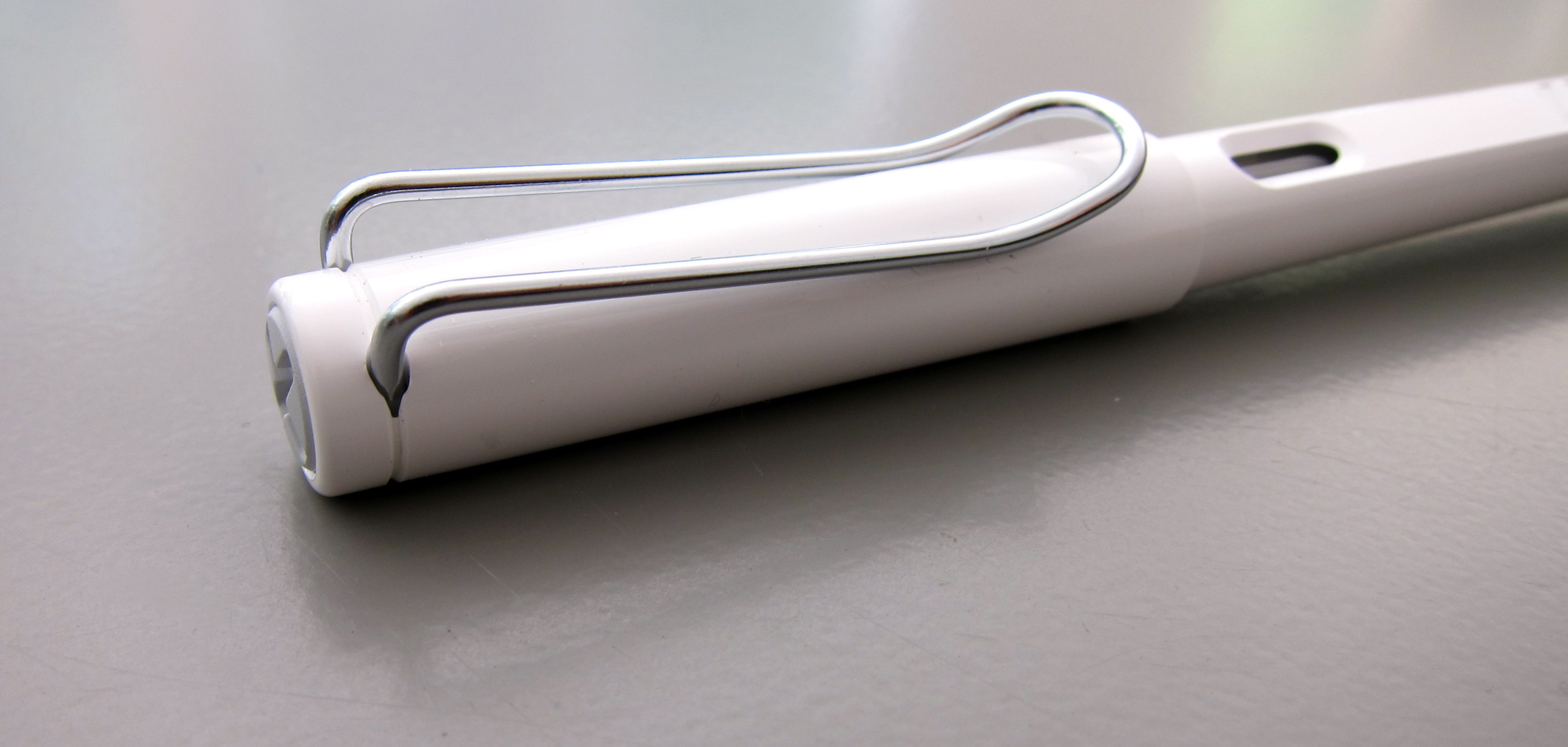
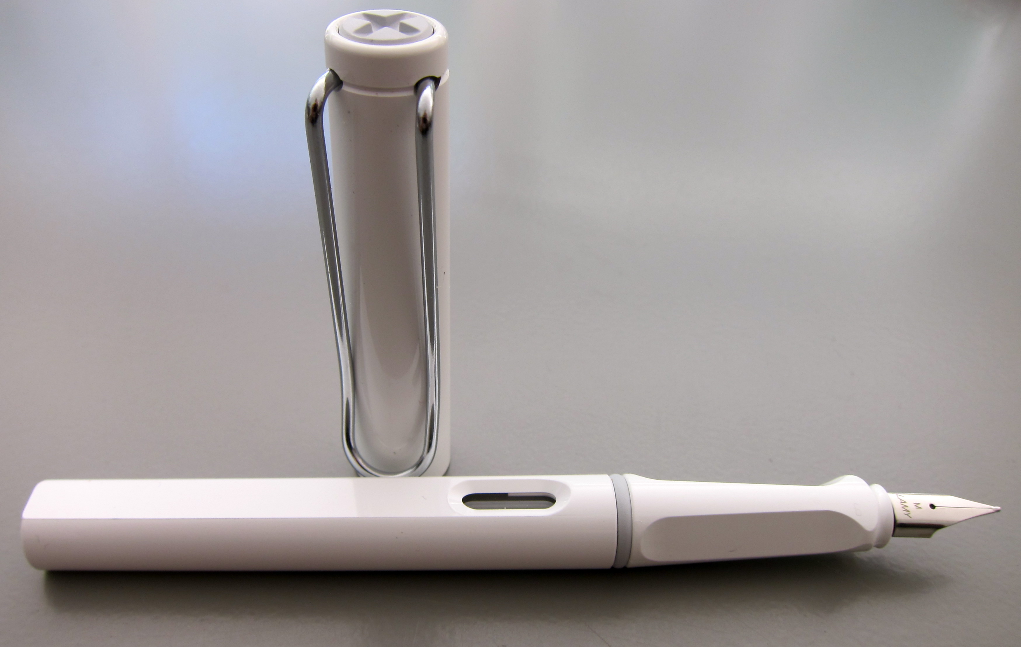
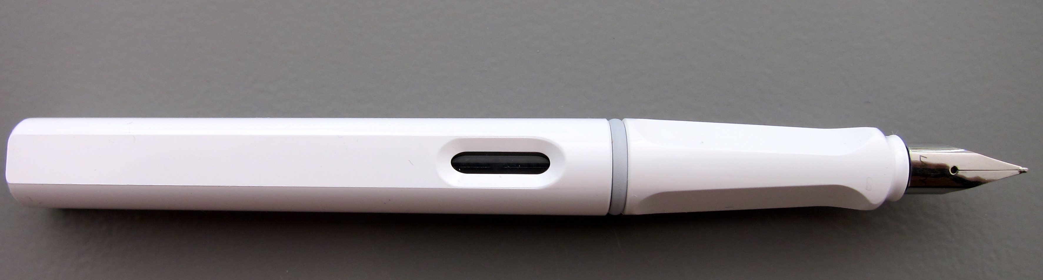
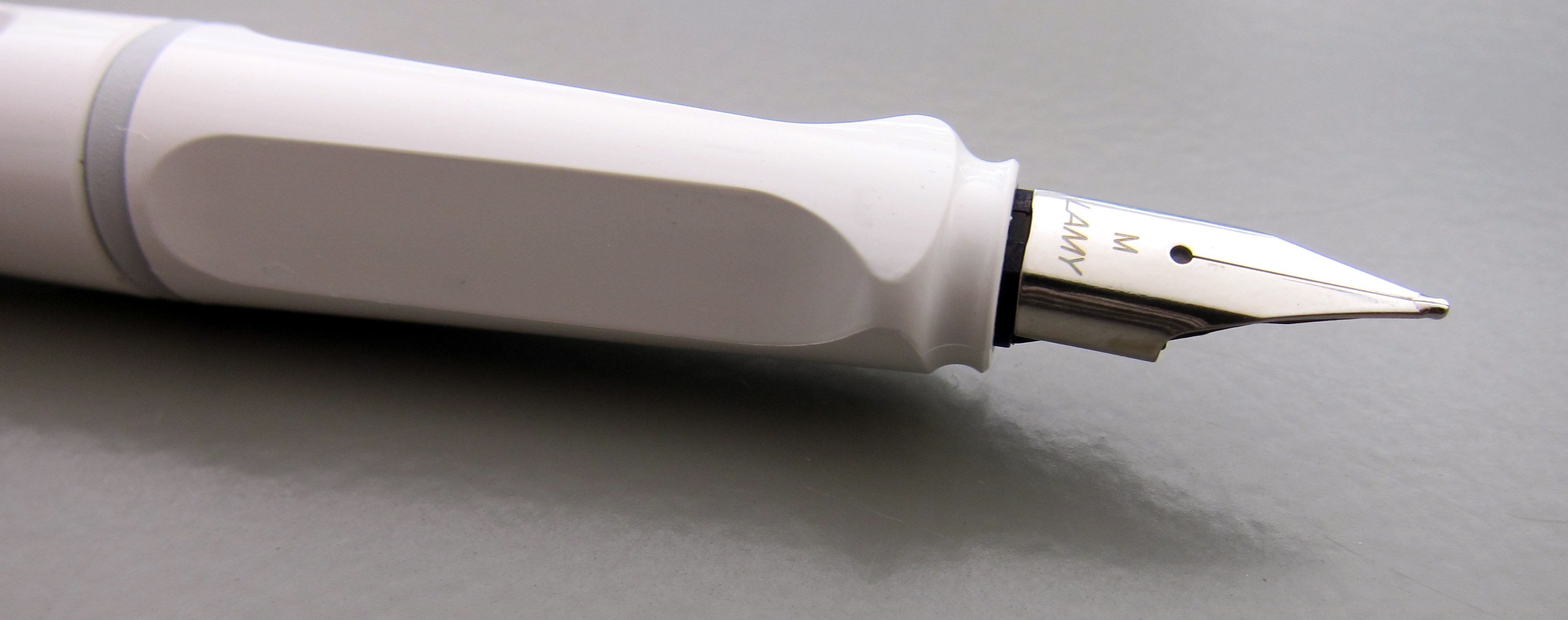
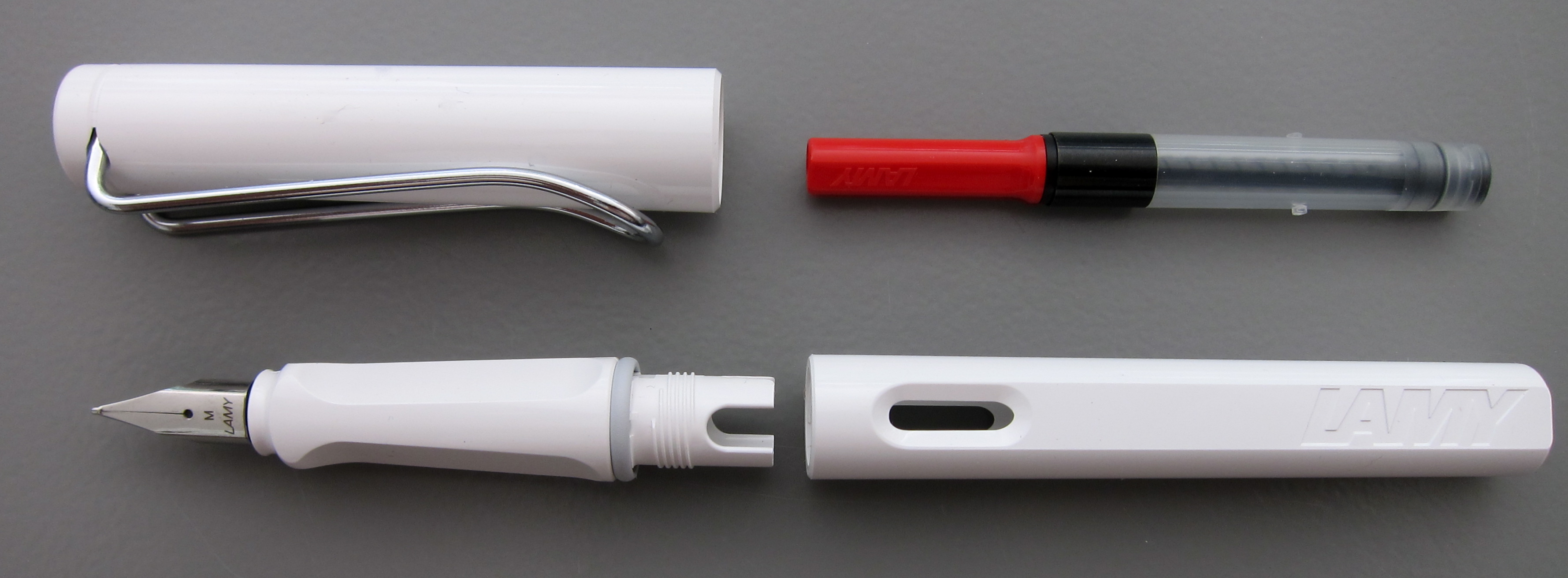
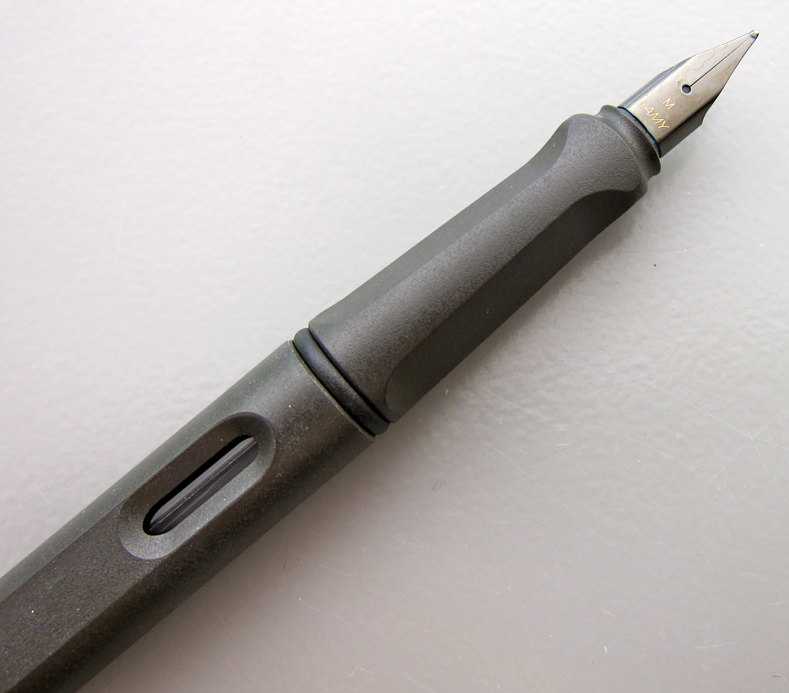
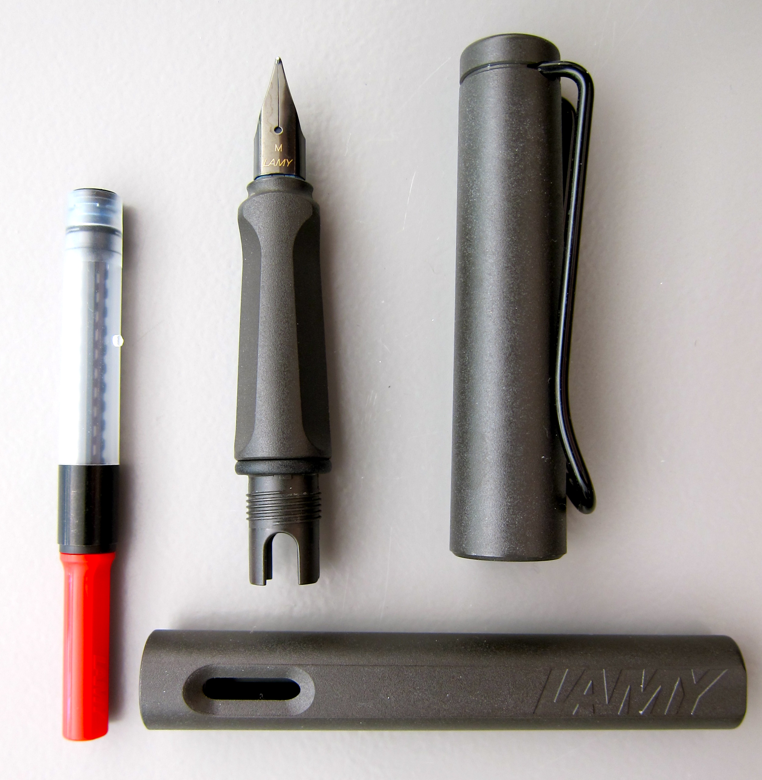
I received my Cube from Mike Dudek of The Clicky Post and Dudek Modern Goods. I ordered the least expensive item on his page – you know, just in case. You guys, it’s pretty incredible. As you can see from the photo above, Lamy Safari fit perfectly.

I was a little worried that the inside of the openings would be a too rough to trust that they wouldn’t scratch my collection, but that is not the case at all. The Cube feels weighty, solid in your hands and it’s perfectly smooth – perfectly perfect. Well, there is one tiny small issue – I actually bought this as a gift for Mr. Pentulant (who only dabbles in fountain pens, but needed a safe place to keep the few that he owns I let him borrow), and now The Cube is on my desk.

I have no affiliation with Dudek Modern Goods other than a sincere admiration for what he does.

Pen Addict reviewed the Retro 51 Tornado Black Fountain Pen. I don’t think this one will make it to my wish list.

The Well-Appointed Desk dressed the part for Handwriting Day. I might be jealous.

Gourmet Pens didn’t have anything to say about Akkerman Hofkwartier Groen.

Inkdependence reviews Namiki Blue. You like?

Oh..and, finally, I changed my name over on Instagram. I’m Pentulant there now, too, because that’s how I roll.

Have a good weekend.

CHECK IT OUT MONDAY: Instagram

six red pens
I’ve been busy over on the Instagram again.  

Pocket Dept. Notebook and Lamy Safari Fountain Pens

I’m seeing a definite trend.  Ink reviews on the blog. Pen porn over on Instagram. It wasn’t even on purpose – it’s just so easy. And it doesn’t feel like it has to be perfect.

Recent delivery from Goulet Pens

What does the fox say?
I love that this looks like a selfie. haha

If you’ve not tried this, you simply must.
Simply. Must.
Trader Joe’s Speculoos Cookie & Cocoa Swirl

Tippy top of the Golden Gate Bridge on a Saturday evening
Nib creep is kinda sexy
Always Journey Dreamer Journal from Brush Dance

I also wanted to remind you today that I’m giving away one of the amazing Journals / Notebooks pictured above.

FRIDAY FOLLOW: Instagram

If you’re not on Instagram, you’re really missing something.  
In no particular order, here are some of my more recent Instagram images . . . 
The Waterman Edson Twins (they are not identical)
VW swag for Baby O (because, really, how cute is this?)

An inky project I’m working on

Love #inkinthesink

Right?

My TWSBI Collection makes me swoon just a bit.

Strawberry Ice Cream

Doesn’t everyone meal plan with a #wetnoodle?

My beloved Montblanc Boheme collection.

I opened Mr. Pentulant’s textbook, took this picture, and then promptly closed the book.  

And here’s a listing of just some of the people I follow…

Gourmet Pens

Ed Jelley

Ellina

Pablo Garcia Melnick

Gerald Taylor – aka MyCofeePot

Chrissy Sparks

PenAddict

What I love about Instagram is that most of the people I follow post more than just pens. It’s a real glimpse into the person and what is important in his/her life.

Here’s my Instagram link.  Where is yours?

QUICK LOOK WEDNESDAY – Six Pretty Colors

Sometimes, I want to play with my pens, inks, and papers, but can think of nothing to write.

The first step is to write the name of the ink and the name of the pen (see above). I just noticed that each ink is from a different manufacturer – nice.

Apparently, the last resort is to write things that I overhear from the television (see below).

It was actually quite a bit of fun – watching and scribbling, changing pens and writing a bit more. I love the way the entire sheet of paper looks – each color is pretty amazing on its own, yes?

Let’s take a closer look . . .

Above – DeAtramentis Alexander Hamilton. I love this purple. It’s so rich and deep in color – nice saturation. I don’t see this ink discussed much on the various forums, but I think this is a purple that could be used anywhere.  (more on that another day)

Below – Private Reserve Spearmint. One of my favorite green inks. It looks a bit dark here to my eye, but it is usually quite cheery.

Do you have a guess as to which show I was watching at the time?

Below – Montblanc Hitchcock. A gorgeous blood red ink if I ever did see one. Some really pretty shading in there, too. I have to confess, I have a quite a lot of this in my cabinet. Shall I keep it forever? Use it as if I’ll never run out? Or maybe even sell some?

Below – Noodler’s Habanero. A favorite. That shading. The brightness of the color. Need I say more? Mm..wait, I already did right here.
 

By the way, the above quote is the one that seems like the one that would tell the secret of what I was watching. Have you guessed it yet?

Above – Pilot Iroshizuku Fuyu-syogun. I wonder if I only could have one ink, if this would be it. Check out my big review here. It is crazy CrAzY to think that I, lover of bright and beautiful colors, would be so taken with a gray ink, but there you go.

Above – Diamine Majestic Blue.  Easy to see why it’s one of my favorites, yes?  So pretty.

And, so, there we have it – six pretty colors. All so different from one another and yet all so wonderful.

Which show was I watching?  Downton Abbey, of course!  Have you seen it? Highly recommended.

INK DROP: April 2013

I received my Goulet Pens Ink Drop delivery a couple of days ago.

What a great group of colors, yes?

If I had to choose one that didn’t fit with the others, it would be the De Atramentis Indigo Blue – it’s a little dusky compared with the other clear clean colors, but I’d definitely write with it.

Between the two turquoise colors, I would choose the Lamy. Though the colors are very similar, the Lamy is definitely more saturated and I like that.

The Namiki blue has a bit of red in it – defnitely still blue, but leans more toward the purple end of things to my eye.

I’ve heard some great things about Diamine Soft Mint (which ended up a little funky in the scanned image above) and hope to have time to take a closer look at it in the very near future.  Here’s a picture from my iPhone – the color is a bit better here….

Kudos to the person at Goulet Pens who chose this assortment! Well done.

Oh..and here’s the image I posted over on Instagram. I’m @christinewitt there.

PEN REVIEW: Lamy Safari White

Clean!
Fresh!
Sharp!
I’ve been loving my Lamy Safaris lately. This one is white with a medium stainless nib.
Let’s havea quick look at this pretty thing. More in-depth reviews are coming up next week. Stay tuned.

It has a nice glossy quality to it.  I used to haaaate the look of the huge clip, but isn’t that nice looking? Like it could really hold on to something.  (Do you clip your pens to your shirts? Does anyone?)

Pen porn…

The converter doesn’t come with the pen. Inconvenient. But it does come with a cartridge. Convenient. If you’re into those. I’m not.

Love the way it writes. Love.  (Click to make images bigger.)

PEN REVIEW: Lamy Safari Charcoal with Black Nib

As we all know from my first post, I’ve been in love with fountain pens since the 1980s.  Somehow, though, the entire Lamy line had eluded me.  Crazy, right?

Earlier this year, my deep love for fountain pens, ink, and paper was reignited. I blame Goulet Pens and their zillion ink samples. (Thank you, Brian and Rachel!)

I also started peeking in at Fountain Pen Network from time to time. Lamy this, Safari that. So prevalent were the posts about the Lamy Safari and its astounding incredible wonderfulness – how was I to resist?

Now, Jeff swears I bought this for him. I remember no such conversation. He even says it was delivered to him wrapped – with a bow! He so crazy. (Later, he admitted that he knows that all pens in the house belong to me – he’s just allowed to borrow them from time to time.)

This pen is the charcoal color. I chose a black medium nib.  I have it on good authority that the black steel nibs write the same as the traditional steel nibs.

The pen is hard plastic. The grippy section is triangular. Some people have issue with the shape – I think it depends on how you hold the instrument and your writing style. For me, it’s fine. Not ultra-comfy, but it’s definitely not uncomfortable. (Did you know I’m left-handed?)

I love the ink-a-boo (I just made that up) window. Let’s you see how much ink you have left – and, if you’re forgetful, what color is in your pen.

The Lamy Safari can take (proprietary) cartridges or use the (proprietary) converter for unlimited inking options. (Be brave, go converter.)

I found it to be one of the easiest pens to clean. Bonus points for that.

But we all know the big question. How did it write?
Like. OMG. That’s how it wrote.
I love this pen. The Lamy Safari is one smooth operator. (Maybe too smooth if you like a little traction.) And I think it makes my handwriting look nice without even trying.  (Click images to make them bigger.)
Obviously, some of this is the ink and paper combination (Pilot Iroshizuku Syo-ro and Clairefontaine Triomphe), but look at that shading!  Can you even stand it? In-freakin-sane.

I made these lemon pots de creme using the lemons from the tree in our backyard. 
So. Yeah. I’m loving the Lamy Safari.  Costs around $30. Mine came with a cartridge I won’t use. The converter was around five bucks.
In fact, I loved it so much that I now have several of them – stay tuned! (Yikes!)