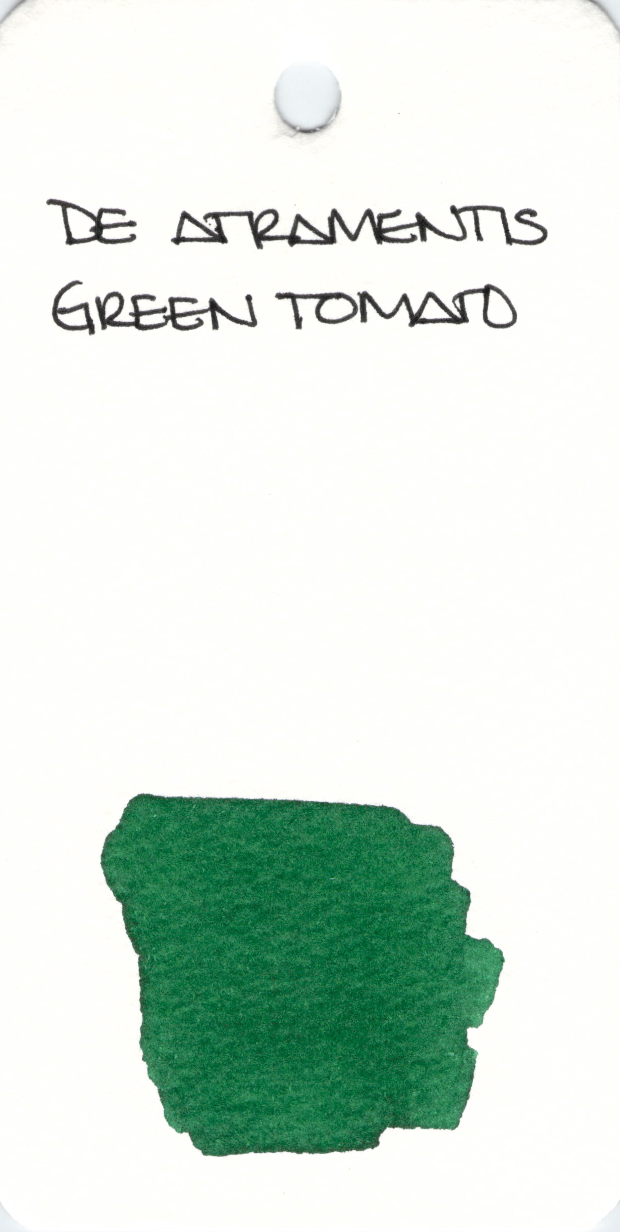
De Atramentis Green Tomato: yes, it’s scented.

De Atramentis Green Tomato: yes, it’s scented.
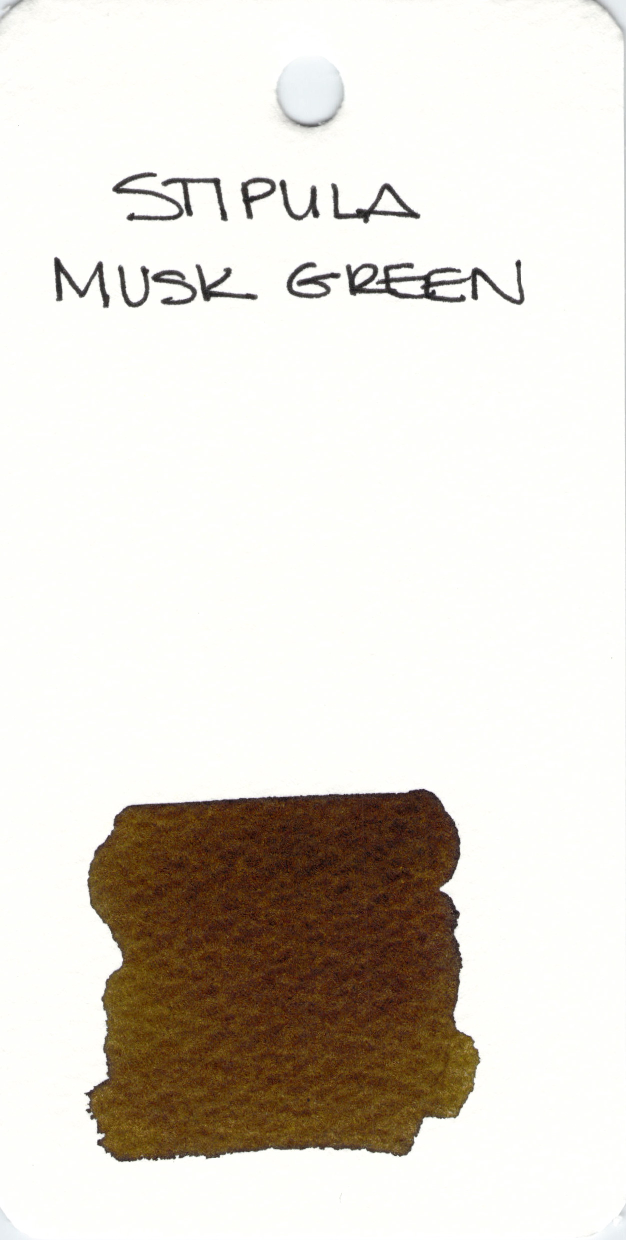
Stipula Musk Green isn’t an ink I’ve used. However, I can say that it doesn’t look very green here. I’m oddly attracted to it!

Lamy Green is.
🙂
This is a long and interesting article. It’s not only about Justine Sacco and how one stupid tweet changed her life, it’s also about how easy it is to “pile on.” The person who started this piling on later apologized to Justine when he experienced much the same thing. Lesson: words are powerful.
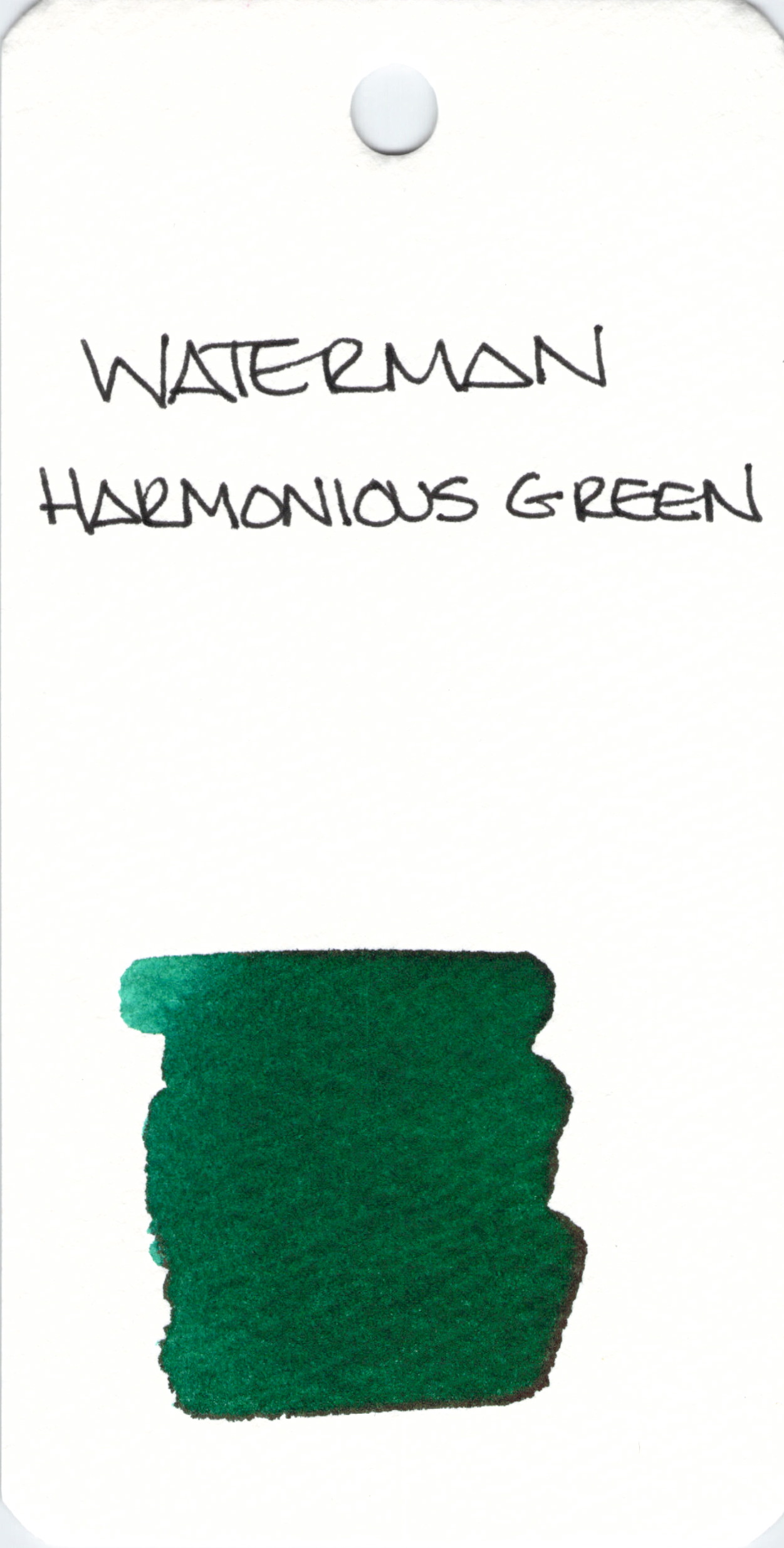
Waterman Harmonious Green looks like a fairly standard green. I’ve not written with it yet, have you?
And check this out. I’ve read this blog for ages and today, the writer posted about her great grandfather’s journal. He was in love. Big love.
 Monteverde Green
I like green inks a great deal and this one is a good classic green.
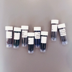
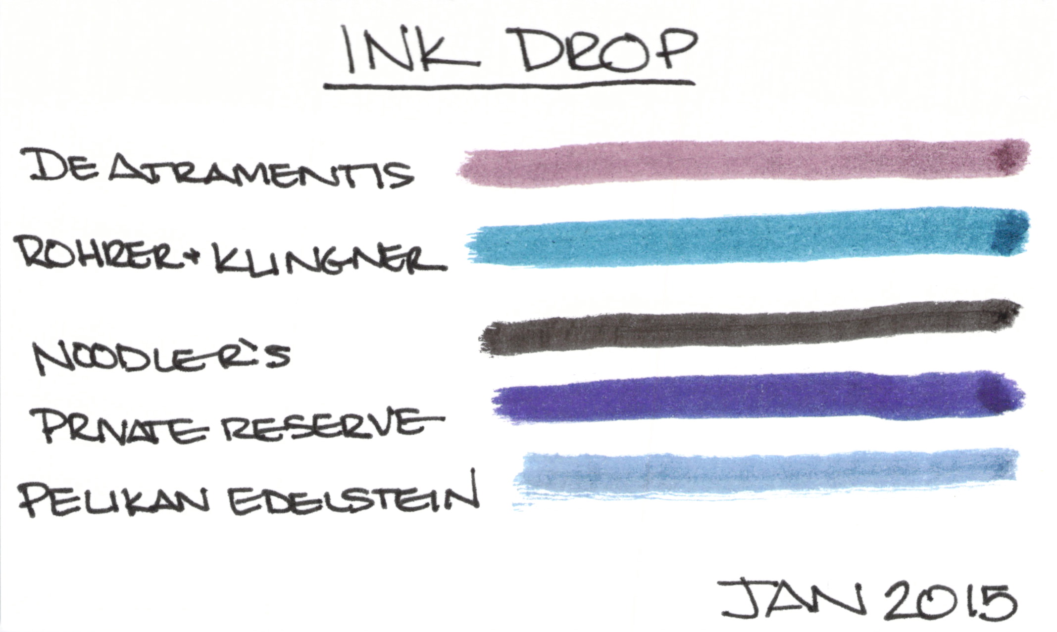 January 2015 Ink Drop from Goulet Pens
I received January’s Ink Drop from Goulet Pens earlier this week.
I usually super-saturate cotton swabs with ink before swiping across the paper, but this time, I barely barely got the cotton wet with ink. I thinking maybe this gives a more accurate idea of what the ink would look like from a pen? If you have thoughts, I’d love to hear them.
I’m about to reveal the inks from top to bottom. If you don’t want to know, this is the time to look away.
And the theme? Safe for Work
I like most of these inks – going to have to look at the De Atramentis a bit more, though. What are you thinking? Safe for work?

Oh, you guys, It’s been so busy behind the scenes over here.
While everything hasn’t been moved over yet and some of the links are empty, I’m really happy to present the brand new Pentulant website. As part of the new look, I’ve moved everything over to WordPress and I’m feeling confident that this is the correct platform for growth in 2015.
In other words: FUN TIMES AHEAD!
And while we’re on the topic of new things – Happy New Year! Did you stay up too late last night and are now faced with sleep lines criss-crossing your smiling face? Are you sporting the best case of bed head ever? Wait. Wait. That’s me! Happy New Year!
Finally, we have a winner! Remember way back before sleep lines and bed head? The contest was to guess the number of cotton swabs in the above pictured gallon-sized bag.
The winner gets samples of each of the eight Diamine 150th Anniversary inks!
How many swabs in the bag? A whopping 729.
And our winner? Jackie! Jackie guessed 725. I’ve already contacted Jackie about collecting the prize.
Have you tried any of the new inks? I’ve used Tropical Green (not my favorite color, but it writes really well) and Terracotta (a truly unique orange/brown with some great shading).


 |
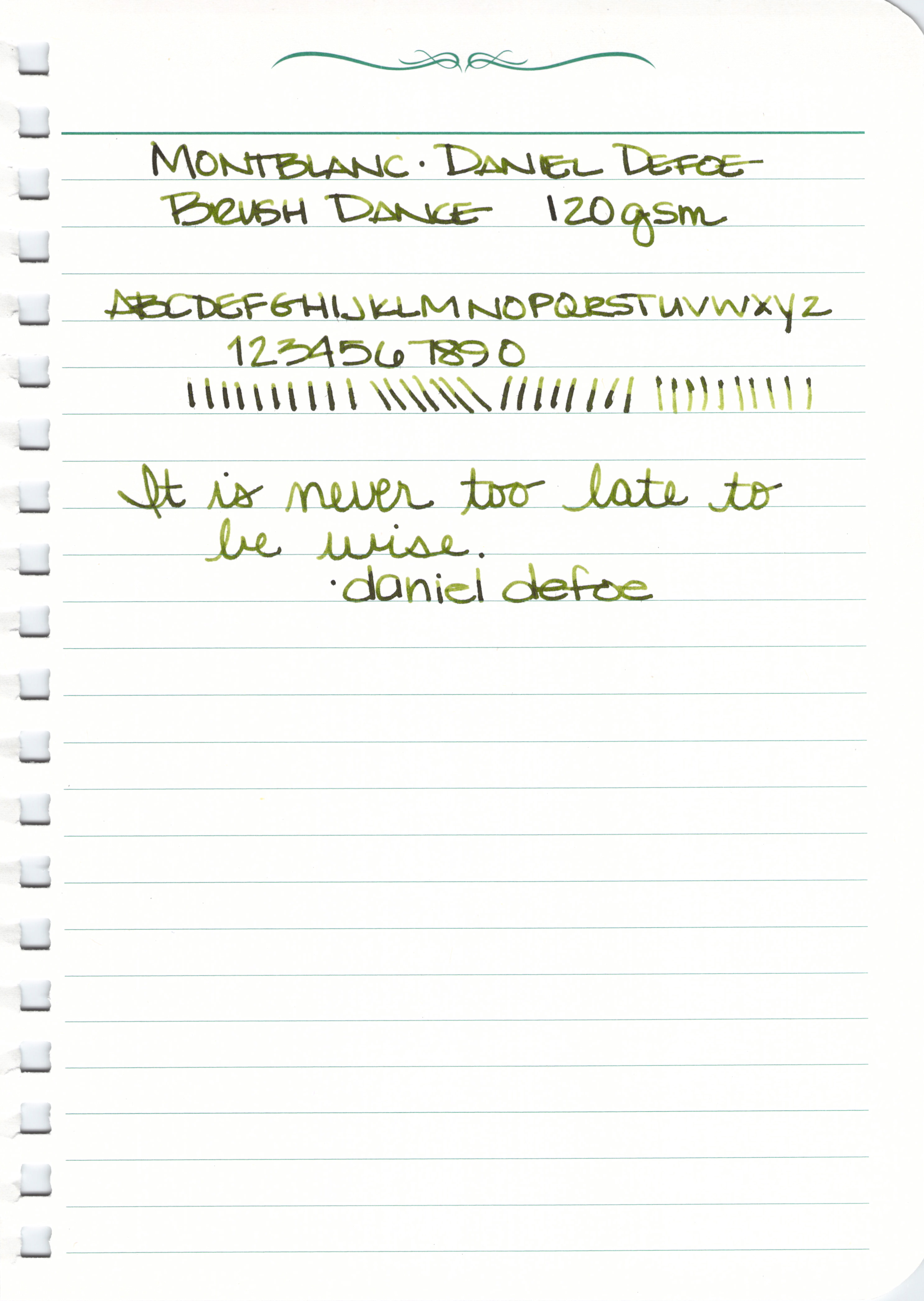
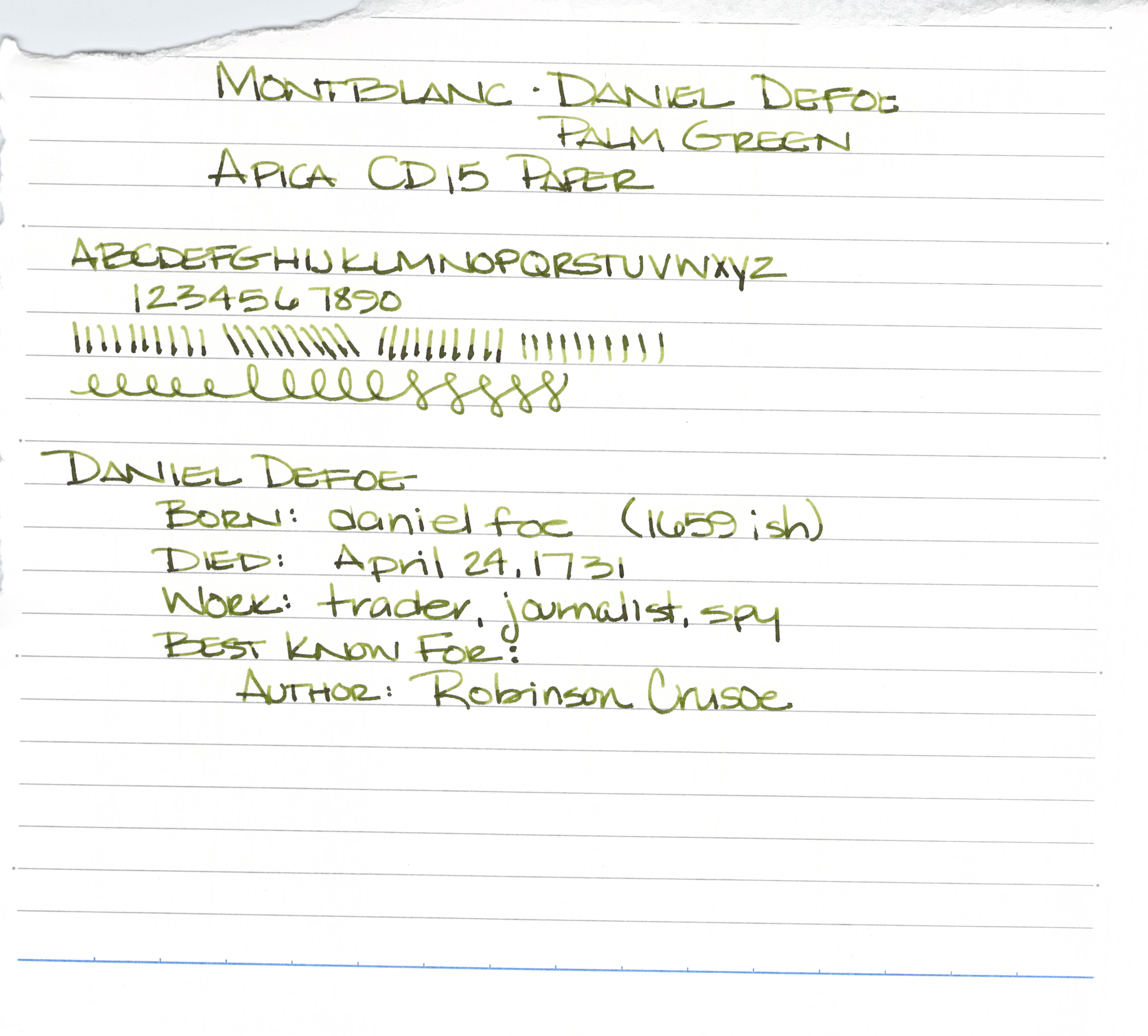
| Handwritten Ink Review – Montblanc Palm Green |


 |
| Daniel Defoe – loving the shading. |

I’m not 100% convinced that the color is for me. I’m generally a fan of clean green colors. For example, Noodler’s Gruene Cactus Eel is appealing to me.
Having said that, though, I will also say that Daniel Defoe and his Palm Green ink is growing on me a quite bit in the week or so that I’ve had it.
I’m going to check in soon with an update after I’ve used it a bit more. What do you think? Love it, have to have it?


Can you see the differences between these two inks? One color is always on top. The other is always on the bottom.
Let’s take a closer look . . .


Alrighty, which do you like? Both? Neither? They are pretty close, yes? I would choose the top color – but not by much. It’s the shading that made the difference for me. I think I could be happy with either (even though teal isn’t my most favorite color).
Scroll down for the spoiler . . .
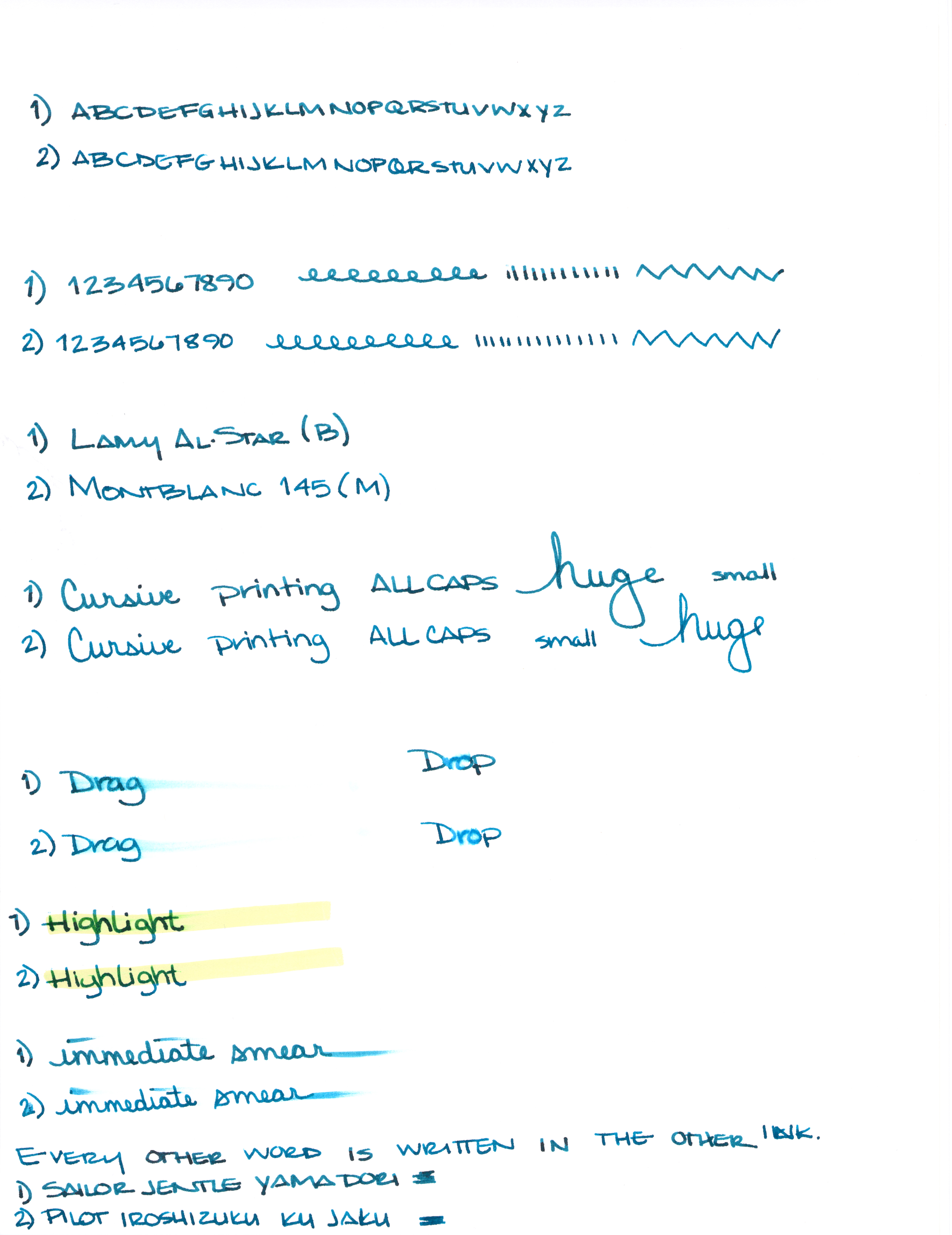
What is so interesting to me about this is that Yama-dori is legendary. Ku-jaku gets favorable reviews, but it’s not a Big Deal. The differences are subtle and if they weren’t side-by-side, I wonder if you or I could tell them apart.
Like I said yesterday, Yama-dori is my E.T. ink. You can read all about that right here.
What do you think? Am I crazy and there’s a huge difference that I’m not appreciating here?