


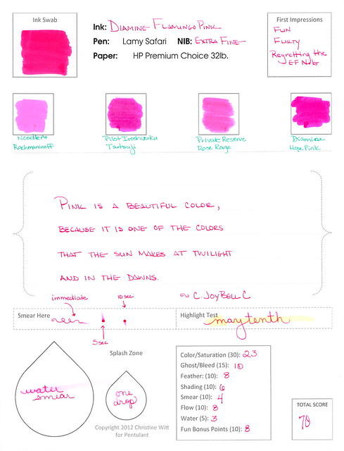
All so different and I’m in love with each!
 Pilot Iroshizuku Fuyu-syogun A perfect gray. Lovely shading. Great color.
 Diamine Flamingo Boom-Boom Wow color!
 Diamine Majestic Blue True blue!
Which inks are you loving on lately?

All so different and I’m in love with each!
Pilot Iroshizuku Fuyu-syogun A perfect gray. Lovely shading. Great color. Diamine Flamingo Boom-Boom Wow color! Diamine Majestic Blue True blue!
A quick look at four blue inks from Diamine.
 Diamine Midnight (strange that this image is bigger than the others, right?)
 Diamine Presidential Blue
 Diamine Registrar’s Blue Black
 Diamine Denim
Which do you love?
I’m not sure that I have a favorite, but I definitely have a least favorite – Diamine Registrar’s Blue Black. It’s not very well saturated – looks more like a gray/grey – and I just don’t like it. Not one little bit.


I received my Goulet Pens Ink Drop delivery a couple of days ago.
What a great group of colors, yes?
If I had to choose one that didn’t fit with the others, it would be the De Atramentis Indigo Blue – it’s a little dusky compared with the other clear clean colors, but I’d definitely write with it.
Between the two turquoise colors, I would choose the Lamy. Though the colors are very similar, the Lamy is definitely more saturated and I like that.
The Namiki blue has a bit of red in it – defnitely still blue, but leans more toward the purple end of things to my eye.
I’ve heard some great things about Diamine Soft Mint (which ended up a little funky in the scanned image above) and hope to have time to take a closer look at it in the very near future. Here’s a picture from my iPhone – the color is a bit better here….

Kudos to the person at Goulet Pens who chose this assortment! Well done.
Oh..and here’s the image I posted over on Instagram. I’m @christinewitt there.


 |
| See it even bigger. |

 |
| Diamine Evergreen |
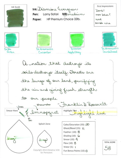 |
| want a closer look? |


It shades like a son-of-a-gun. Sounds like I should love it, right? Or at least like it. But no, I hate it.

Hard to believe I’m going pass by shading like this. But I am.

In fact, I wanted this to work badly enough that I tried it again another day. With another kind of paper.


Delta Brown, what’s that flower you have on?
I couldn’t stop singing while preparing the handwritten review. Poor Mr. Pentulant – the things he puts up with!
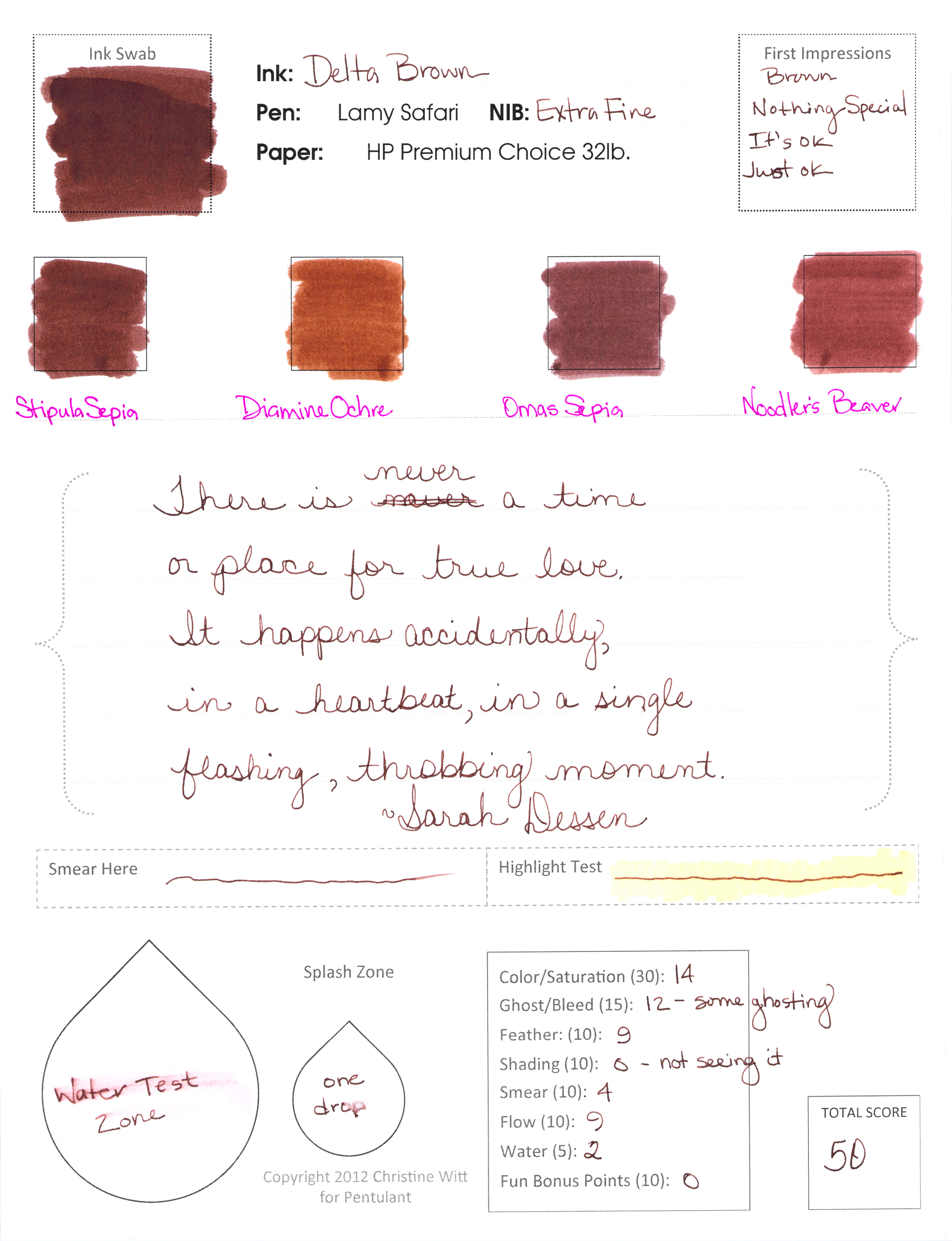
It’s brown.
That pretty much sums up my review. And coincidentally, the final score is 50 – right in the middle of the pack.
It’s nice looking, well-behaved in the pen. Not water-resistant (not a surprise).
The remarkable thing about the browns in the Compare Squares? Delta Brown, Stipula Sepia, and Omas Sepia are all kinda the same.

If you’re looking for a good solid brown, this could be your ink. I can see using it in a professional setting as easily as some blues or grays. I could really see drawing with it. If you’re into matching your inks to your pens, you might love brown. But I won’t be buying a full-sized bottle.
Dear Brown,
I’m just not that into you.
Love,
Pentulant
P.S. You do know the song Delta Dawn, yes? Here’s a link to it on iTunes if you’re in the mood to get your 1970s on.
Still recovering from the holidays here and wrapping up a few pre-scheduled reviews before diving into new and exciting things!
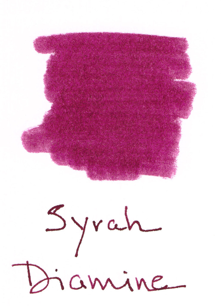
Syrah from Diamine is a berry nice shade. Kinda red-purple. Deep plum. And by now, everyone knows how I feel about “mixed shades” of ink. I’m not a huge fan.
Here’s the ugly. Major fail. (Those of you who watch “How I Met Your Mother” may now salute. Those of you who have no clue about which I speak may also salute. Major Fail – get it?) Anyway, major fail = water test. Even the tiny droplet test (where the “ro” in “from” should be) faded this color into nothingness.
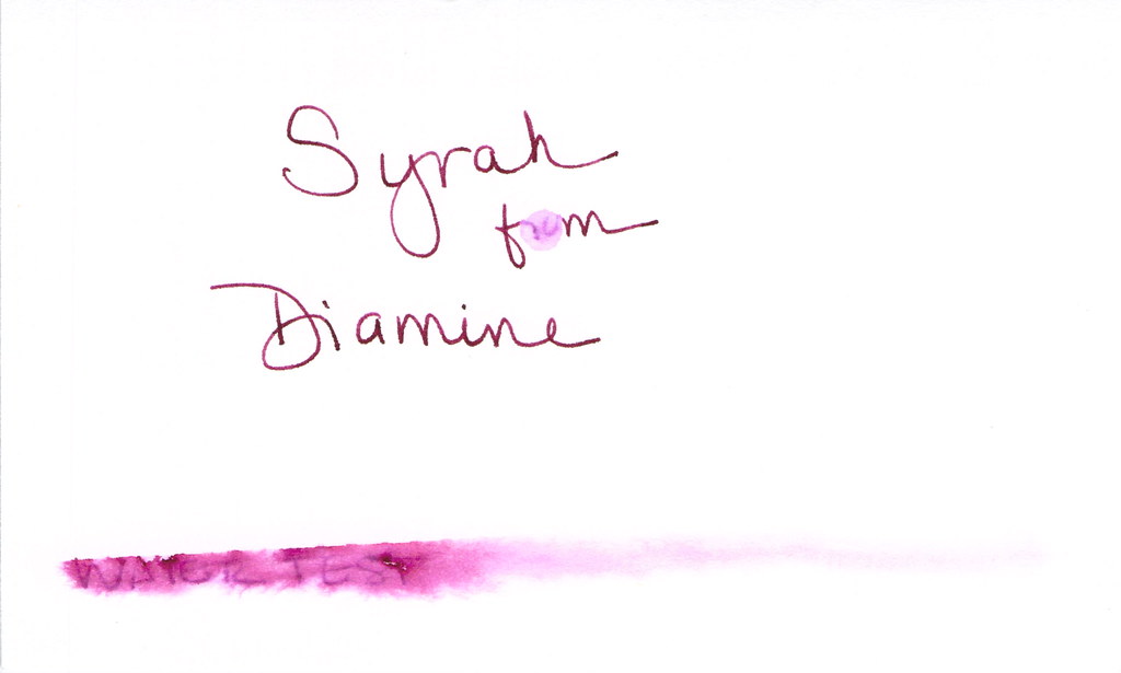
I used a dip pen and Syrah performed well enough. No big complaints, but no big compliments either.
Look at that compare square? I do think if the writer is looking for something dark, but different, this could work (as long as one never nears the water).
It was a little wet as you can see in the Smear Here – but not intolerable.


 |
| Click Images to Enlarge |
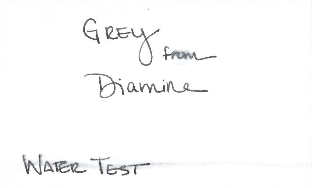
But..it is a true gray (ok, grey!) and I do appreciate that.
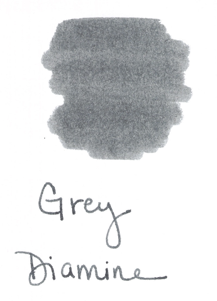
I’m not going to buy a full bottle of this ink (testing was done from a sample as usual). There’s just nothing that special about it.
Tyler Dahl LOVED this ink. A true sign that YMMV.
Have you tried it? What do you think? Wonderful or just meh?
UPDATE: For some odd reason, this post received a whole big mess of spammy posts. I’ve closed comments on this post, but please contact me if you have something to add to the conversation! xo