INK REVIEW: J Herbin Vert Empire

We’re going to dive right into this quick review . . .

Click for the full-size image

This was a stop on the way to finding a deep dark green for Mr. Pentulant.

A fast stop. I couldn’t tell if this was green or gray (grey). With a name like Vert, I’d expect something rather obvious.
Bottom Line: This is not the perfect ink for Mr. Pentulant, but mostly because of the color. If you liek the color, it’s actually a very well-behaved ink.  
Tell me, do you like this color? 

The Fine Point

Welcome to The Fine Point!
There are so many things going on with pens and ink and paper that I thought it would be fun to do a post each Friday with news and information and stuff.
So..let’s see.  Are you on Instagram? My user name is christinewitt  I hope you’ll follow me there, too. 
Here are some of my recent Instagram photos . . . 
Ink in the Sink

Edison Pen Co. Hudson

Sammy and her super-imposing shadow

My March Ink Drop from Goulet Pens
I’m a regular reader over on Fountain Pen Network. I post, too, sometimes. My user name there is pentulant
Some recent interesting posts over there . . . 
Would you ever? Not me!

Mine is a doozie!

I was 22. You?

Ug!

Jealous!

How often?

I’d go for the 146.

Your turn! Where do you hang out online? Where can I see your fabulous pictures?

PEN REVIEW: Pelikan M200 Demonstrator

What’s better than a demonstrator pen? A demonstrator with a great looking fill system.

And an italic nib.

Of course, looks aren’t everything.

I liked it!  Shorter than your average pen, but well-balanced and neither too heavy nor too light. 
It holds a gallon of ink and as I rarely use more than a couple of ml of ink per pen each week, I didn’t fill it completely. Lordy, I love seeing that ink slosh around in the pen. Even if it was “just” Noodler’s black doing the sloshing. Beautiful.
I had some repeated issues with hard starts. Wondering if it’s the italic nib + my dastardly left-handedness that causes the trouble. Fortunately, I have a replacement nib (it was free with purchase – nice!) and can try again another day with this one.
Do you like demonstrators? I like them and have a strong preference for those that are perfectly clear. 

INK REVIEW: Diamine Evergreen

Diamine Evergreen
Nice, right?
Let’s take a closer look . . .
want a closer look?
Mr. Pentulant has been looking for a dark green ink for everyday use. This translate to . . . I have been looking for a dark green ink for Mr. Pentulant.  Oh yes. poor me, forced to test ink after ink. Whatever will I do? (Probably test every green ink in the world! Muhahahaha!)
Anyway! I think I have a winner in Diamine Evergreen.  
The color is definitely a very dark green.

There’s a tiny bit of shading, little feathering.
It’s a little smearish (dude, it’s a word). If there’s one (or two) big issues, it’s with the water test (both drag and drop) and the highlight test.
So..if Mr. P. can live with the issues, I think the color is a winner, but I’ll probably continue the search – you know, in the name of doing good for other people. Right.
Do you have any dark green recommendations? Have you ever had to search high and low for ink for someone other than yourself? How did you survive?

REVIEW: Sharpie White Paint Marker

Sharpie love.

Individually wrapped.

Shake well before using.

To get the ink flowing, I just pressed it gently against a scrap piece of paper.  I remember in years past having to press press press to get things like this going.

Sharpie must have strange definitions for fine points. They’re all a bit on the thick side.

I loooove the look of this paint marker on black. Looks like a chalk. Glossy would also be good, but this is a nice look.

We’re not really having all of that for dinner.  It’s more likely that we’ll have salmon and asparagus. Or cookies. What are you having?

INK REVIEW: Montblanc Albert Einstein

Seems like gray inks are a love ’em or hate ’em kind of thing. Me? I find that I’m picky about my grays (or greys, if you prefer). I like either true gray – or perhaps a bit blue leaning like J Herbin’s Gris Nuage or Pilot Iroshizuku’s Fuyu syogun (Old Man Winter).

Before we dive into the review of Montblanc’s Albert Einstein ink, you have seen the pen, yes?  It’s the cap that does me in, makes me swoon, gives me heart palpitations. Love, love, love.

But it’s this part that turns me off . . .

The metal. The sharp drop-off between the barrel and the grip. Bleh.

I had the opportunity to hold one of these at the Montblanc Boutique in San Francisco when they were first available. I just didn’t love it. I mean, I’d take one if someone wanted to gift it to me (duh), but I’m not buying one for myself.

Anyway…the ink review..

Clicky here for the biggy big version of the review.

And a closer look . . .

I like it. It’s ok. It’s not amazingly wonderful. I have a couple of full bottles of it, but I’m not hurrying to fill all of my pens with it. I think Mr. P would like this more than I. It’s a little dark with no special characteristics, but it gets the job done. It’s a serious gray from a serious pen company – I imagine Montblanc is quite happy with it.
Bottom Line:  It’s ok.

INKY REJECTS

Three inks that will never ever ever (well, maybe) make it into any of my pens.
We’ll start with Organics Studio Mercury in the middle. Turns out that after sitting for awhile, this ink solidified – well, actually, it gellified (it’s a word).  You can actually see the clumps in the third swab of this really pretty color.
Organics Studio Cobalt is guilty by association. I know, I know. I could try it with a glass dip pen, perhaps. It is a really pretty color – especially when it’s laid down in three layers, yes?
Noodler’s Rochmaninoff. I bought a sample of this from Goulet Pens (love them!) and it’s clear this isn’t like other inks. I had to shake the vial to mix it all up and even then, it looked – suspicious – like something I wouldn’t want to put in a pen. But. When I swabbed it, no problem – perfectly smooth and kinda pretty (in a Pepto kind of way). And look at the glow – pretty, right? I think I’m going to get brave sometime and test this one. Maybe. 
Are there ink brands you just won’t use? Have you ever changed your mind and it worked out ok? Or (yikes) didn’t work out?

INK REVIEW: Noodler’s Blue Eel

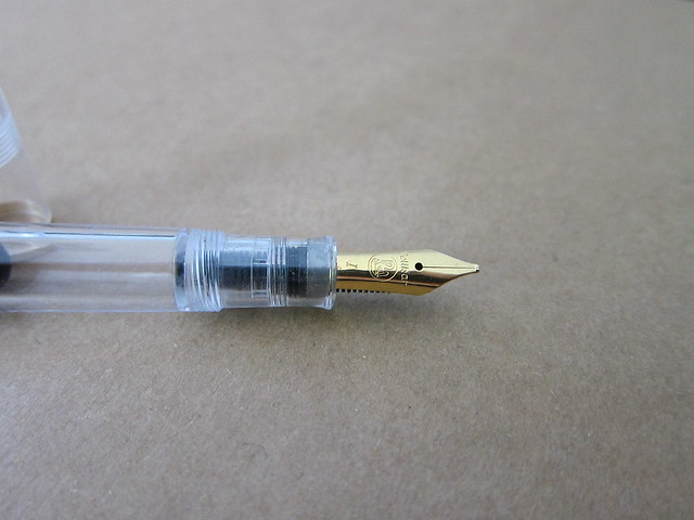
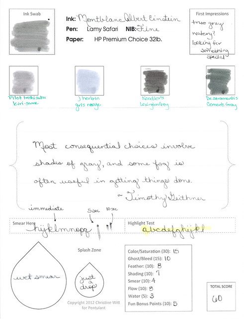
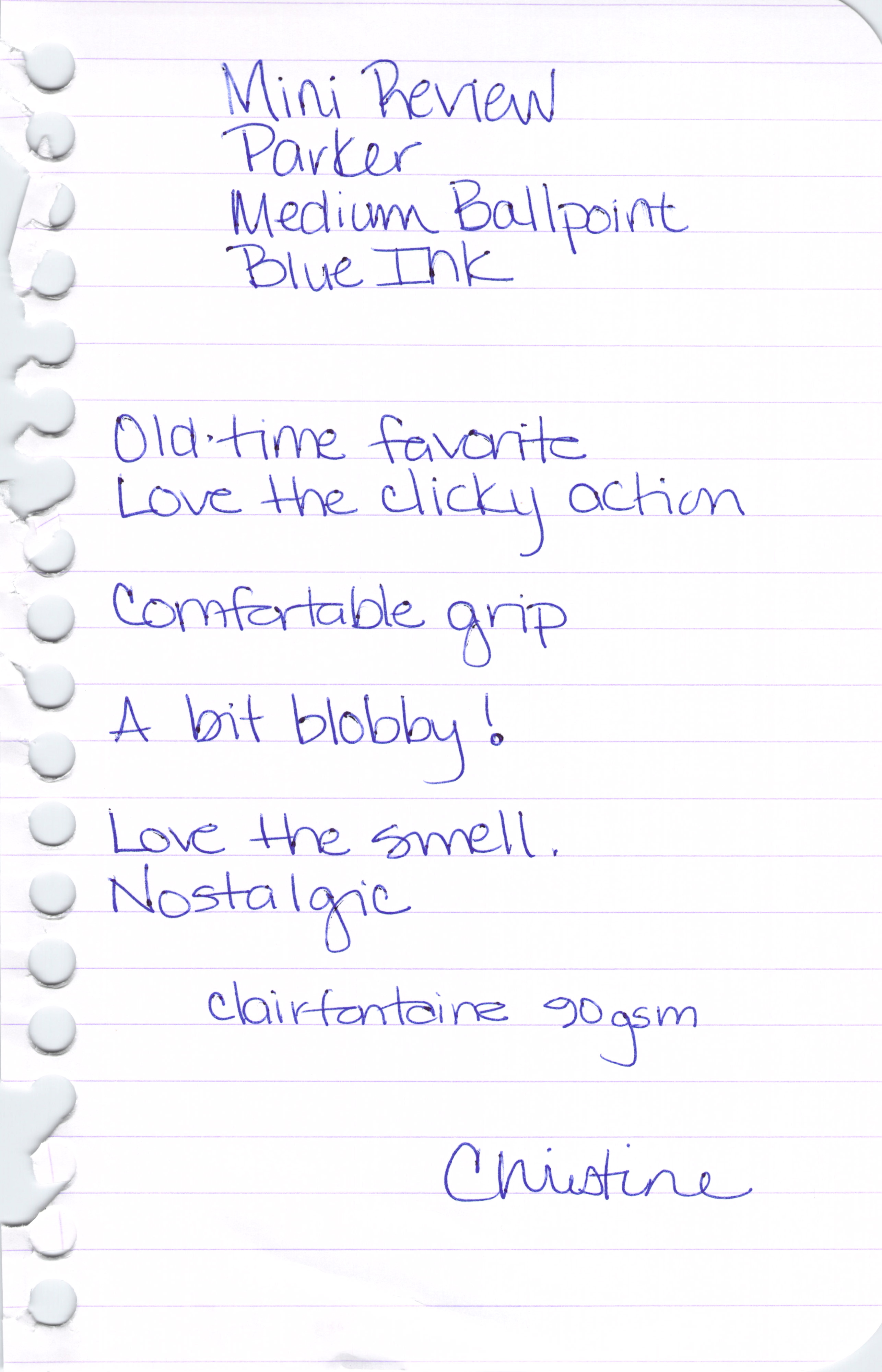
Turns out that some of my extra-big-huge-ginormous images have been crashing some mobile device readers. Oops, sorry about that. Going forward, I’ll use smaller images here and link to the bigger image if there’s something worth seeing in detail.  Like this….

Click to See Extra-Large Hugnormous Gigantic Image

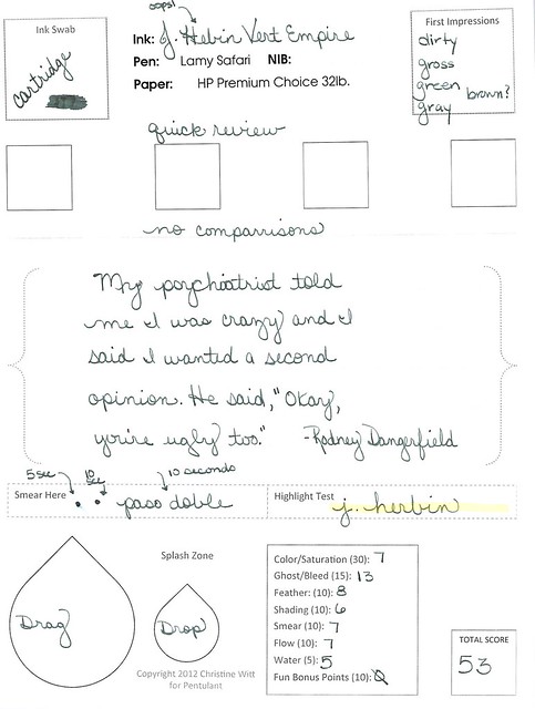
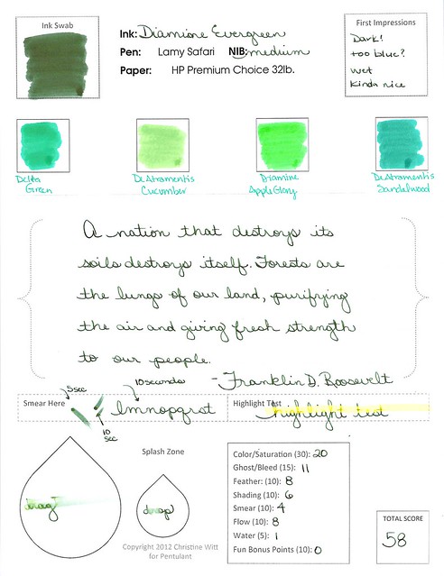
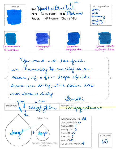
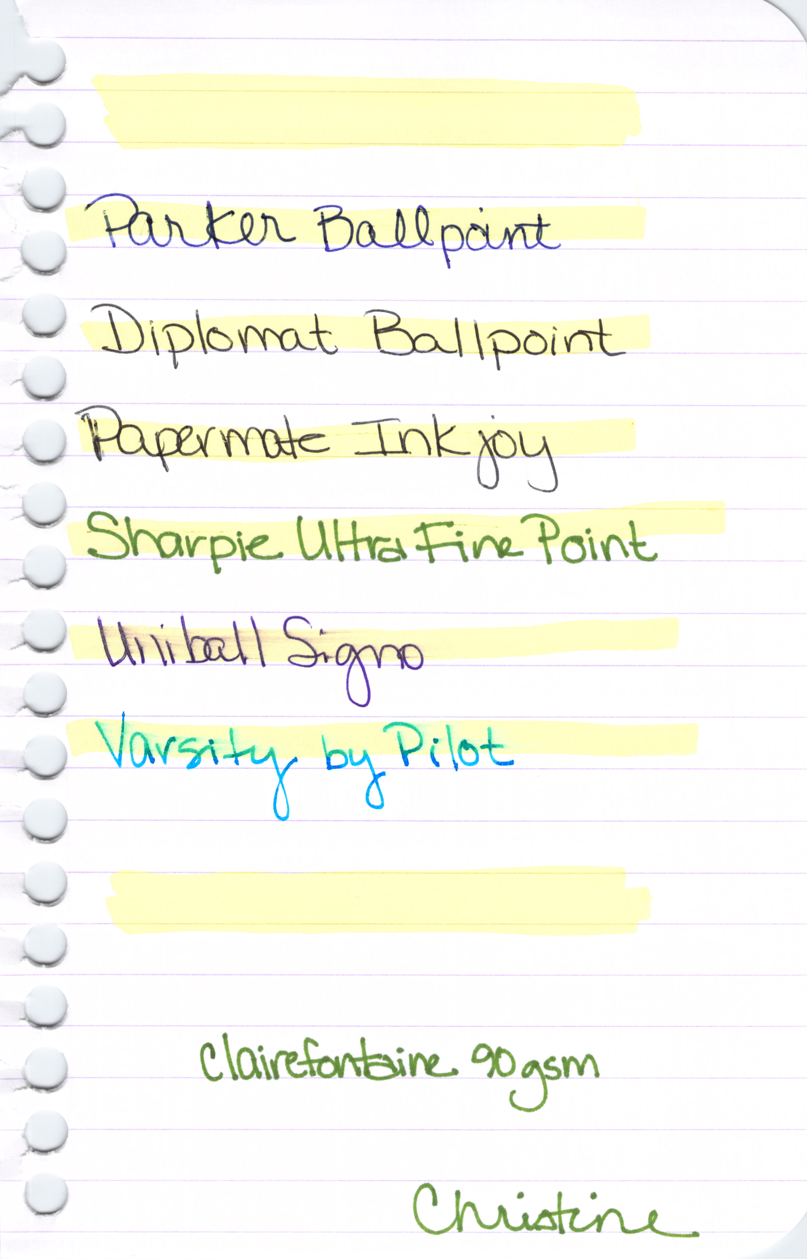
It also turns out that I’m not loving my new review form as much as I enjoyed Noodler’s Blue Eel ink. Here’s the thing – I sincerely like this ink – and yet it ranks only a 63 on my scale. In school – that would be a scary grade – but here, it means that it’s better than average.

So. I need to make some tweaks to my ranking system. Of course, I have four or five other reviews lined up so we’ll need to somehow make it through those before moving on to another form. It’s a good thing only Mr. Pentulant reads this blog – otherwise, I could be causing mass confusion with my fickle-pickle switcharoo.

Anyway! Stay tuned, but for now…the review!

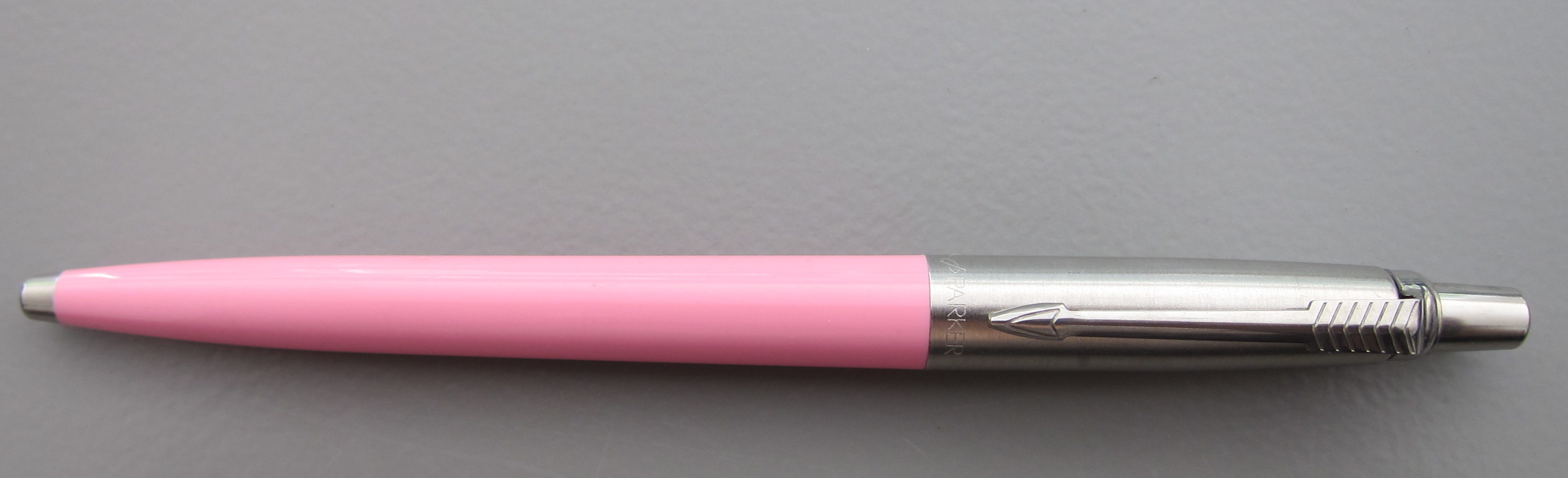
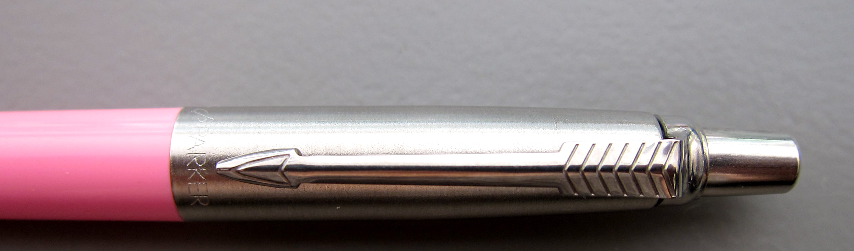
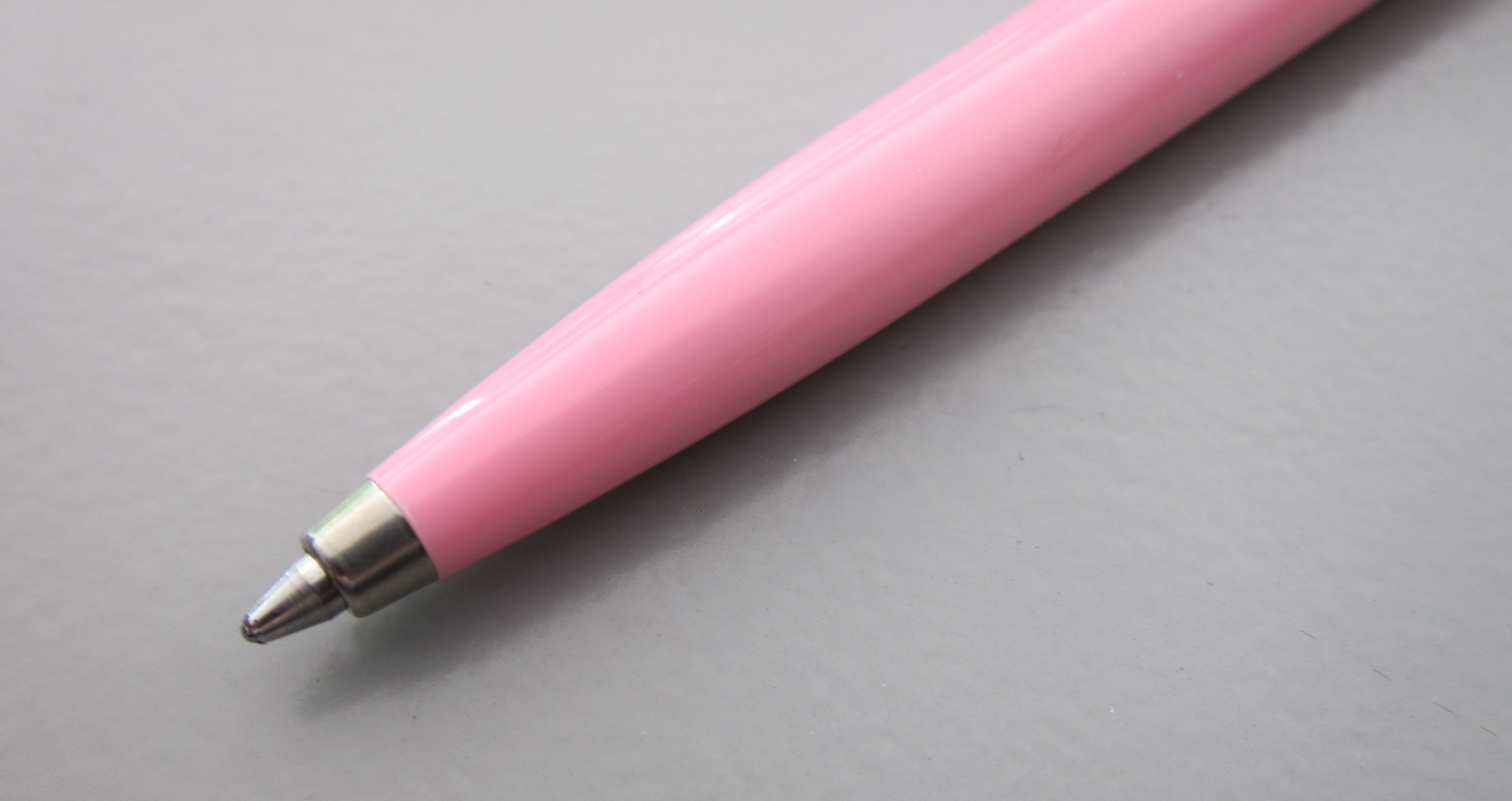
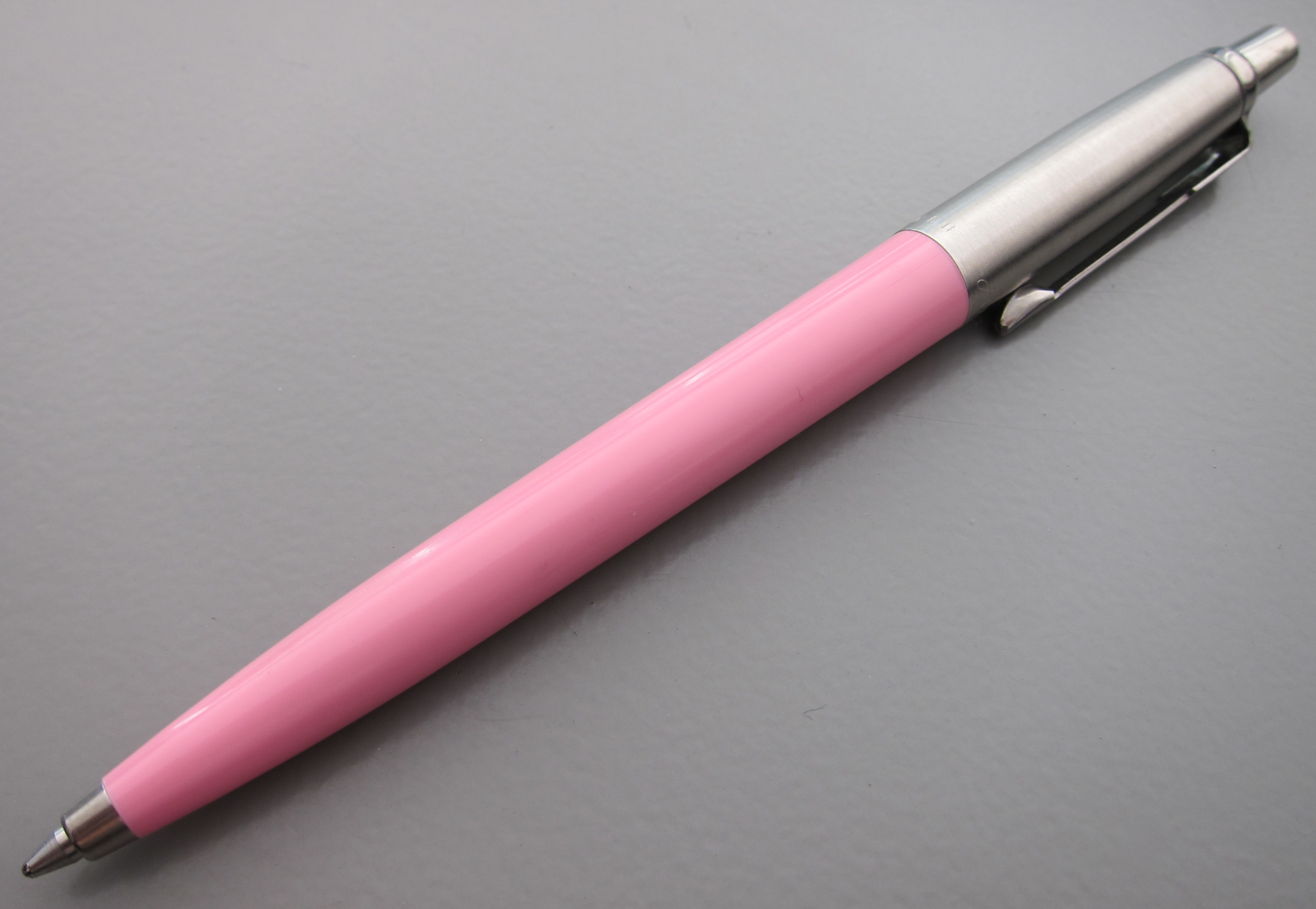
Adore the color and saturation. It’s perfect for a girl like me. Nice and bright. Would write all day with this one (if I could ever settle on just one color, that is).

Feathering? Not sure why the heck I gave it a 7 on my scale.  Look at this and help me decide what I was thinking . . .

. . . yeah, I don’t know either. It’s a feathery mess of a an ink.
But at least it doesn’t smear . . .
OK, yeah. It smears, too. This was after writing normally and then waiting (at least) ten seconds to test. Some of you might be thinking it’s my paper choice, but this is the paper I’ve used for all of my other current ink reviews. Noodler’s Blue Eel is a slippery wet son-of-a-gun.
And . . .
And . . .

So. Is the fact that it’s a slippery wet son-of-a-gun a bad thing? Well, like so many other things in life, it depends.  On this paper, with this pen – it was not horrible, but I am definitely not rushing out to buy the full-size bottle of this ink.  But…this ink was made to be a slippery wet son-of-a-gun. In fact, all of the Eel series of inks from Noodler’s are. 
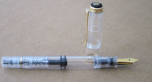
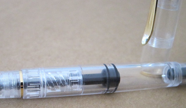
The Eel series was apparently formulated with piston-fill pens in mind. The idea is that the pistons like a little bit of lubrication to keep things moving. If left unlubed (it’s a word, trust me), the movement will not be as smooth over time.  I don’t know anything about this. I read it here. What I do know is that it’s unlikely that any of the piston-fill pens I have were ever filled with a lubricating ink and they are (or at least seem to be) just fine. In fact, Richard Binder has this to say:
Lubrication, as used here, does not refer to the addition of special substances for the ostensible purpose of lubricating the pen’s piston or other filler parts.

He’s not talking specifically about Noodler’s (or at least he doesn’t say that outright).

So. Bottom line:  This is one of those ymmv things. If you like a wet son-of-a-gun ink and believe that your piston-fill pens need lubrication – this is totally the ink for you.

It’s not the ink for me, however, because I need other things more than I need lube.

Now..it’s see what kind of spam comments I get as a result of using the word “lubrication” in my posts. Fun times ahead!