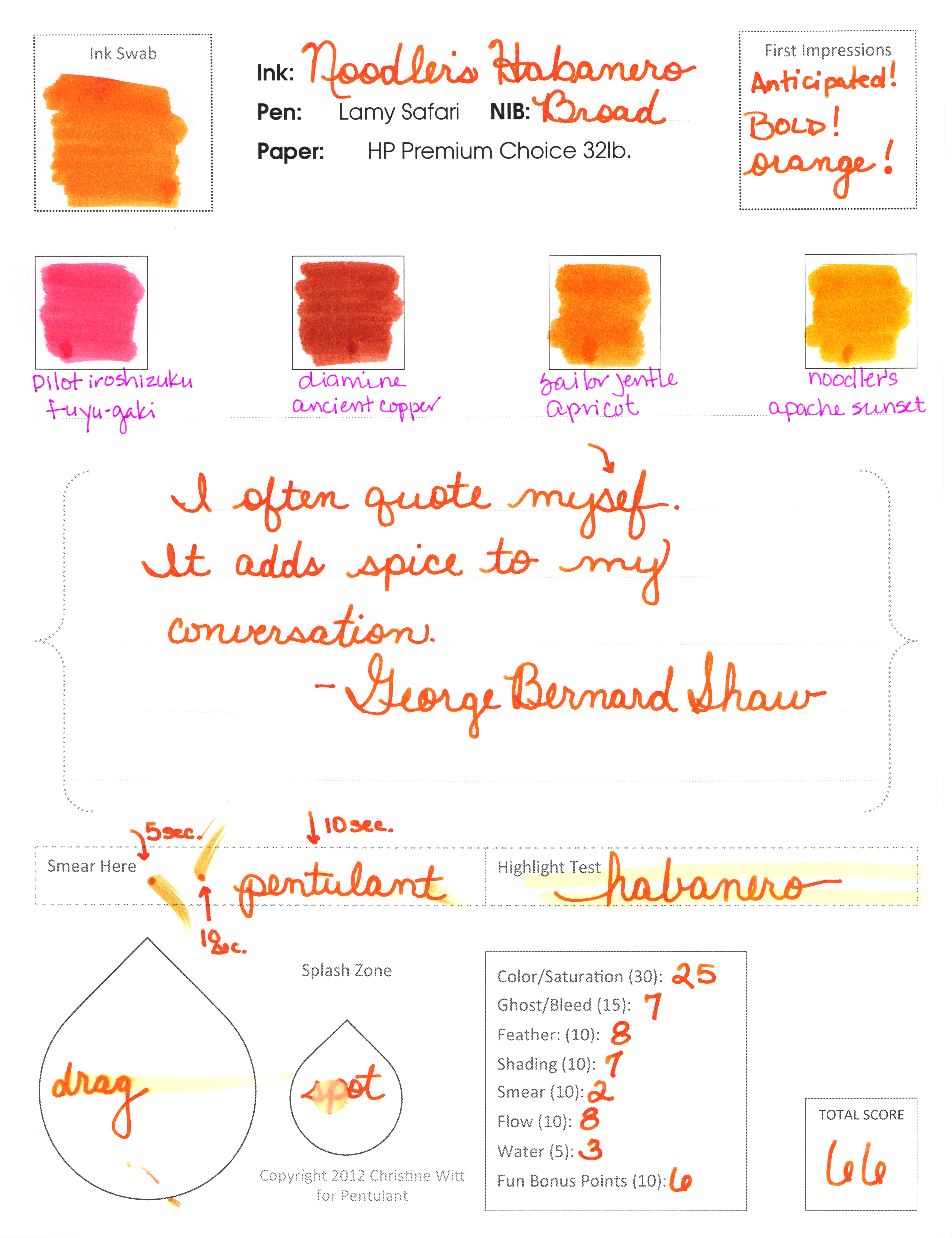
INK REVIEW: Noodler’s Habanero

I don’t know why I’ve waited so long to fill a pen with Noodler’s Habanero. It’s one of a few inks that I know about before I test them and I had been really really excited about getting this for myself.
The swab above is a “cut” from the actual swab in the review below. I purposefully got the edge – because even with a darn cotton swab, it’s clear that this is a special ink.
                                           
Whoa, momma, look at that shading.  I’m so excited about this ink. I want to load up all of my pens with it and spend an entire day writing.
clicky to make bigger

I really do love Habanero.  Definitely getting a full-sized bottle of it.

Does my score reflect my love?  Sixty-six seems low…but when you consider that 50 is average – this is definitely above average.
It’s not a perfect ink, is it? Smeared lots, not water resistant. 
It sure is pretty, though. I’d say my love for Habanero rivals my love for Diamine Pumpkin. How many orange inks does one girl need? (Two – so far!)

Mr. P likes it, too – though he seemed to be focused on the broad nib. He calls me Chickie – isn’t that sweet?

Let’s talk about spicy food in the comments. Love it or hate it? Me, I am a total spicy food wimp.

INK REVIEW: Stipula Sapphron

Holy cow. 
I hate Stipula Sapphron.

It shades like a son-of-a-gun. Sounds like I should love it, right? Or at least like it. But no, I hate it.

It’s not often that I say that. In fact, here are all of my posts with “hate” as a tag.  
In the sample vial, the ink looked like a pretty (though not saturated) orange. When I swabbed, I thought the ink looked a little on the yellow side, but was still pretty enough.  (See my first impressions on the handwritten review.)

Then I started writing with it. I was sure my pen must have been dirty. But at the same time, I knew it was a brand new pen and a brand new converter. No ink had ever touched either and both were cleaned prior to use. I twisted a bit of ink out onto another piece of paper – and it sat there looking like a bubble of yellowish mud!  When I smeared that mud around with a cotton swab – it looked like the Ink Swab in my review.
Ca-razy! I don’t get it.

You know what else I don’t get? I couldn’t find even one other review for this ink. Not on Fountain Pen Network, not on Goulet Pens, and even Google came up empty. It’s like I’m in the twilight zone over here.

Hard to believe I’m going pass by shading like this. But I am.

Pretty weird. That’s my first impression – and coincidentally – my bottom line for Stipula’s Sapphron. (By the way, I have no Stipula aversion – I own and love several of their fabulous pens. This ink is just weird.)

In fact, I wanted this to work badly enough that I tried it again another day. With another kind of paper.

Always looking on the bright side, however, Apache Sunset has been on my list of inks to review forever and I’m excited that it’s coming up sometime soon!  And that De Aramentis Gandhi? Isn’t that pretty? 
Time to ‘fess up! Do you have Sappron? Do you love it? Hate it?

INK REVIEW: De Atramentis Gold

De Atramentis Gold is an interesting ink.
It’s not really gold, is it?
More of a brown-yellow.
Even green looking?
Something.
And there’s the trouble, hm?
We all know by now what I love.
Big bold colors. Lots of saturation.
So I don’t love this and I don’t think the name matches the color.
It wrote fine . . . 

I just didn’t love it.
Didn’t like it either.
I will say this, though, if one is seeking this exact color, it is well-behaved in the pen. It does just fine with the water test, there’s some of that wonderful shading we fountain pen users adore. 
This isn’t my (even close to) perfect ink – but maybe it strikes a chord with you?

PEN REVIEW: Montegrappa Espressione

So pretty.  So sleek and modern. A great profile. This Montegrappa Espressione is quite the looker!

And..it has a screw-to-post cap – Mr. Pentulant loves that.

Montegrappa is a well-respected line, many people love their pens. I don’t love this. In fact, I pretty much hate it. How is that even possible?

See the metal grippy part? (Grown ups call the the Section or Gripping Section.) It’s metal. And it’s omg, too short. Which means that my finger is resting on the threading. Which means it hurts. Bad.
And. It’s heavy. Too heavy. When posted (as it’s clearly meant to be), it’s unbalanced and gross.
No likie.
But man, it’s pretty.
Here is my written review.  Click to make it bigger.
In an act of unselfish love, I offered the pen to Mr. P. And even though he loves him a screw-to-post pen and he agrees the Espressione is gorgeous, he rejected this pen, too!
I’m going to ponder a bit on what to do with this pen. I won’t write with it again. Mr. P won’t use it either. Seems a shame to let it hang around here with no love when someone else would probably love to have it.
Will keep you posted on how this one plays out!
But tell me your thoughts – have you tried this pen? Have you given away pens you would never use?

INK REVIEW: Delta Brown

Delta Brown, what’s that flower you have on?

I couldn’t stop singing while preparing the handwritten review. Poor Mr. Pentulant – the things he puts up with!

It’s brown.

That pretty much sums up my review. And coincidentally, the final score is 50 – right in the middle of the pack.

It’s nice looking, well-behaved in the pen. Not water-resistant (not a surprise).

The remarkable thing about the browns in the Compare Squares? Delta Brown, Stipula Sepia, and Omas Sepia are all kinda the same.

If you’re looking for a good solid brown, this could be your ink. I can see using it in a professional setting as easily as some blues or grays. I could really see drawing with it. If you’re into matching your inks to your pens, you might love brown. But I won’t be buying a full-sized bottle.

Dear Brown,

I’m just not that into you.

Love,
Pentulant

P.S. You do know the song Delta Dawn, yes? Here’s a link to it on iTunes if you’re in the mood to get your 1970s on.

PEN REVIEW: Delta Autodromo Nazionale Monza

So. Pretty.
I don’t know much about this pen.
I Goggled and didn’t get much help.
I know I bought it from Fountain Pen Hospital.
It was the first $$$$$ pen I bought.
This is the first time I’ve used this pen.
Pretty, right?
Well. I tried and tried, but it just wouldn’t go.
It’s flexy – love that.  
I’m going to assume this is a bad ink/paper/pen combination and follow-up.  I sure hope this is a bad ink/paper/pen combination.  Right? Otherwise, I’m going to be so bummed.

INK REVIEW: Montblanc Winter Glow

hello gorgeous
Now. There is some red!  That in-yo-face color that I adore!
Highlight test went (surprisingly) well.
The colors in the Compare Squares don’t really compare at all – even for a second try! Even Tiananmen from Noodler’s and not even Florentine Red from Stipula.  No, Winter Glow from Montblanc is in a class by itself.

On very close inspection, it’s has a bit of spread. Spread = not quite perfect, but not really feathering. With the naked eye, though, this just isn’t noticeable on any of the papers I’ve used with this pen/ink combination.
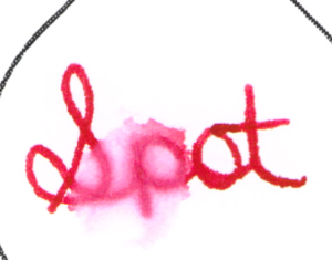
Speaking of the pen/ink combination, you’ll notice that I used a Montblanc Boheme for this test. That’s because the ink is in a cartridge rather than a bottle. I have a bottle, too, just wasn’t ready to open it. 
Wait, let’s be honest here, I wanted to try a MB ink in a MB pen and this is what I went with.

Suggest keeping it dry
The only bit of trouble I had was on the review paper (HP Premium Choice 32 lb.). Just a little hard starting.
The letter to Mr. P below is written on Whitelines Paper and it worked out just fine.

In closing, I’d like you to notice how kind I am to refer to the pen as his. Everyone knows all of the pens in the house (and in the cars, and in the world) belong to me.

The End 🙂

NEWS & INFO: Current Topics

If you’re reading here, you’re most likely reading other blogs that focus on Pens, Paper, and Ink. 

But just in case you missed anything . . . 
We’re talking about Sticky Notes over on FPN. See post #11 from yours truly.
I started reading EDJELLEY this week. I like his style. In fact, he has a post over on FP Geeks
Edison is bringing back the pneumatic filler. Wild, right?
I’m itchin’ for one of these Diamine Music Sets. Sounds like it was going to be a limited edition (LE), but now it’s not.
Looking for Green Ink?
OK..that’s all for today. Share links to your favorites?

PEN REVIEW: Noodler’s Nib Creaper Flex Pen

Made by Noodler’s (love his inks!), I was excited about getting this gem in the mail from Goulet Pens.

So excited that I ripped into the box, tossed it and the packaging over my shoulder without reading any of it, and inked this bad girl up.

This was quite some time ago. And I didn’t love it. The pen (as I remember) felt scratchy and decidedly inflexible.
Last week, I saw this video from Brian Goulet. 
“Nib and feed are friction fit.”   Ohhhhhhh.
“Further in the nib is pushed, the less flex you’ll have.” Yes, yes, that makes sense!
“The feed, the further in it’s pushed, the less…”
“The closer the feed to the tip of the nib, the more….”
At around 7:42, Brian says that he’s tried to film his video multiple times and each time, it’s done something different. He’s a trooper!
I am not.
I know some people love the fiddle-factor of fountain pens. I’m not one of those people. I’m a grab and go girl (don’t be gross). 
I got zero flex from this pen. I’m sure it’s me.  Look at the reviews over at Goulet’s. People love these things.
So. I’m not going to post a writing sample – I realize that the biggest with this pen is user error on my part. 
You know what I’m going to do? Hahaa – I’m going to ask Mr. P if he would like to watch that video and give it a go. He’s probably geeky enough to want to try. Once he has it going, I’ll steal the (filled) pen back from him and post a sample.
OK….chime in. Fiddler? or Grabber? Which are you? (Don’t be gross.)