QUICK LOOK WEDNESDAY: Four Fab Blues

Time for this week’s Quick Look Wednesday!

I like all of these inks for different reasons.

De Atramentis Indigo Blue – a straight-forward blue that could be used in any setting

Diamine Eau de Nil – (does this mean River Water?) a bit of green, but not quite enough to call it turquoise

Private Reserve Ebony Blue – maybe my least favorite because it looks more like a green-black in my swabs. Have any of you tried writing with this one?

Noodler’s Ottman Azure – boom! Pure blue saturation with this one.

So, yeah, each of these are so different from the others and I like them all.  Which is your pick?

INK REVIEW: Omas New Gray

It’s been awhile since I’ve added any new gray/grey inks to my Fifty Shades of Grey collection!
New Gray from Omas is a lovely shade of gray with a bit of blue in it. It’s probably too light to use in a business setting and definitely lighter than the other shades of gray that I’ve reviewed.

It writes great. No smearing. Maybe a little dry, but not bad. Some nice shading.

You’ll have to believe me when I say that it handles highlighting very well.  (What is up with me and all of the failed highlighting tests?)

The water test is pretty amazing. Even on the original, I have to squint to see where I dragged the web cotton swab across my writing.

Overall, this is a gray I dig and I could see using it on a regular basis. That is, if I hadn’t already fallen in love with another gray.  Stay tuned . . .

QUICK LOOK WEDNESDAY: You call that red?

Time for another Quick Look Wednesday!

What do all of these inks have in common?  They are all samples from my bag of red inks.

Red?

 Private Reserve – Vampire Red
 Diamine – Maroon
 Pelikan Edelstein – Ruby
 Sailor Jentle – Grenade
So, yes, I sort my ink samples by color. I have so many that there has to be a system – I’ll take pictures and show you sometime soon. 
I first look at the name of the ink and sometimes it’s obvious where the ink belongs.  Delta Brown?  Not a big decision. Frankly, Pelikan Edelstein Ruby didn’t seem like a big decision either. Ruby – Red, right? Not so much. Yikes.
When the name doesn’t make it obvious, I open the sample, have a peek, and make a best guess. Sailor Jentle Grenade belongs with the purples. Oops.
I’m really liking Private Reserve Vampire Red. Perfect name for this color, yes? Can’t wait to write with it!
Maroon from Diamine is ok – nothing special to me. It’s one of those colors that isn’t really a color. Haha.
What do you think?  Do the names of inks get you all bothered, too? Ruby – ha!

PEN REVIEW: Mystery Pilot Pen

You know how it is.

You order a pen that looks like a ton of fun.

You take it out of its packaging. Toss it (the packaging, not the pen) and any paperwork over your shoulder and into the recycling bin. This pen is meant for using and loving, not collecting.

You even take some pretty nice photographs of the pen.

Weeks – or maybe even months – later, you realize that you’ve never inked it.  By now, you can’t remember the model name. And that paperwork is long lonnnng gone.

Ink it up anyway. Write a review.  (You like the pen, but it’s not love. Stub may not be the best option for you.)

You do a little research on the pen and still can’t figure it out.

Oh…wait…that’s just me, hm?

So…help a slightly embarrassed girl out?  Which Pilot is this?

Just for Fun: Tomoe River Paper Swabs

Oh.My.Goodness.
Tomoe River Paper isn’t for ink/paper/pen newbies. It can be difficult to deal with – it’s super-thin, wrinkles easily, needs to be stored carefully, and wrinkles easily (worth mentioning twice).  It’s expensive, ghosts like a sonofagun, and wrinkles easily (that’s three).
But.
Oh.My.Goodness.

The above swabs were done as one of my earliest experience with Tomoe River Paper.  I did these (as I do all of my swabs) with a cotton swab saturated with the ink and the “scrubbed” onto the paper.  Even though the paper is super-duper thin (and wrinkles easily) , there was zero bleed-through. None.

And.

Oh.My.Goodness.

The colors just…pop!…from this paper.  This is the way the ink manufacturers must mean for their inks to be experienced.

Here’s a link to the full-size image. It’s big. It’s worth the load time.

Check this out…

Diamine Majestic Blue

And this…

Pilot Iroshizuku Fuyu Syogun

So. If you’re in love with paper and inks and pens and such – Tomoe River Paper is a must try. It’s definitely not an everyday paper for me (wrinkles easily, you know), but wow. Wow.

Have you tried Tomoe River Paper?  What other papers do you love?

INK REVIEW: Diamine Majestic Blue

Diamine’s Majestic Blue is not a perfect ink.  If you’re looking for an ink that is fast-drying and water-resistant, you should move along because this is not the ink for you.

However.  If you’re looking for a blue ink with absolutely fabulous color and saturation – this may be the ink for you.  It is for me.

I love Majestic Blue.

The ink is rich with color. Not so bright that it cannot be used in an office environment. Not so dark that you question if the ink is blue or black. This is blue.

I actually wrote this review awhile back (using my old and kinda misleading form) and loved it so much that I ordered a full bottle. I’ve used it nearly every day since then and am still in love with it.

The fascinating thing to me about this ink is that sometimes, in the right light, at the right angle, there is a red sheen. I’ve not been able to photograph it, though.  But, man, it’s special – and it’s not an intrusive sheen like some of the other inks about there.  
This is my blue ink. I am also realizing that I’m a huge fan of Diamine inks.  It’s all about the color to me – I can be (at least somewhat) flexible on other issues, but not color. No way, Jose.
Oh oh oh..and look, I’m working on a much more casual format for testing inks.
Casual. That’s me. 
Well, sometimes.

QUICK LOOK WEDNESDAY: Four Green Inks

It’s Quick Look Wednesday!  Today, we have four very different shades of green.

 De Atramentis Bamboo Green
 Private Reserve Sherwood Green

 De Atramentis Black Edition Green
 De Atramentis Patina Green
Do you have a favorite?  I’m digging Sherwood Green. Nice clear color.
My least favorite is De Atramentis Black Edition Green. It just looks too muddied to me. But check out the review here.  It looks much better, yes?  The difference may be explained by the fact that my quick looks are just swabs and this is a handwritten review.
As for green inks? I love them. More than I thought I would. They are fun without being too loud (like some kind of crazy pink inks!)

PEN REVIEW: Pilot Metropolitan

There’s a lot of talk about the Pilot Metropolitan being the next great cheapie fountain pen. I agree – mostly.

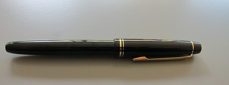
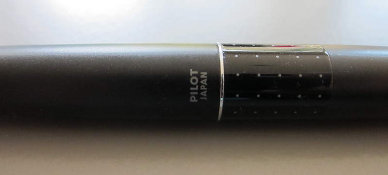
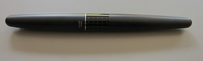
It has a nice sleek understated look and could be used in even the most conservative business settings. There’s nothing remarkable about the appearance.

At under $20, it is definitely one of the least expensive, readily available refillable fountain pens out there.

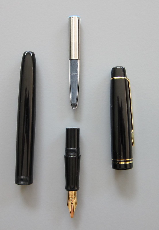
The pen comes with a squeezy converter and will also accept Pilot cartridges.  The pen will also take the Pilot CON-50 converter, though I don’t understand why it’s considered an “upgrade” by some when the squeezy converter is equally functional and a bit different from other pens.

The cap is friction fit and it posts nicely.

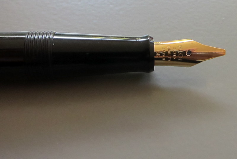
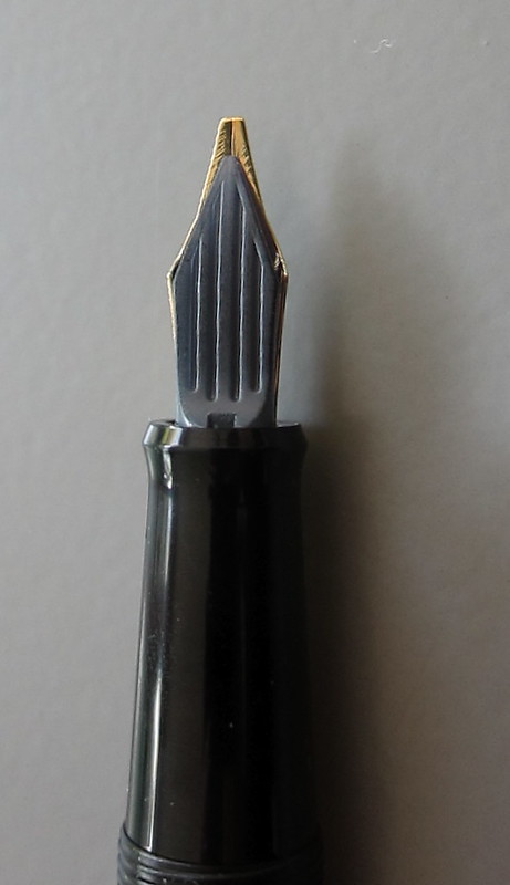
The pen is a tad on the light side for me, but seems well-balanced overall.  The nib is ultra-super-smooth. There is very little feedback when writing – a bit like writing on glass, perhaps?  The nib is very stiff – no spring at all.

The Metropolitan only comes with a medium nib. It looks like a thin medium to me – and that’s fine from my perspective.

After writing with it for awhile, my hand felt a little tired. This is probably due to a couple of things: the pen feels a little on the skinny side and there is that big drop off below the barrel of the pen that had me adjusting my grip.

So, overall, it’s a good writing experience. Take the crazy pricing into consideration and  it’s a pretty incredible value for the money.