INK REVIEW: Pilot Iroshizuku – Fuyu Syogun

Wrapping up a couple of reviews before we move on to the new form…

Another sweet shade of gray from Pilot Iroshizuku – Fuyu-syogun does not disappoint!  I’m usually a purist when it comes to colors – I don’t dig muted shades, for example, give me a real, full color! But this gray (grey?) with a touch of blue is jussssst right.

I’ll spare you suspense. I’m totally ordering a bottle of this. It’s available most everywhere for $28 per bottle. Kind of expensive, right? But it’s such a joy to write with. Some of this must be the pen – I’m a sucker for a broad nib – and you know that I love me some Lamy Safari – but still. I’m swooning over here.

Not too wet. Didn’t seem too dry either.

Really. Look at this shading? And there’s not much feathering – even on this mid-quality paper.
 And .. my (limited) understanding is that this ink is also known as Old Man Winter. How cool is that?

And! The news just keeps getting better. Look at that water test. What water test, you ask? Exactly!  (Actually, look in “from,” that’s the droplet test area and you can see just a bit of fading.)

I’ll stop blathering on so you can see what others are saying…
There aren’t a lot of people talking about this one. Have you tried it?

A YEAR IN REVIEW – A YEAR IN PREVIEW

I’ve only been blogging here for four months. (Here’s my first post.) The end of the year seems like a good time to have a bit of a look back – and forward.
Total Posts:  37
Ink Reviews: 19
Pen Reviews: 6 (7 if you count #1 above as a review)
My favorite ink?  
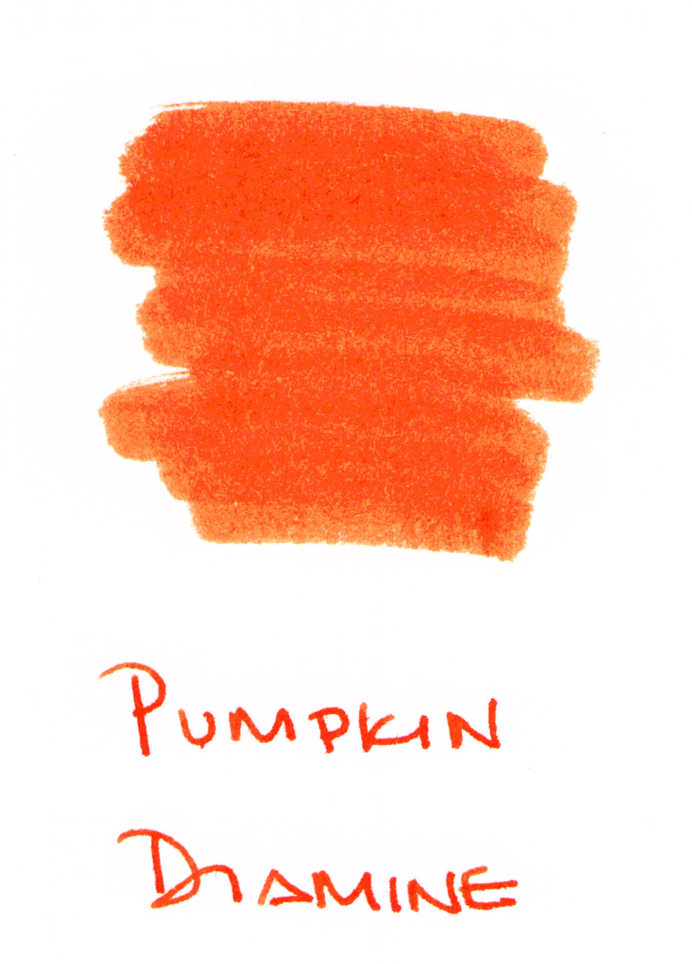
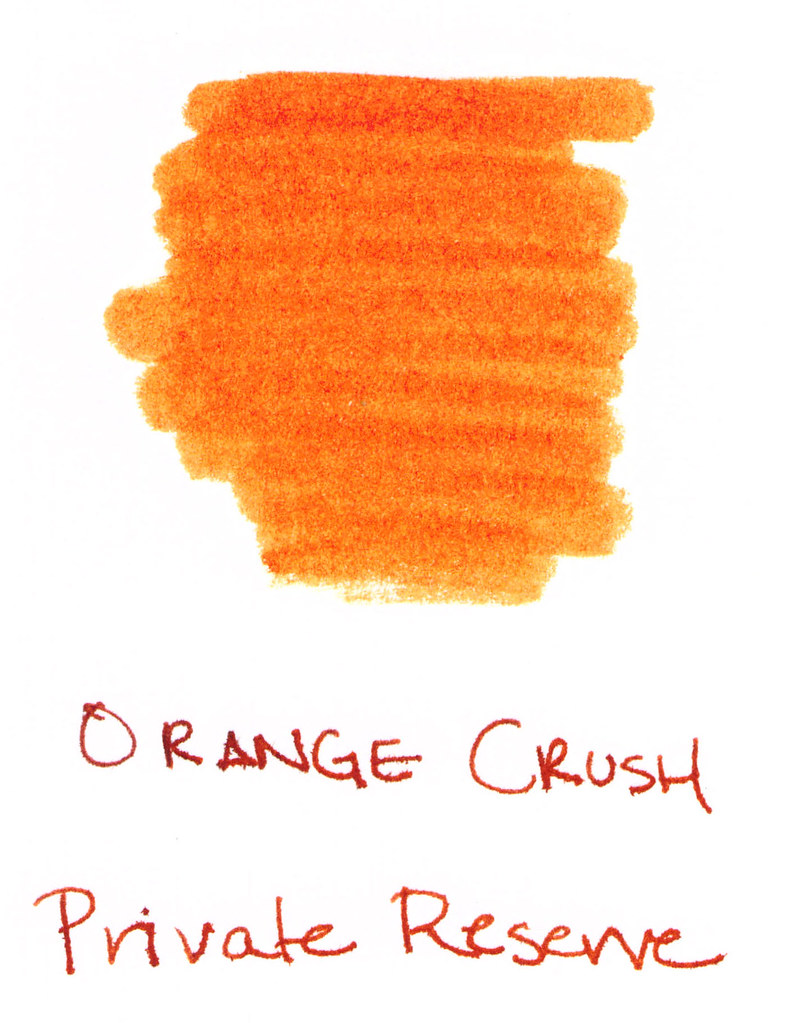
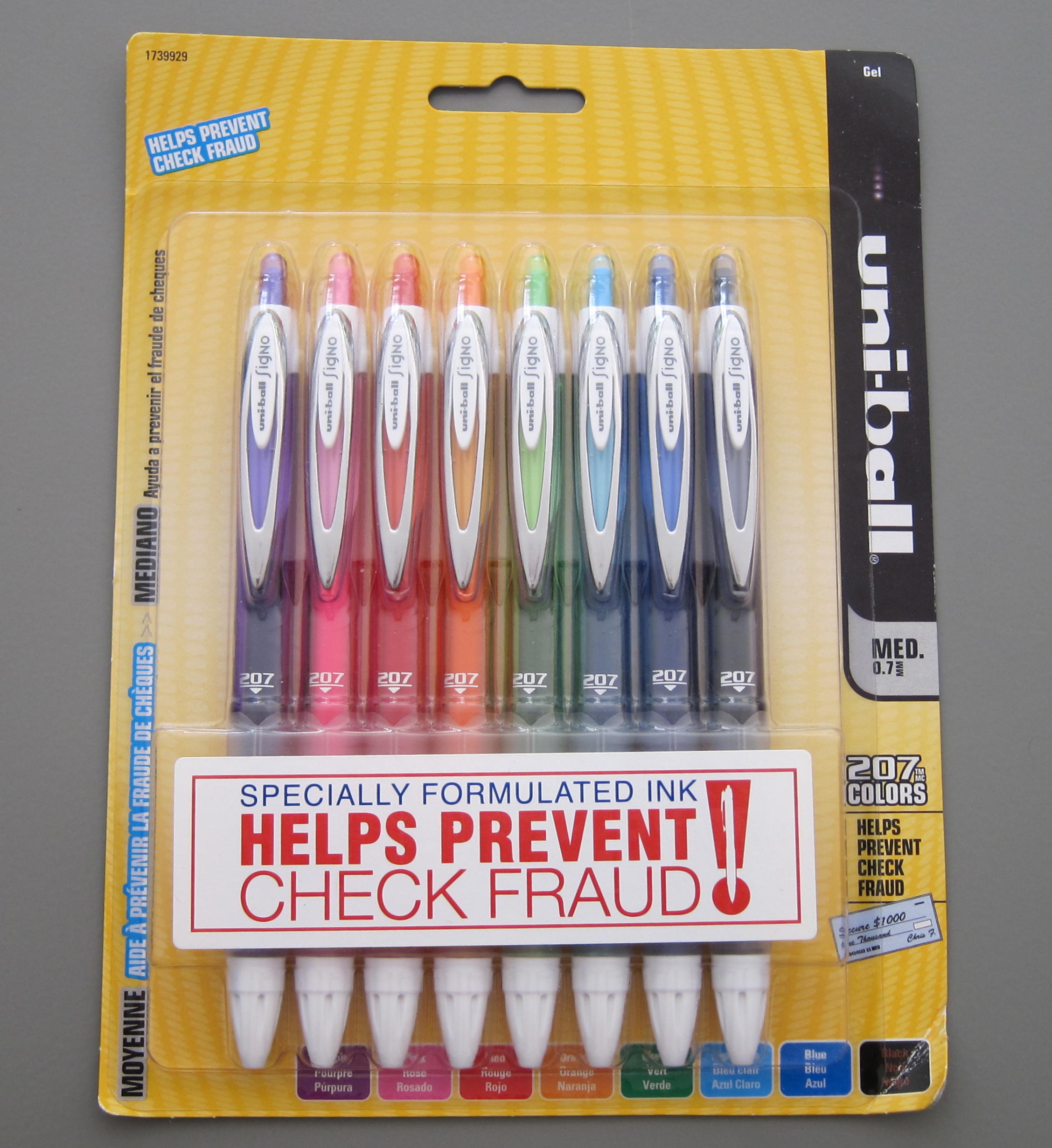
I didn’t know how much I needed an orange ink until this review. I mentioned in the review that I didn’t think I’d be able to use it for much – who writes with orange every day?  Turns out – this girl! Wooo! 
I plan to continue my Fifty Shades of Grey (Gray!!) series in 2013.
Oh..and speaking of plans for 2013….
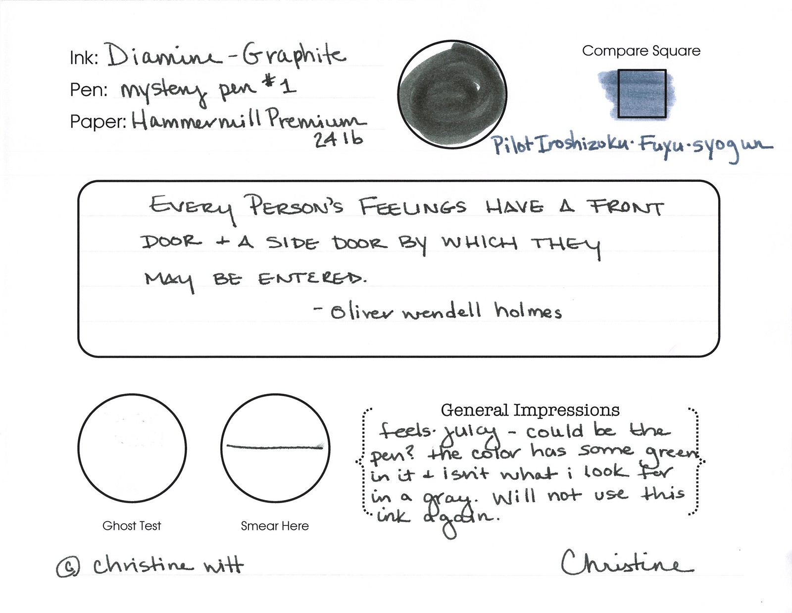
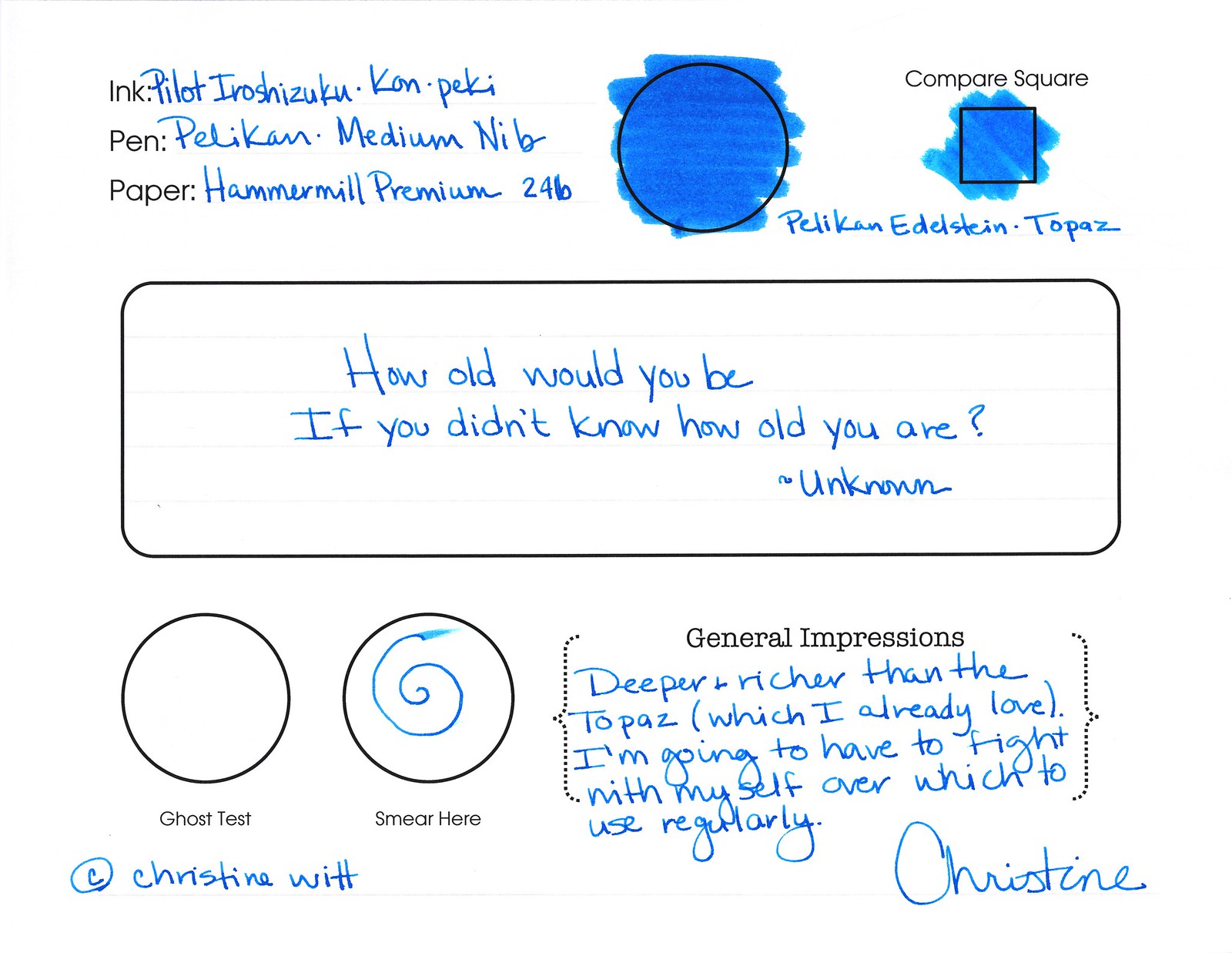
I’m modifying my ink review lay-out. The look is completely different from what I have going on now, but there are also some important changes about the process I’ll use to evaluate inks.
..No more separate ink swabs on index cards. I’ve searched for high quality cards, tested a few, and have just not been happy with the quality. I’m sure I could find some stock and spend the time cutting them into tidy little squares, but that’s not how I want to spend my time. So ink swabs will be right on the review itself.
..This Pen + That Pen + The Other Pen = Inconsistent Results.  I’m going to use one pen – the Lamy Safari for all of my ink tests. I probably won’t stick with the same nib width, though. I know, I know. Why the Safari? A couple of reasons. First, it’s a smooth writing son-of-a-gun that has given me good results with a variety of inks and papers. Second, I have several of them (trying to collect them all, yo) and this means I’ll be able to efficiently complete several reviews in one sitting. 
..I’m changing my paper for all reviews to HP Premium Choice 32lb. I’ve been really happy with the Hammermill that I’ve used since the beginning, but it’s time to mix it up a bit and I’ve been reading good things about the HP. 
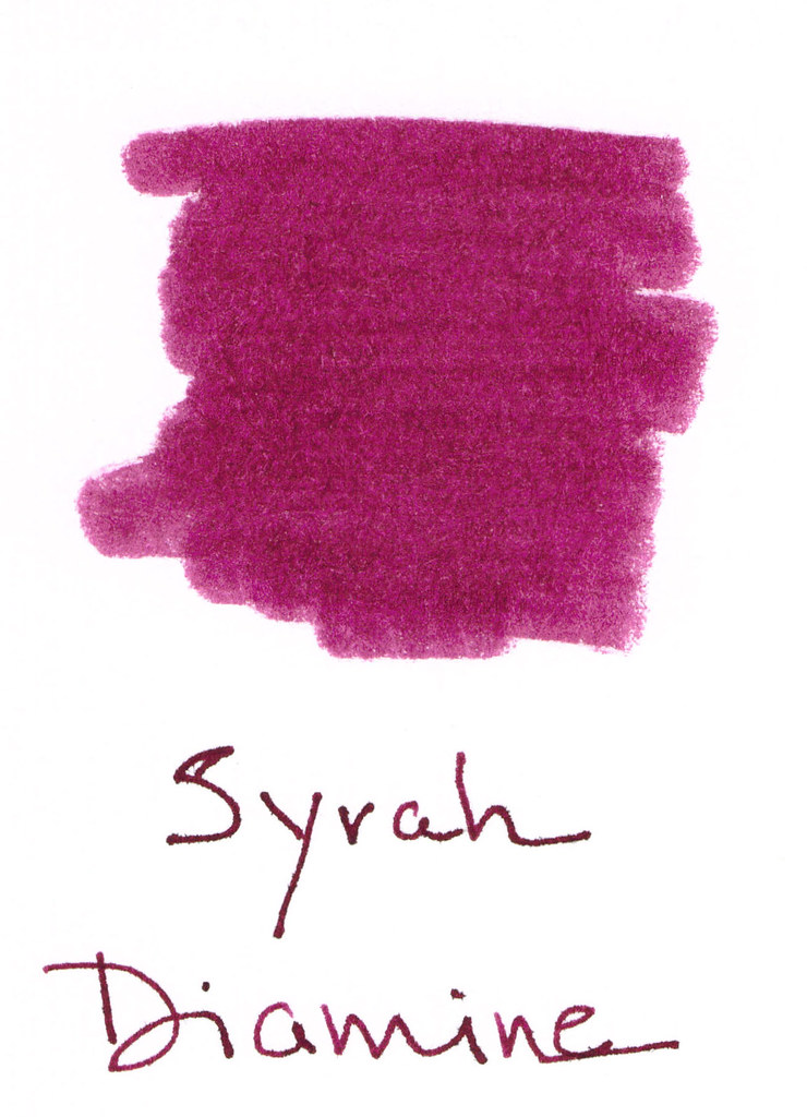
..The four boxes going across the page? That’s the Compare Square section. One of my favorite parts of looking at inks is comparing the ink to others. Sometimes, the other colors will be similar colors and maybe sometimes the other colors will be colors from the same line as the ink being reviewed. Let’s mix it up a bit in 2013, shall we?
..I’ve added a Highlight Test section. This is not at all related to my fancy new Montblanc Document Marker. 
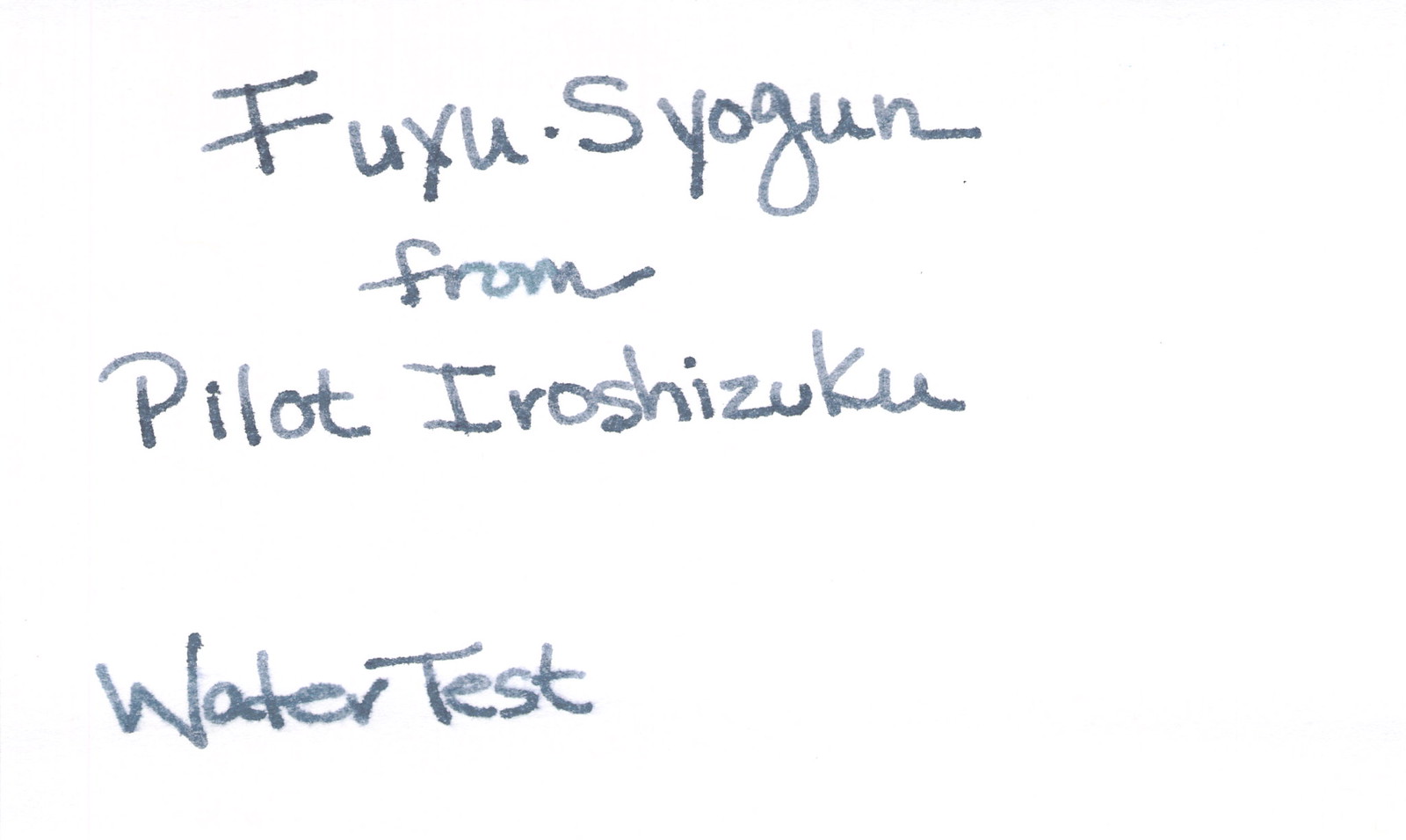
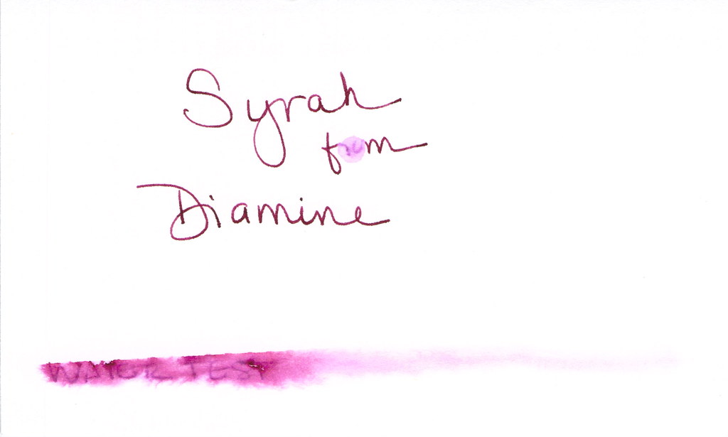
..No more separate Water Test sheets. Again, the issue with index cards comes up. This also reduces the number of pieces of paper that I need to keep track of. Winner winner, chicken dinner.
..A scoring system. It’s my system, you don’t have to agree with it. Items are weighted – meaning that the more important a characteristic is (to me), the more possible points it will score. For example, color and saturation are important to me – so important that it’s worth about one-third of the total points. Whew..that’s a lot.
There will be a period of transition. I work ahead a bit on ink reviews – completing the actual reviews ahead of time and then writing the blog posts as time allows. It will be a mixed bag until those are all done. Keepin’ you on your toes.
You know what else is new in 2013?
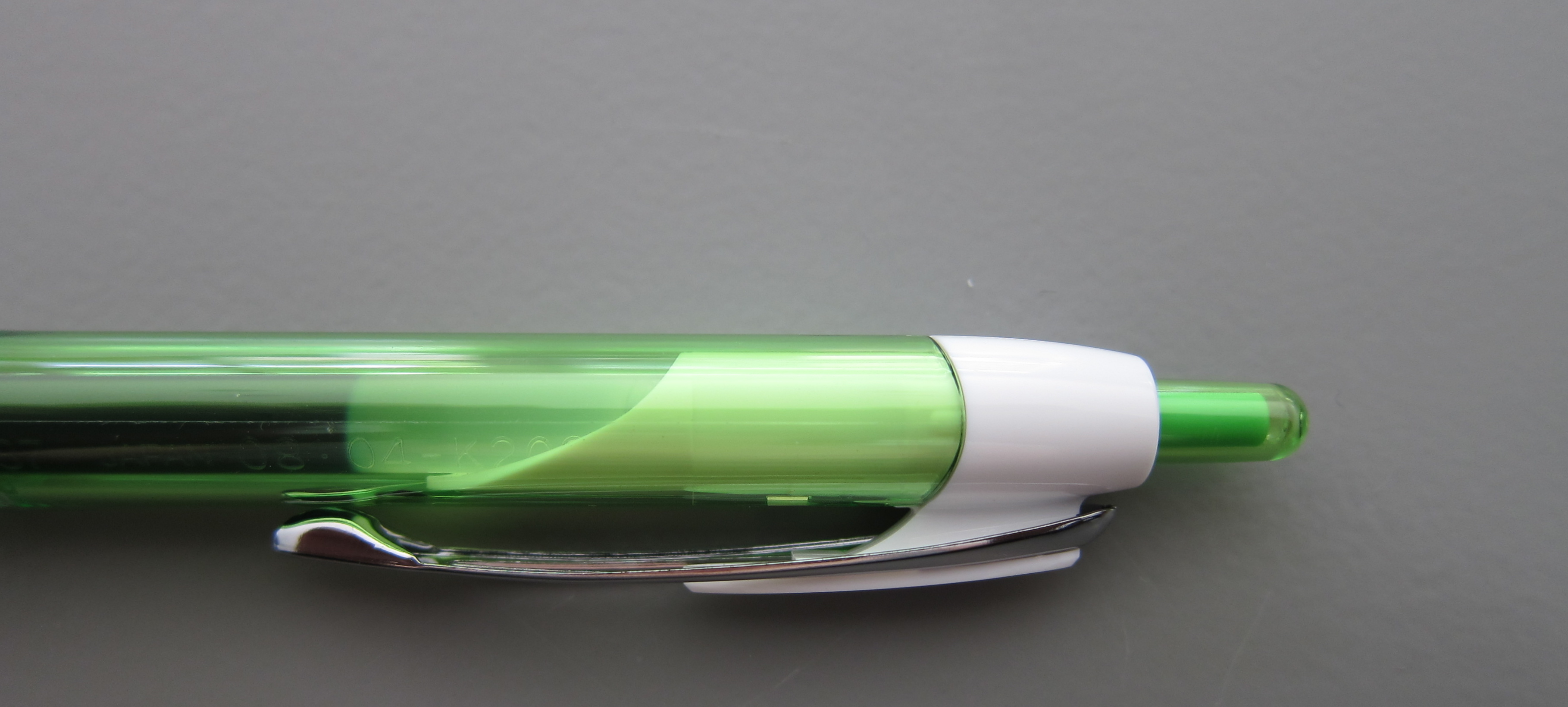
Pen reviews! I’ve been holding out on you, dear reader. I have a stash of pens that would make Caran D’Ache herself blush! And 2013 is the year I get over the weird shyness I have about showing them off to you. I always feel like I would be bragging or tooting my own horn too much – but then I think about what it’s like to be on the other side and I looooove looking at the pens that other people own or want to own.
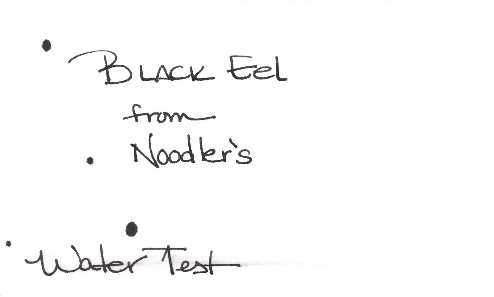
As you can see from the above form, I’m going to a rating system for pens. I’ve also decided to use Noodler’s Black for all the of the pen reviews. Noodler’s Black is well-regarded for its get-‘er-done attitude and it should work well in nearly all pens – freeing me up to write about the pen and not about pen, ink, paper combinations. 
I have a few other things up my sleeve for the coming year. Maybe I’ll do some give-aways? Start a Facebook Page? Invite guest writers? Track my handwriting improvement plan here? It’s a whole new year filled with opportunities!
New opportunities. Not just for Pentulant, but for me – for you – for all of us. 
Happy New Year!!!!

INK REVIEW: Diamine – Syrah

Still recovering from the holidays here and wrapping up a few pre-scheduled reviews before diving into new and exciting things!

Syrah from Diamine is a berry nice shade. Kinda red-purple. Deep plum. And by now, everyone knows how I feel about “mixed shades” of ink. I’m not a huge fan.

Here’s the ugly. Major fail. (Those of you who watch “How I Met Your Mother” may now salute. Those of you who have no clue about which I speak may also salute. Major Fail – get it?)  Anyway, major fail = water test. Even the tiny droplet test (where the “ro” in “from” should be) faded this color into nothingness.

I used a dip pen and Syrah performed well enough. No big complaints, but no big compliments either.

Look at that compare square?  I do think if the writer is looking for something dark, but different, this could work (as long as one never nears the water).

It was a little wet as you can see in the Smear Here – but not intolerable.

Overall, I’d give Syrah from Diamine a good solid C. It would work, but I’m not in love. In looking at other reviews after I wrote this one – this is a popular ink. People love it and its color. Consider me the dissenting reviewer.
Such a contrarian.
What do you think? Love it?

INK REVIEW: Noodler’s Black Eel

I’m off recovering from eggnog, picking ribbon out of my hair, or just taking it easy. In other words, this review was pre-written.  Enjoy!
Noodler’s Black Eel.
How is this different from Noodler’s Black?
Well, I didn’t know. And I wanted to know. So I did some research before this review. 
But first, what the heck is that line down the center of the ink swab? Yeah, I don’t know. It’s not on the swab. I think it’s gunk in the scanner. I hope it’s not too distracting. I hope my mess-up on the “c” in “Black” isn’t too distracting, either. I’m sorry, ok? That’s what I’m trying to say.
Anyway.
Inks in the Noodler’s Eel series are lubricated (stop being gross).  Rumor is that this lubrication helps the action of piston converter pens (the ones you twisty up and down to fill). 
Then I read things that say that the difference isn’t appreciable. Then I read things that say the ink is “sticky,” and takes a long time to dry. And then I read things that contradict all of the above.
My general thought – ymmv, yo. There are so many variables with inks and pens and papers and your writing style. Your mileage may vary, yo.

It’s pretty. The cost is the same as other Noodler’s inks. It’s very well-saturated and I like that. A little smearing, but not horrible. Felt wet to me in my pretty Libelle. I liked it.

Very little feathering. No shading. Solid.

On to the water test. Solid. See those black specks? I don’t want to talk about them, but I can tell you this – those are not Black Eel from Noodler’s. And I hope they are not too distracting.  (They are actually from my horrible Invincible Black fling-a-thon!)

So. That’s Black Eel. Will you give it a go? I may end up getting bottle of this to see if it makes any difference in pens that I’ve had trouble with. 
Here’s what some of the kind people over at Fountain Pen Network had to say about this one.

MERRY CHRISTMAS!

So!  Santa dropped some things off early here this year!  (There’s even more that arrived after this!)

And since it’s so close to Christmas and things are so crAzY BUsY, I’m going to let this picture speak at least one thousand words.  We’ll have a closer look at everything soon.

Merry Christmas!!

INK REVIEW: Private Reserve – Orange Crush

Let me start by saying that this is a perfectly fine ink. It’s well-behaved with the glass dip pen and on the paper. And I probably would have loved it. Had it not been for Diamine Pumpkin getting in the way!

The color is a bit muddy for me. When I think of Orange Crush, I think of big bright screamin’ orange -and this wasn’t exactly that.

But…no smearing…no ghosting or bleeding..it’s fine. But just fine. It’s not BIG LOVE. Honestly, I wonder if any other orange ink will ever pass Diamine Pumpkin for me. Probably not in 2012, at least. Hahaaha

As a side note – we’re so close to Christmas! Peeking through the pile of gifts, I do think some of them look pen-box-shaped!  Wheeee!    What is Santa bringing you this year?

INK REVIEW: Pelikan Edelstein – Onyx

Nice!  This ink had great flow from the pen. It was such a pleasure to write with. I wonder how much of that was the pen? (Watch for more on this topic in a future post.)
I little smearing, but I work around that fairly well – even for a lefty.
Nice color. Not as “solid” as some.
But here’s the issue. The major stinkin’ issue …
The way I look at water tests – I don’t expect all of my inks to do well when they meet water. I know they won’t. But . . . I do expect better performance from an average black – probably becuase I know it’s possible to make black with great stability.
I’m so glad I only bought the sample of this ink and not the full-size bottle.  Bummer.
Do you have rules like my black-must-do-well-with-water rule?

PEN REVIEW: Uni-Ball Signo Pack

I love fountain pens, but let’s face it – they are not perfect for every situation.

For vibrant gel pens, these Uniball Signo pens are among my favorites.

And (bonus points!), they help prevent check fraud! (Not really sure that’s a selling point for most people who are handling their check writing electronically these days.) (And I’m not really sure banks would appreciate checks written in some of these colors.)

Here’s the blurb about check washing from the back of the package:

I love the pretty colors. They really are quite vibrant.

Love the click action. The clips are nice if you’re into those (I’m not).

Like most packaged pens these days, these come with the protective blob at the tip to prevent leaks.

The grippy section is – well, grippy. The texture has a good feel to it. I’m not completely sold on the material used for the grippy section – it feels a bit rubbery to me, but it’s not awful.

How do they write?  Lovely, that’s how!

click to make bigger
Nice!

too pale to be useful?

Love purple!

my favorite!

At around $10 per pack (eight pens), it’s hard to go wrong.

If there’s a negative, it’s that I wish these came in a finer tip. The .7 mm is a bit thick for my preferences – but I’m assuming they’ve asked around and this is what most people want.

When you’re not using a fountain pen, what are you using?

xo