|
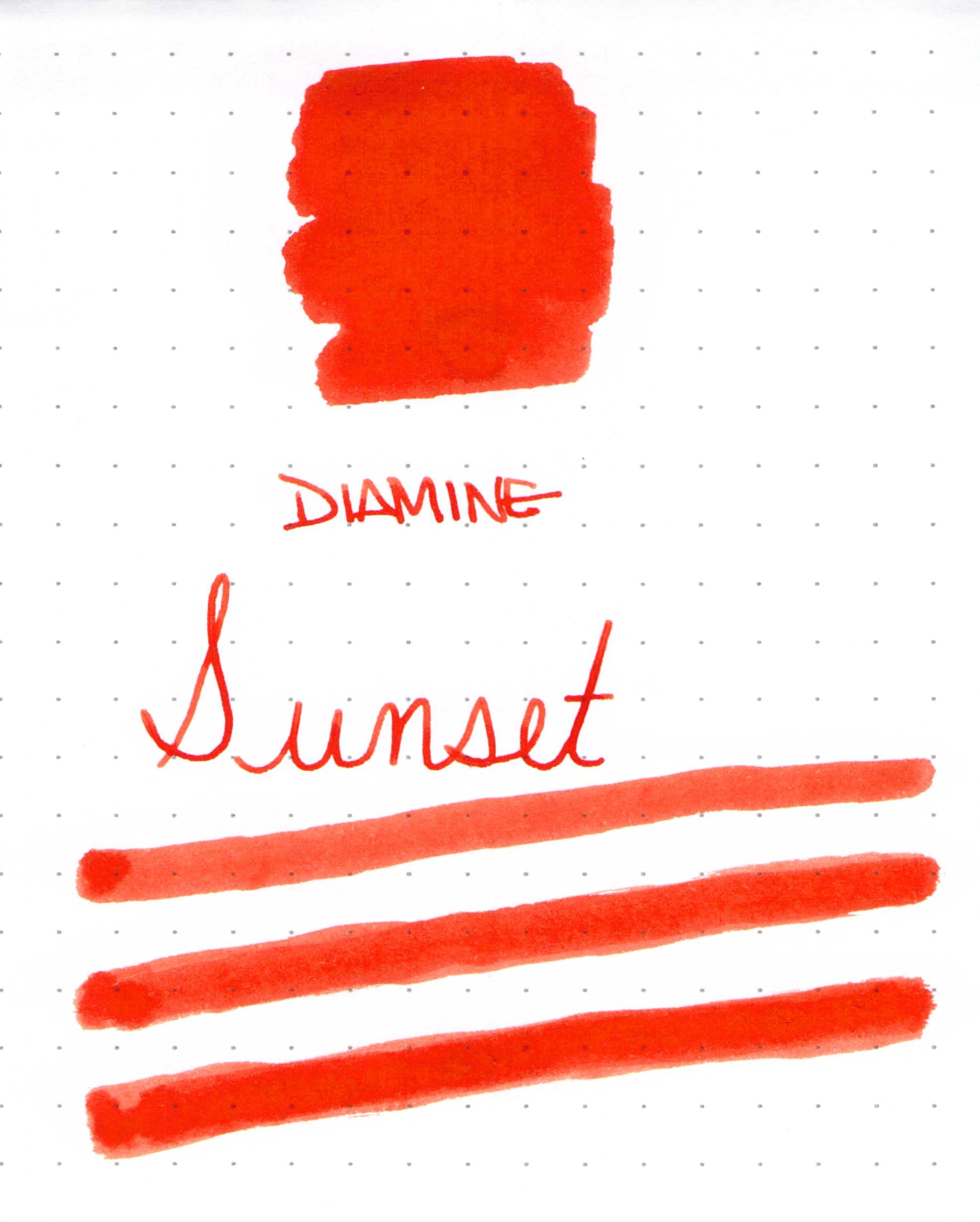
| Diamine Sunset Ink Swab |
Anyone who has been here for awhile knows how much I love a bold bright ink. Diamine Sunset certainly seems to fit that bill, though the red-orange color isn’t quite enough to cover the dots on the Rhodia paper I was using.
 |
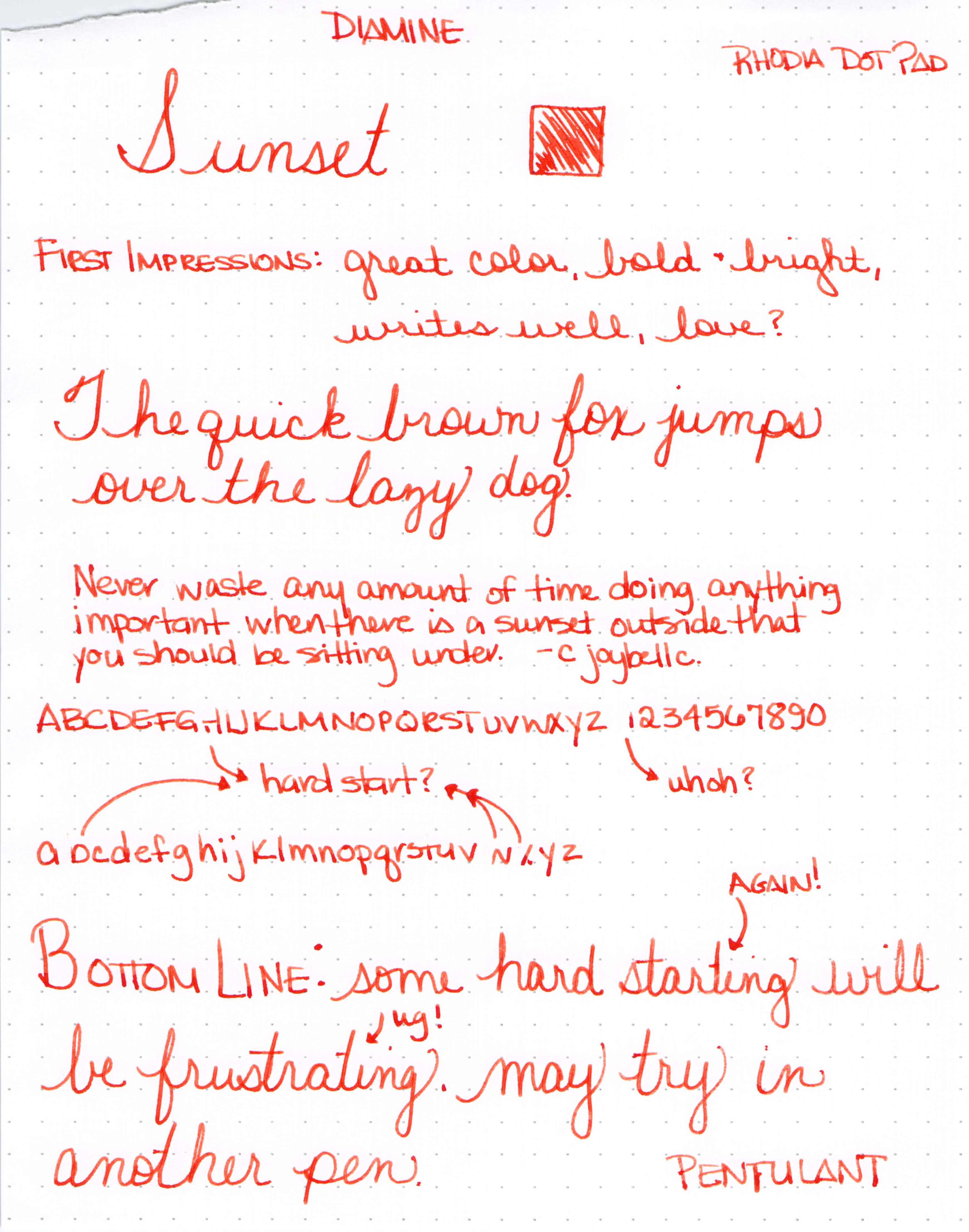
| Diamine Sunset Writing Sample with Lamy Safari (B) |
Add in a a little bit of shading and it just might be love.

Er. What is this? A B C D E F G . . .


I usually use an ink for a week or so before posting the review, but the hard starting continued throughout the first day and I couldn’t stand it.
My initial thought was that the ink must be more dry than others. I was using a Lamy Safari – Broad nib – and rarely have trouble with them. I’m fastidious about cleaning my pens, so I doubt that’s the issue.
Here are some other reviews for the same ink…
Fountain Pen Network – “flow for this ink seems high” (Uh. Oh.)
Fountain Pen Network – “a nice flowing orange” (Hmm.)
Goulet Pens Reviews – “it is a very dry ink” (Interesting!) and “…made the pen skip quite a bit” (Ah Ha!)
So..what about you? Have you tried Diamine Sunset? What was your experience?
 |
| Click for Full-Size |
 |
| Click for Full-Size |