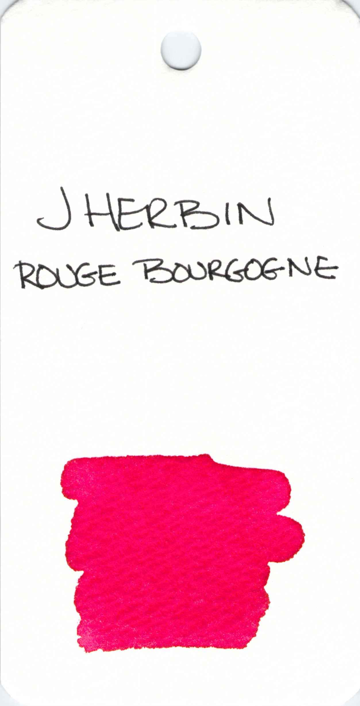
J Herbin Rouge Bourgogne
J Herbin is a terrific brand of ink. I have no writing experience with this pretty red, but I think I will ink it up soon enough.
You like?

J Herbin Rouge Bourgogne
J Herbin is a terrific brand of ink. I have no writing experience with this pretty red, but I think I will ink it up soon enough.
You like?
Happy Valentine’s Day!
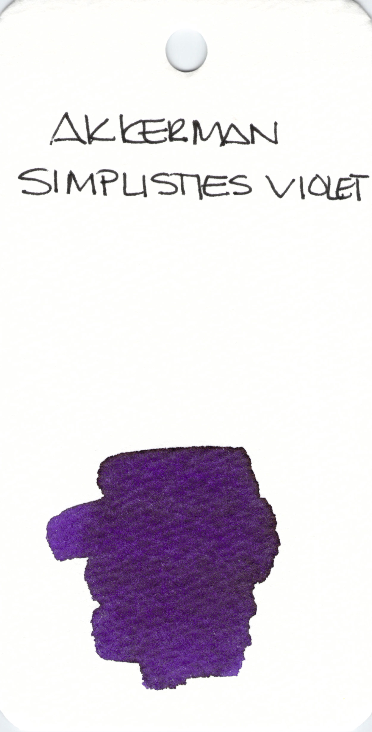
With all of the pink and red out there today, I thought I’d do something a bit different and show off a beautiful purple ink that I love – PW Akkerman’s Simplisties Violet. This is an ink that I’ve reviewed in the past and absolutely loved. The fact that the ink comes in the best bottle ever is just a bonus.
xoox

Lamy Green is.
🙂
This is a long and interesting article. It’s not only about Justine Sacco and how one stupid tweet changed her life, it’s also about how easy it is to “pile on.” The person who started this piling on later apologized to Justine when he experienced much the same thing. Lesson: words are powerful.
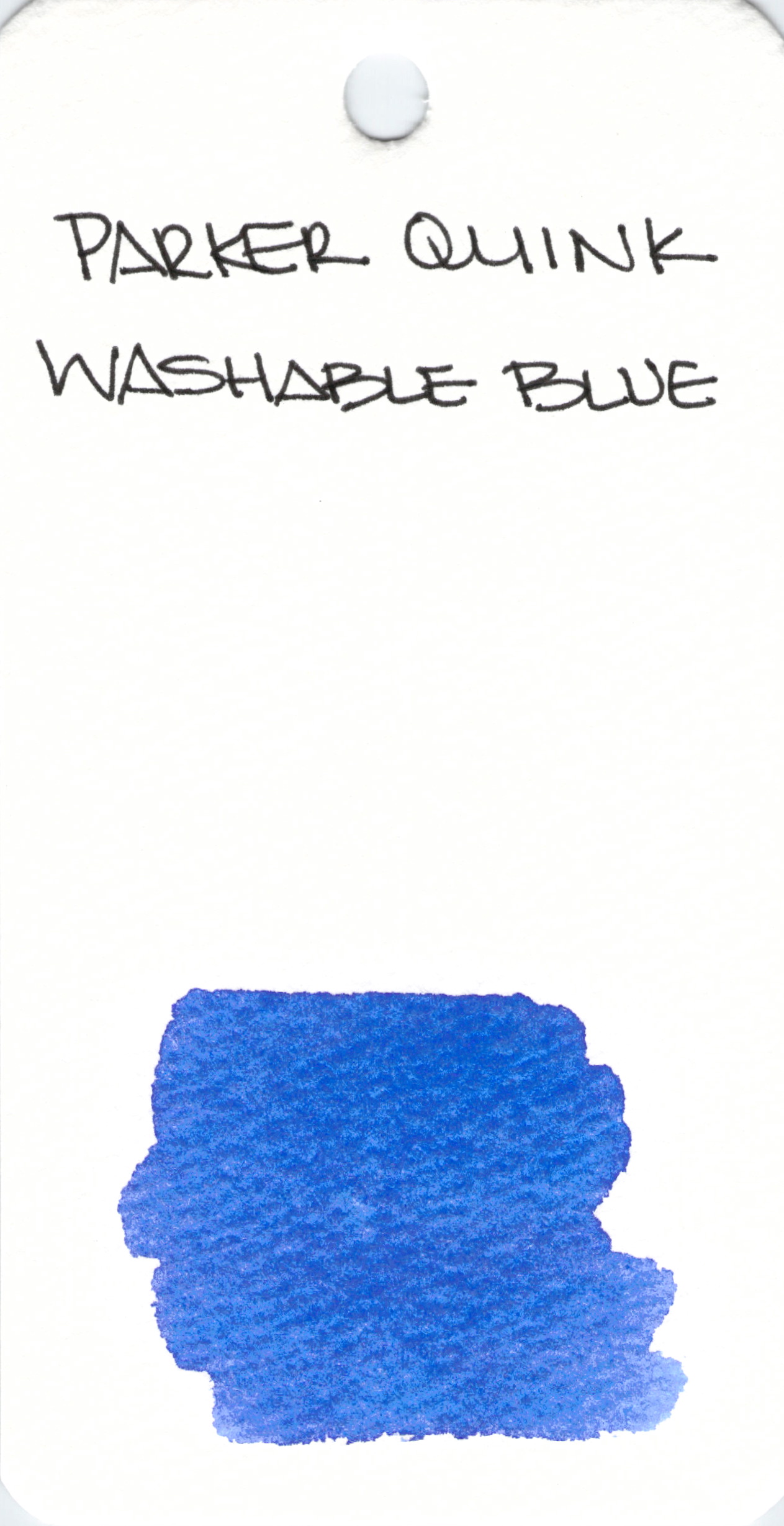
Parker Quink is a good solid blue ink. Many people love the long history and great reputation of the Quink line. The ink works well in most pens.
I tend to want more specialness from my inks, but have no complaints about Washable Blue.
Tell me – do you like the standard colors? or are you like I am and chase the more unconventional shades?
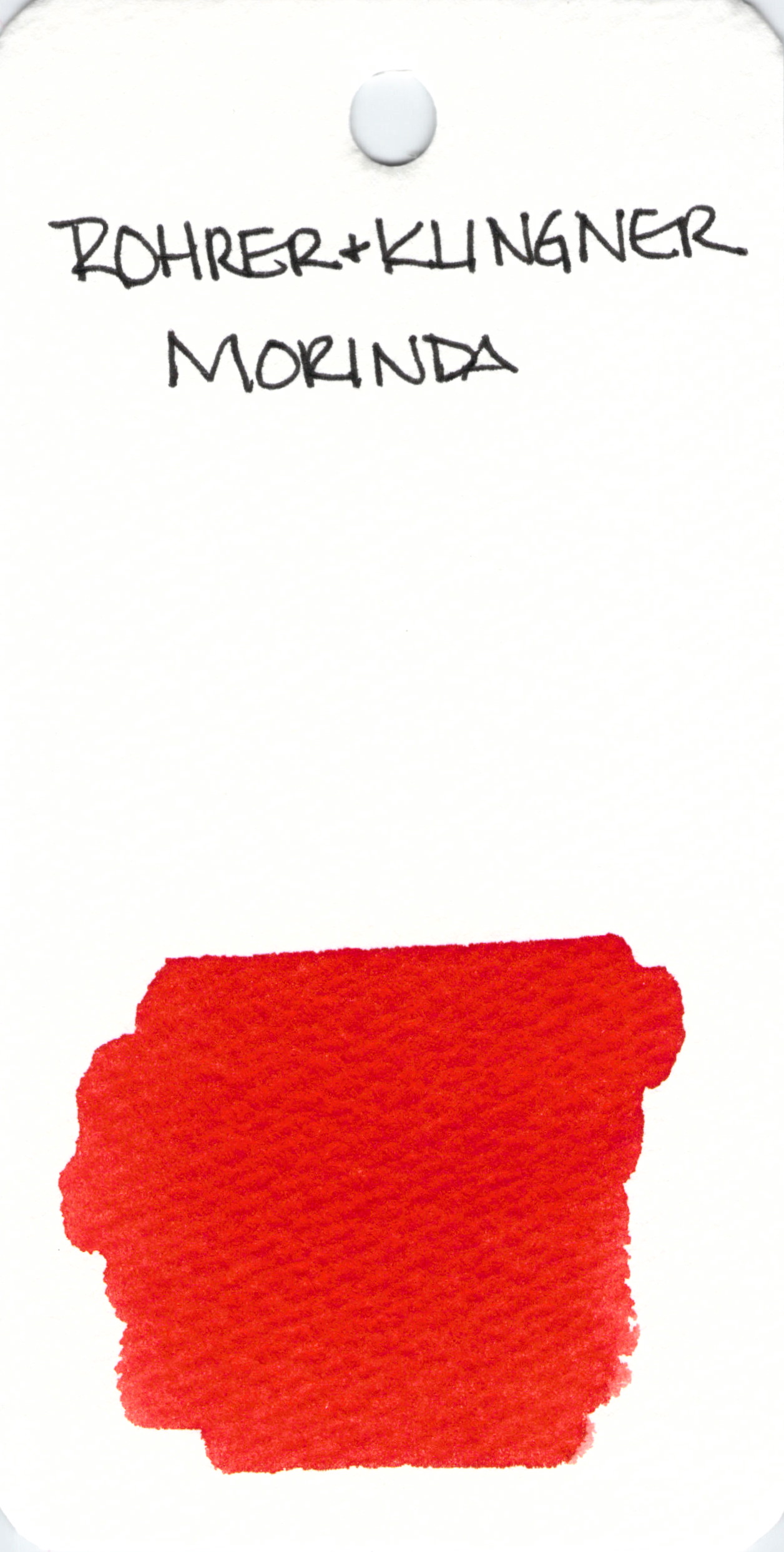
Rohrer & Klingner Morinda is one of my favorite red inks. I reviewed it quite some time ago – read that review here. It writes so well.
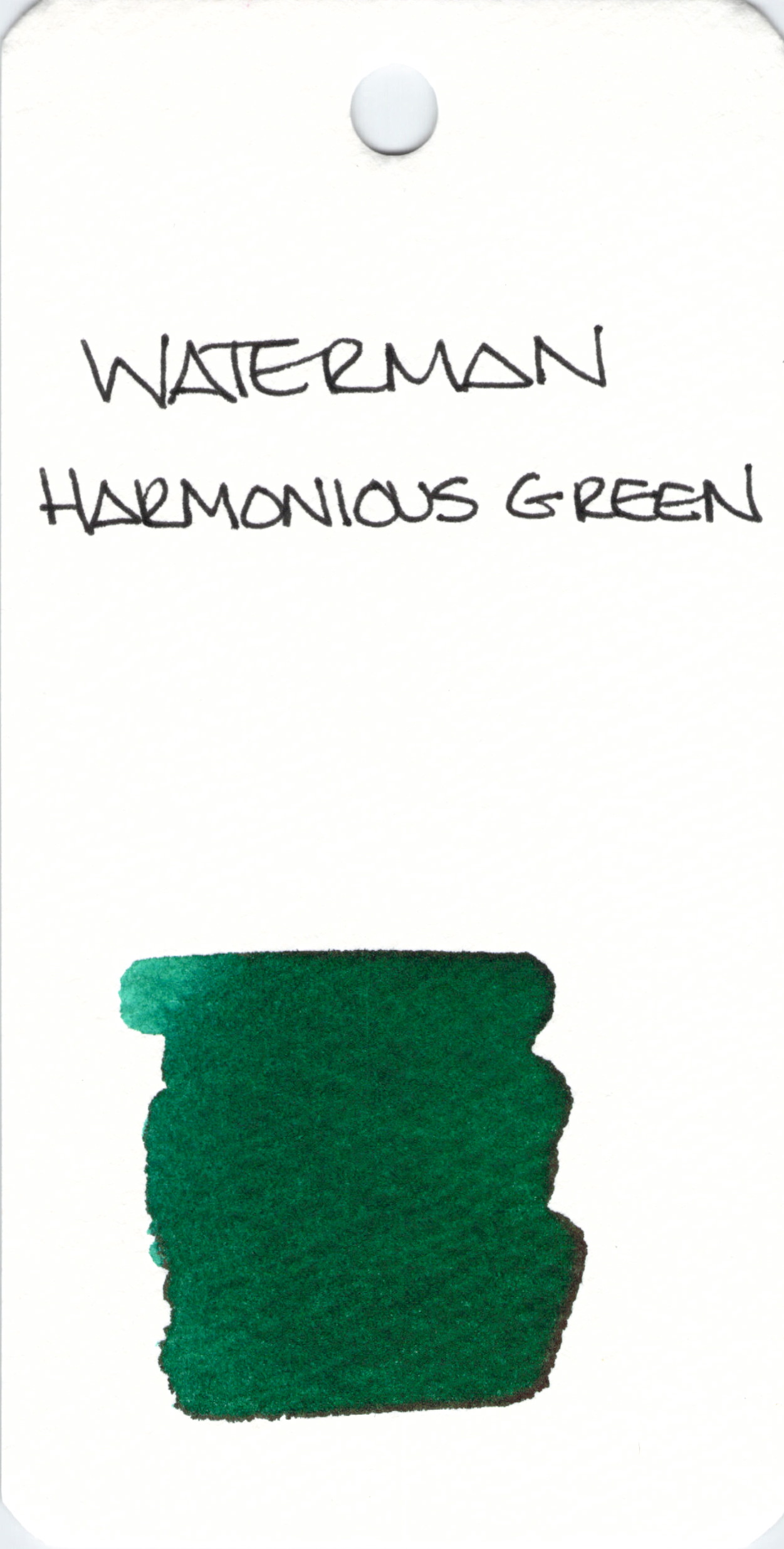
Waterman Harmonious Green looks like a fairly standard green. I’ve not written with it yet, have you?
And check this out. I’ve read this blog for ages and today, the writer posted about her great grandfather’s journal. He was in love. Big love.
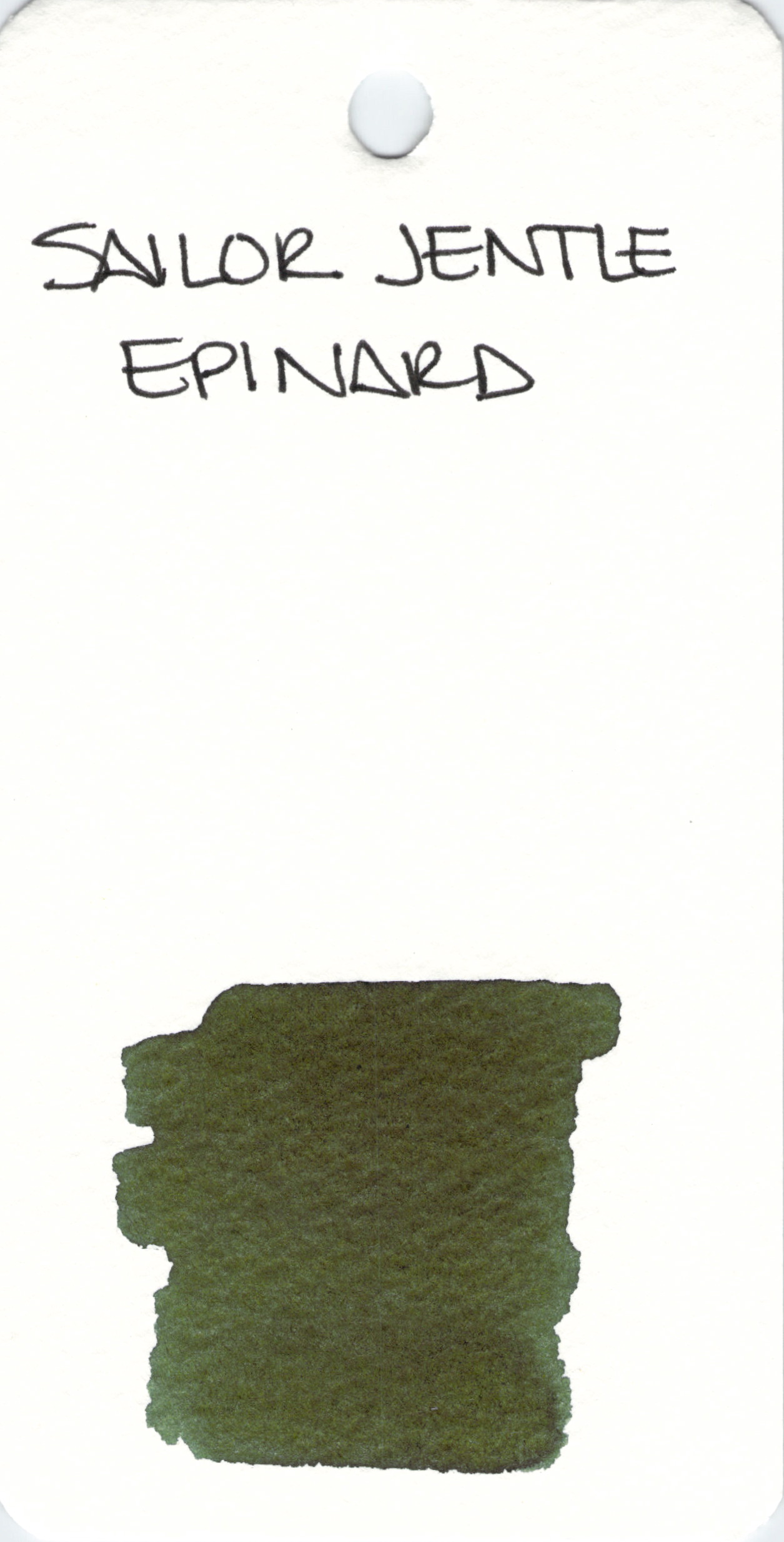
Sailor Jentle Epinard is part of the line that has been discontinued. People love this ink. I don’t. Here’s a link to my scathing review. Hahaha
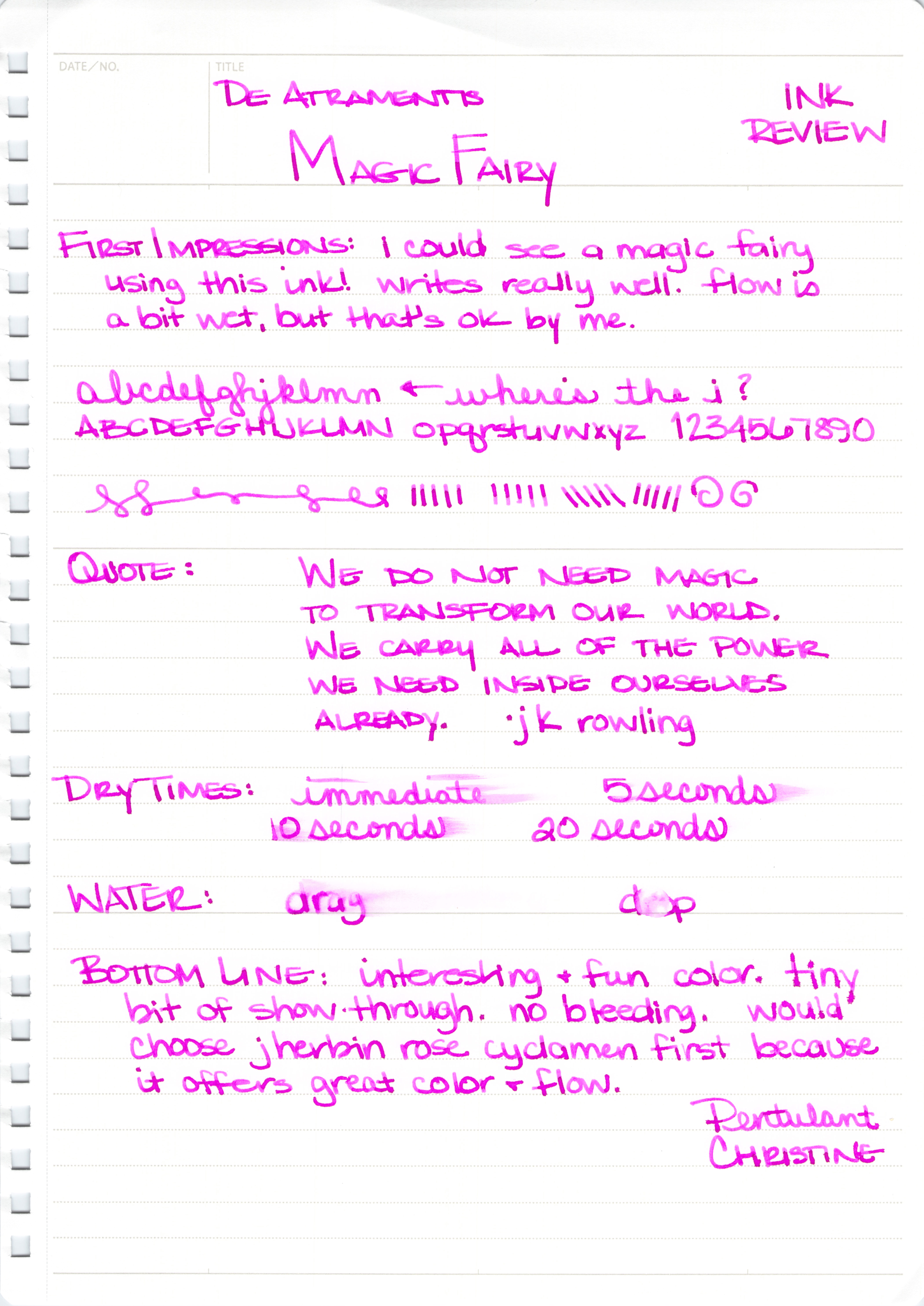
With its super-bright purple/pink hue, Magic Fairy from De Atramentis is a bold choice for fountain pen users. I’m not sure there are many practical uses for the ink, but I’m not sure that matters either. The heart wants what the heart wants, after all.

The ink performed well for me at first with no skipping, no bleeding, and no showing through. Initially, I didn’t think there was much potential for shading, but the strokes above and a closer look at some of the other writing makes it seem that with the right nib, one could expect some degree of shading.

I was prepared to like Magic Fairy and then this started happening as I wrote more with the ink:
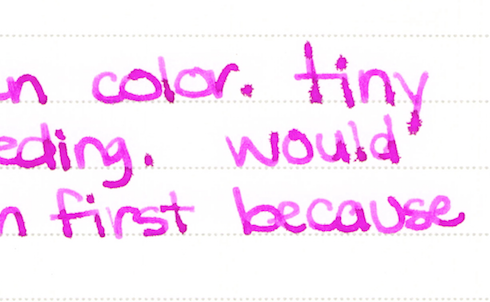 See the spreading? It was really hit or miss. The word “tiny” above is just terrible, but the word “because” looks just fine. Look at “first,” though – the thin downstroke of the r combined with the other issues makes me think that what I’m dealing with here is inconsistent ink flow.
I’ve written with Magic Fairy a couple of times since completing the review and it definitely has a consistency issue for me. J Herbin’s Rose Cyclamen is a close color match and I’ve not had a bit of trouble with it. For this reason, I’ll not be buying a bottle of Magic Fairy anytime soon.
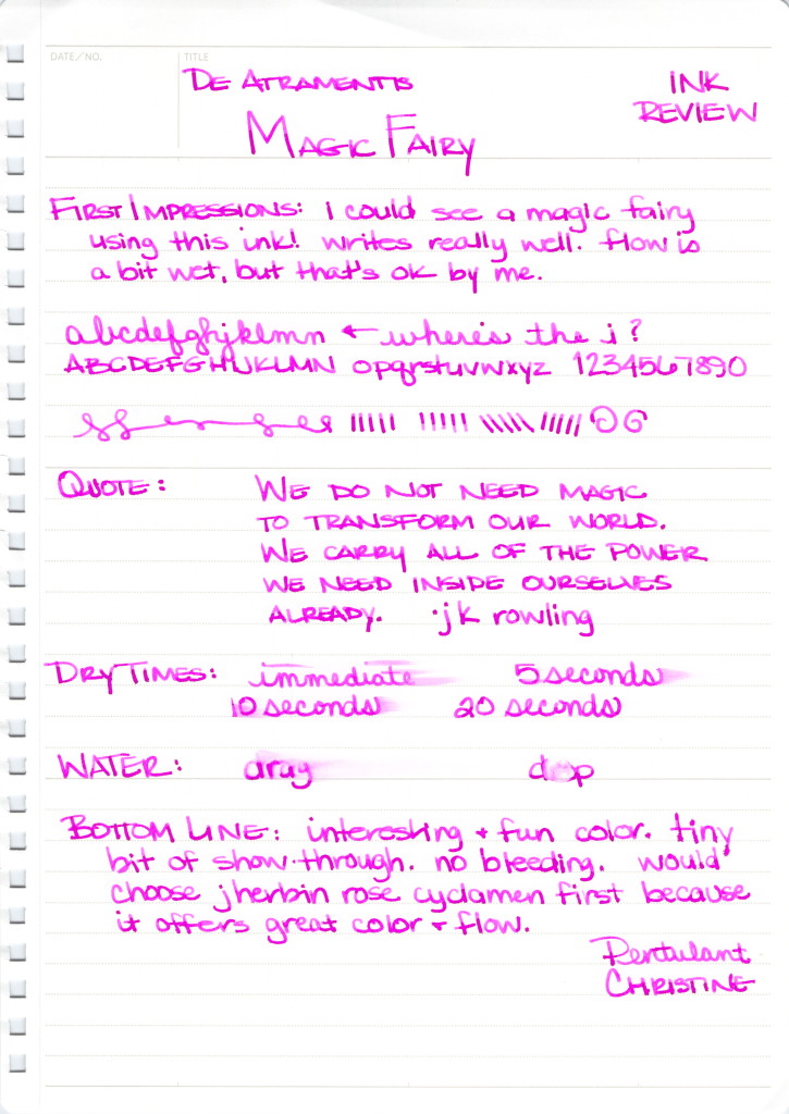
I bought my sample of this ink from Goulet Pens. It is either out of stock or no longer being offered by them. It is available for sale on the De Atramentis site, however.
Have you tried this one? Did you find it to be inconsistent? Are there inks that have no practical application that you just can’t stay away from?
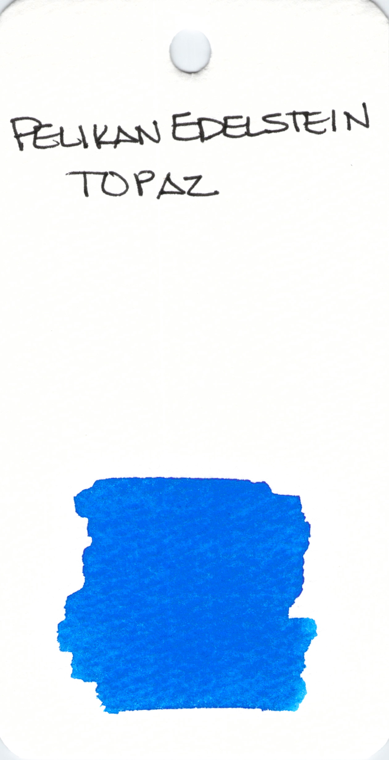
I very much like the Pelikan Edelstein line of inks. They are generally well-saturated and write well with a variety of pens. Topaz is a great color.
Do you like it, too?
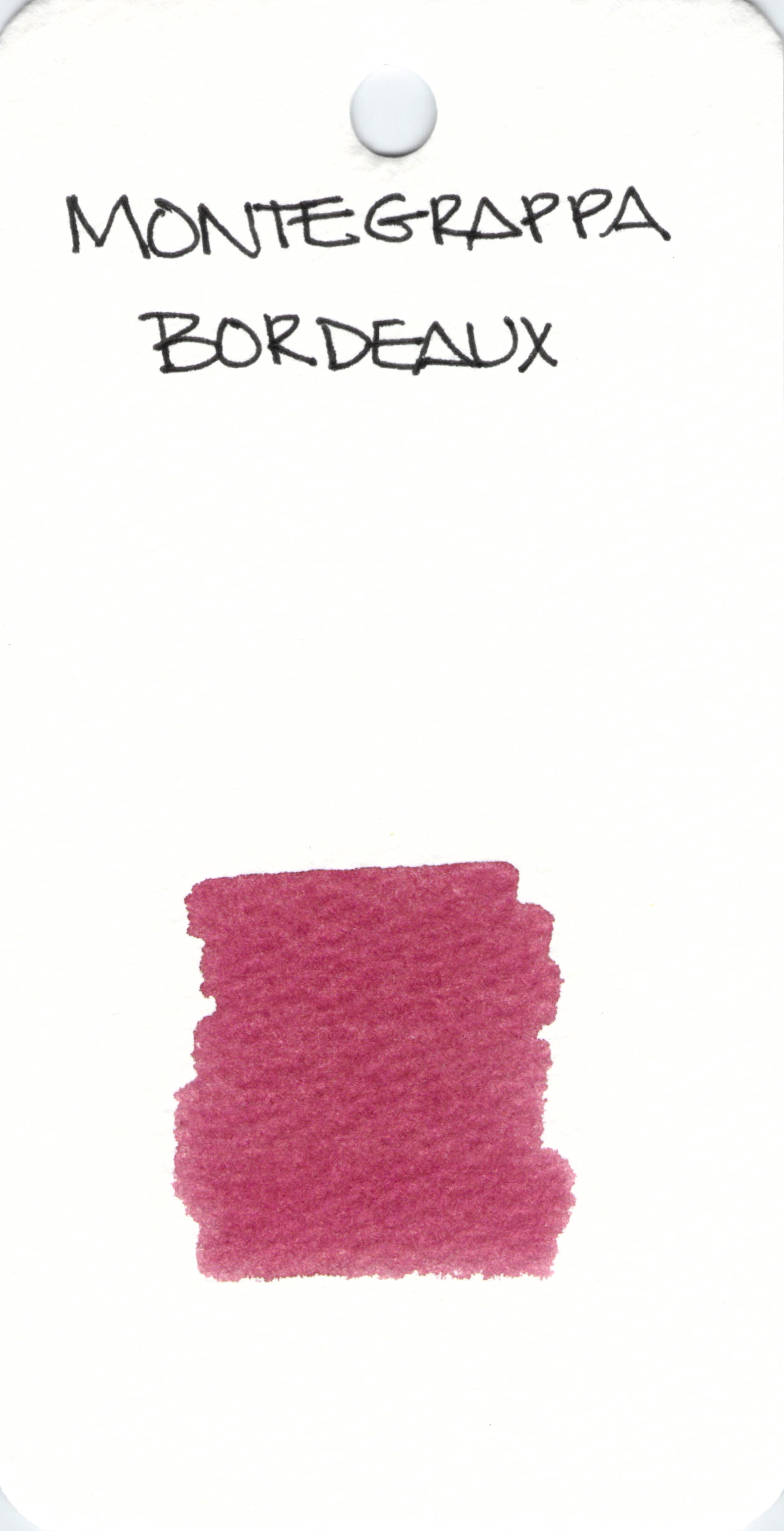
Bordeaux: is it red or is it purple?