PEN REVIEW: Lamy Safari White

Clean!
Fresh!
Sharp!
I’ve been loving my Lamy Safaris lately. This one is white with a medium stainless nib.
Let’s havea quick look at this pretty thing. More in-depth reviews are coming up next week. Stay tuned.

It has a nice glossy quality to it.  I used to haaaate the look of the huge clip, but isn’t that nice looking? Like it could really hold on to something.  (Do you clip your pens to your shirts? Does anyone?)

Pen porn…

The converter doesn’t come with the pen. Inconvenient. But it does come with a cartridge. Convenient. If you’re into those. I’m not.

Love the way it writes. Love.  (Click to make images bigger.)

INK REVIEW: J Herbin – Gris Nuage

Here’s a quickie review of one of my favorite inks to get us back into the groove this week. (More on Thanksgiving another time.)
The above swab was done with a q-tip and then the name of the ink written with a glass pen. In my experience, there’s a lot of feathering with glass pens and this was no exception. (It also doesn’t help things that it’s written on a cheap-o index card.) (Again, I ask, are there are any nice index cards out there? Starting to think there aren’t.)
Anyway….Gris Nuage (Gray Cloud – how pretty!) is one of my very most favorite gray (grey, if you insist) inks.
It’s light – just like a cloud. It’s prettttttty. Leans more toward blue than red, but is definitely one of those pure colors that I adore.  
And, holy crappoli (it’s a word), it writes like a dream. Check it out….
Pretty, yes?  Some lovely shading going on there, too. And no smearing, no feathering, no ghosting, or bleeding. What more could a girl want in a gray ink?

Oh, yes, it does well with water!  Nice!!!  This is totally one of my gray inks. It makes me swoon!

OK..so see those black specks on the water test?  No, it’s not Gris Nuage gone crazy – that’s collateral damage from my Invincible Black spatter. Haha!

Do you have a favorite gray? Mr. Pentulant was using Montblanc Oyster Grey for awhile in his fancy new Boheme, but he wasn’t loving it.

INK REVIEW: Private Reserve – Invincible Black

click to see bigger images
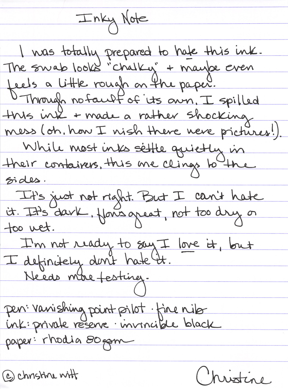
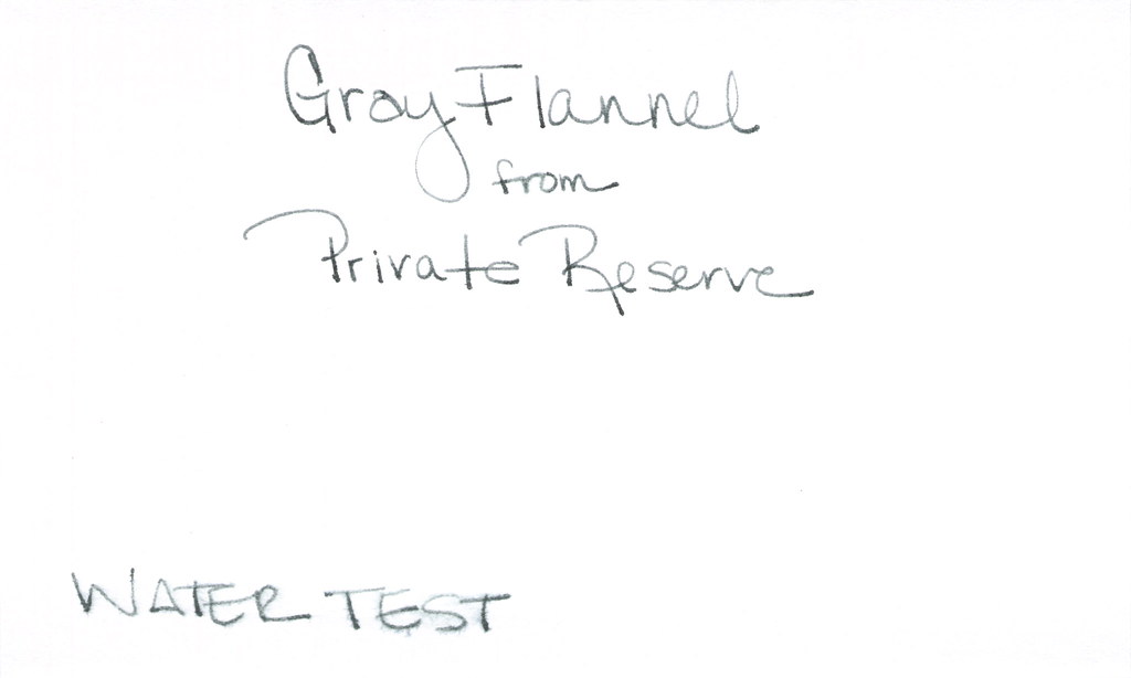
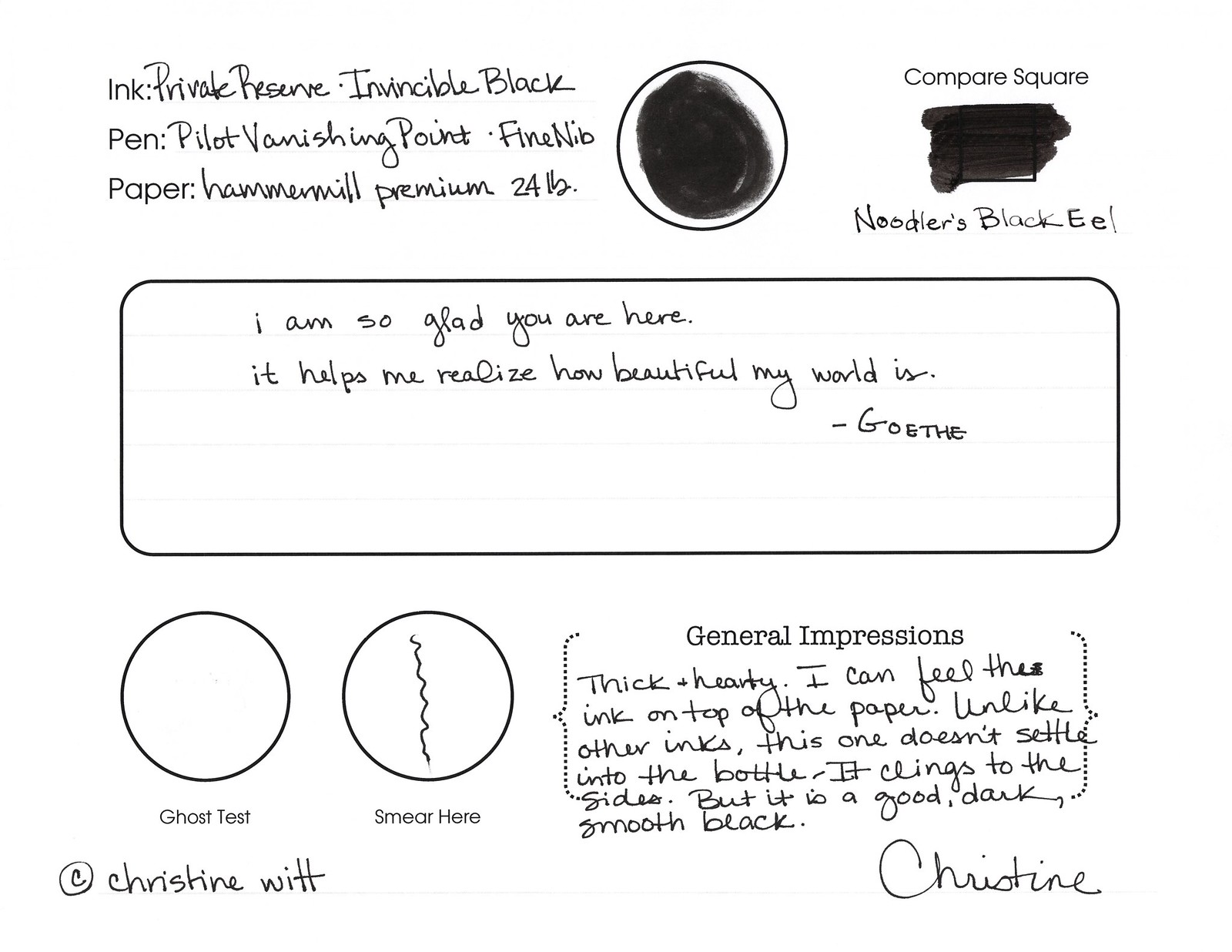
Invincible Black from Private Reserve is an interesting ink!  The difference between it and other ink samples in my collection was noticeable right from the start. Rather than the ink settling in the bottom of the vial, it clung to the sides.  (Think…the difference between a bottle of Coke and a bottle of ketchup – not that the ink is thick like ketchup!..it’s not, but it hung like that to the sides of the vial.)
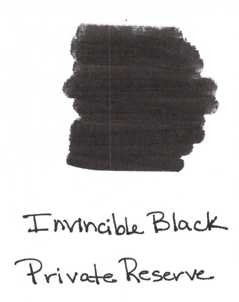
Anyway, I knew right away that I had something interesting on my hands.  And just look at the swab – that is some crazy black. Opaque.  (That streak down the left side of the scan was something from my scanner, not from the ink.) Anyway – opaque – I almost want to say chalky, but that’s not exactly right. Keep reading . . . 
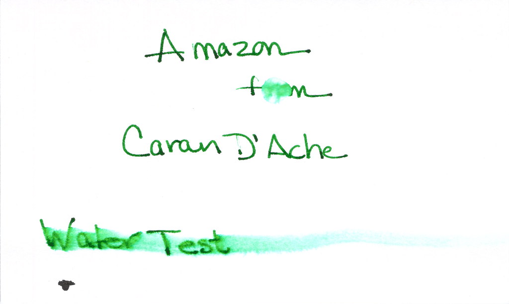
passes the water test!

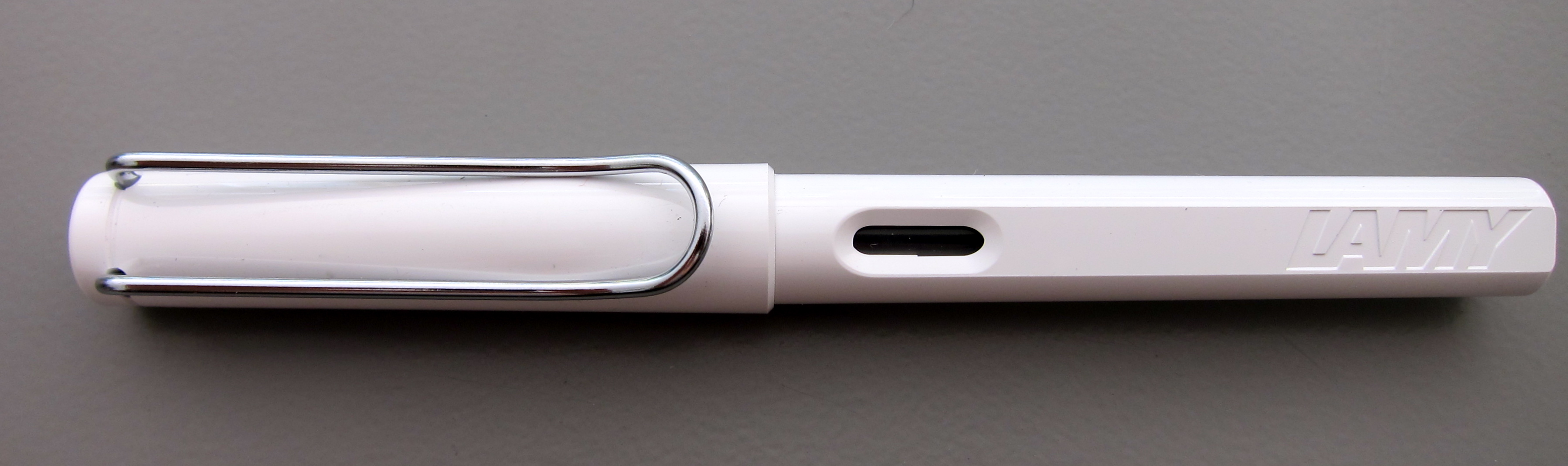
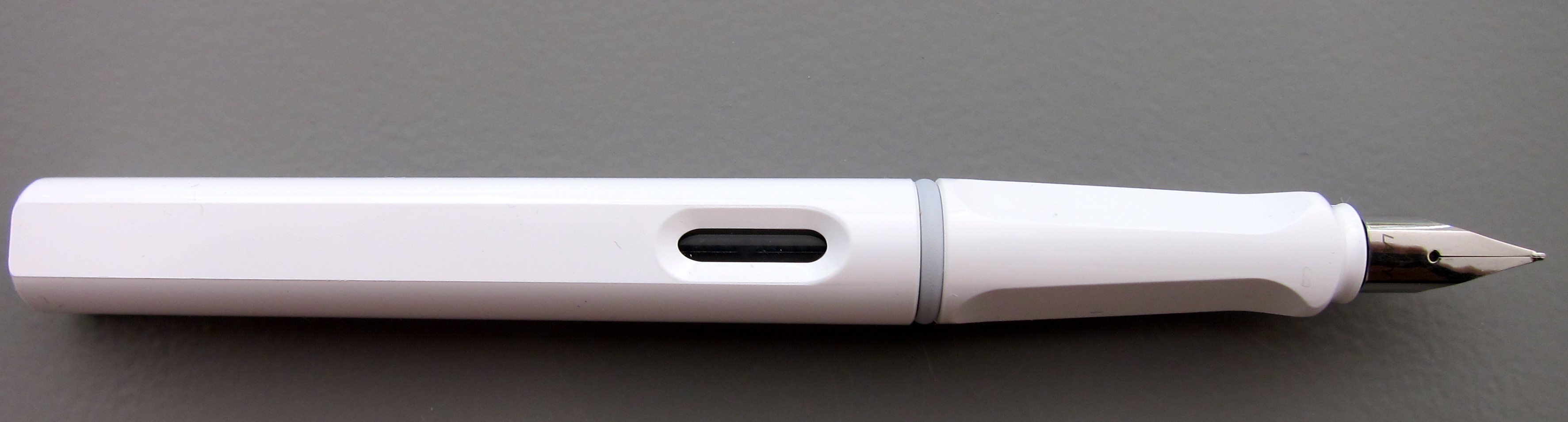
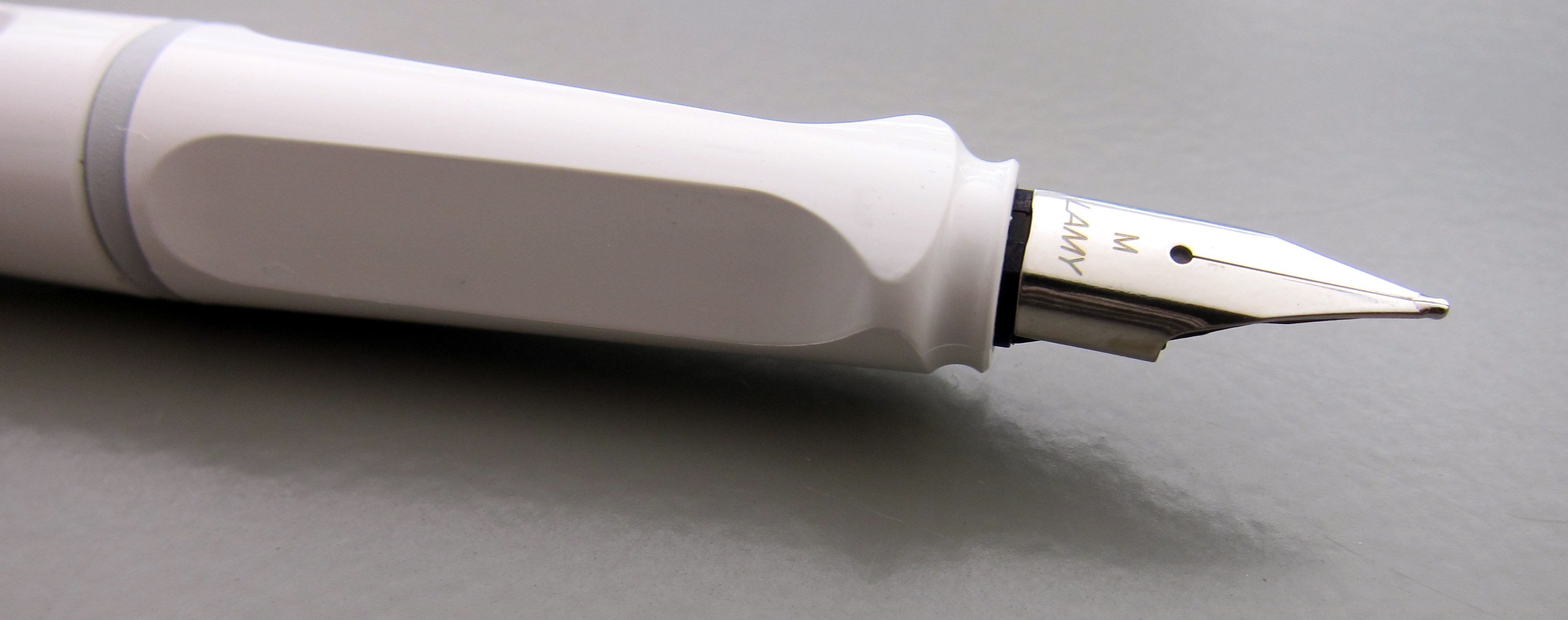
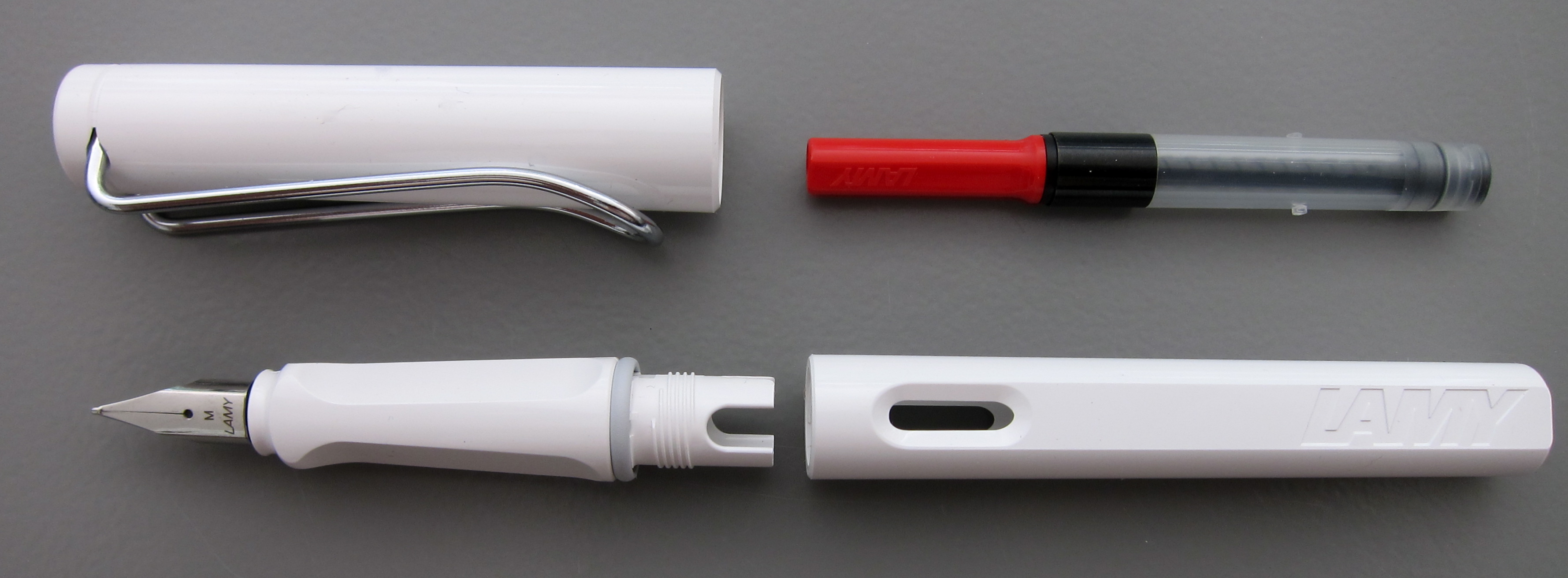
I inked this up in my white Pilot Vanishing Point (fine nib) and when I sloshed ink all over the place (don’t ask), I was definitely nervous that it was going to be a nightmare to clean, but it wasn’t. (Big Sigh of Relief!)
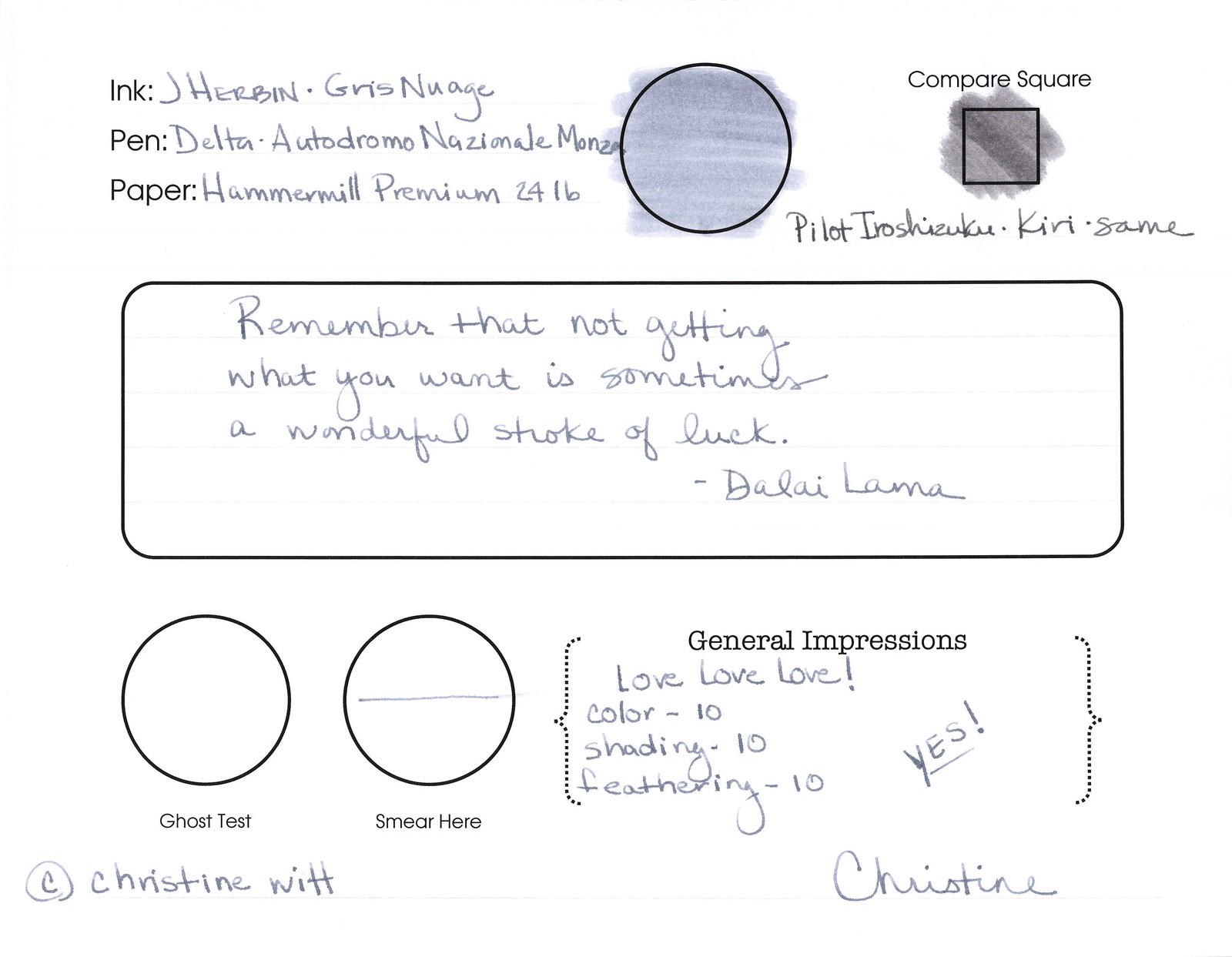
Does the swab in my review form below look chalky to you? I think it’s because the ink was definitely thicker than others I’ve experienced. Not in a bad way – just different. And!!!…I could actually feel the ink on the surface of the paper. St-range! But in a cool way.
thick & hearty?

It feathers. Quite a bit.  Look at these from the Hammermill paper (same paper I’ve used in my other reviews of other inks):

And so I decided to test it on other paper – Rhodia . . .

…and it definitely feathered less. Somewhat less, anyway.
Is it strange that I seem to write above the line rather than right on it?

So. I was worried about Invincible Black – just the name alone had me a little worried. It’s cling-factor freaked my freak. Should have seen my face when I flung some of the ink across the table. Yikes.
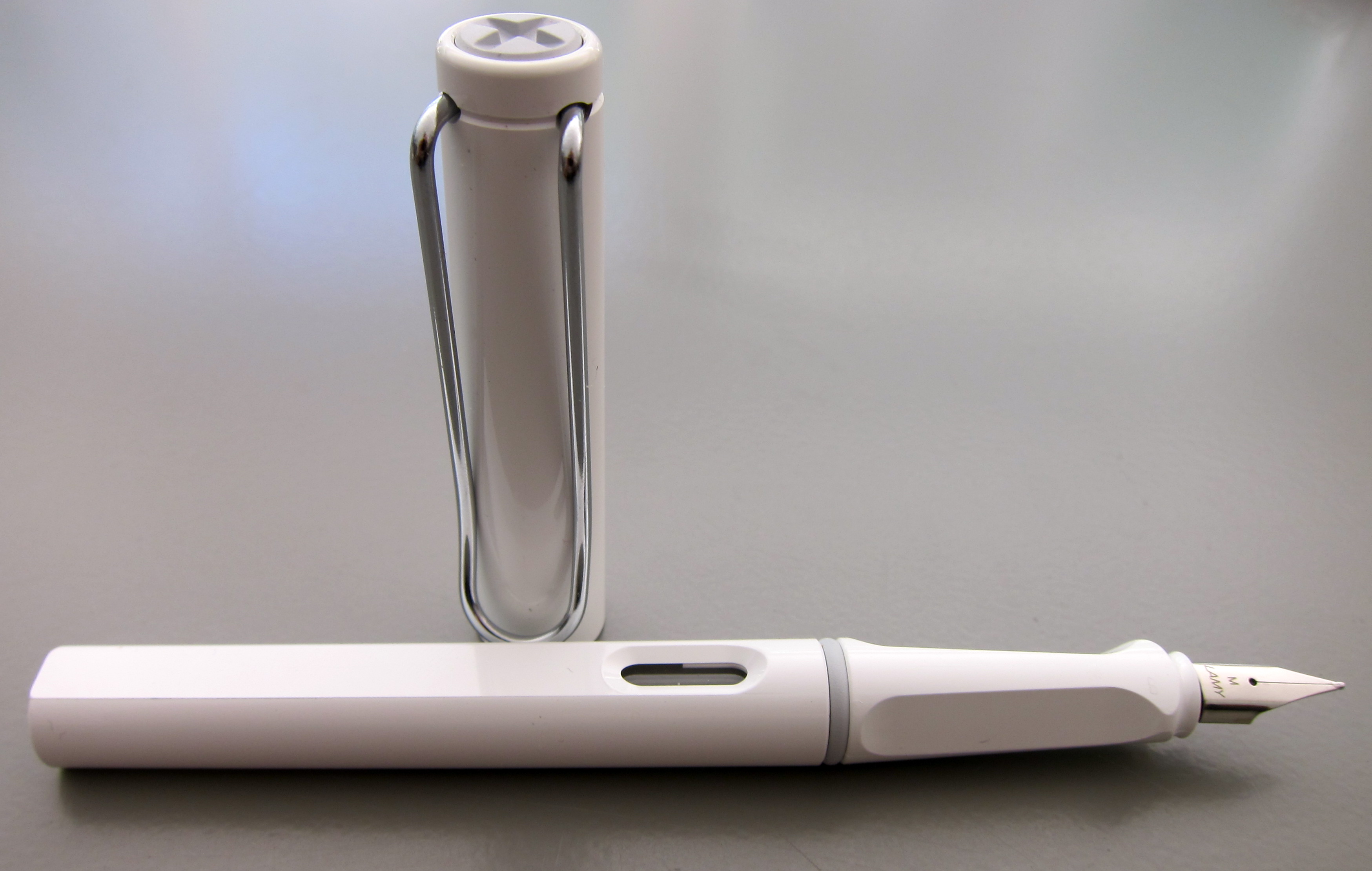
But..I think I like it.  Probably not enough to buy a bottle? Maybe. I’ll try it again with a different pen and other paper (thinking Lamy and Clairfontaine). We’ll see.
After I wrote this review, I researched it a bit. Here’s a link to a thread on Fountain Pen Network – where there are some differing opinions. And here’s a link to it on Goulet Pens – again, opinions vary.
Have you tried Invincible Black? What is your “go to” black? 

INK REVIEW: Noodler’s Purple

Woo Woo!
Now, there is some color!
Regal, royal, raving, raging – ok, I’m out of good “R” words. 
I loooove this color. Love this ink.  
It’s a bright purple. Grape, even. It looks like a color that a teenaged girl would love – a teenaged girl AND me!!
Let’s look at it more closely…
Click for bigger image

It’s not a perfect ink. A bit sloppy even for me – and I love me some wet writing. It smears easily. It feathers.
I’m glad I don’t have a Water Test complete – this means I can keep loving this ink – at least for now. My plan is to keep it short today, but to use the sample I have for a week or so, do a water test, and come back to talk about this in more detail another day.
I’m pretty sure that even if it’s too wet. Even if it won’t pass the water test (and it probably won’t). I’ll still love it. Color like that – meant to be loved!
Do you love purple inks? Are there any guys out there using purple? At work?

INK REVIEW: Private Reserve – Gray Flannel

First impression?  It’s a little…green. We all know from other posts that I’m a bit of a purist when it comes to my ink colors. Not meaning that I only like blues and blacks – meaning that I like to look at a color and be able to say, “That’s gray!” (or, “That’s grey!” depending on from where you are in the world.) So..that’s definitely a strike against Gray Flannel from Private Reserve for me. A big strike, but let’s look at it more closely . . .
It passes the water test. I put a droplet of water where I’ve written “from” and that seems to have survived quite well. Where “Water Test” is written, I dragged a water-soaked Q-Tip. So. Yeah – not bad.

How does it write?

It’s fine. It really is, but I cannot get past that color. Look at how it compares to the J Herbin Gris Nuage. Nuage is a bit on the blue side, but the side-by-side comparison really shows who green the Gray Flannel is.

But..I digress…it writes well. Great flow, no smearing. I’ve been loving broad nib pens lately, but this performed really well in my vintage Parker (not sure of the model) with a fine nib.

So…it’s probably easy to see that I’m not all wound up excited about this ink. I’m not. With so many shades of green gray out there, I’m going to keep looking for the ones I swoon over.

I’ve asked before – but what are your thoughts about color? Purist like I am? Or mix-n-match is ok with you?

INK REVIEW: Caran D’Ache – Amazon

Nice!  I love this Amazon from Caran D’Ache. Remember, Caran D’Ache is not a person!
Anyway – the ink is a true green. It wrote beautifully – though a little wet/smudgy – I’m willing to believe (hope) that had something to do with the pen I was using and allow myself to fall in love with the ink. Not too yellow – not too blue – just green. 
Tiny bit of feathering, but again, that could be linked to the pen. I’m willing to take that bet.
A little shading, too. Not loads, but a nice little bonus.
But the biggest bonus is the big in-your-face color – and we all know how I like that.

All of this goodness has to come at a price, hm?  Amazon’s water test is a total fail. The droplet of water test (in the word “from” below) completely took over the ink – and, sadly,  the smudge test didn’t fair much better.

That bloop of ink on the bottom of the water test isn’t Amazon – it’s Invincible Black – but that’s a story for another day!

If there’s another green out there with this sort of color, but more permanency, I wish you’d post a comment and tell me all about it. For now, though, me and Caran – we’re BFFs.

xo

PEN REVIEW: Libelle Autumn Leaves

This pretty little number was a gift from a friend. I’ve had it for years – I’m guessing since 2005 or so – but have not used it much.
Love the variations in colors and the special look of the top/bottom. Nice.
A bit of translucency in the right light . . .
Sleek – with a great shape. Easy to hold. Well-balanced. Comfortable. Posted well.
The clip has a very art deco look to it, yes? Look at those swirls of color. Yummy.
This pen was part of a series from Libelle and has since been discontinued. These were not super-expensive pens – around $80 or so – and seem to be quite collectable now.
The only place I really spotted the “cheap” is in the threads – they aren’t the very fine sort that I see in much more expensive pens. Not a big deal.
Mine is a medium nib.
And the $1,000,000 question: How did it write?
Beautifully. Smooth with just a bit of feedback. No scritchy-scratchy. Not to floaty over the paper. Just right.
A comfortable pen always make my handwriting look pretty. No hard starts, no skipping. Just right.

I used Noodler’s Black Eel ink on Clairefontaine Triomphe paper.  The flow was perfect for me.
A great writing experience.
Suggest making the following recipe for fall football games. Also suggest moderating the amount of hot sauce.
Tell me what you’re thinking? Love Libelle? Love hot sauce?  😉

FOUNTAIN PEN DAY!

Ms. Sammy
aka The Destroyer!

Let me introduce you to Sammy.  She’s one of our three dogs. Yes, three. Yes, we’re insane.

We’d left her alone for just a few short minutes. Jeff heard sounds from the living room and went to investigate.

I heard, “Oh no. Sammy, what did you doooooooo?”

Apparently, she climbed up on the sofa (bad girl!) and grabbed this sample vial of ink the end table (bad girl!) and then decided to investigate (baaaaad girl!).  (It’s Pilot Iroshizuku in Momiji – not my favorite color, but still.)

She’s lucky she’s so cute, hm?

Today is Fountain Pen Day! I’m writing with my vintage Montblanc 149 and a several other pens. The MB was a gift from Jeff’s uncle. So nice!

Are you celebrating Fountain Pen Day? What are your plans for the weekend?