

Last week, I took a really close look at four fabulous blue inks.

The bottles and packaging look amazing and I’ve definitely enjoyed using the sample Gerald sent me.
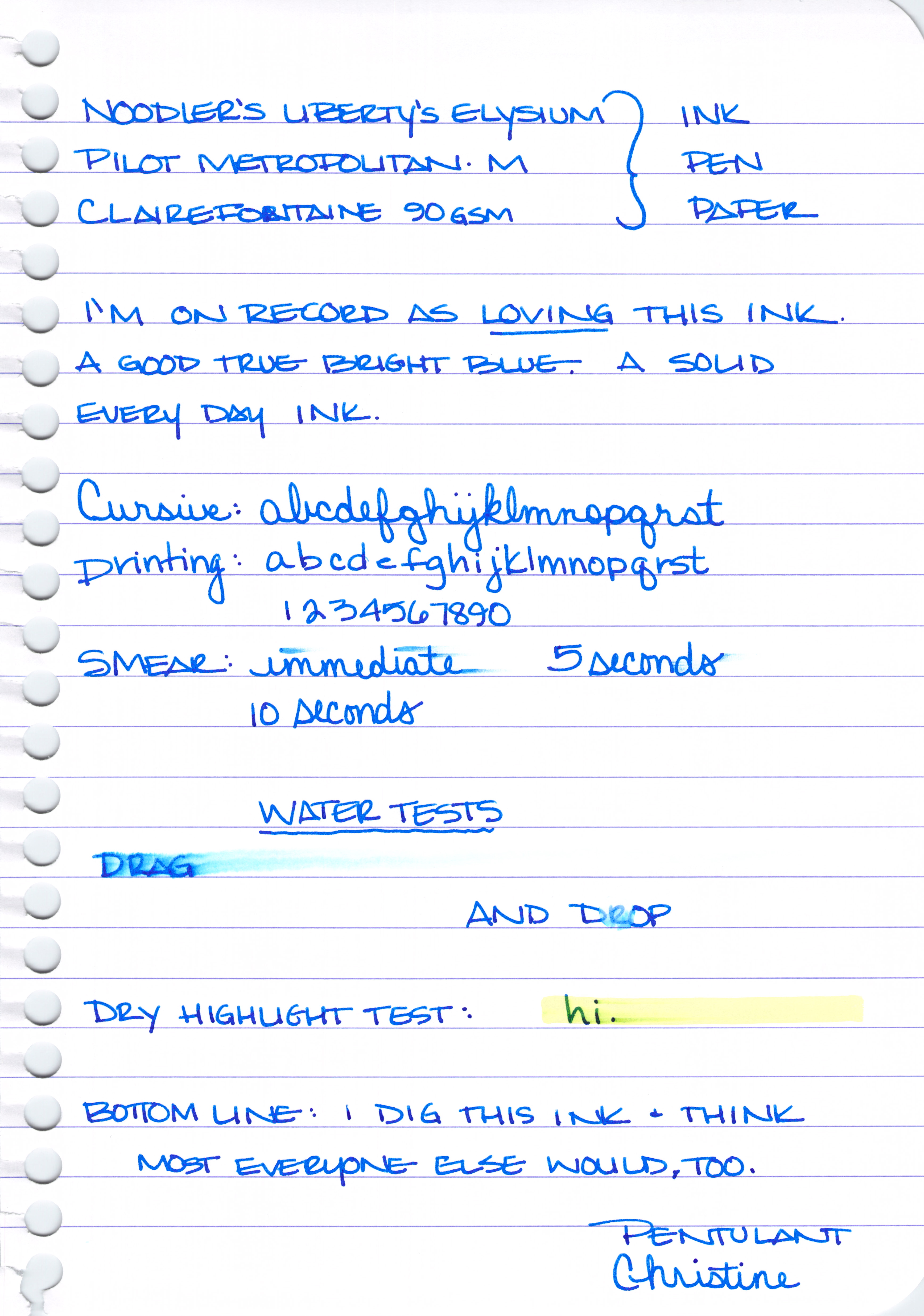
Noodler’s Liberty’s Elysium

Noodler’s Liberty’s Elysium is only available from Goulet Pens. The good news is that Goulet Pens has a fantastic reputation in the fountain pen community for excellent customer service. They will also ship overseas.
I shop at Goulet Pens regularly and mention them frequently. I’m not related to the Goulet’s, I receive no discounts, free product, special treatment, or anything else from them. Unfortunately, in our relationship – the money only flows in the one direction 😉
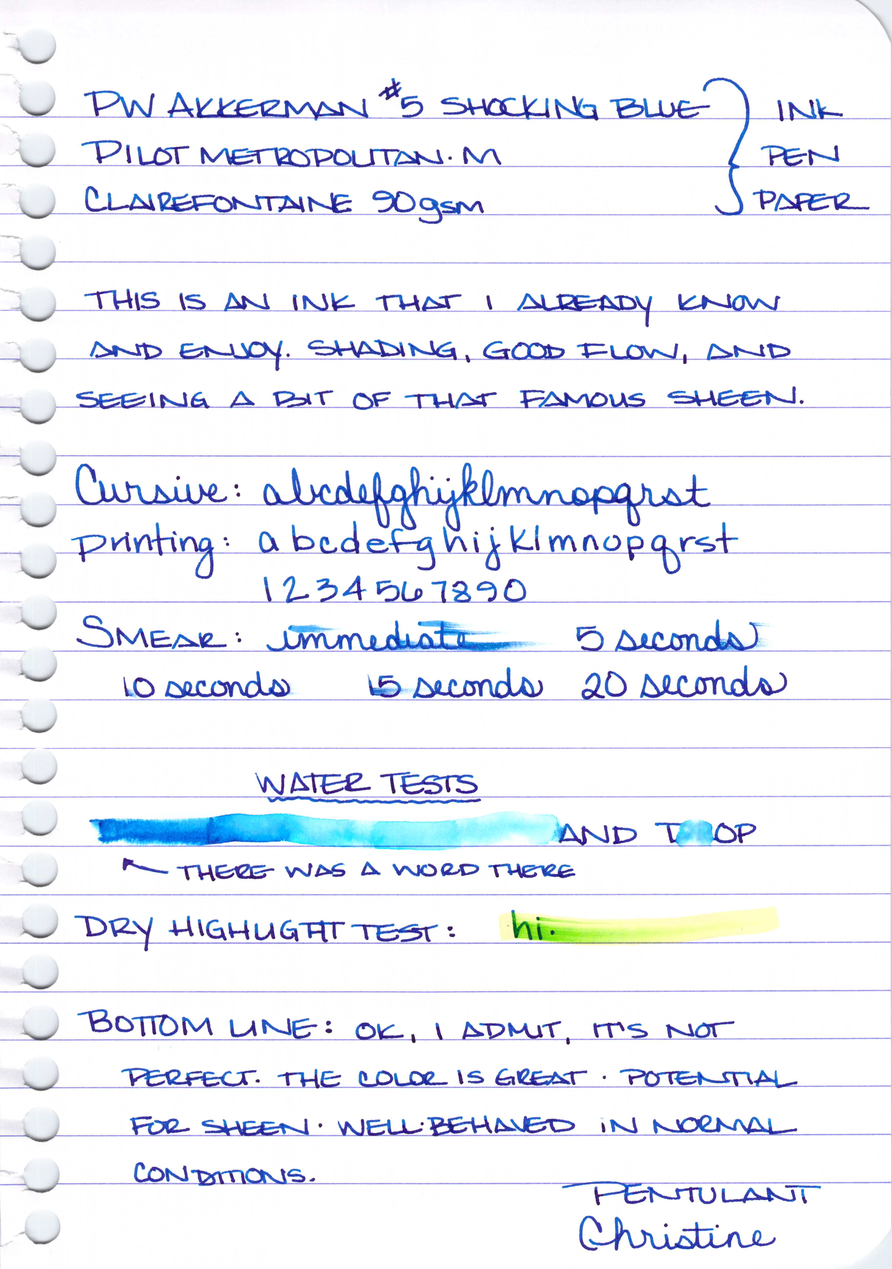
PW Akkerman #5 Shocking Blue

I got mine direct from the Netherlands. Shipping was fast, seemed reasonable (though I was buying multiple bottles), and everything arrived in good condition.
Vanness Pen Shop also carries Akkerman inks. You’ll have to call or email them for specifics.
It’s expensive. The Akkerman bottles are super-fancy and they’ve come a long distance. If you don’t want to put out the money, my strong recommendation is Diamine Majestic Blue (see image below).

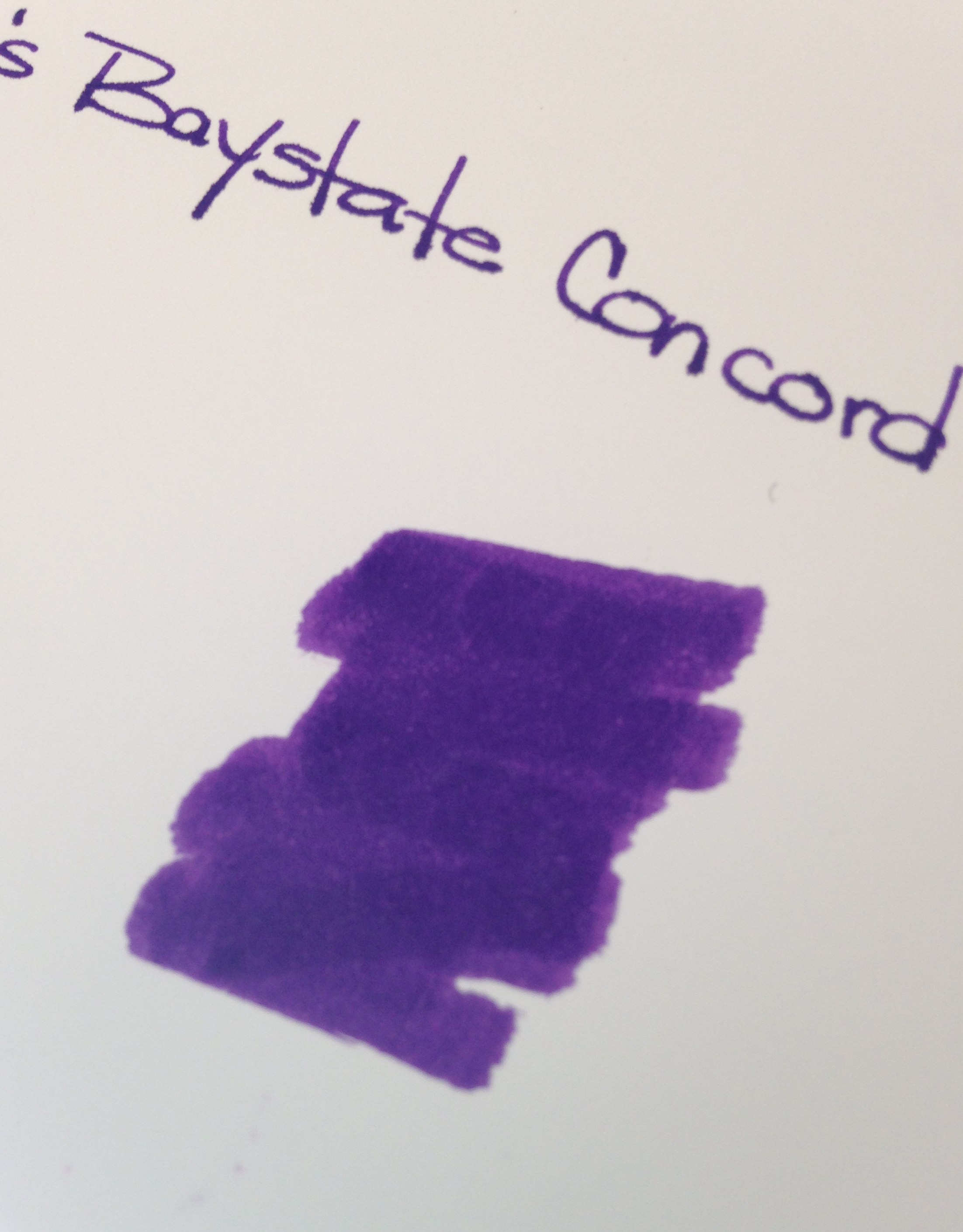
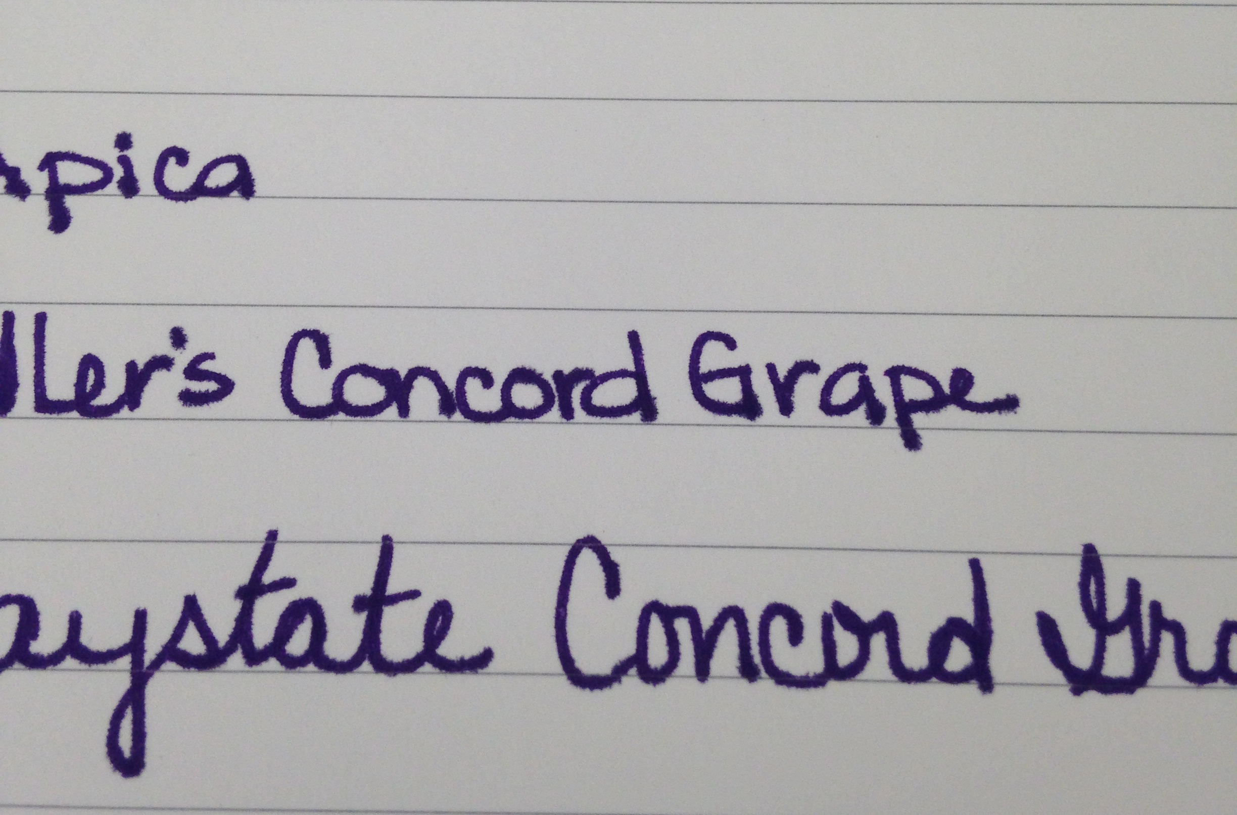
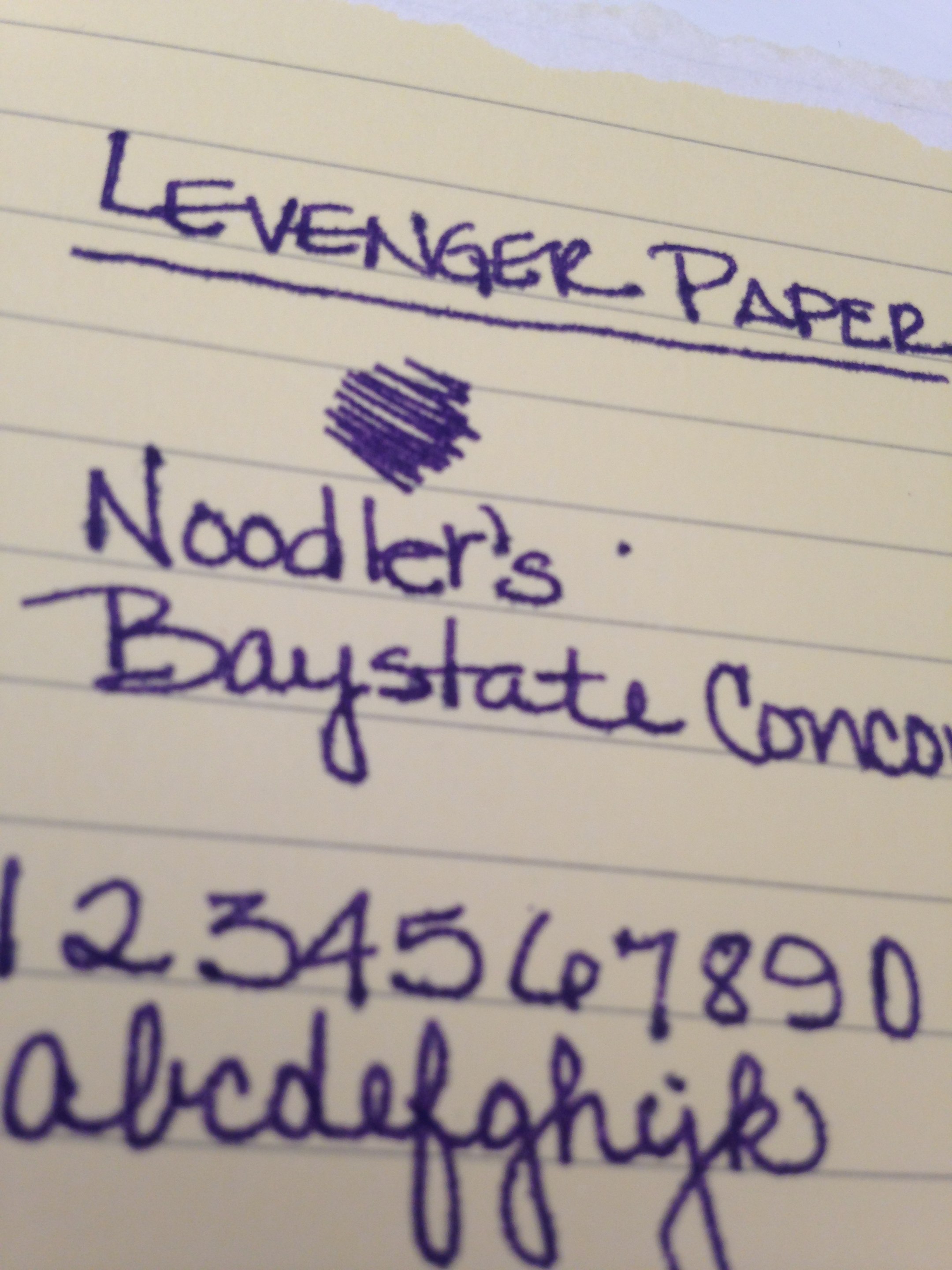
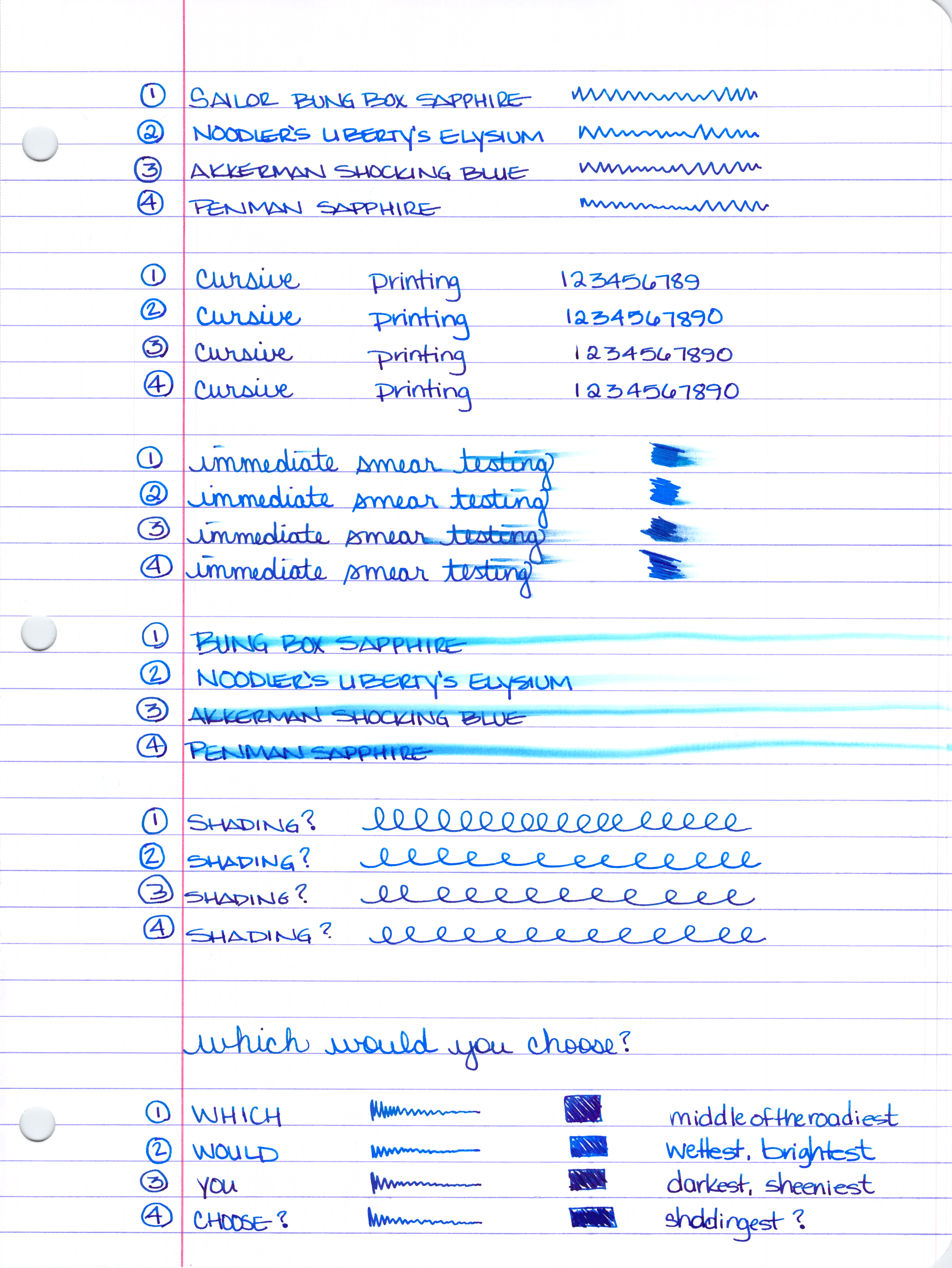
Another Parker Penman Sapphire Replacement
The difficulty here is that while I think it is possible to get the color right (or at least close enough), I’m feeling pretty certain that it’s quite impossible to get the feel of Parker Penman right on target. That is to say this: the color is only part of what makes an ink so special. The feel of the sample I had is wonderfully different from all of the other blues here and I seriously doubt that mixing 6.5 drops of ink #1 with 3.75 drops of ink #2 is going to result in that same feel* – and without that, well, there are plenty of off the shelf colors that come close enough. Have a look . . .


Some of the above ink swabs are showing the sheen – and maybe you’re thinking Penman Sapphire doesn’t have much sheen here or in my review from last week, but look at this review over on FPN – crazy sheen.
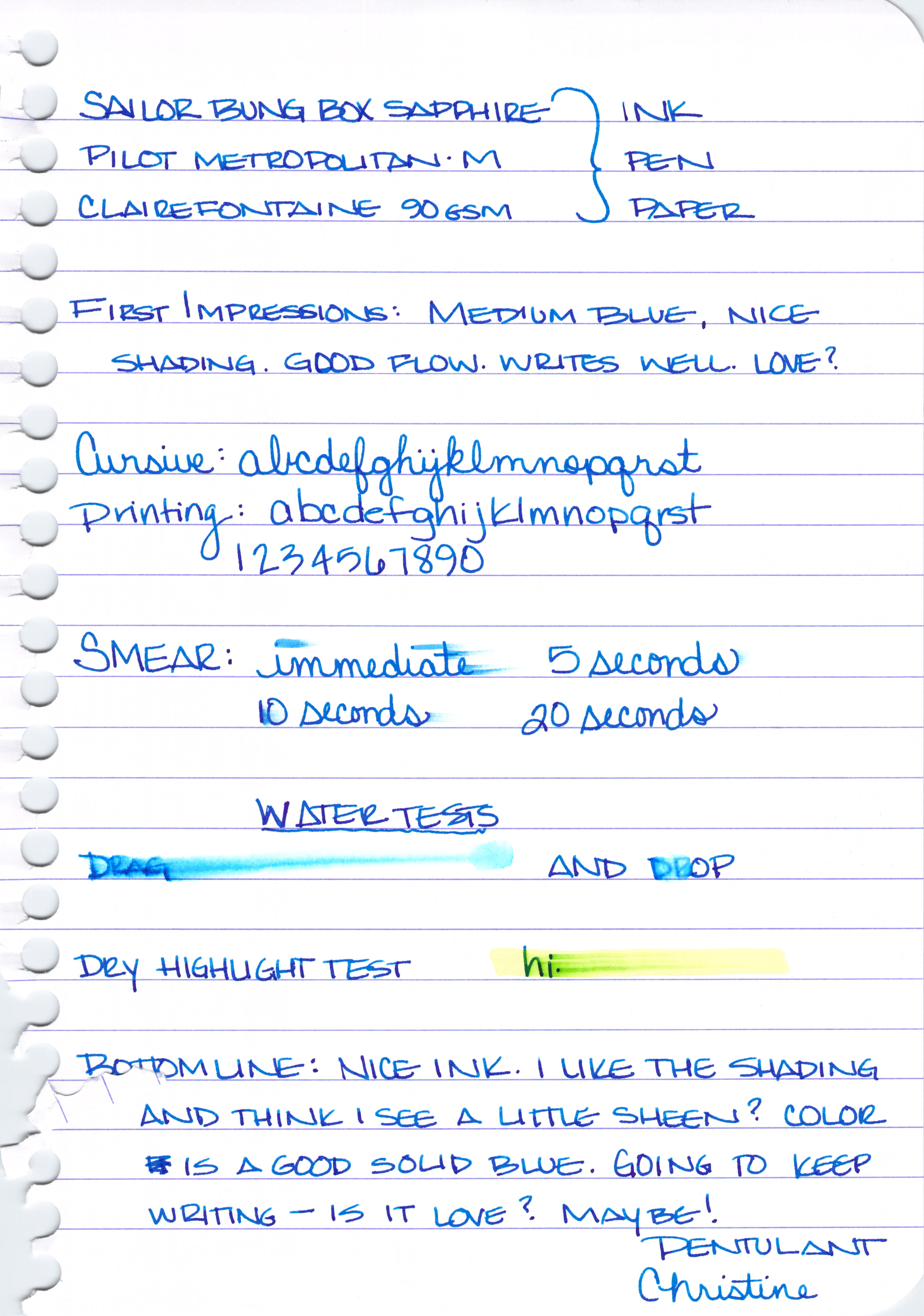
Sailor Bung Box Sapphire also looks like a good sub for Parker Penman Sapphire, but there are difficulties in obtaining that ink, too. (See the above section for those details.)
Bottom Line – DC Supershow Blue is the color I would choose if I was trying to match the color of Parker Penman Sapphire.
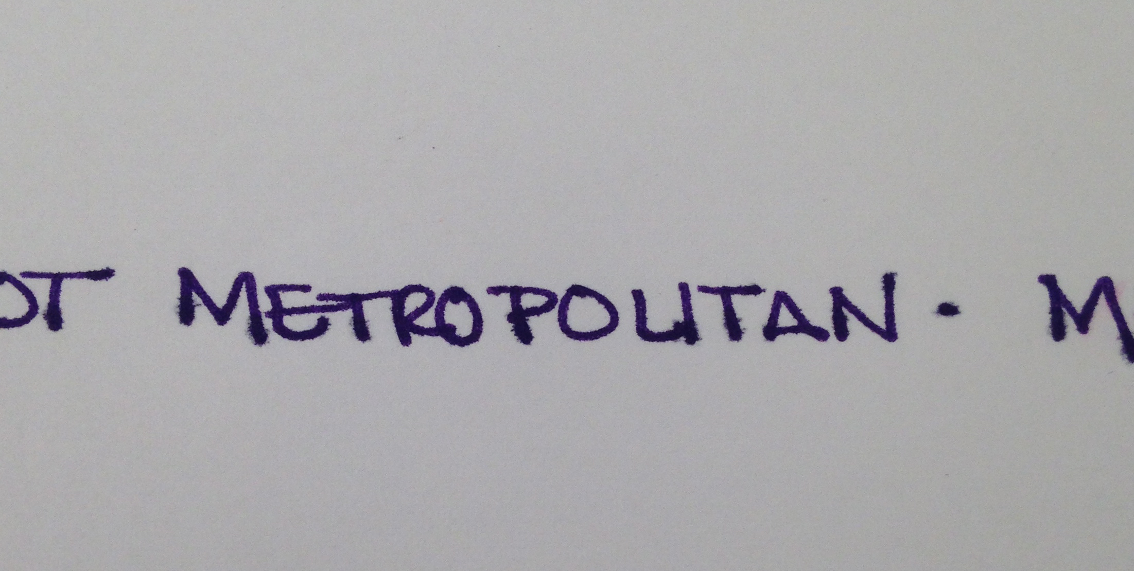
Of course, you could search eBay for it, but there are rumors that it was discontinued because it may contain metallic bits (hello, sheen) in it and it causes pens to clog. I’ve not had trouble with it in my Pilot Metorpolitan, however.
* Did you know that mixing inks can be an invitation for Major Trouble? Some inks don’t play well with others and you could end up with a blobby globby mess – in your pen. Some mixtures will take some time to form the blobby globby mess and by the time it does, you may have already loaded it into your pen. Be careful.
Annnnnd…that’s that! Four Fabulous Blue Inks. This has been a fun fun project and I really have to thank Gerald again for sending me samples of some of these inks. If you’re not following me and Gerald on Instagram, you simply must.
You tell me . . . Are you going shopping for one of these? Or maybe you have another favorite blue ink?


