Uncle Robert’s Pens

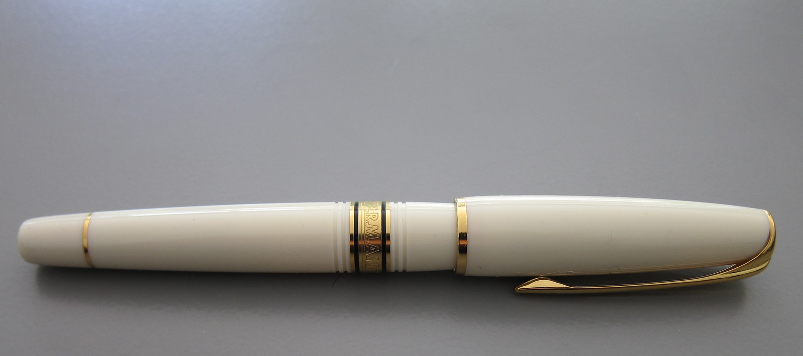
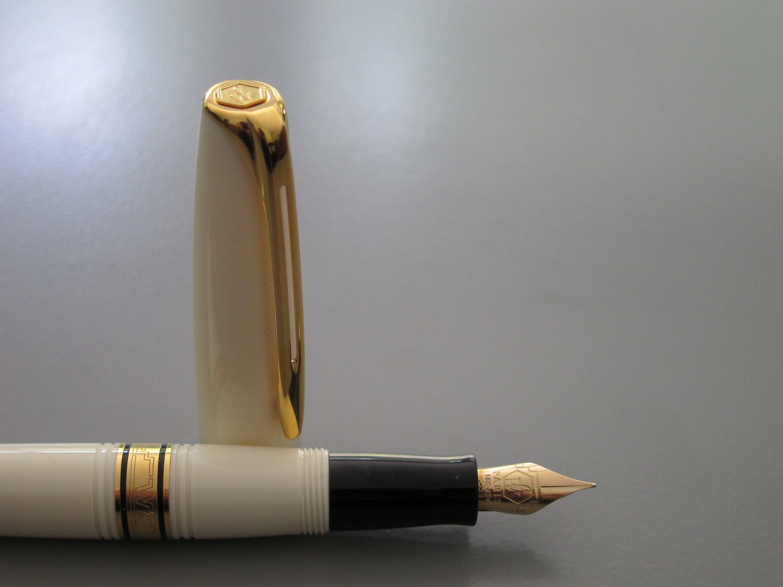
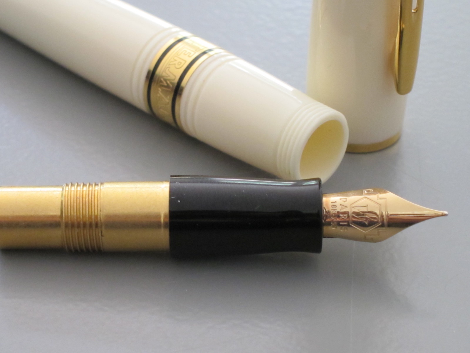
Early last year, Jeff’s very favorite uncle gifted me with two pens from his personal collection – a Montblanc 149 and a Namiki Geisha. (Jeff is Mr. P, by the way.)

Things came up and months later, I got around to cleaning and inking the Montblanc. I’d thanked Uncle Robert in email and on the phone for the incredible gifts, but knew I had to write him a proper thank you note using his much-loved pen.

I did that in October. And for some reason, I scanned the note.

Uncle Robert died quite unexpectedly in November.

There are things I want to say about Uncle Robert.

..he and Aunt Suzanne were in love. I’m sure they must have had their moments, but they loved each other. Big love. They were a team.

..he loved Jeff, and Jeff unabashedly loved him. Actually, it’s more than that – Jeff admires his uncle. He aspires to be like him – to eventually become the kind of uncle that Robert was to him. Uncle Robert is Jeff’s hero.

..Uncle Robert lived. He had some physical limitations, but that didn’t stop him from living. He was a passionate bicyclist. He played the lute (the lute!). He loved pens, and knives, and photography, and pipes, and beer, and music, and German shepherd puppies.

And now to circle back to pens…

When I see people write about selling their inherited pens, I cringe. These are such personal items – so full of history and the stories that make up the lives of their owners. Pens take up so little space and it’s unlikely that they would raise a significant amount of money.

(Of course, if your family is starving and you’re holding on to a $10,000 pen, you’re crazy pants.)

INK REVIEW: Noodler’s Turquoise Eel

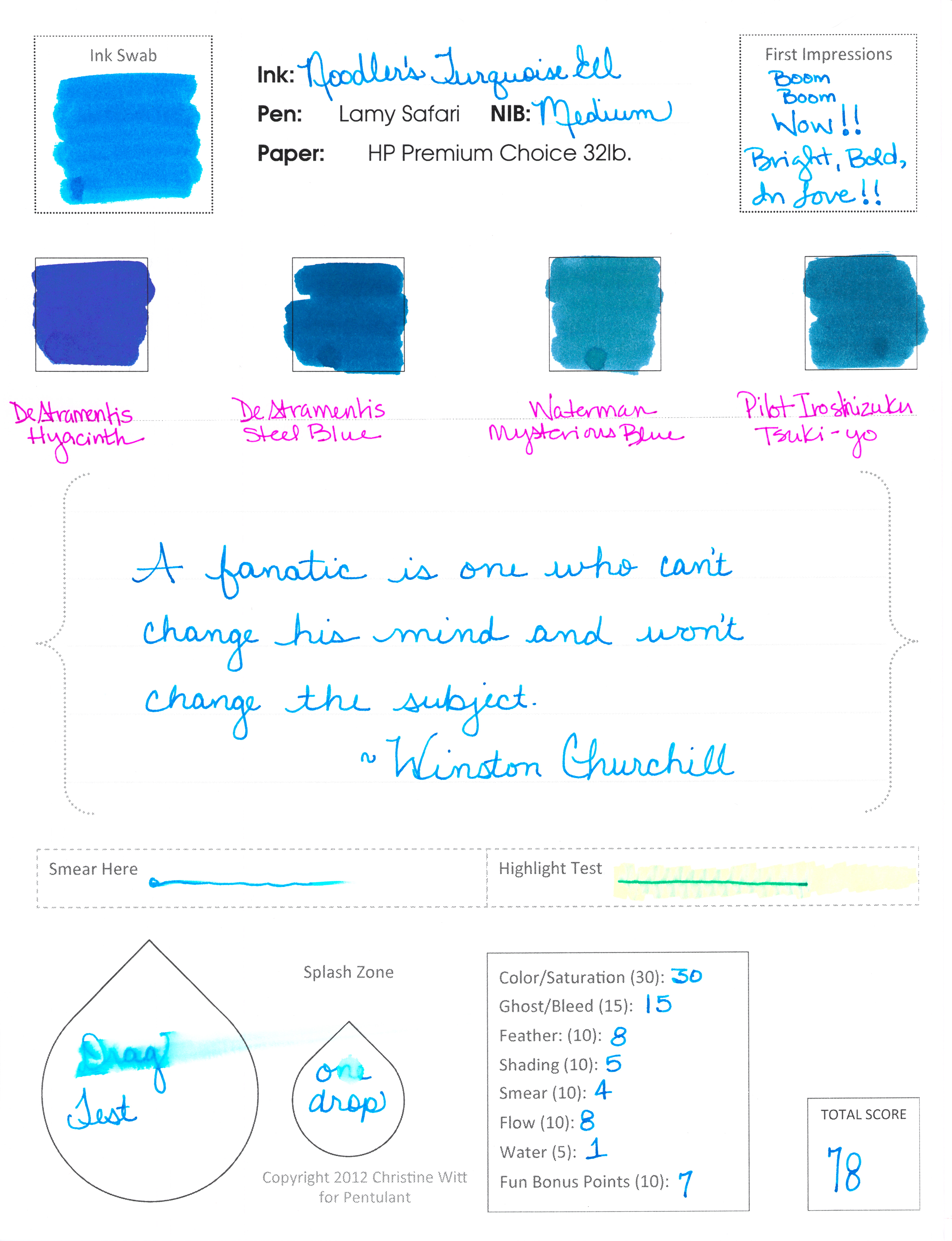
Noodler’s Turquoise Eel

Now. This is what I’m talkin’ about!

Some real, in-yo-face, color.

And, bonus! It writes like a dream.

Noodler’s Turquoise Eel rivals Pilot Iroshizuku Kon-peki in every way. It has great color and saturation. It writes beautifully – flow from the pen is just right.

Smear factor isn’t bad.  Not much shading. Is there a turquoise that shades wonderfully? Guess I’ll have to try them all and find out!

Back to the ink . . .

. . . I really don’t have anything negative to say – if I don’t talk about the water test – ha! It’s a great well-behaved ink that I would consider purchasing if I didn’t already own a couple of other turquoise inks. (I test from sample vials, but you probably knew that already.)

A bunch of side notes…

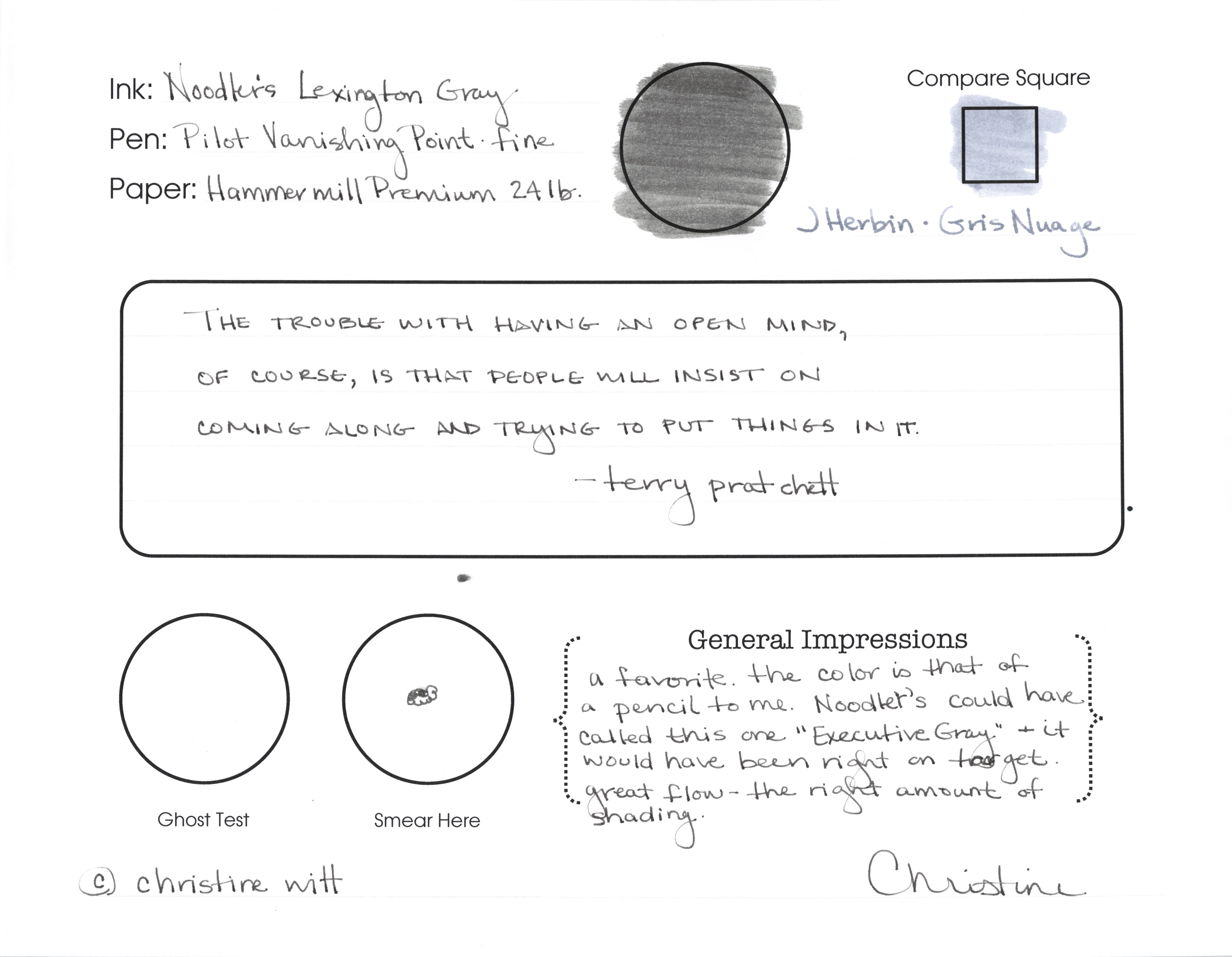
…this is my first review with my new form. Totally excited. Let me know what you think?

…my ink reviews all fall into broad color categories (new this year). This one ended up with the blues because it’s more blue than green. Maybe I need a turquoise – but then I’d need a teal – and sometimes it’s hard to decide. I’ll just keep doing the best I can.

…omg, did you notice the first Compare Square? De Atramentis Hyacinth. I’m excited about reviewing that one sometime soon. Pretttttty.

…Waterman Mysterious Blue felt watery compared to the other inks on this page. Wonder how that will translate in a pen when I get around to testing it.

POSTCARD PROJECT: Help Wanted

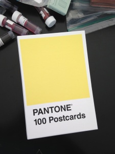
I received this amazing set of 100 Pantone Postcards for Christmas. It’s #7 in this picture.

I’ve decided that I’m going to try try try to have them all sent out by the end of this year. (Maybe I’ll keep one for myself and frame it as an homage to the project?)

Would you like a postcard from me? If yes, contact me privately with your address information (I’d never share it with anyone – big honkin’ promise!) and I’ll get one right out to you!

You know what’s great about these postcards? They are fountain pen friendly! The fronts are coated paper, but the back is not – makes for a pretty good writing surface!

Anyway – help me send you pretty colors and complete my project!

So exciting!

INK REVIEW: Private Reserve Chocolat

Well.
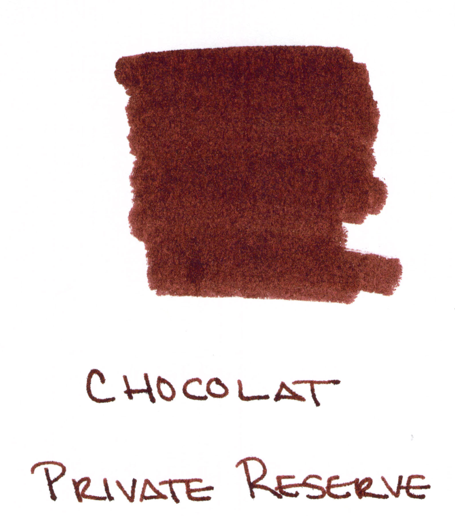
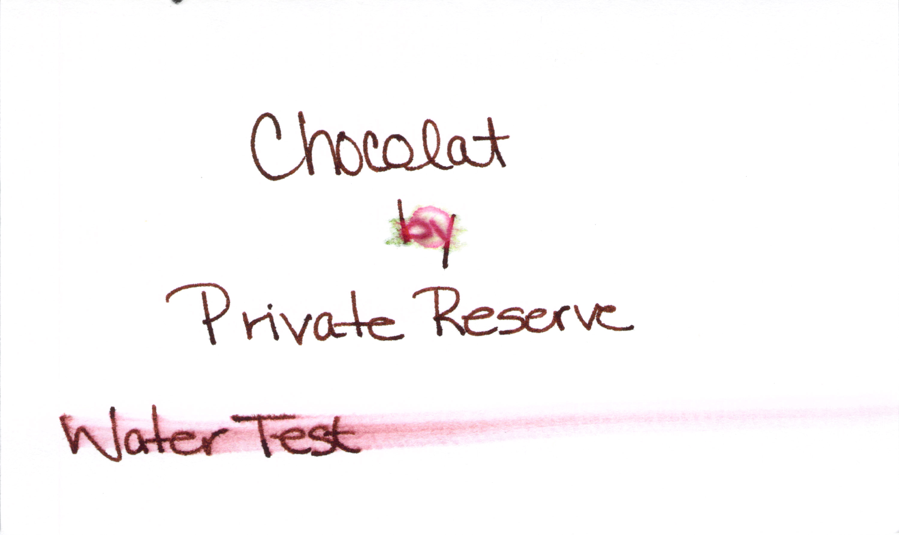
You know what I love? An ink that has a great name. Chocolat from Private Reserve. Yum. I can practically taste the cocoa.
And even with the swab above, it’s easy to see that this is one glossy shiny ink. I love that, too. Love.
Maybe just a tiny bit too red.  And not water resistant, though I’m not surprised by that.
A little smeary. 
Bottom Line:  I dig it! If I wanted a brown, I’d probably buy a full bottle.

PEN REVIEW: Pilot Varsity All Colors

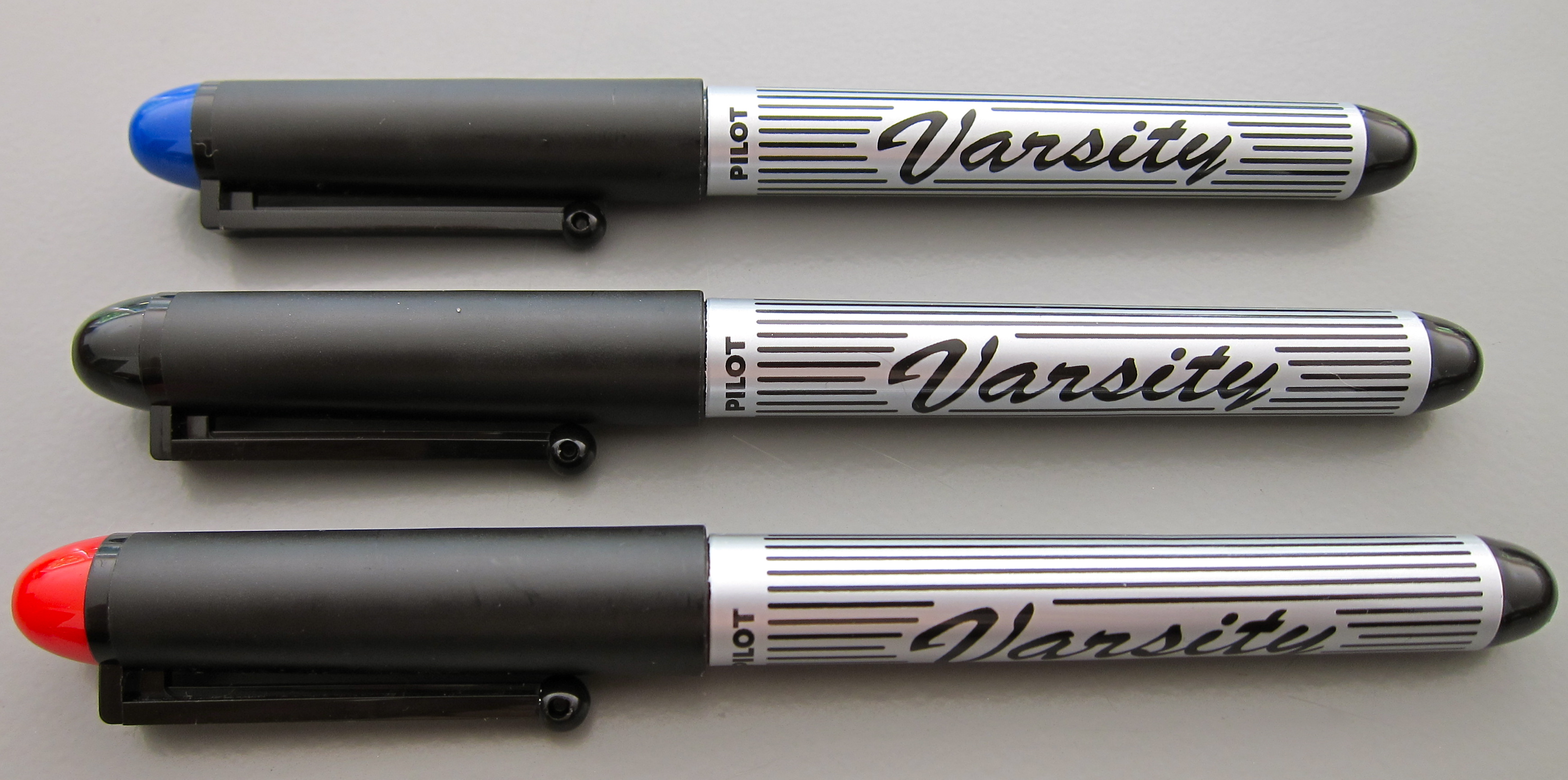
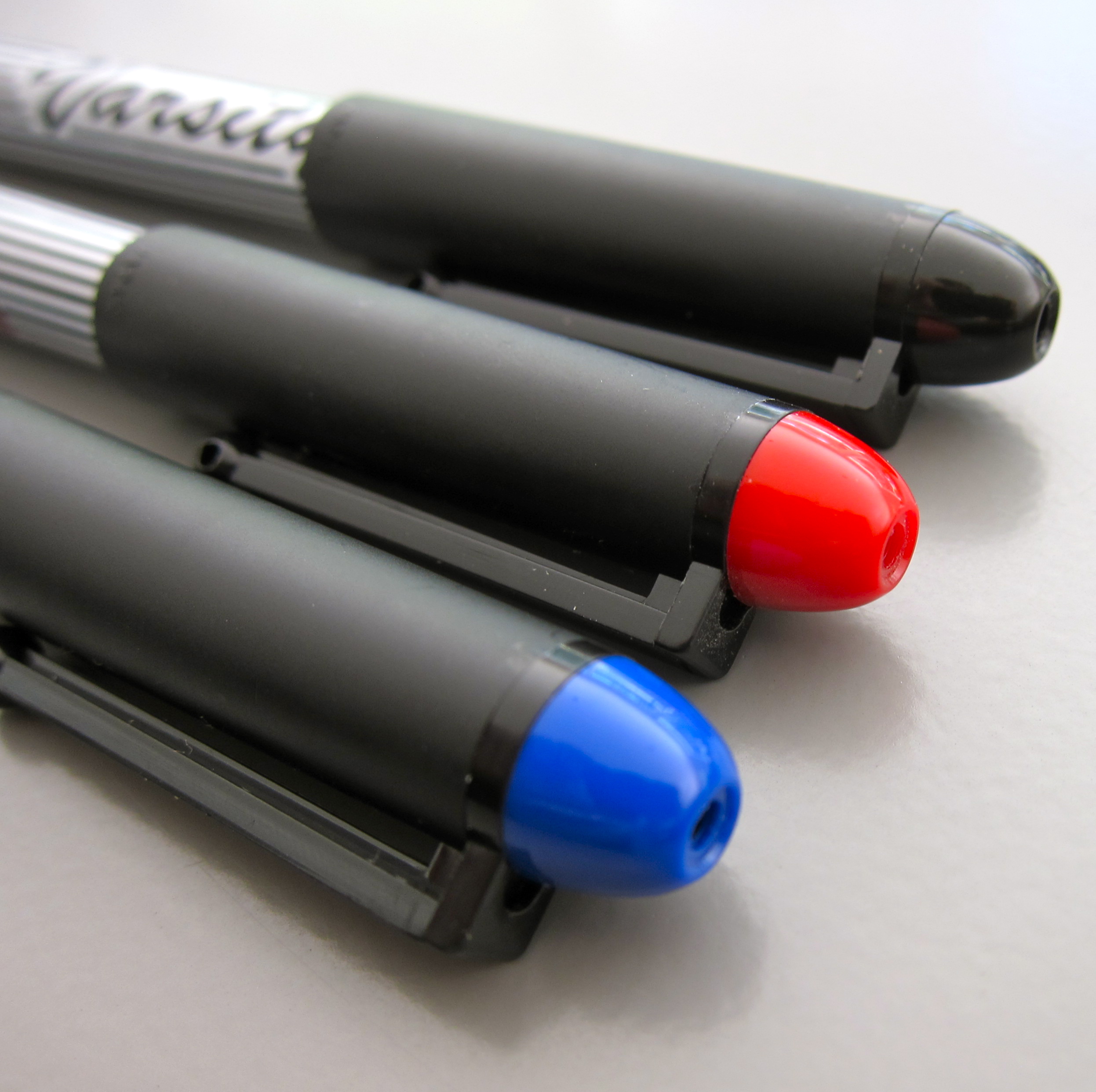
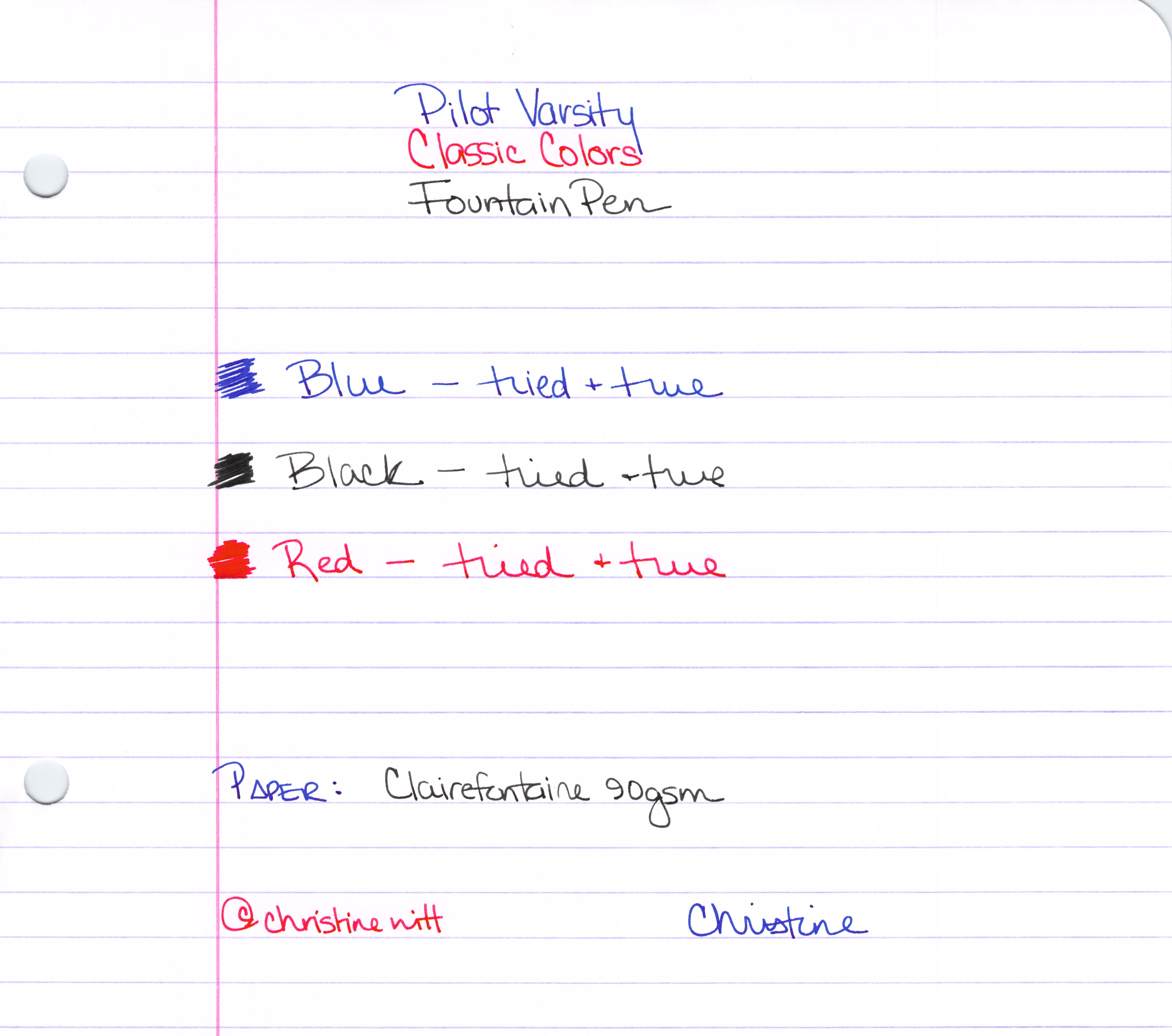
We’ve already looked at the blue – and now here are the remaining colors of the Varsity Pilot fountain pens.

The Classics
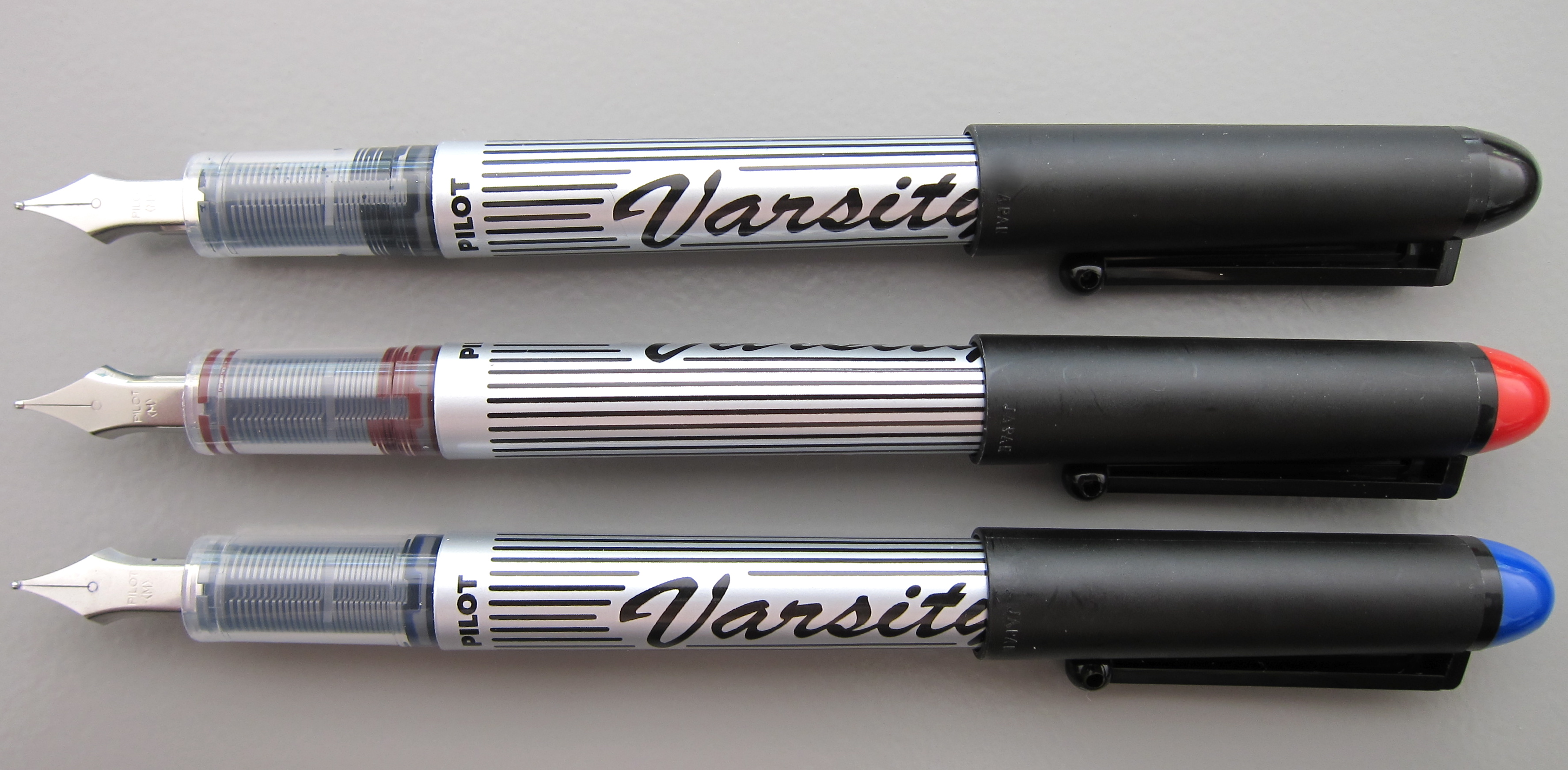
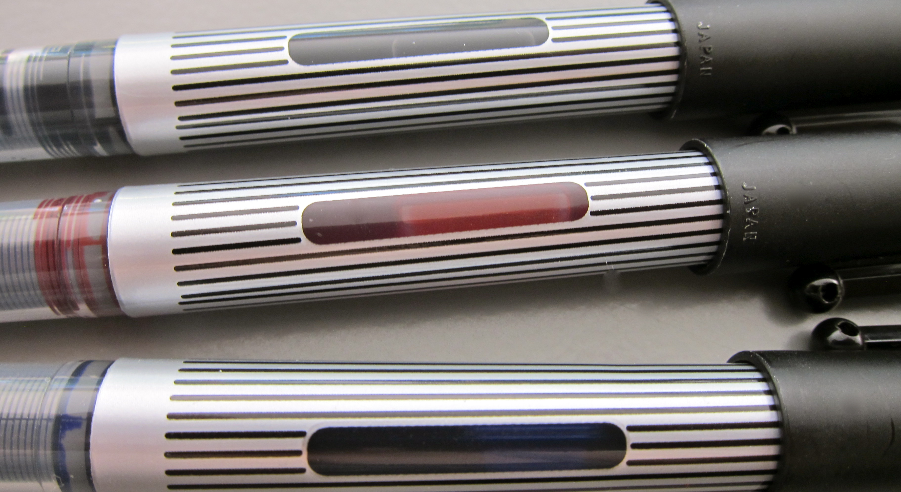
Some people worry that something is wrong with the pen when they see the ink down in the section (the part of the pen between the barrel and the nib). This is perfectly normal and is a result of the ink moving through the feed system into the nib. In most pens, this part of the pen is opaque – but if you could see, you would see – this is perfectly normal.

Handy Ink Window

The Whole Enchilada
Bottom Line? In a pinch, these get the job done. The colors are fun.

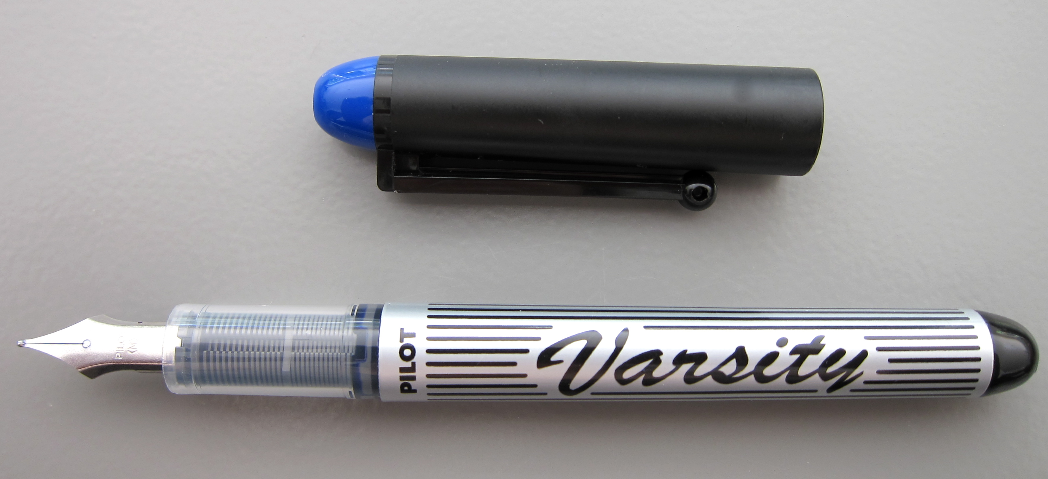
PEN REVIEW: Pilot Varsity Blue

Nearly everyone who has been attracted to fountain pens has given one these a try. Some people even convert their empties to eyedropper pens and use them forever.

I always think it’s interesting when someone recommends a cheapie pen to someone interested in trying a fountain pen for the first time.

I think handing them something fancy pants would be the better choice. Let the new use experience the best right from the start. But isn’t a brave fountain pen user who is willing to hand over their luxury pen to a newbie?

My assessment….it writes. It’s not smooth. The ink is well-saturated. As you’ll see in coming weeks, I have managed to Collect Them All.  I’ll be giving them away. Probably to a newbie..haha.

Sound off below. Have you tried the Pilot Varsity?

INK PREVIEW: Oops.

Pffft.

I’d completed the review of Montblanc’s Winter Glow and then went to my stash – grabbed four red inks out of my red inks sample bag – and above is the result.

Dude. Those aren’t red. Maybeeeeeee Rouge Caroubier is close – but even it is more of a pinky color.

Heaven only knows why I didn’t stop after the first – or the second – OR THE THIRD – but I kept right on going.

So..what you have here is a mess. But at least you can see the swab of Winter Glow and a bit of writing. It’s darker than I thought it would be coming out of the pen.

I’ll get a proper review of Winter Glow done soon.

After I try sorting my samples by color one more time 😉

INK REVIEW: Pelikan Edelstein Sapphire

Despite whatever else I say below – I like this ink. I do. 
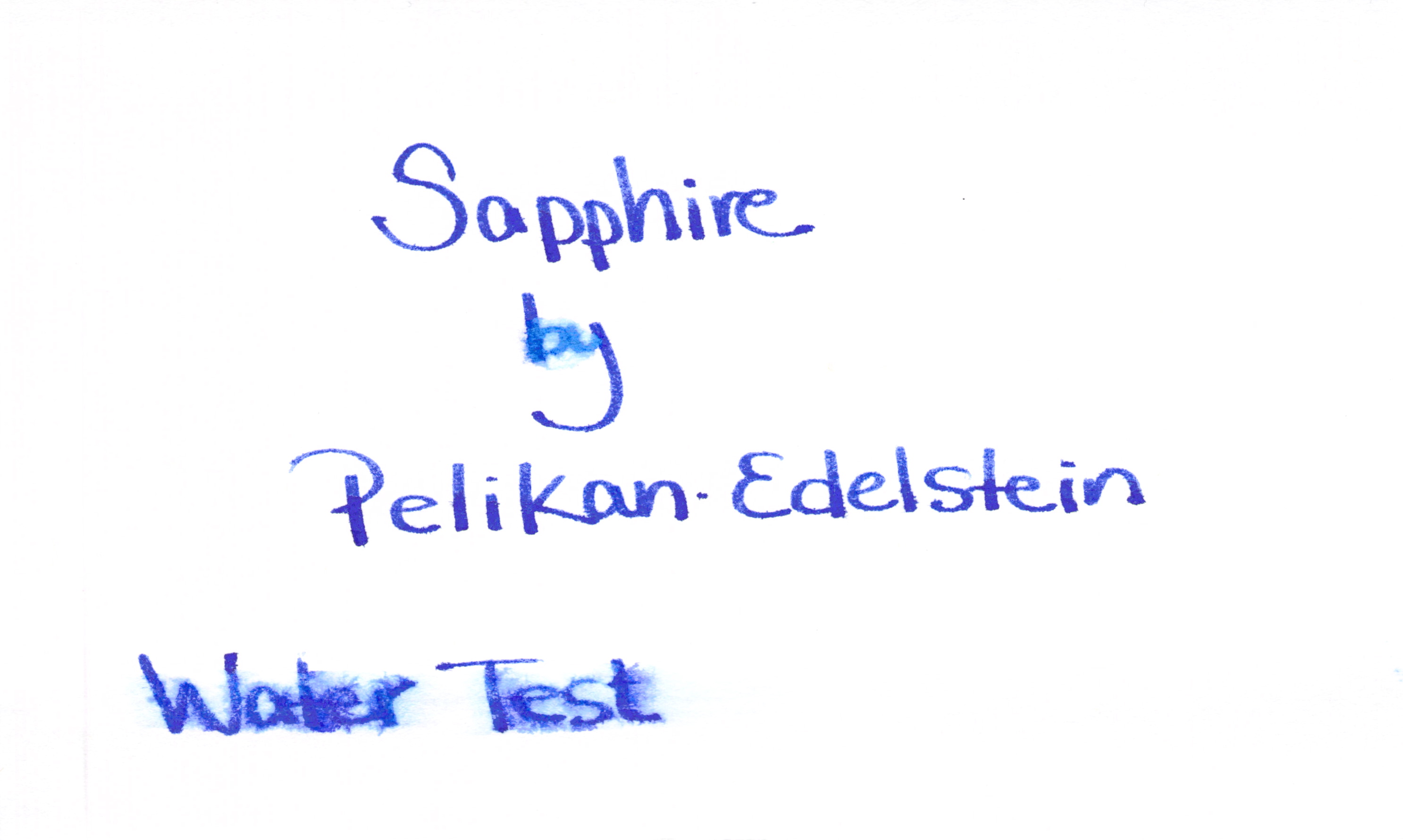
It failed the water test. See?

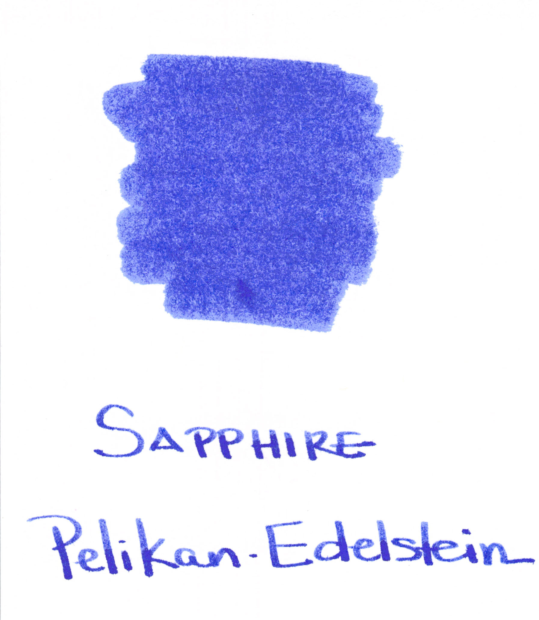
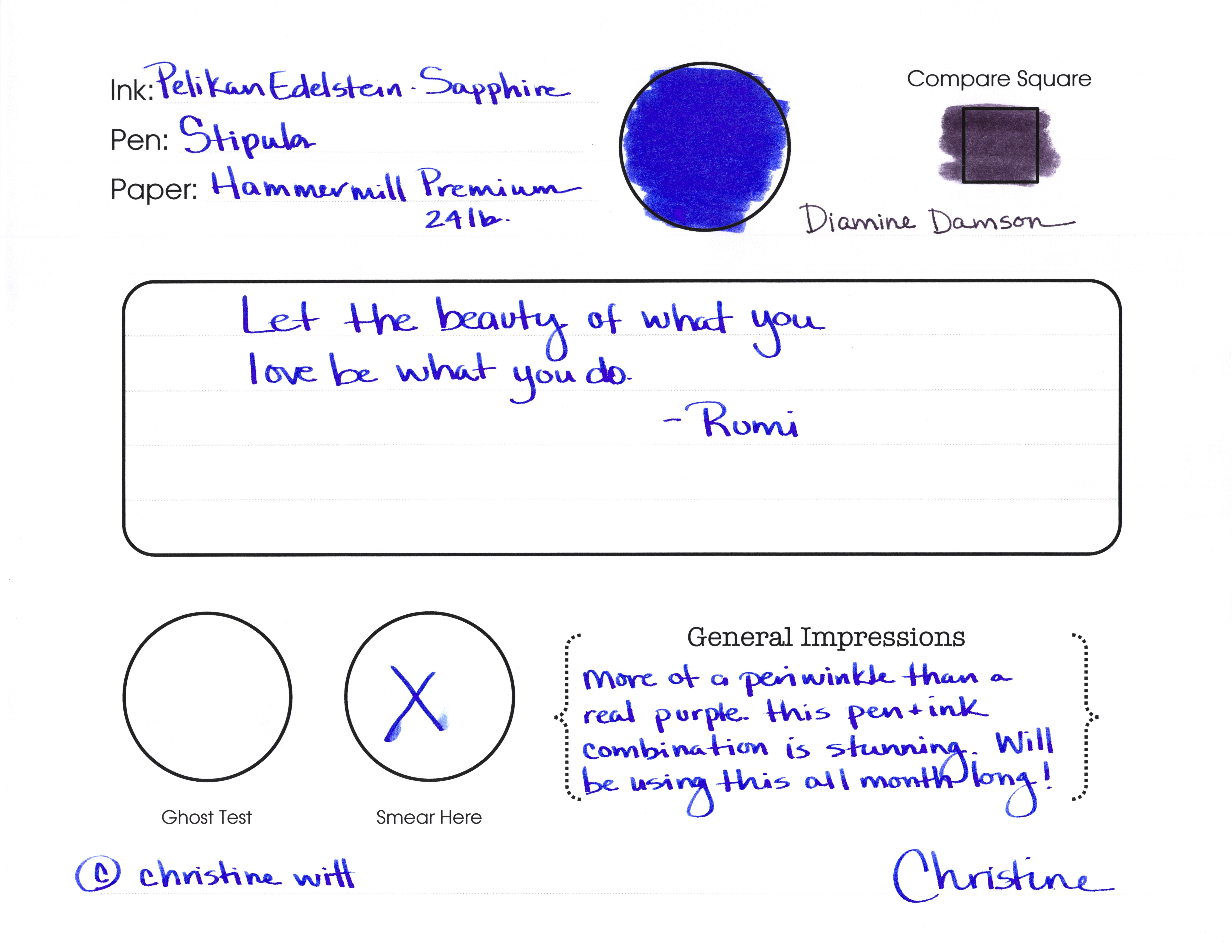
It’s not really sapphire in color. I realize there are different colored sapphires out in the world, but most people think of them as blue. This is more of a purple – or even a very bright periwinkle.  I like all of those colors.

It’s bright. Love that.  It’s BOLD. Really love that.

Tiny bit of shading.
Not the driest ink in the land.

And some feathering upon close examination.

So..Pelikan Edelstein isn’t a perfect ink, but I like it. I’m not sure that I’ll get a full bottle of the stuff (this review was from a sample vial), but I like it.  No matter its issues.
Have you tried Sapphire? Maybe I need to try it again with another pen/paper.