FOUND AROUND FRIDAY: What I’m Reading and Instagram Edition

//instagram.com/p/rkfH4fG2aV/embed/

Earlier this week, I reached a whopping 900 Followers on Instagram.  I hope you’re one of them. I usually just have a list of links for you on Friday mornings. I’m going to sprinkle in some images this time.  Oh yeah, it’s getting wild and crazy here, people. You never know what I’ll do next 😉

On with the show . . .

Last night, Edison Pen Company announced their 2014 Limited Edition. Are you in? I’m a maybe.

Inkophile has the cutest watercolor paint tin!

Fountain Pen Physicist reviewed Leuchttrum’s Journal.  I have a couple of their products, but have never tried them – crazy. I need to get on that!  And I can’t even talk about this.

Gourmet Pens reviews the Pilot Knight.  And..this.

//instagram.com/p/rdRf5om2VQ/embed/

I have a review coming soon – DeAtramentis Jasmine. Have you tried it?

I ordered mine.  And…omg. And…a new gray/grey ink!

Fun from Inkdependence.  I’ve played with doing this – just not like this.

Inklode is killing me.  I have around half a bottle left.

Kaweco review from MyCoffeePot.

Peninkcillin talks about a stained Kaweco and the DC Pen Show.

Pens! Paper! Pencils! reviews a Diplomat fountain pen. I once had a well-known person in the pen world try to tell me that within a few years, Diplomat would overtake Montblanc as the finest pen maker in the world.  Yeah, ok. That was 5+ years ago.

Mr. Mike Dudek of ClickyPost shows off his new Pelikan. I need it.

//instagram.com/p/rIqE0jm2dZ/embed/

Quick fact for you:  Alexander Hamilton was not a president, but his ink sure is pretty.

The Pen Addict reviews a glorious thing. (I agree.)

Unroyal Warrant fills a new Penvelope. And this!

In other and unrelated news, I’ve started reading this blog.  I’m fascinated – not in a good way.

Have a great weekend, friends!

xo

INTERNET FAMOUS!!

You guys!!!

I had no idea they were going to, but Goulet Pens mentioned me in The Goulet Communique today!

I am thrilled. And honored!  In fact, I texted Mr. Pentulant with something like the following:

omg omg omg
omg omg omg 
OMG OMG OMG
I’m Internet Famous!
Gotta go. Bye!

Their shout-out is sending a bit of traffic this way (so appreciative!) and I thought it would be fun to post a little something about who I am and what I do here.

Let’s see . . . my name is Christine and I love all things pen-related. 

I think that sums it up!  I hope you poke around a little, like what you see, and stick around.

xoxo

P.S. Follow me on Instagram – you won’t be disappointed.

P.P.S. The Goulets were kind enough to send me the following items in exchange for my honest opinion.

Edison Nouveau Premiere Summer Edition (swooon!)

Apica Premium C.D. Notebook (loved it!)

Monteverde 36-Pen Case (mixed feelings)

P.P.P.S.  What? You don’t know about The Goulet Pen Company?  I’ll do a full post about them sometime soon, but really, go buy some ink samples, ok?

THIS OR THAT: Yama-dori or Ku-jaku

This or that? Top or bottom?  Which do you love?

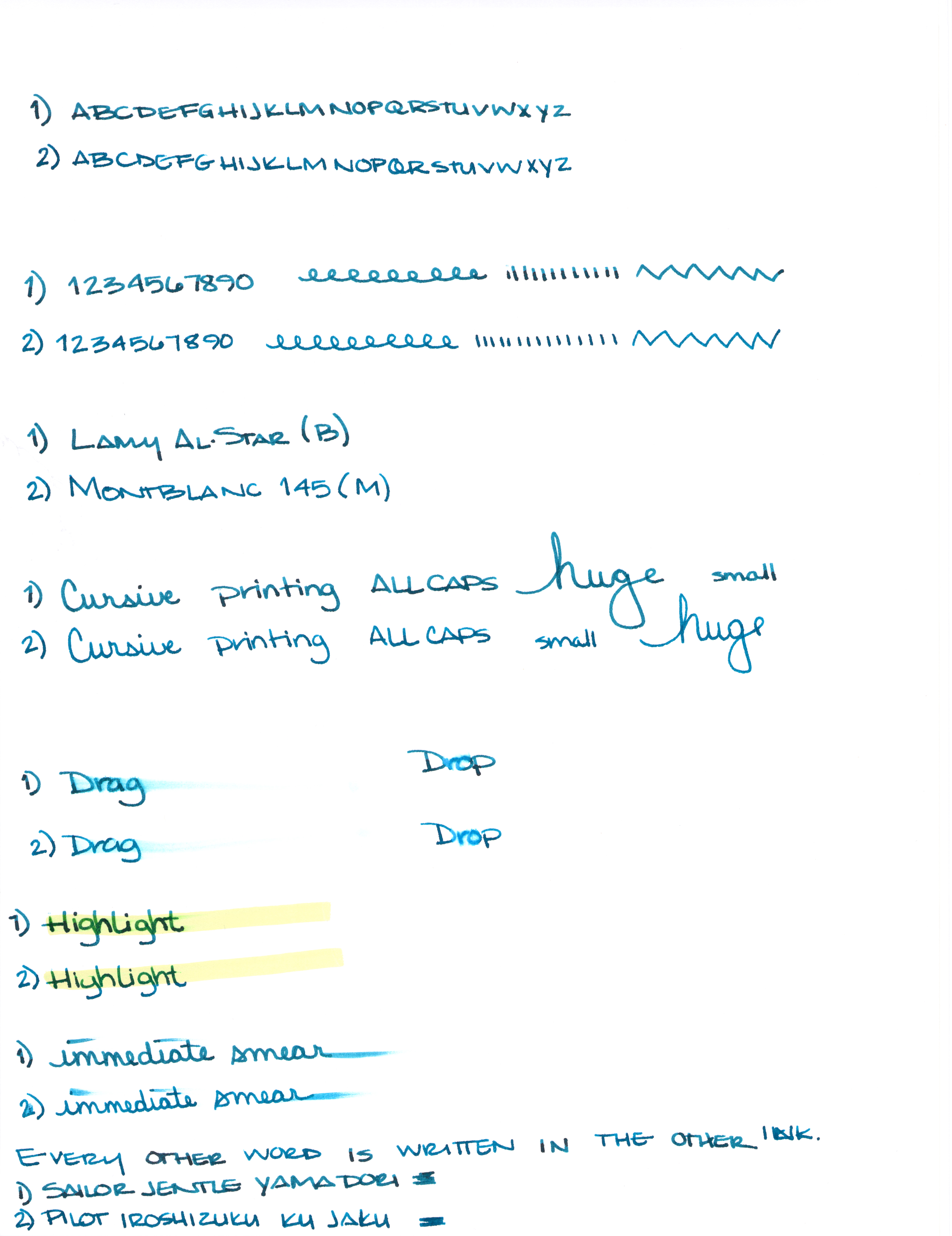
Can you see the differences between these two inks?  One color is always on top. The other is always on the bottom.

Let’s take a closer look . . .

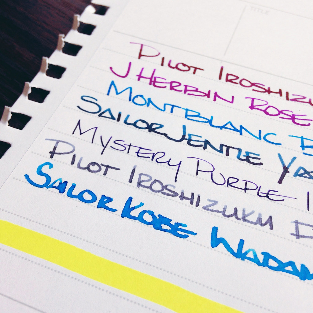
One of these is Pilot Iroshizuku Ku-jaku.  The other is Sailor Jentle Yama-dori.
Color is quite similar.
I see a definite difference here.
Not much difference here.
Which ink is this?  Hint:  it’s both!

Alrighty, which do you like? Both? Neither?  They are pretty close, yes? I would choose the top color – but not by much. It’s the shading that made the difference for me. I think I could be happy with either (even though teal isn’t my most favorite color).

Scroll down for the spoiler . . .

The top shade is Sailor Jentle Yama-dori. 
The bottom is Pilot Iroshizuku Ku-jaku.  

What is so interesting to me about this is that Yama-dori is legendary. Ku-jaku gets favorable reviews, but it’s not a Big Deal. The differences are subtle and if they weren’t side-by-side, I wonder if you or I could tell them apart.

Like I said yesterday, Yama-dori is my E.T. ink. You can read all about that right here.

What do you think? Am I crazy and there’s a huge difference that I’m not appreciating here?

INK REVIEW: Sailor Jentle Yama-dori

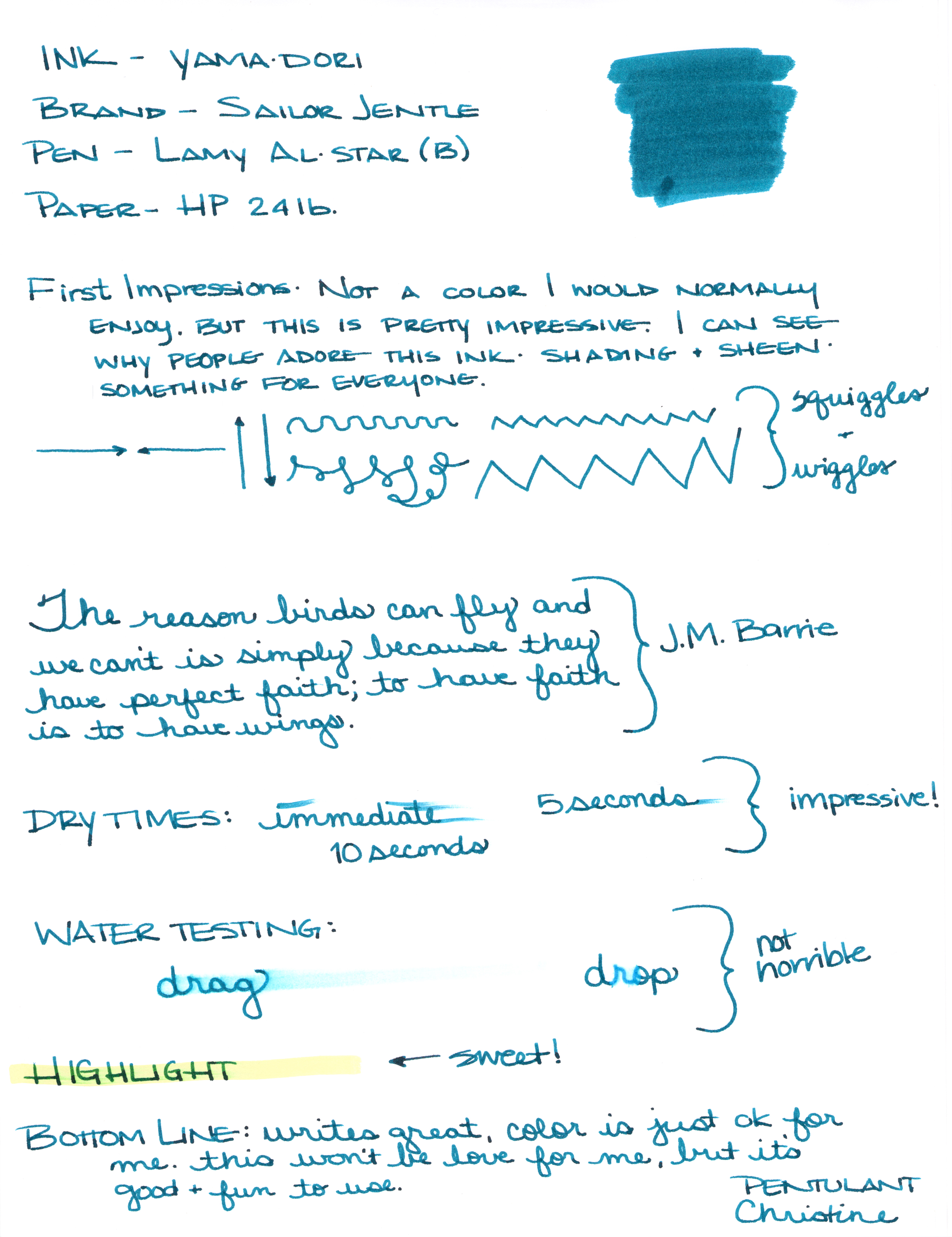
Sailor Jentle Yama-dori Fountain Pen Ink Review


I generally try to avoid reading much about inks before I have the opportunity to try them for myself. I want my opinion to definitely be my own and not influenced by others as much as possible.

That was impossible with Yama-dori. This ink has superstar status over on Fountain Pen Network. Even before the ink was re-released, there was chatter about how amazing it is – it sheens, it shades, it’s perfect! Gotta get me some of that!

I got mine from JetPens with pennies from my own piggy bank. It’s listed at $20 there. Looks like it can be had for a buck or two less at some other online stores.

There are things I really like about Yama-dori. It sheens, it shades, it flows really well. It passed the smear and highlight tests with flying colors.

Yama-dori is my E.T. of inks. Let me explain . . .

Waaaay back when the movie E.T. (you know, the Extra-Terristrial) came out in theaters, it was the Must See movie. OMG, gotta see it. What, you haven’t seen it?  You don’t know what you’re missing!  Best. Movie. Ever.

The build-up was just so much that there was practically no way the E.T. was going to meet my expectations. And it didn’t. I mean, it was ok.

And that’s kind of where I am with Yama-dori. It’s good. It’s nice. I like it. But am I coco-crazy-go-nutters for it?  Nah.

I’ll be back tomorrow (a rare Tuesday post!) with more show and tell on Yama-dori.  (How is that for a tease?)

In the meantime, check out the full review (click here for the full-size image – it’s huge), and tell me what you think.  Do you love Yama-dori?  Do you have an E.T. ink?

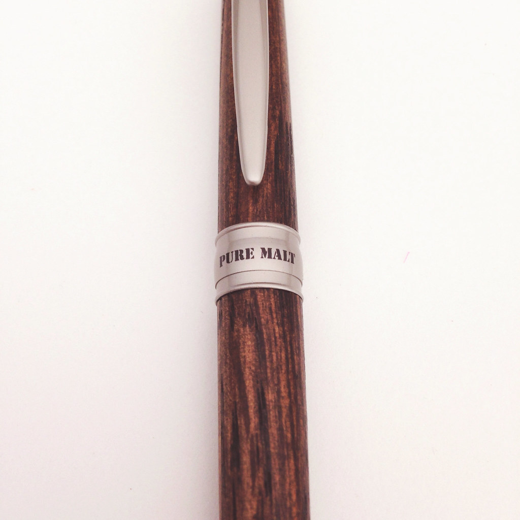
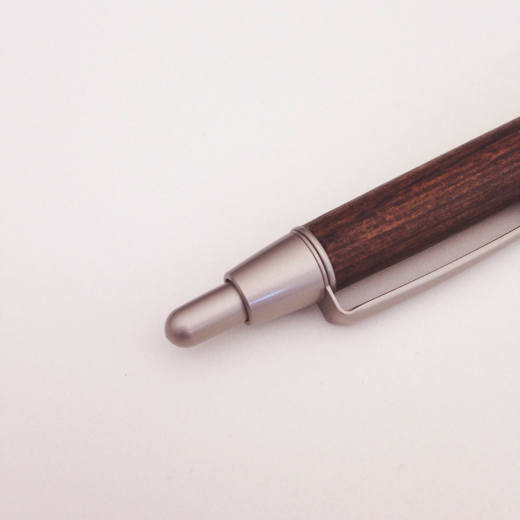
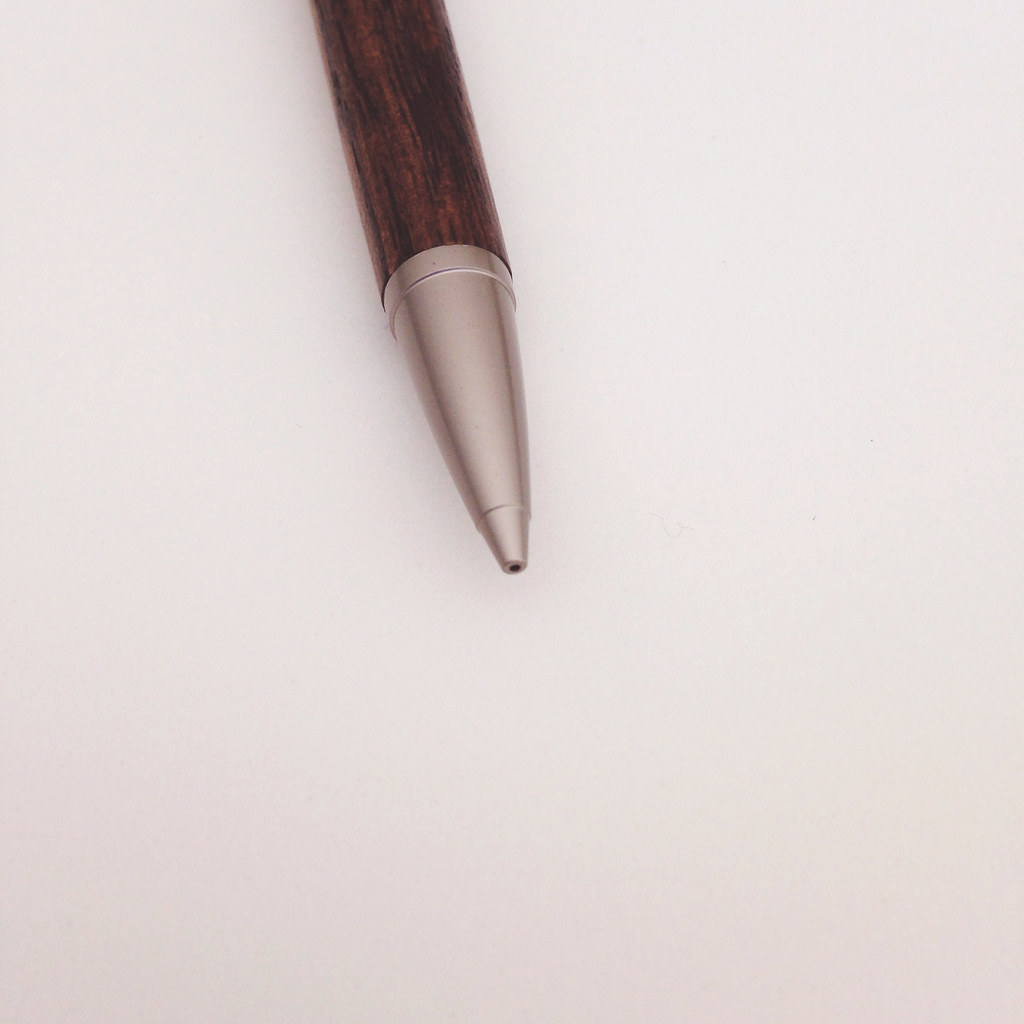
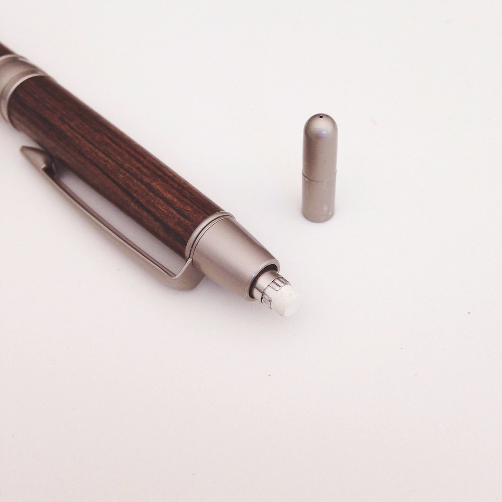
ALMOST WORDLESS WEDNESDAY: Mitsubishi Pure Malt Mechanical Pencil Review

Mr. Pentulant and I recently made the trek to Japantown in San Francisco to Maido. (OMG, I love that store.)

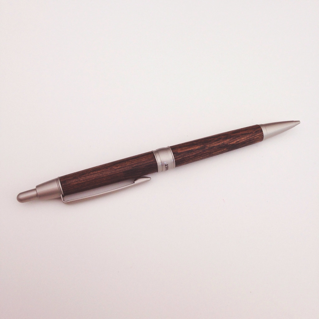
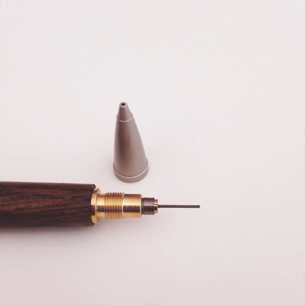
Among other things, we came away with this Mitsubishi Pure Malt Mechanical Pencil. It takes .5mm leads.  I don’t know much about pencils, but Mr. Pentulant tells me he loves it.

Away we go . . .

Are you into pencils? What is your favorite?  I have a new one to show off soon, too!

PAPER REVIEW: Mnemosyne B5 Notebook by Maruman

Shopping for paper online is wonnnnderful. Shopping for paper in a store is like, whoa.

Feeling the creaminess of the paper. Studying the color of the lines. Pondering the lay-out and line width. Comparing sizes, and bindings, and covers, oh my.

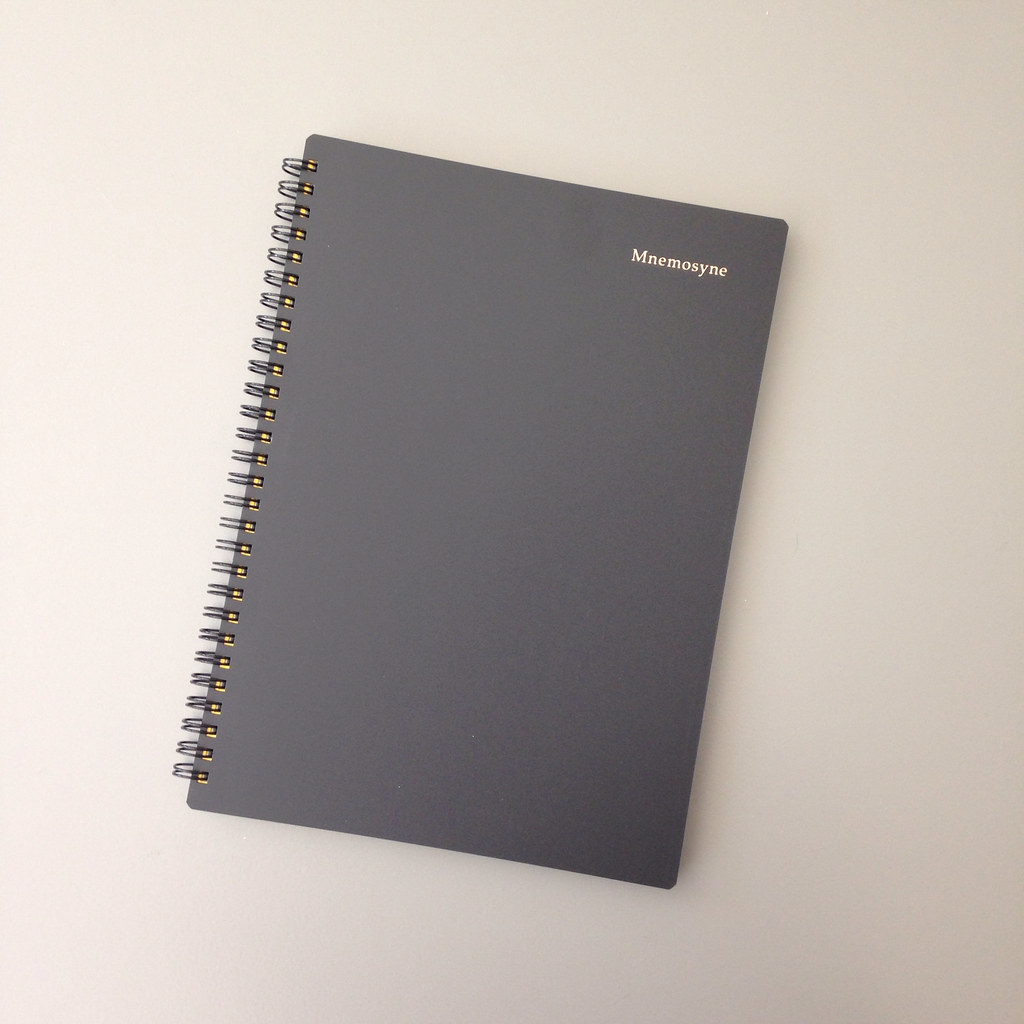
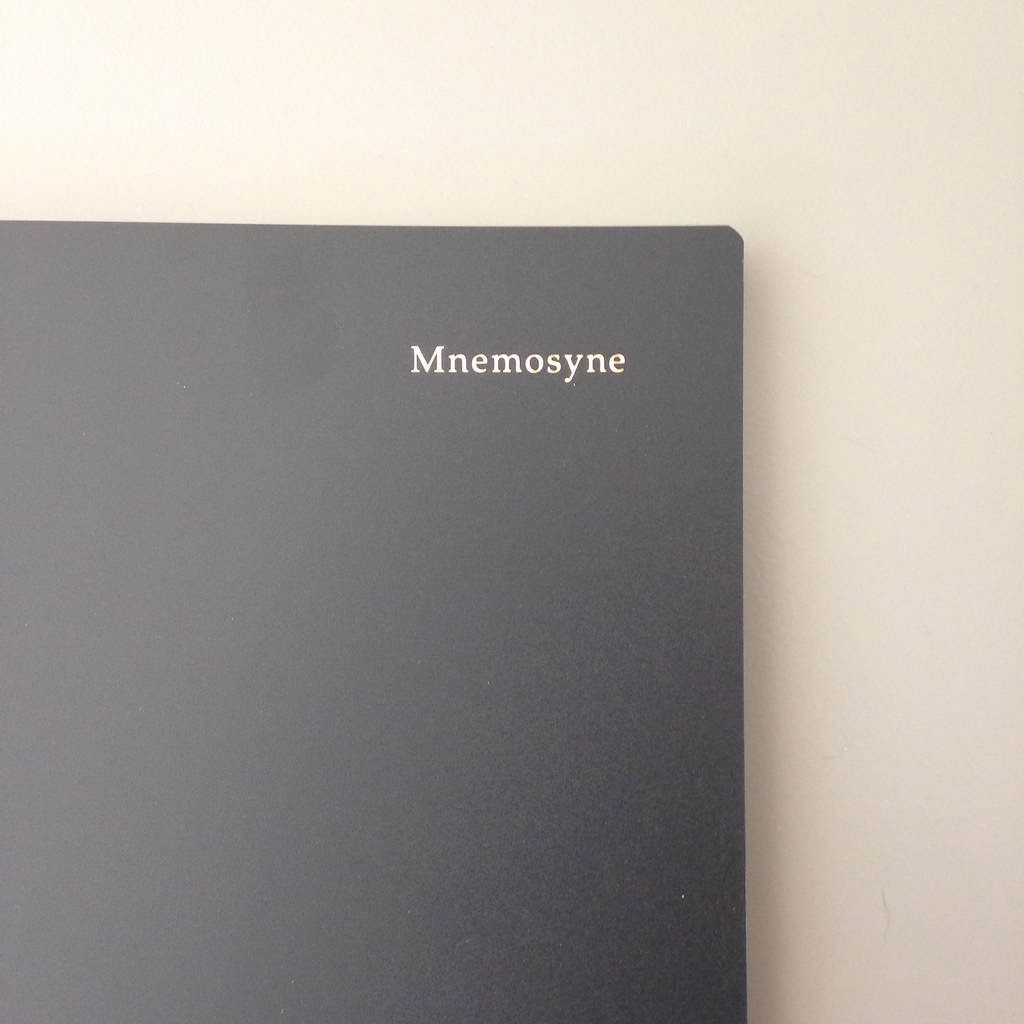
I found this Mnemosyne B5 Notebook by Maruman at Maido in Japantown, San Francisco. I love that store. I could move in there. (Especially because there are noodle and mochi shops nearby. Yum.)

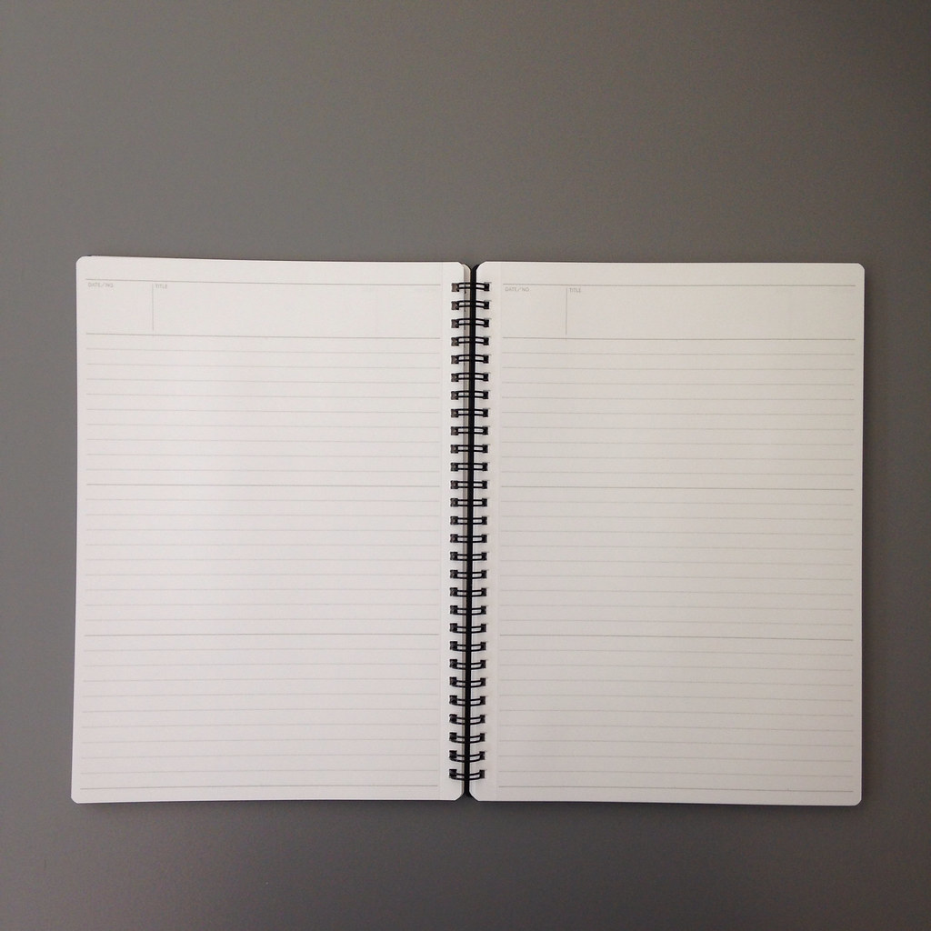
This notebook is a B5 size. It measures 176 x 250 mm. That’s 6.9 x 9.8 inches for those of us who don’t speak millimeters. Such a pleasing size. Neither too long nor too wide. It can be laid open on the corner of a desk without being too much in the way.  Fold it over on itself and it’s not too big to be held in one hand. I’m digging B5.

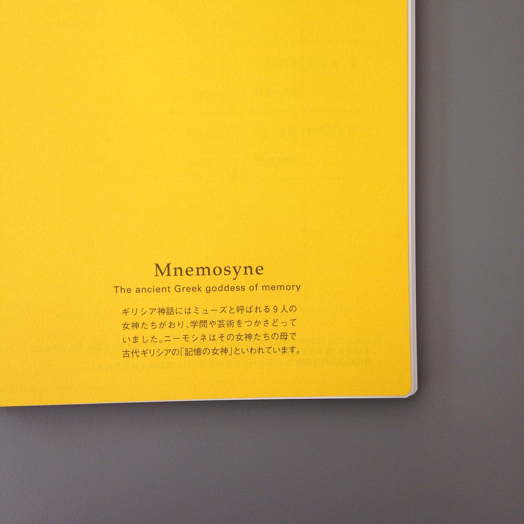
This yellow sheet is the first page in the notebook. It looks like instructions, but it’s in Japanese. And it’s a little confusing at first glance because these pages do not have vertical lines, but this example page does. What the heck?

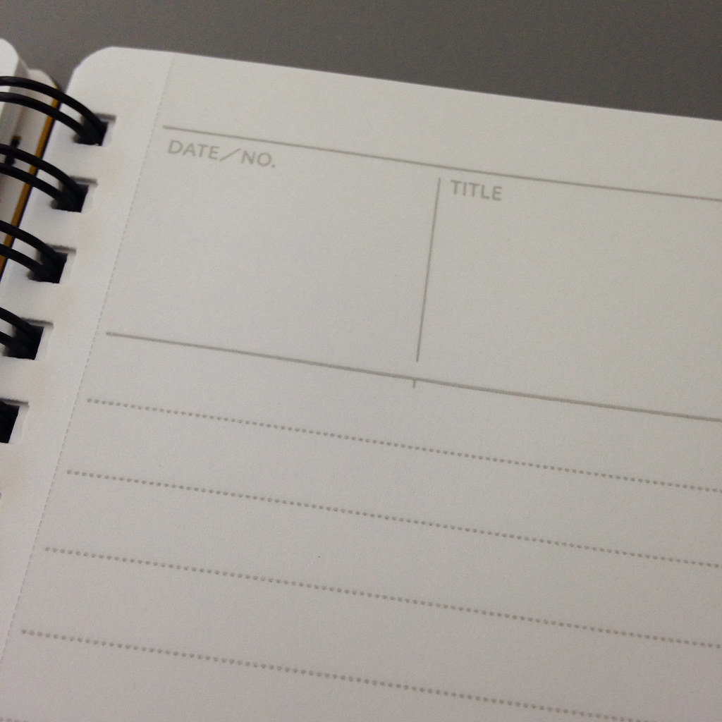
It turns out that there are teeny-tiny very light vertical marks on the paper near the header and then again at the bottom of page to help us create tidy vertical lines on the paper. If you want to, that is.

You can see one of these little marks in the picture below.  Such a nice touch – love the easy flexibility.

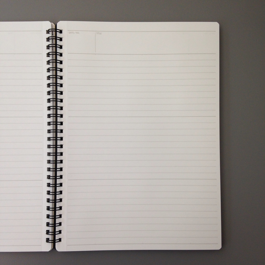
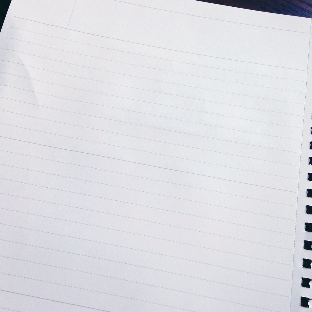
Each of the 160 pages (80 sheets) has gray dotted lines that are spaced 7mm apart. Every ten lines, there is a heavier solid line. These heavier lines lines divide the writing part of the page into three equal sections. These lines are not so intrusive that you have to use them, but they’re there if you want to. Again, easy flexibility.

The paper is white, but not screaming bright white
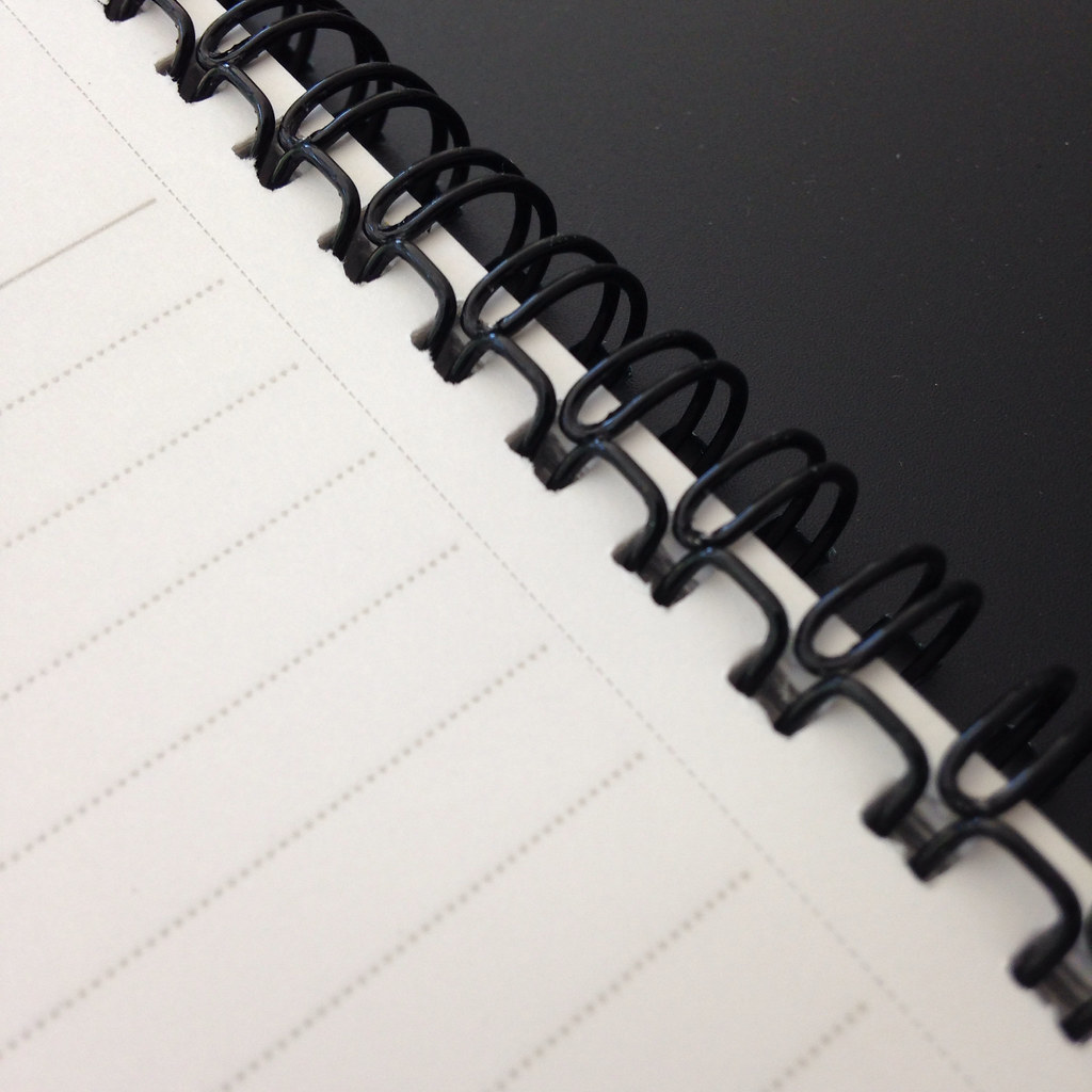
The binding is wire-o. Pages are perforated.

But…how does it perform?  Check it out . . .

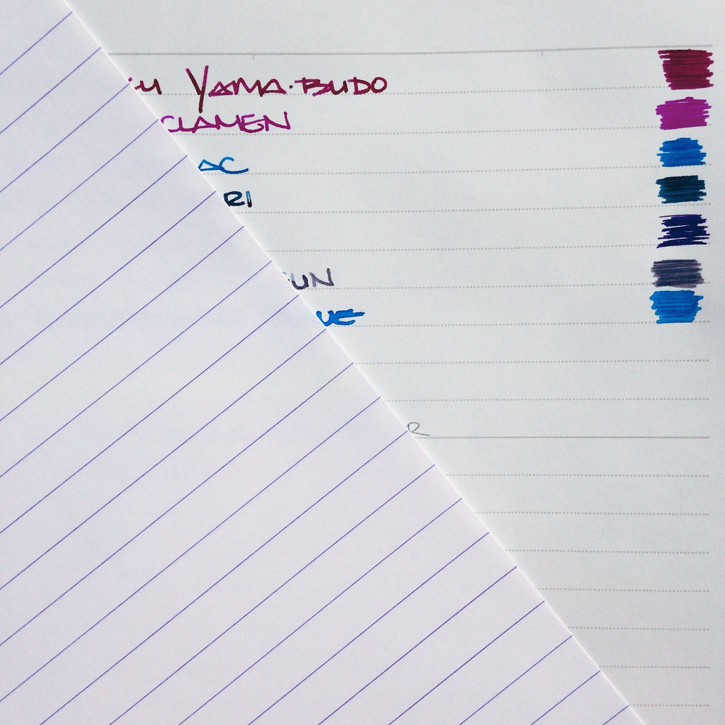
No feather, no bleeding, tiny amount of ghosting (show-through).

The paper on top of the writing sample is Clairefontaine 90gsm. The Mnemosyne is definitely a softer white.  The paper is buttery smooth with an expensive look and feel.  I paid  $8.95 for the notebook and while that’s a lot when compared to a Mead notebook, it’s about what I’d expect to pay for a premium product.

Bottom Line:  I love this notebook and can definitely see using it for work notes or at home for planning or maybe even scribbling down quotes I love.

If you’re not near a store that carries Maruman products, JetPens has it – for around $15. (Making me feel like I got a pretty good deal!)

Tell me which notebooks you love? And do you love B5? I asked on Instagram and A5 seems to be more popular.

//instagram.com/p/rF4Idqm2QO/embed/

FOUND AROUND FRIDAY: Catching Up Edition

You guys. It’s August. Where did July go?

I was so far behind on my blog reading, but I’m all caught up now.  Check it out . . .

Inkophile reviewed an ink I have, but haven’t gotten to yet. I like the color!

Unroyal Warrant has a CRAZY Field Notes thing going on.

My Instagram buddy, Fountain Pen Physicist, is working on an epic ink test and a different sort of test for her students. (Pretty sure the answer is either 42 or yes.)

Peninkcillin has a detailed (in a good way) review of the Pilot Metropolitan. Check it out here.

Do you read Inklode? I’m gonna start.

MyCoffeePot looks at the Parker Duofold Centennial. He says it’s his most favorite pen and I can certainly see why. My goodness. (Watch the video – pretty sure I can hear him about to burst with giddiness.)

Office Supply Geek bought a Poppin notebook from Staples. After my other Poppin experiences, I’m going to pass. (Though I still have, use, and love the ruler!)

I’ve been excited about Kaweco lately. Check this one out from The Pen Cup. That milky color. I loves it.

New ink from J Herbin?  That’s what Inkophile tells us! I won’t be at the DC Pen Show – will you?

Oh my. A Colorado Pen Show. I love it there. I have good friends there. Hm.

And, finally, over on Instagram, I was getting ready to mail out some ink samples . . .

//instagram.com/p/rDTMGTm2Zv/embed/

Do tell. Which blogs should I be reading?

Have a good weekend!
xo
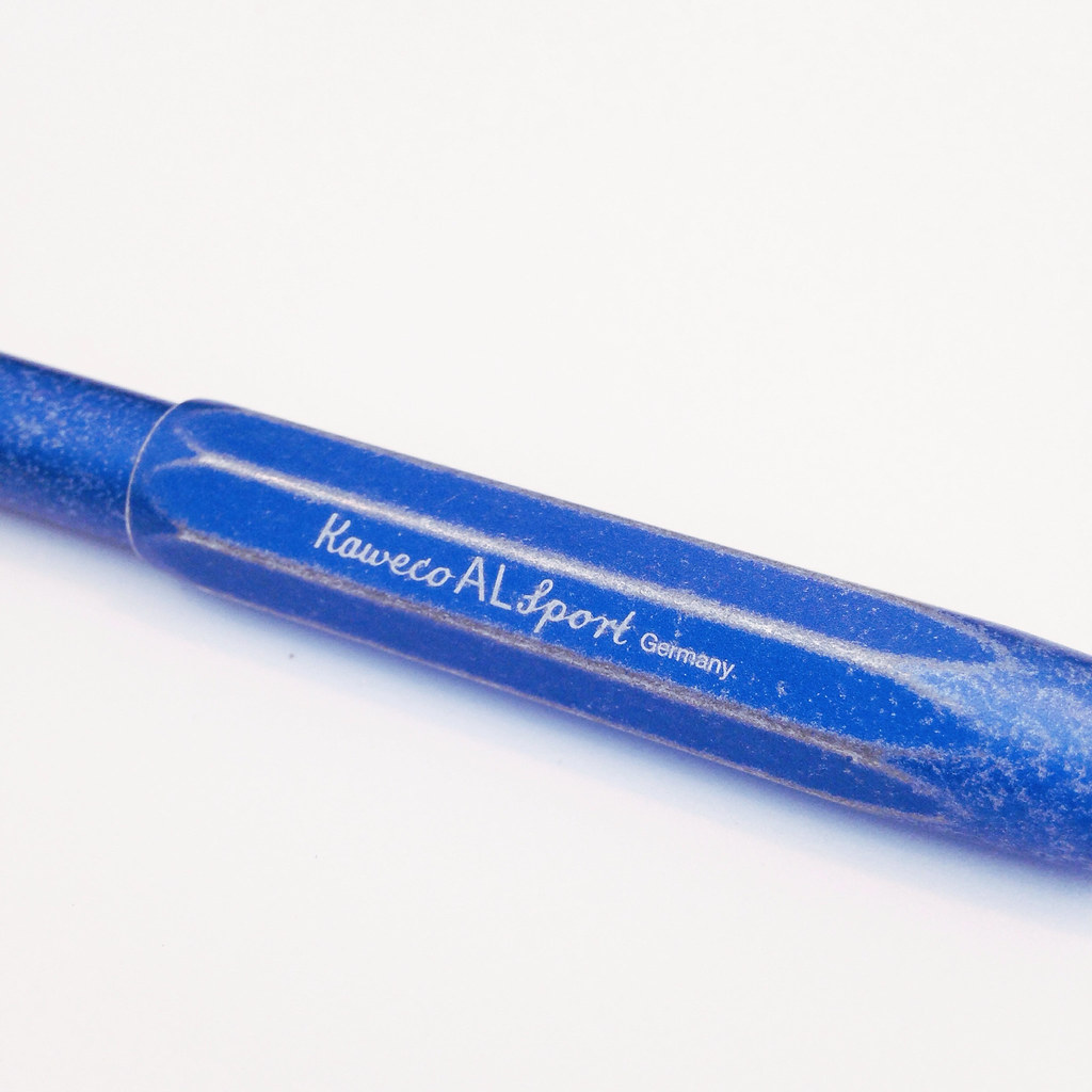
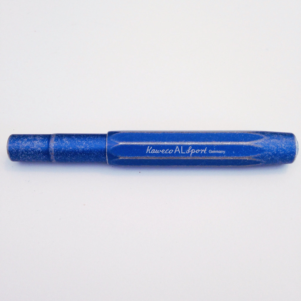
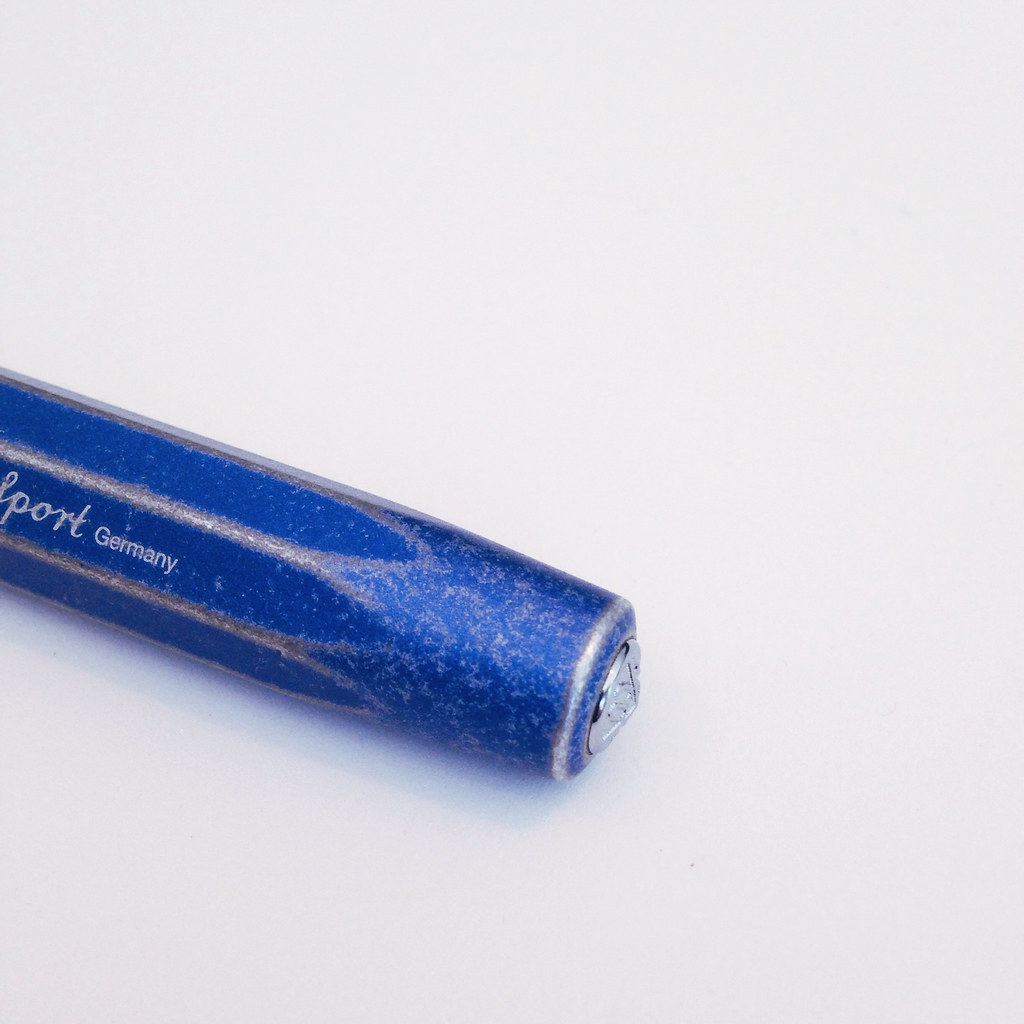
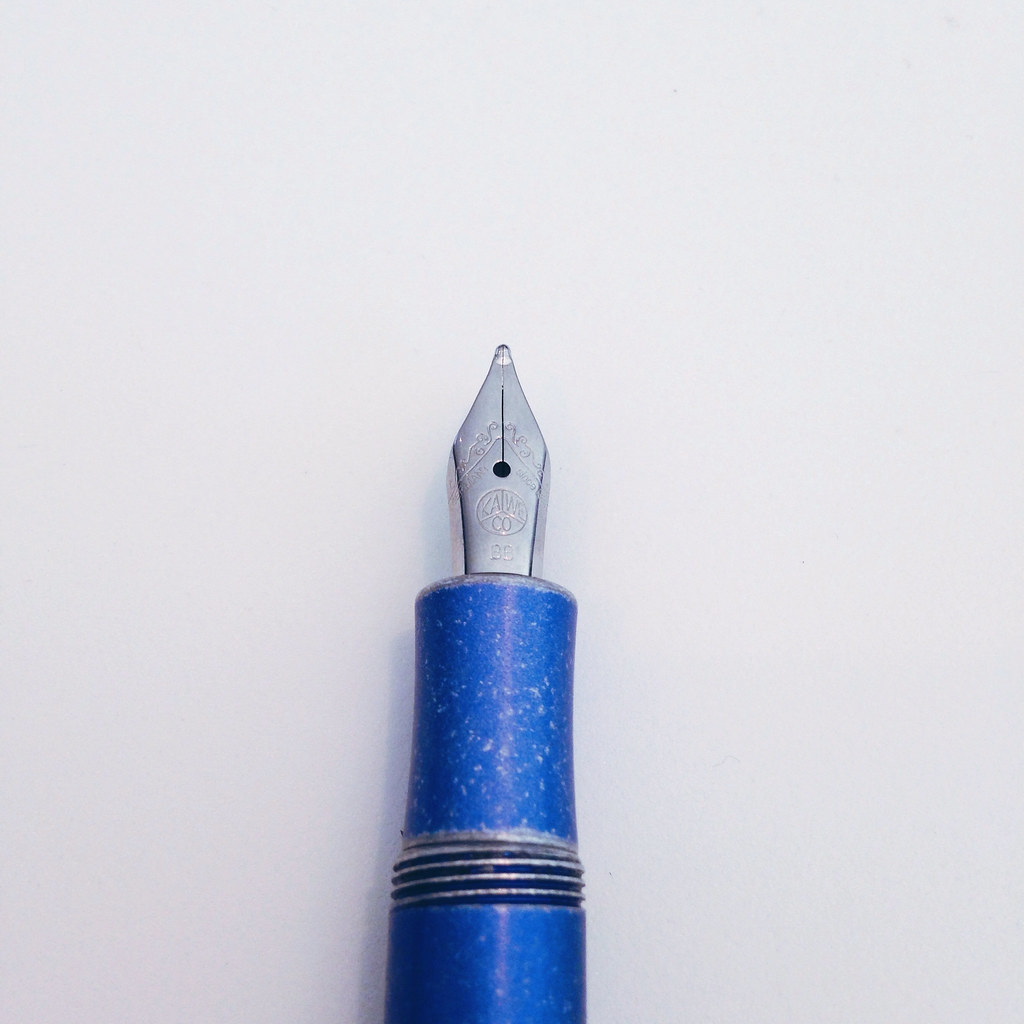
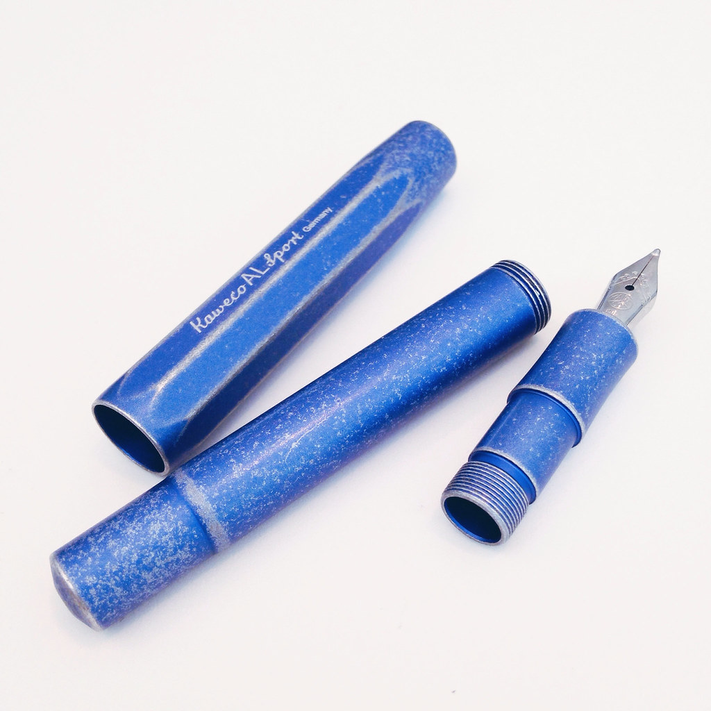
ALMOST WORDLESS WEDNESDAY: Kaweco Stonewashed (Blue) Kaweco AL-Sport
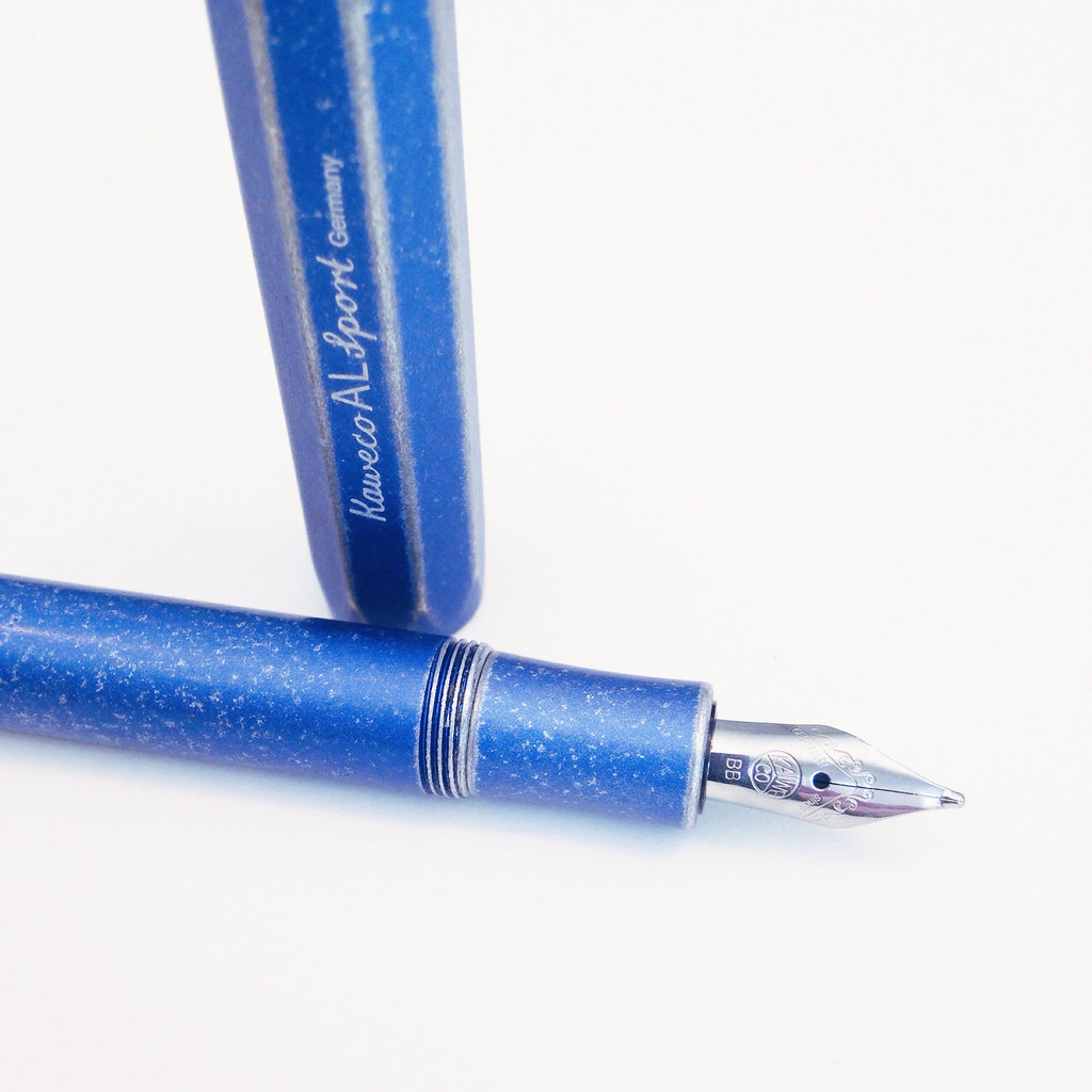
I recently reviewed the Kaweco AL-Sport. Here’s a link to that review. This pen is exactly like that – except the look is way cool. Right?  (Not that the other isn’t, but wow.)
I’ve been calling this the Kaweco Stonewashed AL-Sport and have seen others refer to it as the Kaweco Raw AL-Sport.
On to the wordless portion of this Wordless Wednesday . . . 

Yes.

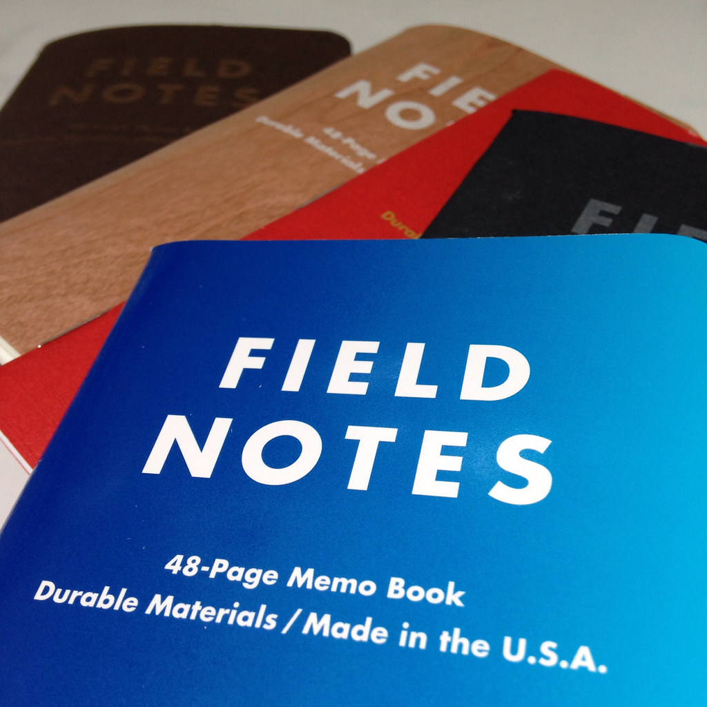
PAPER REVIEW: Field Notes – Arts & Sciences Edition


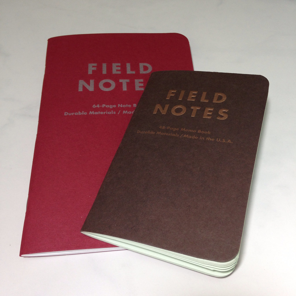
FIELD NOTES ARTS & SCIENCES EDITION
Over and over again, I buy Field Notes brand Memo Books. I’m not sure why . . . the paper quality of most editions I’ve seen is Just Not That Good and not very suitable for fountain pen use.
(Un)fortunately, they get it just right sometimes. And that’s enough to keep me coming back for more.  You know what I’m saying? It’s like pizza delivery – they get the order right just often enough to make me try again another day.

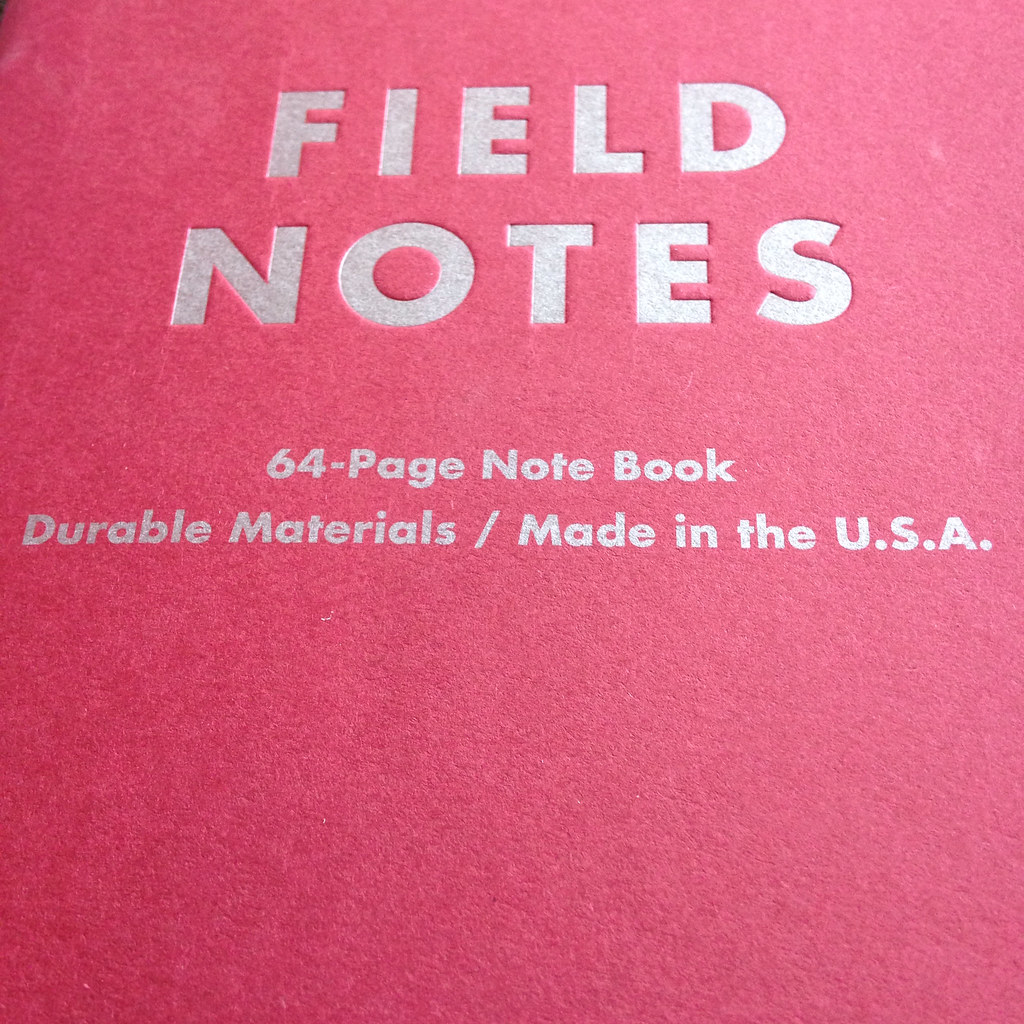
And that brings us to the 64-Page Note Book from Field Notes. The Arts & Sciences limited edition. The big one.

Some things about the  note book. . .
measures 4.75” x 7.5”
110 lb cover stock
50 lb bright white paper paper with silver ink
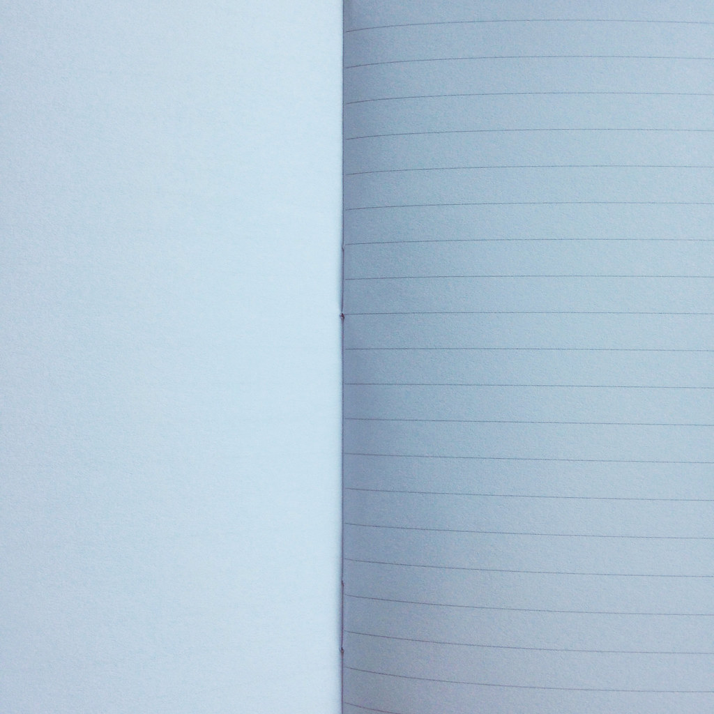
printed with light gray lines on right side of book – blank on left
staple bound (also called saddle stitching)
rounded corners
made in the US

Two more things about this note book . . .

  1. It’s not fountain pen friendly
  2. I’m going to use the hello out of this book
Annnnnd this is why I keep coming back to Field Notes: despite the fact that this book is comprised of average components with a standard design, I adore it.
Field Notes: they’re easy.

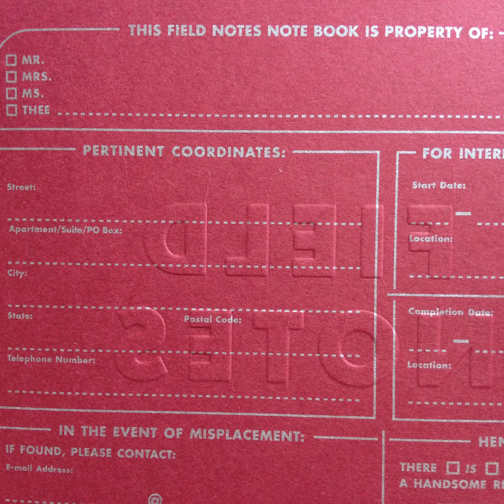
Enough pages to fill with good information, not so many that the book is even a little bulky. The front covers are iconic in their simplistic design. (This one has a deeply debossed logo on the front cover.) The inside covers are filled with interesting little tidbits, and at the end of the day, It Just Works.

So. Like so many before it, I won’t be using my fountain pens with this edition of Field Notes, but I will be carrying it with me for list making and planning purposes.  And by the time I’m finished filling the note book, it will probably be a bit tattered and worn (thank goodness for those rounded corners), and it may even be stained with pizza.
There are other great little notebooks out there. I’ve been loving Curnow Bookbinding & Leatherwork and Yellow Paper House (a new shop on Etsy), and they are definitely fountain pen friendly.
And what about you, dear reader? Which little notebooks do you love? Or love to hate 😉

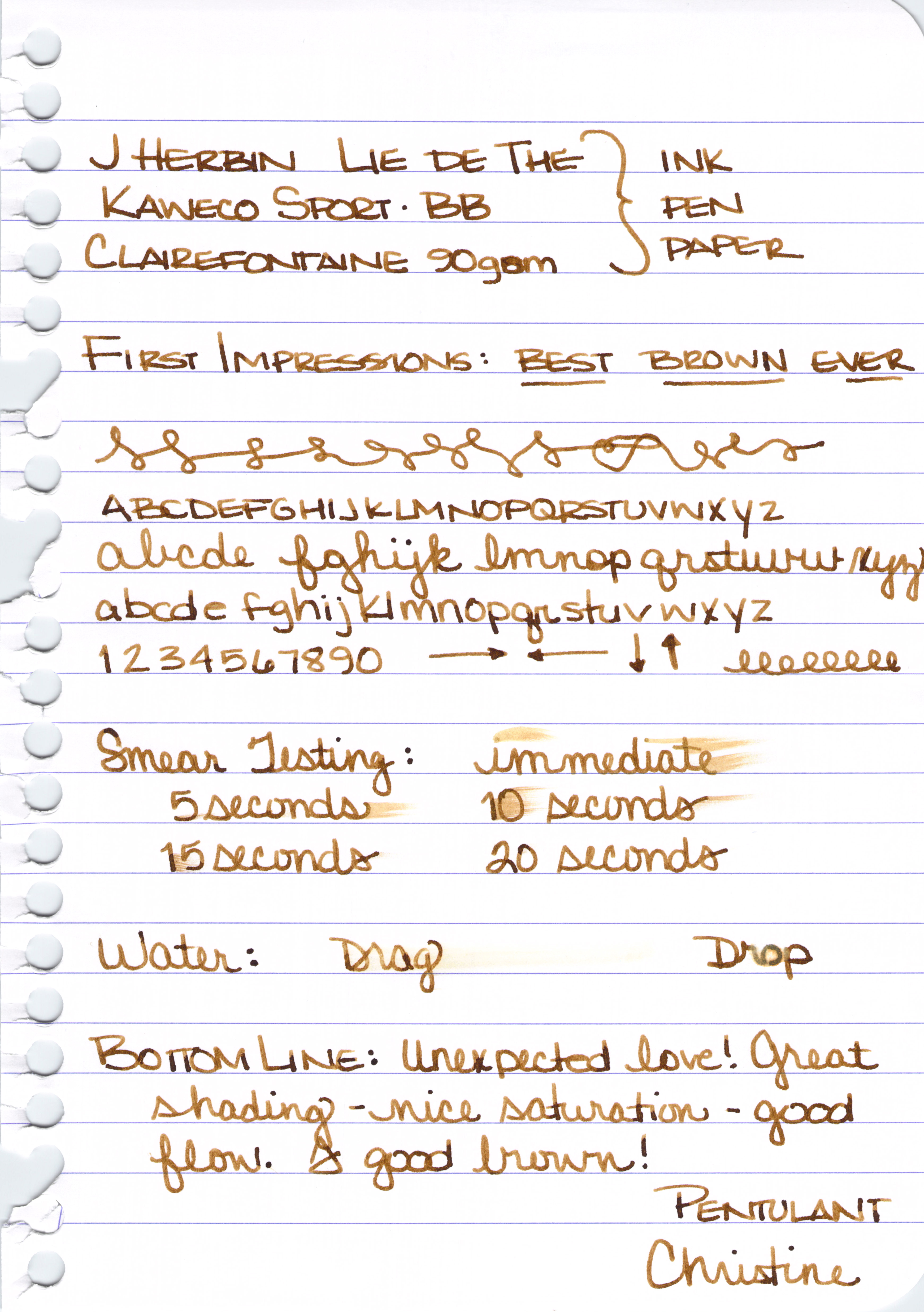
INK REVIEW: J Herbin Lie de The

I don’t like brown inks. It’s been documented right here on this blog.  
Delta Brown, what’s the flower you have on? It’s brown.
Chocolat from Private Reserve? I said I liked it, but I don’t. I never bought a bottle like I said I might.
I don’t like brown inks. Really, I don’t!! 
J Herbin Lie de The
Why try again? Well, I have just about every other color group represented in my currently-inked pens and the Kaweco Sport I wanted to use is blue.  I’ve always thought brown and blue look great together. Leather and denim, right? Can’t just be me.
Anyway . . .
Best. Brown. Ever. 

I’m a convert. I have seen the light brown and I like it. I love it.  My gosh, look at that shading.

The color is wonderful. Not too dark, not too light. I’m not seeing any of that red that turned me away from some of the other browns I’ve tried. There’s definitely some yellow in there, though.
It writes fantastically. No flow issues (consider that I was using a BB nib). Dry time was a little long (that nib was laying down some serious ink). 
There was no feathering, bleeding, or ghosting with Clairefontaine paper. There was all of the above when I touched the nib to some cheapie cheap-o paper.  I don’t know if that’s more because of the paper or the ink, but there you go.

I’m adding Lie de The to my inky wish list.
Here’s the full review. Click here to see the full-size image (it’s big).  

OK…speak up….brown ink. Are you in or out? Do you like browns that lean toward the yellow or more toward red?

xoxox

P.S. I rarely look at other reviews before I write my own, but will sometimes check them out after. There are lots of reviews on Fountain Pen Network that talk about how green Lie de The is. I don’t see that. I don’t see that so much that I wonder if the formulation has changed. When I look at the swabs on both Goulet Pens and Zeller Writing, I don’t see green.  Do you?