 |
| click the image to see more detail |
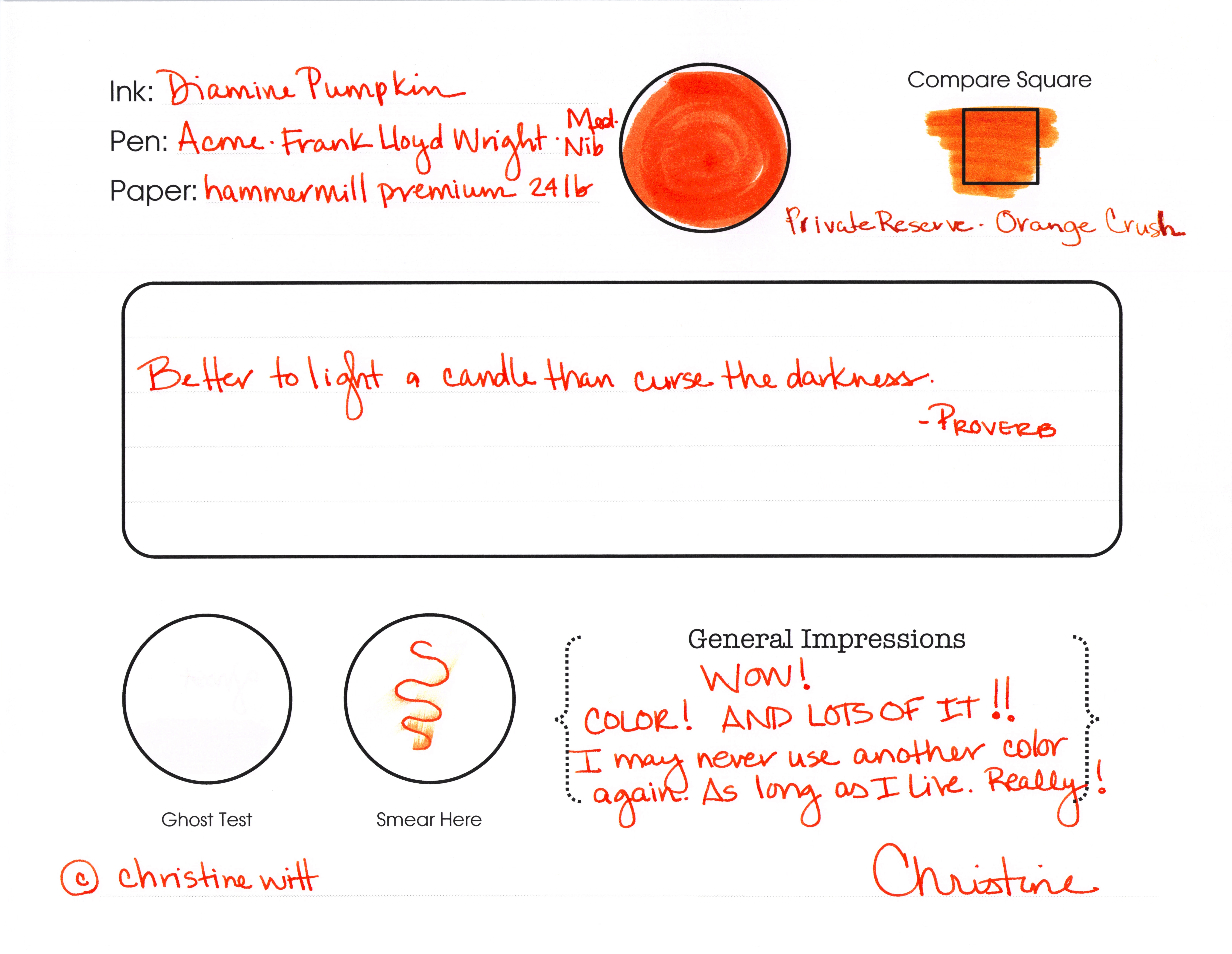
See what I said? “I may never use another color again. As long as I live. Really!”
Ha! How crazy is that? I might mean it, though.
Look at the Compare Square. I think Orange Crush from Private Reserve looks more like a shade of pumpkin than Pumpkin from Diamine. I really think I should be in charge of naming colors.
There’s some smearing, but it’s not awful. I made that squiggle, waited just a few seconds and then ran my finger along the ink.
I didn’t have any ghosting – and I wish I could come up with a better way of illustrating my ghost tests. I’ll work on that. You work on getting this ink. Today.
Check this out…
 |
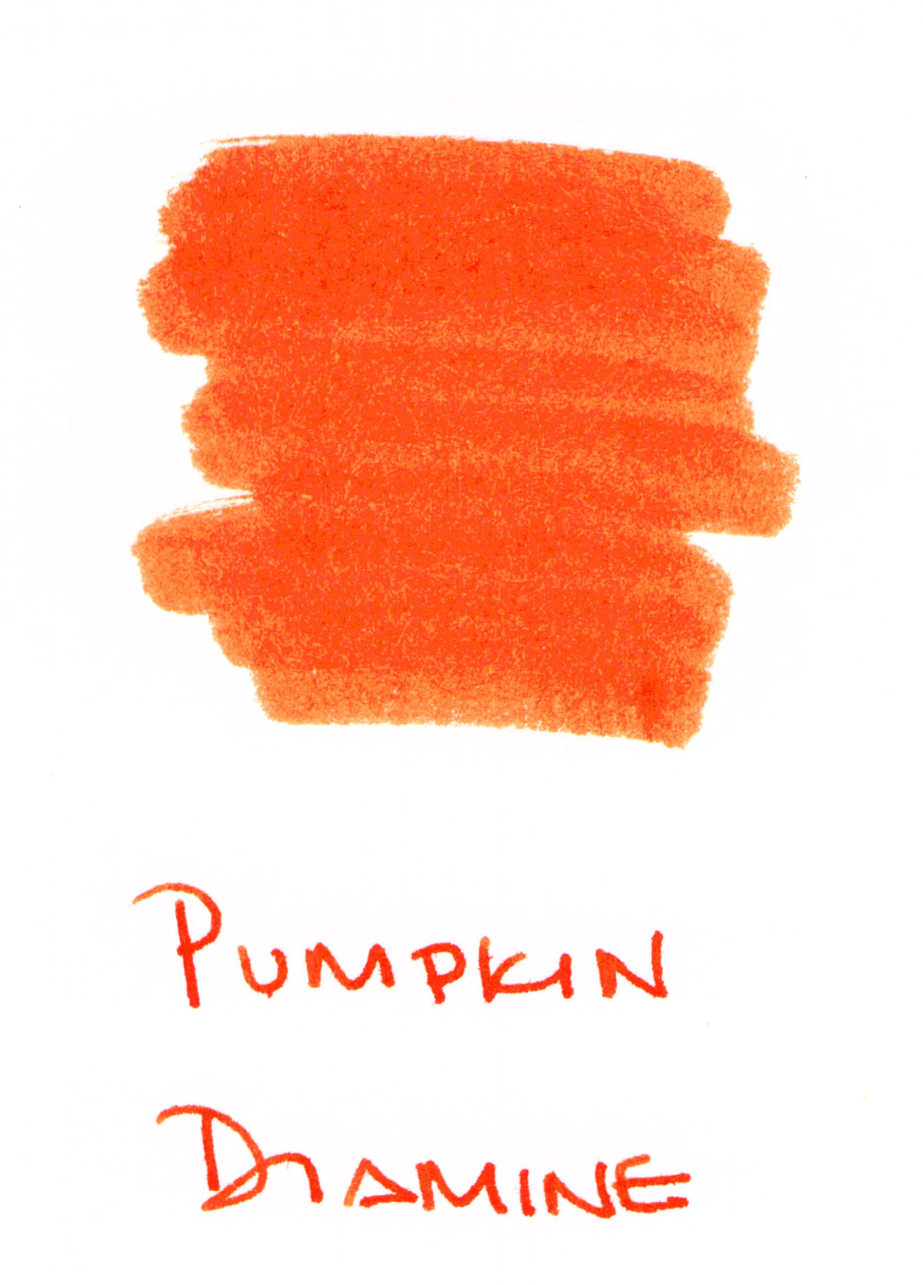
| Some shading, but it’s mostly super-saturated |
There’s some slight feathering on Hammermill paper, but not much. If we were going to see terrible feathering, it would be on the swab – those are done on 3×5 index cards and the paper is so thin. (Does anyone make high quality index cards?)
Whew. That’s some ORANGE. I’m in love. Orange Jello! That’s what it reminds me of.
I almost wish I didn’t have to show you this . . .
 |
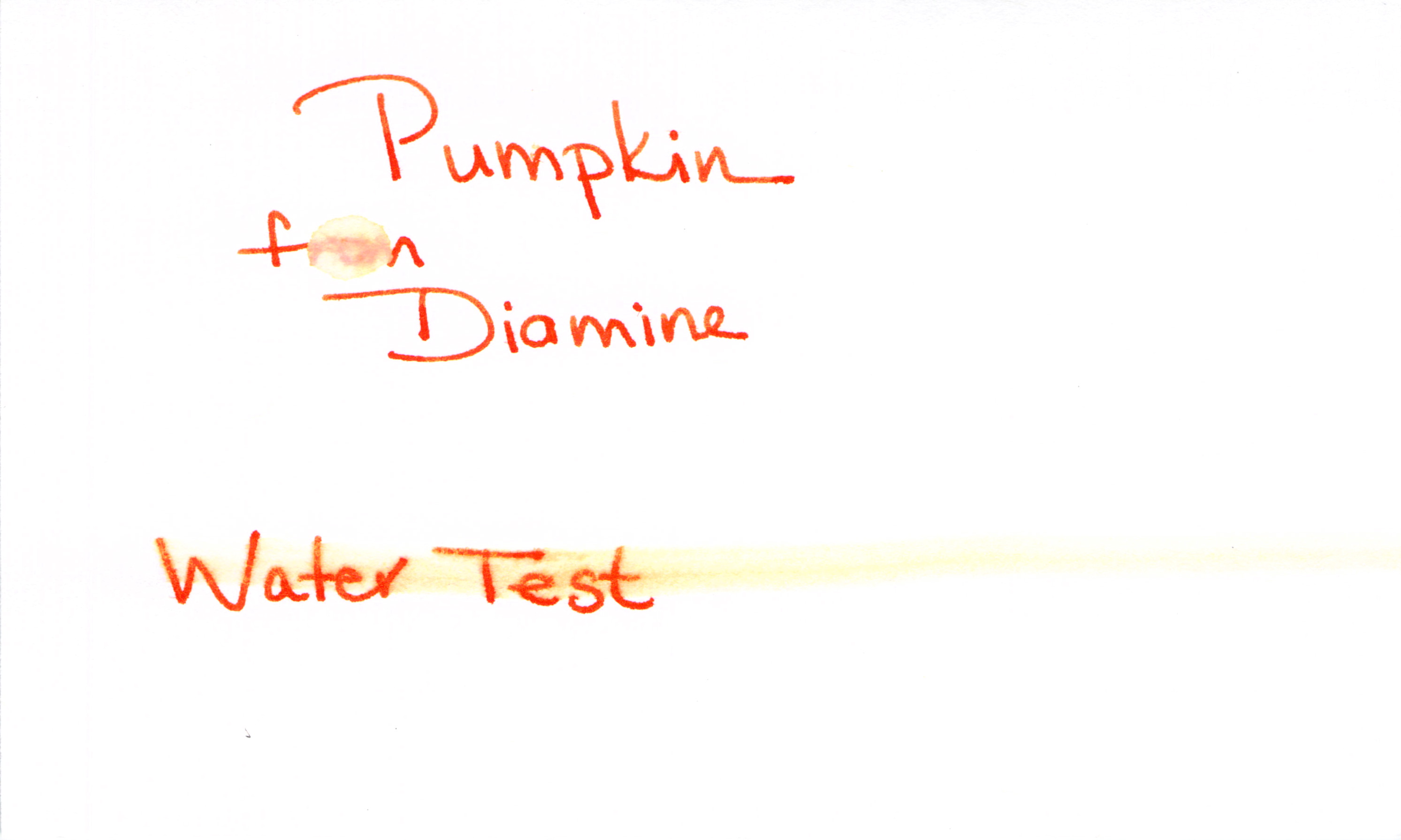
| Water Test – Fail |
Poo.
Here’s how I test for water resistance:
1. Write with the ink (always a good first step!)
2. Let it dry for 10+ minutes
3. Place a droplet of water on one word (“from” in this case) and let that dry naturally
4. Smear a moistened Q-Tip across the words “Water Test”
I’m bummed that the water test is a fail. I’m not surprised, though. My limited understanding is that it’s difficult to get water resistance from most mixed shades like purple, orange, green. Wah Wah.
All of this said, I (probably) will not be using this color for everrrrrrything, but I’m totally into it for some fun this fall. I’ve found it all over the place for $12-15.
Are you seasonal about your ink colors? Which are your current favorites?


I likey!
Pingback: INK SWAB 201: J Herbin Orange Indien | Pentulant