 Monteverde Green
I like green inks a great deal and this one is a good classic green.

Monteverde Green
I like green inks a great deal and this one is a good classic green.
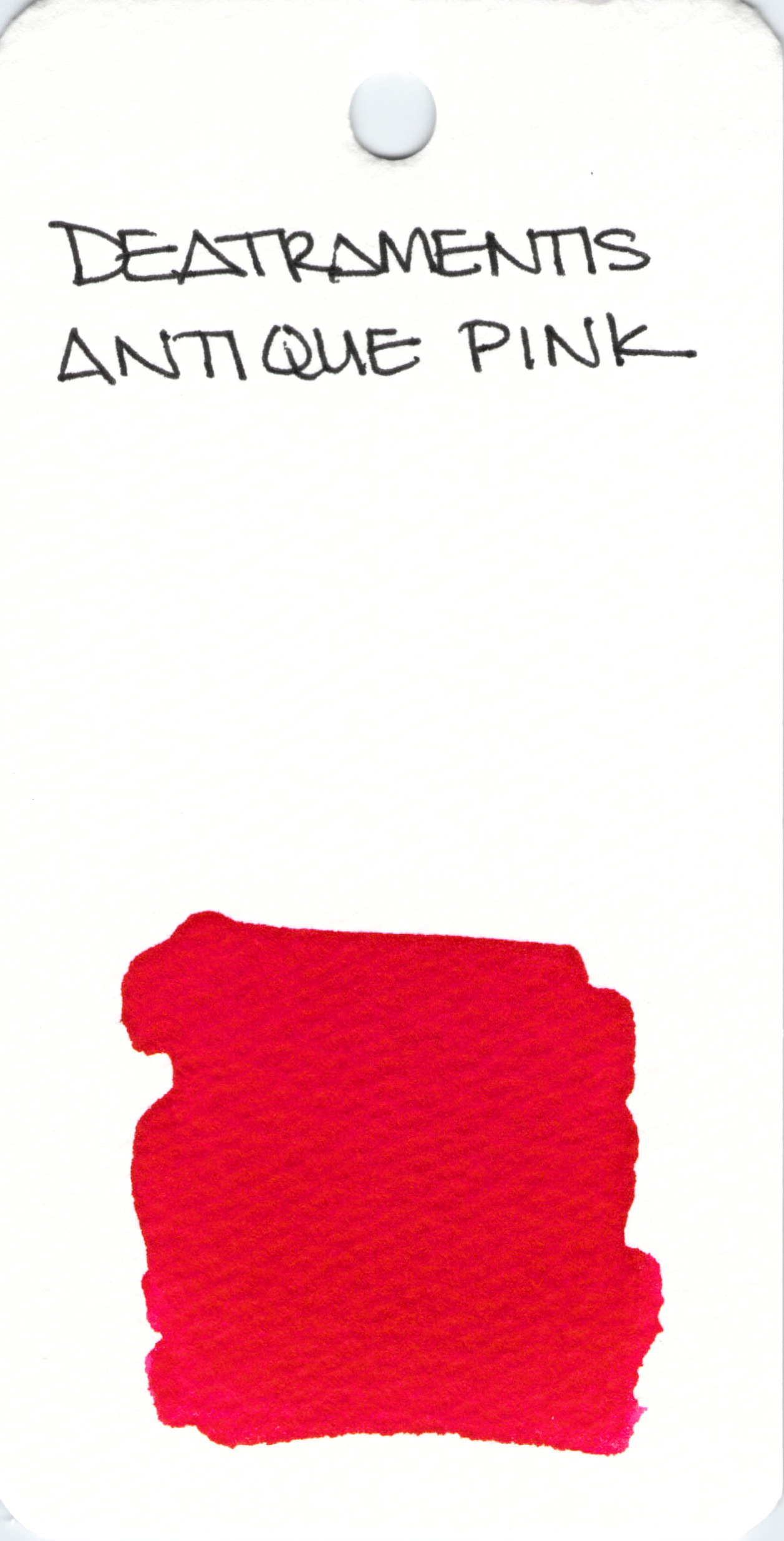
Scanned swabs are usually an accurate representation of the ink. This is an example of when that is not the case. Check out my full review of De Atramentis Antique Pink for a more accurate view.

Oh, how I love this ink. Sadly, it has been discontinued. Here’s my review from a long long time ago.
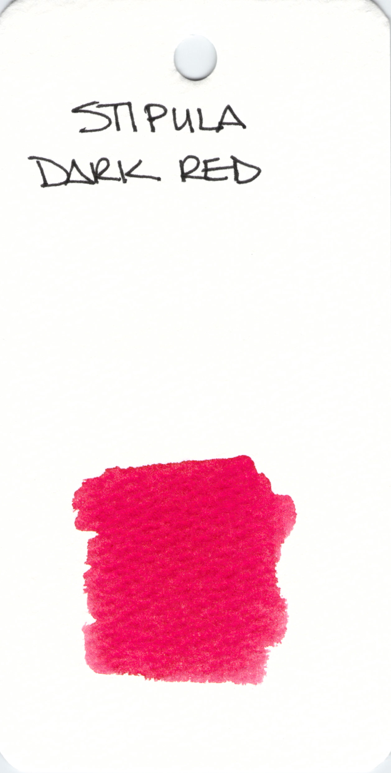 Stipula Dark Red doesn’t seem very dark from where I’m sitting.
Stipula is another brand that doesn’t get a lot of exposure. I’ve not written with this one and would love to hear what you think of it. Which red is your favorite?
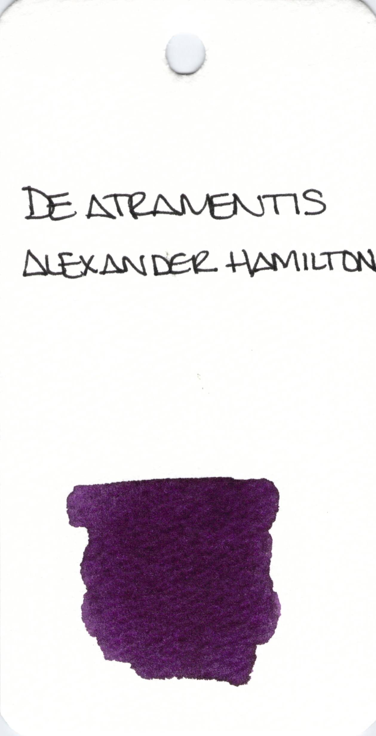
OK, seriously, I love Alexander Hamilton. And this ink from De Atramentis isn’t bad either. Ha.
This dark and dusky shade of purple really does it for me. Check out my full review and then go get yourself a bottle of this yummy yummy ink.
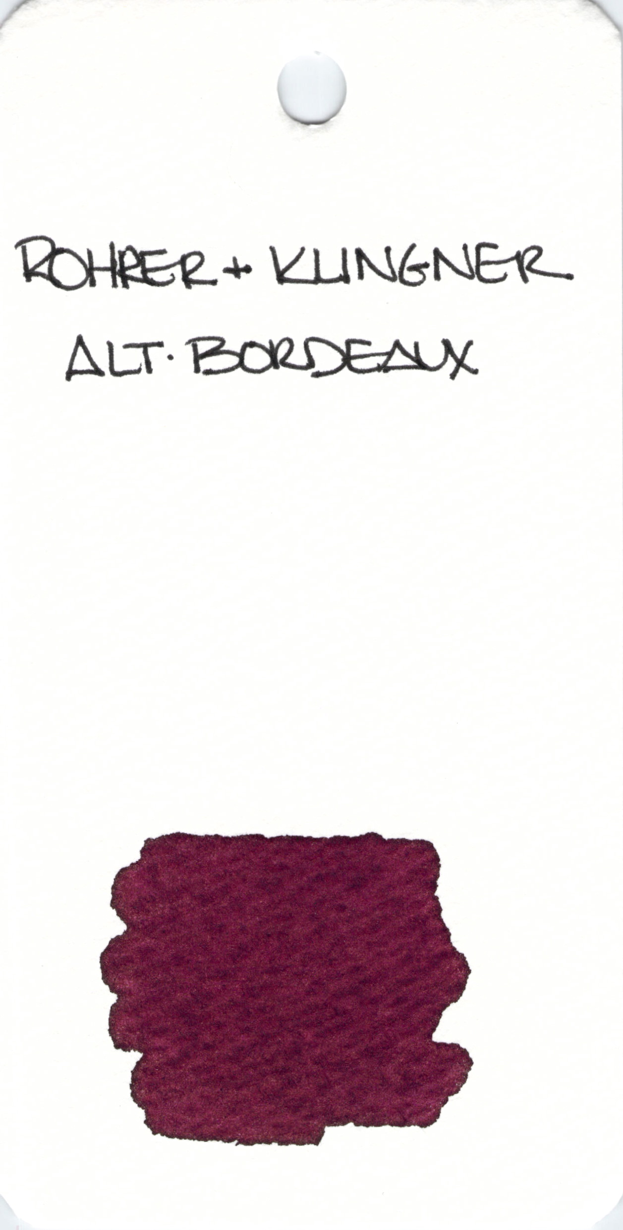
Rohrer & Klingner is a brand that doesn’t get a whole lot of attention.
I’ve not written with Alt-Bordeaux, but I have enjoyed other R&K inks and this is an interesting purple that leans toward red – aptly named.
While today isn’t Friday, I need to mention how much I enjoy Fashionable Friday from The Well-Appointed Desk. Pretty pretty.
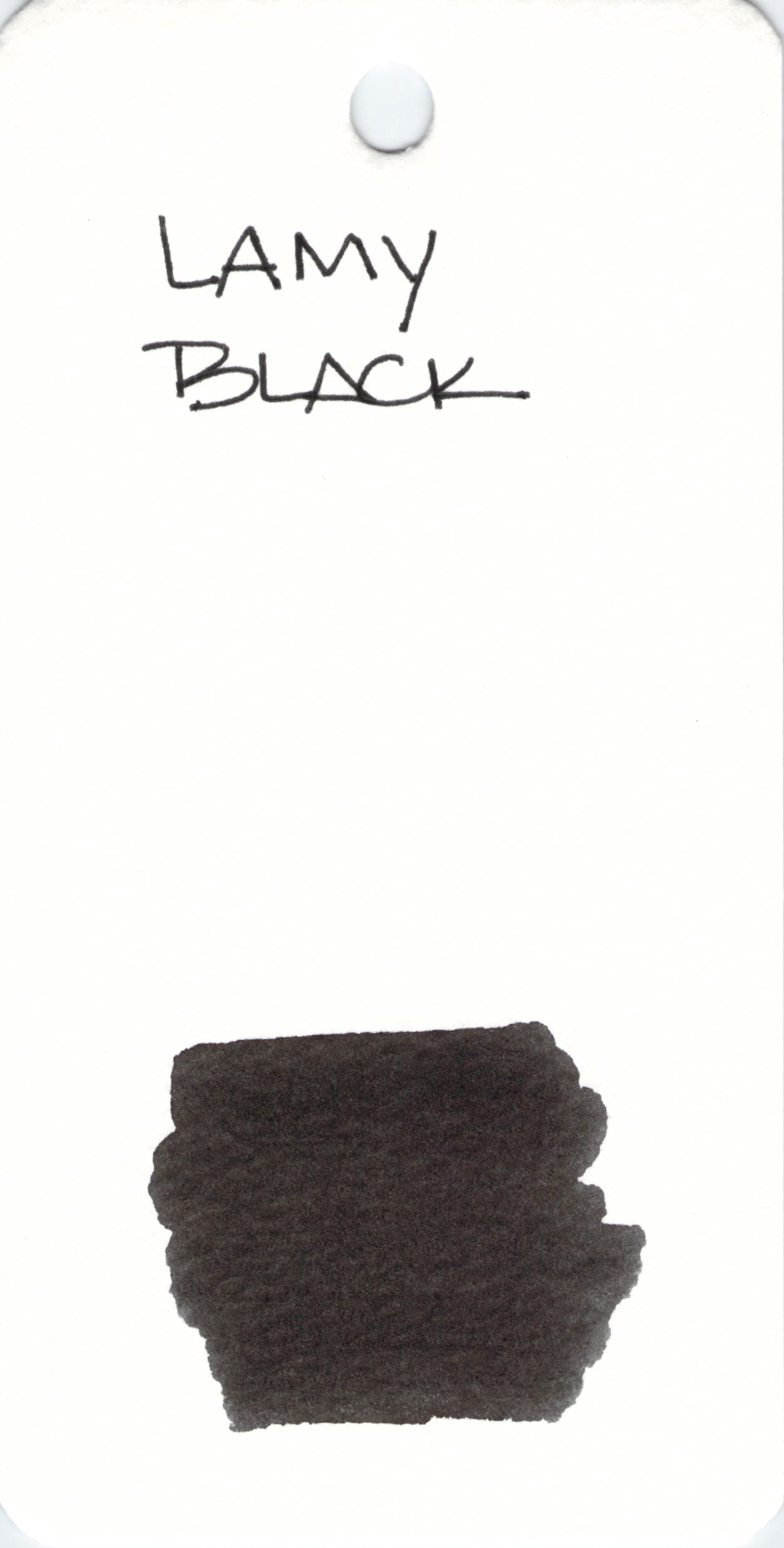 Lamy Black.
It’s black.
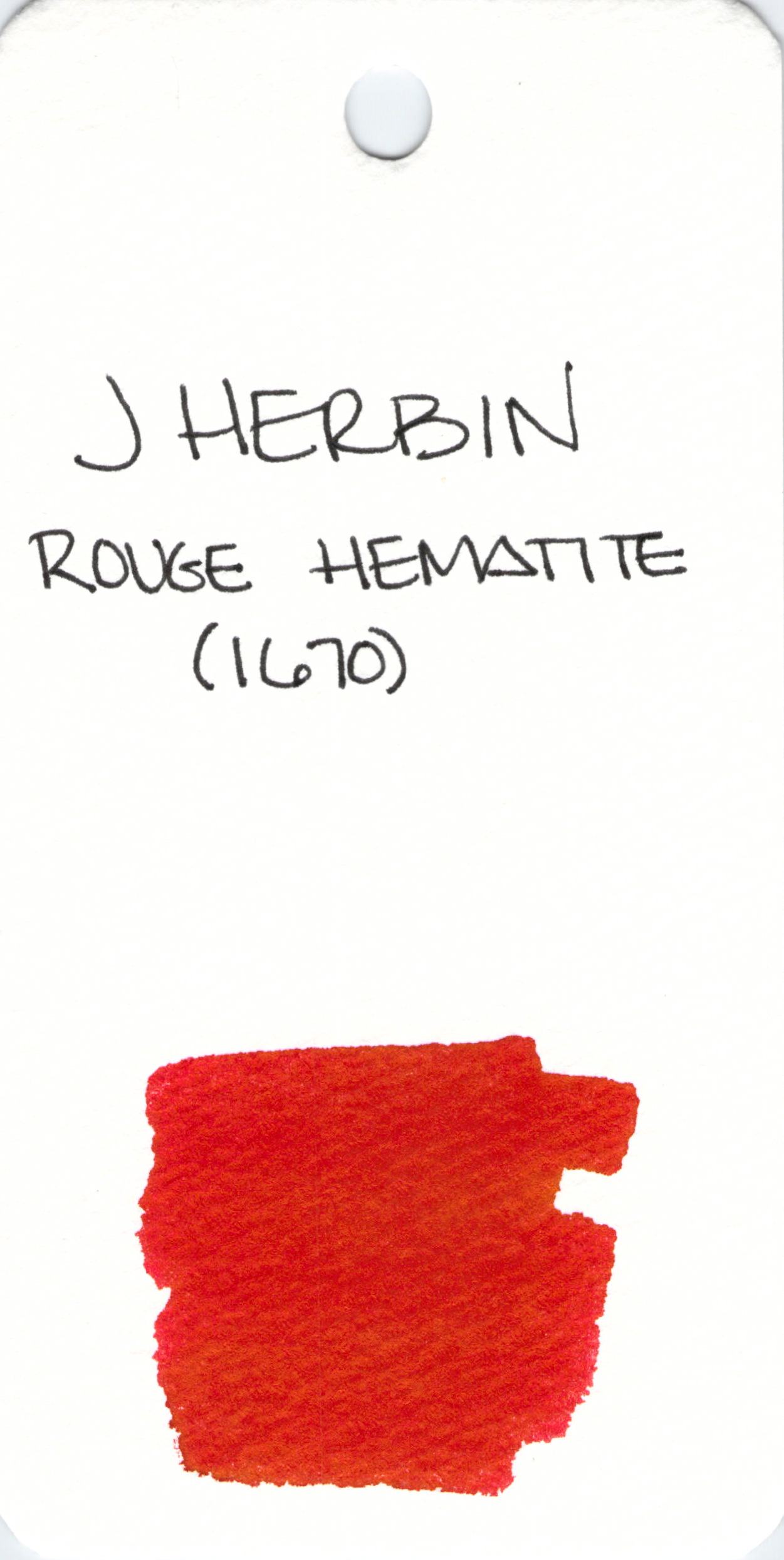
A quick look at the super-duper popular Rouge Hematite from J Herbin. This ink has gold flecks in it. I did this swab without first shaking the bottle so we can see the color of the ink and not just the gold flecks. Not that there’s anything wrong with gold flecks.
Some people avoid this and Stormy Grey because the flecks can make this a high-maintnance ink. I’m willing to put up with the extra effort for the extra omg-factor. You?
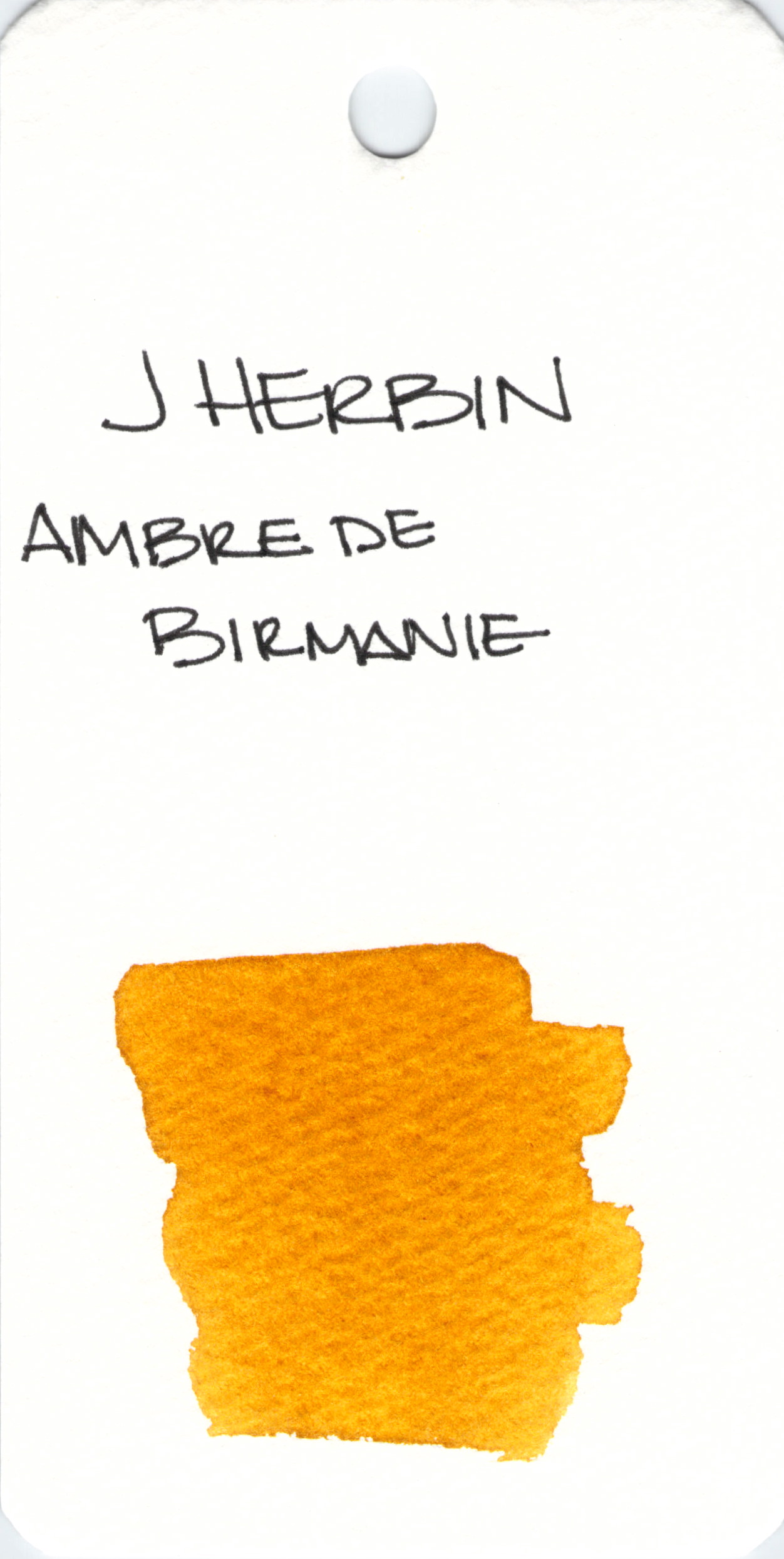 I’ve not written with J Herbin’s Ambre de Birmanie, but I’m going to – and soon! Love the way it looks in this swab.
If you’ve tried it, please let me know what you think in the comments section below. I’m hoping you loved it.
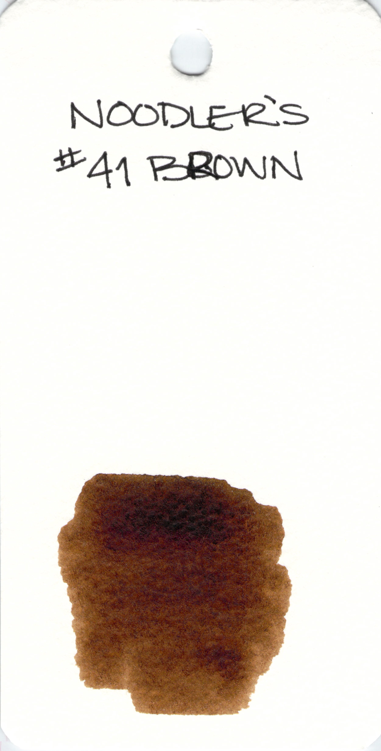
Noodler’s #41 Brown ink is a fountain pen ink that I reviewed back in October.
It falls a little flat for me and with so many other options (Lie de The!), I’d pass this one over.
Noodler’s can be controversial. Nathan from Noodler’s can be even more controversial. Care to share your opinions on either?