INK REVIEW: Pilot Iroshizuku Fuyu-syogun

Oh. Goodness.

Gracious. Me.

Oh. My.

Pilot Iroshizuku Fuyu-syogun Swabs (3, 2, 1)

Have mercy.

Fuyu-syogun Shading
Not too light.
Not too dark.
Nothing but gray. No icky red or green undertones.
Gorgeous shading. 
Decent dry time.
Writes beautifully.
I’m in love.  In love. Head over heels.
If this ink isn’t in your collection, it certainly should be. Certainly.
Have a look at my other grey/gray ink reviews and then run out and get this one.
Seriously, I have nothing negative to say about this ink.

INK REVIEW: Omas New Gray

It’s been awhile since I’ve added any new gray/grey inks to my Fifty Shades of Grey collection!
New Gray from Omas is a lovely shade of gray with a bit of blue in it. It’s probably too light to use in a business setting and definitely lighter than the other shades of gray that I’ve reviewed.

It writes great. No smearing. Maybe a little dry, but not bad. Some nice shading.

You’ll have to believe me when I say that it handles highlighting very well.  (What is up with me and all of the failed highlighting tests?)

The water test is pretty amazing. Even on the original, I have to squint to see where I dragged the web cotton swab across my writing.

Overall, this is a gray I dig and I could see using it on a regular basis. That is, if I hadn’t already fallen in love with another gray.  Stay tuned . . .

INK REVIEW: De Atramentis Cement Gray

I like gray inks. Always looking for that perfect shade. It’s been a long time since I’ve added an ink to my Fifty Shades of Grey line-up or talked about the spelling of gray -vs- grey. Too long if you ask me!

Unfortunately, I’m not wild about Cement Gray from De Atramentis. (Thank goodness it doesn’t stink like cement, though!)

The problem seems to be that there’s a lot of green in the ink.

Admittedly, it’s difficult to see the green with my scans, but it’s there. It’s there so much that I pointed out to Mr. Pentulant that he might want to consider this ink as his dark-nearly-black-but-still-green choice. He tried it for a short while, but didn’t love it.

The green is most apparent when looked at along side other inks…

As usual, I wrote with this ink for about a week after the review. It wrote fine – a little hard-starting at times even in a medium nib Lamy Safari.

The problem (for me) was the color.  What do you think? See the green? Like it? Hate it?

INK REVIEW: Montblanc Albert Einstein

Seems like gray inks are a love ’em or hate ’em kind of thing. Me? I find that I’m picky about my grays (or greys, if you prefer). I like either true gray – or perhaps a bit blue leaning like J Herbin’s Gris Nuage or Pilot Iroshizuku’s Fuyu syogun (Old Man Winter).

Before we dive into the review of Montblanc’s Albert Einstein ink, you have seen the pen, yes?  It’s the cap that does me in, makes me swoon, gives me heart palpitations. Love, love, love.

But it’s this part that turns me off . . .

The metal. The sharp drop-off between the barrel and the grip. Bleh.

I had the opportunity to hold one of these at the Montblanc Boutique in San Francisco when they were first available. I just didn’t love it. I mean, I’d take one if someone wanted to gift it to me (duh), but I’m not buying one for myself.

Anyway…the ink review..

Clicky here for the biggy big version of the review.

And a closer look . . .

I like it. It’s ok. It’s not amazingly wonderful. I have a couple of full bottles of it, but I’m not hurrying to fill all of my pens with it. I think Mr. P would like this more than I. It’s a little dark with no special characteristics, but it gets the job done. It’s a serious gray from a serious pen company – I imagine Montblanc is quite happy with it.
Bottom Line:  It’s ok.

INK REVIEW: J Herbin – Gris Nuage

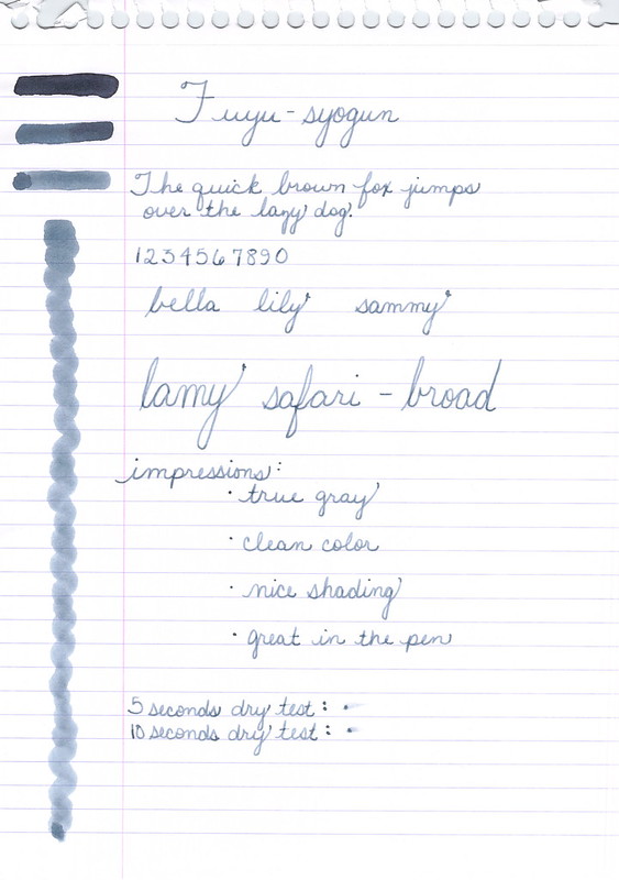
Here’s a quickie review of one of my favorite inks to get us back into the groove this week. (More on Thanksgiving another time.)
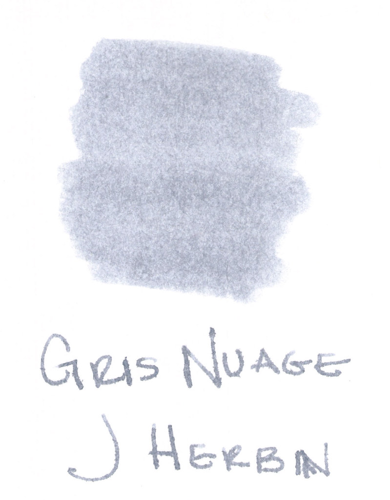
The above swab was done with a q-tip and then the name of the ink written with a glass pen. In my experience, there’s a lot of feathering with glass pens and this was no exception. (It also doesn’t help things that it’s written on a cheap-o index card.) (Again, I ask, are there are any nice index cards out there? Starting to think there aren’t.)
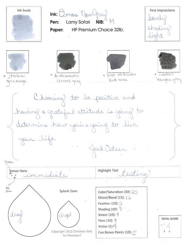
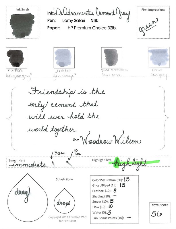
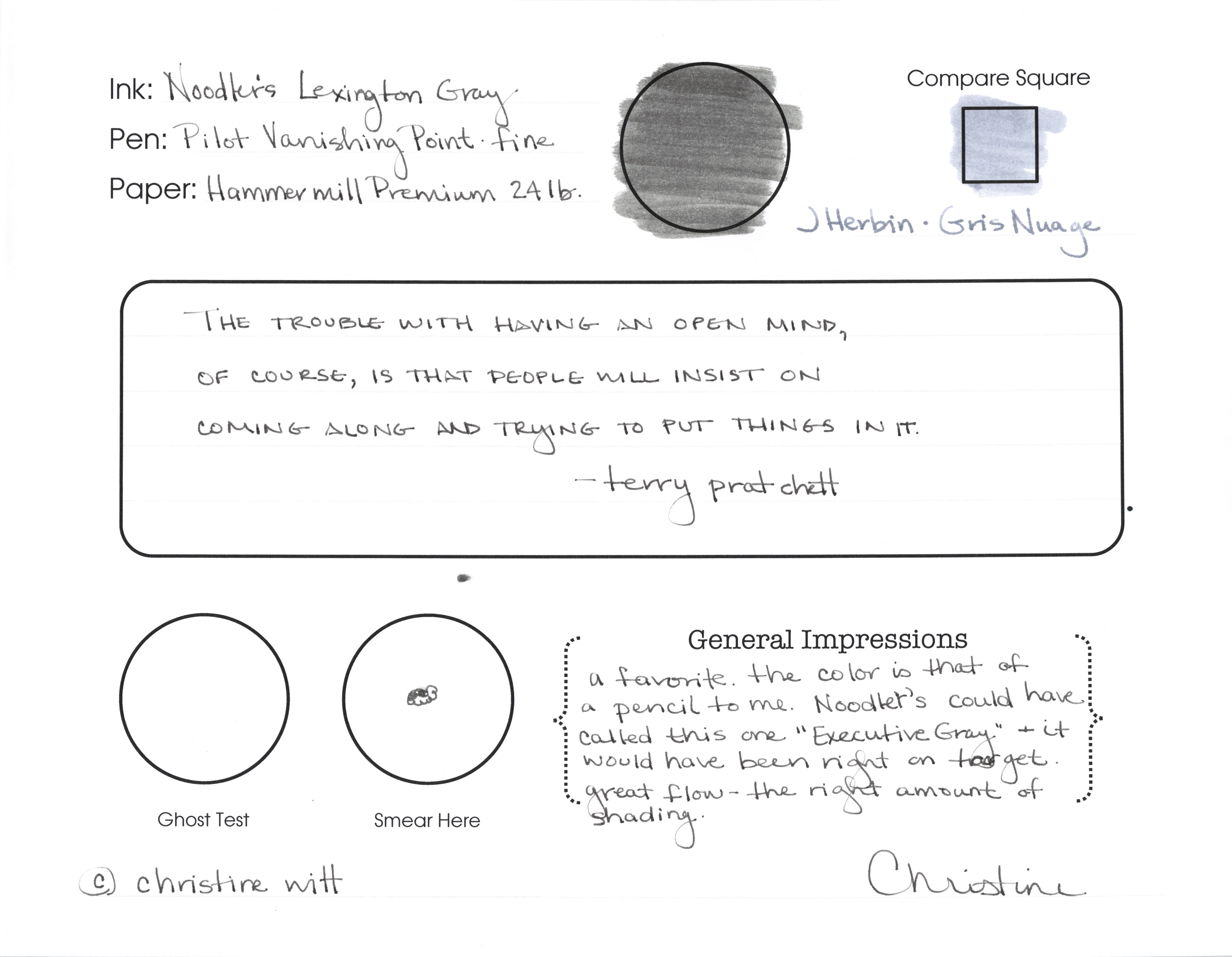
Anyway….Gris Nuage (Gray Cloud – how pretty!) is one of my very most favorite gray (grey, if you insist) inks.
It’s light – just like a cloud. It’s prettttttty. Leans more toward blue than red, but is definitely one of those pure colors that I adore.  
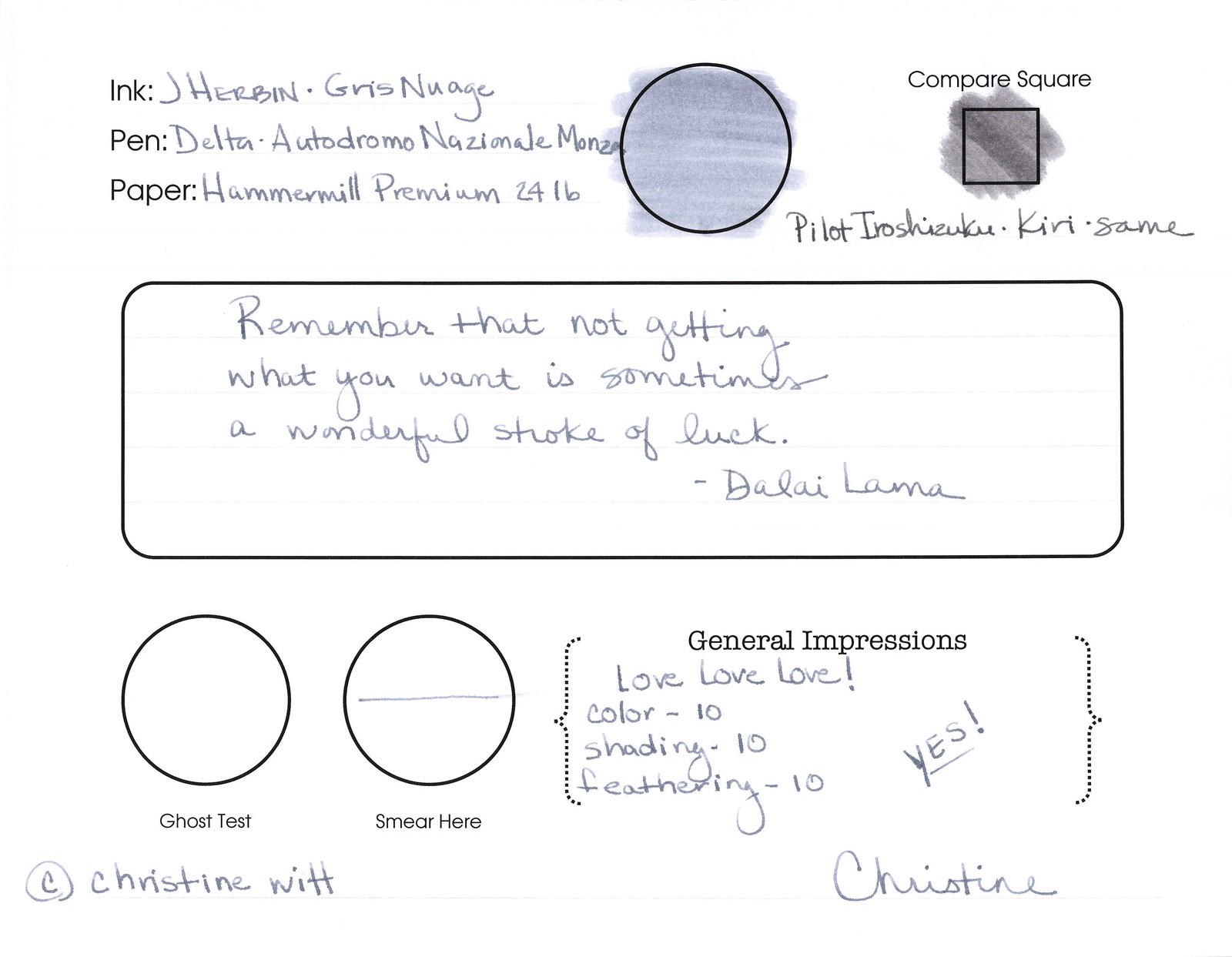
And, holy crappoli (it’s a word), it writes like a dream. Check it out….
Pretty, yes?  Some lovely shading going on there, too. And no smearing, no feathering, no ghosting, or bleeding. What more could a girl want in a gray ink?

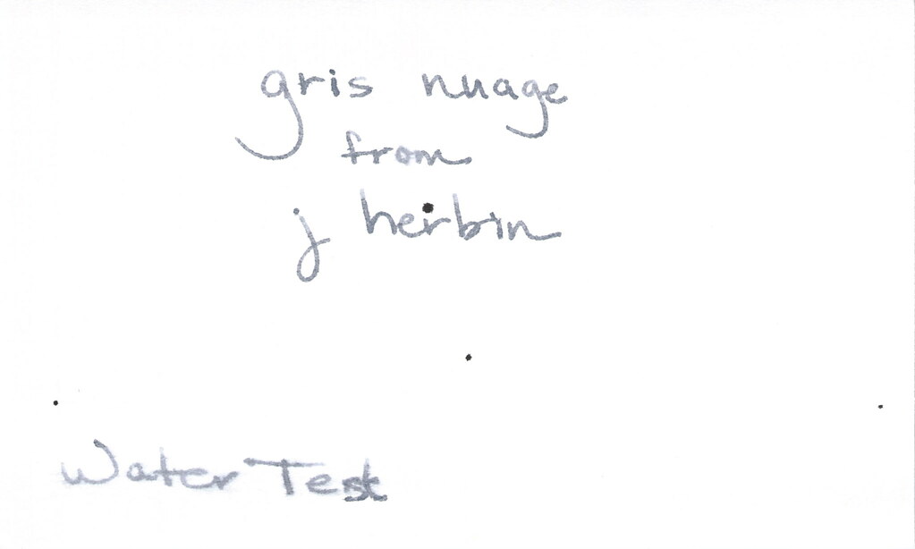
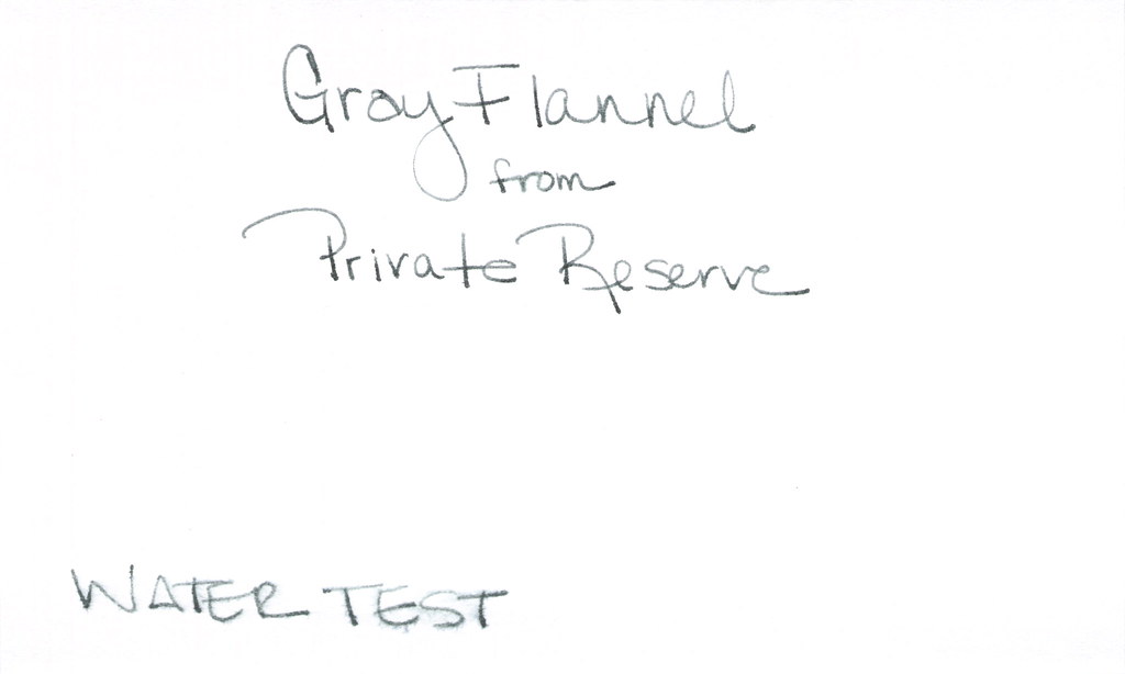
Oh, yes, it does well with water!  Nice!!!  This is totally one of my gray inks. It makes me swoon!

OK..so see those black specks on the water test?  No, it’s not Gris Nuage gone crazy – that’s collateral damage from my Invincible Black spatter. Haha!

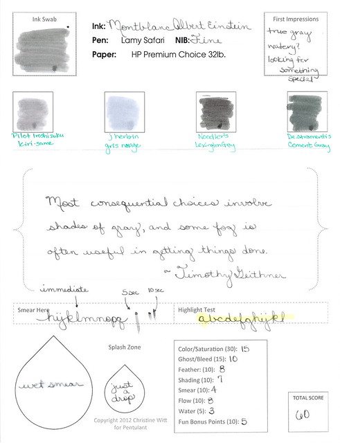
Do you have a favorite gray? Mr. Pentulant was using Montblanc Oyster Grey for awhile in his fancy new Boheme, but he wasn’t loving it.

INK REVIEW: Private Reserve – Gray Flannel

First impression?  It’s a little…green. We all know from other posts that I’m a bit of a purist when it comes to my ink colors. Not meaning that I only like blues and blacks – meaning that I like to look at a color and be able to say, “That’s gray!” (or, “That’s grey!” depending on from where you are in the world.) So..that’s definitely a strike against Gray Flannel from Private Reserve for me. A big strike, but let’s look at it more closely . . .
It passes the water test. I put a droplet of water where I’ve written “from” and that seems to have survived quite well. Where “Water Test” is written, I dragged a water-soaked Q-Tip. So. Yeah – not bad.

How does it write?

It’s fine. It really is, but I cannot get past that color. Look at how it compares to the J Herbin Gris Nuage. Nuage is a bit on the blue side, but the side-by-side comparison really shows who green the Gray Flannel is.

But..I digress…it writes well. Great flow, no smearing. I’ve been loving broad nib pens lately, but this performed really well in my vintage Parker (not sure of the model) with a fine nib.

So…it’s probably easy to see that I’m not all wound up excited about this ink. I’m not. With so many shades of green gray out there, I’m going to keep looking for the ones I swoon over.

I’ve asked before – but what are your thoughts about color? Purist like I am? Or mix-n-match is ok with you?

INK REVIEW: De Atramentis – Silver Grey

Really quick review for today…

Silver-Grey from DeAtramentis is one of my favorites from my Fifty Shades of Grey (Gray) post.

What I love…
..the name of the color matches the color of the ink!
..it’s a true gray – I don’t see any blue or red or green undertones
..no smear, no bleed, no nonsense

What I didn’t love so much…
..it smells a little funky (not like mold funk, but a definitely chemical / petroleum (?) smell. Something.
..maybe a little too fast-drying

I wrote with a glass dip pen for this test and you can see that things are a bit thin. I don’t think this is a necessarily a fair test of the ink for shading and ghosting.  I’ll need to retest at some point.  Maybe I’ll do a single post with all of the inks I’ve promised to retest at some point. It would be a doozy!
Have a great week, everyone!  xo