INK REVIEW: J Herbin – Gris Nuage

Here’s a quickie review of one of my favorite inks to get us back into the groove this week. (More on Thanksgiving another time.)
The above swab was done with a q-tip and then the name of the ink written with a glass pen. In my experience, there’s a lot of feathering with glass pens and this was no exception. (It also doesn’t help things that it’s written on a cheap-o index card.) (Again, I ask, are there are any nice index cards out there? Starting to think there aren’t.)
Anyway….Gris Nuage (Gray Cloud – how pretty!) is one of my very most favorite gray (grey, if you insist) inks.
It’s light – just like a cloud. It’s prettttttty. Leans more toward blue than red, but is definitely one of those pure colors that I adore.  
And, holy crappoli (it’s a word), it writes like a dream. Check it out….
Pretty, yes?  Some lovely shading going on there, too. And no smearing, no feathering, no ghosting, or bleeding. What more could a girl want in a gray ink?

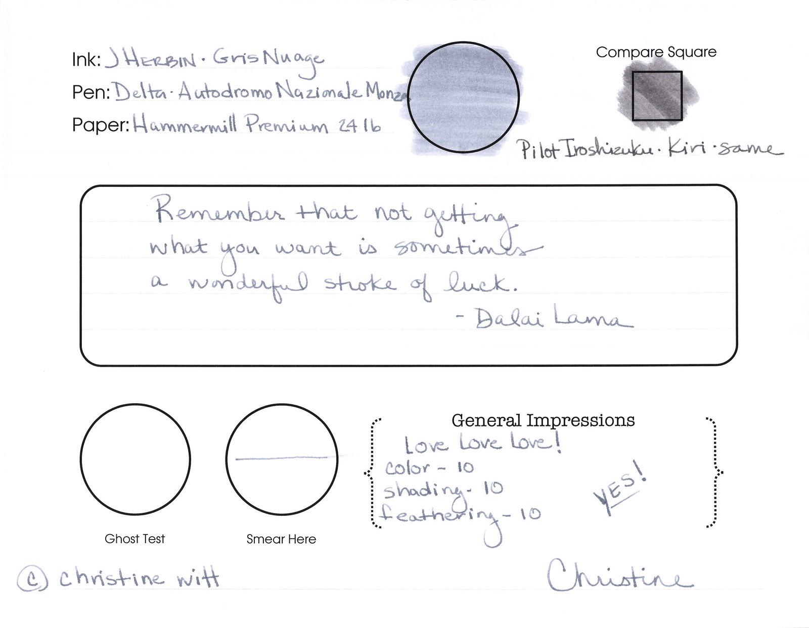
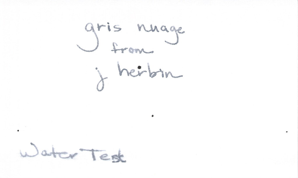
Oh, yes, it does well with water!  Nice!!!  This is totally one of my gray inks. It makes me swoon!

OK..so see those black specks on the water test?  No, it’s not Gris Nuage gone crazy – that’s collateral damage from my Invincible Black spatter. Haha!

Do you have a favorite gray? Mr. Pentulant was using Montblanc Oyster Grey for awhile in his fancy new Boheme, but he wasn’t loving it.

INK REVIEW: Private Reserve – Gray Flannel

First impression?  It’s a little…green. We all know from other posts that I’m a bit of a purist when it comes to my ink colors. Not meaning that I only like blues and blacks – meaning that I like to look at a color and be able to say, “That’s gray!” (or, “That’s grey!” depending on from where you are in the world.) So..that’s definitely a strike against Gray Flannel from Private Reserve for me. A big strike, but let’s look at it more closely . . .
It passes the water test. I put a droplet of water where I’ve written “from” and that seems to have survived quite well. Where “Water Test” is written, I dragged a water-soaked Q-Tip. So. Yeah – not bad.

How does it write?

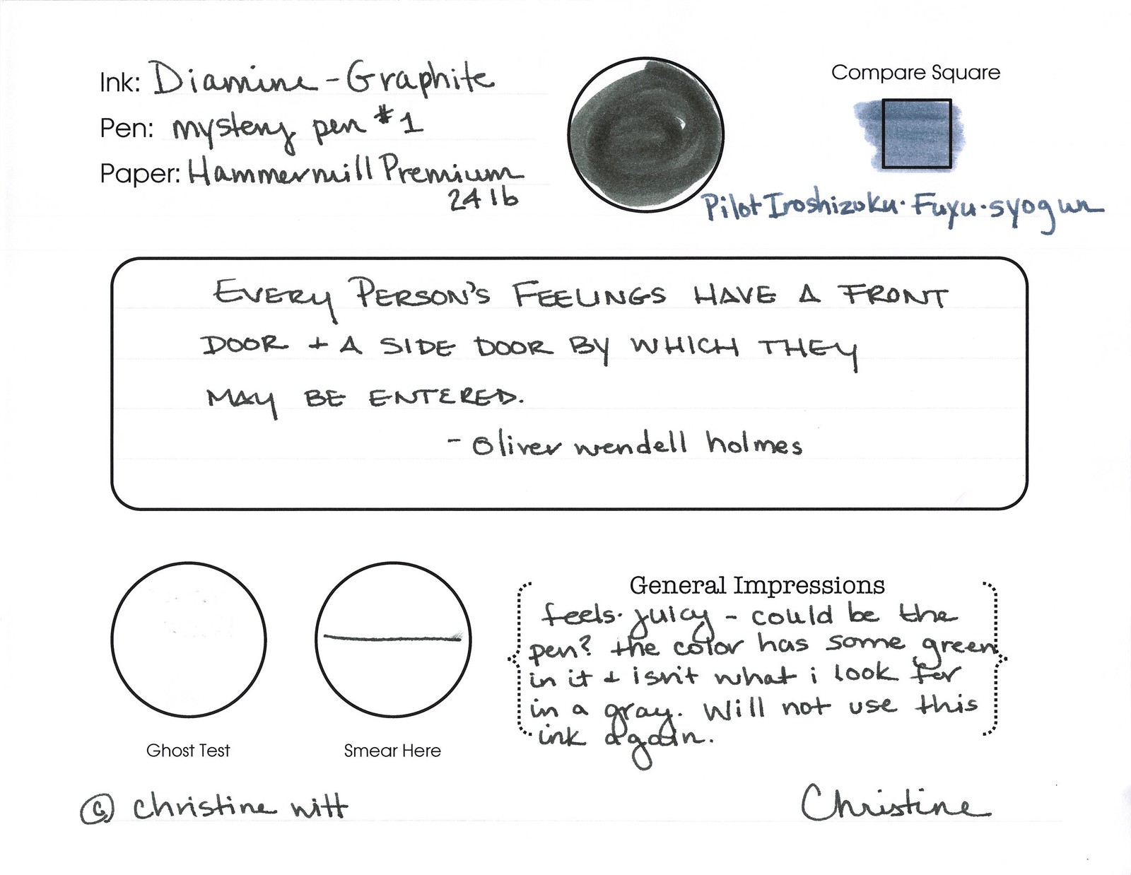
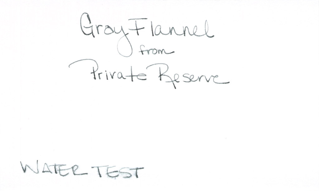
It’s fine. It really is, but I cannot get past that color. Look at how it compares to the J Herbin Gris Nuage. Nuage is a bit on the blue side, but the side-by-side comparison really shows who green the Gray Flannel is.

But..I digress…it writes well. Great flow, no smearing. I’ve been loving broad nib pens lately, but this performed really well in my vintage Parker (not sure of the model) with a fine nib.

So…it’s probably easy to see that I’m not all wound up excited about this ink. I’m not. With so many shades of green gray out there, I’m going to keep looking for the ones I swoon over.

I’ve asked before – but what are your thoughts about color? Purist like I am? Or mix-n-match is ok with you?

INK REVIEW: De Atramentis – Silver Grey

Really quick review for today…

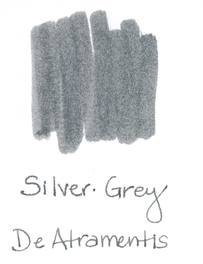
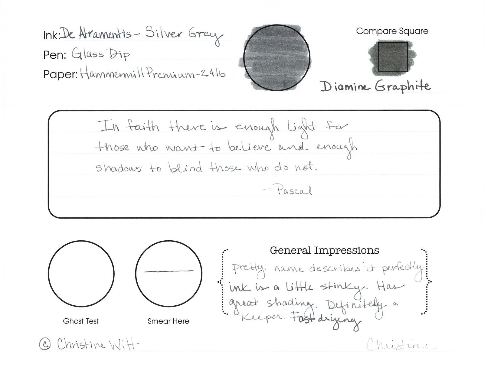
Silver-Grey from DeAtramentis is one of my favorites from my Fifty Shades of Grey (Gray) post.

What I love…
..the name of the color matches the color of the ink!
..it’s a true gray – I don’t see any blue or red or green undertones
..no smear, no bleed, no nonsense

What I didn’t love so much…
..it smells a little funky (not like mold funk, but a definitely chemical / petroleum (?) smell. Something.
..maybe a little too fast-drying

I wrote with a glass dip pen for this test and you can see that things are a bit thin. I don’t think this is a necessarily a fair test of the ink for shading and ghosting.  I’ll need to retest at some point.  Maybe I’ll do a single post with all of the inks I’ve promised to retest at some point. It would be a doozy!
Have a great week, everyone!  xo

INK REVIEW: Diamine Grey

Click Images to Enlarge
A quick look at Diamine Grey..
This color is a true gray (grey, for those of you who insist).  Stately and professional as I said in my Fifty Shades of Grey post last month.
It’s a bit darker than I like. If I’m going to get that close to black, I may as well go black.  
It smeared a bit on my Hammermill Premium paper, but it’s tolerable. Some shading is nice. Tiny bit of feathering – even on the index cards below.
The water test is a fail – not so much from the Q-Tip across “Water Test,” but more from the standing test in the word “from” below.  

But..it is a true gray (ok, grey!) and I do appreciate that.

I’m not going to buy a full bottle of this ink (testing was done from a sample as usual). There’s just nothing that special about it.

Tyler Dahl LOVED this ink. A true sign that YMMV.

Have you tried it? What do you think? Wonderful or just meh?

UPDATE:  For some odd reason, this post received a whole big mess of spammy posts. I’ve closed comments on this post, but please contact me if you have something to add to the conversation! xo

INK REVIEW: Pilot Iroshizuku – Kiri Same

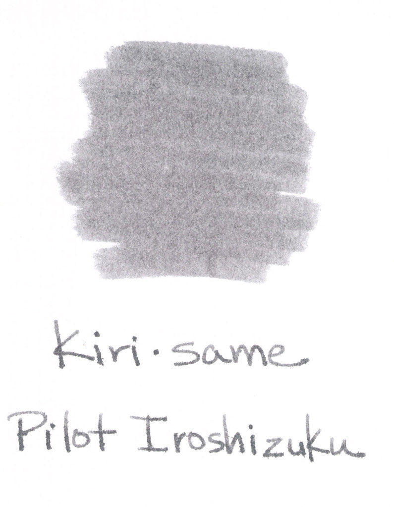
Kiri same from Pilot Iroshizuku is such a pleasing shade of gray.  I like my gray inks to look as much like pencil as possible – so that the reader may even wonder if I’d written in pencil. A simple fine line. Mmm. This one fits the bill, but when compared with other grays – it seems to have some red qualities to it. It’s probably not enough red to notice when the ink is on its own, but the red is definitely there.

The above swab is on a cheap index card (really, are there any quality index cards out there these days?). The feathering on the index card had me concerned, but look below at the water test – no feathering, no smearing.  For the water test, I write, wait a few seconds, and then drag a moistened Q-Tip across the writing. I also place a water droplet on the card – in this case, it’s on the L in “Pilot” – crazy, right?

Pricing is the same as the other Iroshizuku inks – $28 at most places. 
I like the hint of shading, too. Some feathering on my Hammermill Premium paper, but you have to get pretty close to see it. Definitely not something that would keep me from enjoying this ink.
This one is a temptation! I’m going to plan to try another sample. Perhaps on a variety of papers. And then I’ll know. Is this my gray?  Which is your gray (or is it grey)? I answered that question last week.
Here’s what other people are saying . . . 
Fountain Pen Network  (look at that shading!)

Seize the Dave (the essence of storm clouds in a bottle)

Grays are a favorite color for me. Love, hate, or indifferent – how do you feel about gray ink?

Fifty Shades of Grey Ink, Part 1

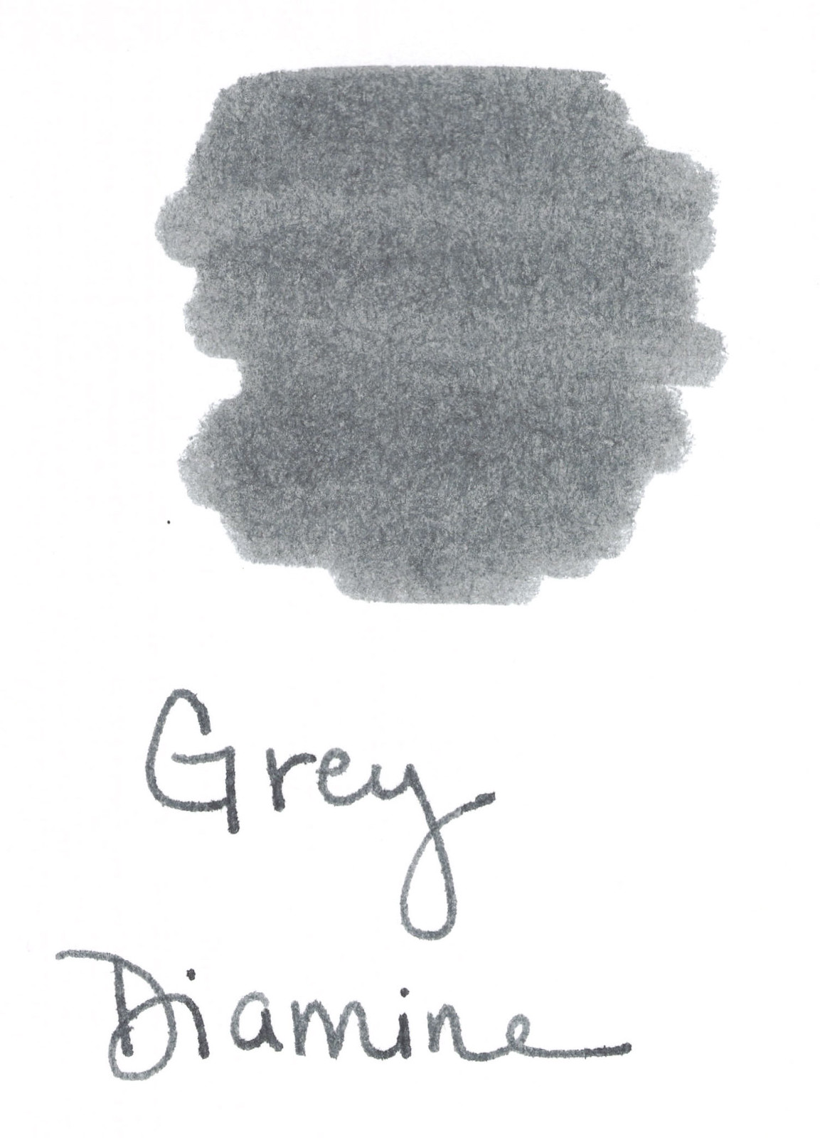
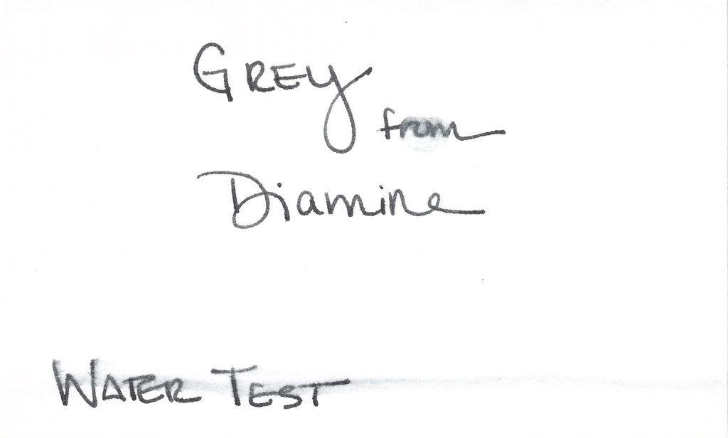
Grey from Diamine so stately and professional. A good basic grey.
I’m not even close to having Fifty Shades of Grey ink. Do 50 different greys even exist? Wonder how long it will take me to find out. Wonder how much fun I’ll have finding out!
Full reviews of each of these inks coming another time. This time, it’s just for fun.
Pilot Iroshizuku Kiri-same – delicate (hints of red)

I’ve been loving the Iroshizuku inks lately. Have you tried any? Highly recommended. And the bottles? Gorgeous!

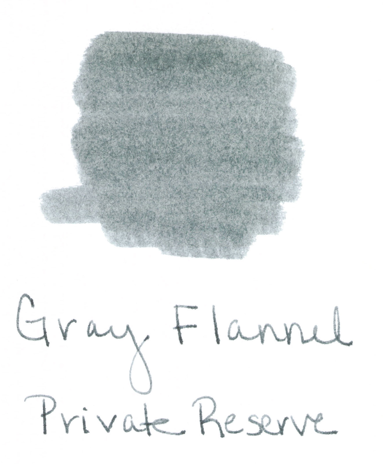
Private Reserve Grey Flannel – Regular ole grey (with bits of green?)
You know what I wish? I wish the entire world could get together and decide on just one spelling for grey/gray. My preference (like Private Reserve’s) is “gray.” It just makes more sense, yo.
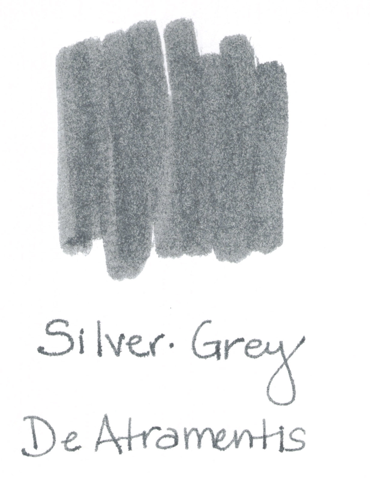
DeAtramentis – Silver-Grey – Nice classic shade
DeAtramentis Silver-Grey definitely looks more grey to me than silver. This isn’t to slight Silver-Grey in any way, it’s perfectly lovely.
You know what else I wish? I wish my images were all the same size. They were all scanned the same and they are all on 3×5 index cards. Still, the safe bet is that it has something to do with something I’m doing wrong. Probably with Flickr. I’m no Flickr expert even though it’s been around for ages.

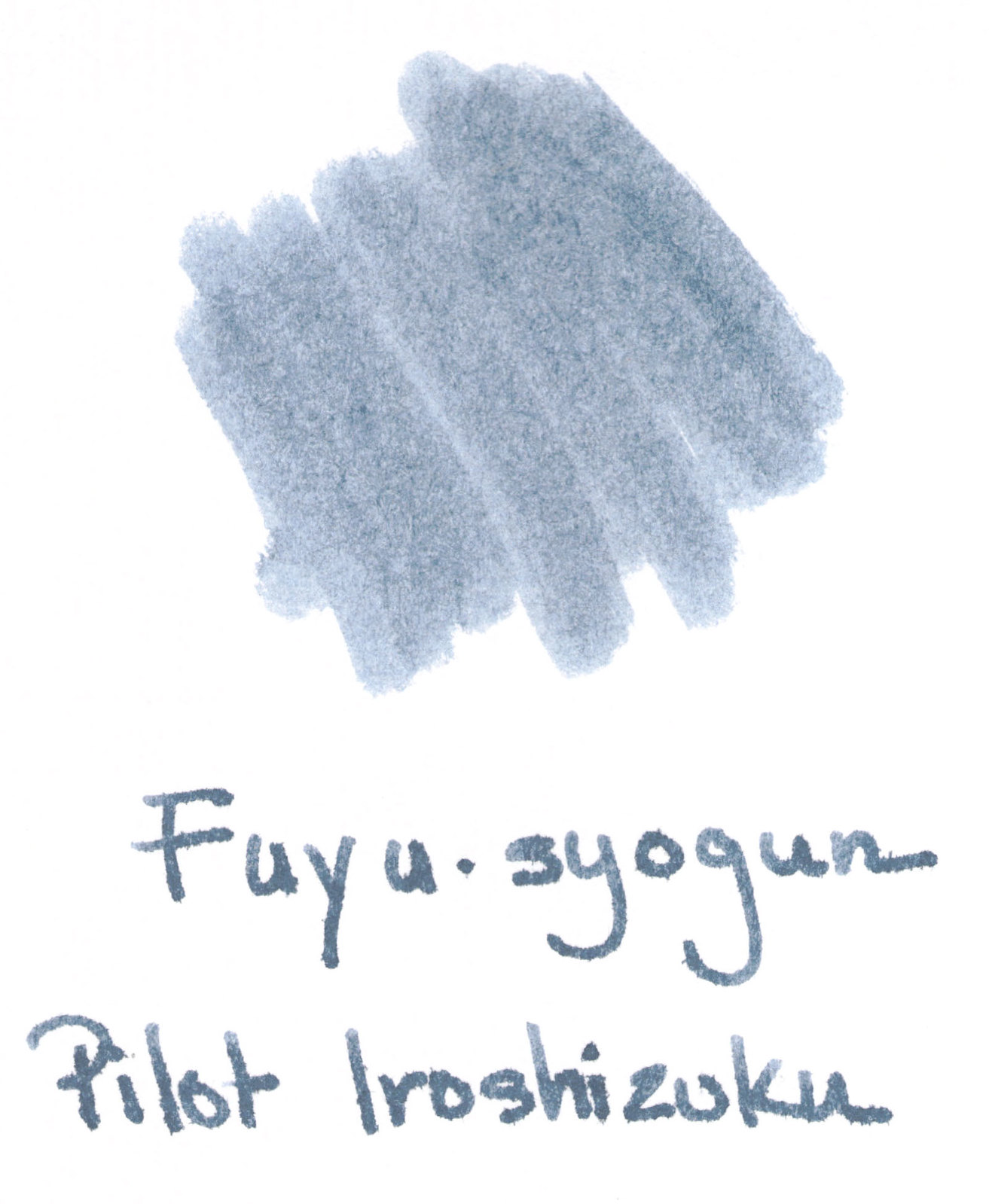
Pilot Iroshizuku Fuyu-syogun – soft and a bit blue
How pretty is Fuyu-syogun? So pretty that it made my Wish List.  It is perfect – not too black, not too blue. Delicious. (Wait..how did I create this ink swab if I don’t own the ink? I bought a sample from Goulet Pens, of course.)
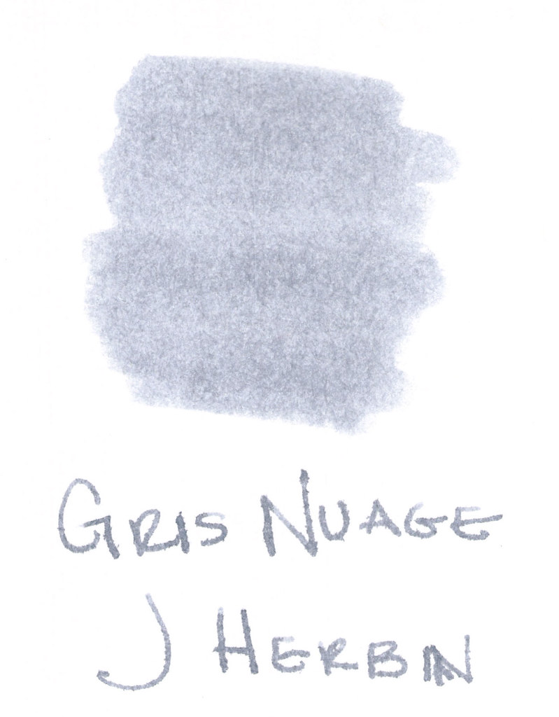
J Herbin Gris Nuage – delicate
Gris Nuage is a beautiful gray. I always call it New Age Gray in my head. Funny, right? Nuage is actually the French word for cloud. 
Definitely has some blue / silver qualities to it. For some reason, I think this color belongs in weddings; it’s such romantic shade, isn’t it? I ran into some trouble with this ink during a test run – but I’m not ready to give up on it. More on that another time.
So..that’s six of fifty. A lofty goal, but I’m confident I can find 44 more shades of grey and I can’t wait to show you.
My favorite grays definitely lean toward the silver/blue side of things. Grays with too much red end up looking muddy to my eye. I’m a purist when it comes colors. I want to look at a color and say, “That’s gray!” Not, “Oh. Is that gray?”
And on the (mostly internal) debate about grey versus gray. The Grammarist says either is right, though gray is used more commonly in the US – and I guess that explains my preference.
Which are your favorite grays? Have you read Fifty Shades of Grey?