PEN REVIEW: Pilot Parallel 6mm

I’m just going to blurt it out: I love this pen.

Let’s dive in . . .

I have two Pilot Parallel Pens – around ten bucks each, yo. I opened and played with both, but only inked the blue 6mm version.

Above: The pen comes with two Pilot proprietary ink cartridges (one red, one black) and a converter. These inks are mixable. I don’t get into it here, but Rachel Goulet has a terrific video that you should watch.

Converter? For cleaning the pen unit? Huh? What the heck? While I don’t know yet if it will help with cleaning, I am sure that the converter cannot be used for ink. The seal is not nearly sufficient to keep ink in the converter. Strongly suggest not trying it, but please take pictures if you decide to go for it – I love a beautiful mess.

My understanding is that the Pilot CON-50 converter will work with this pen. I plan to find out. Because, really, imagine big fat shaded or sheen line? Oooh…or maybe Diamine Flamingo Pink?

The Pilot Parallel also comes with a handy Nib Cleaner (it’s a piece of film that slips between the plates of the nib) and a somewhat informative instruction sheet.
I love this picture – the reflection of my yard, my fingerprint – what’s not to love. 

The Parallel is available in four different sizes. The different sizes have different colored caps. They are:

  • Blue                        6 mm
  • Green                   3.8 mm
  • Yellow                  2.4 mm
  • Red/Orange          1.5 mm
The size of the nib is clearly marked in a couple of places . . . .
The nib is made up of two plates that are parallel to one another. 
Get it? Parallel.


But how’s it write?

Wheeeeeee!  
I love it! 
I was worried that the writing would be too wet – it’s not. The flow is terrific and on good paper, there was no bleeding.  After playing with it a bunch initially, I find that I’m using it for a few things:
  • separating topics/sections on a page 
  • crossing items off of my to do list
  • writing short (very short) love notes to Mr. Pentulant
It’s a fun pen. For regular use, I might change the ink to a bright yellow and use it a highlighter. Fun, yes?
Downsides . . . 
  • the pen cannot be posted – come on, pen manufacturers, help a girl out
  • doesn’t come with a converter that can be used for ink – arrrgh.
Highly recommended!  
One of my Pilot Parallel pens came from Goulet Pens. The other came from Jet Pens. Goulet’s price is less. Bought and paid for with my own pennies out of own piggy bank. 


Have you tried one of these? Do you love it?

PAPER REVIEW: Mnemosyne B5 Notebook by Maruman

Shopping for paper online is wonnnnderful. Shopping for paper in a store is like, whoa.

Feeling the creaminess of the paper. Studying the color of the lines. Pondering the lay-out and line width. Comparing sizes, and bindings, and covers, oh my.

I found this Mnemosyne B5 Notebook by Maruman at Maido in Japantown, San Francisco. I love that store. I could move in there. (Especially because there are noodle and mochi shops nearby. Yum.)

This notebook is a B5 size. It measures 176 x 250 mm. That’s 6.9 x 9.8 inches for those of us who don’t speak millimeters. Such a pleasing size. Neither too long nor too wide. It can be laid open on the corner of a desk without being too much in the way.  Fold it over on itself and it’s not too big to be held in one hand. I’m digging B5.

This yellow sheet is the first page in the notebook. It looks like instructions, but it’s in Japanese. And it’s a little confusing at first glance because these pages do not have vertical lines, but this example page does. What the heck?

It turns out that there are teeny-tiny very light vertical marks on the paper near the header and then again at the bottom of page to help us create tidy vertical lines on the paper. If you want to, that is.

You can see one of these little marks in the picture below.  Such a nice touch – love the easy flexibility.

Each of the 160 pages (80 sheets) has gray dotted lines that are spaced 7mm apart. Every ten lines, there is a heavier solid line. These heavier lines lines divide the writing part of the page into three equal sections. These lines are not so intrusive that you have to use them, but they’re there if you want to. Again, easy flexibility.

The paper is white, but not screaming bright white
The binding is wire-o. Pages are perforated.

But…how does it perform?  Check it out . . .

No feather, no bleeding, tiny amount of ghosting (show-through).

The paper on top of the writing sample is Clairefontaine 90gsm. The Mnemosyne is definitely a softer white.  The paper is buttery smooth with an expensive look and feel.  I paid  $8.95 for the notebook and while that’s a lot when compared to a Mead notebook, it’s about what I’d expect to pay for a premium product.

Bottom Line:  I love this notebook and can definitely see using it for work notes or at home for planning or maybe even scribbling down quotes I love.

If you’re not near a store that carries Maruman products, JetPens has it – for around $15. (Making me feel like I got a pretty good deal!)

Tell me which notebooks you love? And do you love B5? I asked on Instagram and A5 seems to be more popular.

//instagram.com/p/rF4Idqm2QO/embed/

INK REVIEW: J Herbin Lie de The

I don’t like brown inks. It’s been documented right here on this blog.  
Delta Brown, what’s the flower you have on? It’s brown.
Chocolat from Private Reserve? I said I liked it, but I don’t. I never bought a bottle like I said I might.
I don’t like brown inks. Really, I don’t!! 
J Herbin Lie de The
Why try again? Well, I have just about every other color group represented in my currently-inked pens and the Kaweco Sport I wanted to use is blue.  I’ve always thought brown and blue look great together. Leather and denim, right? Can’t just be me.
Anyway . . .
Best. Brown. Ever. 

I’m a convert. I have seen the light brown and I like it. I love it.  My gosh, look at that shading.

The color is wonderful. Not too dark, not too light. I’m not seeing any of that red that turned me away from some of the other browns I’ve tried. There’s definitely some yellow in there, though.
It writes fantastically. No flow issues (consider that I was using a BB nib). Dry time was a little long (that nib was laying down some serious ink). 
There was no feathering, bleeding, or ghosting with Clairefontaine paper. There was all of the above when I touched the nib to some cheapie cheap-o paper.  I don’t know if that’s more because of the paper or the ink, but there you go.

I’m adding Lie de The to my inky wish list.
Here’s the full review. Click here to see the full-size image (it’s big).  

OK…speak up….brown ink. Are you in or out? Do you like browns that lean toward the yellow or more toward red?

xoxox

P.S. I rarely look at other reviews before I write my own, but will sometimes check them out after. There are lots of reviews on Fountain Pen Network that talk about how green Lie de The is. I don’t see that. I don’t see that so much that I wonder if the formulation has changed. When I look at the swabs on both Goulet Pens and Zeller Writing, I don’t see green.  Do you?

PEN REVIEW: Montblanc 145 Rose Gold – Meisterstuck 90 Years Anniversary Fountain Pen

It has been busy around here the last couple of weeks!

Mr. Pentulant graduated from his masters program, went on a short vacation, celebrated my birthday while we were away, and Mr. Pentulant started his fancy new job. Busy!

Above is one of my birthday gifts from the mister.  The pen is actually sitting on top of the box in that picture.  Here is the box without the pen . . .

I find it interesting that it’s the 1912 Heritage (or perhaps the original safety pen?) on the sleeve. Also, my understanding from the Montblanc Facebook Page is that the shiny rose gold sleeve is only available for a year.

While I generally am not a huge fan of rose gold, there are so many things to love about this pen – the rose gold is deep and warm, the detailed design of the nib engraving, and (of course) the superb quality and reputation of Montblanc – it was definitely on my wish list.

Mine has a fine nib.  Even the sticker is rose gold . . .

And Mr. Pentulant correctly guessed that I would want a 145 – smaller-sized than the iconic 149 and with a converter rather than piston.

I couldn’t wait to ink it up.

It’s a great pen – the style, the writing. It sounds cliche, but the this pen really is an instant classic.

INK REVIEW and COMPARISON: Yama-budo -vs- Black Swan in Australian Roses

 
-vs-

Back in January, I did a quickie review of Noodler’s Black Swan in Australian Roses (BSIAR) – I didn’t love it. I didn’t hate it.  A week or so ago, I received a larger sample of it along with a sample of Pilot Iroshizuku Yama-budo.

I’d heard so many wonderful things about about Yama-budo that I didn’t wait too long to ink my Pelikan M320 and take it for a spin.

And because I was inking pens, I inked a Lamy Al-Star with BSIAR and decided to compare and contrast it with Yama-budo.

In each of my pairs of writing, Yama-budo will be on top.

The color of each reminds me of grapes. I’d originally said that BSIAR was bordeaux in color and my first thought about Yama-budo was that it reminded me of melty grape sorbet. In looking at the colors right next to each other, I’m confident with each of those descriptions. Yama-budo looks fresh and BSIAR has a more aged look to it. Yama-budo is a bit brighter while BSIAR has a little muddiness to its darker color.

Shading? They both shade, but there seems to be more variation with Yama-budo. Yama-budo goes from an almost bright pink to a deeper purple color while BSIAR seems to remain various shades of the same color.

Saturation is about equal (and very good) with both inks.

I experienced no trouble writing with either ink. Flow was good, neither was excessively wet nor dry. Each is a good quality ink.

There’s no feathering, or bleed through with either. Yama-budo did have some ghosting on Clairefontaine paper, but just when dotting the letter i in a couple of places – so minor that I almost didn’t mention it.

Yama-budo was more likely to smear right out of the gate, but by the time 30 seconds had passed, things were just about even.

Again, Yama-budo on top and BSIAR under . . .

I regularly write in all caps…

Here’s the entire review sheet . . .

Click Here to see it full size (it’s huge).

So, what’s my bottom line?  I’ve ordered a full-sized bottle of Yama-budo. While the color difference isn’t huge, the brightness and amount of shading made all of the difference for me.

There are so many ink choices out there that it is the subtle things that make all of the difference between “just ok,” and “love it!”

Having said that, if you like the color of each of these inks and the brightness doesn’t matter that much to you (or maybe you even prefer the darker color?), save yourself the bucks and go with Black Swan in Australian Roses. Goulet Pens (no association except I spend so much of my paycheck there) sells BSIAR for less than half of what Yama-budo goes for.  ($12.50 -vs- $28, respectively)

What do you think?  Black Swan in Australian Roses or Yama-budo?  Neither? Both?

FOUNTAIN PEN REVIEW: Montblanc Heritage 1912

I’m in love.

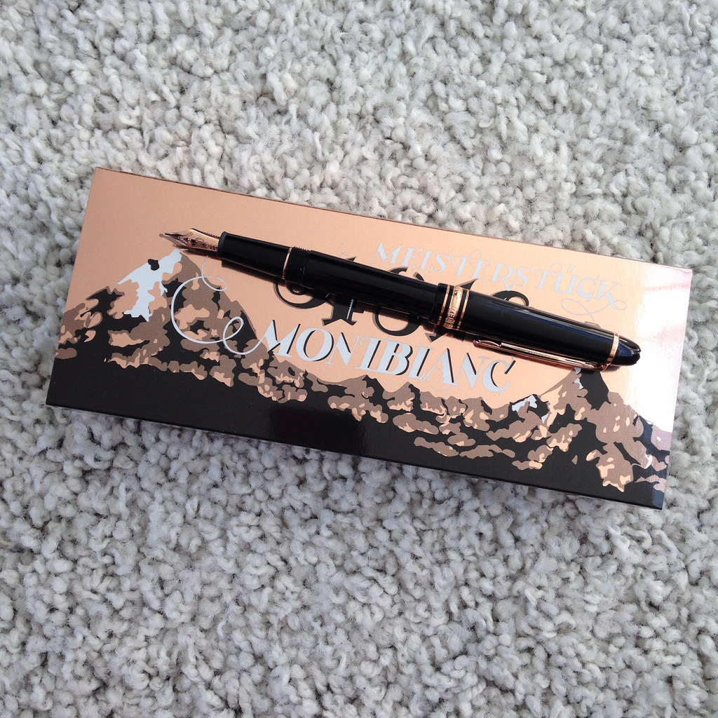
Like any normal fountain pen lover, there are a great number of pens that I have my eyes on at any given time. When the Montblanc Heritage 1912 pen was released, I knew I was attracted to it and I knew right away that it would find its way to my wish list, but I didn’t know I’d end up with it!

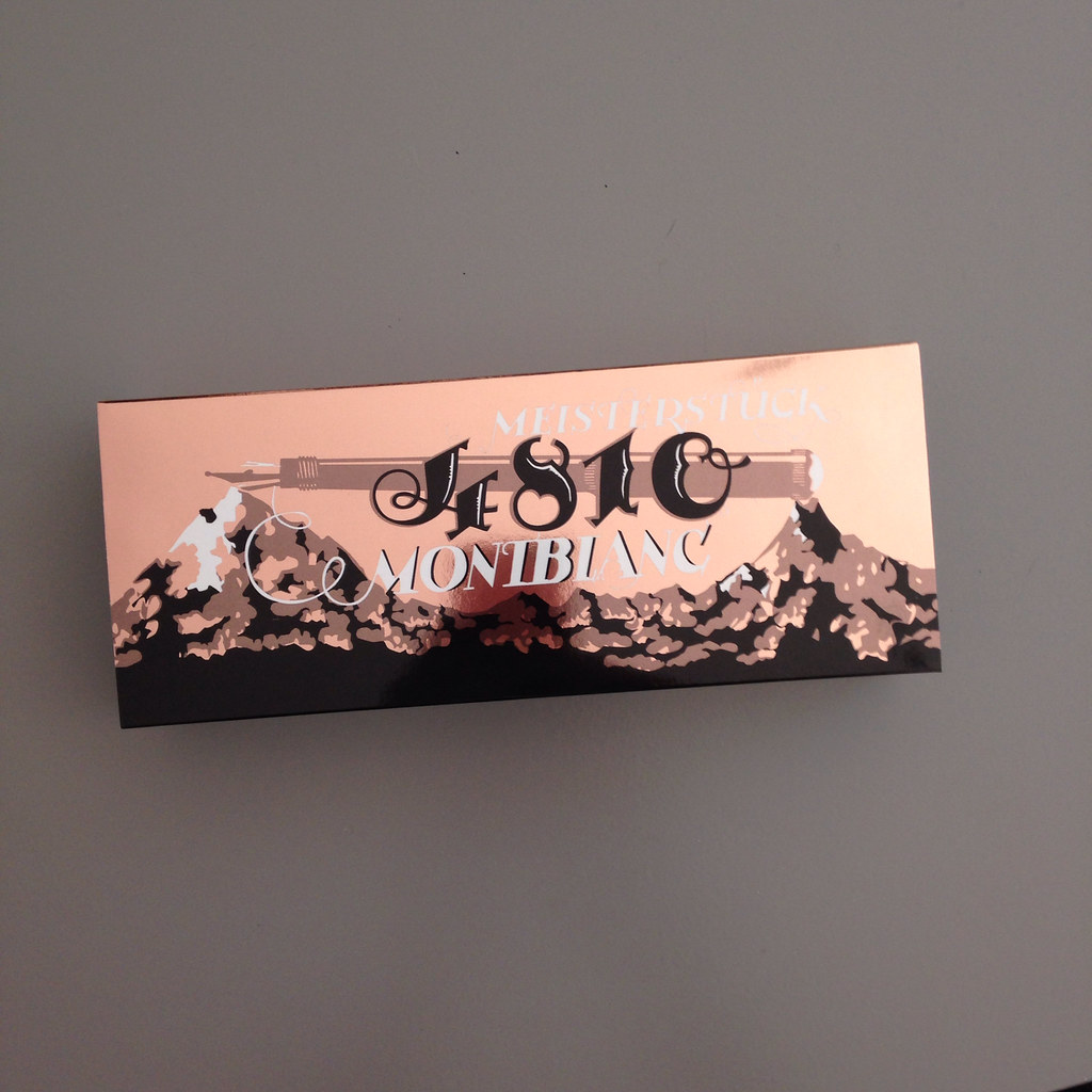
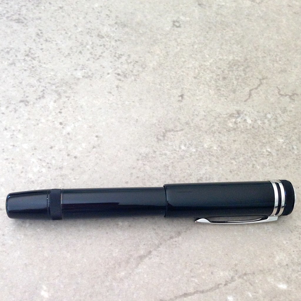
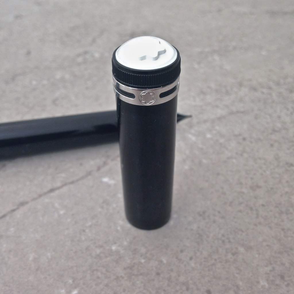
I mean, seriously, look at this thing . . .

Yummy goodness, right?  (Side note – all of the pictures except the one directly above are my own. The one above is from the Montblanc website. You can tell because their picture is perfect and mine are not.)

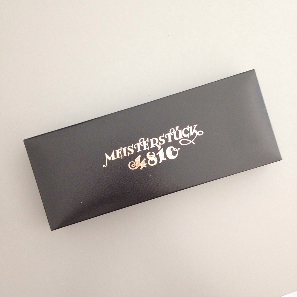
I received this pen as a late Christmas gift from a friend. When I opened the wrapping and saw the box, I’m pretty sure I gasped. Or maybe squealed. Probably both.

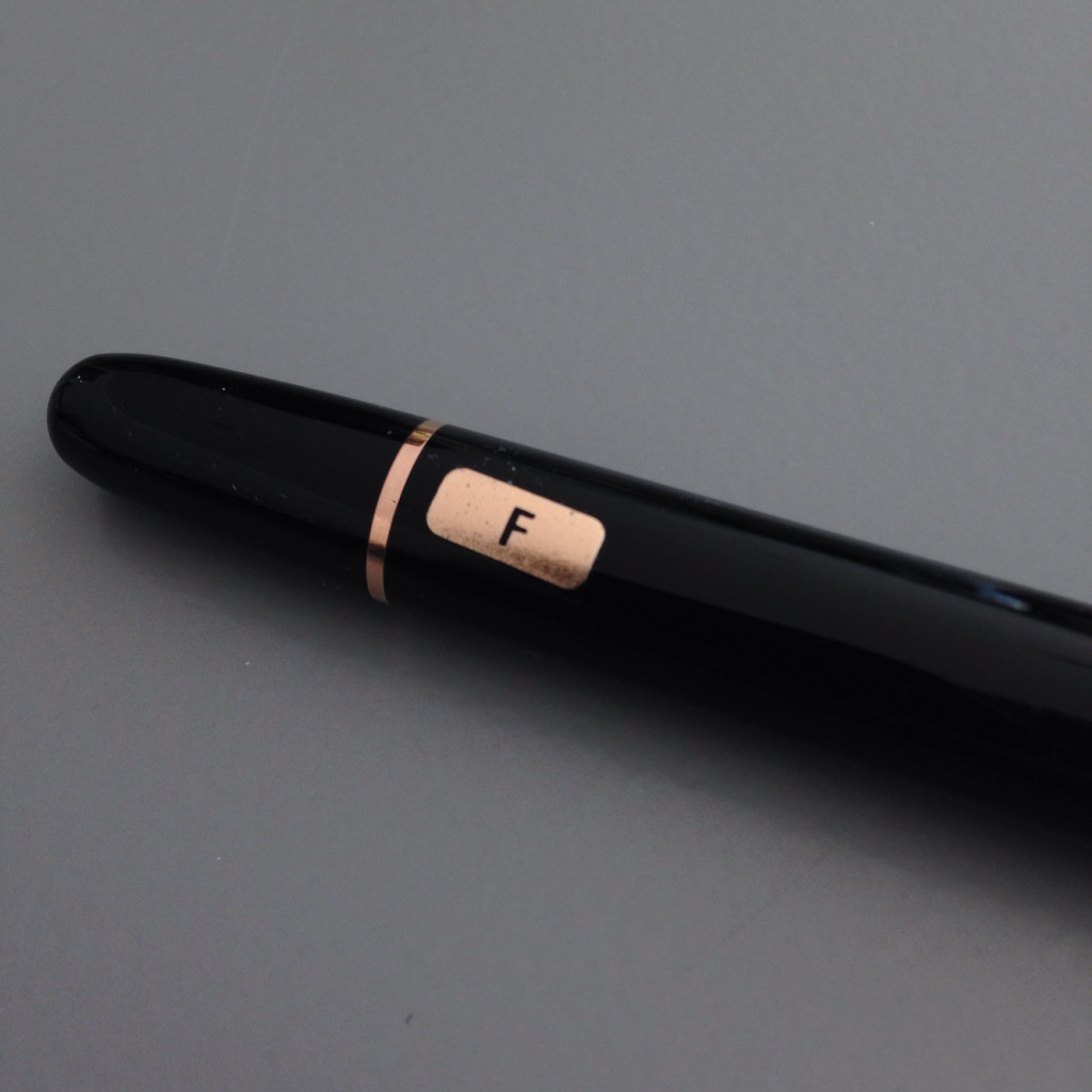
About the Heritage 1912 . . . 

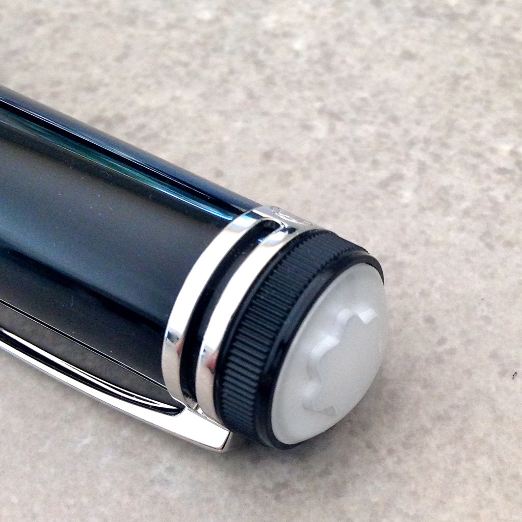
The design is inspired by the Montblanc Simplo Safety Filler – one of the first fountain pens. (Crazy, right?) The Simplo was small in size, had a retractable nib, was made of hard rubber, and had a rounded white-tipped cap. I actually held one of these at a pen show a long time ago.

The original Heritage 1912 was a limited edition of just 333 pieces and was made of titanium. It’s gorgeous, but has a scary (for most people) price tag.

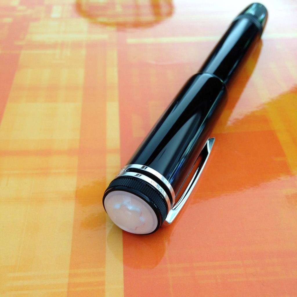
This precious black resin version of the pen has similar qualities . . .

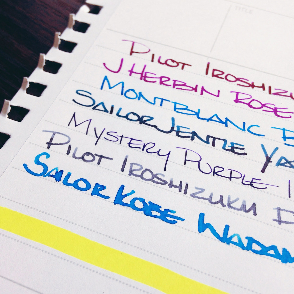
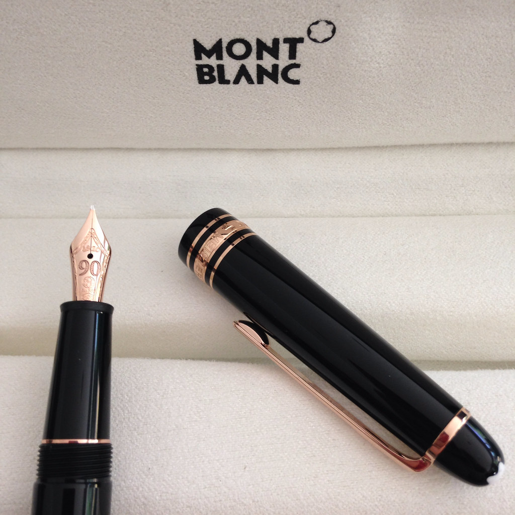
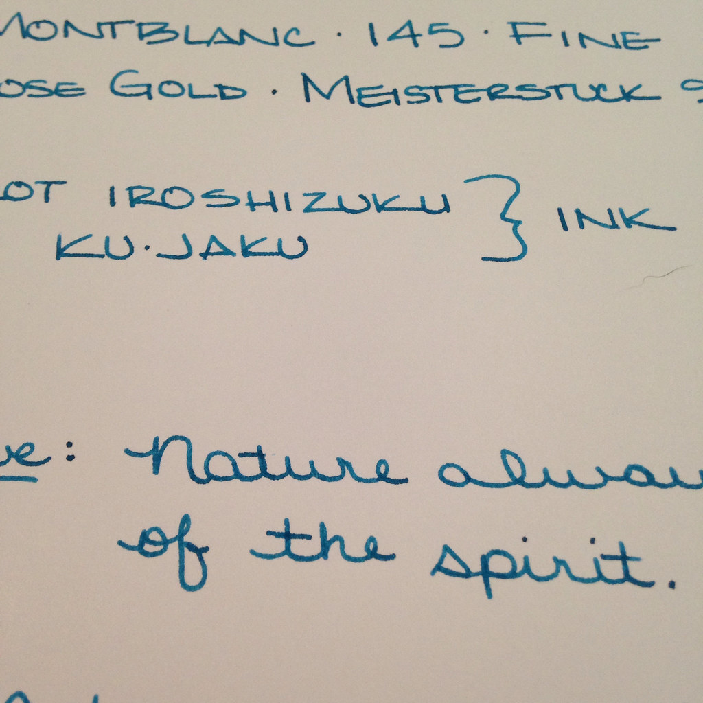
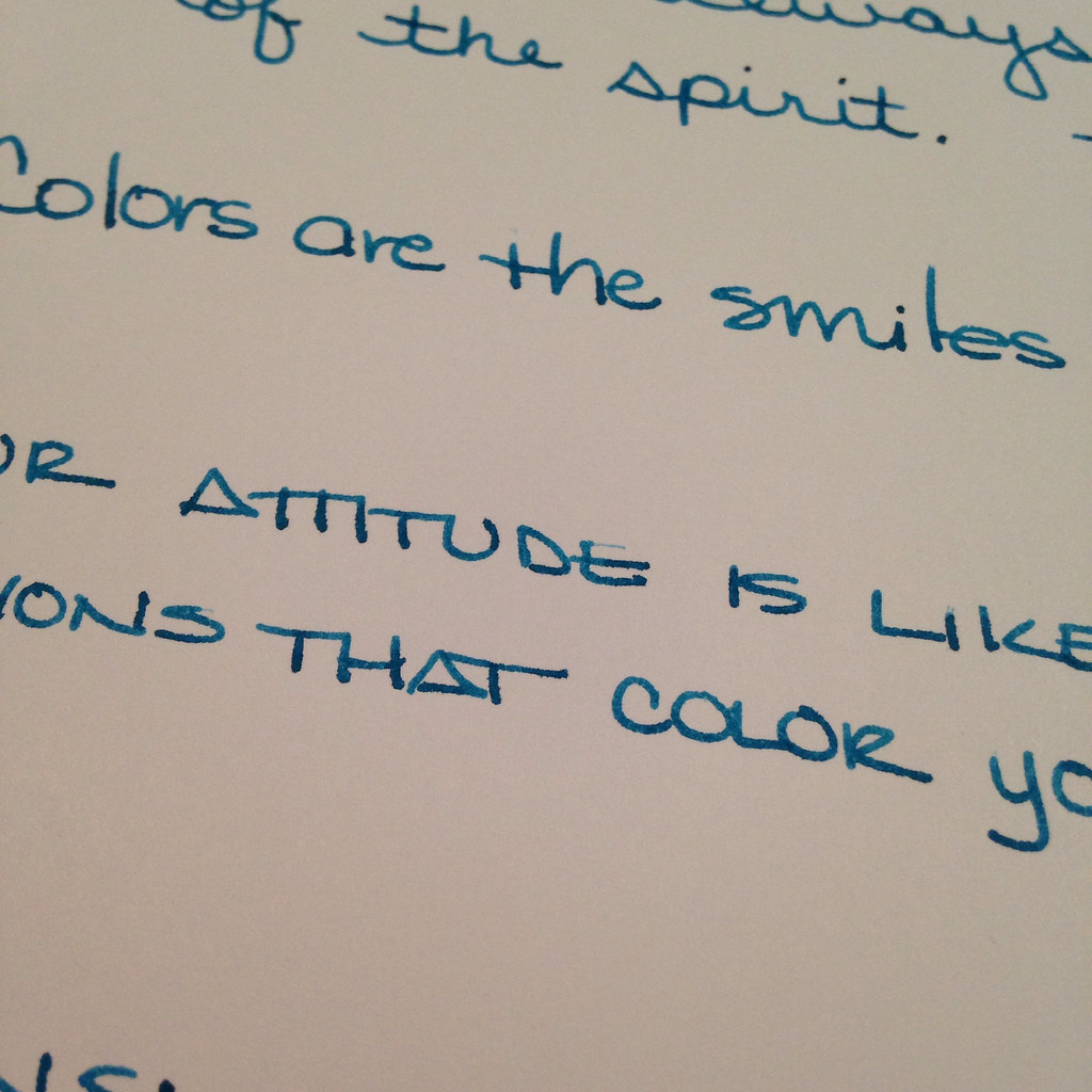
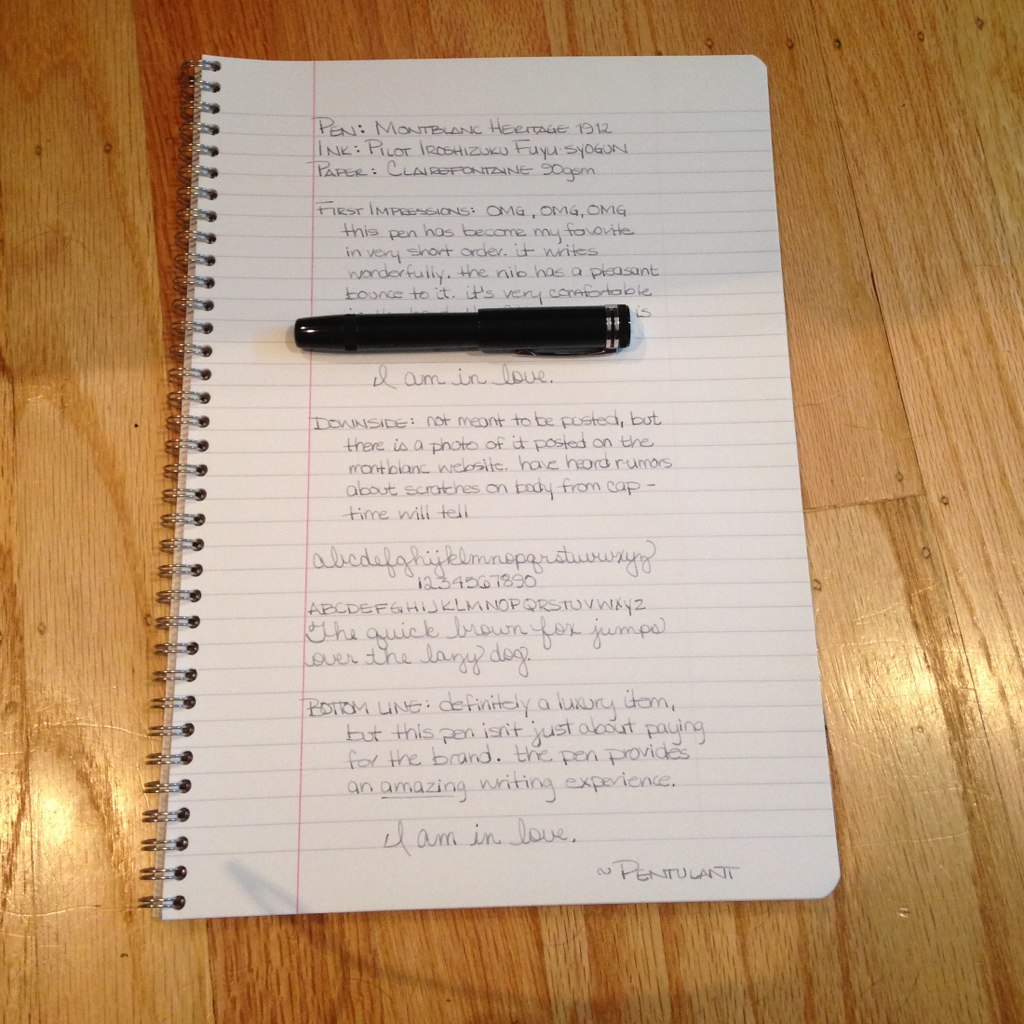
It’s a beauty. And then I wrote with it . . .

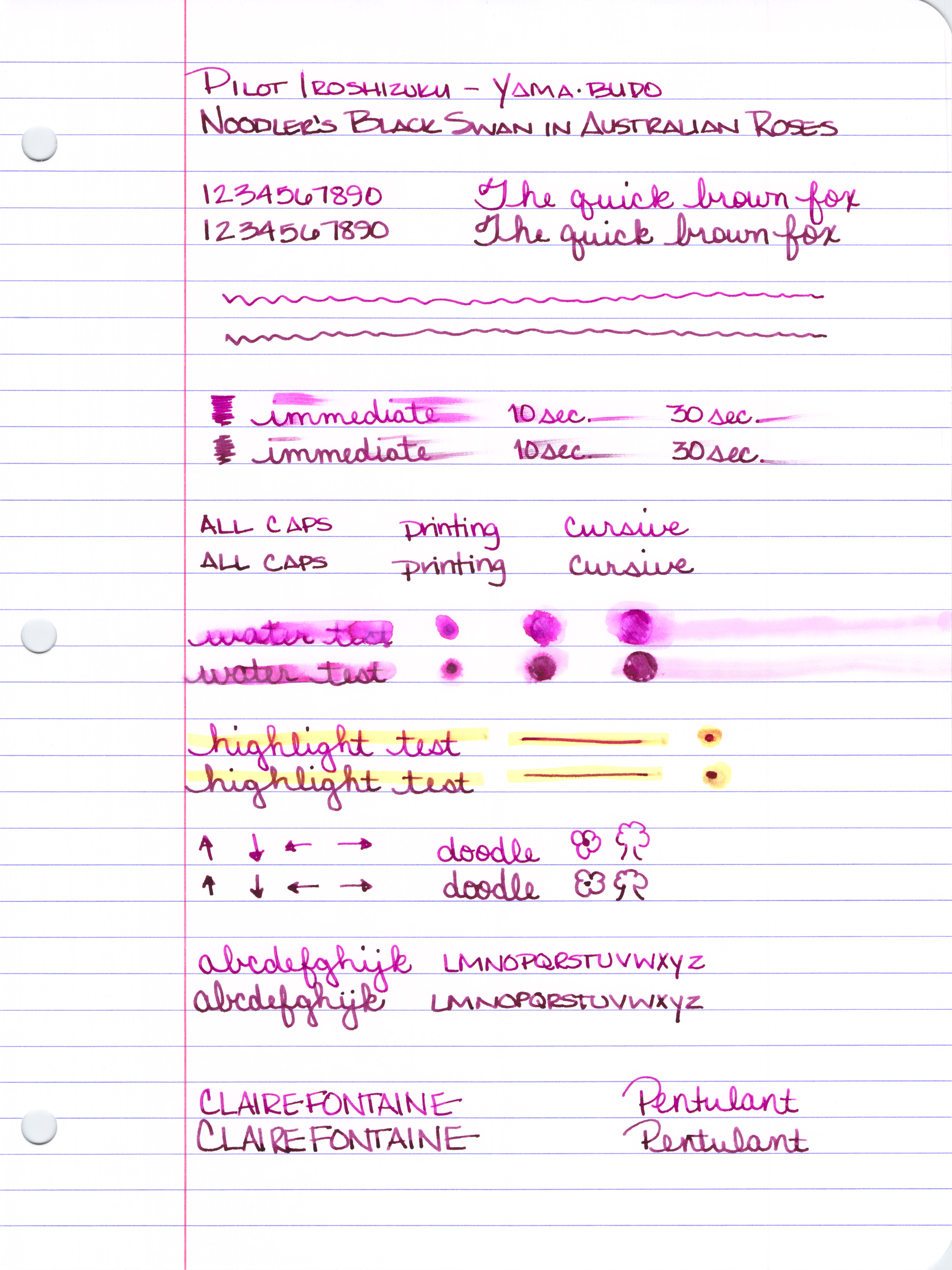
And I was in love. Big love.  (The ink is one of my favorites – Pilot Iroshizuku Fuyu-syogun.)

A Pragmatic Look . . . 

I’ll let someone else do all of the weights and measures. I’m more about how it looks, feels, and writes.

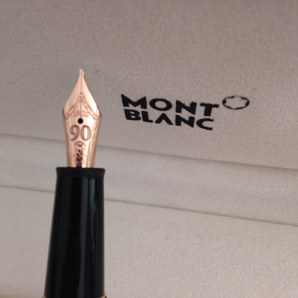
Design – love it. Very stylish, classic. I’ve always been attracted to retractable nibs. This pen has a sleekness to it that isn’t often found. There’s a thingy in the cap to prevent the user from ruining the nib if the cap is replaced without first retracting the nib.

Length – appears shorter than average, but is average when the nib is engaged

Weight – very comfortable

Width / Grip – nice – the smooth design makes this a very comfortable pen to hold. I can imagine that someone with sweaty (ok, moist) hands would have an issue because there is no real grip, but this works wonderfully for me

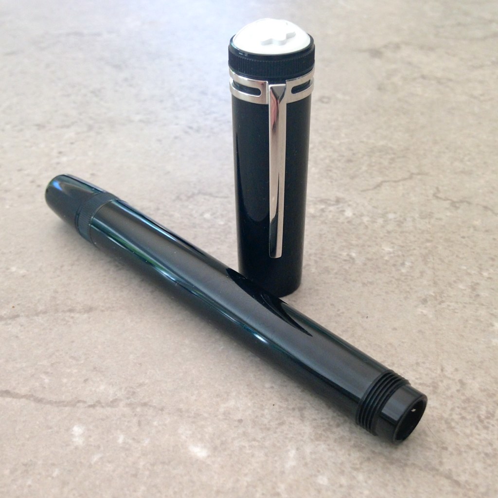
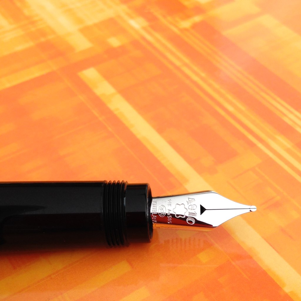
Fill System – unique piston fill

Nib – medium with a bit of bounce. It’s not flex, but it’s not like any other nib I’ve ever written with either. It’s a wonderful writing experience

Performance – oh my goodness, it writes wonderfully

Well, there is one issue with performance – the pen is not meant to be posted. Ironic given the picture above that I pulled from the Montblanc website, yes? Normally, this would be a deal breaker for me (I always post), but I love the pen and the writing experience so much that this is a complete non-issue.  When attempting to post, the cap is loose and the pen is unbalanced – I do not think anyone could post the cap and be happy with it even if it were possible to do so (which it’s not).

Practicality – the Heritage 1912 will be an everyday writer for me. I am not overly careful with my pens and I don’t flip out if a scratch appears. If I worked in an office, I probably would not take it with me because it would be too expensive to replace and I’d cry if it became lost/stolen. For me, the pen is very practical.

However, there are some reports that the pen scratches easily and that the cap rubs and causes “rings” to appear on the body of the pen. My guess is that the resin itself isn’t anymore likely to scratch than other MB pens, but that there is long expanse of resin and that scratches are more noticeable. If this kind of thing is going to bother you, you may disagree with my assessment on practicality.

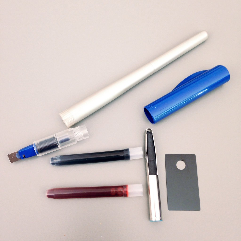
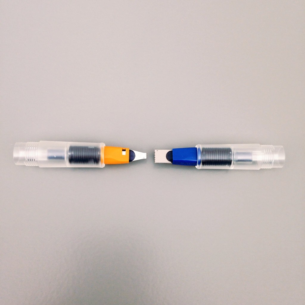
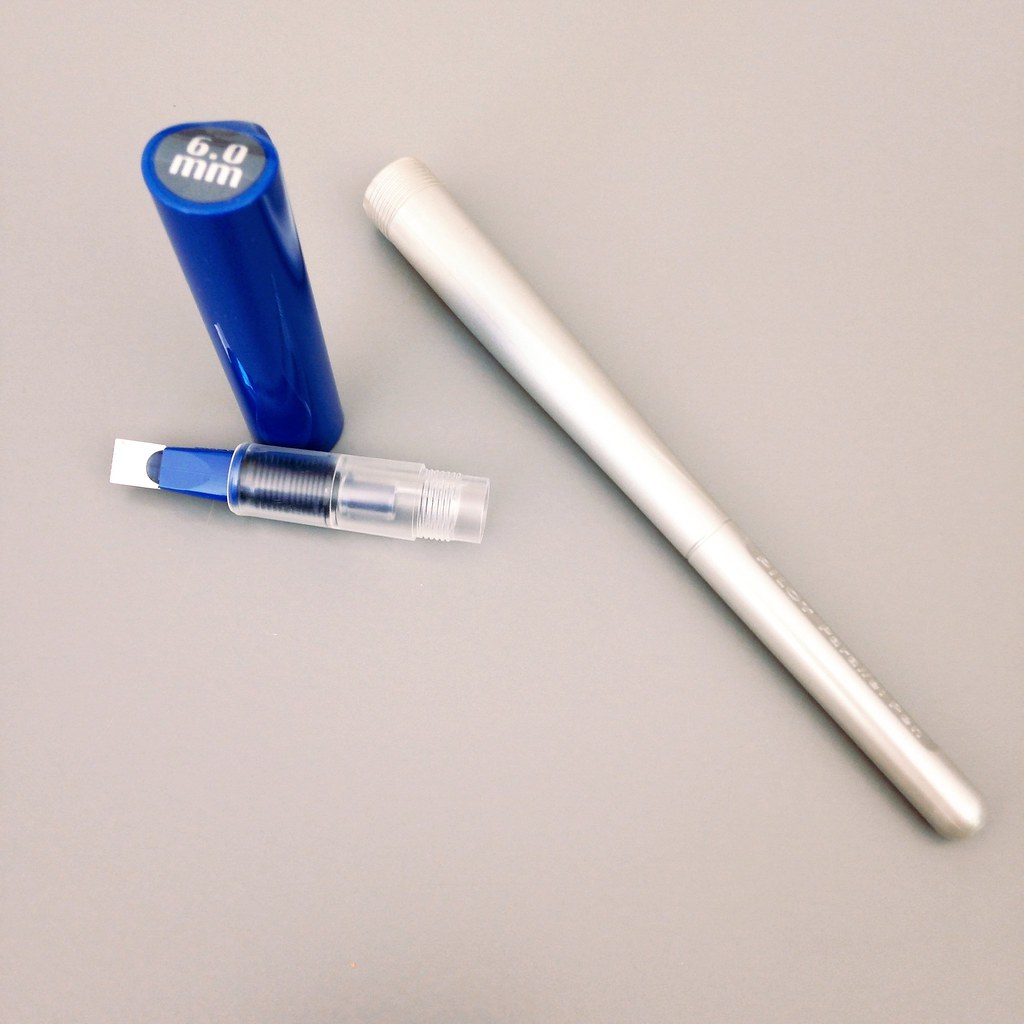
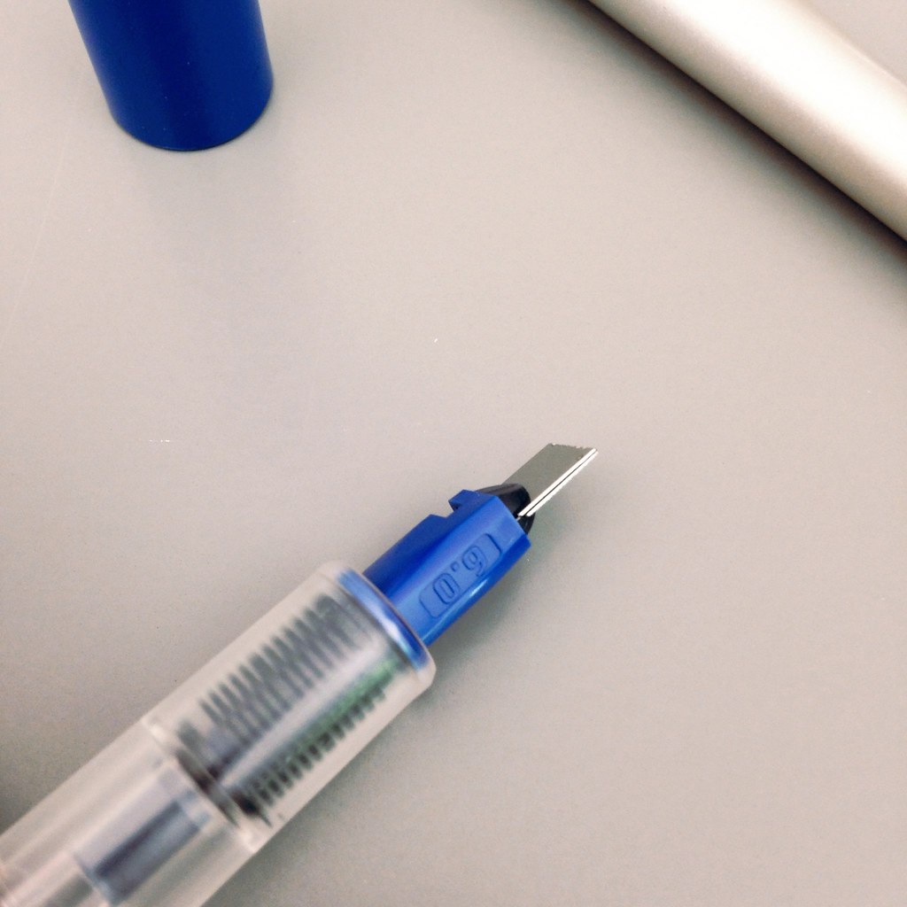
Some Bonus Pics . . .

Yummy yum yum!

I also want to toot my own horn a little. I love Instagram and am happy to have so many friends over there – more than 400 now, which isn’t a lot to some people, but feels like bunches to me.  A few days before I started posting pictures of the Heritage 1912 fountain pen, this came up on my news feed . . .

Wooo!  Maybe they follow everyone – I don’t know, I don’t want to know – haha. But Montblanc is following me on Instagram and I feel pretty giddy about it.  I’m pretty sure this means that you should also be following me there.  I’m Pentulant on Instagram.

And, finally, it’s clear that I love this pen, but you should read as much about it before you run out and get one of your own. It’s not quite the same as buying a Pilot Metropolitan (which I also love!).

I’ve put together the following resource list.

Have a great week, everyone!

xo

Montblanc Heritage 1912 Resource List

See the Heritage 1912 Limited Edition of 333 pieces

Pictures of the Montblanc Simplo and a comparison

A good write-up from Luxurious Magazine

FPN members discuss scratching

A MB produced video

INK REVIEW: AKKERMAN SIMPLISTIES VIOLET

PW AKKERMAN SIMPLISTIES VIOLET FOUNTAIN PEN INK REVIEW

Hello purple!

I’ve had this ink for quite awhile, but am just getting around to a good review of it. Akkerman inks have been on my mind because they recently announced a new smaller-sized bottle. The inks come from the Netherlands and shipping isn’t cheap (neither is the ink), but those bottles. Goodness.

Akkerman Ink Bottle Size Comparison (New on the left.)

Closer look at Akkerman Ink Bottle
Click for Full-Size Image

Back to Simplisties Violet – it’s a gorgeous ink. Writes great. Amazing deep, dark color and saturation. I’m not seeing any shading here, but I wonder if I would with a broad nib.

I really have nothing negative to say. Decent dry-time. Flow was wonderful in my TWSBI 540. 
Check out the handwritten review …

Click to See Full-Size

It’s love
What inks are you loving these days? Do you own any Akkerman inks?
Have a good week!
xox

INK REVIEW: Private Reserve Black Magic Blue

Private Reserve Black Magic Blue Fountain Pen Ink

First ink review of the new year and I am so glad to say that we have a winner!  Maybe this is an indicator that all inks this year will be winners? Ha!

Other than my usual pet peeve (see below), Black Magic Blue is pretty special.

Black Magic Not Blue

This “blue” ink is definitely purple. Purple in the swab, purple in the bottle, purple in the writing – blue in the name.  I once read a post (probably on FPN) where the writer was complaining that the colors on ink packages didn’t match the color in the bottle – I totally get that it would be very difficult to color-match bottled ink to a printed package – but the name? I totally don’t get it. Why not be be as descriptive in the names as possible?

So . . . I wanted to hate Black Magic Blue on principle, but this ink definitely worked it magic on me.

Check it out . . .

Woo!

The color of an ink is everything to me.  Other things are negotiable, but if the color and saturation aren’t there, all of those other features don’t matter a bit.  And..if the color is there, I’ll put up with some pretty terrible “features” to get that color.

Fortunately, Black Magic Blue is easy to love. (Yes, it’s making my love list!)

It writes wonderfully – great flow in the Lamy Safari (Broad Nib) I used for this test. Perhaps a little wet – but, again, I was using a broad nib so some smearing is expected and it doesn’t seem terrible even when I was smearing on purpose.

The color is deep.  If you’re looking for bright, check out Private Reserve Purple Mojo – there’s some bright!

The color is clear. If you’re looking for something a little dusky, check out Alexander Hamilton from De Atramentis.

As for me – I used Black Magic Blue for a full week and definitely fell in love.

Have you fallen in love in 2014? With inks, pens, or anything (anyone?) else?

INK REVIEW: Noodler’s Liberty’s Elysium

Noodler’s Liberty’s Elysium Ink Swab

I’m just going to put it out there right from the start.  I LOVE Noodler’s Liberty’s Elysium. Love, Love, Love.

Blue inks, in general, are just ok in my book. I mean – they’re blue. Blue is a fine color. In fact, I have found two others that I love:  Diamine Majestic Blue (deep color, great sheen) and Pilot Iroshizuku Kon peki (that color and saturation!!), but if I had to choose a “forever ink,” it probably wouldn’t be a blue. I’d go for something a little less conventional.

So why do I love Liberty’s Elysium? It is the color. It is BLUE. A pure, vibrant, gorgeous, non-fussy blue. There are no undertones to the color – just – blue.

I’ve known about this ink for some time. It’s a collaboration between Goulet Pens and Noodler’s Ink….

….It sounds like Brian Goulet wanted a bold blue ink that was also “bulletproof.”  Bulletproof fountain pen inks magically bond with paper fibers in such a way that they are then impossible to remove with water or even bleach – making them more resistant to fraud. As far as I’m concerned, this added feature is just that – a bonus. I’m all about how inks look and how they write.

One of my first impressions was that Liberty’s Elysium is a wet ink. However, after using the ink even just a short time, I didn’t come away with that impression at all. It definitely passed the smear test below.

So, there you have it. I love this ink. I bought a full-sized bottle of it within a day of using it for the first time.

Liberty’s Elysium is available exclusively through Goulet Pens. I’m not affiliated with the Goulets at all. Brush Dance is my gig. I like shopping at Goulet because they offer wonderful service, have great products, and they are a small business doing big things.

INK REVIEW: DIamine Wild Strawberry

Diamine Wild Strawberry Ink Swab

Ladies and gentlemen, it is safe to say…the losing streak of Monday reviews is OVER!  (In case you hadn’t noticed, my last three Monday reviews were not inks I fell in love with.)

But this!  This is an ink to love!  This is Diamine Wild Strawberry. Yum!

Diamine Wild Strawberry Writing Sample

Because seriously. Look at that color!  Wooooo…color like that makes me happy happy!  Similar in color, but with more saturation than R&K Morinda. Very different from Noodker’s Red.

OK.it’s not perfect. There is no shading and I love shading inks.  Other than that, though, it’s pretty darn perfect.

Dry time is a bit long – even with the fine nib I was using, but I can live with that.

Yep. It’s love!  Yaaay!!!

Tell me, what ink are you loving on this week? Is it a red?