Throwback Thursday: Fountain Pen Edition

Noodler’s Habanero Ink Swab on Tomoe River Paper

It’s another edition of Throwback Thursday!

Just about a year ago, I was going on and on about Noodler’s Habanero. I’d heard so much about it and its wonderful shading abilities. I was definitely not disappointed. It was one of the inks I swabbed on to Tomoe River Paper.  Gorgeous! And I wrote about it again in August.

I’ve not used it for a few months, but seeing it again definitely makes me crave.

What was everyone else talking about last year?

FPN had a review of Pilot Iroshizuku Ku-Jaku.

Notebook, Esq. wasn’t talking about a fountain pen.

Foutain Pen Geeks were looking at form and function.

Rocket? Pencil Sharpener?  Take a look.

Inkdependence was sharing some ink love with us.

And, finally, Gourmet Pens had a sweet Wordless Wednesday.

INK REVIEW: Noodler’s Black Swan in Australia Roses

Noodler’s Black Swan in Australia Roses Ink Swab

Such a popular color. People really seem to love Black Swan in Australia Roses. I like it well enough, but I wouldn’t call it love.  It’s not that it doesn’t write well (it does), it’s just that the color isn’t perfectly me.

Black Sawn in AUS Roses – writing sample

Pretty sure it’s the shading that makes everyone love it so much.

Australian Roses Smear Test
Pass!

The smear test is pretty impressive, yes? Can barely, barely see any smearing (look at the “e” above).

Bottom line: I can see why everyone loves it so much, but it’s still not for me.  Is it for you?

Oh, and surprise, I thought it would be fun to pull out one of my old review forms for this test.

Click to See Full Size Image

The Fine Point

Lamy Safari Fountain Pens + Dudek Modern Goods

It’s been a busy week. Over at Brush Dance, we are looking at so much art for 2016 calendars (yes, already), selling so many 2015 calendars (yes, already), and talking about lots of new projects.

And here’s what’s going on with in fountain pens . . .

I received my Cube from Mike Dudek of The Clicky Post and Dudek Modern Goods. I ordered the least expensive item on his page – you know, just in case. You guys, it’s pretty incredible. As you can see from the photo above, Lamy Safari fit perfectly.

I was a little worried that the inside of the openings would be a too rough to trust that they wouldn’t scratch my collection, but that is not the case at all. The Cube feels weighty, solid in your hands and it’s perfectly smooth – perfectly perfect. Well, there is one tiny small issue – I actually bought this as a gift for Mr. Pentulant (who only dabbles in fountain pens, but needed a safe place to keep the few that he owns I let him borrow), and now The Cube is on my desk.

I have no affiliation with Dudek Modern Goods other than a sincere admiration for what he does.

Pen Addict reviewed the Retro 51 Tornado Black Fountain Pen. I don’t think this one will make it to my wish list.

The Well-Appointed Desk dressed the part for Handwriting Day. I might be jealous.

Gourmet Pens didn’t have anything to say about Akkerman Hofkwartier Groen.

Inkdependence reviews Namiki Blue. You like?

Oh..and, finally, I changed my name over on Instagram. I’m Pentulant there now, too, because that’s how I roll.

Have a good weekend.

INK REVIEW: De Atramentis Sahara Grey

DeAtramentis Sahara Grey Ink Swab

DeAtramentis Sahara Grey Ink Review

Those of you who have been reading here for more than a week know that ink names is one of my biggest pet peeves. Seriously, they could have just left it at Sahara and been ok, right?
If you’re looking for a great shading olive or drab green, this color may be the one for you.
It wrote great in the Pilot Metropolitan I was using for testing. (If you’re looking for fantastic inexpensive pen, the Metropolitan is one I’d definitely recommend.)
No starting issues, no flow problems, and (bonus!) lots of great shading.
I also want to show you this . . .
I couldn’t believe how little it smeared (I was using Rhodia paper). 
Bottom line? If you love the color, you’ll probably love this ink. It really is a winner.
As for me, I’m not a fan of the color – a little too Army for me. What do you think?
DeAtramentis Sahara GreyInk Swab & Review
Click For Full-Size Image
DeAtramentis Sahara Grey
Ink Review

Throwback Thursday: Fountain Pen Edition #1

It’s Throwback Thursday!

Last March, I was talking about the F-word, Cookie Butter, and flex writing. Check it out.

Let’s go back in time and see what others were talking about.

Beautiful Handwriting over on FPN

Pretty pretty ink review on Inkdependence

Rants of the Archer had a Lamy Nexx up for review. (Look at that color!)

The Missive Maven was talking about postal rate increases. Ug.

Writing by Hand – I dig that style.

Scription posted a cRaZy Field Notes experiment. I suggest watching the video rather than trying it at home yourself.

INK REVIEW: Noodler’s Baystate Concord Grape

Noodler’s Baystate Concord Grape Ink Swab

Disclaimer: While I usually scan the sheets of paper for my ink reviews, these images are coming right out of my iPhone. That explains the inconsistencies in color and quality.

Second Disclaimer: I realize that this post flies in the face of what I said last week about putting up with some other things as long as the color and saturation are there. What can I say? I’m fickle.

If you’ve been in the fountain pen community for any length of time, you  have probably heard of Noodler’s Baystate Blue. Famous for it’s amazing color and it’s amazing ability to stain (or even ruin?) your most loved pens.

But Blue isn’t the only Baystate color from Noodler’s. There is Concord Grape and also Cranberry.

Today, we discuss Concord Grape.

No likeie.

The color is what I expected – very saturated, very purple. No complaints there.

But here’s the problem….

Baystate Concord Grape – Apica Paper Test
Noodler’s Baystate Concord Grape – Levenger Paper Test
Noodler’s Baystate Concord Grape – HP 32lb Paper Test

It’s the feathering. Click on the images to see the full-size or have a look at these screenshots from the original images.

If it was just one paper (especially the Levenger, which has been questionable with a number of inks), I could let it go. The color is so great that a problem here or there is ok with me, but this ink was a problem on almost every paper I used.

I was using a Pilot Metropolitan (medium nib). It’s a pen I’m very familiar with and have had no problems with in the past. After the ink sat in this pen for a day or so, the flow was terrible – I eventually had to open the pen and give the squeezie converter thing a little squeeze to get things flowing again.

With most of my ink reviews, I use the ink regularly for an entire week before posting. I was only a few days into the week before I realized that I wasn’t reaching for this ink at all. It was making a mess out of my work notebook (a Rhodia) with all of its ugly feathering.

Now, of course, your mileage may vary and I’m no expert in pens and inks (just love me some pretty colors and shiny things). If you’ve tried Baystate Concord Grape, I would love to hear about your experiences.

INK REVIEW: Private Reserve Black Magic Blue

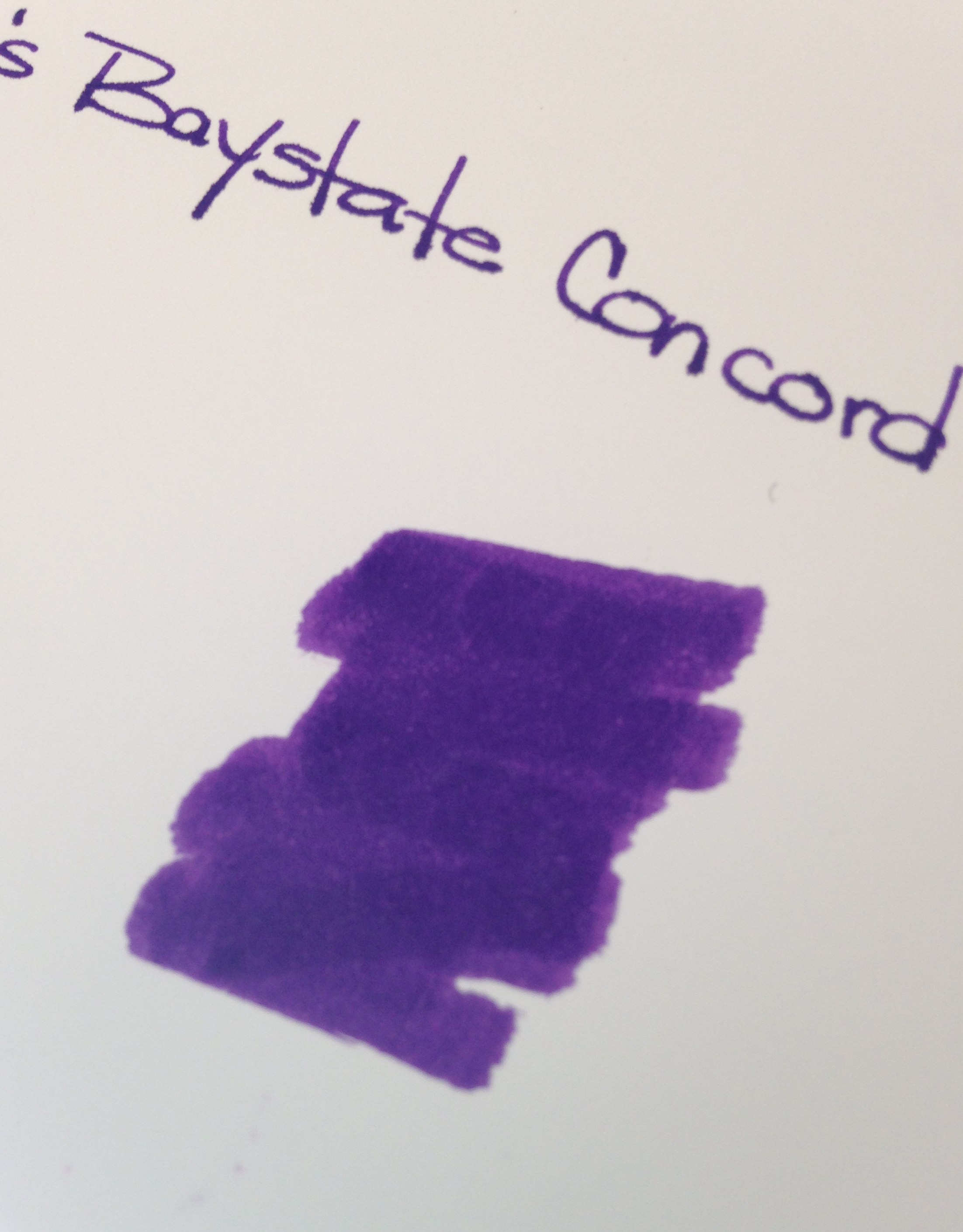
Private Reserve Black Magic Blue Fountain Pen Ink

First ink review of the new year and I am so glad to say that we have a winner!  Maybe this is an indicator that all inks this year will be winners? Ha!

Other than my usual pet peeve (see below), Black Magic Blue is pretty special.

Black Magic Not Blue

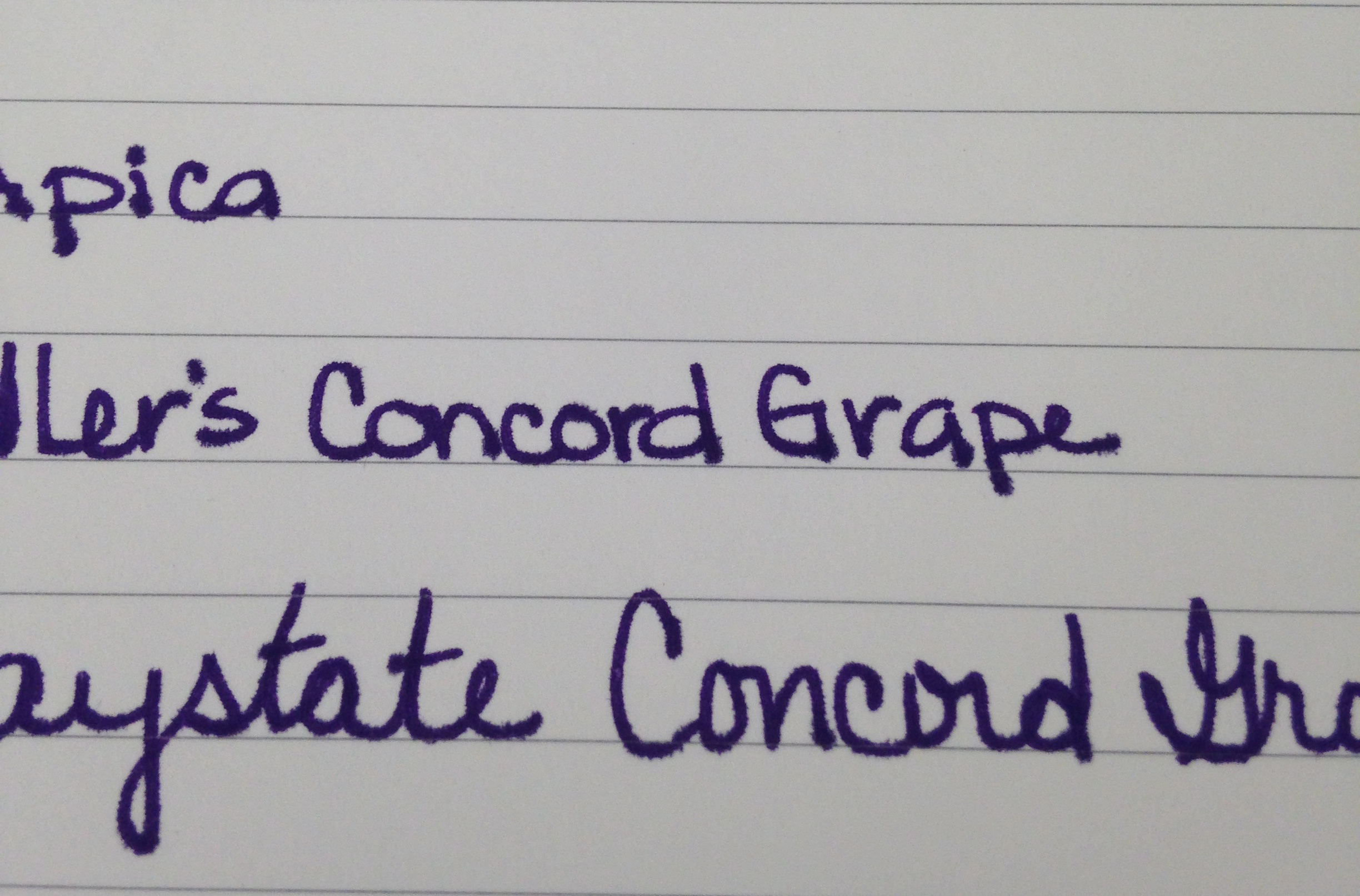
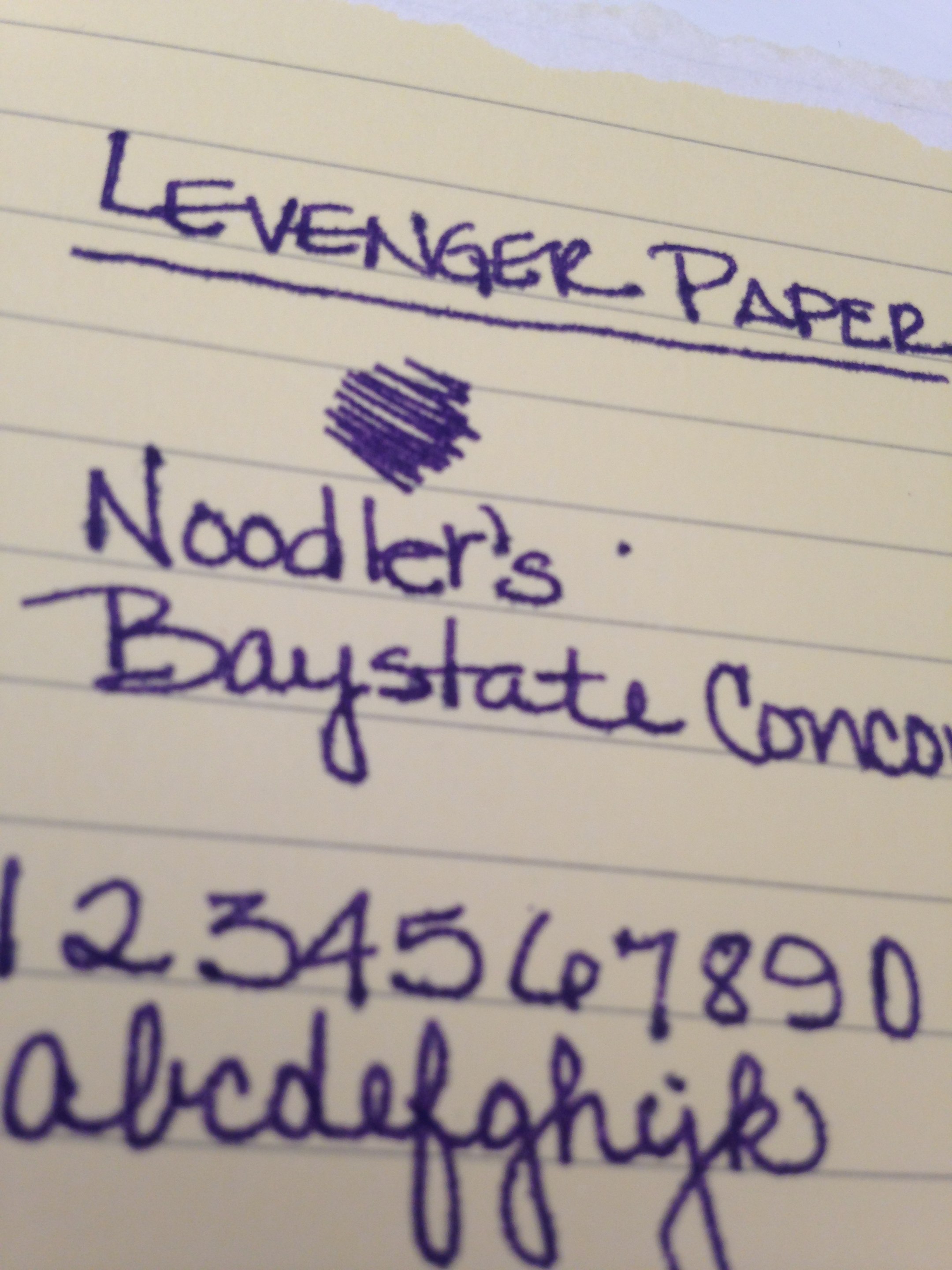
This “blue” ink is definitely purple. Purple in the swab, purple in the bottle, purple in the writing – blue in the name.  I once read a post (probably on FPN) where the writer was complaining that the colors on ink packages didn’t match the color in the bottle – I totally get that it would be very difficult to color-match bottled ink to a printed package – but the name? I totally don’t get it. Why not be be as descriptive in the names as possible?

So . . . I wanted to hate Black Magic Blue on principle, but this ink definitely worked it magic on me.

Check it out . . .

Woo!

The color of an ink is everything to me.  Other things are negotiable, but if the color and saturation aren’t there, all of those other features don’t matter a bit.  And..if the color is there, I’ll put up with some pretty terrible “features” to get that color.

Fortunately, Black Magic Blue is easy to love. (Yes, it’s making my love list!)

It writes wonderfully – great flow in the Lamy Safari (Broad Nib) I used for this test. Perhaps a little wet – but, again, I was using a broad nib so some smearing is expected and it doesn’t seem terrible even when I was smearing on purpose.

The color is deep.  If you’re looking for bright, check out Private Reserve Purple Mojo – there’s some bright!

The color is clear. If you’re looking for something a little dusky, check out Alexander Hamilton from De Atramentis.

As for me – I used Black Magic Blue for a full week and definitely fell in love.

Have you fallen in love in 2014? With inks, pens, or anything (anyone?) else?

Top 12 Posts of 2013

For this first post of 2014 (Happy New Year!), I thought it would be fun to have a look at some of the most popular posts from 2013 . . .

Costco Selling Fake Montblanc Fountain Pens?  I was surprised to see how much traffic this post received – I’m glad it’s getting lots of hits, though. I would hate to see someone stuck with a fake.

Ink Review: Montblanc Albert Einstein I liked it, I didn’t love it. I have not used it since this review. Wah wah.

Fountain Pen Review: Pelikan M200 Love the pen – hate the nib. I’ll need to try it with another nib at some point.

Fountain Pen Review: Namiki Falcon Soft Fine still loving this pen – especially filled with Noodler’s Habanero. A favorite combination, for sure.

My First Post as a Married Woman Best decision. Ever.

Ink Review: Pilot Iroshizuku Tsutsuji Not sure why I’ve not used this ink every single day – I love, love, love it.

Ink Review: Diamine Majestic Blue Seriously in love with this ink. Seems like it’s always in a pen even though I have a zillion other blues that I want to try. The sheen, the saturation, lots to love.

Ink Review: Pilot Iroshizuku Fuyu-syogun One of my very most favorite inks – ever. A pure, beautiful gray. Love it.

Ink Review: De Atramentis Alexander Hamilton Great color! I’ve not used this ink a whole lot since the review, but I want to! So many inks, so little time!

Ink Review: Diamine Wild Strawberry LOVE!

Tools of the Trade

Instagram I’ve been having so much fun over there. I love the immediacy of it, the searchability, the lack of pressure. If you’re not following me on Instagram, you should be.

And that’s it!  The top 12 of 2013 from Pentulant!

Oh, and I updated my Wish List, in case you’re curious.

Thank you for all of your visits, your comments, your suggestions. I love what I’m doing here and have so many things planned for 2014. Stay tuned . . .