INK REVIEW: Pilot Iroshizuku – Kiri Same

Kiri same from Pilot Iroshizuku is such a pleasing shade of gray.  I like my gray inks to look as much like pencil as possible – so that the reader may even wonder if I’d written in pencil. A simple fine line. Mmm. This one fits the bill, but when compared with other grays – it seems to have some red qualities to it. It’s probably not enough red to notice when the ink is on its own, but the red is definitely there.

The above swab is on a cheap index card (really, are there any quality index cards out there these days?). The feathering on the index card had me concerned, but look below at the water test – no feathering, no smearing.  For the water test, I write, wait a few seconds, and then drag a moistened Q-Tip across the writing. I also place a water droplet on the card – in this case, it’s on the L in “Pilot” – crazy, right?

Pricing is the same as the other Iroshizuku inks – $28 at most places. 
I like the hint of shading, too. Some feathering on my Hammermill Premium paper, but you have to get pretty close to see it. Definitely not something that would keep me from enjoying this ink.
This one is a temptation! I’m going to plan to try another sample. Perhaps on a variety of papers. And then I’ll know. Is this my gray?  Which is your gray (or is it grey)? I answered that question last week.
Here’s what other people are saying . . . 
Fountain Pen Network  (look at that shading!)

Seize the Dave (the essence of storm clouds in a bottle)

Grays are a favorite color for me. Love, hate, or indifferent – how do you feel about gray ink?

PEN REVIEW: Diplomat Ballpoint

A quickie review of the Diplomat Excellence A Guilloch Rhomb Ballpoint Pen.
Visually, it’s quite appealing. Matte black finish with gleaming chrome accents. (Can you make out my reflection in the chrome?)
Isn’t that inlaid grid (how’d they do that?) incredible? So unique.

I love the lines this pen creates. 
It’s the combination of masculinity (the hardness of the metal barrel, the solid lines, dark color) and femininity (the rounded clip, the softness of the logo) that sold me on this pen.

Twist Mechanism

I bought this last year at the SF Pen Show. It’s hard to believe it’s been almost a year!

I have no idea what I paid for this pen. It’s a ballpoint, so I’m guessing I wasn’t keen on spending too much for it, but I see that it’s listed all over the place for around $200 and that seems like a lot, doesn’t it?

When I got this pen out of its box to take photos, Jeff (the kind, patient, loving man of my dreams – hi, Jeff!) asked, “Hey, isn’t that the pen you gave me?”

Yeah. Right. Me. Give away a pen. Ridiculous! (Actually, I think he might be right – at the time, he was not at all into fountain pens and I wanted him to have something from the show – mostly to assuage my guilt for spending so much!)

This year, Jeff suggested we take cash to the show. “You know, so we don’t overspend.” I looked at him like he had three heads and he didn’t say another word.

Pretty, Pretty

So. The Diplomat Excellence A Guilloch Rhomb Ballpoint Pen (what a mouthful!) is a beauty. But. It’s not without flaws. It feels heavy and poorly balanced in my girly hand. It is also hard and cold – the whole thing is metal – and my hand feels fatigued after writing a bit.

And this: even though everything is well-seated in the pen, it makes a bit of a click-click noise when I’m writing. It’s almost as if the refill is tapping around inside the pen – inside the $200 pen. Unacceptable.

Ballpoints. Love ’em or hate ’em?

INK REVIEW: Diamine Pumpkin

Last year we picked up, packed up, and moved from New York to the San Francisco area. We loooove it here in the Bay area, but I sure miss autumn in New York.  The smells, the weather, the COLOR!
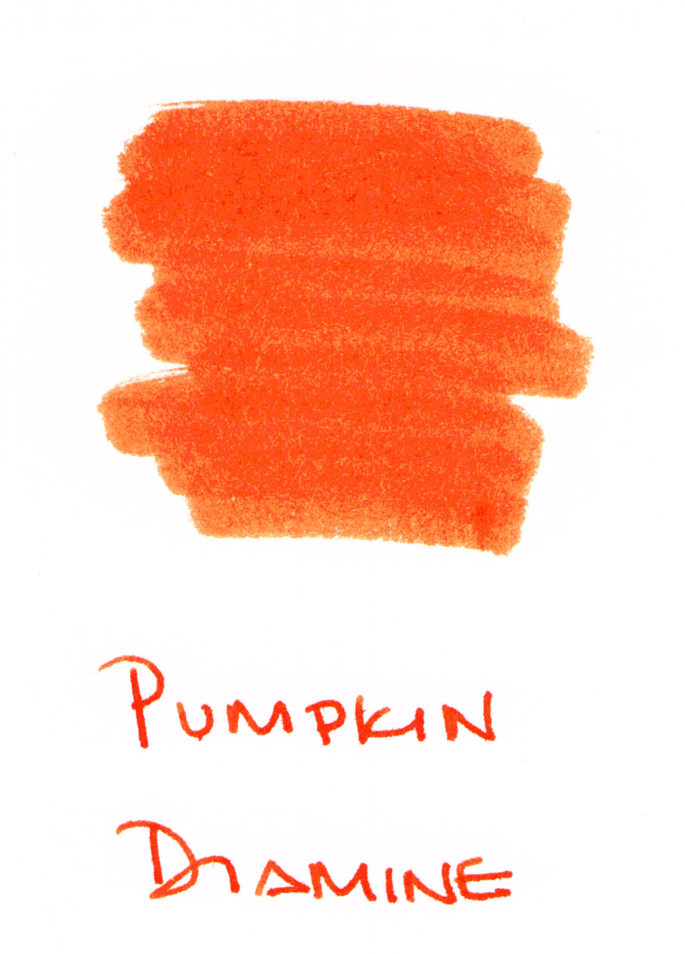
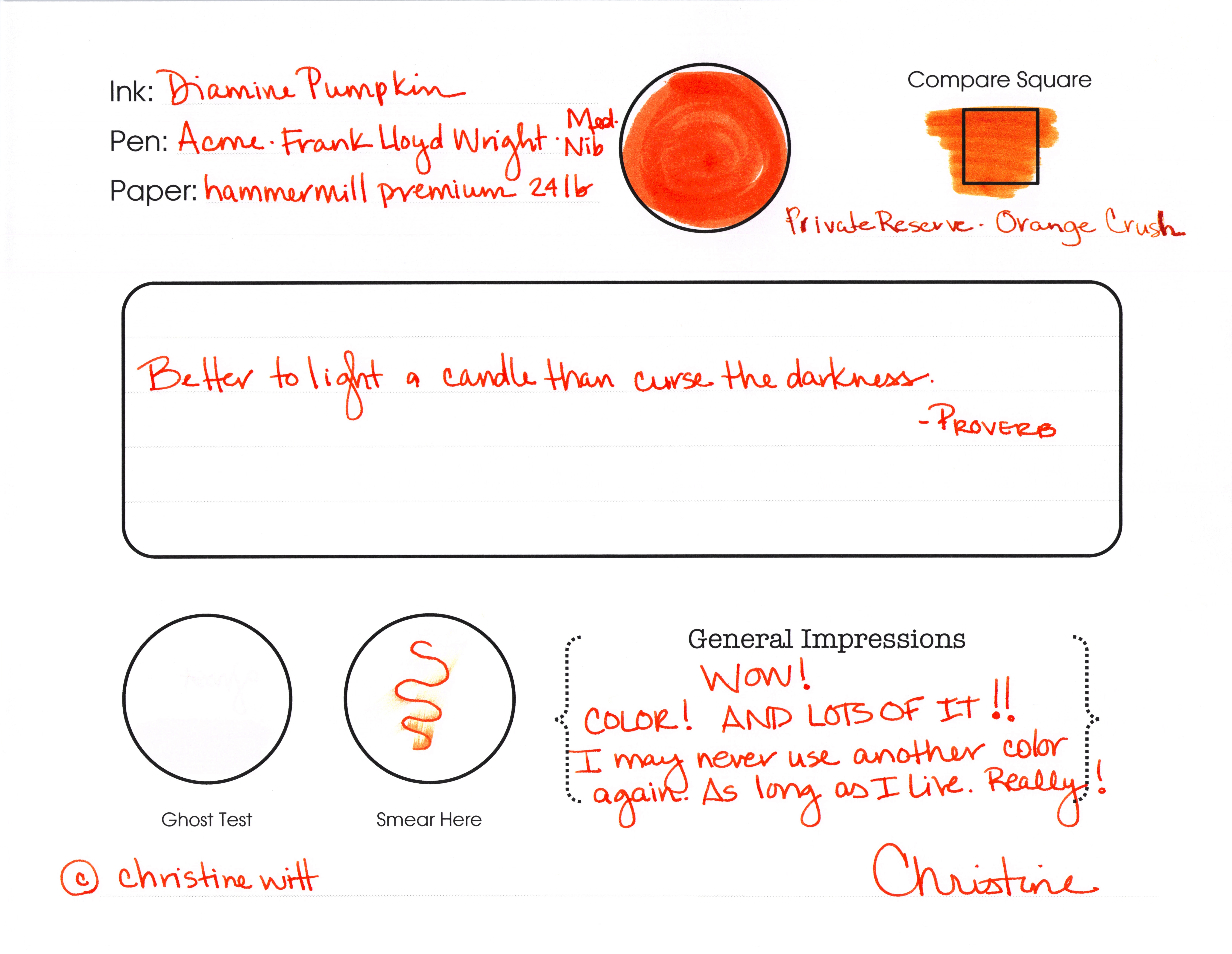
This screamin’ orange ink from Diamine really does it for me. So bright, so right. It’s a perfect shade of orange. Not too brown, too yellow, or too red. I’m in love.
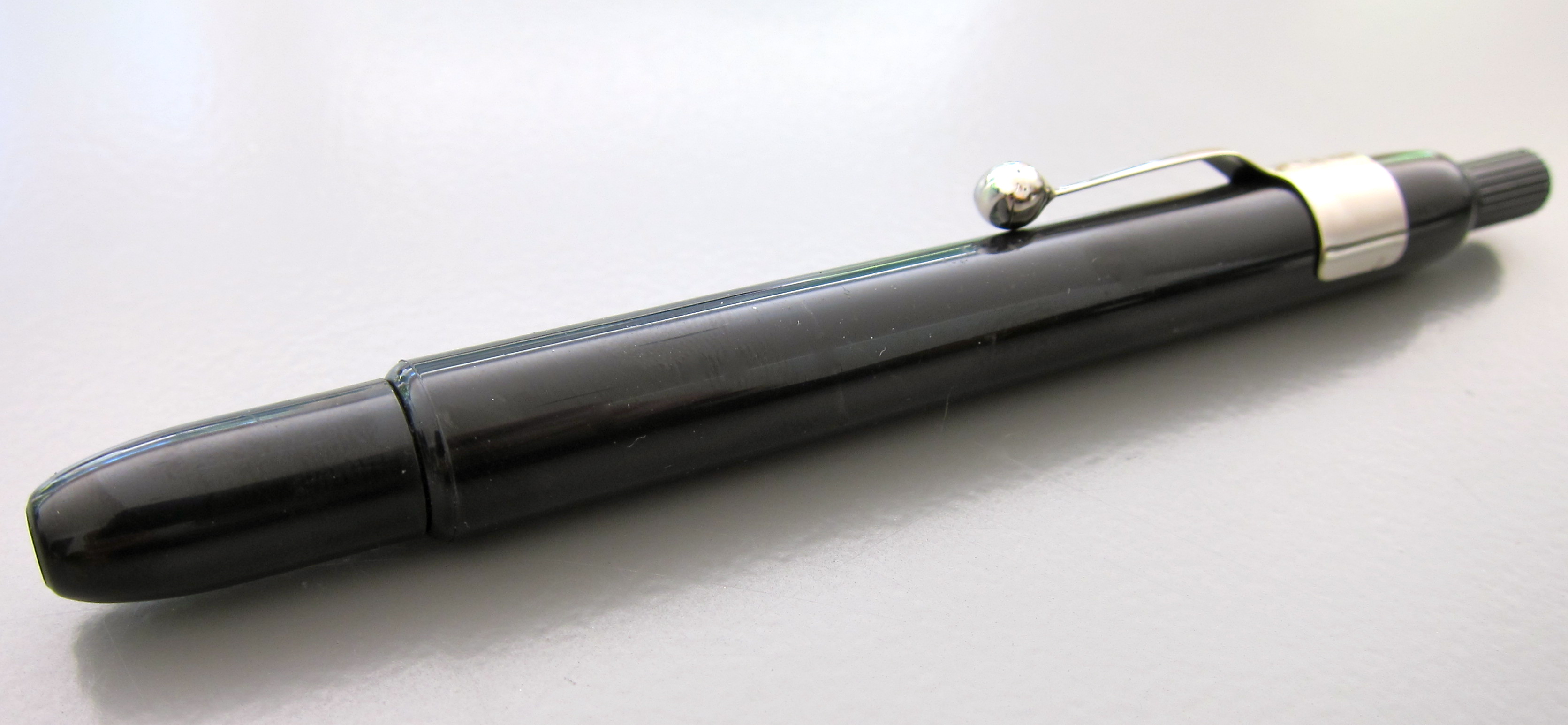
Check it out. 
click the image to see more detail

See what I said? “I may never use another color again. As long as I live. Really!”

Ha! How crazy is that? I might mean it, though.

Look at the Compare Square. I think Orange Crush from Private Reserve looks more like a shade of pumpkin than Pumpkin from Diamine. I really think I should be in charge of naming colors.

There’s some smearing, but it’s not awful. I made that squiggle, waited just a few seconds and then ran my finger along the ink.

I didn’t have any ghosting – and I wish I could come up with a better way of illustrating my ghost tests. I’ll work on that. You work on getting this ink. Today.

Check this out…

Some shading, but it’s mostly super-saturated

There’s some slight feathering on Hammermill paper, but not much.  If we were going to see terrible feathering, it would be on the swab – those are done on 3×5 index cards and the paper is so thin. (Does anyone make high quality index cards?)

Whew. That’s some ORANGE.  I’m in love. Orange Jello! That’s what it reminds me of.

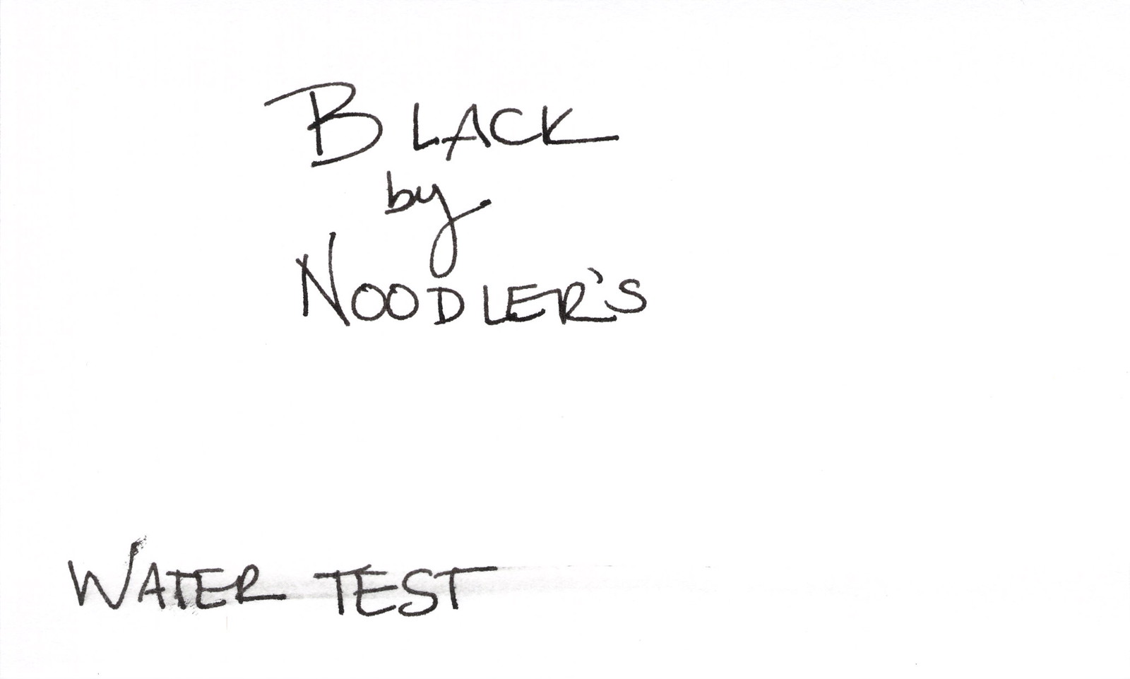
I almost wish I didn’t have to show you this . . .
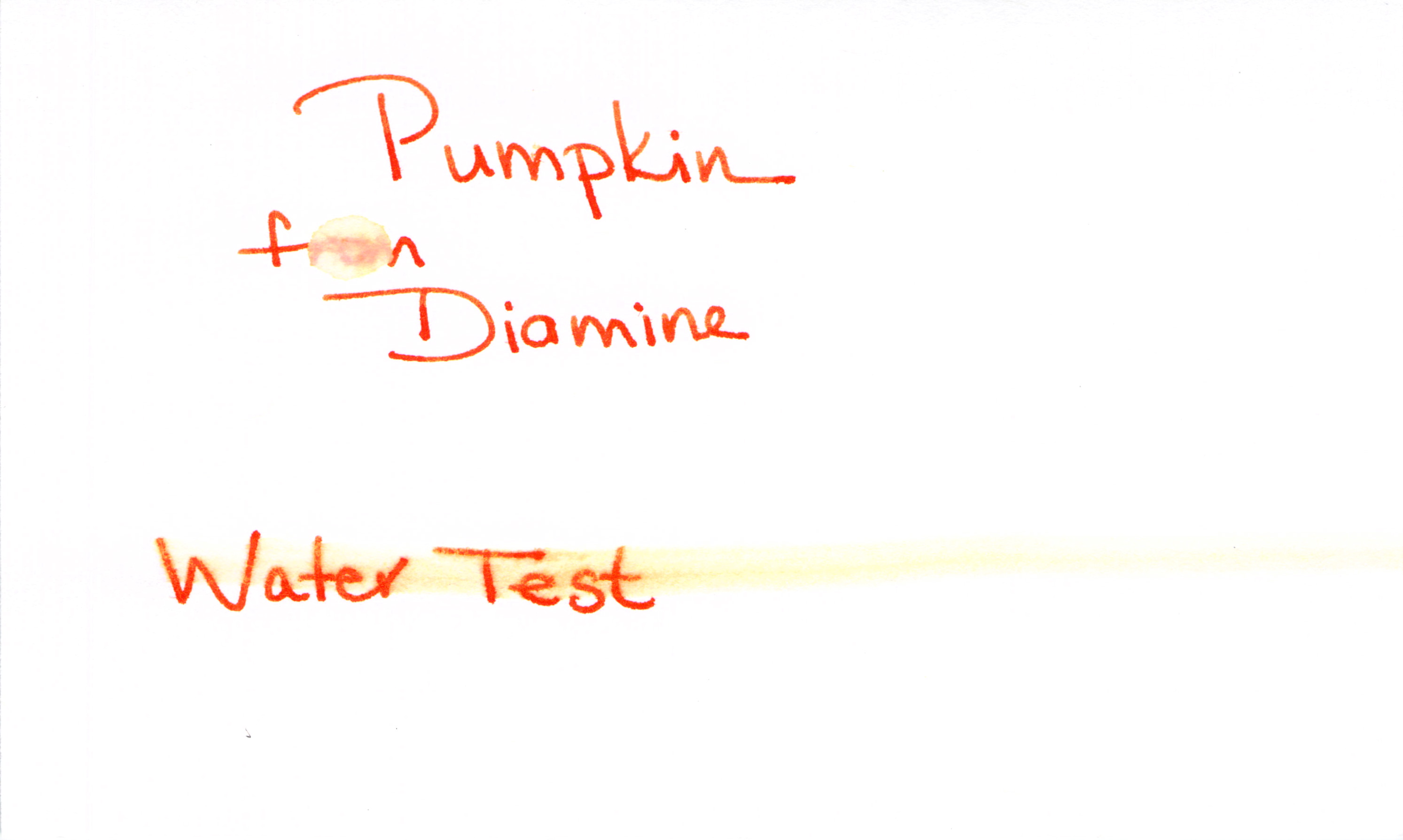
Water Test – Fail

Poo.

Here’s how I test for water resistance:

1. Write with the ink (always a good first step!)
2. Let it dry for 10+ minutes
3. Place a droplet of water on one word (“from” in this case) and let that dry naturally
4. Smear a moistened Q-Tip across the words “Water Test”

I’m bummed that the water test is a fail. I’m not surprised, though. My limited understanding is that it’s difficult to get water resistance from most mixed shades like purple, orange, green. Wah Wah.

All of this said, I (probably) will not be using this color for everrrrrrything, but I’m totally into it for some fun this fall. I’ve found it all over the place for $12-15.

Are you seasonal about your ink colors? Which are your current favorites?

Fifty Shades of Grey Ink, Part 1

Grey from Diamine so stately and professional. A good basic grey.
I’m not even close to having Fifty Shades of Grey ink. Do 50 different greys even exist? Wonder how long it will take me to find out. Wonder how much fun I’ll have finding out!
Full reviews of each of these inks coming another time. This time, it’s just for fun.
Pilot Iroshizuku Kiri-same – delicate (hints of red)

I’ve been loving the Iroshizuku inks lately. Have you tried any? Highly recommended. And the bottles? Gorgeous!

Private Reserve Grey Flannel – Regular ole grey (with bits of green?)
You know what I wish? I wish the entire world could get together and decide on just one spelling for grey/gray. My preference (like Private Reserve’s) is “gray.” It just makes more sense, yo.
DeAtramentis – Silver-Grey – Nice classic shade
DeAtramentis Silver-Grey definitely looks more grey to me than silver. This isn’t to slight Silver-Grey in any way, it’s perfectly lovely.
You know what else I wish? I wish my images were all the same size. They were all scanned the same and they are all on 3×5 index cards. Still, the safe bet is that it has something to do with something I’m doing wrong. Probably with Flickr. I’m no Flickr expert even though it’s been around for ages.

Pilot Iroshizuku Fuyu-syogun – soft and a bit blue
How pretty is Fuyu-syogun? So pretty that it made my Wish List.  It is perfect – not too black, not too blue. Delicious. (Wait..how did I create this ink swab if I don’t own the ink? I bought a sample from Goulet Pens, of course.)
J Herbin Gris Nuage – delicate
Gris Nuage is a beautiful gray. I always call it New Age Gray in my head. Funny, right? Nuage is actually the French word for cloud. 
Definitely has some blue / silver qualities to it. For some reason, I think this color belongs in weddings; it’s such romantic shade, isn’t it? I ran into some trouble with this ink during a test run – but I’m not ready to give up on it. More on that another time.
So..that’s six of fifty. A lofty goal, but I’m confident I can find 44 more shades of grey and I can’t wait to show you.
My favorite grays definitely lean toward the silver/blue side of things. Grays with too much red end up looking muddy to my eye. I’m a purist when it comes colors. I want to look at a color and say, “That’s gray!” Not, “Oh. Is that gray?”
And on the (mostly internal) debate about grey versus gray. The Grammarist says either is right, though gray is used more commonly in the US – and I guess that explains my preference.
Which are your favorite grays? Have you read Fifty Shades of Grey?

INK REVIEW: Noodler’s – Black

Noodler’s Black is a good, solid black.  The color is rich and deeply saturated. It was definitely wet in my Caran D’Ache with a fine nib; I imagine it would be almost too wet for me in a pen with a broad nib.

Look at the water test, yo.  That’s some impressive behavior!  (The “b” in “by” is where I place a single drop of water – can’t see it at all!)

I rarely read reviews before testing the inks on my own.  It doesn’t matter too much what other people think about a particular ink – I want to know how it performs for me – in my pens. Having fallen in almost-love with this ink, I decided to see what others were saying . . .

Amazon Reviews

Goulet Reviews

According to Noodler’s, the ink is Waterproof, UV resistant, bleach resistant, fade-resistant, and good for archival purposes. It’s also forgery-resistant. SOLD! I’ve added this ink to my wish list.

PEN REVIEW: Montegrappa Micra Red

My sweet, beautiful Montegrappa Micra. Marbly resin with sterling silver accents, this pen is stunning. I really dig the patina that has developed over the years.  I bought it new at a pen show (when? I cannot remember), used it regularly for a bit, and then placed it in a drawer with other pens.

Why would this pen sit so long unused? (Love the dog fur in my pictures?)

The pen measures around 4.5″(or around 5.75″ when posted).
The cap is a screw-to-post style. (Loooove this feature.)

Even after years of sitting, the red is just as vibrant. The swirls in the resin are just a bit opalescent.

Having sat for so long, I didn’t remember the model name of this pen. I had to research a bit and couldn’t help but read some of what I found at Fountain Pen Network.

After writing with it for a bit, I think I may have discovered why it sat for so long. It’s just not as comfortable as other expensive pens. The silver grip isn’t – grippy. It’s awkward, even. While the shape of the pen is faceted, the grip is smooth (though slightly concave) and feels – hard. I found myself with a total death grip and tired hand.

And the writing. I’m sure this is a matter of ink incompatibility (or a cleanliness issue).

Skipping . . .

And hard starting . . . 
As always, click to make any image bigger.


So I changed paper . . . 
My bottom line?  Well, I’m not ready to say just yet. I don’t remember the pen being this uncomfortable, or the skipping and hard starting. 
I’m going to give it a good cleaning, change the ink, and try again.  Will keep you posted.

QUICK REVIEW: Marking Pencil

The Listo Marking Pencil. Adverstised as WRITES ON EVERYTHING.

Look how dusty the packaging is. I bought it like this. Must not be much call for Listo Marking Pencils. (I wonder, is this the same thing as a “grease pencil”?)

Completely Mechanical. What does that even mean?

With refills available in seven different colors. I don’t remember seeing these in the store. Again, more dust and grime on the back of the package.

Twisty action.

Grippy part is a bit too low on the pencil.

Removable clippy part.

After turning and turning and turning and turning the twisty part at the top, the “lead” finally emerged.

While you can’t see it here, it looked a bit . . . crumbly. I wonder if this is from sitting on the shelf forever?

My plan was to run around the house, write on EVERYTHING, and take pictures to show you, but then I realized – I don’t know how (if)  it would clean up and while I’m pentulant, even I am not that brave!

So. I twisted it back up without writing on a single thing!  Wimp!

I’ll pull it out again sometime in the future and write on some things with it. In the meantime, what do you know about these? Anything?