
Here’s a quickie review of one of my favorite inks to get us back into the groove this week. (More on Thanksgiving another time.)
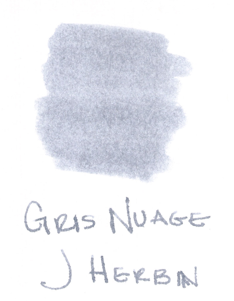
The above swab was done with a q-tip and then the name of the ink written with a glass pen. In my experience, there’s a lot of feathering with glass pens and this was no exception. (It also doesn’t help things that it’s written on a cheap-o index card.) (Again, I ask, are there are any nice index cards out there? Starting to think there aren’t.)
Anyway….Gris Nuage (Gray Cloud – how pretty!) is one of my very most favorite gray (grey, if you insist) inks.
It’s light – just like a cloud. It’s prettttttty. Leans more toward blue than red, but is definitely one of those pure colors that I adore.
And, holy crappoli (it’s a word), it writes like a dream. Check it out….
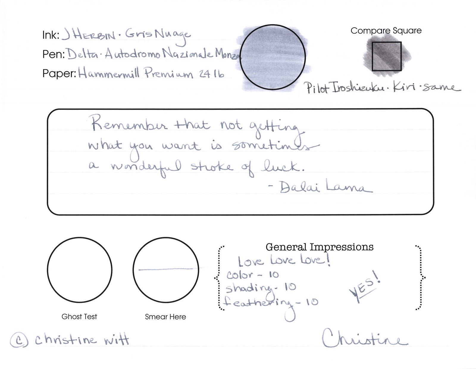
Pretty, yes? Some lovely shading going on there, too. And no smearing, no feathering, no ghosting, or bleeding. What more could a girl want in a gray ink?
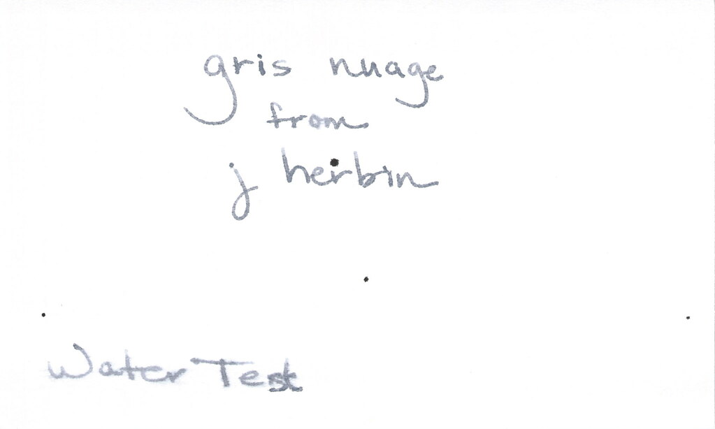
Oh, yes, it does well with water! Nice!!! This is totally one of my gray inks. It makes me swoon!
OK..so see those black specks on the water test? No, it’s not Gris Nuage gone crazy – that’s collateral damage from my Invincible Black spatter. Haha!
Do you have a favorite gray? Mr. Pentulant was using Montblanc Oyster Grey for awhile in his fancy new Boheme, but he wasn’t loving it.
Users exploring online stores frequently prefer structured navigation and clean design especially when they land on Birch Harbor Market Place Center I like how organized everything is making exploring very convenient and allowing users to browse easily without unnecessary complexity or distraction.
While going through countryside stay options, I discovered this Fisherman’s Retreat scenic lodge page and the location feels peaceful, scenic, and ideal for relaxing stays experience, with imagery that suggests a calm and refreshing environment.
People who enjoy curated shopping platforms often look for websites that use boutique hall aesthetics to present products in a clean organized and easy to navigate format Glade Ridge Elegant Hall Market – providing a minimalist e commerce environment where curated products are displayed in a structured layout designed to make browsing smooth efficient and visually enjoyable for users
In many online retail experiences, users prioritize fast loading speeds and logical interface design, especially when they access GoodsZone Quick Shop because it provides a streamlined browsing experience that helps them move effortlessly between product sections and discover items with minimal effort.
Solid post, the structure is easy to follow and the language stays simple even when the topic gets a bit more involved, and a look at fastcartcenter kept that same standard going, so I left feeling like the time spent here was actually worth something for once which is rare lately.
In discussions about improving online vendor ecosystems, usability testers frequently highlight the importance of visual clarity and organized categories when interacting with platforms like Hazel Harbor Shop Collective – Smooth browsing experience, products are clearly displayed and accessible, ensuring that users can browse comfortably while maintaining focus on product selection rather than struggling with interface complexity or slow page behavior.
While casually browsing through a list of websites, I discovered go to this page – It stands out for its neat layout, where everything looks aligned and thoughtfully placed.
As I continued checking niche initiative websites, I discovered this Stride Simpsons engagement page and this looks meaningful and worth spending some time exploring, providing structured content that seems worth reading more carefully.
In the process of reviewing online retail interfaces focused on smart navigation systems, I found that smart hub approaches enhance usability by organizing products logically, which became evident when analyzing smart shopping experience portal – The platform feels well structured and efficient, allowing users to explore products easily through a clean and intuitive design.
In the process of evaluating digital shopping environments focused on simplicity and usability, I found that minimal cart structures enhance browsing flow and reduce cognitive load, which was clear when reviewing simple browsing cart center – The interface is clean and easy to understand, ensuring a shopping experience without any navigation confusion.
As I continued browsing online shops, I discovered this fast and easy market and saw interesting products listed, with the experience feeling convenient, quick, and highly user-friendly overall.
Many users browsing digital stores value fast performance and clean layouts especially when they visit Cove Marble Commerce Network Hub The interface is simple and it works really well for quick browsing ensuring a smooth experience across all categories and pages.
Reading this gave me something to think about for the rest of the afternoon, and after futuretrendzone I had even more to mull over, the kind of post that lingers in the background of your day rather than evaporating immediately is genuinely valuable in an attention economy that punishes depth rather than rewarding it.
While reviewing ecommerce systems designed for structured navigation and smart organization, I observed that well categorized marketplaces improve clarity and efficiency, which was evident when testing organized product hub – The platform is intelligently structured, making it easy to browse and locate products quickly.
In user experience audits of modern commerce platforms designed for scalability and accessibility across multiple device types and user demographics Honey Cove Market Atelier Guide design experts often observe smoother interaction flows and clearer category structures that enhance overall shopping efficiency – analysis shows improved engagement and reduced search time for products across catalog sections.
In the process of reviewing digital commerce platforms for usability comfort, I encountered a section titled nest style discovery center – The design feels warm and intuitive, helping users browse products easily while maintaining a calm and structured navigation flow across the entire marketplace experience.
Reviewing the latest site adjustments, many users appreciate the smoother transitions between pages, and within the explanatory section there is Serene Coastal Outpost included naturally, while surrounding notes mention enhanced layout spacing, clearer visual hierarchy, and a more relaxed browsing experience that encourages longer and more comfortable sessions on the platform.
While going through different online pages, I stopped at check this page and checked it out today, finding the structure neat and the navigation experience straightforward and user-friendly overall.
Reading this confirmed that my time researching the topic in other places had not been wasted, and a stop at globalcartcenter extended the confirmation, when independent sources agree that is a useful signal and this site is one of the more reliable sources I have found for cross checking what I read elsewhere on similar subjects.
Individuals who prefer engaging online shopping experiences often appreciate platforms that use trading post design to make browsing dynamic with varied product selections that enhance clarity and exploration Harbor Wave Select Flow Hub – featuring a structured e commerce environment where trading post inspired layout enhances product variety and creates a dynamic browsing journey designed for easy navigation and user satisfaction
While conducting usability research on ecommerce systems with emphasis on discounts and affordability, I noticed that deal corners improve clarity by highlighting cost benefits effectively, which became evident when analyzing affordable savings marketplace – The deals look appealing and well presented, creating a strong impression that this is a great place for finding real savings opportunities.
Shoppers browsing modern trend stores frequently appreciate platforms that offer smooth navigation and minimal clutter, especially when they visit Clever Trend Corner Space – The design flow is intuitive and visually appealing, helping users explore products easily while maintaining a consistent and engaging browsing experience.
In the course of checking various online shopping directories and vendor ecosystems, I arrived at Local vendors collective browsing link which appeared to streamline access to multiple vendors and product categories making it easier to explore different shops within a single platform – overall it felt organized and accessible for browsing purposes
I was checking different outlet-themed websites for general comparison and usability testing purposes when I encountered a page that stood out for its simplicity Hollow Creek retail index and easy structure which makes it approachable even for first time visitors – It leaves a calm impression with no unnecessary complexity in navigation
While browsing charity motorsport initiatives online, I came across karting charity event page and interesting concept overall, seems well organized and quite engaging today, with a structured presentation that highlights both sporting activity and meaningful support efforts in a clear and accessible way. – The idea feels purposeful and well coordinated.
While analyzing platforms focused on shopping efficiency, I discovered smart shopping indexer that improves deal organization – this shopnetmarket.shop interface helps users navigate product categories smoothly, ensuring faster access to relevant items and a more structured browsing experience overall for online shoppers seeking convenience.
Across multiple device tests, the interface demonstrates improved responsiveness and clearer visual organization, especially in sections containing Chestnut Harbor Trading Gateway smoothly integrated into the content, while design updates focus on usability – The browsing experience remains straightforward and easy to understand, with improved structure that helps users move naturally through pages without unnecessary distractions or delays.
In the process of analyzing digital commerce platforms focused on global cart experiences and product diversity, I found that worldwide cart systems enhance usability and browsing satisfaction, which became evident when exploring global cart browsing portal – The store uses a global cart style approach, making a wide range of online products easy to navigate and access.
As I navigated through various web pages, I encountered see this option and after a quick visit, I found the content neat and the navigation quite simple and user-friendly throughout.
gratis sportwetten ohne einzahlung
my website :: Basketball-Wetten.Com
Online shoppers who enjoy peaceful and visually soothing digital environments often prefer platforms designed with a lakefront market lounge concept where calm design elements create a pleasant browsing atmosphere that makes shopping feel relaxing and enjoyable across all categories Velvet Lakefront Lounge Market Hub – offering a calming lakefront inspired shopping experience where market lounge design creates a smooth and peaceful browsing environment helping users explore products in a relaxed and visually pleasing way across different curated sections
In the process of exploring digital shopping tools for better convenience, I encountered easy buy corner guide that simplifies browsing through categorized listings – Hyper Cart Corner delivers a really easy shopping experience with affordable products and fast delivery, making it easier for users to compare items and complete purchases with minimal effort and improved efficiency.
Picked this site to mention to a colleague who would benefit, and a look at have a look at this page added more material I will pass along, recommending sites to colleagues is a higher bar than recommending to friends because the professional context demands more careful curation and this site cleared the professional bar without me having to think.
When examining online retail platforms built for enhanced usability and optimized browsing workflows across diverse digital product ecosystems and vendor listings Trading Foundry Icicle Link feedback indicates high satisfaction – Overall experience remains simple and effective with fast navigation clear interface structure and well organized product displays supporting effortless comparison and exploration of available items.
Shoppers today often look for shopping centers that provide neon inspired designs with smooth navigation and a wide range of practical product options Neon Cart Selection Hub improving browsing flow – It is frequently appreciated for its clean layout and easy to use interface that simplifies online shopping
Digital shopping environments are becoming more competitive as platforms strive to offer better deals and faster delivery options worldwide SmartEdge Bargain Center – This marketplace prioritizes affordability and speed, ensuring users can access promotions quickly and complete purchases efficiently.
buchmacher kurse beim rennsport
Look at my web blog :: die besten sportwetten anbieter
People exploring digital marketplaces often enjoy websites that act as premium goods corners with solid collections of items and smooth browsing experiences for efficiency Premium Goods Trend Flow Corner enhancing usability – It is commonly described as clean and user friendly with intuitive navigation tools
Horse Racing Bet Payout Calculator results from windsor
yesterday
While comparing different online deal directories for everyday shopping, I found a platform reference deal browsing gateway which helps users explore categorized offers more easily – this shopnetmarket.shop interface makes deal discovery feel clean, structured, and simple for users who prefer organized navigation and faster decision making while shopping online across multiple categories.
Many shoppers enjoy rapid goods zones offering fast shopping zone with simple layout and useful product range, helping them browse efficiently while maintaining clarity and ease of use FlowSelect Rapid Goods Zone Access – Designed for smooth transitions and fast category switching
In my exploration of various online outlet-style resources, I discovered a page that seemed designed for simple navigation and clarity Hollow Creek outlet directory making it easy to browse without feeling overwhelmed – The layout gives a steady and predictable flow across all sections
seriöse sportwetten online (Margene) bonus auszahlen
During a comparative analysis of online marketplaces focused on modern layout structure and cart usability, I discovered that corner designs enhance engagement and reduce confusion, which stood out when exploring intuitive cart shopping hub – The design appears clean and well balanced, creating a user friendly shopping experience that feels smooth and efficient.
betting on fast horse racing results today [Nestor] races strategy
Shoppers enjoy platforms that reduce clutter and improve browsing efficiency significantly today Minimal Cart Space – Clean visual structure helps users focus on relevant products while avoiding distractions and ensuring that navigation remains smooth and consistent across all sections of site
People who enjoy online shopping often prefer platforms that combine convenience with meaningful price reductions across multiple product categories and seasonal promotions Bargain marketplace allowing them to compare options quickly and select items that match both their budget and personal style preferences easily – This platform frequently highlights cost-effective choices so users can make informed decisions and enjoy better savings on a variety of goods
During exploration of niche marketplace platforms and independent shop directories, I encountered Ember Guild marketplace resource portal which organizes vendor listings into clean categories, and after reviewing it I noticed fast performance and simple layout – overall it gave a clear and easy browsing experience
Online users often appreciate platforms that combine clean design with reliable performance for better usability, particularly when browsing CrystalBuy Trend Hub – The interface feels smooth and simple, making it easy to locate products while maintaining a consistent and trustworthy shopping experience overall.
As I explored different online sources, I landed on see this option and it appeared informative at a glance, making me think it could be worth exploring more deeply in the future.