
Here’s a quickie review of one of my favorite inks to get us back into the groove this week. (More on Thanksgiving another time.)
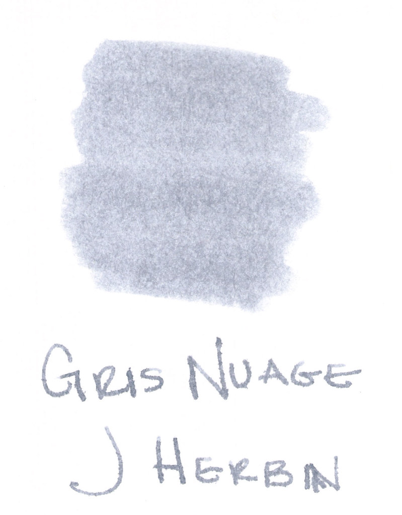
The above swab was done with a q-tip and then the name of the ink written with a glass pen. In my experience, there’s a lot of feathering with glass pens and this was no exception. (It also doesn’t help things that it’s written on a cheap-o index card.) (Again, I ask, are there are any nice index cards out there? Starting to think there aren’t.)
Anyway….Gris Nuage (Gray Cloud – how pretty!) is one of my very most favorite gray (grey, if you insist) inks.
It’s light – just like a cloud. It’s prettttttty. Leans more toward blue than red, but is definitely one of those pure colors that I adore.
And, holy crappoli (it’s a word), it writes like a dream. Check it out….
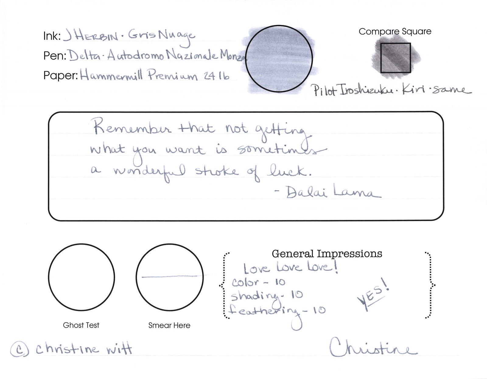
Pretty, yes? Some lovely shading going on there, too. And no smearing, no feathering, no ghosting, or bleeding. What more could a girl want in a gray ink?
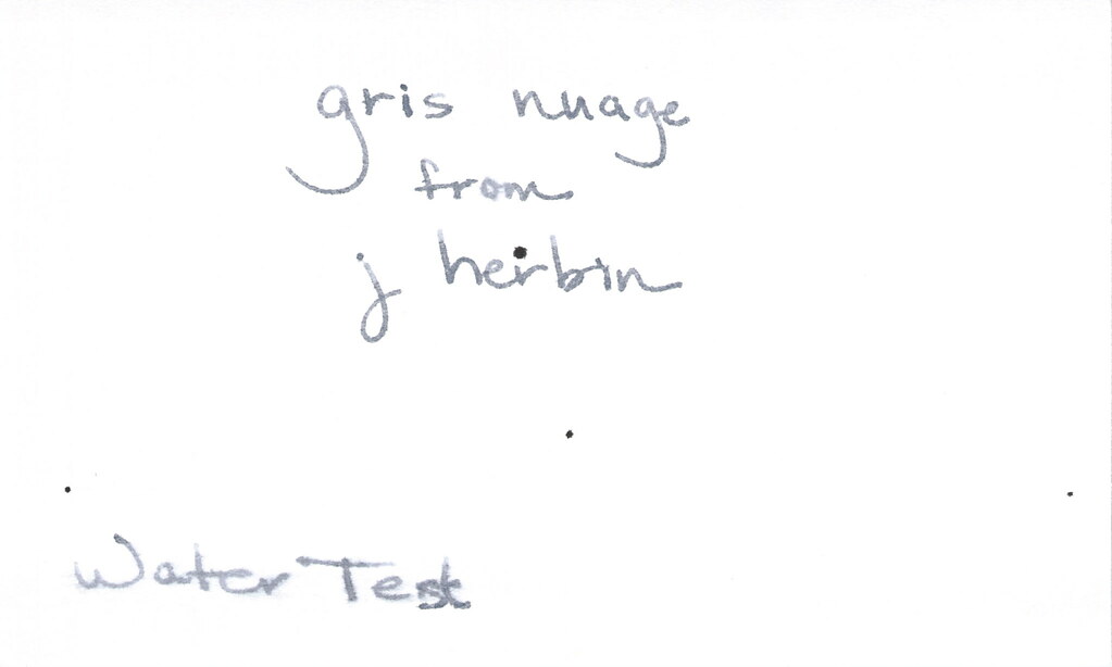
Oh, yes, it does well with water! Nice!!! This is totally one of my gray inks. It makes me swoon!
OK..so see those black specks on the water test? No, it’s not Gris Nuage gone crazy – that’s collateral damage from my Invincible Black spatter. Haha!
Do you have a favorite gray? Mr. Pentulant was using Montblanc Oyster Grey for awhile in his fancy new Boheme, but he wasn’t loving it.
While researching digital commerce platforms and their structural layouts, I examined a site architecture that included Clover Harbor trade portal view embedded within a balanced page design that avoids clutter and maintains consistent spacing across sections – Overall it feels smooth, organized, and easy for users to follow without effort.
/>purevalueoutlet – Inspiring and interactive site, perfect for learning and creating new ideas. Generate 20 variations following all rules above.Make sure that each line is 40 words minimum and the website should appear in the middle of line not in the start or end
many digital shoppers prefer online stores that focus on clean design and structured navigation helping them compare products efficiently while browsing multiple categories across different sections edge easy cart flow known for simplicity – it provides a seamless browsing experience where users can quickly compare items and move through categories with ease and comfort throughout their shopping journey
During comparative evaluations of online retail systems and interface performance metrics across global vendor platforms, analysts frequently emphasize the importance of responsive layouts HoneyCove Commerce Studio Hub that support faster product discovery, improved navigation consistency, and a more streamlined browsing experience for returning and new users alike – visitors note that the checkout flow and browsing system feel highly efficient with minimal friction during usage.
Shoppers interested in creative handmade markets and independent seller platforms often encounter this website through online recommendations and searches VelvetGrove Trading Gallery featuring a wide assortment of unique listings that appeal to collectors and casual buyers alike – Customer service tends to be responsive and shipping updates are reliable.
In the course of reviewing digital retail platforms focused on usability and design structure, I found that grid-based layouts improve shopping efficiency by keeping information visually aligned and easy to scan, which was clear when analyzing clean product grid index – The interface arranges products neatly in a structured format, making browsing feel smooth, intuitive, and visually balanced overall.
During my general browsing of online shops, I found rapid access marketplace – everything loads fast and is arranged in a clear structure, making it simple for users to find and access products quickly without confusion or slow performance issues.
After comparing different websites that often lacked structure, I came across check out this page and it seemed trustworthy enough, encouraging me to think about visiting again later for updates or new information.
In the middle of checking various marketplaces, I paused at take a look axis shop and found an interesting selection available, with categories laid out neatly, making the site easy to navigate.
During my search for something straightforward, I checked out discover this site and noticed that even though it lacks complex visuals, it delivers consistent speed and smooth transitions that make browsing feel easy and stress free.
While testing ecommerce storefront usability across multiple scenarios and device types, I analyzed a system where CloverCove Commerce Flow Market – Navigation was fast and simple with a clean layout that helped users find products quickly without any difficulty overall today.
While conducting usability research on ecommerce systems emphasizing straightforward navigation, I noticed that basic layouts improve accessibility and user comfort, which became evident when analyzing simple product browsing portal – The design feels clean and uncluttered, making it easy to browse a variety of products without confusion.
Many bargain focused users often search for platforms that present deals in a clear and accessible way, especially bargain market guide when they are trying to compare international offers and want a simple browsing experience that helps them make faster purchasing decisions online
While exploring various modern minimalist marketplace designs for usability research, I came across a clean structured layout that included Snow Cove goods gallery portal embedded naturally within a balanced interface emphasizing spacing and clarity – The browsing experience feels calm, simple, and very intuitive, allowing users to move through sections without confusion or visual overload
During a comparative review of multiple online retail systems and their interface designs, I explored ecommerce browsing summary note – The structure appears simple and functional, with products displayed in an orderly way and navigation that supports quick access to different sections without difficulty.
As I continued browsing different shopping websites, I discovered this smooth commerce dashboard – everything works efficiently, and pages load fast, creating a reliable and pleasant browsing experience.
During a comparative analysis of online shopping systems focused on streamlined marketplace design, I discovered that smooth interfaces enhance user experience, which stood out when exploring modern product browsing center – The design feels smooth, and browsing products is simple, fast, and easy to follow.
лента стальная для прокладок лента стальная штрипс
While reviewing ecommerce UX models designed for improved purchasing efficiency, I observed that smart buying systems enhance navigation flow and product accessibility, which became clear when testing smart cart navigation portal – The platform feels easy to use, with smooth navigation that allows users to browse and shop without unnecessary complications.
While browsing alternative commerce platforms online, users often find Raven Grove marketplace browsing portal which sits inside a well-organized system that makes navigation feel natural and easy – I personally found the entire journey straightforward and aligned with my expectations completely
HoneyCoveVendorStudio – Clean interface, everything loads fast and works very smoothly.
While analyzing online retail systems for UX research, I found a responsive platform that made browsing feel fast and well organized across all categories Bright Trading Hub Studio – Fast loading pages ensured smooth interaction, and the shopping experience felt dependable and easy to navigate throughout the entire browsing process.
As I reviewed several online shopping sites, I noticed this clean commerce page – the product range is wide, and browsing feels simple, smooth, and very accessible.
While comparing different online options, I noticed see more here and found that it offered a clean and accessible layout, making it easy to browse and retrieve information in a short amount of time.
As I browsed through several shopping websites, I stopped at check it out fast cart and noticed the platform feels fast and responsive, making browsing quite enjoyable and smooth without interruptions.
In the process of evaluating digital shopping environments focused on trust and clarity, I found that trusted buying hubs improve usability and reduce hesitation, which was clear when reviewing secure buying navigation hub – The platform feels reliable and easy to use, with smooth navigation throughout all sections.
Ganesha Gold feature buy decisions are being modeled before clicking.
People searching for better ecommerce organization often highlight platforms that group items effectively, such as value range hub which is typically seen as practical and user friendly; it helps users explore different product ranges easily while keeping navigation simple and reducing unnecessary effort in finding relevant items.
In my analysis of online storefront systems I evaluated usability clarity responsiveness and overall browsing structure across pages GladeRidge Commerce Product Loft everything felt polished and easy to use and the collection of items is impressive and everything is neatly arranged and clear throughout
Users prefer platforms with simple design because it works nicely and makes browsing quick and easy Cotton Meadow goods directory I liked how fast everything loaded
While exploring vendor listing directories and digital marketplace tools, I encountered Flora Ridge shopfront portal placed within a visually structured interface that emphasizes simplicity – The experience feels calm, coherent, and pleasantly easy to use for browsing multiple sections effortlessly.
goodsparkstore.shop – Nice spark in design, shopping feels smooth and pretty intuitive
As I continued browsing different shopping websites, I discovered this structured commerce hub – items are clearly displayed, and access is simple, smooth, and very user friendly overall.
In the course of evaluating online shopping deal hubs emphasizing clarity and structured pricing, I found that organized layouts improve decision-making, which became evident when exploring bargain deals discovery center – The deals section feels attractive, and pricing appears structured, fair, and easy to understand.
While comparing online shops for curated gift items I discovered Meadow Jasper Vendor Hub which featured a simple and clean layout that made browsing effortless – The product details were precise and reliable which helped me evaluate items quickly and made the entire shopping experience smooth and stress free overall
Users browsing handmade product marketplaces frequently highlight efficiency and clarity, particularly on platforms such as Wood Cove Showcase Portal which organizes listings in an easy to navigate format – Most customers reported that checkout worked flawlessly and the entire experience felt fast and convenient.
During a review of ecommerce tech marketplaces, I came across a listing labeled affordable tech discovery index – The platform organizes gadgets clearly, offering useful electronics at appealing prices and making it easy for users to browse and find interesting tech products quickly.
During my exploration of various ecommerce demo stores across different niches I carefully analyzed user experience flow and product visibility across categories CoastBrook Marketplace Foundry Center The interface performed consistently well with smooth navigation paths and clearly structured product sections that made decision making extremely simple and fast overall experience
While checking several online marketplaces, I discovered this organized commerce platform – the interface is clean, making it easy to browse and explore products smoothly without any confusion.
While analyzing ecommerce platforms optimized for modern cart interaction and clean presentation, I noticed that polished layouts improve usability and reduce friction, which stood out when reviewing modern shopping flow center – The interface appears refined and well designed, offering a seamless shopping experience that feels natural and efficient.
At some point during my search, I used tap this link and realized how convenient the browsing experience was, with clearly arranged sections that made it simple to locate exactly what I needed in less time.
During my usual search across eCommerce websites, I stopped at check this trail market shop and as it was my first time visiting, it looks like a decent place to shop online with a straightforward browsing flow.
During analysis of e-commerce user experience patterns, I interacted with a well organized platform that made browsing feel simple, fast, and visually comfortable CoveBright Vendor Studio – The layout is clean and modern, allowing users to enjoy browsing products easily while maintaining clarity and smooth navigation throughout the site.
People who shop online regularly often prefer platforms that minimize complexity while offering a wide range of products across different categories Smart Grid Deals Shop – It focuses on delivering a seamless experience that supports quick browsing and ensures users can complete purchases without unnecessary distractions
kombiwetten tipps heute
Here is my webpage … basketball pro a wetten (https://basketball-wetten.Com/)
In between reviewing multiple eCommerce platforms, I explored discover this buying zone and noticed it feels legitimate, with smooth navigation that makes browsing products comfortable and straightforward.
Online users frequently appreciate marketplaces that combine responsive design with flexible navigation systems for a smoother and more enjoyable shopping experience fast shop gateway it is often considered a reliable and efficient browsing platform – The system is recognized for quick page loading and seamless transitions between categories improving usability significantly
As I reviewed several online shopping sites, I noticed this structured vendor interface – browsing feels smooth, and everything is arranged in a simple and clear way.
online shoppers exploring ecommerce sites often prefer platforms that reduce checkout complexity by focusing on simple cart flows allowing them to finish purchases in fewer steps with better efficiency fast cart explorer view widely seen as efficient – it provides a seamless shopping experience where users can move from browsing to checkout quickly while maintaining a clean and easy to understand interface throughout
During analysis of user-friendly online shopping systems focused on simplicity and accessibility, I found that streamlined cart designs enhance usability when working with platforms such as easy purchase basket – The system keeps everything straightforward, allowing shoppers to manage their cart effortlessly and proceed through checkout without unnecessary steps or complications.