
Here’s a quickie review of one of my favorite inks to get us back into the groove this week. (More on Thanksgiving another time.)
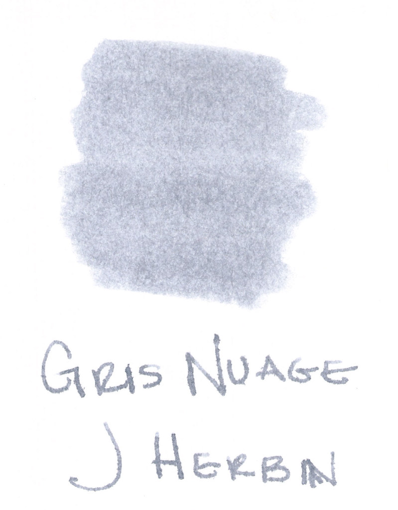
The above swab was done with a q-tip and then the name of the ink written with a glass pen. In my experience, there’s a lot of feathering with glass pens and this was no exception. (It also doesn’t help things that it’s written on a cheap-o index card.) (Again, I ask, are there are any nice index cards out there? Starting to think there aren’t.)
Anyway….Gris Nuage (Gray Cloud – how pretty!) is one of my very most favorite gray (grey, if you insist) inks.
It’s light – just like a cloud. It’s prettttttty. Leans more toward blue than red, but is definitely one of those pure colors that I adore.
And, holy crappoli (it’s a word), it writes like a dream. Check it out….
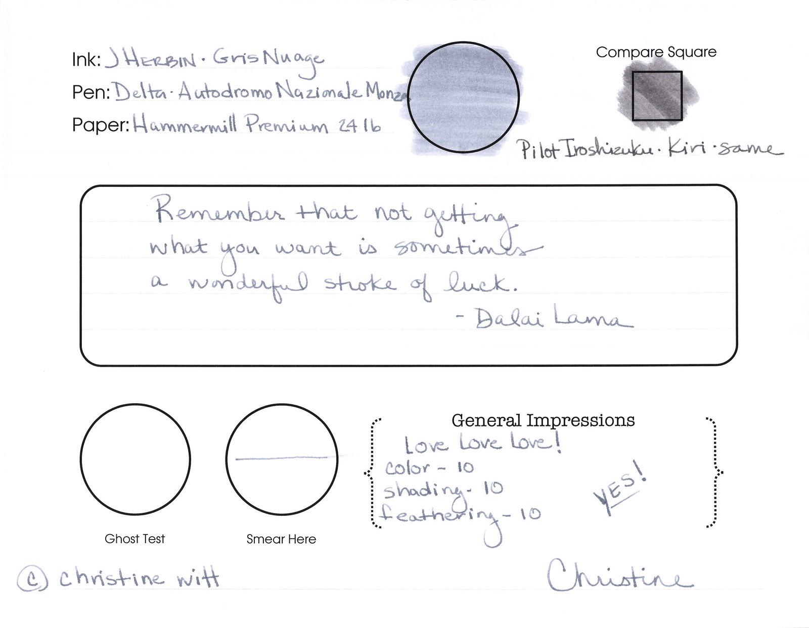
Pretty, yes? Some lovely shading going on there, too. And no smearing, no feathering, no ghosting, or bleeding. What more could a girl want in a gray ink?
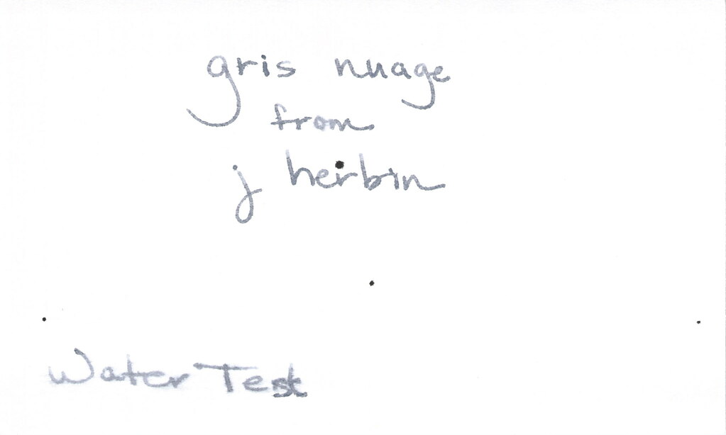
Oh, yes, it does well with water! Nice!!! This is totally one of my gray inks. It makes me swoon!
OK..so see those black specks on the water test? No, it’s not Gris Nuage gone crazy – that’s collateral damage from my Invincible Black spatter. Haha!
Do you have a favorite gray? Mr. Pentulant was using Montblanc Oyster Grey for awhile in his fancy new Boheme, but he wasn’t loving it.
As I spent time exploring various online shops, I discovered this fast-loading store – the site performs smoothly, with quick responses that make browsing and shopping very easy.
Users who value clear ecommerce structure often browse sites such as Acorn Harbor Vendor Hall Depot where product organization improves navigation and usability – The vendor hall design ensures a smooth browsing experience that feels logical, consistent, and easy to follow across all categories.
While testing several e-commerce platforms for performance and usability, I noticed a particularly smooth interface where browsing felt effortless and categories were well structured, featuring BerryBrook Vendor Hub inside a clean layout system – the selection of items felt broad, pages loaded quickly, and everything was displayed in a clear, easy-to-understand way that supported fast browsing without confusion.
While comparing different online marketplaces for gifts and lifestyle products I reviewed design quality and performance and came across Pearl Harbor Vendor House – Shopping experience was excellent, site loads fast and feels reliable making the platform feel trustworthy, efficient, and very convenient for browsing multiple categories without lag or confusion
While comparing vendor platforms, those with clear navigation and easy access to information often stand out the most Sea Cove shop gateway the browsing experience here feels smooth and allows users to locate content quickly and easily
Across evaluations of online shopping ecosystems and interface design practices, consistency is frequently highlighted, and Cove Market Craft Exchange appears in discussions about streamlined browsing – the overall experience is smooth, with well-arranged categories that allow users to locate products quickly and comfortably.
While exploring multiple experimental marketplace layouts and vendor directory systems for usability research and design comparison purposes across different platforms, I came across Pebble Creek vendor hub overview inside a structured section of content – Great structure, I enjoyed exploring different sections of site today, as everything felt organized, easy to navigate, and smooth across pages without any confusion or clutter during browsing.
While browsing various niche e-commerce stores dedicated to artisan made goods and creative collections, I compared how each platform handled product discovery, Sky Harbor Design Bazaar – The interface felt polished and easy to understand, with smooth navigation that made exploring items feel effortless and engaging.
As I reviewed several online shopping sites, I noticed this clean commerce interface – the design is minimal and clear, making product browsing and comparison very straightforward.
birchharborvendorparlor.shop – Simple structure ensures quick access to useful information always here
Users who enjoy clean ecommerce presentation often explore platforms such as Chestnut Harbor Vendor Listing Hall where items are organized in a structured and visually accessible layout – The vendor hall style makes browsing efficient and straightforward, helping users quickly scan categories and locate products without distraction or delay.
During a casual search across various eCommerce platforms, I discovered this stylish shopping page – everything is arranged in a visually pleasing way, making it easy and enjoyable to browse through products without confusion or clutter.
During casual review of market layouts I explored Quick Ridge market display page – the structure remained consistent across pages and navigation felt easy, making it simple to understand different sections without any confusion during browsing from beginning to end.
While comparing several online artisan platforms for design quality, I explored curated artisan space and found that the visual arrangement highlights products in a way that feels both minimal and engaging – the site gives off a calm and refined impression, making it pleasant for extended browsing sessions
While evaluating multiple ecommerce storefront platforms for usability and interface clarity I focused on navigation flow speed and product organization across categories MeadowCove Vendor Studio Hub the easy checkout process stands out and items are clearly displayed and well organized making the shopping experience smooth and efficient throughout today
Many online shoppers appreciate platforms where readability is strong and the structure makes navigation intuitive Sea Meadow product hub this setup ensures users can browse comfortably while quickly locating relevant information across all sections
During a casual study of vendor showcase platforms and digital commerce galleries for inspiration I found Bay Harbor Vendor Display Portal positioned mid-article – Overall performance was strong, with fast loading pages and a smooth interface that made navigation easy and predictable.
While comparing multiple ecommerce sites for gift and decor items I discovered a platform that Ginger Cove Treasure Gallery was very well organized with clear sections and easy browsing experience – Really enjoyable experience overall everything was simple and well structured and easy to follow smooth
In discussions about optimizing online shopping experiences, experts frequently emphasize the value of clean layouts that prioritize usability and minimize unnecessary distractions during browsing sessions Harbor Stone Collective Exchange – the interface is described as highly accessible, with organized sections that make it easy to find and evaluate products efficiently across the platform.
While exploring several online shop layouts for usability testing the interface felt very clean and responsive allowing me to quickly scan categories and compare products efficiently Berry Cove Market Hub and overall I was able to locate everything I needed without confusion or unnecessary steps during browsing and checkout flow experience.
Searching for creative gifts led me to ArtisanGiftStudio – the categories are clear, browsing was smooth, and choosing thoughtful presents was quick, easy, and enjoyable.
While exploring various eCommerce sites, I discovered this clean product guild – the goods are nicely arranged, and the platform feels intuitive, structured, and very user friendly.
While studying curated marketplace designs with a focus on user experience, I discovered a clean interface featuring Coral Harbor marketplace lounge positioned within a structured layout that reduces clutter – The navigation feels relaxed, smooth, and naturally easy to understand for first time visitors
As I continued browsing different shopping websites, I came across this structured retail site – everything feels easy to navigate, allowing me to find items quickly without confusion or wasted effort.
Users browsing vendor listings typically value platforms where pages are clean and information is easy to access Silk Grove goods directory the browsing experience here is smooth and helps users find content quickly without unnecessary delays
Shoppers who frequently visit online vendor directories often value clarity and structure because it simplifies browsing and reduces time spent searching for items, especially on Vendor Parlor Alpine Hub where website checkout was smooth reliable and completed without any complications reported users – The website checkout was smooth, reliable, and completed without any complications reported users.
website should appear in the middle of line not in the start or end
During my exploration of niche handcrafted goods platforms and curated vendor collections, I focused on usability and visual structure, Parlor Trade Harbor Finds – Browsing felt pleasant and well organized, with clear product presentation that made it easy to understand offerings and move through categories without confusion or delay.
While evaluating digital marketplace platforms I analyzed layout structure responsiveness and how naturally users interact with categories BayHarbor Trading Vendor Studio the experience was smooth and fast and everything looks professional making browsing products simple and very comfortable across all sections today
While reviewing different digital marketplace interfaces for usability insights, I explored a layout that felt intuitive and visually organized across all categories Birch Brook Supply Studio – navigation was smooth and efficient, and I could easily locate products without getting lost or distracted by cluttered design elements or confusing structural layouts.
During my search for interesting online stores, I came across this fast checkout platform – usability is high, and the purchase process is simple and very efficient from start to finish.
In evaluations of idea-focused digital ecosystems, simplicity and interactivity are often highlighted as essential features that enhance user productivity and engagement levels Pure Outlet Idea Studio – users experience a fluid interface where creativity feels natural and browsing different topics becomes an effortless and motivating process throughout their session.
While reviewing several online shops, I paused at quick visit here and noticed I was actually enjoying browsing, thanks to the nice looking items and prices that seem quite fair.
While exploring various eCommerce sites, I found this clean storefront page – products are displayed clearly, and the design makes browsing smooth and very easy to follow.
While navigating through different platforms, I came across click to view easy shop and found the browsing experience smooth, with fast access to products that makes shopping feel effortless.
Портал о металлопрокате https://metprokat.com виды продукции, характеристики, ГОСТы и применение. Обзоры, цены и советы по выбору для строительства, производства и частных задач
While testing different online storefront concepts I noticed a clean structure where Cloud Cove Vendor Hub – Navigation felt very straightforward with clearly separated categories, and I could browse without hesitation, finding pages responding quickly and the overall experience making product discovery feel natural, organized, and pleasantly simple even during extended browsing sessions today online.
In the process of analyzing different digital commerce platforms, I noticed a smooth and intuitive layout that supported easy navigation, including Birch Cove Shop Interface – Products are clearly displayed with logical grouping and a clean structure that helps users browse comfortably and quickly find what they need without confusion or distraction.
snowcovegoodsgallery.shop – Cool minimal design helps users browse content without confusion today
While evaluating online curated product galleries, I explored Velvet Brook product discovery lounge positioned inside a structured interface designed for clarity – The site feels relaxed and easy to navigate, offering a consistent browsing flow that supports long viewing sessions without fatigue or confusion
people who regularly shop online often appreciate websites that prioritize usability and clean presentation especially when dealing with large inventories and multiple product categories at once smart shopping lane frequently noted for its intuitive feel and organization – the browsing experience remains consistent and comfortable allowing users to explore items without feeling overwhelmed or lost in complex menus
While testing ecommerce interfaces I focused on navigation design responsiveness and overall ease of product discovery across systems CalmBrook Vendor Showcase Studio the platform was clean and smooth and I found what I needed without any trouble which made browsing very comfortable and intuitive
Душевой уголок BelBagno Albano привлекает тем, как в нём сочетаются размеры, внешний вид и практическая логика. Здесь важно оценивать качество материалов, тип конструкции и то, насколько модель подходит под конкретную нишу или планировку. Такой разбор помогает увидеть сильные стороны модели заранее и не промахнуться с ожиданиями после установки https://my-bathroom.ru/dushevye-ugolki/dushevoj-ugolok-belbagno-albano-obzor/
During a casual browsing session, I encountered this simple commerce hub – the interface is clean, and I found products quickly without any confusion or effort.
In discussions about optimizing online shopping experiences, analysts frequently mention the benefits of fast loading pages and structured catalogs when exploring platforms such as Harbor Hazel Marketplace Studio – Smooth browsing experience, products are clearly displayed and accessible, helping users quickly find relevant items while enjoying a clean interface that supports efficient browsing and product comparison activities.
Searching for office décor ideas led me to WorkSpaceWonders – the variety and layout make it effortless to find practical items that still add a touch of personality and charm.
While exploring various retail platforms, I found this user-friendly shop page – everything is laid out clearly, creating a smooth and intuitive shopping experience for users.
During my search for shopping websites, I explored visit this listing and found several interesting items that looked appealing, so I could come back later for another look.
During my search for online deals, I explored visit modern point shop and noticed the modern layout looks nice, with products displayed clearly and attractively, improving browsing clarity and flow.
When evaluating different ecommerce setups for performance and clarity I tested a structured storefront that prioritized simplicity and speed where CB Vendor Forge – The shopping journey was straightforward and efficient with clear categories and a very responsive checkout system overall experience.