
Here’s a quickie review of one of my favorite inks to get us back into the groove this week. (More on Thanksgiving another time.)
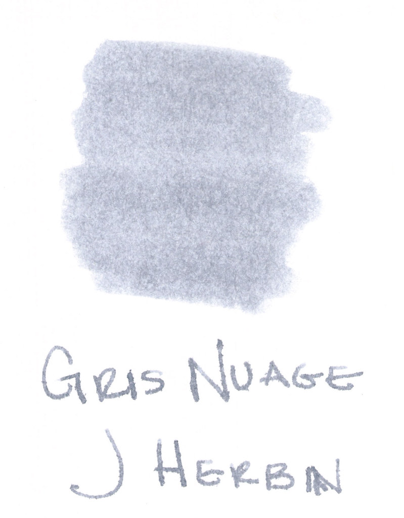
The above swab was done with a q-tip and then the name of the ink written with a glass pen. In my experience, there’s a lot of feathering with glass pens and this was no exception. (It also doesn’t help things that it’s written on a cheap-o index card.) (Again, I ask, are there are any nice index cards out there? Starting to think there aren’t.)
Anyway….Gris Nuage (Gray Cloud – how pretty!) is one of my very most favorite gray (grey, if you insist) inks.
It’s light – just like a cloud. It’s prettttttty. Leans more toward blue than red, but is definitely one of those pure colors that I adore.
And, holy crappoli (it’s a word), it writes like a dream. Check it out….
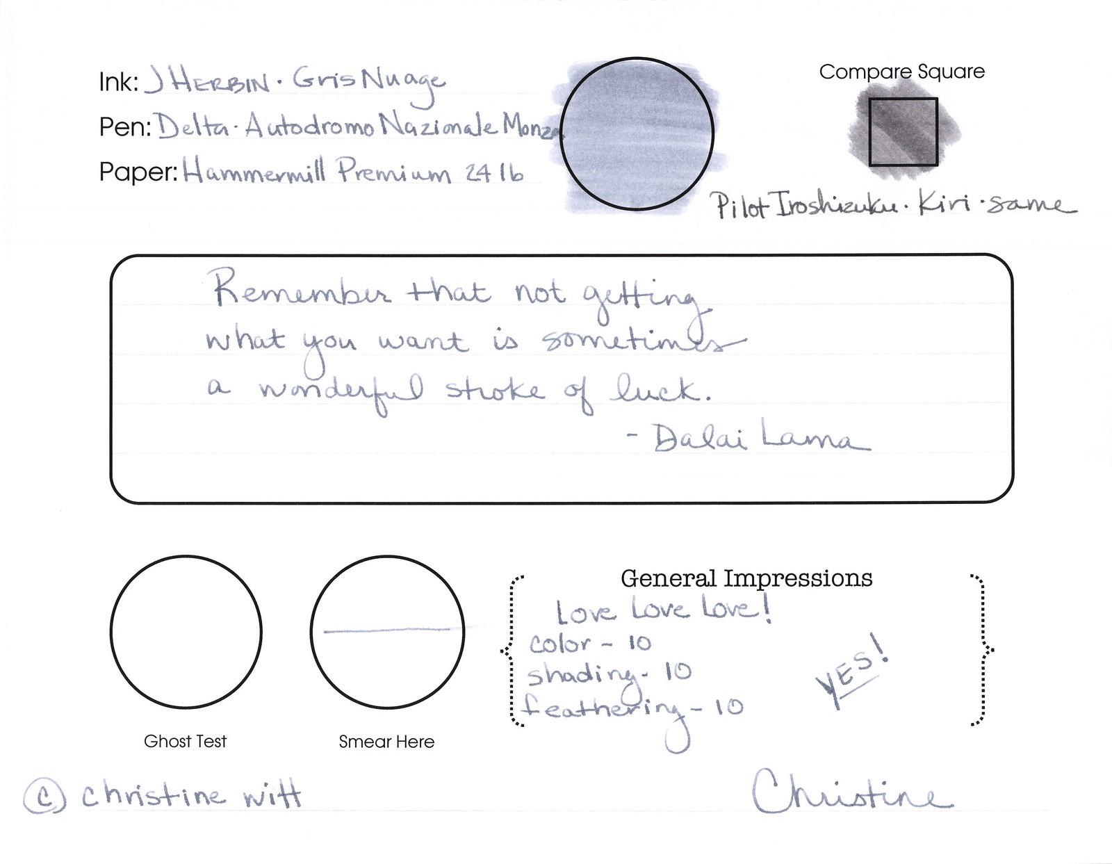
Pretty, yes? Some lovely shading going on there, too. And no smearing, no feathering, no ghosting, or bleeding. What more could a girl want in a gray ink?
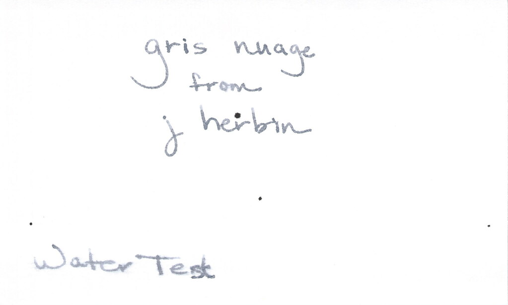
Oh, yes, it does well with water! Nice!!! This is totally one of my gray inks. It makes me swoon!
OK..so see those black specks on the water test? No, it’s not Gris Nuage gone crazy – that’s collateral damage from my Invincible Black spatter. Haha!
Do you have a favorite gray? Mr. Pentulant was using Montblanc Oyster Grey for awhile in his fancy new Boheme, but he wasn’t loving it.
While browsing artisan focused ecommerce websites for home and gift products I noticed EmberStone Stone Ember Shop – the platform had a smooth checkout experience and a large selection of items while product descriptions were accurate and navigation was easy to follow throughout
During a casual browsing session, I encountered this clean retail studio – the layout is simple and effective, making product viewing and browsing very fast and intuitive.
While exploring various online vendor platforms, I noticed how great usability combined with a simple design makes everything work perfectly fine indeed here Crystal Harbor vendor parlor hub navigation feels smooth and every section is easy to access
While navigating through several digital marketplaces, I encountered this efficient online shop – the layout is well organized, making product comparison simple and fast.
During my review of marketplace websites, this platform stood out because its modern layout makes navigation simple and content clear and helpful Bright Harbor browsing portal I found everything intuitive and well organized
seoflowpro – Loved the layout today; clean, simple, and genuinely user-friendly overall.
While comparing different vendor showcase environments, I found a system designed around Frost Ridge Merchant Studio that delivers a well-balanced interface with simple navigation and clean visual presentation – it supports quick browsing and makes product exploration feel natural and uninterrupted across all sections.
Users who prefer structured vault inspired marketplaces often explore sites such as Ivory Vault Ridge Premium Hub where items are displayed in a refined and minimal format – The design ensures content feels carefully curated, visually clean, and easy to browse across all categories of the store.
Users often prefer vendor platforms where performance is fast and navigation remains intuitive and structured Rose Harbor browsing center this creates a smooth experience that helps users explore listings without unnecessary effort or delays
Modern e-commerce users value systems that reduce search time and improve product discovery efficiency overall VC Wood Cove search center this results in smoother navigation experiences and allows users to quickly find items that match their preferences across categories during typical browsing sessions online today
floraridgevendorparlor.shop – Nice structured pages provide clear information and smooth navigation flow
Online users exploring simplified product windows for viewing curated trade listings may encounter platforms like Trade Product Window – which present item details in a focused layout designed to reduce clutter and improve comprehension during browsing sessions involving multiple vendor selections.
In my review of ecommerce storefront designs I focused on usability flow clarity and product visibility across sections MapleCrest Vendor Digital Hub the platform was stable and smooth and the variety of goods is impressive and the shopping process feels simple and fast improving overall experience
During my time checking different online stores, I encountered this organized retail hub – the interface is simple and clean, making browsing smooth and very easy to navigate at all times.
sageharborgoodsgallery.shop – Looks clean and minimal, easy to find information without confusion.
During late night browsing for curated gift and home decor platforms I explored multiple websites and discovered Glass Meadow Select Market – The overall shopping flow felt intuitive, with well organized sections and accurate product descriptions that made the entire experience efficient and enjoyable.
Online buyers often appreciate websites that reduce waiting times and provide intuitive navigation for a better overall shopping experience, and this is seen in PrimeCove MarketHub – the system is designed to be responsive and well organized, helping users browse efficiently and complete purchases without unnecessary complications.
Users who appreciate soft themed marketplaces often browse platforms such as Cove Honey Cozy Vault Space where products are displayed in a gentle and warm layout – The interface ensures a structured browsing experience that feels relaxing, intuitive, and visually harmonious throughout the entire platform.
While exploring various digital product catalog systems, I came across a layout centered around Frost Ridge Retail Lab which provides clear category separation and responsive navigation elements that enhance usability – the browsing experience is straightforward and visually balanced across all pages.
Users often look for platforms that keep things simple while making navigation intuitive and easy to follow Ruby Orchard quick browse page this one supports efficient browsing and allows users to locate information quickly without frustration
While exploring digital commerce platforms and curated marketplace layouts for design inspiration and analysis, I found Kettle Crest trade showcase link embedded mid-content – The interface felt simple and user friendly, and I could access everything without difficulty as navigation remained stable and responsive across all sections.
As I continued browsing different shopping websites, I discovered this simple and friendly store – the overall experience is smooth, intuitive, and very comfortable for casual browsing.
During exploration of curated online storefront systems and vendor platforms, I noticed a structured interface containing Linen Meadow trade showcase hub placed within a minimal layout that prioritizes clarity and visual balance – The browsing flow feels smooth, intuitive, and pleasantly organized, making it easy for users to explore different categories without effort
Online shoppers who value well-organized platforms often emphasize how important clean navigation and structured layouts are especially when they come across sites such as CrestMarket online browsing – offering a smooth and intuitive browsing journey that enhances user engagement and satisfaction.
I recently explored multiple eCommerce platforms and found this smooth vendor interface – everything loads fast, the product display is nice, and the structure feels well organized overall.
Some websites feel cluttered, but this interesting platform overall allows browsing different sections today here without confusion Jewel Brook quick browse page navigation felt stable and easy
During exploration of various marketplace discovery pages and online shopping hubs, I found a platform where Harbor marketplace discovery page – appeared reasonably reliable and worth revisiting at a later time. The browsing experience was smooth, with organized sections that made it easy to locate relevant content.
While comparing online shopping platforms I focused on interface design usability flow and overall browsing experience MarbleBrook Commerce Vendor Hub everything felt efficient and structured and the website runs smoothly and browsing items feels natural and well structured improving usability overall
While comparing online artisan marketplaces I reviewed layout simplicity and product accuracy and found Juniper Harbor Goods Pavilion and items arrived quickly while site navigation is smooth and very intuitive too which gave a positive impression and made exploring different categories feel natural and very efficient overall experience
People who prefer stylish ecommerce platforms often explore sites like Stone Gilded Brand Collective Hub where items are displayed with strong attention to aesthetic consistency – The design creates a luxurious browsing experience that feels smooth, structured, and visually aligned with a high end branding approach.
Online platforms that emphasize usability and minimal structure typically provide more enjoyable browsing experiences for users Ruby Orchard browsing hub this one allows users to move through content effortlessly while maintaining a clean and organized interface
While reviewing experimental vendor platforms and digital marketplace layouts for usability testing and performance comparison I came across Moss Harbor trade system overview board and immediately appreciated the interface simplicity and smooth navigation flow which makes it easy for users to find content without unnecessary effort or confusion across all pages overall – Fast structured browsing with clear navigation flow
People exploring curated product marketplaces often noted that platforms like Harbor Wild Goods Portal – stood out for their wide selection of items, while shipping reliability and fast dispatch times were commonly mentioned positives in customer experiences.
A well structured site enhances browsing, and this one makes it easy to browse different sections quickly Dawn Ridge browsing center I enjoyed how smooth and natural everything felt
honeymeadowmarketgallery.shop – Warm visuals and clean layout create pleasant browsing experience overall
While reviewing different digital storefronts, I encountered this user-friendly shop – its clean interface and logical layout make the shopping journey feel seamless and easy to navigate.
In the middle of exploring online platforms, I discovered browse this link which featured a nice overall structure, making everything easy to access and view in a well-organized and simple way.
While exploring various eCommerce sites, I found this clear product hub – the layout is neat and intuitive, making browsing and finding items very easy and fast.
People who enjoy visually dynamic online stores often engage with platforms like Stone Ginger Exhibit Galleria where products are displayed in a curated and stylish gallery format – The layout enhances user experience by combining clarity with aesthetic flow, creating a seamless and enjoyable browsing journey.
While researching online stores for home accessories and gift items I came across Nightfall Goods Trade Portal and enjoyed browsing their collection everything is organized and clearly labeled today which made the catalog feel easy to understand and navigation extremely smooth across all product sections available
управление пожарной сигнализацией установка пожарная сигнализация оповещение
ip камера 5mp уличная ip wi fi камера видеонаблюдения
Many users exploring curated vendor platforms appreciate efficient design, and Vendor Foundry Explorer – The browsing experience is consistently smooth, pages respond quickly, and product groupings appear well structured, allowing visitors to focus on comparing listings rather than waiting for content to load.
Users often prefer vendor platforms where the interface is smooth and pages are arranged in a clear and logical way Sage Harbor browsing center the browsing experience feels pleasant and helps users find information quickly without confusion
Users browsing vendor platforms often prefer a very clean interface that provides easy access to information and smooth browsing overall Cotton Grove shop access point this one delivers a clear and structured experience
While testing ecommerce vendor systems I studied responsiveness design flow and browsing efficiency across devices MarbleCove Trading Commerce Loft the platform was fast and intuitive and the great layout made everything simple and I enjoyed how easy it was to navigate making navigation simple
While exploring curated marketplaces for handmade and trade-oriented collections, I contacted support with multiple questions and appreciated how quickly they responded, Snow Harbor Trade Art Gallery making the entire experience feel efficient, user focused, and very comfortable while navigating through different categories.
While checking several online marketplaces, I discovered this clean shopping platform – everything is structured well, and shopping feels smooth, easy, and very user friendly from start to finish.
waveharborvendorparlor.shop – Smooth performance and tidy layout make site very easy today
During a relaxed session of reviewing digital marketplace designs and vendor showcase ideas, I came across several structured pages and found Rose Harbor marketplace entry point positioned within the content flow – I enjoyed checking this out, content feels simple and informative, and everything appeared neatly arranged without any confusing elements while browsing.