
Here’s a quickie review of one of my favorite inks to get us back into the groove this week. (More on Thanksgiving another time.)
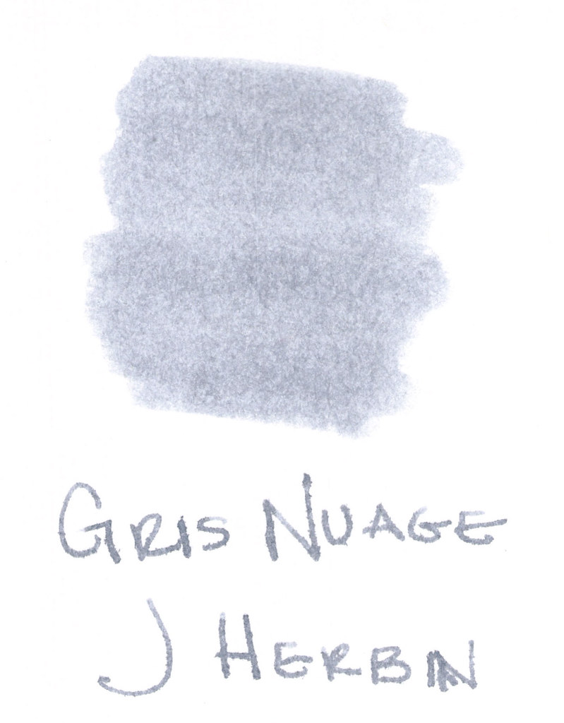
The above swab was done with a q-tip and then the name of the ink written with a glass pen. In my experience, there’s a lot of feathering with glass pens and this was no exception. (It also doesn’t help things that it’s written on a cheap-o index card.) (Again, I ask, are there are any nice index cards out there? Starting to think there aren’t.)
Anyway….Gris Nuage (Gray Cloud – how pretty!) is one of my very most favorite gray (grey, if you insist) inks.
It’s light – just like a cloud. It’s prettttttty. Leans more toward blue than red, but is definitely one of those pure colors that I adore.
And, holy crappoli (it’s a word), it writes like a dream. Check it out….
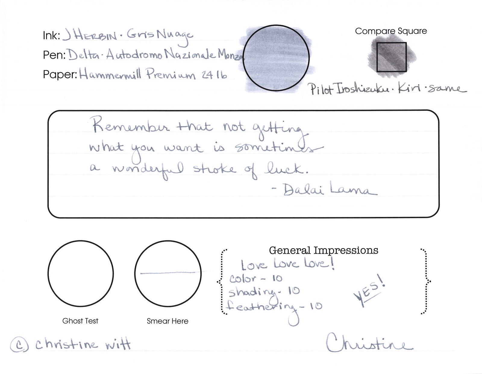
Pretty, yes? Some lovely shading going on there, too. And no smearing, no feathering, no ghosting, or bleeding. What more could a girl want in a gray ink?
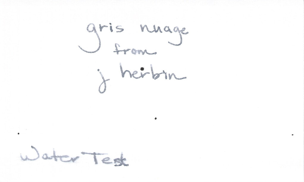
Oh, yes, it does well with water! Nice!!! This is totally one of my gray inks. It makes me swoon!
OK..so see those black specks on the water test? No, it’s not Gris Nuage gone crazy – that’s collateral damage from my Invincible Black spatter. Haha!
Do you have a favorite gray? Mr. Pentulant was using Montblanc Oyster Grey for awhile in his fancy new Boheme, but he wasn’t loving it.
While analyzing different trade gallery concepts and experimental e-commerce platforms for UI comparison purposes I found Birch Harbor trade showcase page placed within contextual text – pages responded quickly and the experience felt stable overall, with clean structure and no noticeable delays during navigation between sections.
pineharbortradeparlor.shop – Nice interface design makes navigation simple fast and quite pleasant
As I browsed various marketplace listings and vendor hubs, I came across a platform that appears complete but inactive in content, particularly Cove vendor Autumn commerce room link – The empty blog section makes me question whether anyone is maintaining the site anymore.
Good usability depends on design and navigation, and this platform provides a modern and intuitive browsing experience overall Sky Harbor vendor explorer I found everything easy to access and well structured across all sections
In the middle of exploring different platforms, I discovered <view this page which delivered a clear and well-organized experience, allowing users to navigate easily and understand the content without effort.
As I continued exploring various online resource pages and recommendation threads, I noticed something that seemed well structured and easy to follow, particularly with this clean marketplace portal – everything feels smooth and simple with nothing confusing or hard to locate, so I’ll likely return again soon.
mintorchardretailatelier.shop – Definitely coming back here for the holiday season.
As I navigated across related websites, I noticed click here to view – the similarities in layout, colors, and structure closely mirror another site, making it difficult to distinguish between the two and creating a repetitive browsing experience.
During usability analysis of ecommerce demo systems and environmental themed UI kits, testers found a navigation module featuring elm harbor marketplace goods node embedded mid layout, but despite the cohesive natural branding, image links break frequently leaving blank placeholders instead of product visuals – Elm trees are strong, but the goods room has broken image links disrupting visual clarity
sageharborgoodsgallery.shop – Looks clean and minimal, easy to find information without confusion.
While going through multiple niche discovery pages and listing directories, I came across something that felt clean and well structured, especially where Moss harbor vendor portal appeared – Seems like a decent site overall, and I’ll probably check it again soon because the experience feels straightforward and organized.
zencovegoodsgallery.shop – Simple interface clear structure makes finding information very quick indeed
During exploration of vendor gallery systems and online marketplace structures for usability research and design inspiration across multiple examples, I found Plum Cove goodsroom catalog entry embedded in structured content – The layout feels very readable and straightforward, allowing smooth browsing through sections while keeping everything clear and easy to follow from start to finish.
Online football matches http://www.futbol-oyunlari.com.az play football for free and without registration. Choose teams, participate in matches, and enjoy dynamic gameplay right in your browser without downloading.
car games online araba oyunlari com az racing, drifting, parking, and driving. Over 20 games are available for free — play now and hone your skills.
coralharbortradegallery.shop – Great browsing experience overall everything feels organized and easy today
While browsing individual portfolio and biography websites, I encountered a well designed page that highlights professionalism and user friendly structure professional web profile page – The site feels smooth to navigate, with clear information presented in a clean and structured format overall experience
Users who appreciate artisan focused ecommerce design often browse platforms such as Wind Cove Artisan Studio Market Hub where products are displayed in a neat structured format – The design ensures browsing feels easy, organized, and visually pleasant across all handcrafted product categories.
As I explored various trade hubs and online vendor listings, I came across a berry-themed website featuring Cove berry commerce market house link – It looks fresh and inviting, yet the missing contact page makes it feel incomplete.
After comparing various resources that lacked clarity, I encountered check this link which stood out for its structured layout, making it easy for users to find things much faster and navigate efficiently.
People who enjoy organized online stores often explore sites like Meadow Juniper Goods Exchange Hub where items are arranged in a minimal layout – The design ensures browsing feels simple, structured, and easy to navigate across all sections.
A good session is the one that closes green and follows the plan.
Many online marketplaces can feel cluttered, but this platform keeps everything nicely structured so browsing feels smooth and comfortable Sky Harbor product hub I liked how easy it was to find content and move through pages effortlessly
A well designed interface with nice visuals improves usability, and this platform ensures browsing feels smooth and pleasant overall Berry Cove marketplace link I found everything easy to view and well organized
Exploring vendor directories highlights how fast loading pages improve overall usability and user satisfaction Sea Cove vendor explorer this platform keeps everything simple and allows users to find content quickly and easily
While going through several online resources, I found access this site and noticed everything looks well structured, helping users move around without issues and providing a straightforward browsing experience.
During a relaxed session analyzing digital marketplace systems and vendor gallery interfaces for structural evaluation and UX comparison, I discovered Sun Cove vendor showcase portal placed mid-content – The interface felt modern and responsive, and I enjoyed how visually pleasant everything looked while browsing through sections without confusion or delay.
Портал по инженерии https://build-industry.su и перепланировке: проекты, согласование, нормы и практические решения. Полезные статьи, сервисы и экспертиза для безопасного изменения планировок и внедрения инженерных систем
Дома и коттеджи https://orionstroy.su под ключ в Москве: от проекта до готового жилья. Профессиональный подход, контроль качества и комфортные условия сотрудничества
People who enjoy efficient online outlet shopping often browse sites like Stone Harbor Outlet Category Hub where listings are clearly divided – The design focuses on usability and simplicity, allowing users to quickly scan products and move through categories without unnecessary complexity.
seoshelf – Pages loaded fast, images appeared sharp, and formatting stayed consistent.
During evaluation of online trade platforms and e-commerce design systems, I noticed a structured interface containing Upland Cove browsing gallery hub embedded within a clean layout that highlights clarity – The experience feels organized, calm, and naturally easy to navigate without confusion
While researching creative fusion websites, I encountered a platform that integrates cultural elements from different regions into one engaging design brooklyn jeddah theme site – The content feels diverse and interesting, with a strong blend of styles that makes the experience more dynamic and engaging overall
People who appreciate eco friendly online shopping often browse sites like Cove Forest Nature Artisan Outlet Hub where items are presented in a clean structured layout – The interface makes browsing feel calm, organized, and easy to navigate across the entire marketplace.
As I finished browsing through online marketplace sites, I found a minimal vendor hub containing Berry commerce harbor vendor room entry – It’s decent enough for a quick look, but overall it doesn’t feel particularly special.
rainharborvendorparlor.shop – Good organization easy navigation helps users find things efficiently today
Users often value platforms that make it simple to explore content through well-defined sections and logical layouts Elmwood gallery quick access this structure keeps browsing straightforward and allows visitors to locate relevant sections without confusion
While going through multiple niche directories and resource hubs, I found something that felt quite structured and easy to navigate, especially when seeing this vendor listing page included – the clean layout makes browsing comfortable and straightforward, so I might come back later for deeper insight.
sageharborgoodsgallery.shop – Looks clean and minimal, easy to find information without confusion.
People who enjoy winter inspired online marketplaces often engage with platforms like Ice Isle Crystal Market Place where items are displayed in a clean and frosty visual layout – The interface emphasizes clarity and freshness, ensuring browsing feels smooth, intuitive, and visually refreshing across all product categories without unnecessary clutter.
Ремонт и отделка квартир https://kaluga-remont.su а также строительство коттеджей под ключ. Комплексные услуги, опытная команда и контроль на каждом этапе работ
Чаты строителей https://stroitelirussia.ru в России— официальный сайт для общения и обмена опытом. Объединяем строителей со всех регионов России, обсуждения, вакансии, советы и полезные контакты
People who appreciate clutter free shopping platforms often browse sites like Harbor Acorn Outpost Smart Hub where items are presented in a clean and efficient layout – The design ensures browsing feels simple, organized, and easy to follow throughout the experience.
In the process of checking multiple sites, I found open this platform and noticed how intuitive it felt, allowing me to move through sections easily and locate relevant details without wasting time.
почему ноутбук не видит телевизор через wifi и телевизор не видит ноутбук по wifi
While browsing unique cultural fusion websites, I discovered a platform that mixes different stylistic and thematic elements in an appealing digital presentation brooklyn jeddah fusion hub – The experience feels engaging and culturally diverse, offering a creative blend of ideas that keeps the content visually interesting
During research on modern vendor platforms, I found an informational area including Harbor Berry commerce lounge site integrated into a clean design structure – The experience feels stable and user friendly, allowing users to browse comfortably with clear focus
During a search for efficient vendor directories, I noticed platforms that emphasize clarity and speed for better user experience >vendor parlor Aurora Harbor the browsing process feels fluid and responsive, making it easier to explore different listings without encountering navigation issues or delays online
While comparing vendor platforms, this one clearly stands out due to its smooth layout and responsive page design overall Snow Harbor listings page I appreciated how easy it was to move between sections without delays
Shoppers tend to favor websites that maintain consistent structure and offer easy navigation between categories overall usability boost Valecove Goods Room main entry portal – Navigation system design prioritizes clarity, helping users move through sections without confusion or unnecessary complexity based on interface usability findings user feedback analysis data reports