INK REVIEW: Diamine Grey

Click Images to Enlarge
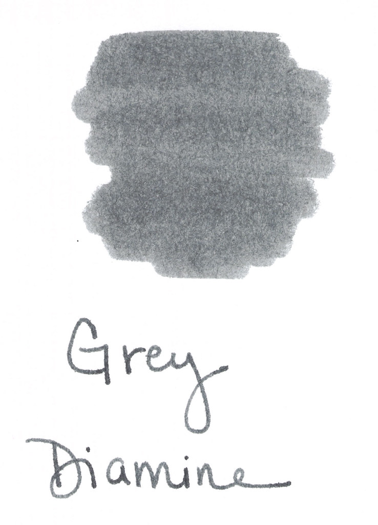
A quick look at Diamine Grey..
This color is a true gray (grey, for those of you who insist).  Stately and professional as I said in my Fifty Shades of Grey post last month.
It’s a bit darker than I like. If I’m going to get that close to black, I may as well go black.  
It smeared a bit on my Hammermill Premium paper, but it’s tolerable. Some shading is nice. Tiny bit of feathering – even on the index cards below.
The water test is a fail – not so much from the Q-Tip across “Water Test,” but more from the standing test in the word “from” below.  

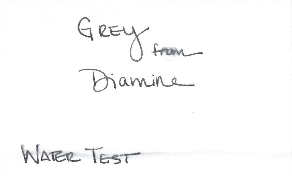
But..it is a true gray (ok, grey!) and I do appreciate that.

I’m not going to buy a full bottle of this ink (testing was done from a sample as usual). There’s just nothing that special about it.

Tyler Dahl LOVED this ink. A true sign that YMMV.

Have you tried it? What do you think? Wonderful or just meh?

UPDATE:  For some odd reason, this post received a whole big mess of spammy posts. I’ve closed comments on this post, but please contact me if you have something to add to the conversation! xo

INK REVIEW: Pilot Iroshizuku – Kiri Same

Kiri same from Pilot Iroshizuku is such a pleasing shade of gray.  I like my gray inks to look as much like pencil as possible – so that the reader may even wonder if I’d written in pencil. A simple fine line. Mmm. This one fits the bill, but when compared with other grays – it seems to have some red qualities to it. It’s probably not enough red to notice when the ink is on its own, but the red is definitely there.

The above swab is on a cheap index card (really, are there any quality index cards out there these days?). The feathering on the index card had me concerned, but look below at the water test – no feathering, no smearing.  For the water test, I write, wait a few seconds, and then drag a moistened Q-Tip across the writing. I also place a water droplet on the card – in this case, it’s on the L in “Pilot” – crazy, right?

Pricing is the same as the other Iroshizuku inks – $28 at most places. 
I like the hint of shading, too. Some feathering on my Hammermill Premium paper, but you have to get pretty close to see it. Definitely not something that would keep me from enjoying this ink.
This one is a temptation! I’m going to plan to try another sample. Perhaps on a variety of papers. And then I’ll know. Is this my gray?  Which is your gray (or is it grey)? I answered that question last week.
Here’s what other people are saying . . . 
Fountain Pen Network  (look at that shading!)

Seize the Dave (the essence of storm clouds in a bottle)

Grays are a favorite color for me. Love, hate, or indifferent – how do you feel about gray ink?