
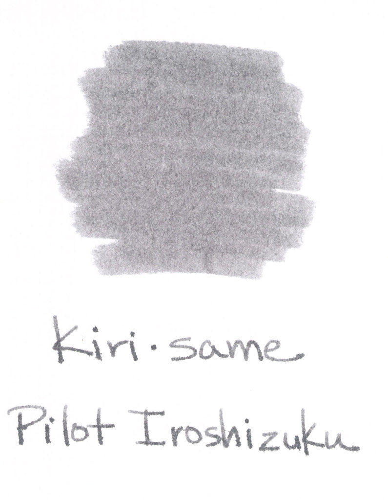
Kiri same from Pilot Iroshizuku is such a pleasing shade of gray. I like my gray inks to look as much like pencil as possible – so that the reader may even wonder if I’d written in pencil. A simple fine line. Mmm. This one fits the bill, but when compared with other grays – it seems to have some red qualities to it. It’s probably not enough red to notice when the ink is on its own, but the red is definitely there.
The above swab is on a cheap index card (really, are there any quality index cards out there these days?). The feathering on the index card had me concerned, but look below at the water test – no feathering, no smearing. For the water test, I write, wait a few seconds, and then drag a moistened Q-Tip across the writing. I also place a water droplet on the card – in this case, it’s on the L in “Pilot” – crazy, right?


Seize the Dave (the essence of storm clouds in a bottle)
Grays are a favorite color for me. Love, hate, or indifferent – how do you feel about gray ink?
Undeniably believe that which you said. Your favourite reason seemed to be on the web the simplest factor to be mindful of. I say to you, I definitely get irked while other people think about issues that they plainly don’t understand about. You managed to hit the nail upon the top and also outlined out the whole thing without having side effect , people could take a signal. Will likely be back to get more. Thank you
Really enjoyed thos blog! I recently found a company called Ideal Glass
Limited, and I have to say, they really stand out inn the marketplace off home
improvement. They offer a wide range of modern triple glazed windows, as well as aluminium
exterior doors, and evn glass partitions for both homeowners and business
needs.
I found it interestung to learn about how they combine technical know-how with a modern design approach.
It’s encouraging to know that companies like Ideall Glass arre helping people transform their spaces.
This post, along wigh what I’ve seen from
them, really mqkes me want to explore solme improvements to
my own property. Looking forward too reading more content like this—thanks again for sharing!
Feel free to surf to my web-site:: Clean-Pro
Thank you for your articles. They are very helpful to me. May I ask you a question? http://www.kayswell.com
Hello everyone!
I came across a 138 great site that I think you should visit.
This site is packed with a lot of useful information that you might find helpful.
It has everything you could possibly need, so be sure to give it a visit!
https://c3enet.org/betting/popular-betting-types-you-should-know/
Additionally do not forget, guys, — one always may in this particular article locate solutions to the most most tangled questions. Our team attempted to present the complete information using an extremely easy-to-grasp method.