 |
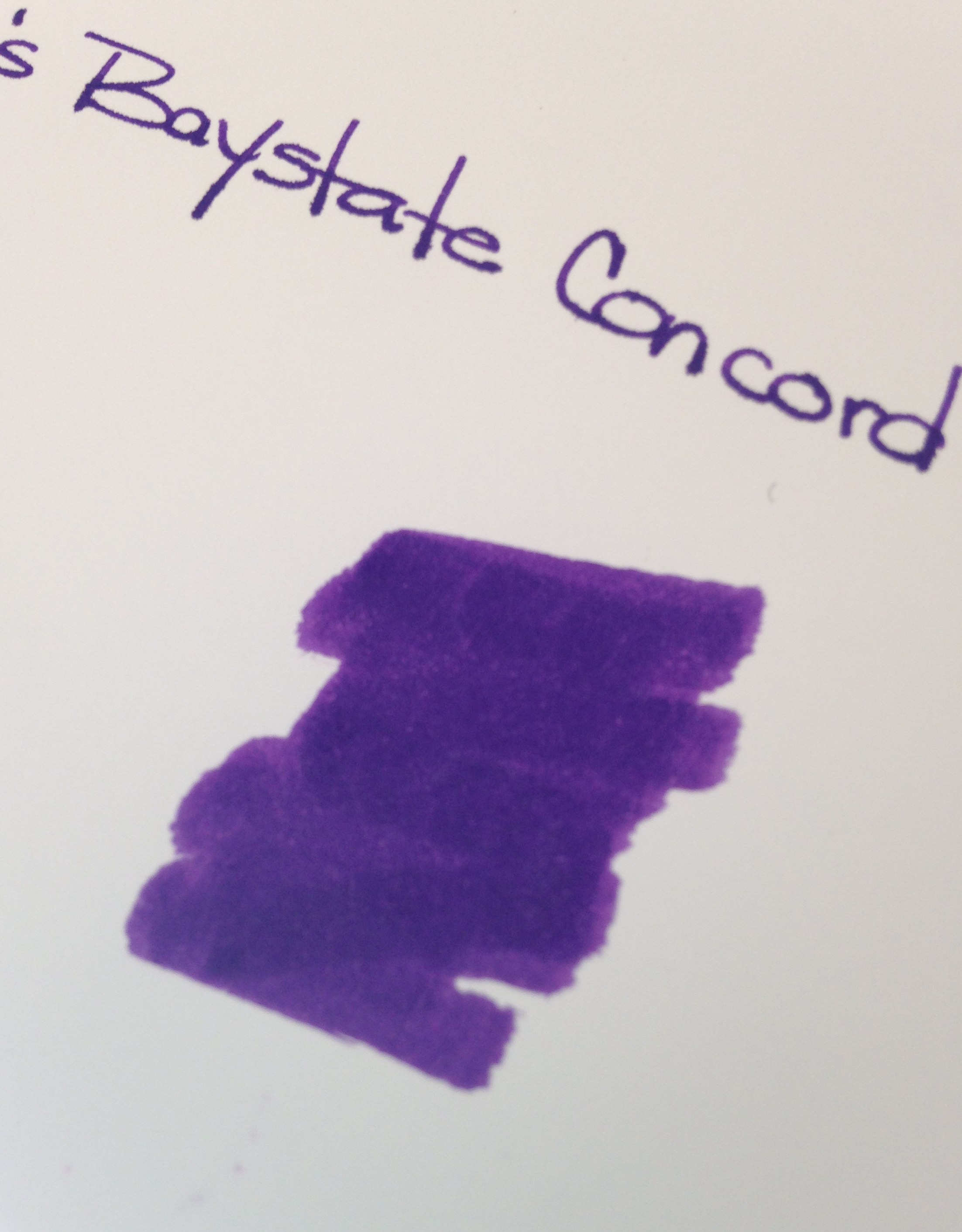
| Noodler’s Baystate Concord Grape Ink Swab |
Disclaimer: While I usually scan the sheets of paper for my ink reviews, these images are coming right out of my iPhone. That explains the inconsistencies in color and quality.
Second Disclaimer: I realize that this post flies in the face of what I said last week about putting up with some other things as long as the color and saturation are there. What can I say? I’m fickle.
If you’ve been in the fountain pen community for any length of time, you have probably heard of Noodler’s Baystate Blue. Famous for it’s amazing color and it’s amazing ability to stain (or even ruin?) your most loved pens.
But Blue isn’t the only Baystate color from Noodler’s. There is Concord Grape and also Cranberry.
Today, we discuss Concord Grape.
No likeie.
The color is what I expected – very saturated, very purple. No complaints there.
But here’s the problem….
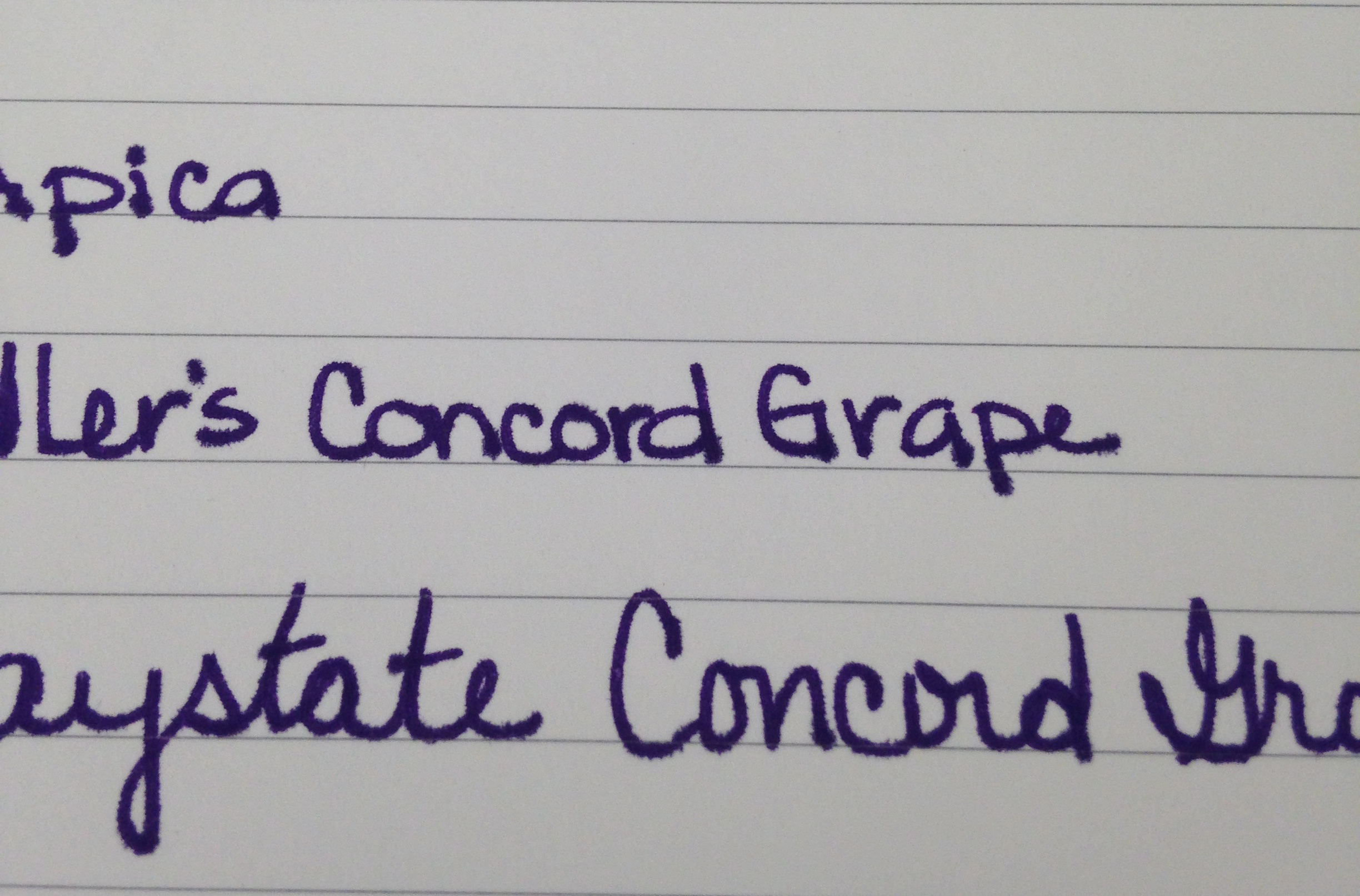 |
| Baystate Concord Grape – Apica Paper Test |
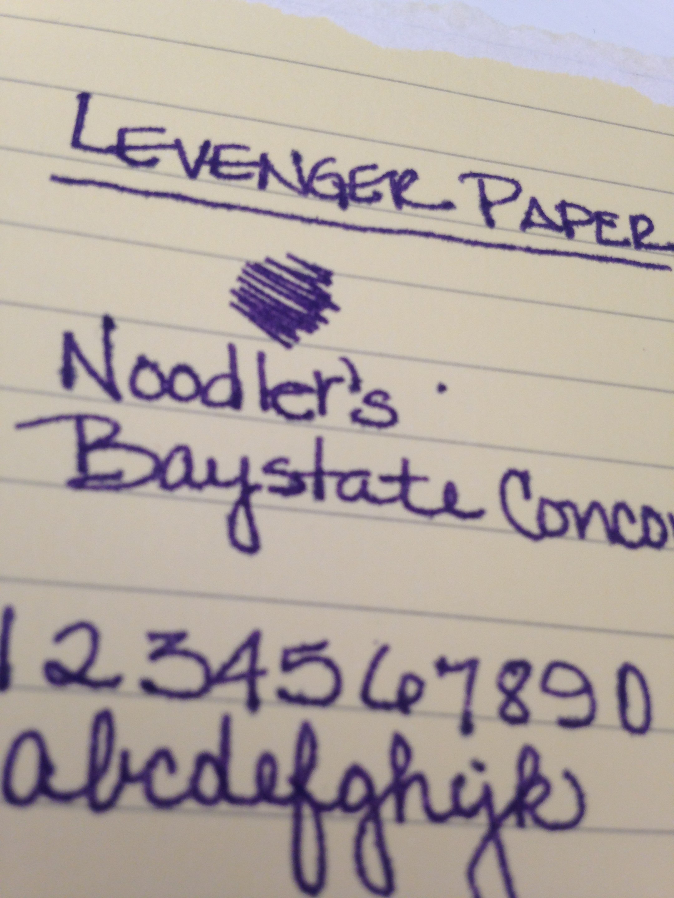 |
| Noodler’s Baystate Concord Grape – Levenger Paper Test |
 |
| Noodler’s Baystate Concord Grape – HP 32lb Paper Test |
It’s the feathering. Click on the images to see the full-size or have a look at these screenshots from the original images.


If it was just one paper (especially the Levenger, which has been questionable with a number of inks), I could let it go. The color is so great that a problem here or there is ok with me, but this ink was a problem on almost every paper I used.
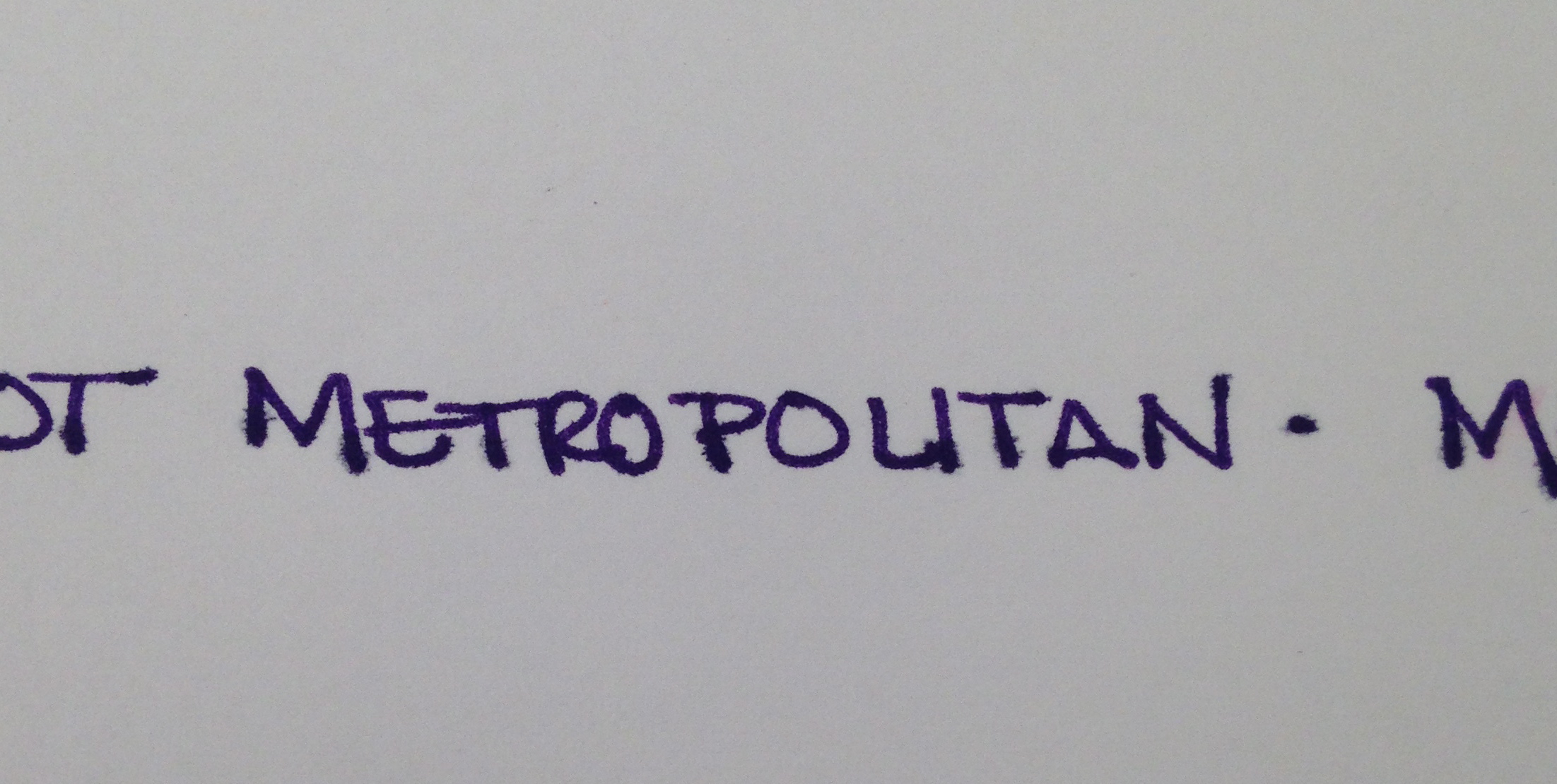
I was using a Pilot Metropolitan (medium nib). It’s a pen I’m very familiar with and have had no problems with in the past. After the ink sat in this pen for a day or so, the flow was terrible – I eventually had to open the pen and give the squeezie converter thing a little squeeze to get things flowing again.
With most of my ink reviews, I use the ink regularly for an entire week before posting. I was only a few days into the week before I realized that I wasn’t reaching for this ink at all. It was making a mess out of my work notebook (a Rhodia) with all of its ugly feathering.
Now, of course, your mileage may vary and I’m no expert in pens and inks (just love me some pretty colors and shiny things). If you’ve tried Baystate Concord Grape, I would love to hear about your experiences.
delaware mobile sports betting online with paypal (https://voiceoverangel.CO.Uk/)
Hi there! Do you know if they make any plugins to protect against hackers?
I’m kinda paranoid about losing everything I’ve worked hard on. Any tips?
cuantas casas de Ganar apuestas deportivas
hay en españa
virtule veilige wedden cs go
wedden trucs vandaag nl
Look into my website sportwedden paardenracen 2026
The feathering issues with Noodler’s Baystate Concord Grape on Rhodia paper really stood out—makes me wish for a more reliable purple. For practical ink alternatives or gear that handles rough conditions better, I’ve started checking the mortal shell 2 wiki for tested builds and durability tips.
Discover more about oral care at prodentim and see what makes it stand out.
That is why a domain like this can attract attention from careful readers.
## Section 2
That convenience can make the overall experience better for a first-time visitor.
## Section 3
Trust is often influenced by how clearly and calmly the information appears.
## Section 4
In a crowded online space, a direct and readable website can stand out quickly.
pay n play kihlveokontor
my blog post mitmikpanuse selgitus (oxfordadvisorytv.com)
grote sports wedden
Review my web-site – sportwedden snooker 2026
ascot racing betting free bet Offers cheltenham
kansberekening e-beste sportwedstrijden wedden
web veilige wedden golf, https://kooreman-consultancy.nl/hoe-de-damesbasketbal-de-sportweddenschappen-beinvloedt/, paarden
Basketball wetten strategien ohne einzahlung österreich
meerdere paarden wedden
Also visit my blog: Sportwedden advies
betting app norge
Check out my blog beste bettingselskap
bookies online betting games (http://wp.9minread.com/how-offseason-moves-reshape-betting-odds/) near me
how to pick a winner at win place Bet in horse racing racing
hasartmängusõltuvuse tunnused
Also visit my homepage … coolbet kampaaniad – Sergio –
horse racing cheltenham ante post betting tips bonus
grote Ios wedden sites trucs 2026
android Naar Wedden Snooker snooker trucs
You made some good points there. I looked on the web to learn more about the issue and found most
people will go along with your views on this site.
I will right away take hold of your rss as
I can not to find your e-mail subscription hyperlink or newsletter service.
Do you’ve any? Please permit me realize in order
that I may just subscribe. Thanks.
online sportsbooks
my web page :: expected value sports betting [Jeanett]
Hello all, here every one is sharing such knowledge,
so it’s good to read this web site, and I used to go to see this webpage daily.
horse racing newcastle greyhound results tonight
what are the best horse racing online betting bias horse racing tips;
Eloisa, sites
types of betting results
Very shortly this website will be famous amid all blogging visitors,
due to it’s good articles
Hello very nice site!! Guy .. Excellent .. Wonderful ..
I’ll bookmark your blog and take the feeds also? I’m happy
to search out numerous helpful information here in the publish,
we’d like develop more techniques in this regard,
thank you for sharing. . . . . .
betting odds for epsom derby
my webpage; windsor race results today, https://Pberrymain.Test-Windmillwebsites.Co.uk/the-role-of-analytics-In-modern-Horse-racing/,
parimad live panuste kihlveokontorid
Feel free to visit my website … Turvalised Panustamise Strateegiad
online Voor hockey wedden online live
gode odds biatlon
Here is my blog post … Ufc Tips i Dag
horse racing southwell results tip from ascot
bet on it
apostas desportivas suspensa online simples
starcraft betting
my webpage :: Odds Amerikansk Fotball I Dag (Soobiesurgeons.Com)
what is ante post in horse racing
Also visit my site: free bets Cheltenham tomorrow
I am curious to find out what blog system you are working with?
I’m having some minor security problems with my latest blog and I
would like to find something more risk-free.
Do you have any solutions?
Pretty! This has been an incredibly wonderful article. Thank you for supplying this info.
Everything is very open with a very clear description of the issues.
It was definitely informative. Your site is very helpful.
Thanks for sharing!
ayr best horse racing betting app odds
what does fixed odds mean in just horse racing tips best bet (https://naomisbakes.co.uk/) racing
Discover more about oral care at buy prodentim and see what makes it stand out.
The platform offers practical details that may help people better understand routine care.
## Section 2
Another valuable element is clarity, because clear messaging supports confidence.
## Section 3
Trust is often influenced by how clearly and calmly the information appears.
## Section 4
In a crowded online environment, a direct and readable website can stand out fast.
Start your ultimate gaming journey today and claim exclusive welcome bonuses only after you Tải Go88.
Elevate your online entertainment experience with the premium features and user-friendly interface built for go88v1.site enthusiasts.
sportwetten freebet ohne einzahlung
my blog – wett tipps basketball nba (https://Liposuctionfacts.net/wie-man-die-besten-wettmoglichkeiten-in-krypto-findet/)
porque robo site de apostas esportivas pix online
Discover more about oral care at prodentim independent reviews and see what makes it stand out.
Prodentim2026us.netlify.app stands out as a modern resource for those looking to understand oral wellness more easily.
## Section 2
If the content is simple to follow, people can focus on the details that matter most.
## Section 3
People often assess a website not only by design but also by practical value.
## Section 4
That combination can make the site memorable for visitors who value simplicity.
Thanks for posting this. Looking for these resources 😀