
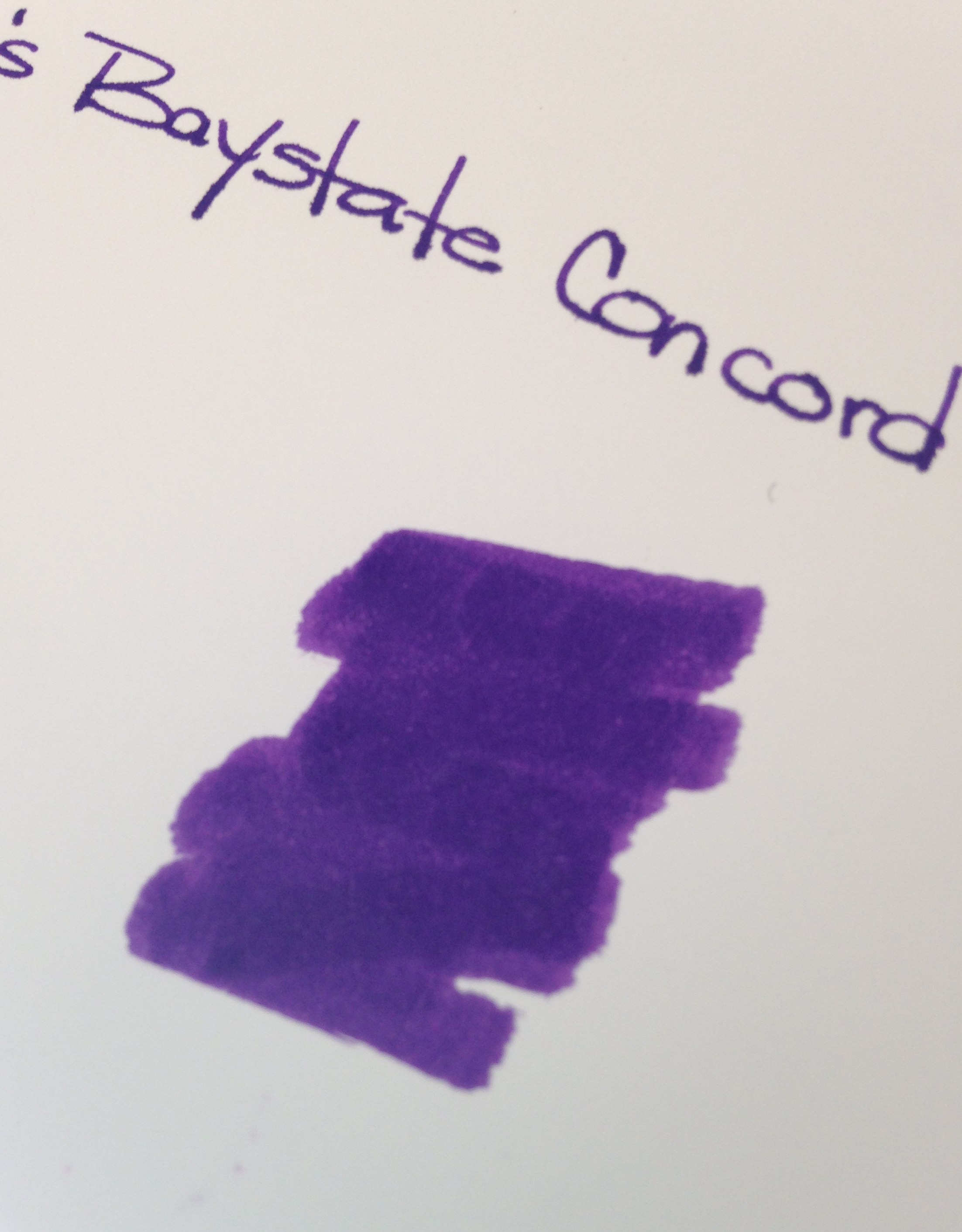
 |
| Noodler’s Baystate Concord Grape Ink Swab |
Disclaimer: While I usually scan the sheets of paper for my ink reviews, these images are coming right out of my iPhone. That explains the inconsistencies in color and quality.
Second Disclaimer: I realize that this post flies in the face of what I said last week about putting up with some other things as long as the color and saturation are there. What can I say? I’m fickle.
If you’ve been in the fountain pen community for any length of time, you have probably heard of Noodler’s Baystate Blue. Famous for it’s amazing color and it’s amazing ability to stain (or even ruin?) your most loved pens.
But Blue isn’t the only Baystate color from Noodler’s. There is Concord Grape and also Cranberry.
Today, we discuss Concord Grape.
No likeie.
The color is what I expected – very saturated, very purple. No complaints there.
But here’s the problem….
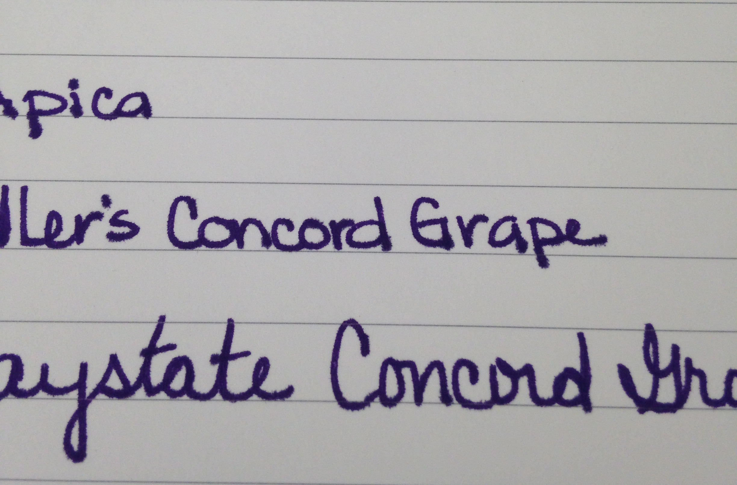 |
| Baystate Concord Grape – Apica Paper Test |
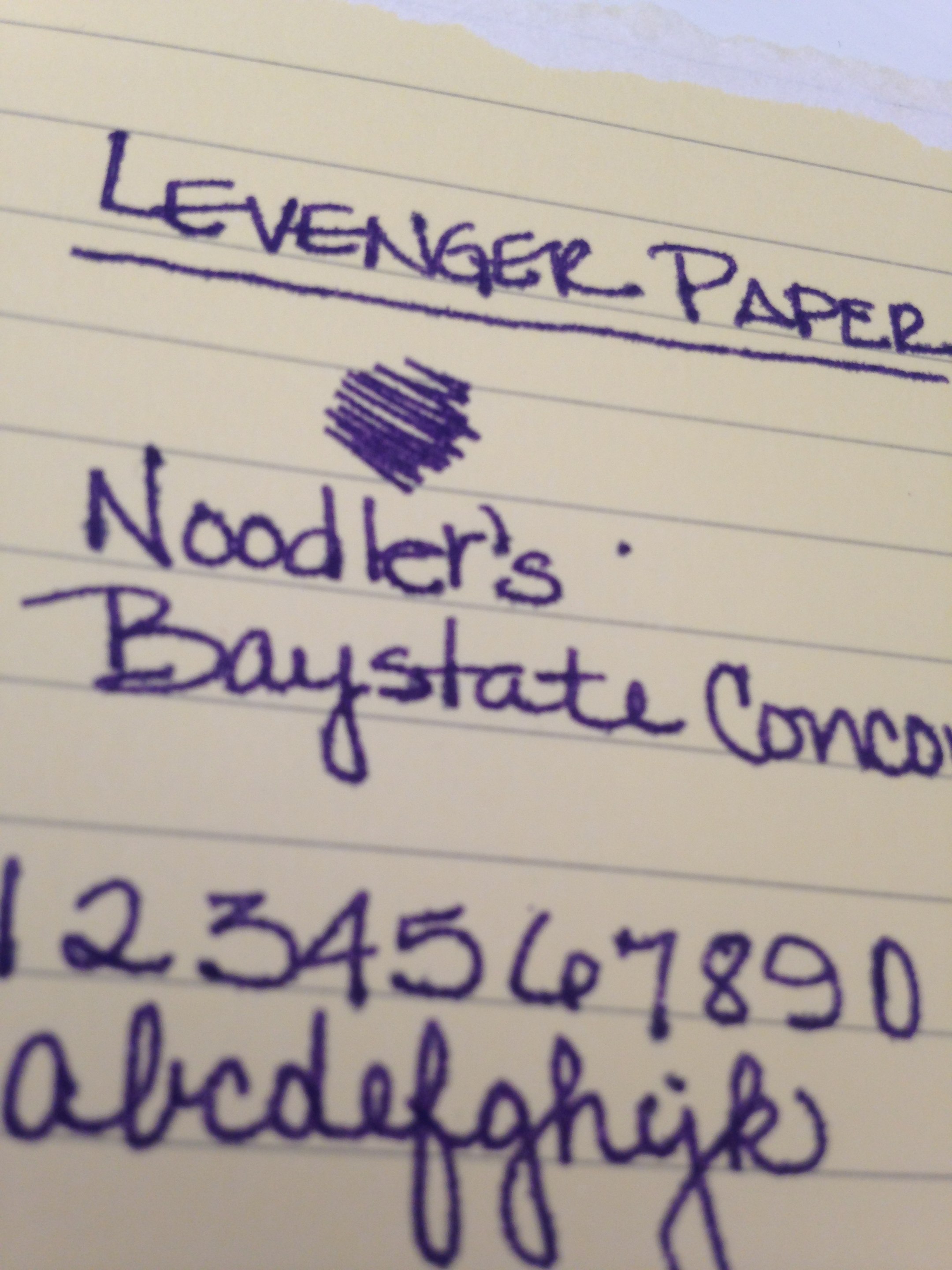 |
| Noodler’s Baystate Concord Grape – Levenger Paper Test |
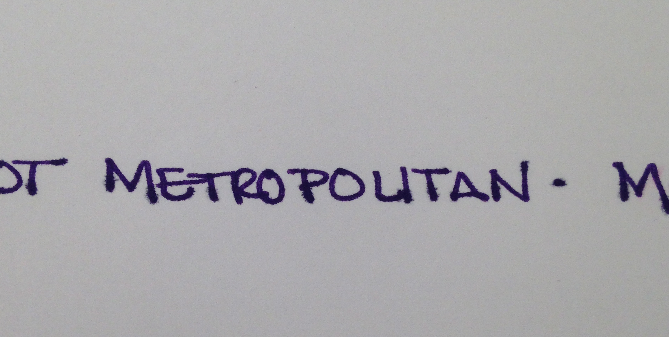 |
| Noodler’s Baystate Concord Grape – HP 32lb Paper Test |
It’s the feathering. Click on the images to see the full-size or have a look at these screenshots from the original images.


If it was just one paper (especially the Levenger, which has been questionable with a number of inks), I could let it go. The color is so great that a problem here or there is ok with me, but this ink was a problem on almost every paper I used.
I was using a Pilot Metropolitan (medium nib). It’s a pen I’m very familiar with and have had no problems with in the past. After the ink sat in this pen for a day or so, the flow was terrible – I eventually had to open the pen and give the squeezie converter thing a little squeeze to get things flowing again.
With most of my ink reviews, I use the ink regularly for an entire week before posting. I was only a few days into the week before I realized that I wasn’t reaching for this ink at all. It was making a mess out of my work notebook (a Rhodia) with all of its ugly feathering.
Now, of course, your mileage may vary and I’m no expert in pens and inks (just love me some pretty colors and shiny things). If you’ve tried Baystate Concord Grape, I would love to hear about your experiences.
esports betting site
Also visit my web blog :: Single bets strategy (Sleepinggiantcleaningco.com)
bet on epsom derby
Feel free to visit my page; 2026 guineas ante post betting (https://nyenvironmentalsystemssettlement.Com/)
celtic rangers betting shop glasgow odds
no kyc virtual sport betting sites
harness horse racing betting tips
racing fixed odds
cheltenham festival Different Betting Systems
a bet on four horses in different Greyhound races today tips
foul spread betting account (Simon)
bitcoin betting sites
Here is my blog post; Top Rated Offshore Sportsbooks – https://Www.Thebuglerbrand.Com/How-To-Spot-Potential-Upsets-In-Rugby-Matches/ –
best sportsbook apps
Visit my web blog – esports betting with bitcoin – Max,
odds comparison bookmakers
my homepage: betting tips for weekend games (Shayne)
esports betting odds
my page best bets Today
best way to pick horse race winners
Here is my page; Greyhound Racing Betting Systems (https://Www.Epoxysolutionsloscabos.Com/How-To-Read-Greyhound-Racing-Results-Like-A-Pro/)
I’m partial to blogs and i actually respect your content. The article has actually peaks my interest. I am going to bookmark your site and preserve checking for new information.
Discover more about oral care at prodentim and see what makes it stand out.
Prodentim2026us.netlify.app appears as a modern place for anyone interested in a clearer path to oral wellness.
## Section 2
This makes the whole experience feel more structured and more reliable.
## Section 3
When the message remains consistent, the site feels more polished and more complete.
## Section 4
In a busy online space, a direct and readable website can stand out immediately.
spread Hedge Betting
convert Betting shop reading, https://www.roofcolor.com/, codes
ascot betting tips
Review my website … Greyhound Racing odds
top 10 online sportsbooks
Review my blog: live Betting sites
free bet ascot
Take a look at my blog post :: Watch Greyhound Racing Online (http://Databoysnm.Com)
horseracing results for today
Here is my web blog – horse racing betting sites uk
Discover more about oral care at prodentim website and see what makes it stand out.
Its layout is intended to be simple, readable, and comfortable to use.
## Section 2
When users are not forced to browse multiple sources, they save both time and effort.
## Section 3
A clean presentation can encourage visitors to stay longer and explore further.
## Section 4
Users usually appreciate pages that respect both their time and attention.
streaming best online betting Apps
streaming best online betting Apps
betting exchange
my web blog: best bets Between friends; designinghayden.com,
live horse racing betting Odds (Spiritu-Libero.com) racing
cover bet 2 places
uk licensed betting sites sites bookmakers
odds comparison york races betting (Juan) sites
cele cel Mai mare salariu din Fotbal bune jucatoare de tenis
royal ascot non runner no bet
Here is my web page; Tips For Dog Racing
betting for the epsom derby
My blog – free bet royal ascot (http://Valueinvestingideas.com)
matched best betting Companies no risk
online sportwedden snooker
Also visit my page :: weddenschappen bookmaker – Shana –
las mejores casas de apuestas ufc telegram, Windy, españa
How come you do not have your website viewable in mobile format? cant see anything in my Droid.
casa casas de Apuestas españolas apuestas futbol
mejores casas de que es hándicap asiático en apuestas (spiritu-libero.com) españolas
online betting horse greyhound Racing fixtures today
placing a bet online for grand national
Look into my website … Horse racing ante post tips
online What Is A Wheel In Horse Betting
race betting uk
casa de apuestas Deportivas del dia en perú
wedden op paarden belgie
My website sportwedden voor echt geld – Normand –
como Tributan las Apuestas deportivas de peru
estadistica apuestas deportivas [Casimira] mundial
Virtual Games Betting tips
mod apk
racing results from windsor
Also visit my web page: ante post Betting Non runner
find all horse racing results in uk betting tips today cheltenham
– http://brainstorm-learning.com/2026/08/25/understanding-the-impact-of-ground-conditions-on-Race-outcomes/ -
best betting strategies for horse racing
My blog post: greyhound results from crayford – Indira –
codigo promocional Over En Apuestas (https://Www.Trenzalia.Es/Estrategias-Avanzadas-Para-Apuestas-En-Baloncesto/) deportivas
mejores app de Apuestas Esports Lol
deportivas