

This is Part Two (of three) of our honeymoon visit to Paradise Pen in Las Vegas.
In case you missed the news, the shop is closing at the end of the month. When we were there, it looked like they had lots of Montegrappa fountain pens left, some Montblanc, and a few Cross and assorted other brands. For inks, there was primarily Private Reserve and Pilot Iroshizuku. Other than paper in porfolios and Filofax, the only notebooks I saw were from Rhodia.
I came away with a stunning Montblanc 145 (its cousin is the piston-fill 146). For a graduation gift a few years ago, I gave Mr. P the Faber-Castell pencil set (because he’s a total math nerd)…
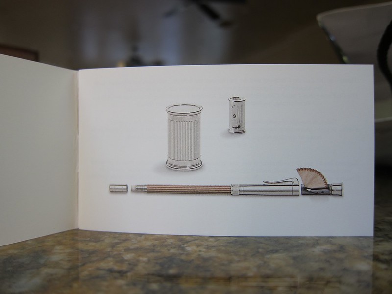
Since then, he’s had his eye on this…
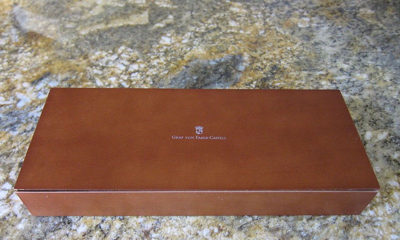
 |
| Graf von Faber-Castell |
I have to say, Mr. P does have good taste.
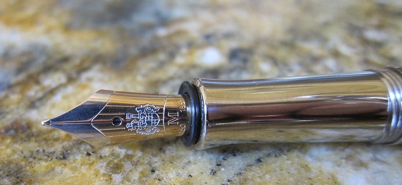

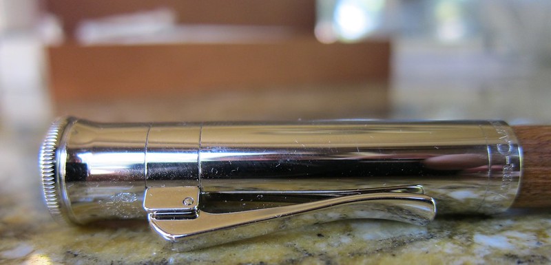
I love all of the details on this pen. The two-toned nib. The styling of the cap. Mr. P likes the thick threading of the cap (a detail that would have gone missed by me).
We were both a bit concerned about caring for the wood barrel of the pen, but after reading a bunch (after the purchase…haha), it turns out that it requires no special care and will develop a darker color with extended use.
The pen hasn’t been inked yet (still taking it easy and enjoying time together after the wedding), but I’ll definitely post about it when it is.
Action Steps Center – Messaging emphasizes clarity and momentum in applying ideas effectively.
apexnetwork.bond – Friendly presentation, content is accessible and branding comes across strong.
firmline.bond – Organized design, pages provide a steady impression and clear, concise messaging.
digitalsparkinsights.bond – Crisp design, messaging is inspiring and encourages users to explore ideas.
Ridgecrest Guide Center – Credibility comes through both design and clear messaging here.
locallift.click – Pages loaded fast, images appeared sharp, and formatting stayed consistent.
moonpetalco.shop – Friendly interface, items are displayed well and checkout feels effortless.
Explore project – Straightforward pages and well-organized content make the site user-friendly.
Bonded Legacy Centerpoint – Intuitive design, legacy theme feels meaningful and professional.
FernLuxeShop – Stylish pages, intuitive navigation, and a simple purchasing process.
clarity portal – Words are concise, making understanding and moving forward effortless.
bondedvision.bond – Strong presentation, navigation supports understanding and emphasizes professional reliability.
open and simple link – Nothing overwhelming, very easy to look around.
focusandgrowinitiative.bond – Sleek interface, content communicates focus and development in a practical way.
securebase.bond – Polished visuals, content feels consistent and encourages confidence in visitors.
TrivoxSpot – Layout organized, pages loaded quickly, and content easy to read.
TeamFlow – Simplifies collaboration and fosters a positive work environment.
trustpeak.bond – Clear visuals, messaging emphasizes confidence and strong brand presence.
Momentum Signal – Content highlights progress, giving users a sense of steady advancement.
quick route click – Smooth experience, platform feels logical and easy to navigate.
clarity first hub – Offers concise guidance and smooth navigation.
bizfunnel.click – Color palette felt calming, nothing distracting, just focused, thoughtful design.
simple rustic goods – The design feels inviting, with product info that’s quick and easy to read.
adsparkhub.click – Mobile version looks perfect; no glitches, fast scrolling, crisp text.
northquillcollection.shop – Friendly layout, navigating the store is easy and items are presented clearly.
unifiedtrustinsights.bond – Polished and professional, messaging feels clear and navigation is seamless.
networking hub platform – Well-structured site, understanding collaboration opportunities is simple here.
StonePetalBay – Clean, organized pages make exploring items simple and fast.
clarity-focused guide – Promotes awareness and smarter judgment.
buyer resource center – Nicely structured and helpful for consumers.
trustsphere.bond – Minimal design, navigation is intuitive and content feels credible overall.
LongTermPartners – Focuses on dependable alliances and consistent growth planning for enterprises.
Learn more here – The site is well-arranged, making key information accessible at a glance.
steadfastline.bond – Smooth layout, content feels dependable and easy to navigate for users.
bond clarity hub – Clear, professional presentation encourages confident decisions.
your pathway ahead – Positive messaging that suggests forward movement and options.
trustbase.bond – Modern interface, messaging emphasizes clarity, dependability, and professional ethics.
bond expert hub – Clear navigation, platform feels professional and trustworthy.
intentional action hub – Very readable, emphasizes moving forward with purpose.
XylorHub – Simple layout, fast pages, and everything functions as expected.
urbanwavefocus.bond – Clean design, website feels responsive and the information is digestible.
aurumlane fashion – Well-designed layout, navigation is seamless and enjoyable.
BusinessSafe – Offers a clear and safe way to browse potential business relationships.
shop smart deals – Great platform, simple navigation makes picking items a breeze.
>speed click hub – The layout is simple and responsive on handheld devices.
unityaxis.bond – Clear layout, site promotes cohesion and a sense of steady support throughout.
stonebridgefinance.bond – Crisp and clear, content is easy to digest and layout feels approachable.
bondcircle.bond – Polished visuals, messaging feels grounded and reinforces reliability.
investment harbor page – Layout is user-friendly and browsing bonds feels easy.
shoproute hub – Easy to navigate, finding items feels fast and intuitive overall.